An overview of you-know-what from Engadget
- Transfer
Apple iPad. The word is not a sparrow, especially when it is a brand. A brand is more than just a device, it is an idea, a postulate with a claim to a key role in the world of consumer electronics. Until the moment of "X"iPad was called by different names: Apple Tablet, the Slate, Canvas and many, many others. Although the history of the tangle of rumors enveloping the tablet has been in excess of 10 years, some of them have nevertheless been realized. After the big announcement on January 27, Apple began to prepare for one of the most high-profile steps in history - the formation (or destruction) of a whole class of consumer technology. The iPad is a device that takes its place between the monumental iPhone and the successful MacBook, the invader of the throne of netbooks, the forerunner of a completely new kind of personal electronics devices ... provided that Apple keeps its promises. And the promises are huge. The company talked about “magic” and “revolution”, describing what is not visible behind “just a big iPod”. But what if there really is something? Is there still hope that all the promises of the evolution of the idea of "man-machine" will not be a marketing ploy? Are we really facing the future of personal computers?
All answers are under a cat. Just watch the traffic,% username% - they are illustrated. And there are a lot of beeches.
Attention - a topic of evil!
Iron
Design and form factor

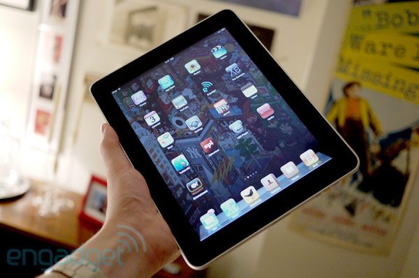
The first thing that catches your eye is the fact that nothing catches your eye. Even in terms of design, it’s almost nothing to cling to. The front side of the device is a 9.7-inch IPS screen with diode backlight and a resolution of 1024x768, surrounded by a black frame. Which, although it seems to many too thick, is in fact an important element of this design itself - it is necessary to hold the device for something without causing “adverse reactions” to the touch screen. And of course, the round button under the display is Apple's calling card. The back panel is a solid aluminum plate. Like most of the company's products, the tablet is pleasing to the eye. Not so frantically good, that at least write boiling water, but not bad. And although the appearance of the device is very restrained, it still makes you feel the power of technology that has fallen into your hands. The device is slightly weighty - as much as 680 grams, which, however, does not interfere with comfort to keep it in any position. With all its computing power, the case barely exceeds a centimeter in thickness, which also makes an impression. The brushed metal of the back of the case pleasantly transfers heat (although you can’t use it with bare hands anyway), the design focuses on the most important part - the screen.
There are several other elements worthy of attention: the volume rocker and the screen orientation lock on top on the right side, the “on-off \ sleep” button on the top left, opposite from the 3.5 mm jack with a microphone, and the famous 30-pin connector and thin niche of the built-in speaker. Nothing extraordinary or unexpected - if you've ever used an iPhone or iPod Touch, you'll feel right at home. What the manufacturer sought.

Although the ergonomics of the device are troubling for some, the position of their promo video “sitting on the couch” is quite comfortable. But there are times when using the gadget is inconvenient. For example, attempts to type on the virtual keyboard with one hand when holding the iPad with the other. The tablet is weighty, and although it is convenient to use it in most cases, the severity becomes very noticeable after holding it for a long time on weight.
In an advertising video, Apple showed a happy young man who, lying on a sofa and cross-legged, with a smile on his face, leafed through Internet pages and typed emails. It’s really cozy, but when you have a lot of work with text, you often don’t have a sofa at hand, and then you have to sit down at a table and type on your iPad, laying it on a flat surface (unless of course there is a special dock). The trick is that in this position it’s very comfortable to fill. Of course, it requires a habit, but there is nothing annoying or tiring in this. I would even say that it is much more convenient to print with one hand. Although here, as well as in the situation with the iPhone, there are a number of factors that can scare away people who lead an “active” lifestyle.
Insides
As you may know, the iPad carries a powerful, specially designed chip called A4, consisting of a single Cortex A8 core paired with a PowerVR SGX GPU. The amount of RAM was not disclosed, although there are suspicions of 512 megabytes of this - it will become clear when iFixit or someone else puts the device under the knife. Also on board is 802.11a / b / g / n WiFi, Bluetooth 2.1, a digital compass, an accelerometer, a microphone, and a light sensor. In the 3G version, which will be released at the end of the month, UMTS / HSDPA and AGPS controllers will be added. There are 16, 32 and 64 gigabyte versions on sale, we used the latter to write a review.
The vaunted A4 platform behaved perfectly, steadily and smartly digesting everything that we “fed” to it: in everything, from rendering the pages of the Internet browser to the most “gluttonous” toys (including up-scales of games for the iPhone), there weren’t podlaginov, no horizontal "rides", no hanging. The photo gallery was particularly impressive: for all its beauty and finesse, things like quick scrolling through a bunch of high-resolution pictures, or zoom with your fingers worked without a hitch - quickly and beautifully. The applications themselves opened very quickly, although not instantly. Of course, many (including Engadget) talked about the lack of multitasking, so it was not a surprise for us to see how such a productive and fast platform does not hold more than one application at a time. Not only that, we were convinced of this, watching the early version at the event on January 27th. But in the end, we had the impression that the A4 chip still has a show, and tests of the applications we downloaded indicate the potential of the platform - it will support the growth of not only the graphic, but also the functional complexity of the programs.
At the same time, the 25-watt lithium-ion polymer battery (irreplaceable, of course) held very dignified, perhaps even for an unexpectedly long time. More in the relevant chapter.
Display

As already noted above, the screen is the most important thing in the device. The 9.7-inch IPS display will not disappoint you. The colors are bright and saturated, while the black color also looks deep and realistic. The brightness can be twisted to extremely high values, but even with normal and low ratios, the display behaves cool. A special gift for fans to read - you can adjust the brightness without leaving iBooks. Thanks to the IPS-matrix, the viewing angles of the screen are extremely good, although for us personally this is not so important - in most cases it is undesirable to put our work on display. The sensor, as already noted, is capacitive - with support for multi-touch, very sensitive and accurate. If you’ve ever used an iPhone or iPod Touch, then you’re aware of the quality of sensors built into Apple devices. Perhaps,
A lot of controversy arose around how convenient it would be to read on such a display regarding the Kindle or any other E-Ink reader. To put it bluntly, reading on an iPad didn't bother your eyes. There is always the opportunity to adjust the brightness for yourself - this is a matter of five minutes, after which the screen itself simply ceases to be noticed - it reads like a simple paper book. We will not guess what it is like to read on it for a long time - it has been repeatedly proved that the quality of reading is least dependent on screen technology when electronic ink enters the discussion.
Other iron

In general, in addition to the written, talking about any technical details of the iPad is not necessary. There are not so many of them - the same “home” button, volume rocker, and screen orientation lock. The built-in speaker impresses with its clear sound, the sound is balanced and good, but to be honest, it will not replace a good sound system. The 30-pin port is Apple's standard feature, but still the lack of a USB or SD card slot makes itself felt. They are distributed in the form of accessories, but this still does not make the situation. If Apple really expects to do business on the netbook market (and it is) - you need to come up with something more convincing than just a couple of appendages to the proprietary connector. So far, it looks like an attempt to suck out money from customers ’wallets and the omission of a whole class of peripherals from third-party manufacturers.
Another detail that you will not find on your tablet is a webcam. Its lack has already served as an occasion for indignation after the announcement of the device. There is something criminal in this - to deprive users of the opportunity to participate in video conferences of the kind of iChat or to fully use Skype, given that the rest of the device is almost like the embodiment of the wildest fantasies. It is clear, of course, that you will not please everyone, but to miss such an important thing is at least strange.
Another feature worth mentioning is the 3.5mm jack located on the top of the device. We don’t know about you, but the thought of a wire stretching across the entire screen or the back panel warps us a little. And you know what? In practice, this is really inconvenient. Why don't Apple designers make the connector more logical way - for example, from below, or even on the side - a real mystery.
Software
Operating system / user interface

It is already well known that the new UI is almost identical to what was used in the iPhone or iPod Touch. And it’s understandable why: the gadget is controlled by the same OS. And the main navigation looks exactly the same as on the iPhone. The desktop is still divided into pages filled with a tile of icons, the dock with selected icons (which now fit 6) in its place, and the status bar at the top of the screen familiarly tells the time and other information. In our opinion, Apple missed a great opportunity to use the increased screen space for widgets and mini-programs. Considering that you can’t take any useful information from the top line, except for Wi-Fi status and time, the discharged grid of icons on the whole screen looks not just a waste of display space - it just looks silly. The company's designers explain this by that spraying the user's attention on many objects at once is not good. But in our opinion they are not just wrong, it sounds like neglecting the experience of developing their desktop OS. Although, there are still new elements demonstrating Apple’s attempts to somehow expand the appearance of its brainchild.
In addition to all the interface elements that we know and love on the iPhone, the company has brought in a handful of new ones. Before talking about general impressions, we want to introduce you to them:
- Pop-ups: Windows that pop up over other content. Used to familiarize the user with additional options when viewing content in applications such as albums, iPod, iBookStore or iTunes. They contain their own navigation elements, the functions of which depend on the content with which you work.
- Split screen (split-screen): It is. It is used to separate content according to a certain principle and present it in different segments of one screen. For example, in the mail client, the small column of letters on the left makes it possible to search or manage the mailbox, while the open letter is displayed on the right side of the screen. The same can be seen in Keynote.
- He pressed and held: It also occurs in the iPhone in some places, but on the iPad this function played in all its glory. Here, a long press allows for a deeper and more functional interaction with the content. We really like this gingerbread in other gadgets (hello, Android), it is very nice to see it here. We hope that the reception will receive due development in other mobile devices from Apple.
- Context menus: The “pressed-hold” method adds some contextual interactivity, but besides it there are many other similar menus called up by buttons on the screen.
- Drop-down lists: unlike the iPhone, here the list items are not just links to another screen. They have a more complete and complex hierarchy, often multi-level. And there are a lot of them.
- Tabs (like in CoverFlow): Remember how Safari handles many open pages? By a similar principle, viewing lists of options or files in the iPad is organized. In Safari, like in many other programs, the content is divided into a grid filled with small page previews (like webOS cards)
- Almost full-size keyboard: In portrait mode, the keyboard is convenient for typing with one hand. In horizontal orientation, the keyboard is large enough and comfortable for two hands. We were pleasantly surprised how easily and quickly texts are printed on it.
So what does all this give us in terms of the overall picture? If you are still in doubt, we will say directly - you will not find any windows, files or folders there. iPad - you can’t call a computer in the sense that everyone is used to. All these innovations only deepen and expand the functionality of the interface taken from the iPhone. This is something completely different, something in between. You can work on it, play, work with the media, but at the same time the entire running gear of the operating system remains almost imperceptible. For example, in office applications like Numbers or Keynote, you will not see the usual menu “file”, “edit”, and so on. - all this has been replaced by things like CoverFlow. Do you have 200 saved documents? You will have to scroll through everything to get to the last. This is not to say that it looks like a computer for beginners, but close to it.
There is no doubt the genius of Apple's approach - they created a computer that works so simple and obvious that anyone can take it and without any preparation to start working with it. In addition, already now, third-party developers have written many equally simple and innovative programs: like Marvel, TweetDeck or ScetchBook Pro. But this concept also has failures - and big ones, not only in the user interface.
To begin with, we recall once again the lack of multitasking everywhere, except for default applications - like Safari, iPod and Mail. In all other cases, everything works according to the “log-in, log-out” principle, which means that using IM applications will not be as handy as we would like. IPhone users may be used to this sort of thing, but negotiating ace and checking mail at the same time (as all laptop users are used to) will fail. The same applies to Twitter - to keep up with the updates you have to constantly keep the program open. Even receiving updates or downloading new applications is subject to this policy - you can load only one thing at a time, no more. This can be forgiven for a smartphone, from which you do not expect laptop agility, but here - you must admit - the situation is different. Admittedly, cases when multitasking is vital, not so much. Not only that, most users will not even pay attention to this as a problem, because basic programs can still work in the background. But the rest will feel somewhat constrained. The iPad does a lot of things better than a netbook, but multitasking is clearly not one of them.
Another difficulty associated with the lack of multitasking is the issue of notifications. As you know, Apple has provided a set of software tools that allow applications to notify the user of any changes bypassing the background launch. For example, the AIM client constantly notifies the user of new messages and makes it possible to quickly launch the program to write an answer. This is all cool, of course, but notifications work just as inconveniently as on the iPhone. Imagine if while you are working with one application, a pop-up constantly pops up, “freezing” it and requiring you to click “OK” and you will see a chip. Of course, it’s foolish to demand more from the phone. But yo, one thing is the phone, and another is a revolutionary mobile computer. This is terribly annoying. Of course, you can leave only sound with a small icon from notifications,
Link to the video on Engadget:
http://www.viddler.com/simple/c3f0c326/
In conclusion about the interface and OS, let's say that Apple has built a powerful, functional, but at the same time amazingly simple and obvious platform for its new brainchild. Equally important, third-party software also follows this principle. Most consumers can easily perform everyday tasks on the iPad, while the work itself will deliver a lot more positive impressions than working on a regular PC. Of course, he cannot replace a laptop - the OS cannot do everything a laptop can. Although what she does is already more than enough.
Embedded applications
We will not go deeper into the jungle and write in detail about the complete programs, but we think that some are worthy of mention. These are just the new elements that make the iPad what it is.
Mobile Safari

Apple promised, according to Jobs, "the best surfing experience you've ever had." Is it so? We can say with confidence: the Internet on the tablet looks and works amazingly. It works quickly, smoothly, equally cool in portrait and panoramic mode. Scrolling is magnificent, the responsiveness of the screen is on top - already familiar finger gestures work without a single hitch. And improved and augmented navigation brings a lot of new things. So really, this is one of the best concepts we have seen. But not the best.
Why? The answer to this question is both simple and extremely complex. In general, there is such a web standard called Flash, developed by Adobe and used to easily insert complex media components into Internet pages. Media components mean everything from streaming video and audio, to online toys and entire sites built on this technology. The percentage of prevalence of Flash in the world’s network fluctuates around 98, which means that almost every site contains elements made on it. At the same time, the iPad browser does not support Flash, and probably never will. Apple is not only turning its back on the widespread web standard, but is also promoting the newer one - HTML5. Before that, the company was successful in such enterprises, but whether this time will work out is a big question. Too much of this flash on the net.
For the end user, this means that sites such as Hulu, HBO, NBC, Lala (which Apple recently bought, that's the irony), Engadget, Gizmodo will not be fully displayed. And some will not. We, people familiar with the technology, will immediately present an icon indicating unknown content or a request to install the plugin. But for most users, all this will flow into an unfavorable, frustrating experience. It’s as if something is broken ... Maybe for Apple it’s in the order of things, but not for us, and certainly not for everyone else. We were also surprised how little attention was paid by other reviewers to this problem. The problem is not small. Understand correctly - we don’t confess to Flash’s love and don’t marry it, we are glad to see another, less resource-demanding standard. But HTML5 is not it, at least not yet. Many users will miss this technology, even if Apple is against it, even if Safari is great without it. And he is really great.
iBooks

To say that Apple is sharpening a big tooth on the Kindle would be an exaggeration. The iBooks application is probably the most beautiful and thoughtful implementation of the advantages of a tablet screen. You can write a thousand words about how good the program is and how pleasant it is to use it, how many various options and settings are in it to satisfy the critic who is meanest for compliments. The iBooks look is simple: in portrait mode, the library button is on top (pressing is accompanied by the beautiful “secret room” effect), the chapter selection button, brightness control, view settings and the search field. Inside the book, a long press brings up a menu with the following items: copy / paste, dictionary, bookmark and search. The pages turn over with an attractive realistic effect - useless, but magnificent in appearance and touch. This is the first reader
Calendar and contacts

These programs are not stunning, but also good. Both are the same book-like splitscreen. The calendar is designed for the best overview of cases for a month / week / etc., works very similar to iCal for MacOSX.
post office
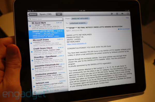
This is a separate song for us guys from Engadget. A lot of our time is spent on emails, and working with them on the iPhone was not always a pleasure. Has it gotten better? Not really. As followers of Gmail, we are used to the usual email schemes provided by Google. It seems to us that this is the most convenient and smart way to work with mail and correspondence. Some such schemes have been adopted in the OSX mail client, which makes it possible to group thematic letters and constantly keep correspondence under control. But here it is not so. Precisely because “iPad is not a computer”, we could not find a solution to the problem of exporting a simple txt file to an email, which greatly stalled our work on the review (it is entirely written on the tablet). Another unpleasant thing is to insert an attachment as a file, you need to export it to Mail from the program in which it was created - what the hell is the point of such difficulties? Although the program interface is good and convenient, such problems are encountered constantly. Mail is fast, beautiful and convenient. He's just not what he should be.
iTunes / iBookstore / App Store

All these machines for spending money on the device are similar to the desktop version of iTunes, which is nice. The search-familiarization-purchase process is extremely fast due to the large amount of information placed on one screen. iBookstore is a true friend of the reader, although the selection of books did not seem to us as rich as expected (we were especially keen on the lack of Phillip K. Dick and George R. R. Martin). Downloading is linear and simple, there are many free previews and even free books. It is logical that publishers, which have not yet entered into cooperation with the service, should take a closer look, because its success is rapidly gaining momentum. Of course, there is still something to improve, but now iBookstore is also convenient and good, like other services.
Video / iPod / YouTube

The entertaining media part will not amaze with its novelty of revolutionism, but it is still good. The iPod section looks much better than its younger brother, although the lack of support for the new iTunes LP format surprised us. The video player copes with playing HD-video (720p with restrictions) with Spartan confidence. Sometimes I wanted to stop playback and just admire how cool a high-fidelity picture looks on a luxurious IPS display.
YouTube looks matured, adopting the already familiar “split-screen”. And of course, support for HD movies is also there and works as it should.
iPhone apps on iPad

Yes - the tablet turns almost every one of the 150,000 programs already written for the iPhone and iPod Touch (not 100%, but a large majority). And it twists in two modes: life-size and the center of the screen, or full screen, cloning the missing pixels. Cool, but not without a fly in the ointment. First things first, it’s worth remembering that this is just an iPhone simulator, with all that it implies. This means that in typing you will have to use an iPhone keyboard, which even in full screen mode does not look too good. It is convenient if you need to use some special application, but you still don’t want to spend a lot of time behind it.
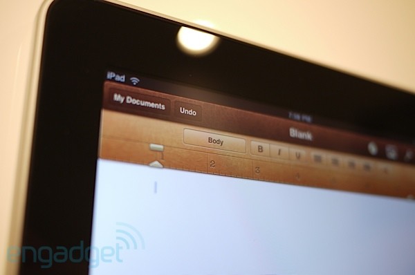
IWork Pack

If you doubt that the iPad can be convenient for creating and working with complex office documents, these three programs will dispel your doubts. They are simple, surprisingly comfortable and functional. Although the existing document storage scheme cannot be called very convenient, most likely Apple will come up with something like a shared repository in the future for this purpose. But in general, the iWork package proves that it is not only possible to perform office work on the tablet, but at the same time it is pleasant and comfortable.
Our colleague and friend, Michael Gartenberg, wrote a deeper review and analysis of this package , if interested.
Third Party Applications
The store is already available many programs written specifically for the iPad. We just highlighted a few that we liked and, in our opinion, are an example of how the tablet should perform other application tasks. If you want more, a more complete and detailed list is here .
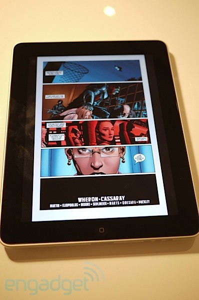
- Marvel: Just a cool application that shows the potential of the device so that already salivating. Great startup, despite the new content format used.
- ABC video player: Although this is a workaround for Flash support, the program copes with its task with a bang. I wish Hulu did the same.
- Netflix: Netflix for iPad. Apparently, it will also be on younger platforms
- Yahoo! Entertaiment: But this is a real surprise. We did not expect the first application from Yahoo! for a tablet it will be nice or convenient ... And it and such and such immediately. All basic functions work fine, but I would like some in-depths in future updates. Yes, and another client for US Weekly.
- Photogene, SketchBook Pro, and Brushes: Three programs showing that a tablet can not only consume, but also produce content. We used them with pleasure, we believe that they show how great the potential of the platform is.
- TweetDeck: Just an example of a very good twitter client. Almost like a desktop. If only you could run it in the background ...
Battery
We downloaded and tested many new applications, played 3D toys, watched HD-video, all this during the background download of email. In general, the device was raped in full. This is very difficult to believe, but the iPad not only withstood as much as promised, even more - as much as 10 hours 43 minutes. No, we did not watch HD movies all the time, did not spend all 10 hours with music playing in the background, while the video from Netflix was downloading, so we can not promise a similar result in any situation. But still - it's just super.
We are going to conduct a few more tests when the rest of the editorial staff will receive a tablet to return and finally say what the device can and cannot.
To summarize

Now our opinion about the iPad is finally formed. It is clear that the tablet has qualities that we liked, as well as those that we disliked. In sum, we can provide two conclusions about the device: the first in terms of how suitable it is for the role of the “evolutionary” of personal computers, and the second whether it is worth the price.
The first conclusion: the iPad is a real revolution. Is he really a representative of a new stage in the development of personal computing? Yes, like that. Despite the fact that you are now thinking about it, or what restrictions Apple has put on some functions of the gadget, it makes a really significant contribution to the modern market. The iPad is the most powerful, elegant and most unusual computer we have ever used. Remember how old games on a game console seem to be compared to games on it, but released after years of development? Now imagine what the iPad could become in a year or two. The contribution of software developers is especially important here. The gadget, although not magical, but nevertheless, he made a small revolution - we must pay tribute to Apple. Finally,
The second conclusion: is it worth buying a revolution today? First, you need to say, although they have already said that the iPad will not be a replacement for a laptop. Not yet. This means that if you need to work with something like Exel, Word or any of countless other desktop programs, you should not expect such a need from the tablet. But most do not use their cars for anything other than music, movies, toys, networking or socializing. If you are, then 499 bucks should not be a high price for such a treasure for you. Because it is these things that the device performs better than any laptop or PC.
So, the verdict? The person who bought the iPad can be attributed to one of two categories. The first is people who are inspired by the potential of this thing, or chasing luxury (and the thing is really luxurious). Others are those who do not need to perform complex tasks, who prefer a simple, fast and beautiful way to handle data. Do you know anyone like these guys?