About RSS Habr and usability ...
It just so happened that I was invited here because I once scolded RSS Habr for the discrepancy between the publication date of the article and the date the article got into the RSS feed, which caused a slight mess and confusion. Developers can eliminate this problem of usability of Habr. Today I want to describe another problem of the usability of the Habr RSS feed, which, oddly enough, should be eliminated, we are the creators of articles and notes. It's about pictures ...
Reading Habrahabr via RSS is convenient. Firstly, we don’t have to remember where we stayed last time. Secondly, you do not need to load a full-fledged Habr in order to understand that from the last time nothing interesting to you personally has appeared. To bring a brief description of the new information that appeared on Habré, and a link to its full version - this is the task of the Habr’s RSS feed. However, RSS Habra does not perform this task as well as it could. Why?
RSS Habrahabr is designed so that as a brief description of the new information is taken everything that the author placed before the habracat (and if the author did not use the habracat, then the entire note is used as a short description). This, as one character used to say at one time - once ...
On different Internet sites, successful and not-so-good bloggers and journalists recommend providing their posts (articles, notes) with pictures - without a picture, they say, it looks somewhat fresh and “doesn't catch”. This, as the same character used to say - two ...
Putting together the first and second, we get a rather unpleasant effect - RSS Habrahabr often does not allow to understand the meaning of new articles, which completely loses all its charm. And the reason for this is precisely the pictures that are designed to revitalize Habr’s materials. Let me give you a few examples ...
I personally prefer offline applications for reading news, mail and the like. In particular, I used to read RSS through Shrook. And this is how one of the news came to my Shrook (all pictures are clickable):
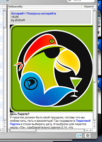
The parrot, of course, is cool, no words. Cute and funny. But this parrot, alas, greatly prevented me from understanding what the article is about - note that the parrot took up almost the entire space reserved for Shrook for the news, making it impossible for me to read the very “brief description of new information”. And here is the same feathered robber in another RSS reader:
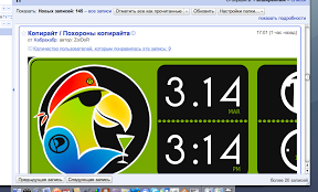
This is a Google Reader, you guessed it. Please note that in comparison with Shrook it turned out that the parrot is not just like that! The parrot, it turns out, has a certain display on which mysterious numbers shine. However, even here the author does not allow me to immediately understand what’s the point of the parrot with numbers - I first need to scroll down the news to get to the horizontal scroller, and use it to see the picture. Well, or open Habrahabr to read the news itself. So it turned out that in this case, the killer parrot pecked all RSS to smithereens and shreds, completely gobbling up all its functionality and washing down with its martini.
And here is another example from the same Google Reader:
The first thing that occurred to me when I saw this news was the gods, is Office'97 really alive somewhere else ?! But the news is not about him - I did not guess. The news, it turns out, is about fighting the bloated interface. True, it was precisely this essential information from the exorbitantly hyped RSS that blew far beyond the borders of the screen. It’s awkward somehow, the right word ...
Large pictures falling into RSS have generally become a kind of scourge of the Internet lately. Here, for example, is another option - less criminal, but still:

Here, the picture does not interfere with reading the text of the news, but somehow you can’t enjoy and be impressed with the result - the bug did not fit on the screen. It seems to be insignificant, but ... They wrote already, and more than once, that the browser should not have horizontal scrolling - Artemy Tatyanovich expressed himself very sharply in this regard, but no less justly. The beetle would have to scroll horizontally. And this despite the fact that on my beech - not such a small monitor. But I don’t have mice with two scrolling wheels - I’m not used to rodents, I prefer to poke my fingers.
The above examples clearly demonstrate how usability can depend not only on the developers of a resource, but also on its direct authors - on content generators. The author, wanting to revitalize his post or illustrate it, inserts a picture into it, and then this picture spoils the life of those who read the site via RSS or from a portable device. Just because the author did not think about these people, although there are not so few of them in the world. Meanwhile, creating clickable small thumbnails of large pictures is a trivial matter. This can be done not only by Picasa, which I use, but also by a whole bunch of other image hosting sites. For some reason, however, no one uses this opportunity.
Small pictures, however, also create additional and not quite understandable problems. A simple example:

It seems that all the news fit, but for some reason reading it is not as easy as we would like. Why? Because the eye, running through the lines of text, constantly stumbles on a bright picture. And this happens because in this case a rule has been violated, which almost all HTML textbooks have been repeating since ancient times - by inserting a picture and wrapping it with text, take care of the indent between the picture and text in order to make the text readable.
Generally speaking, wrapping text around a picture is a pretty cool thing, funny and decorative. But this does not mean at all that it should be applied to any image. For example, in this case, this flow looks somewhat inappropriate:
At the same time, the text of the news itself is visible in a volume sufficient for understanding (there is no need to scroll), and there seems to be an indent, but here the lines at the beginning of one word kill on the spot, as well as the monstrous size of the hole between the text to the left of the picture and continuation under the picture into which all attention falls. Compare, for example, with this: Or with this:


From the foregoing, a simple, inherently, and obvious rule follows - when publishing an article on Habré (and not only on Habré), remember that someone will start acquaintance with your article with an RSS aggregator, and someone with portable device. Open your favorite RSS aggregator and imagine that you see the RSS version of your article in it. Are you sure that the image inserted at the beginning of the text with dimensions of 1600 by 1200 will fit into the window allotted to the news? Are you sure that after it gets there (or does not fit) there will be room for text in the window? Are you sure that upon seeing a small piece of an image unknown to him, the reader will immediately understand and be interested in your article?
On the Internet, as elsewhere, they meet on clothes. However, the Internet is the very environment where your article tries on several clothes. Shrook leaves the news a piece of the screen measuring 30% horizontally by 85% vertically. RSS Owl leaves the same piece of screen 75% horizontal and 90% vertical for the same news. But Thunderbird is inclined in some submissions to leave news only 70% horizontally and 45% vertically of the screen size. Are you sure that the “short” content of your article with three pictures of 1600 by 1200 will look equally good in all three clothes? And do not forget that everyone’s screens are different too - whatever fits on a widescreen one will not fit into a regular one. After thinking about this, ask yourself if it would be better to remove the full-size image under the habracat,
Reading Habrahabr via RSS is convenient. Firstly, we don’t have to remember where we stayed last time. Secondly, you do not need to load a full-fledged Habr in order to understand that from the last time nothing interesting to you personally has appeared. To bring a brief description of the new information that appeared on Habré, and a link to its full version - this is the task of the Habr’s RSS feed. However, RSS Habra does not perform this task as well as it could. Why?
RSS Habrahabr is designed so that as a brief description of the new information is taken everything that the author placed before the habracat (and if the author did not use the habracat, then the entire note is used as a short description). This, as one character used to say at one time - once ...
On different Internet sites, successful and not-so-good bloggers and journalists recommend providing their posts (articles, notes) with pictures - without a picture, they say, it looks somewhat fresh and “doesn't catch”. This, as the same character used to say - two ...
Putting together the first and second, we get a rather unpleasant effect - RSS Habrahabr often does not allow to understand the meaning of new articles, which completely loses all its charm. And the reason for this is precisely the pictures that are designed to revitalize Habr’s materials. Let me give you a few examples ...
I personally prefer offline applications for reading news, mail and the like. In particular, I used to read RSS through Shrook. And this is how one of the news came to my Shrook (all pictures are clickable):
The parrot, of course, is cool, no words. Cute and funny. But this parrot, alas, greatly prevented me from understanding what the article is about - note that the parrot took up almost the entire space reserved for Shrook for the news, making it impossible for me to read the very “brief description of new information”. And here is the same feathered robber in another RSS reader:
This is a Google Reader, you guessed it. Please note that in comparison with Shrook it turned out that the parrot is not just like that! The parrot, it turns out, has a certain display on which mysterious numbers shine. However, even here the author does not allow me to immediately understand what’s the point of the parrot with numbers - I first need to scroll down the news to get to the horizontal scroller, and use it to see the picture. Well, or open Habrahabr to read the news itself. So it turned out that in this case, the killer parrot pecked all RSS to smithereens and shreds, completely gobbling up all its functionality and washing down with its martini.
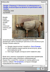
And here is another example from the same Google Reader:
The first thing that occurred to me when I saw this news was the gods, is Office'97 really alive somewhere else ?! But the news is not about him - I did not guess. The news, it turns out, is about fighting the bloated interface. True, it was precisely this essential information from the exorbitantly hyped RSS that blew far beyond the borders of the screen. It’s awkward somehow, the right word ...
Large pictures falling into RSS have generally become a kind of scourge of the Internet lately. Here, for example, is another option - less criminal, but still:
Here, the picture does not interfere with reading the text of the news, but somehow you can’t enjoy and be impressed with the result - the bug did not fit on the screen. It seems to be insignificant, but ... They wrote already, and more than once, that the browser should not have horizontal scrolling - Artemy Tatyanovich expressed himself very sharply in this regard, but no less justly. The beetle would have to scroll horizontally. And this despite the fact that on my beech - not such a small monitor. But I don’t have mice with two scrolling wheels - I’m not used to rodents, I prefer to poke my fingers.
The above examples clearly demonstrate how usability can depend not only on the developers of a resource, but also on its direct authors - on content generators. The author, wanting to revitalize his post or illustrate it, inserts a picture into it, and then this picture spoils the life of those who read the site via RSS or from a portable device. Just because the author did not think about these people, although there are not so few of them in the world. Meanwhile, creating clickable small thumbnails of large pictures is a trivial matter. This can be done not only by Picasa, which I use, but also by a whole bunch of other image hosting sites. For some reason, however, no one uses this opportunity.
Small pictures, however, also create additional and not quite understandable problems. A simple example:
It seems that all the news fit, but for some reason reading it is not as easy as we would like. Why? Because the eye, running through the lines of text, constantly stumbles on a bright picture. And this happens because in this case a rule has been violated, which almost all HTML textbooks have been repeating since ancient times - by inserting a picture and wrapping it with text, take care of the indent between the picture and text in order to make the text readable.
Generally speaking, wrapping text around a picture is a pretty cool thing, funny and decorative. But this does not mean at all that it should be applied to any image. For example, in this case, this flow looks somewhat inappropriate:
At the same time, the text of the news itself is visible in a volume sufficient for understanding (there is no need to scroll), and there seems to be an indent, but here the lines at the beginning of one word kill on the spot, as well as the monstrous size of the hole between the text to the left of the picture and continuation under the picture into which all attention falls. Compare, for example, with this: Or with this:
From the foregoing, a simple, inherently, and obvious rule follows - when publishing an article on Habré (and not only on Habré), remember that someone will start acquaintance with your article with an RSS aggregator, and someone with portable device. Open your favorite RSS aggregator and imagine that you see the RSS version of your article in it. Are you sure that the image inserted at the beginning of the text with dimensions of 1600 by 1200 will fit into the window allotted to the news? Are you sure that after it gets there (or does not fit) there will be room for text in the window? Are you sure that upon seeing a small piece of an image unknown to him, the reader will immediately understand and be interested in your article?
On the Internet, as elsewhere, they meet on clothes. However, the Internet is the very environment where your article tries on several clothes. Shrook leaves the news a piece of the screen measuring 30% horizontally by 85% vertically. RSS Owl leaves the same piece of screen 75% horizontal and 90% vertical for the same news. But Thunderbird is inclined in some submissions to leave news only 70% horizontally and 45% vertically of the screen size. Are you sure that the “short” content of your article with three pictures of 1600 by 1200 will look equally good in all three clothes? And do not forget that everyone’s screens are different too - whatever fits on a widescreen one will not fit into a regular one. After thinking about this, ask yourself if it would be better to remove the full-size image under the habracat,