 November 20, 2009 at 17:30
Layout of repeating blocks
Quite often, when layouting a site, it becomes necessary to place blocks of the same width, but of different heights, in a container with a variable width (read rubber). Plus, a filter can be applied to this list, which JS will hide or show the elements of the list, while it should not destroy the "lines", layout, or create holes, so the decisions on the tables do not roll right away. The simplest example is a product catalog:
We decided, together with morfi, to make a more or less universal solution that would allow this kind of content to be published without unnecessary problems. The important point is that the height of the blocks may depend, for example, on the height of the title, or on the description if it were in the layout.

There are two pitfalls. The first is the gaps between the blocks. If you just put (I simplified the syntax), then the last element in the "line" will always be indented, so it will never be clearly on the border of the container. Solution c lying on the surface:
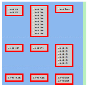
Everything would be fine, but in such a situation, if the height of the blocks can differ greatly, such a jamb could arise: Pay attention to the blocks three, four and five. The green block is a wrapper, the blue is a container. Logically, the situation is understandable - the unit must draw the line (or “line”) in which it is located. This behavior is typical of . In order to put this solution into practice you need:


No bugs have been noticed yet, the solution is cross-browser.The inline method calmly withstands P. S. The solution is not new, but it will be useful in any case. P. P. S. In the screenshot - the future online store-portal for mothers.

There are two pitfalls. The first is the gaps between the blocks. If you just put (I simplified the syntax), then the last element in the "line" will always be indented, so it will never be clearly on the border of the container. Solution c lying on the surface:
float:left; margin-right |bottom:50pxfloat- We set the elements
float:left;margin-top |left:50px - We wrap the elements in another container and set it
margin-top |left:-50px - For friendship with IE, the container and wrapper need to be assigned
zoom:1and so that they do not collapse fromfloat elements -overflow:hidden - Purely for IE, you need to specify
display:inlinefor blocks, otherwise we will get doublemargin
Everything would be fine, but in such a situation, if the height of the blocks can differ greatly, such a jamb could arise: Pay attention to the blocks three, four and five. The green block is a wrapper, the blue is a container. Logically, the situation is understandable - the unit must draw the line (or “line”) in which it is located. This behavior is typical of . In order to put this solution into practice you need:

display:inline-block - Again set
marginas in the example above - We distribute the universal cross-browser design to the blocks
display:-moz-inline-box ; display:inline-block ; *zoom:1; *display:inline - We notice that the horizontal distances turned out to be slightly more than necessary
50px- this isdue to the gaps between theinline-block - To deal with spaces, measure its width - it turns out
4px, and this is 25% of1emwhich,by default, is equal16px. Thus, we put the containerword-spacing :-0.25emword-spacing :normal - For IE, you also need to register the blocks
text-align :top


No bugs have been noticed yet, the solution is cross-browser.
text-align :center
text-align :leftstyle.css