 October 27, 2009 at 11:55
 Prototyping with the Grid 960 CSS Framework
- Transfer
 Grid 960 is a CSS framework that allows developers to quickly design prototypes of design. They are a great tool for creating layouts. Why? Because they do all the hard work for you, allowing you to get quick results.
 That sounds great, but how is it done? There are a large number of articles on the Internet advocating the pros and cons of using CSS frameworks, but there is nothing to help inexperienced readers. Therefore, in today's article we will look at the prototype process.
Imagine that you got a design, and you need to make it up for the client. In this article, you will learn the basics of Grid, designing grid designs, and prototype coding. We will use a fairly simple design that uses most of the features of the Grid 960, which will help you get the basic knowledge base for further work. After you familiarize yourself with the design presented below, let's begin to study the principles of operation of the Grid 960.

Grid Creation
Grid 960 operates on the basis of class inheritance. This framework provides two grids: 12 and 16 columns. The main container always has a width of 960px. Using the number 960 allows you to use most of the various combinations of columns, without complicating the work with them. For the layout of this design, we will use a grid of 12 columns, but we will not use all 12 columns. Each grid cell is assigned a margin property: 0 10px. This creates a gap of 20 pixels. When creating a row, the sum of the width of all elements is added to 960. Take a look at the demo page of Grid 960. You will see a grid with all kinds of combinations. Each grid cell has a class that determines how wide it is. The following is a breakdown of the column width for a 12-column grid:
- 60px
- 140px
- 220px
- 300px
- 380px
- 460px
- 540px
- 620px
- 700px
- 780px
- 860px
- 940px
Each width corresponds to the name of the class, written in the form: grid_X, where X is the serial number from the list above. If you need a 940px wide block, use the grid_12 class. How does the Grid 960 know what width should be used? Each grid_X is a container_Y .grid_X selector, where the Y value is 12 or 16 columns.
Let's take a look at the code itself. Here's how to create a two-row grid in a 12-column container. Here, the first row is 940 pixels wide, and the second row contains two identical columns.
  940px


  460px

  460px


* This source code was highlighted with Source Code Highlighter.
When you create a row in the grid, make sure that all of the gird_X child numbers add up to the number of columns you are using. This ensures the correct width. Two divas with the grid_6 class give a total of 12. You are not limited to these values only, and you can also use 6, 4 and 2. That's all, the grid is ready for content. Now that you’ve learned how the Grid 960 works, let's see how the layout is created.
Layout
Visualizing a design grid is pretty easy. There will be one line for the heading picture, a line for navigation, a line with two columns for the heading and poster article, a separator, 4 columns, then a basement consisting of three columns.

After rendering, you should understand how to create a layout grid. Using the width values in the class name from the list above, let's put together the code. Remember to add a cleansing div at the end of each line. Remember to include the CSS files included with the Grid 960.
* This source code was highlighted with Source Code Highlighter.The skeleton is ready. It's time to impose a design. Green panels are just blocks with background color and height. The navigation bar has no height set. Instead, it will be controlled by the size of internal links. Remember to add a caption picture.
div.spacer {

  background-color: #8FC73E;

  height: 1em;

}


div#navbar {

  background-color: #8FC73E;

  padding: 10px 0;

}


* This source code was highlighted with Source Code Highlighter.
Using classes to adjust grid_12 blocks and setting ID
* This source code was highlighted with Source Code Highlighter.
The center speakers do not require any effects. Add some text to fill the design. Before proceeding to the top, take a look at the basement. In the screenshot, the basement is of a uniform color. You will not be able to implement this with existing code. A wrapping div around these three columns will solve the problem. You think it's okay, you just need to insert a div. But this div will break the grid, because the Grid 960 is based on parent and child elements when using styles (remember the container_12 .grid_4 selector). In this case, the nested grid that the Grid 960 allows you to use will help solve the problem. Create a nested grid by adding the grid_12 block, then place the grid_4 blocks inside. When using nested meshes, child elements must have special classes. The first child must have an alpha class, and the last child must have an omega class. Edit the layout to make the necessary changes for the basement.
* This source code was highlighted with Source Code Highlighter.
div#footer {

  background-color: #e5e5e6;

}


* This source code was highlighted with Source Code Highlighter.
Perfectly! Now the basement has a uniform color fill, and you can specify the dimensions of the columns, if necessary. Add some text for the basement columns and move on to the navigation bar. Navigation is made in the form of a simple bulleted list. Add a few links and related styles.
- Articles
- Topics
- About
- Editors
- Contact
* This source code was highlighted with Source Code Highlighter.div#navbar ul {
list-style: none;
display: block;
margin: 0 10px;
}
div#navbar ul li {
float: left;
margin: 0 1.5em;
font: bold 1em Arial;
}
* This source code was highlighted with Source Code Highlighter.Wonderful. The page will be ready soon. All we need to do is create block effects in the top section. It is not as simple as it seems. Before we get started, you need to understand something about the Grid 960 and CSS frameworks in general.
CSS frameworks won't solve all your problems
Attentive readers have probably already noticed something. Our page has absolutely no flexibility. All elements are given certain sizes, and changing these sizes can cause problems or even destroy the whole design. In addition, due to the restriction of the Grid 960, designers cannot use some of their ideas.
For example, if the same design were 1000 pixels wide. Grid 960 creates a grid of 960 pixels wide, so larger layouts can no longer be used. What if you want to expand the layout to 1000 pixels, instead of 960? It’s safe to say that you cannot do this without implementing several complex code changes.
The framework restricts designers to a set of strict rules. Let's say a client wants a wider design, or already 960 pixels. It will be easier for the designer to create code from scratch to implement new tasks than to use the previously created one.
There is another, not yet identified, problem - columns of the same height. Since the center speakers have the same background color, they look the same in height. In the basement, containing the block, sets the same background color, behind the three columns. Grid 960 will not help you in creating the same height speakers. Of course, there are ways to implement this on your own, but since we just create a prototype of the design, we will not waste time solving small problems in the further functioning of the site. At this stage, you need to understand the idea itself.
There is another aspect of the Grid 960 that should be taken into account before we move on to the top section. Grid 960 is based on the sizes of elements and indents, when creating a row of the correct size. If you use a frame or padding, the layout will break. Therefore, if you need to use them, you must provide this in the size of the block, to reflect the changes. This is very tiring. Specifying the sizes of elements in two places will always lead to confusion, moreover, the layout will be much more difficult to maintain. That's all. Let's finish the top section.
Upper section
Fortunately, you can manipulate columns of the same height in the upper section. Since the image on the right is assigned width and height, we know the size of the other column. Create a block effect by adding a new div with a frame inside existing divs. Do not forget to specify the sizes. Do not assign padding to divas, because this will change the width of the blocks and break the grid. Instead, specify margin to child elements. This will not change the width of the parent blocks. Apply margin to inline elements. This will create the desired effect and the text will recede from the edge.
* This source code was highlighted with Source Code Highlighter.Use classes instead of IDs because the topSection class applies to both blocks. This also simplifies the change in height. Select a height value and create a class.
div.topSection div {

  border: solid 10px #e5e5e6;

  height: 280px;

}


div.topSection div p {

  margin: 10px;

}


* This source code was highlighted with Source Code Highlighter.
Excellent! Let's take a look at our work.

Getting started filling content. Fill the left block with a little text. Just do not get carried away, if there is too much text, it will crawl over the edge of the block. This creates a potential layout problem. How do you know how much text will be too large? In production design, to prevent this problem, the designer would have to create a function that displays a certain number of words.
Now, let's insert a picture. Just before inserting it, specify the dimensions. If you are a normal mathematician and understand the box model, you most likely already know how large it should be. If you don’t know, start Firebug and take a look at the DOM. Turn on the Inspect button and click on the block in which the picture will be placed. Click the Layout tab. Firebug displays the box model of the block you selected.

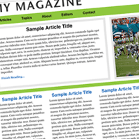
The screenshot shows the size of the picture 360 x 280. Find the picture and create a style. I decided to let the whole picture fill the entire block. If you want to create 10 pixel indents, be sure to reduce the size by 20 pixels on each side.
img#poster {

  width: 360px;

  height: 280px;

}


* This source code was highlighted with Source Code Highlighter.
You should have the following. Feel free to change the text or image.
Remember the limitations
Now that the prototype is ready, let's summarize the work done. You learned how to quickly create prototypes of design. Grid 960 easily creates a grid for us. So what's next? Naturally, you need to show the client, and listen to what he says. There are a few caveats though. Was the design tested in IE6 and IE7? Not. Is there any need to do this? Not. This is just a prototype. Of course, all browser features will be considered before production.
But what if customers want to create a more integrated design? In this case, you will quickly discover the limitations of the framework. What if the design needs to be rubber or elastic? The framework will not be able to help you with this, so you will have to do everything from scratch. Remember that CSS frameworks will not solve all your problems, but they may help with some. Grid 960 as well as other frameworks, great for creating prototypes.
Of course, you can use the concept of Grid 960 in the further development of the code, but frameworks are not recommended to be fully used in your projects. Remember that CSS frameworks, like any other tool, have their fans.
Download the archive with an example .