Font anti-aliasing, anti-aliasing, and sub-pixel rendering
- Transfer
From a translator: I recently had a little discussion with a friend about how to render Safari sites. Like, the text there looks much “tastier” :) In an attempt to find the truth (although all this is certainly a matter of taste), this article was found by Joel Spolsky, which partly clarified why everything is so. I’m not sure what I’m writing on that blog, however, an article (UPD. Which, as it turned out, has already been translated. On the advice of the habrayuzers, I’m not hiding it in draft copies, because many have not seen it, and the design and translation, it seems to me, is better here ):
Opinions of Apple and Microsoft have always diverged on the issue of displaying fonts on a computer screen. Today, both companies use subpixel rendering.in order to achieve acceptable display of anti-aliased fonts at low screen resolutions. What they still have disagreements in is philosophy.
(Note: This picture will be displayed correctly if you have an LCD monitor with a sequence of RGB pixels.
Otherwise, it will look different and incorrect.)
(Note of the translator: something happened to my graphic editors, therefore I will provide comments on the picture with text, in the order from top to bottom)
The advantage of the Microsoft method is that it is better for those who read from the screen. Microsoft pragmatically decided that the typeface is not a shrine, but the sharpness of the text for easy reading is more important than the design idea for its brightness. In fact, fonts released by Microsoft (such as Georgia and Verdana) are good on display, but not so good at printing.
On the contrary, Apple, as usual, went the way of style, putting art above practicality, because Steve Jobs has a taste; at the same time, Microsoft has chosen the path of convenience, a measurable pragmatic way of creating things that absolutely lack panache. In other words, if Apple is Target, then Microsoft is Wal-Mart (translator's note: retail chains, a friend with an economic education suggested that the “Alphabet of Taste” - “Crossroads” would be a suitable adapted comparison).
Now, what about human preferences. Yesterday postJeff Atwood about the comparison of the two font technologies caused the expected heated debate: Apple users prefer the Apple system, Windows users prefer the Microsoft system. This is not just ordinary fanboism; this is a reflection of the fact that when you ask unprepared people to choose a specific style or design, they will prefer what they already know. And so in everything: until they know exactly what they need, they will choose what they have already seen.
Obviously, this is why Apple engineers probably feel that they are doing a great service to the Windows community by providing “superior” font rendering technology to “Gentiles”; this also explains why Windows users generally think that fonts in Safari are blurry and look strange, they don’t know why, but they don’t like it. They think, “Wow! This is something else. I do not like it. Hmm, what's the matter? We need to take a closer look ... Ahh, the font is kind of fuzzy. That’s probably why. ”
Opinions of Apple and Microsoft have always diverged on the issue of displaying fonts on a computer screen. Today, both companies use subpixel rendering.in order to achieve acceptable display of anti-aliased fonts at low screen resolutions. What they still have disagreements in is philosophy.
- Apple believes that the algorithm should preserve the design of the style as much as possible, even if for the sake of this you have to sacrifice a little blur.
- Microsoft believes that the shape of each letter must be firmly inscribed in the borders of the pixel to avoid blurring and increase readability, even if for the sake of this you have to sacrifice the distortion of the font.
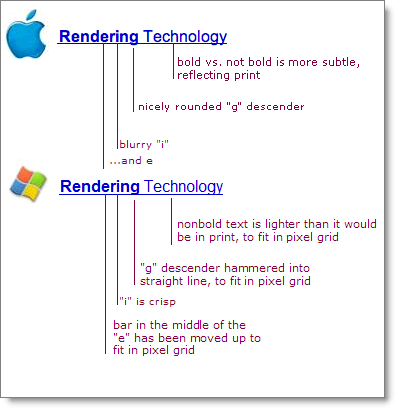
(Note: This picture will be displayed correctly if you have an LCD monitor with a sequence of RGB pixels.
Note translator:
1. Quote from Wikipedia: A single pixel on a color LCD consists of three color elements that (in different displays) follow in the order blue, green, and red (BGR), or red, green, and blue (RGB). For the human eye, these pixel components, sometimes called subpixels, have the same color due to optical blurring and spatial integration of nerve cells. If desired, you can see them with a magnifying glass.
2. There are much fewer monitors with BGR order than with RGB.
Otherwise, it will look different and incorrect.)
(Note of the translator: something happened to my graphic editors, therefore I will provide comments on the picture with text, in the order from top to bottom)
- the difference between bold and non-bold is more invisible, so it will be printed
- well rounded bottom at "g"
- blurry "i" ...
- ... and "e"
- non-greasy text is brighter than it should look on print
- curl at "g" inscribed in a straight line
- "I" is clear
- the strip in the middle of the “e” has moved up
The advantage of the Microsoft method is that it is better for those who read from the screen. Microsoft pragmatically decided that the typeface is not a shrine, but the sharpness of the text for easy reading is more important than the design idea for its brightness. In fact, fonts released by Microsoft (such as Georgia and Verdana) are good on display, but not so good at printing.
On the contrary, Apple, as usual, went the way of style, putting art above practicality, because Steve Jobs has a taste; at the same time, Microsoft has chosen the path of convenience, a measurable pragmatic way of creating things that absolutely lack panache. In other words, if Apple is Target, then Microsoft is Wal-Mart (translator's note: retail chains, a friend with an economic education suggested that the “Alphabet of Taste” - “Crossroads” would be a suitable adapted comparison).
Now, what about human preferences. Yesterday postJeff Atwood about the comparison of the two font technologies caused the expected heated debate: Apple users prefer the Apple system, Windows users prefer the Microsoft system. This is not just ordinary fanboism; this is a reflection of the fact that when you ask unprepared people to choose a specific style or design, they will prefer what they already know. And so in everything: until they know exactly what they need, they will choose what they have already seen.
Obviously, this is why Apple engineers probably feel that they are doing a great service to the Windows community by providing “superior” font rendering technology to “Gentiles”; this also explains why Windows users generally think that fonts in Safari are blurry and look strange, they don’t know why, but they don’t like it. They think, “Wow! This is something else. I do not like it. Hmm, what's the matter? We need to take a closer look ... Ahh, the font is kind of fuzzy. That’s probably why. ”