No items in the basket? Put the highlight there!
Now, with a simple example, I will demonstrate one of our " micro-interface " finds.
If the product is added to the basket, the question with the contents of the block is removed. We write how many goods there are, for what amount, we give a link to place an order.
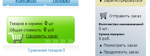
Usually they write that there are no goods in the basket. Particularly “gifted” manage to write something like “in a basket of 0 goods worth 0 rubles”. And give a link to checkout at the same time.

This is how a company that calls itself "Studio No. 4 in Runet" does it.
But this block constantly takes up valuable space on the page. Minimize? Hide? Reduce? It is impossible. He should be here constantly, if we do not want to lose some of the buyers who are baffled by unexpected transformations.
It is desirable that the user notices and fixes the place where then there will be an entrance to the basket. After all, the order is not always placed immediately after adding the goods. Often add goods, then see what else is there, and after that go to the basket.
Can this place be used to greater advantage? Of course! Look at one of our solutions used on mollspb's website .
If there is a product in the basket, the block behaves as it should in such situations:

But if there are no goods in the basket yet, we will advertise something in this block:

Please note: the block still performs its function with dignity, and the advertising text organically combined with it.
Most things can be improved. Even this one of our find.
I borrowed the word “ microinterface ” from microelectronics and propose to use it to designate blocks like this one.
If the product is added to the basket, the question with the contents of the block is removed. We write how many goods there are, for what amount, we give a link to place an order.
But what to put in this block if the basket is empty?
Usually they write that there are no goods in the basket. Particularly “gifted” manage to write something like “in a basket of 0 goods worth 0 rubles”. And give a link to checkout at the same time.

This is how a company that calls itself "Studio No. 4 in Runet" does it.
But this block constantly takes up valuable space on the page. Minimize? Hide? Reduce? It is impossible. He should be here constantly, if we do not want to lose some of the buyers who are baffled by unexpected transformations.
It is desirable that the user notices and fixes the place where then there will be an entrance to the basket. After all, the order is not always placed immediately after adding the goods. Often add goods, then see what else is there, and after that go to the basket.
Our decision
Can this place be used to greater advantage? Of course! Look at one of our solutions used on mollspb's website .
If there is a product in the basket, the block behaves as it should in such situations:

But if there are no goods in the basket yet, we will advertise something in this block:

Please note: the block still performs its function with dignity, and the advertising text organically combined with it.
Most things can be improved. Even this one of our find.
What is a microinterface?
I borrowed the word “ microinterface ” from microelectronics and propose to use it to designate blocks like this one.
