 May 19, 2019 at 10:39
 Creating tables in the Figma design system and implementation in the Storybook (React)
In a previous article on the design of tables in Fig, we found out that the basic element of creating any data grid is a component of a cell, inside which everything you need to stay in one copy and build cell-by-cell tables is hidden. Now let's talk about its structure: what elements are nested, use cases, consider the table specification in terms of color tokens. And finally, I’ll talk about passing specifications to developers and integrating tables into React / Angular frameworks directly from the Figma design system . While hands, for the future is still somewhere nearby.
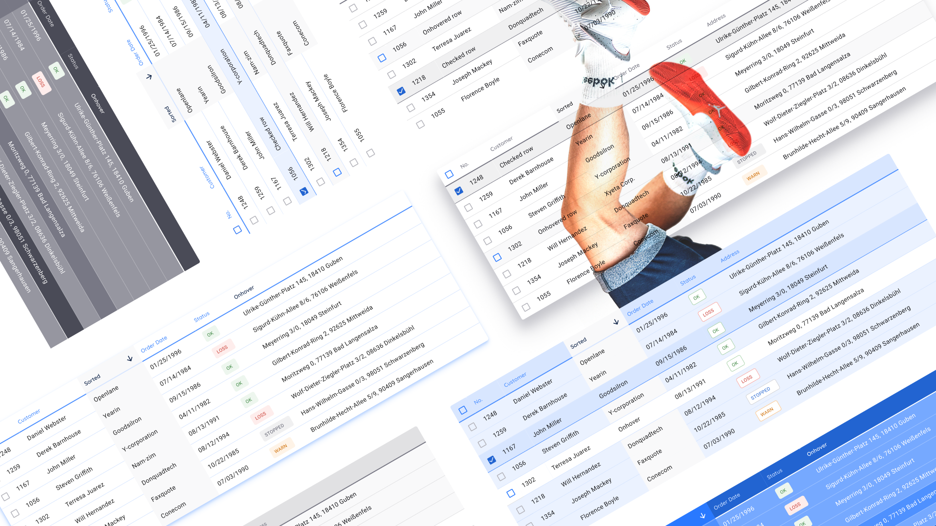
Go! I'll start by demonstrating the useless but fun effects of customizing the entire table through the main master cell:
Select the desired layers in the cell master component and distribute all changes to the table
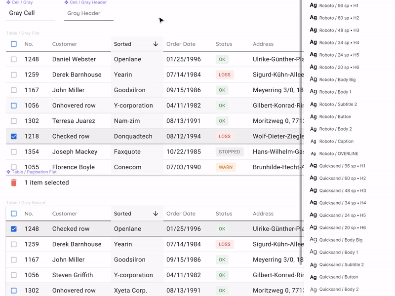
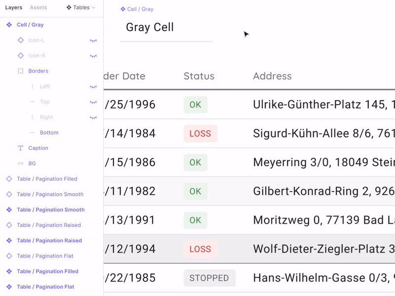
Component Cell Composition
Building tables with the help of components is an algorithm that every project is unlikely to require if it is not a serious design system, which is used by designers and developers within the organization. But since Figma gives components, then they need to be used to the maximum. The composition of the cell is formed from nested layers, some of which are hidden. To create a universal cell for all occasions, you need to know everything about data grids and much more. The composition is determined based on how diverse we want to get cell instances.
The structure of the layers is on the left in the spread.
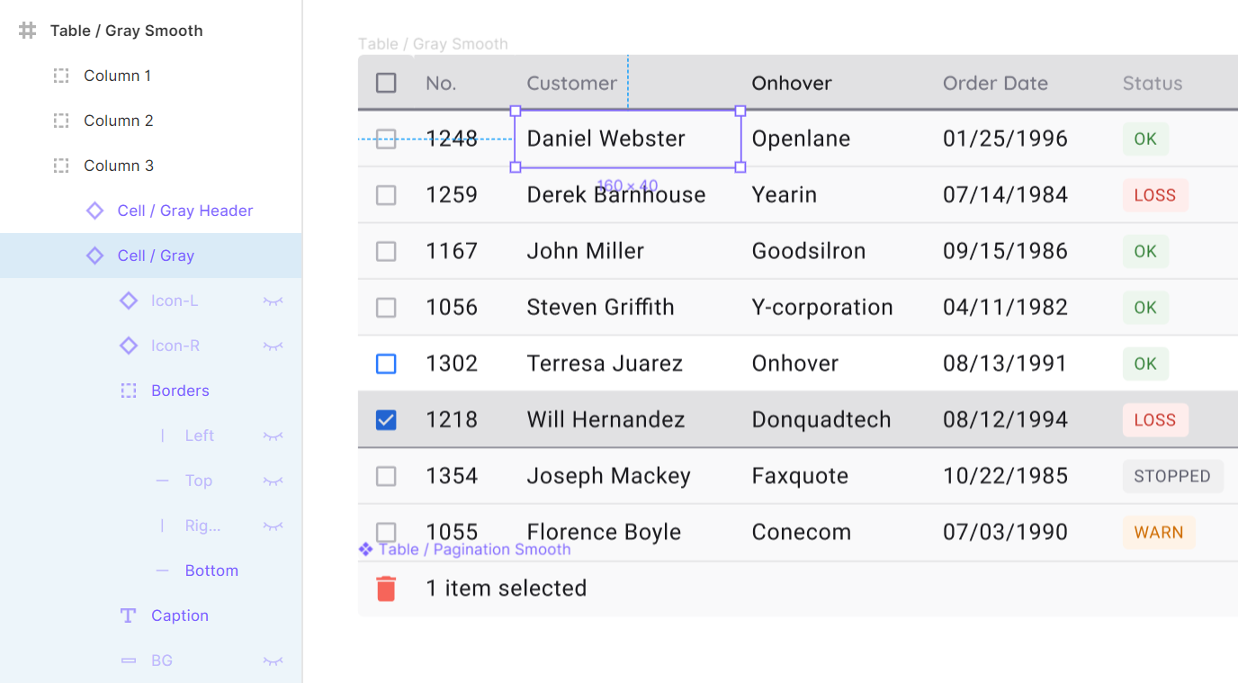
Structure of the component cell:
- Icon-L / R - two hidden icons located on the edges of the cell on the left and right, respectively. By default, they can be made visible to show the sort status. Icon-R can be activated and replaced by an icon, for example, to enhance the action, or display additional functionality
- Borders - four independent lines pressed inside to all sides of the cell
- Caption - directly text element with content
- BG is a background component to receive new states in the future
Let's look at each of the items in more detail.
Icons (Icon-L / R)
To get the cell in the sorting state, it is recommended to activate the Icon-L layer. Thus, you do not need to disconnect the instance, just switch the contents of the icon itself to show the sort order in descending or ascending order. It is believed that any icon library is already integrated in your design system and then the direction of the arrow quickly switches through the Instance menu. You can shift the text from under the icon by a simple trick by pressing the space bar several times and this is not a crime:

Whether to create a new component due to the inability to move the label when the icon is off, or to indent a space - decide for yourself
By the way, if you use Figma , I recommend paying attention to our ready-made design systems . They help freelancers complete more orders per month, programmers are allowed to create beautiful applications on their own, and team leads “sprint” sprints faster using ready-made design systems for team work.
And if you have a serious project, our team is ready to deploy a design system within the organization based on our best practices and tailor it to specific tasks using Figma. Web / desktop, and any mobile. We are also familiar with React / React Native. Write to T: @kamushken
Icon-R activation is useful when it is necessary to show the possibility of an additional action in a cell. For example, the ellipsis for the menu, or the pencil icon if the cell can be edited:
You remember that the instances in the Fig can be replaced by holding Ctrl / Cmd at the time of the drop
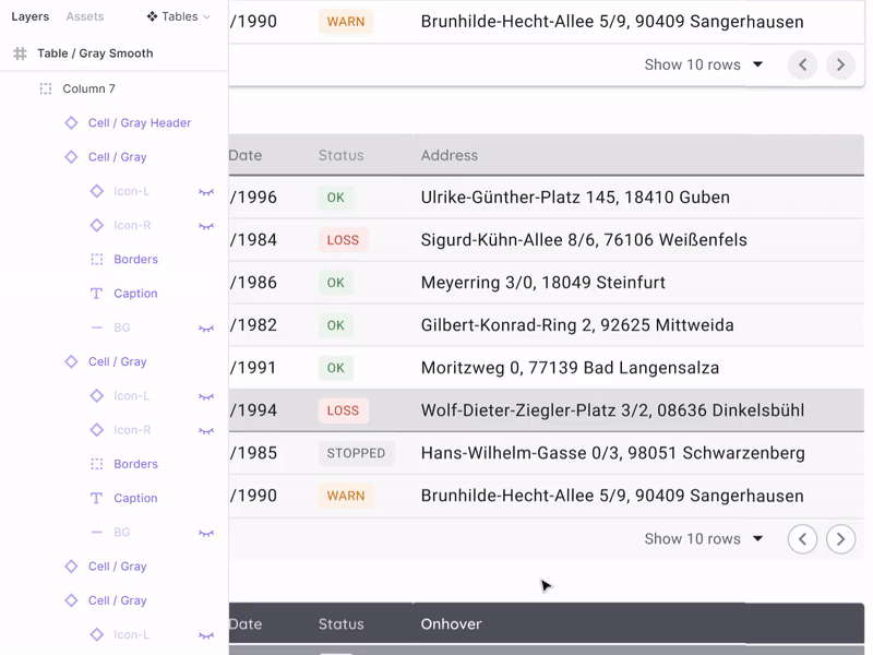
Separators (Borders)
Nesting independent dividers on the four sides of the cell, alas, from hopelessness, a forced life hack. We are all well aware that the design component in its capabilities should strive for the component in the code, which means that the independence of the border should be set at the level of properties, not crutches. Unfortunately, this is still not implemented in Figm, and Axure, for example, has long been able to. Borders are especially needed to control the sharing of content in general throughout the table. Color, thickness, but at least a dotted line. Create
tables as you like:
Borders are organized in the order from left to right clockwise. By changing the color for them in the wizard, we can quickly change the delimiters in all tables
Cell Text (Caption)
With this element, everything is simple: the text element is stretched over almost the entire area of the cell, but with small internal indents, so that the alignment of numbers on the right edge looks proportionally. Putting the Left & Right / Top & Bottom constrains, we get unlimited scaling in height and width with the ability to direct text as you like without loss of visual quality.
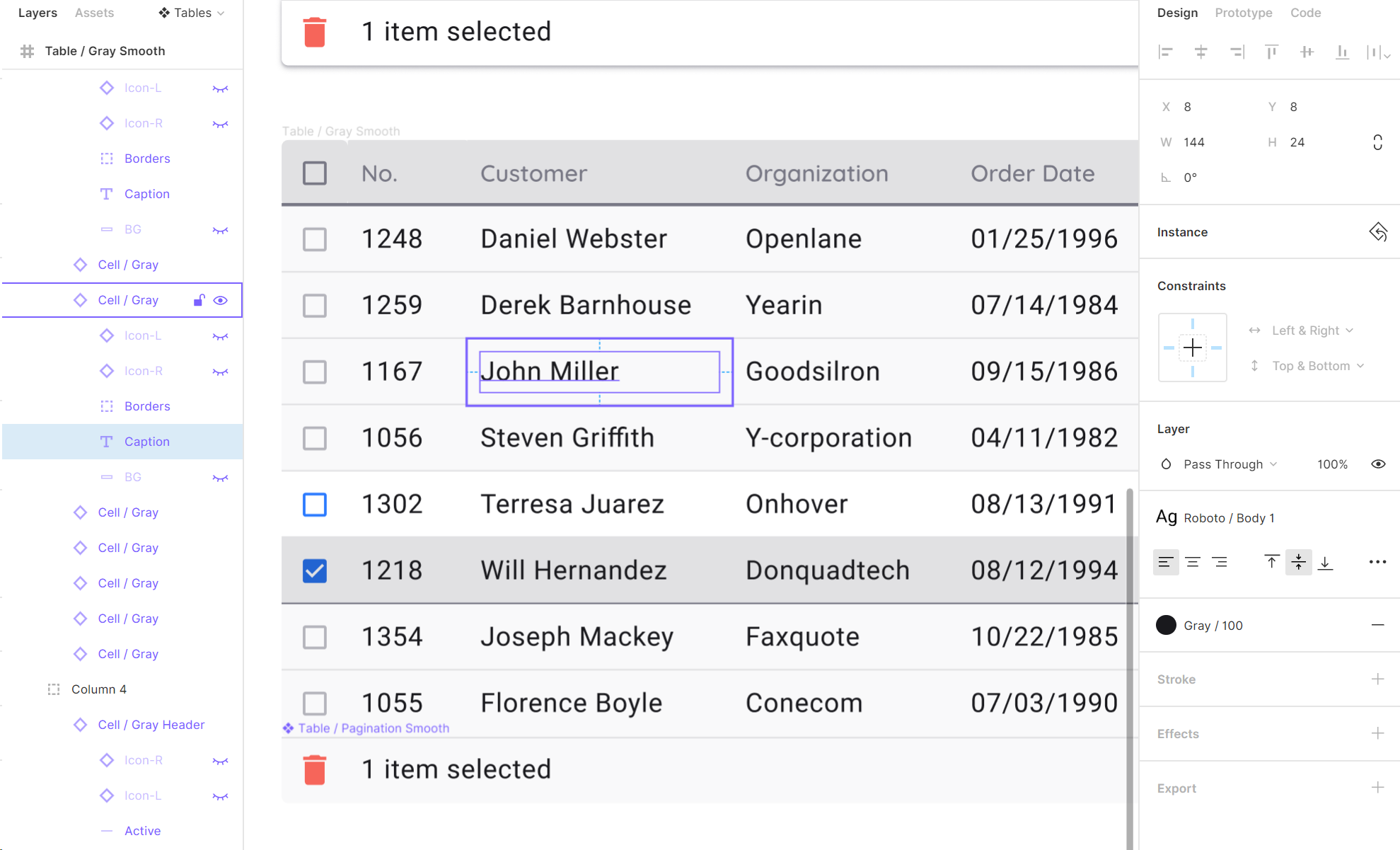
The indentation from the text box to the cell borders is 8dp. For high density tables, you can use 4dp.
Background (BG)
For each cell, I prefer to additionally have a background layer with which you can round the corners. Unfortunately, the copy still cannot indicate rounding corners independently in the Fig. As above in the case of boarders. You can change the state of a cell or a whole series, for example, by coloring in blue. It turns out the Selected style:

If the current task requires frequent switching of row states, it is recommended to move the cell with a new style to a separate component
Tables in the design system. Tokens
Stylization and implementation
This article would not be complete without examples of real tables that were compiled according to the specifications set forth above (now it’s fashionable to say a design token). Now we are preparing an all-in-one framework in Figma / React / Angular for the quick start of web applications of any complexity. In this system, many components will be assembled to solve any problems of prototyping and development; and tables - this is one of the necessary sections, which we reacted with increased attention to. So, data grid tables are available in four variations:
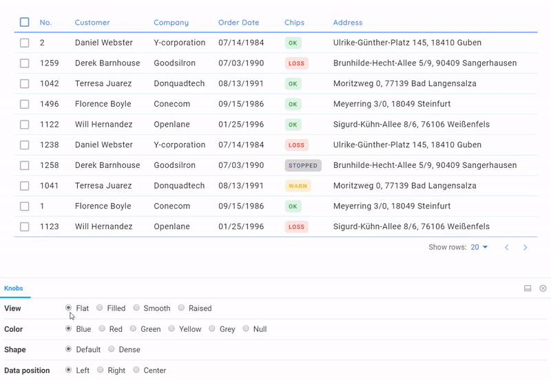
All these tables are completely in code, states, sorting, badges and their fit into the general style are taken into account. Pagination will be improved over time.
4 styles are available:
- Flat - a simple data-first material table, but with a little customization
- Raised - the table turns into a card
- Smooth - Gets soft color saturation
- Filled - fully colored (specific case, for example for emphasis)
As you can see from the GIF above, attention is paid to the states: onHover, onClick, as well as sorting. Such detailing was made possible thanks to the use of design tokens from Figma, which were transferred to the developers in an understandable way. All that was left was to grab the necessary shades from the color system in the Setproduct Design System and screw it into the ready-made React framework in order to get such data-grid that would suit us completely. Thus, future users of our system will have access to many options that are based on the same component of the table, but are stylized in a variety of ways through SCSS.
Specifications and colors
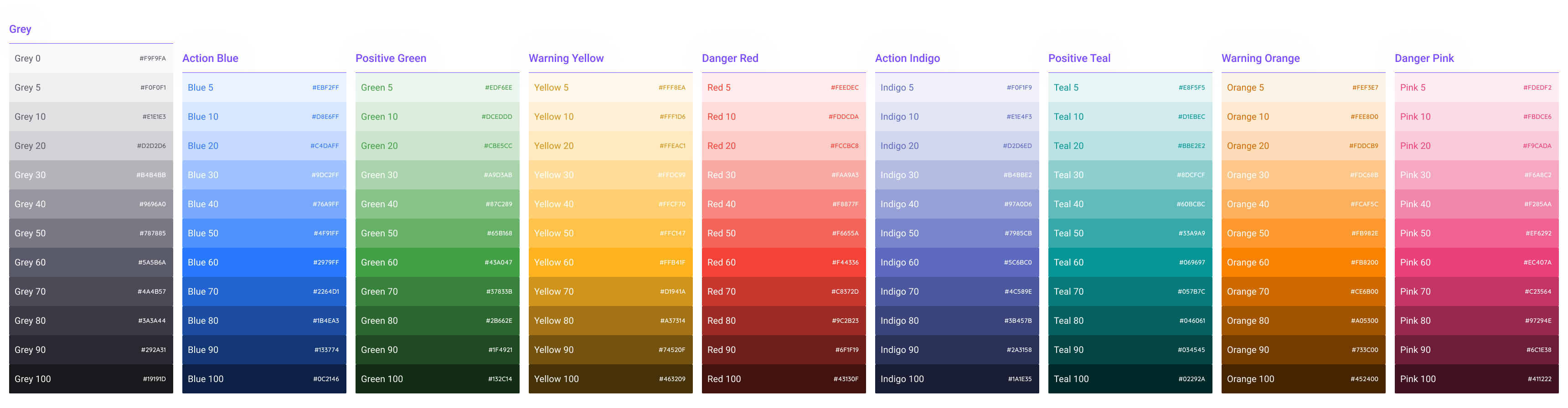
Gray, 4 primary colors and 4 alternative colors. There are gradients.
Honestly, the description of our approach to the color system requires a separate article. But not before the opportunity arises to capture and store tokens for a dark topic in one product. In this fig file, as a demonstration, you can see that the entire color palette, in addition to declaring in global styles, is also converted to components. Thus, developers get the color system linked to tables in a minimum of clicks in Figure:
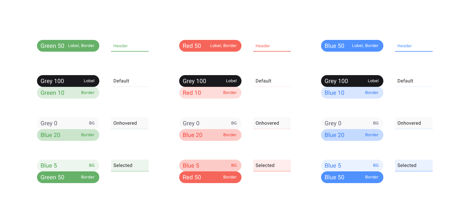
Instances with specifications specially in a shaped style, so that the eye distinguishes them faster from components for which a description follows
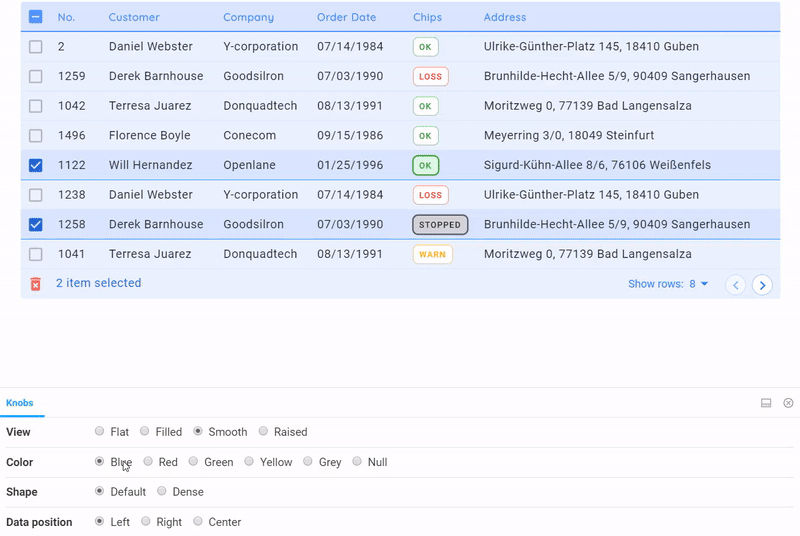
By simply switching the options from the bottom in the Storybook, we quickly change the color of the Storybook table
allows you to quickly organize a preview of all styles of the table in any color. A very suitable service, besides functionality, it helps to catch bugs in styles. A similar concept of the “four styles” we project in general on all components in our system. Somehow I’ll tell you about this ...
That's all I wanted to say about the design of tables through the component. Thanks for reading. In the near future I am planning a series of posts on the mentioned product - Setproduct Design System . Subscribe to my channel if you are interested in the topic of universal tools for design and web development. There will be all the announcements!
This article used materials and ideas from my system design for Figma. If you are looking for a quick start for your projects, this is what you need.
By the way, if you understand Western design trends, are attentive to the grid, typography, horizontal rhythm and generally to each pixel, then you have a great opportunity to join the small Setproduct team to jointly fill the digital market with high-quality design templates that save other teams whole months of development. Email me on Telegram .