 April 29, 2019 at 12:59
Tables in Figma. Data Grid Design by One Component

Building a table of components is a task that sooner or later arises for each designer of design systems in Figma .
There are three approaches to table design to create a data grid with a flexible architecture. In each case, either a row component, or a column component, or a cell component is used. Each of the cases will be considered in detail below.
Why all this?
Why put everything in one cell? Does a medium-sized project really need that kind of flexibility? Is component architecture needed for a regular table?
Inside a large team project, this is the only sure way to create new data grids - through a component. This helps generate more options and validate new ideas faster.
My observations show that not all Figma designers accustom themselves to working with components from the very early stages of a new project. According to a recent survey in Figma chat, just under half of designers use components. Most use just frames and copy-paste.
But those who managed to switch their workflow to component, most likely will never take a step back, because this approach gives more flexibility and is in demand among organizations with their own staff of designers. You want to keep interest in your vacancy, if you are aiming for a cool organization where you already work in Figma - work with components.
Nevertheless, I would also recommend using a ready-made UI library for freelance designers . You can make a duplicate for a new client and through the master components quickly stylize for specific tasks.
By the way, if you use Figma , I recommend paying attention to our ready-made design systems . They help freelancers complete more orders per month, programmers are allowed to create beautiful applications on their own, and team leads “sprint” sprints faster using ready-made design systems for team work.
And if you have a serious project, our team is ready to deploy a design system within the organization based on our best practices and tailor it to specific tasks using Figma. Web / desktop, and any mobile. We are also familiar with React / React Native. Write to T: @kamushken
Table styles
When I created my own, not the first design systems in Figma , I reviewed hundreds of tables and managed to categorize the most commonly used styles.
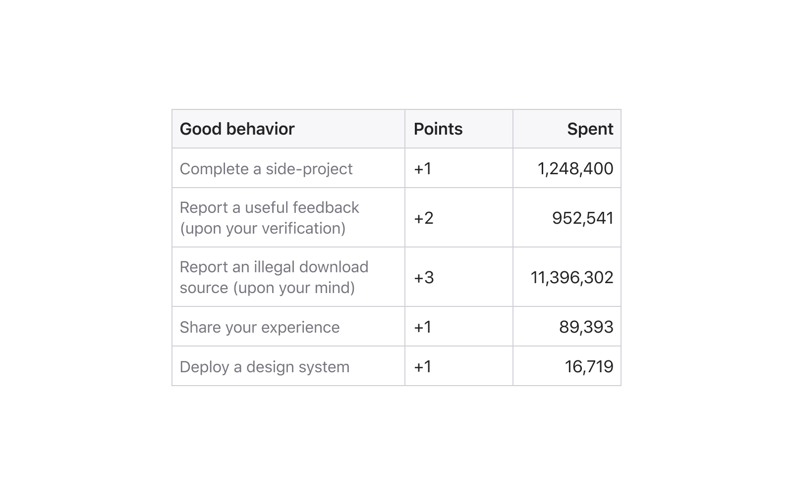
Classic
Horizontal and vertical separators are clearly visible, the headers are highlighted by bold and separated from the background with cells with content. A kind of Excel-style:
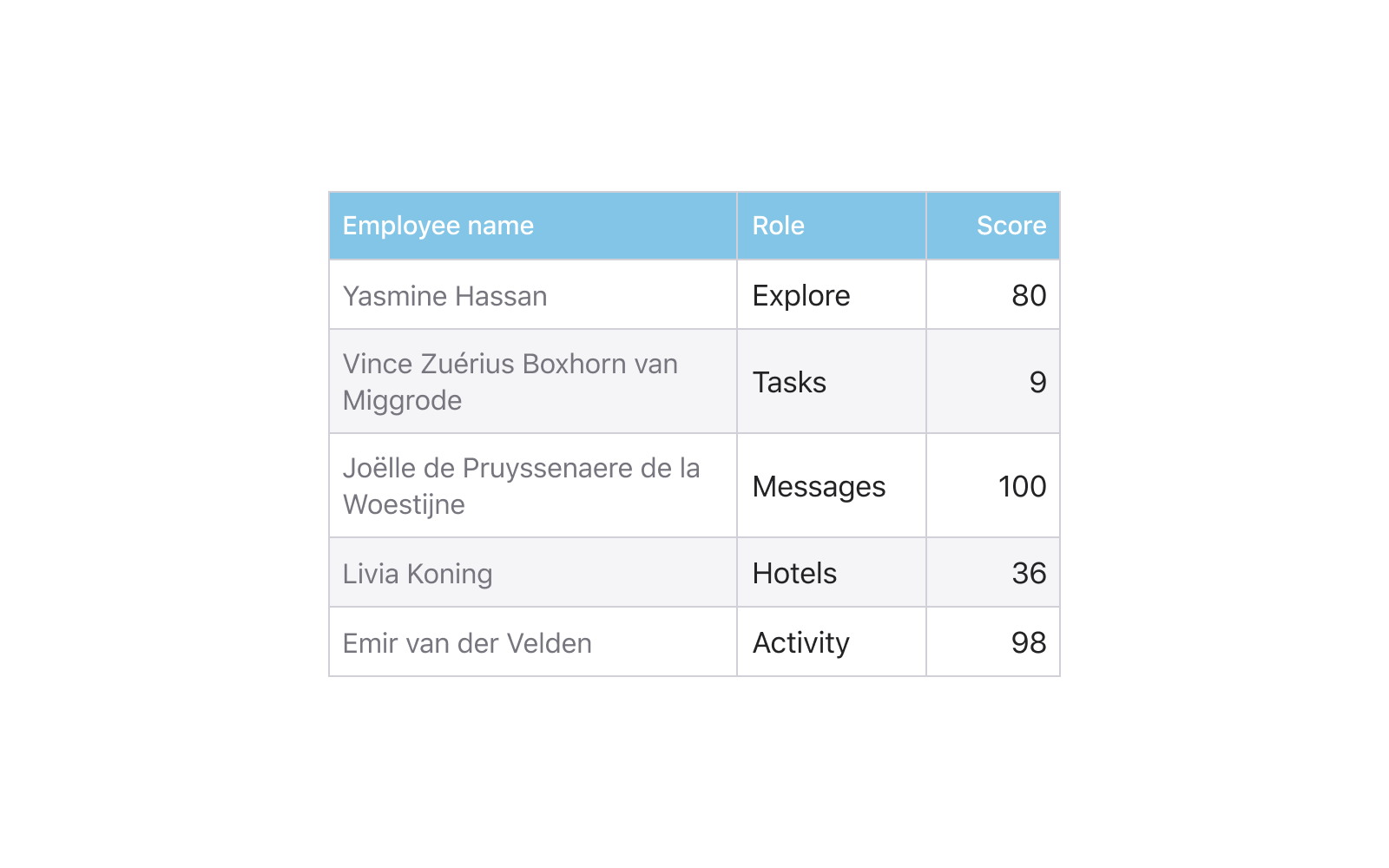
Contrast header
Separators can be absent, or can only be horizontal. Thanks to the intense headers, such data grids are quickly separated by a glance, if there are a lot of them on one dashboard:

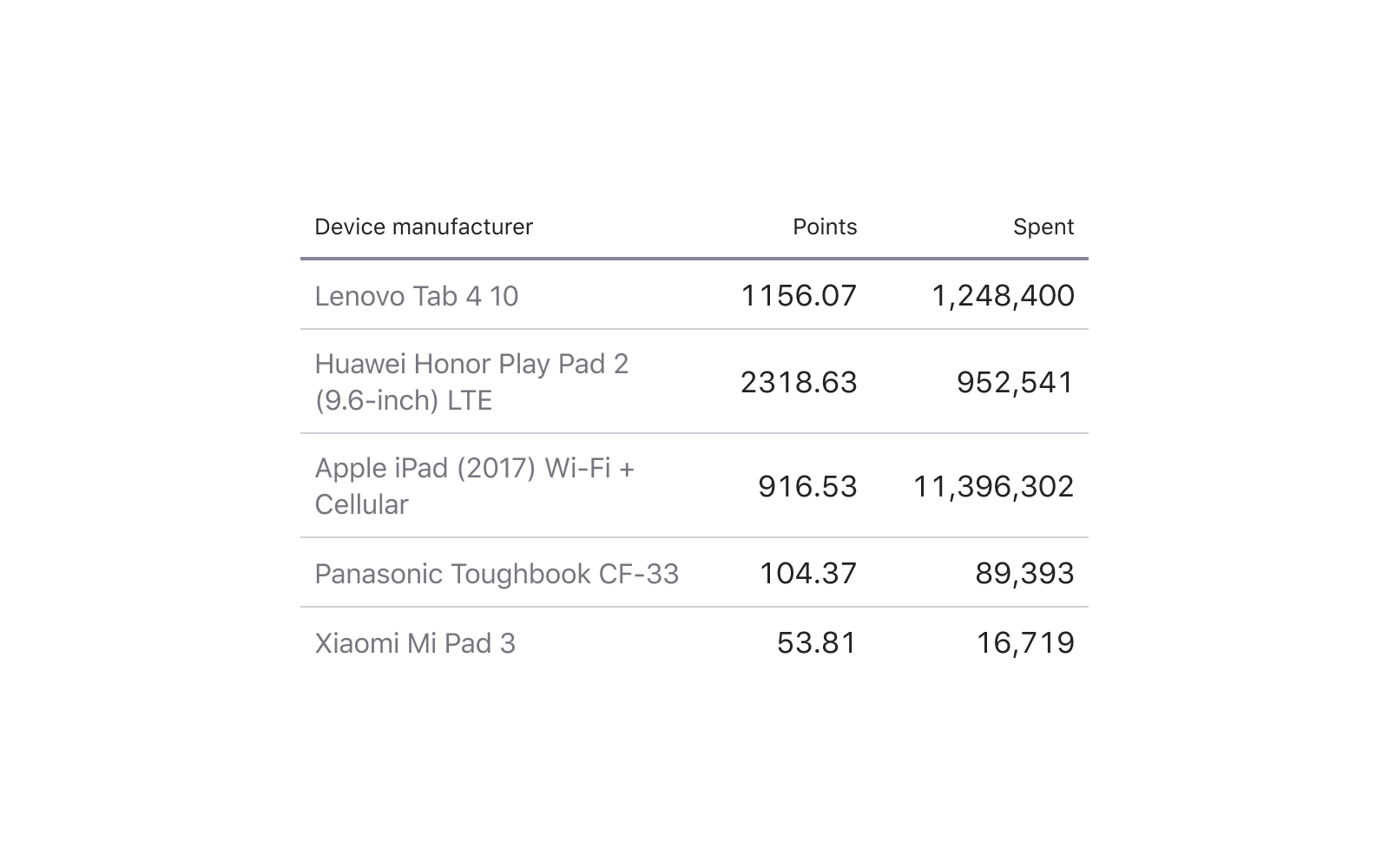
Material table
Data-first approach. Such tables can be found in material design. A more intense upper separator and single-pixel internal divide the data qualitatively:
Through the strip
These tables are straight from the past, but to this day, the use of alternating gray and white rows is often found in the modern UI:
Minimalism
Nothing but data! This is quite justified on dense desktop interfaces, where every pixel counts:

Using components to create a table
All five styles that I showed above are assembled from one component cell, the difference is only in the content and they will all refer to one single main component. I consider this method to be the most flexible and I will talk about it in detail soon, but first I will list two other approaches.
Row component
Using a row with cells of a predetermined quantity. Thus, the table is quickly assembled by simple cloning from top to bottom. Next, the width of each row is adjusted.
Borders inside each cell also have to work, differences are present:
Cons : low degree of flexibility, cells are always scaled proportionally. You will have to keep many components in the system with a different set of cells, and then for each set additionally create new states, which can complicate the organization.
Pros : Row height is convenient to adjust. Ideal for dashboard projects in which horizontal states in the project often change: onHover, onSelected, onFocus, and so on, and the specifics of the development require frequent switching between them:

Column component
For the first time this idea came to my mind a little over a year ago and I implemented it in the later versions of the Material Design System for Figma. It would be convenient to assemble the table from the column components, inside which the N-number of rows is predefined and propagated, and all the extra ones would be cut off outside the frame via the Clip Content option. Then it would be enough to pull the frame down beyond the lower border to show more additional cells in the column:

Cons : inside the component, it will not be possible to adjust the height of each cell (horizontal step), since otherwise it will not be possible to implement “cutting excess”.
Pros : flexible enough to build tables in a design system with different column widths, for example, to fit a different type of data.
Tip: You can hold three such components with different steps: S-32px / M-48px / XL-64px, for example, and to some extent solve the cell density problem. It is especially useful in the case of creating both mobile and desktop templates within the same project / team library.
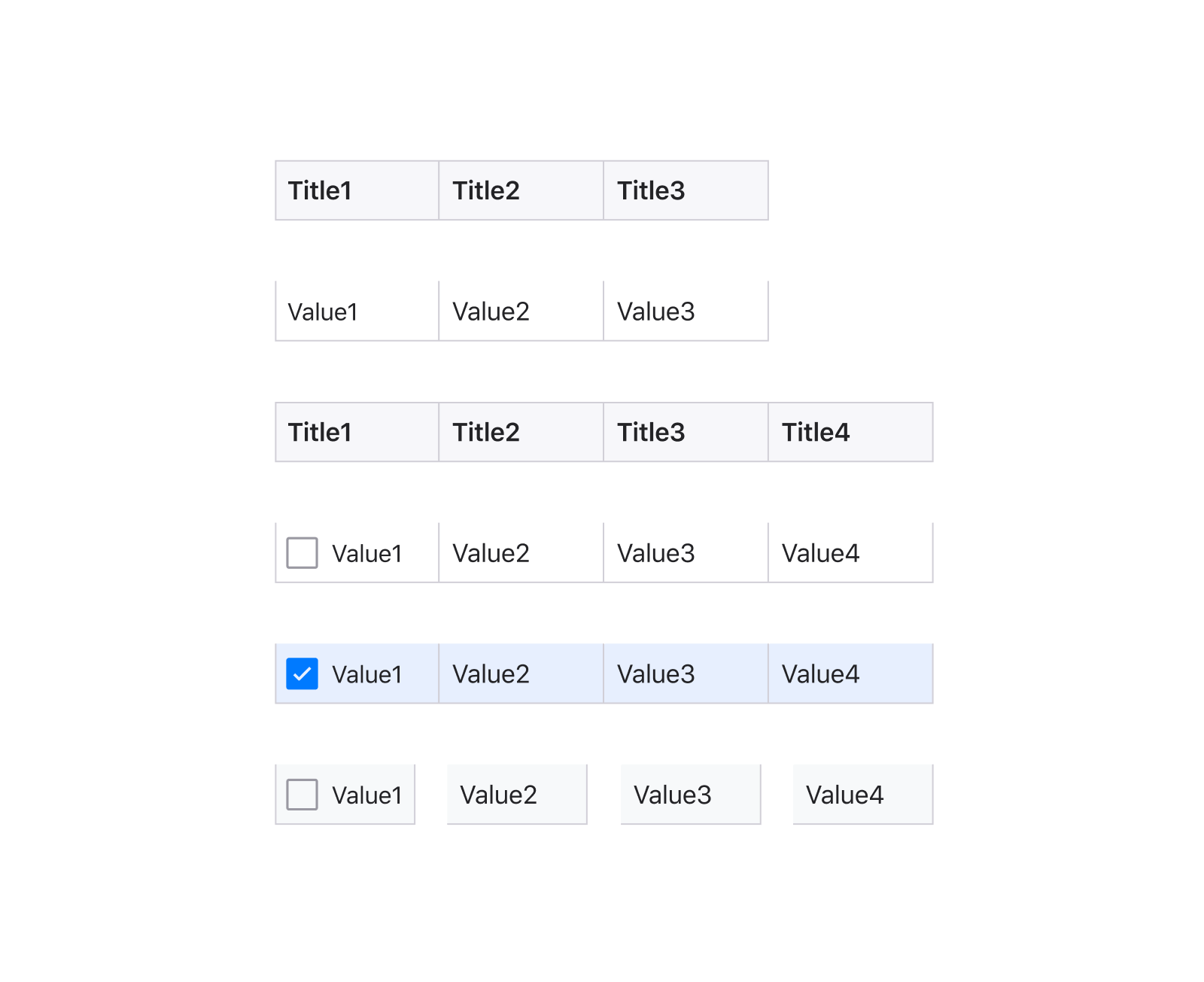
Cell component
Using a component cell gives maximum flexibility in table styling. Rarely does a project require the use of both the Material style and the classic data grid. But if you are a freelancer who regularly creates new dashboards to his clients from their own or commercial database of components, then you better start with the cell from which you will create tables brick by brick. Then it will be enough to nest four lines, press them on the sides of the cell, set constraints and generate new styles.
Uber feature: in my iOS12 mobile library for Figma , I can turn everything upside down through the component :) By the way, it was on the basis of the layouts from this product that the materials for this article were made:

Cons: practically none, unless this approach requires more time and
Pros skills : maximum flexibility, the ability to control the grid using one component, adjust the dividers, background, nested icons and much more.
The detailed composition of such a super cell will be discussed in the next issue.
A source with components is available here .
subscribe to my channel, there will be all the announcements! Especially considering that now we are sawing our own design system for solving many design and web development tasks in one fell swoop. These are the components in the Figma source and React / Angular NPM packages. With an absolutely identical design, a little better than Google Material :) I regularly post new funny pictures about this product. We’re broadcasting the development almost live.
Now many organizations are moving their design departments to Figma. The question arises: to figure out for yourself how to create it from scratch from components with the correct structure, or to take one of the ready-made ones for iOS , Android , Web or for desktop applications . Any of the Figma UI libraries can be deployed within the organization and get hundreds of quality components and templates to create your future products. Learn more at setproduct.com
By the way, if you understand Western design trends, are attentive to the grid, typography, horizontal rhythm and generally to each pixel, then you have a great opportunity to join the small Setproduct team to jointly fill the digital market with high-quality design templates that save other teams whole months of development. Email me on Telegram .