 July 19, 2018 at 11:53
Seven Simple Rules to Make the Internet Accessible to Everyone
- Transfer
Digital accessibility refers to practices for creating digital content and applications that are suitable for use by a wide range of people, including those who suffer from visual, motor, hearing, speech, or cognitive impairments.

There is a false belief that you can make a site accessible only by investing a lot of effort and money, but this is not necessary. If you design a project from the very beginning, taking into account the relevant requirements, you will not need to add any special functions and content, which means that there will be no additional costs.
If it is a question of correcting errors on an existing site, then some efforts will have to be made here. When I worked at Carbon Health, we once tested the site for accessibility using a special extension in Chrome. Already on the main page, 28 violations were found that needed to be eliminated. At first glance, it seemed that it would be a very laborious process, but it soon became clear that making changes would not be so difficult - you just need to invest time and understand the basics. We managed to reduce the number of violations to zero in just a couple of days.
I want to share some simple steps that we have taken and which may help you. These principles are designed primarily for mobile and web applications. But before we begin, let's find out why this is necessary.
We, as designers, are capable and obligated to do everything in our power so that all products created by us can be used by everyone, regardless of capabilities, context or situation. The good thing is the desire for accessibility - it ultimately provides a more positive experience for everyone.
The number of people with disabilities reaches 56 million in the United States (that is, slightly less than one fifth of the population) and about a billion worldwide. In 2017, 814 lawsuits were filed for website accessibility. Already these two facts convincingly demonstrate to us the importance of this issue.
In addition, accessibility is beneficial from a business point of view.: Studies show that accessible sites occupy higher positions in search results, have good SEO indicators, load faster, stimulate the practice of writing better code and are always distinguished by excellent usability.
These seven rules are relatively easy to follow and will allow you to bring the product to level AA through the Web Content Accessibility Guidelines (WCAG 2.0) system, making it compatible with basic assistive devices, including screen readers, screen magnifiers and speech recognition tools.
Color contrast is one of the often forgotten site accessibility issues. Visually impaired people are likely to have difficulty reading text if it does not contrast well enough with the background. According to estimates by the World Health Organization (WHO) in its document on visual impairment and blindness , the ratio of the brightness of the text to the background should be at least 4.5: 1 (to match the AA level). For larger and bold fonts, allowances are allowed - they are easier to distinguish even with low contrast. If your text size is 14-18pt or more, the threshold is reduced to 3: 1.
There are tools that help you quickly check the contrast. For Macs, I suggest you get the Contrast app.- It allows you to instantly calculate the ratio using a pipette. If you want to get a more detailed assessment, I recommend that you enter the necessary values into the tool for checking contrast from WebAIM. It will calculate the ratio for different font sizes and establish the correspondence to different levels (A, AA, AAA). By changing the values, you can get the result in real time.
Source: WCAG Visual Contrast
When you try to tell the user something important - to show an example of an action or provoke a reaction, do not make the color the only visual marker. People with visual acuity or color blindness will have a hard time perceiving your content.
Try to complement the color with some other indicator - for example, a signature or texture. When displaying an error message on the screen, do not stop at just highlighting the text in color - add an icon or a title to the window. Also consider using a bold or underlined font so that the links in the text are immediately striking.
Elements with a more complex information structure — say, graphs — are especially hard to read when data types are separated by color alone. Use other visual aspects to convey information — shape, size, and explanatory text. You can add patterns to the fill to make the difference more obvious. The version of Trello for color blind is a great example of applying this rule. If you switch to this mode, the shortcuts become universally understandable by adding textures.
There is a good way: print the graph on a black and white printer and see if everything will be clear to you. You can also use special applications like Color Oracle, which in real time show how the content will look for people with the most common color perception impairments. All this will help you make sure that the information on your site is not too tied to color.
Source: WCAG Visual Contrast Without Color
Noticed a blue frame that sometimes appears around links, fields, and buttons? Such a frame is called a focus indicator. Browsers use the CSS pseudo-class by default to display it on elements when they are clicked. Perhaps it seems to you not too pretty and you would prefer to simply remove it. However, if you decide to get rid of the default style, be sure to provide some kind of replacement.
Focus indicators help people understand which element you can interact with with the keyboard and where they are in the page structure. They are useful for blind people who use screen readers, people with physical disabilities or carpal tunnel syndrome, and advanced users who prefer this type of navigation. Well, plus, many of us, in principle, prefer to engage in Internet surfing on the keyboard!
Elements for which the active state should be visually emphasized include: links, form fields, widgets, buttons, and menu items. All of them need indicators that will distinguish them from the surrounding elements.
You can design indicators so that they look good in the style of your site and are combined with the brand image. Make active status markers easily visible, with high contrast, so that they are clearly visible among other content.
Source: W3C Focus Visible
One of the grossest mistakes when creating forms is to leave explanatory signatures in the fields themselves so that they disappear when entering data. When there is little space on the screen or you want to give the design a minimalistic, modern look, the temptation is great - but do not do it. The text in the form fields is usually gray and not enough contrast, difficult to read. And people like me, moreover, halfway forget that they typed at all, so the disappearing signature deprives us of all chances to figure it out.
People who use screen readers usually move in shape using the Tab key, moving from one controller to another. Label elements are counted for each of them. The rest of the text that does not apply to them (the same explanatory labels inside the fields) is usually skipped.
Always make sure that people understand what to do with the form and what to write in it. It is best if the signatures remain visible even during the input process - a person should have a context before his eyes when filling in the fields. By hiding signatures and instructions for the form, designers, in the pursuit of simplicity , sacrifice usability .
This does not mean that you need to clutter up the screen with useless information - just make sure that the most key tips are available. An excess of data can bring no less problems than their lack. Your goal is to provide information in such a volume that the user can perform the operation without a hitch.
Source: WebAIM Creating Accessible Forms

Visually impaired people often use screen readers to “listen” to the Internet. They transform the text into sounding speech, making it possible to listen to everything that is written on the site.
An alternative description can be represented in two ways:
Try to describe what is happening on the image and how it relates to the general meaning, and not just get off with a comment like “picture”. Context is crucial.
If the image is added solely for beauty or what it expresses is duplicated in the text, you can add the attribute and leave it blank - in this case, the screen reader will skip it. When alternative text is not written at all, some screen readers will read the file name. You can’t imagine anything worse for a user experience.
Google is working on an artificial intelligence solution, which generates captions for pictures with an accuracy of 94%. The code is in the public domain and is still in the process of being finalized. I hope that soon we will see how this solution will be applied in various products. Until then, you should manually register the meaning and purpose of the pictures in the context of the rest of the content.
Source: W3C Using Alt Attributes
Headings mark the beginning of the content block - these are some kind of tags that determine the style and purpose of the text. In addition, the headers define the hierarchy of content on the page.
The large font in the headings allows the user to better understand the structure of the information. Screen readers also rely on headers when reading content. Thus, people with low vision get an idea of the general appearance of the page by listening to headings in a hierarchical sequence.
When developing a site, you must use the correct structural elements. HTML elements transmit information to the browser about what type of content they carry and what actions to carry out with it. It is the components and structure of the page that form the browser accessibility tree with which screen readers for the visually impaired work.
Incorrect markup affects accessibility badly. Do not limit the use of HTML tags to stylistic effects. Screen readers are guided by a page based on the hierarchical structure of headings - real headings, and not just text that is made bigger and fatter. With their help, users can listen to the full list of headings, skip blocks of content, guided by the type of heading, or go to navigation through headings of the first level (h1).
Source: WebAIM Semantic Structure
The ability to perform operations using the keyboard is one of the main components of accessibility in web design. People with impaired coordination of movements and muscle tone, blind, those who use screen readers, and even some advanced users rely on the keyboard when navigating the site.
Perhaps you, like me, use the Tab key to navigate to the desired interactive page elements: links, buttons, input fields. The indicator of the active state, which we talked about above, allows you to visually emphasize the element that is currently selected.
When moving around the page, the sequence in which the user interacts with the elements is extremely important, so navigation should be logical and intuitive. The transition order should correspond to the direction of the movement of the gaze: from left to right, from top to bottom, first the main navigation, then the buttons that hide the content, and the forms and, finally, the footer.
It’s good practice to test the site using only the keyboard. Go from link to link and from field to field using the Tab key. Check whether it is convenient to select an element by pressing Enter. Ensure that all components are aligned in the correct order and that their appearance is predictable. If you can go through all the pages without touching the mouse, then you are doing well!
One more thing. Pay attention to the volumes in the navigation system - this refers to the number of links, and to the size of the text. Iterating over all the items in a long list can tire people with limited motor abilities, and people who use a screen reader will quickly get tired of listening to long link texts. Try to be more concise. Adding ARIA markers or HTML 5 structural elements (such as main or nav) will also make it easier to navigate the page.
Source: W3C Keyboard
These rules are a good starting point, but if you want to do something else to increase accessibility, I would recommend:
That's it. These were seven rules that will help you bring your site to approximate AA level according to the Web Content Accessibility Guidelines .
I still continue to work to make design more accessible, and I try to observe the principles that I preach to others. Previously, it seemed to me that this is all too complicated and still does not really matter. But I was wrong. I suggest you start the process using these rules and continue the conversation about why accessibility is important.
Promoting accessibility practices is the responsibility of designers. With their help, we open the way to technology for all people, regardless of their capabilities, standard of living, age, education and place of residence. Take responsibility when designing. Thanks!
WebAIM - articles, resources and practical tasks on accessibility in web design
“ 7 things a designer should know about accessibility ” - an excellent article from Salesforce with accurate observations of the
UCLA Disabilities and Computing Program - the site is certainly not the most beautiful and modern, but he is very rich in
UX Myths resources- an extensive list of misconceptions in UX design with rebuttals; some of them touch upon the accessibility problems of
Color Accessibility Workflows - here Geri Coady clearly demonstrates how to get to the W3C color matching point
- the bible of accessibility in web design, from the abundance of materials you can even get lost. But when you understand the structure, you will find great examples, tips and resources.
WebAIM Color Contrast Checker is an intelligent tool for checking contrast; it gives the result immediately after input; for various text sizes,
Inclusive Components is a texture library designed as a blog. Particular attention is paid to issues of affordable design. Each post analyzes some common interface component and offers a more reliable and affordable version of its design.
Color Oracle is a free color blind simulator adapted for Windows, Mac, and Linux. In real time, it shows how people with widespread color perception disorders see.
Vox Product Accessibility Guidelines - Complete List of Requirements for Designers, Developers, and Project Managers
AX Google Chrome Extension - check any site for violations of accessibility principles using the Inspector for Chrome
Contrast - an application for Mac that gives instant access to the brightness ratio from WGAG.
There is a false belief that you can make a site accessible only by investing a lot of effort and money, but this is not necessary. If you design a project from the very beginning, taking into account the relevant requirements, you will not need to add any special functions and content, which means that there will be no additional costs.
If it is a question of correcting errors on an existing site, then some efforts will have to be made here. When I worked at Carbon Health, we once tested the site for accessibility using a special extension in Chrome. Already on the main page, 28 violations were found that needed to be eliminated. At first glance, it seemed that it would be a very laborious process, but it soon became clear that making changes would not be so difficult - you just need to invest time and understand the basics. We managed to reduce the number of violations to zero in just a couple of days.
I want to share some simple steps that we have taken and which may help you. These principles are designed primarily for mobile and web applications. But before we begin, let's find out why this is necessary.
Why strive for accessibility?
We, as designers, are capable and obligated to do everything in our power so that all products created by us can be used by everyone, regardless of capabilities, context or situation. The good thing is the desire for accessibility - it ultimately provides a more positive experience for everyone.
The number of people with disabilities reaches 56 million in the United States (that is, slightly less than one fifth of the population) and about a billion worldwide. In 2017, 814 lawsuits were filed for website accessibility. Already these two facts convincingly demonstrate to us the importance of this issue.
In addition, accessibility is beneficial from a business point of view.: Studies show that accessible sites occupy higher positions in search results, have good SEO indicators, load faster, stimulate the practice of writing better code and are always distinguished by excellent usability.
These seven rules are relatively easy to follow and will allow you to bring the product to level AA through the Web Content Accessibility Guidelines (WCAG 2.0) system, making it compatible with basic assistive devices, including screen readers, screen magnifiers and speech recognition tools.
1. Make the colors contrast enough
Color contrast is one of the often forgotten site accessibility issues. Visually impaired people are likely to have difficulty reading text if it does not contrast well enough with the background. According to estimates by the World Health Organization (WHO) in its document on visual impairment and blindness , the ratio of the brightness of the text to the background should be at least 4.5: 1 (to match the AA level). For larger and bold fonts, allowances are allowed - they are easier to distinguish even with low contrast. If your text size is 14-18pt or more, the threshold is reduced to 3: 1.
There are tools that help you quickly check the contrast. For Macs, I suggest you get the Contrast app.- It allows you to instantly calculate the ratio using a pipette. If you want to get a more detailed assessment, I recommend that you enter the necessary values into the tool for checking contrast from WebAIM. It will calculate the ratio for different font sizes and establish the correspondence to different levels (A, AA, AAA). By changing the values, you can get the result in real time.
Source: WCAG Visual Contrast
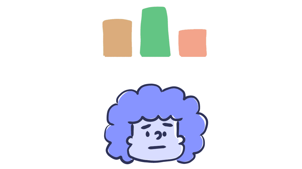
2. Do not rely solely on color to convey critical information
When you try to tell the user something important - to show an example of an action or provoke a reaction, do not make the color the only visual marker. People with visual acuity or color blindness will have a hard time perceiving your content.
Try to complement the color with some other indicator - for example, a signature or texture. When displaying an error message on the screen, do not stop at just highlighting the text in color - add an icon or a title to the window. Also consider using a bold or underlined font so that the links in the text are immediately striking.
Elements with a more complex information structure — say, graphs — are especially hard to read when data types are separated by color alone. Use other visual aspects to convey information — shape, size, and explanatory text. You can add patterns to the fill to make the difference more obvious. The version of Trello for color blind is a great example of applying this rule. If you switch to this mode, the shortcuts become universally understandable by adding textures.
There is a good way: print the graph on a black and white printer and see if everything will be clear to you. You can also use special applications like Color Oracle, which in real time show how the content will look for people with the most common color perception impairments. All this will help you make sure that the information on your site is not too tied to color.
Source: WCAG Visual Contrast Without Color
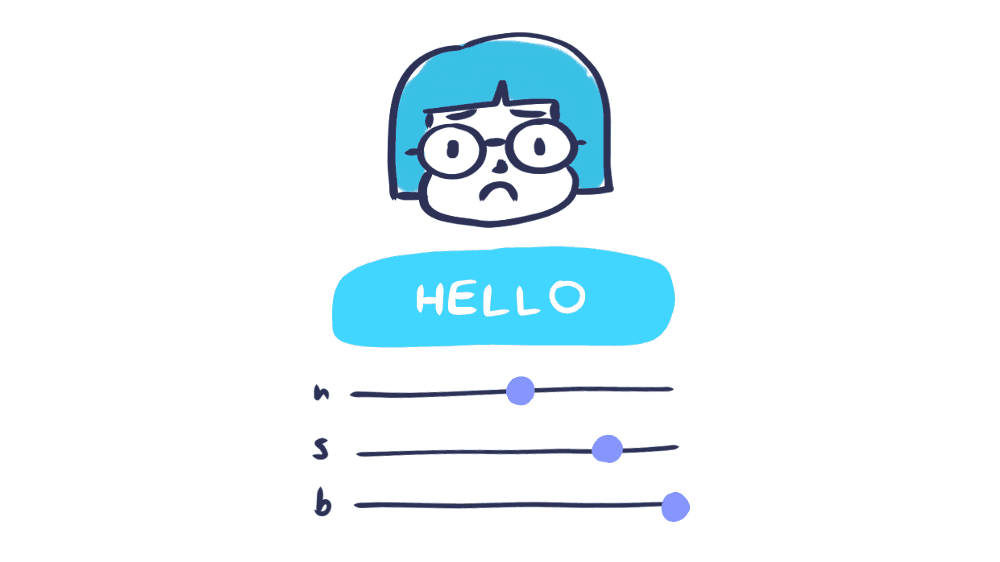
3. Highlight active elements
Noticed a blue frame that sometimes appears around links, fields, and buttons? Such a frame is called a focus indicator. Browsers use the CSS pseudo-class by default to display it on elements when they are clicked. Perhaps it seems to you not too pretty and you would prefer to simply remove it. However, if you decide to get rid of the default style, be sure to provide some kind of replacement.
Focus indicators help people understand which element you can interact with with the keyboard and where they are in the page structure. They are useful for blind people who use screen readers, people with physical disabilities or carpal tunnel syndrome, and advanced users who prefer this type of navigation. Well, plus, many of us, in principle, prefer to engage in Internet surfing on the keyboard!
Elements for which the active state should be visually emphasized include: links, form fields, widgets, buttons, and menu items. All of them need indicators that will distinguish them from the surrounding elements.
You can design indicators so that they look good in the style of your site and are combined with the brand image. Make active status markers easily visible, with high contrast, so that they are clearly visible among other content.
Source: W3C Focus Visible
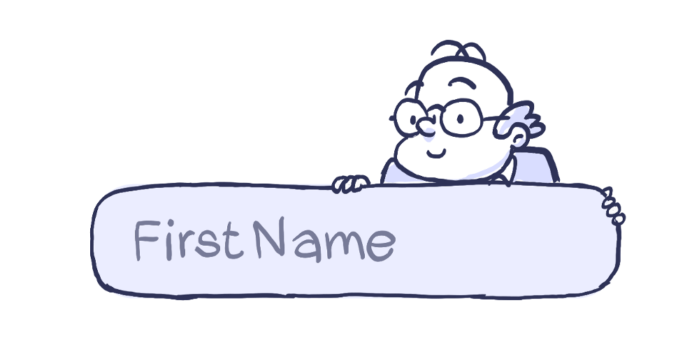
4. Add captions and instructions to input fields
One of the grossest mistakes when creating forms is to leave explanatory signatures in the fields themselves so that they disappear when entering data. When there is little space on the screen or you want to give the design a minimalistic, modern look, the temptation is great - but do not do it. The text in the form fields is usually gray and not enough contrast, difficult to read. And people like me, moreover, halfway forget that they typed at all, so the disappearing signature deprives us of all chances to figure it out.
People who use screen readers usually move in shape using the Tab key, moving from one controller to another. Label elements are counted for each of them. The rest of the text that does not apply to them (the same explanatory labels inside the fields) is usually skipped.
Always make sure that people understand what to do with the form and what to write in it. It is best if the signatures remain visible even during the input process - a person should have a context before his eyes when filling in the fields. By hiding signatures and instructions for the form, designers, in the pursuit of simplicity , sacrifice usability .
This does not mean that you need to clutter up the screen with useless information - just make sure that the most key tips are available. An excess of data can bring no less problems than their lack. Your goal is to provide information in such a volume that the user can perform the operation without a hitch.
Source: WebAIM Creating Accessible Forms
5. Write informative alternative descriptions for images and other non-textual elements
Visually impaired people often use screen readers to “listen” to the Internet. They transform the text into sounding speech, making it possible to listen to everything that is written on the site.
An alternative description can be represented in two ways:
- In the alt attribute of the picture element
- In the immediate context or in the accompanying text to the image
Try to describe what is happening on the image and how it relates to the general meaning, and not just get off with a comment like “picture”. Context is crucial.
If the image is added solely for beauty or what it expresses is duplicated in the text, you can add the attribute and leave it blank - in this case, the screen reader will skip it. When alternative text is not written at all, some screen readers will read the file name. You can’t imagine anything worse for a user experience.
Google is working on an artificial intelligence solution, which generates captions for pictures with an accuracy of 94%. The code is in the public domain and is still in the process of being finalized. I hope that soon we will see how this solution will be applied in various products. Until then, you should manually register the meaning and purpose of the pictures in the context of the rest of the content.
Source: W3C Using Alt Attributes
6. Use markup correctly
Headings mark the beginning of the content block - these are some kind of tags that determine the style and purpose of the text. In addition, the headers define the hierarchy of content on the page.
The large font in the headings allows the user to better understand the structure of the information. Screen readers also rely on headers when reading content. Thus, people with low vision get an idea of the general appearance of the page by listening to headings in a hierarchical sequence.
When developing a site, you must use the correct structural elements. HTML elements transmit information to the browser about what type of content they carry and what actions to carry out with it. It is the components and structure of the page that form the browser accessibility tree with which screen readers for the visually impaired work.
Incorrect markup affects accessibility badly. Do not limit the use of HTML tags to stylistic effects. Screen readers are guided by a page based on the hierarchical structure of headings - real headings, and not just text that is made bigger and fatter. With their help, users can listen to the full list of headings, skip blocks of content, guided by the type of heading, or go to navigation through headings of the first level (h1).
Source: WebAIM Semantic Structure
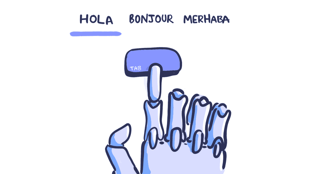
7. Support key control
The ability to perform operations using the keyboard is one of the main components of accessibility in web design. People with impaired coordination of movements and muscle tone, blind, those who use screen readers, and even some advanced users rely on the keyboard when navigating the site.
Perhaps you, like me, use the Tab key to navigate to the desired interactive page elements: links, buttons, input fields. The indicator of the active state, which we talked about above, allows you to visually emphasize the element that is currently selected.
When moving around the page, the sequence in which the user interacts with the elements is extremely important, so navigation should be logical and intuitive. The transition order should correspond to the direction of the movement of the gaze: from left to right, from top to bottom, first the main navigation, then the buttons that hide the content, and the forms and, finally, the footer.
It’s good practice to test the site using only the keyboard. Go from link to link and from field to field using the Tab key. Check whether it is convenient to select an element by pressing Enter. Ensure that all components are aligned in the correct order and that their appearance is predictable. If you can go through all the pages without touching the mouse, then you are doing well!
One more thing. Pay attention to the volumes in the navigation system - this refers to the number of links, and to the size of the text. Iterating over all the items in a long list can tire people with limited motor abilities, and people who use a screen reader will quickly get tired of listening to long link texts. Try to be more concise. Adding ARIA markers or HTML 5 structural elements (such as main or nav) will also make it easier to navigate the page.
Source: W3C Keyboard
What else can be done
These rules are a good starting point, but if you want to do something else to increase accessibility, I would recommend:
- Conduct an audit on availability. Use the special service to find out if your product is in conflict with accessories and whether it meets the requirements of level AA. Make the necessary changes based on the results and repeat the test.
- Appoint an auditor. You can instruct one of the employees to conduct such audits regularly - for example, to someone from the testing team. If there are no people with the necessary experience, you can contact a third-party specialist.
- Consider accessibility factors when collecting information. When conducting research, check to see if your assumptions about accessibility are confirmed, and look for opportunities to refine something. Involving people with disabilities is a little harder. Feel free to contact associations and communities - usually there are happy to help.
Conclusion
That's it. These were seven rules that will help you bring your site to approximate AA level according to the Web Content Accessibility Guidelines .
I still continue to work to make design more accessible, and I try to observe the principles that I preach to others. Previously, it seemed to me that this is all too complicated and still does not really matter. But I was wrong. I suggest you start the process using these rules and continue the conversation about why accessibility is important.
Promoting accessibility practices is the responsibility of designers. With their help, we open the way to technology for all people, regardless of their capabilities, standard of living, age, education and place of residence. Take responsibility when designing. Thanks!
List of references
WebAIM - articles, resources and practical tasks on accessibility in web design
“ 7 things a designer should know about accessibility ” - an excellent article from Salesforce with accurate observations of the
UCLA Disabilities and Computing Program - the site is certainly not the most beautiful and modern, but he is very rich in
UX Myths resources- an extensive list of misconceptions in UX design with rebuttals; some of them touch upon the accessibility problems of
Color Accessibility Workflows - here Geri Coady clearly demonstrates how to get to the W3C color matching point
- the bible of accessibility in web design, from the abundance of materials you can even get lost. But when you understand the structure, you will find great examples, tips and resources.
Useful tools
WebAIM Color Contrast Checker is an intelligent tool for checking contrast; it gives the result immediately after input; for various text sizes,
Inclusive Components is a texture library designed as a blog. Particular attention is paid to issues of affordable design. Each post analyzes some common interface component and offers a more reliable and affordable version of its design.
Color Oracle is a free color blind simulator adapted for Windows, Mac, and Linux. In real time, it shows how people with widespread color perception disorders see.
Vox Product Accessibility Guidelines - Complete List of Requirements for Designers, Developers, and Project Managers
AX Google Chrome Extension - check any site for violations of accessibility principles using the Inspector for Chrome
Contrast - an application for Mac that gives instant access to the brightness ratio from WGAG.