10 small design mistakes that we still make
- Transfer
The saying “good design is a design in which everything is obvious” is a hundred years old at lunch, and I’m sure that in some way it existed in past centuries, as applied to good food, music, architecture, clothing, philosophy, and generally whatever.
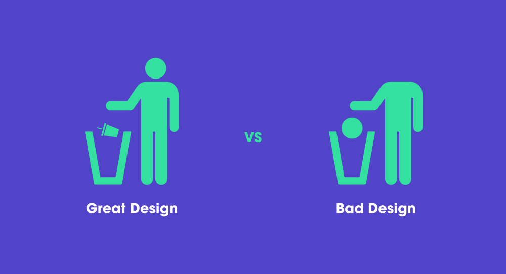
We forget that changes in human thinking are taking place extremely slowly, and the knowledge about the behavior of people that we have now will not become obsolete for another fifty years or so. To make things easier for everyone, we must consistently adhere to several principles that will remind us how to make products with a good design. It would be nice to remind yourself of these principles at least once a month, until we begin to live and breathe.
Back in 2000, after the dot-com boom, Steve Krug outlined some useful considerations that still have not lost their value and relevance. Even during the time that has passed since the publication of the new edition, nothing has essentially changed. Yes, you can tell me that now everything looks in a modern way, that sites are better structured and use advanced technologies (goodbye, flash!). But I'm talking about something else - people's behavior is no different. The principle “do not make me think” will always be useful for any product with which we interact, be it a microwave, television, smartphone or car.

“Your goal is to make every page or every screen self-evident so that the average user can say,“ At first glance, “Everything is clear.” - Steve Krug
The reason is simple: we have a mission and we are looking only for what interests us in connection with it. For example, I hardly recall cases when I read text on a product page from and to. Why? Because most users on the Web are trying to do something specific, and as quickly as possible. We have no time to read more than strictly necessary. Nevertheless, we continue to load pages with text - it seems to us that people need to know all this. Or, as some designers say, "it makes the experience richer."
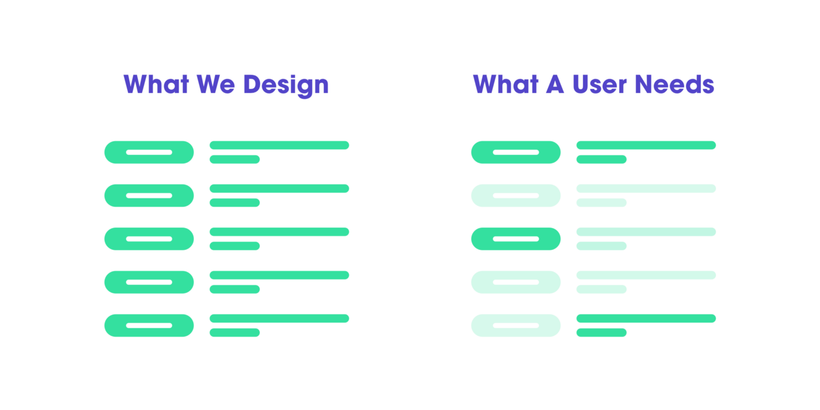
What we do vs what the user needs

Another important aspect that helps to run through the page with your eyes is having the right visual hierarchy. It must be made clear that the appearance of the page reflects the relationship between the elements. Here are a couple of rules to help you achieve this:
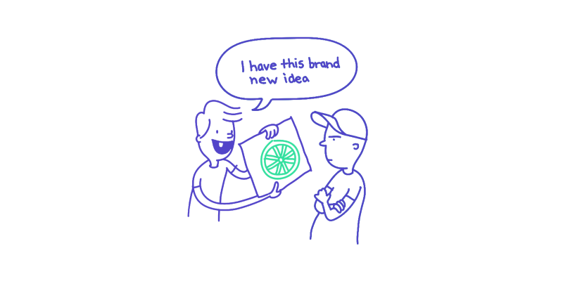
It seems to us that people want something new, something that they don’t have yet. But we forget that the market now has a huge number of applications and each of them claims to be our time. Each of them has its own set of interactions, and we have to master them. And sometimes we just have a brain explode: "What, also understand this application ?!"
When we are asked to design something from scratch, we, as designers, are tempted to reinvent the wheel. After all, doing as everyone else does, it seems to be wrong. We were hired to make us stand out. And the rewards with praises in our industry are usually not received by those who “made the best use of generally accepted practices” in their design.
Before you invent a bicycle, you need to realize what volumes of values (time, effort, knowledge) have been invested in what you are currently trying to challenge and modernize.

Our task is to make everything transparent and obvious. Well, or if it does not work out obvious, then at least it speaks for itself. The main thing you need to know about the instructions is that no one will read them. It is necessary to strive to remove them from the product altogether and make everything not needing explanation. But if without instructions, cut them to the maximum. Although, seriously, nobody will read them anyway. Usually we just get on our own as we can.
For example, take IKEA. If you instruct the average person to assemble a wardrobe from IKEA, I am convinced that in most cases he will cope. Why? Because, again, in most cases, we understand how to collect it if there is a picture in front of our eyes. But even in those situations when a person has to look into the instructions, there are no words in it - only images.

Most people do not feel the need to know or understand how your product works. And the point here is not stupidity at all - they are simply indifferent to it. It is important for them to figure out how to use the product, and after that they most likely will not switch to something else.
For example, consider Apple AirPods. It is unlikely that someone will not agree that in terms of sounding this is one of the worst options for such and such money. But watching how people work with them, I understand the true reason why they buy this product. They don’t have to puzzle over why something is not working. You may not even notice that it uses new technologies.
I watch how my mother interacts with them: she never once asked me what technologies they are based on and what is the principle of work. She only knows that if you open the case next to the device, the connection will be established automatically. Everything is simple.

My favorite one. We designers love to add unobtrusive effects, beautiful little things that delight users to the delight of users. Right? But what if I tell you that users are indifferent to them? No matter how much they assure you of the opposite, in fact, the way it is. For the very first time? May be. In the second? Well, wherever it went. In the third? No, really, how many times do I still have to watch this for you to have enough?
Why it happens? Because life is a much tougher and more stressful environment than
applications with their discreet effects and delights. Well, for example, you are a father, your child yells that he wants ice cream, the dog barks because someone rang the doorbell, and you are trying to book a train ticket that leaves in forty minutes. In such a situation, people wanted to spit on subtle hints. On the other hand, this does not mean that they cannot be used - it is possible, but so that the user's journey does not go off the rails.

A focus group is a small group of people who are sitting at a table and discussing some problems. They express opinions about the product, talk about their past experiences, emotions and reactions that evoke new concepts. Focus groups are a great way to determine what your audience wants.
The usability test is that you observe how the user, one per test, is trying to work with something (in this case, with your product). At the same time, you ask him to perform certain operations in order to understand whether something needs to be fixed in the concept. Accordingly, when working with focus groups, you listen; on usability tests, look.

All of us people who are involved in product design have moments when we say: “I'm the user myself, I know what is good and what is bad.” And for this reason, we experience quite strong emotions about our preferences. We like that, and we consider it a headache.
When working in a team it is difficult to leave all this behind the threshold. As a result, we have a whole room of people on emotions with categorical beliefs about how the design of a good product should be. We tend to think that all other users share our feelings.

To ask questions like: “Do people like drop-down menus?” Is unproductive and will not bring any value. It’s more correct to formulate the question this way: “Will this particular drop-down menu on this particular page contribute to the formation of a positive experience for people who are most likely to visit the site?”.
We need to distract ourselves from the questions “Do people like it? ..” and dive deeper into the strategic context of design.
The reason is that by focusing on abstract preferences, we are wasting our energy and scattering attention. Usability tests mark all these likes and dislikes and show you what you really need to do.

The bottom line is that every question that arises in the user’s thoughts when using the product increases the cognitive load. They divert attention from "why am I here" and "what do I need to do." As a rule, people are not happy to solve puzzles when they just want to understand if a button is clickable.
And every time you force the user to click on something that won't work, but looks like a link or button, this bunch of questions grows. And all this happens because the people who made the product did not bother too much.
Share the small mistakes in the comments that we constantly make in the design of our products so that everyone can learn from them. I wrote this article on the basis of a new edition of Steve Circle’s book, “ Don't Make Me Think .”

We forget that changes in human thinking are taking place extremely slowly, and the knowledge about the behavior of people that we have now will not become obsolete for another fifty years or so. To make things easier for everyone, we must consistently adhere to several principles that will remind us how to make products with a good design. It would be nice to remind yourself of these principles at least once a month, until we begin to live and breathe.
The capabilities of the human brain do not change from year to year, so the results of studies of human behavior have a very long shelf life. What was difficult for the user twenty years ago remains complex today.
- J. Nielsen
"Do not make me think: take two"
Back in 2000, after the dot-com boom, Steve Krug outlined some useful considerations that still have not lost their value and relevance. Even during the time that has passed since the publication of the new edition, nothing has essentially changed. Yes, you can tell me that now everything looks in a modern way, that sites are better structured and use advanced technologies (goodbye, flash!). But I'm talking about something else - people's behavior is no different. The principle “do not make me think” will always be useful for any product with which we interact, be it a microwave, television, smartphone or car.

“Your goal is to make every page or every screen self-evident so that the average user can say,“ At first glance, “Everything is clear.” - Steve Krug
1. People do not read, but run through their eyes
The reason is simple: we have a mission and we are looking only for what interests us in connection with it. For example, I hardly recall cases when I read text on a product page from and to. Why? Because most users on the Web are trying to do something specific, and as quickly as possible. We have no time to read more than strictly necessary. Nevertheless, we continue to load pages with text - it seems to us that people need to know all this. Or, as some designers say, "it makes the experience richer."

What we do vs what the user needs
- Insert more headings - they explain what the essence of each section is and whether this particular user needs it. One way or another, it helps to decide whether to view the page further or better to leave.
- Make paragraphs short - in a long text fragment, the reader is more likely to get bogged down, besides running through their eyes is more difficult than a series of small paragraphs. There will always be some place where the text can be painlessly divided into two parts.
- Use lists - almost anything can be arranged as a list. Do you have a suggestion where a lot of everything is listed with a comma? This is a ready list. Also, do not forget to leave a little empty space between the list items - it’s more convenient to read. For example, you can take the same Medium.
- Highlight key phrases - an essential part of viewing a page is to search for specific keywords and phrases. By highlighting them in bold, you can simplify the task for the user. Just do not overdo it - if there are too many secretions, they lose effectiveness.

2. Build an effective visual hierarchy
Another important aspect that helps to run through the page with your eyes is having the right visual hierarchy. It must be made clear that the appearance of the page reflects the relationship between the elements. Here are a couple of rules to help you achieve this:
- The more important the element, the more it should stand out. The most important information should be written either larger or in bold and eye-catching color.
- If there is a logical connection between the elements, they must be connected visually. For example, similar elements can be designed in the same style or put under one heading.

3. Do not reinvent the wheel
It seems to us that people want something new, something that they don’t have yet. But we forget that the market now has a huge number of applications and each of them claims to be our time. Each of them has its own set of interactions, and we have to master them. And sometimes we just have a brain explode: "What, also understand this application ?!"
When we are asked to design something from scratch, we, as designers, are tempted to reinvent the wheel. After all, doing as everyone else does, it seems to be wrong. We were hired to make us stand out. And the rewards with praises in our industry are usually not received by those who “made the best use of generally accepted practices” in their design.
Before you invent a bicycle, you need to realize what volumes of values (time, effort, knowledge) have been invested in what you are currently trying to challenge and modernize.

4. Product instructions should go extinct
Our task is to make everything transparent and obvious. Well, or if it does not work out obvious, then at least it speaks for itself. The main thing you need to know about the instructions is that no one will read them. It is necessary to strive to remove them from the product altogether and make everything not needing explanation. But if without instructions, cut them to the maximum. Although, seriously, nobody will read them anyway. Usually we just get on our own as we can.
If the product is not immediately obvious, then at least it should speak for itself.
For example, take IKEA. If you instruct the average person to assemble a wardrobe from IKEA, I am convinced that in most cases he will cope. Why? Because, again, in most cases, we understand how to collect it if there is a picture in front of our eyes. But even in those situations when a person has to look into the instructions, there are no words in it - only images.

5. No one cares how your product works.
Most people do not feel the need to know or understand how your product works. And the point here is not stupidity at all - they are simply indifferent to it. It is important for them to figure out how to use the product, and after that they most likely will not switch to something else.
For example, consider Apple AirPods. It is unlikely that someone will not agree that in terms of sounding this is one of the worst options for such and such money. But watching how people work with them, I understand the true reason why they buy this product. They don’t have to puzzle over why something is not working. You may not even notice that it uses new technologies.
I watch how my mother interacts with them: she never once asked me what technologies they are based on and what is the principle of work. She only knows that if you open the case next to the device, the connection will be established automatically. Everything is simple.

6. People do not seek out “subtle hints” - they have no time
My favorite one. We designers love to add unobtrusive effects, beautiful little things that delight users to the delight of users. Right? But what if I tell you that users are indifferent to them? No matter how much they assure you of the opposite, in fact, the way it is. For the very first time? May be. In the second? Well, wherever it went. In the third? No, really, how many times do I still have to watch this for you to have enough?
Why it happens? Because life is a much tougher and more stressful environment than
applications with their discreet effects and delights. Well, for example, you are a father, your child yells that he wants ice cream, the dog barks because someone rang the doorbell, and you are trying to book a train ticket that leaves in forty minutes. In such a situation, people wanted to spit on subtle hints. On the other hand, this does not mean that they cannot be used - it is possible, but so that the user's journey does not go off the rails.

7. Focus groups and usability tests are two different things.
A focus group is a small group of people who are sitting at a table and discussing some problems. They express opinions about the product, talk about their past experiences, emotions and reactions that evoke new concepts. Focus groups are a great way to determine what your audience wants.
The usability test is that you observe how the user, one per test, is trying to work with something (in this case, with your product). At the same time, you ask him to perform certain operations in order to understand whether something needs to be fixed in the concept. Accordingly, when working with focus groups, you listen; on usability tests, look.

8. We let feelings take precedence over work processes.
All of us people who are involved in product design have moments when we say: “I'm the user myself, I know what is good and what is bad.” And for this reason, we experience quite strong emotions about our preferences. We like that, and we consider it a headache.
When working in a team it is difficult to leave all this behind the threshold. As a result, we have a whole room of people on emotions with categorical beliefs about how the design of a good product should be. We tend to think that all other users share our feelings.

9. We ask the wrong questions.
To ask questions like: “Do people like drop-down menus?” Is unproductive and will not bring any value. It’s more correct to formulate the question this way: “Will this particular drop-down menu on this particular page contribute to the formation of a positive experience for people who are most likely to visit the site?”.
We need to distract ourselves from the questions “Do people like it? ..” and dive deeper into the strategic context of design.
The reason is that by focusing on abstract preferences, we are wasting our energy and scattering attention. Usability tests mark all these likes and dislikes and show you what you really need to do.

10. We forget that when using the product, the user should not ask questions such as ...
- Where am I?
- Where do I begin?
- Damn, where did they put x?
- What is most important on this page?
- Why did they call it that?
- Is this an advertisement or part of a site?
The bottom line is that every question that arises in the user’s thoughts when using the product increases the cognitive load. They divert attention from "why am I here" and "what do I need to do." As a rule, people are not happy to solve puzzles when they just want to understand if a button is clickable.
And every time you force the user to click on something that won't work, but looks like a link or button, this bunch of questions grows. And all this happens because the people who made the product did not bother too much.
Share the small mistakes in the comments that we constantly make in the design of our products so that everyone can learn from them. I wrote this article on the basis of a new edition of Steve Circle’s book, “ Don't Make Me Think .”
