Experience creating a watch face for a Pebble watch
I deliberately did not use the word "mine" in the title, since there are not so many of mine there. Nevertheless, I hope the article will be useful to those who are just about to go my way.
So, it all started with two articles by tmnhy (links to the articles themselves at the end of the material), which described in detail the creation of the dial. Even more valuable was that the source code of the working dial was attached to the articles. Judging by the articles, there is nothing particularly complicated in this matter, and I decided to try. I also contacted tmnhy himself , who until the end helped me with programming, for which many thanks to him.
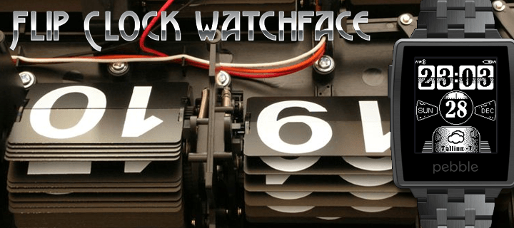
I always liked watches with flipping numbers, plates, so popular in America. A few years ago, I even thought about buying a HTC smartphone just because the watch was made in that style there. This is exactly the dial I wanted to make.
I led the entire development in a special online service from the watch makers, CloudPebble. Honestly, its functionality did not just amaze me, but it really shocked me. All code is written in an editor with convenient highlighting and auto-completion. All graphics are added through a special resource manager. Everything compiles in CloudPebble too, and the application instantly loads into your watch - it just can't be more convenient. You can also download the compiled file to a computer or take a screenshot of the dial. As I understand it, the screenshot is actually taken on my watch, and not on some emulator on the server, because if you change the watch dial at the last second, the screenshot will be taken from it already. Another nice feature of CloudPebble is its integration with GitHub, which I also gladly took advantage of.
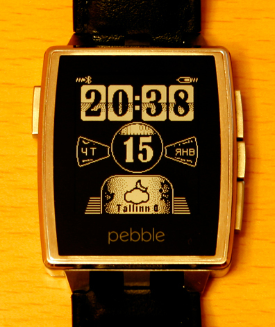
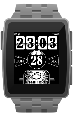 The lion's share of the time it took me to draw graphics. As the graphics were drawn, I immediately added it to the project and arranged it where necessary. I took the C code without changes from the tmnhy example and then changed it to fit your needs. Quite unexpectedly for me, the dial has acquired a slight touch of steampunk. When all the graphics were ready and added to the project, the unexpected happened: I exceeded the memory limit on the watch. The dial was compiled without errors and loaded into the watch, where it instantly “fell”. It was necessary to cut the schedule. I started with “saving on matches” and cut off the “thread” at the battery indicator. Now, instead of this “thread”, a Bluetooth indicator is shown, in which the letter B crawled out of the screen. Visually, there is no difference with the previous version at all. Next was the most time-consuming - the central unit with the date and seconds. I removed the background image with the circle and drew it programmatically.
One nuance was found out here: to draw a circle, the coordinates of the center and radius are set, so its size in pixels will always be odd and it is impossible to position it strictly in the center. I had to slightly move everything else, since the old circle had an even size. For the same reason, the seconds indicator did not fit into the circle and it also had to be redrawn. And this is 60 sprites, if that ... However, if you redraw, you need to squeeze the maximum out of it. As a result, everything that really does not change in the seconds indicator I transferred to the background image, which allowed to significantly reduce the resolution of the sprite. We multiply by 60 and we get significant savings, which, in the end, allowed me to fit into the byte budget.
The last problem I had to solve was the name of the city in the weather block. The fact is that only a not very long name was placed there, but what to do with a long one? Having played around with fonts, I realized that this is not an option. As a result, I got out like this: if the name of the city is short enough, it also shows the temperature, if long - only the temperature.
The second integral part of the dial is the settings page. In fact, this is a regular web page, the address of which is registered in the dial settings and which receives and sends back some variables to the dial. The page did not take much time, since no adaptability and multibrowser was required here. For optimization purposes, I minified all CSS and JS and included them in the page code. As a result, it turned out simple and quite optimized: no graphics, and the only file to include is jQuery.
In this form, the dial was published, but one thing still haunted me. In order to correctly configure the weather display, the user had to find somewhere the ID of his city on openweathermap.org and enter it in the input field on the settings page, which is extremely inconvenient. I found the official list of cities, consisting of ... 74 thousand points. It is clear that loading such a monster as a whole is not an option. The solution I chose is select with AJAX content.
Finding a suitable scriptand “practicing on cats,” I put the entire list of cities in the database. Here a couple of nuances were revealed: 1) cities with the same names existed in different countries, and 2) some cities (apparently large enough) had several IDs attached to different coordinates. I solved the first problem by adding a state flag in front of the name of the city. Flags, again for optimization reasons, found such that they were in one sprite. I did not find an adequate solution for the second problem and therefore just used GROUP BY in the SQL query to “cut off” duplicates.