The answer to smartphone addiction is a bad smartphone?
- Transfer

My smartphone has turned gray, and that's great.
To get rid of smartphone addiction, I joined a small group of people who set gray halftones on their screens: we removed the colors and use the range of shades from white to black. The idea that has become popular thanks to technological ethics by Tristan Harris is to make the sparkling screen less challenging.
I used a screen with gray shades for a couple of days, and it is simply amazing how much my nervous habit of clutching at the phone was reduced. What made me think: perhaps one of the ways to break attachment to a smartphone is to make it a little worse. As it turns out, we are simple animals, which bright colors excite.
Silicon Valley companies like Facebook and Google are aware of this, and are turning more and more to the field of applied neuroscience to understand how the brain responds to colors in applications, which gives us pleasure and holds our eyes. New research shows how important color is to our understanding of priorities and emotions.
However, not everyone wants to be crazy about their screen. This week, two major investors, citing a long-term health threat, turned to Appleasking them to find out how parents can be helped to limit their children’s use of iPhones and iPads. In addition, among some of the oldest employees of technology companies, a movement is growing in strength that warns against the products they produce. And many consumers are starting to think about how this affects our thinking.
Mack McKelvey, executive director of marketing at SalientMG in Washington, says she’s aware of the tricks that phones use so you can use them longer and get back to them as quickly as possible.

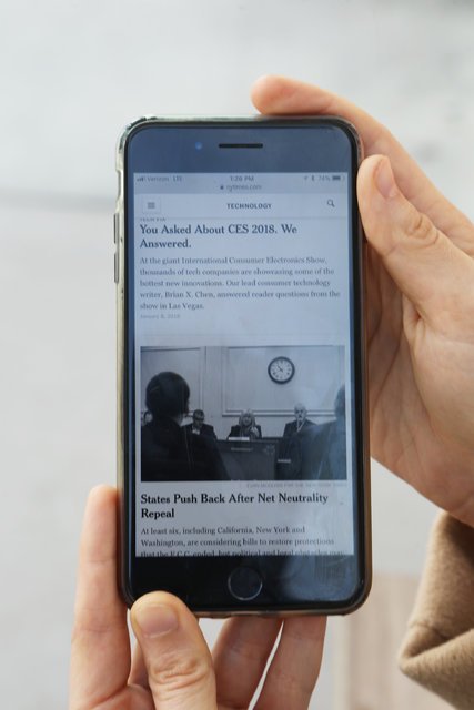
Phone of the author of the text in monochrome.
“You are not buying black and white cereal packages for breakfast; you are buying truly stimulating color boxes. The creators of the applications have developed really cool tiles, cool shapes, cool colors - everything is designed to stimulate you, ”says McKelvey. “However, there is a living world outside, and my phone should not replace it.”
She also decided to switch to monochrome. However, this turned out to be more complicated than she expected.
“It took me about 40 minutes to figure it out. The developers hid this setting, says McKelvey. “You need to really want to do this” (if you want to try, here are a few tips ).
The person Facebook and others are talking to is Thomas Z. Ramsey, the executive director of Neurons, a Copenhagen company that has been around for four years. His company uses brain scans and eye tracking techniques to study applications, upgrade, and create future technologies. A company often measures the electrical activity of a consumer’s brain when immersed in a telephone, for example, messaging or flipping through Facebook.
According to Ramsey, usually the goal of a product is to inspire positive emotions and attract the attention of the consumer without irritating him. Over the past year, he says, Facebook has been his company's largest customer, and the tech giant has published part of this study.. “We have so much work that we want to pinch ourselves,” Ramsey shares.
“Color and size are the cornerstones when it comes to capturing human attention, and attention is the new currency,” he says. “An interface that captures attention but does not cause disturbance, which deliberately does not intrude into someone else's space, is a fine line.”
According to Ramsey, shades of gray return the right to choose.
Companies use colors to indulge subconscious decisions, he says. (For example, I may want to open mail, but I will get to Instagram when I see its colored button). Phone in gray tones eliminates this manipulation. Ramsay says this action revives "controlled attention."
“This is a very good idea. You also need to turn off the sound, ”he says.
Bevil Conway, a researcher at the National Eye Institute, studies color and emotion and says that for Silicon Valley companies, one way to reduce people's dependence on phones is to use a more elaborate color palette.
“Color is not a signal for detecting objects; in fact, it is something more substantial: it tells us what is most likely to be considered important,” Conway says. - If you have a lot of colors and contrast, then you are in a constant state of attracting attention. Your attention system all the time says: “Look, look, look here“ ”.
Conway believes that just as people think about the color scheme when choosing an interior for a living room, they should think about color when it comes to the phone’s home screen.
“If you had a color palette, you would have got a phone that looks nice and not addictive, it would have some focus, but, of course, no one wants you to do this,” he says. “Because they want you to look at the screen.”
Silicon Valley fights for our attention, and often I feel like the very last person to have control over their own eyes. After I put shades of gray on the smartphone screen, I did not become another person out of the blue, but I feel that now I have more control over the phone, which now looks more like an instrument than a toy. If I unlock to write an email, it’s less likely that I will forget my goal and click on the Instagram icon. If I stand in line for coffee, this gray rectangle does not look as delightful entertainment as it once was.
Switching the screen of the smartphone allowed me to quite noticeably realize that here I still have some choice.
