December 1, 2017 at 02:46
Learn CSS Grid in 5 Minutes
- Transfer
Quickly get acquainted with the future of website layouts.
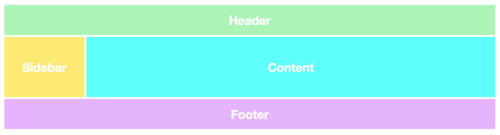
Grid layouts are fundamental to website design, and the CSS Grid module is the most powerful and easiest tool to create it.
This year, the module also received native support for the main browsers (Safari, Chrome, Firefox), so I believe that all front-end developers will have to study this technology in the near future.
In this article, I'll quickly tell you about the basics of CSS Grid.
I am also working on an in-depth CSS Grid course, which I will start for free in December. Become familiar with the preview of the course here .
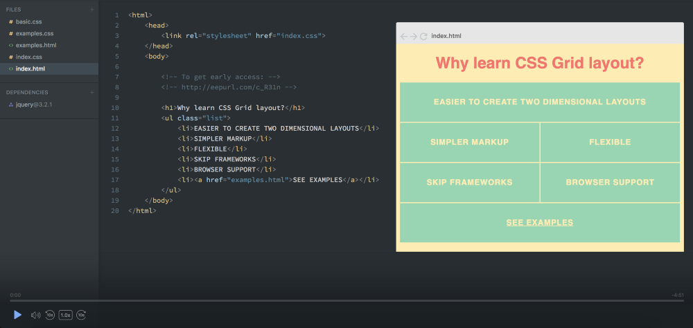
The two main components of a CSS Grid are the wrapper (Parent) and the elements (Children). A wrapper is actually a grid, and elements are content inside the grid.
Here is the markup for a wrapper with six elements in it:
To turn our div wrapper into a grid, we just give it a grid display:
But this still does not do anything, because we have not determined how we want our grid to look. Now it just stacks 6 divs on top of each other.

I added a few styles, but this has nothing to do with CSS Grid.
To make it two-dimensional, we need to define columns and rows. Let's create three columns and two rows. We will use the
Since we wrote three values for
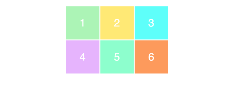
The values determine the width of our columns (100px) and the height for our rows (50px). Here is the result:

To make sure you understand the relationship between the values and what the grid looks like, take a look at this example.
Try to understand the relationship between code and layout.
Here's what it looks like:

The next thing you need to know is how to place elements on a grid. Here you get superpowers, since creating layouts is very simple.
Let's create a 3x3 grid using the same markup as before.
This will result in the following layout:
To position and resize elements, we will indicate them and use the properties
Here we are talking about what we want to

You are probably confused why we have 4 columns, when we have only 3 columns. Take a look at this image where I displayed the column lines in black:
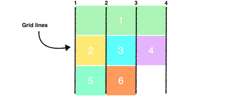
Note that now we use all the rows in the grid. When we made the first element occupy the entire first row, he pushed the remaining elements down.
Finally, I would like to show a simpler syntax for the example above:
To make sure you understand this concept correctly, let's rebuild the elements a bit.
Here's how it looks on the page. Try to understand why it looks like this. It should not be too complicated.

That's all.
PS
Continuation of "How to quickly design a site using CSS Grid . "
The translation was supported by the EDISON Software company , which professionally develops websites of government agencies on Bitrix and creates a useful web application for administering the electronic library .
Grid layouts are fundamental to website design, and the CSS Grid module is the most powerful and easiest tool to create it.
This year, the module also received native support for the main browsers (Safari, Chrome, Firefox), so I believe that all front-end developers will have to study this technology in the near future.
In this article, I'll quickly tell you about the basics of CSS Grid.
I am also working on an in-depth CSS Grid course, which I will start for free in December. Become familiar with the preview of the course here .
Your First CSS Grid Layout
The two main components of a CSS Grid are the wrapper (Parent) and the elements (Children). A wrapper is actually a grid, and elements are content inside the grid.
Here is the markup for a wrapper with six elements in it:
123456To turn our div wrapper into a grid, we just give it a grid display:
.wrapper {
    display: grid;
}
But this still does not do anything, because we have not determined how we want our grid to look. Now it just stacks 6 divs on top of each other.
I added a few styles, but this has nothing to do with CSS Grid.
Columns and Rows
To make it two-dimensional, we need to define columns and rows. Let's create three columns and two rows. We will use the
grid-template-rowand properties grid-template-column..wrapper {
display: grid;
grid-template-columns: 100px 100px 100px;
grid-template-rows: 50px 50px;
}Since we wrote three values for
grid-template-columns, we get three columns. And we get two lines, since we specified two values for grid-template-rows. The values determine the width of our columns (100px) and the height for our rows (50px). Here is the result:
To make sure you understand the relationship between the values and what the grid looks like, take a look at this example.
.wrapper {
    display: grid;
    grid-template-columns: 200px 50px 100px;
    grid-template-rows: 100px 30px;
}
Try to understand the relationship between code and layout.
Here's what it looks like:
Arrangement of elements
The next thing you need to know is how to place elements on a grid. Here you get superpowers, since creating layouts is very simple.
Let's create a 3x3 grid using the same markup as before.
.wrapper {
    display: grid;
    grid-template-columns: 100px 100px 100px;
    grid-template-rows: 100px 100px 100px;
}
This will result in the following layout:
Notice that we only see the 3x2 grid on the page, while we defined it as a 3x3 grid. This is because we have only six elements to fill the grid. If we had three more, then the bottom line would be filled.
To position and resize elements, we will indicate them and use the properties
grid-columnand grid-row:.item1 {
grid-column-start: 1;
grid-column-end: 4;
}Here we are talking about what we want to
item1start from the first grid line and end on the fourth column. In other words, it will take the whole line. Here is how it will look on the screen:You are probably confused why we have 4 columns, when we have only 3 columns. Take a look at this image where I displayed the column lines in black:
Note that now we use all the rows in the grid. When we made the first element occupy the entire first row, he pushed the remaining elements down.
Finally, I would like to show a simpler syntax for the example above:
.item1 {
    grid-column: 1 / 4;
}
To make sure you understand this concept correctly, let's rebuild the elements a bit.
.item1 {
    grid-column-start: 1;
    grid-column-end: 3;
}
.item3 {
    grid-row-start: 2;
    grid-row-end: 4;
}
.item4 {
    grid-column-start: 2;
    grid-column-end: 4;
}
Here's how it looks on the page. Try to understand why it looks like this. It should not be too complicated.
That's all.
PS
Continuation of "How to quickly design a site using CSS Grid . "
The translation was supported by the EDISON Software company , which professionally develops websites of government agencies on Bitrix and creates a useful web application for administering the electronic library .