Strava global heatmap: now 6 times hotter
- Transfer
I am pleased to announce the first major update to the global heatmap at Strava Labs since 2015. This update includes six times more data than before - in the amount of 1 billion activities from the entire Strava database until September 2017.
Our global heatmap is the largest and most detailed, and it is the world's finest dataset of its kind. This is a direct visualization of the activities of the global Strava athletes network. To give an idea of the scale, the new heatmap includes:
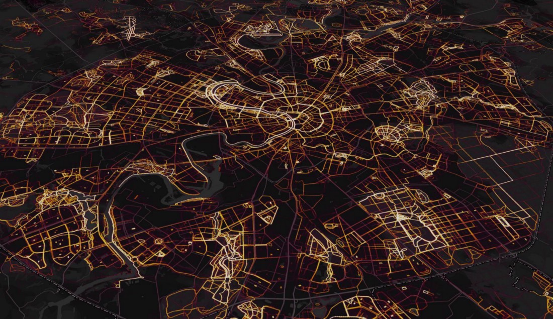
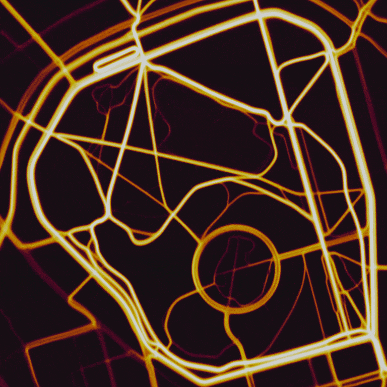
The heat map of Moscow shows the pan / tilt function in Mapbox GL
In addition to simply increasing the amount of data, we completely rewrote the heat map code. This has significantly improved the quality of rendering. In the highlighted areas, the resolution is doubled. Activity data is rasterized by route, not point by point. The normalization technique has also been improved, which gives more detailed and beautiful visualizations.
Heatmaps are already available at Strava Labs and Strava Route Builder . The rest of the article is devoted to a more technical description of this update.
The heatmap update was hindered by two technical problems:
The heatmap generation code was completely rewritten using Apache Spark and Scala. The new code uses a new infrastructure with mass access to the stream of activity and supports the parallelization on each stage from start to finish. After these changes, we completely solved all the problems of scaling. A complete global heatmap is built on several hundred machines in just a few hours, with a total cost of computing operations of only a few hundred dollars. In the future, the changes made will allow updating the heatmap on a regular basis.
Other parts of this article detail how each stage of the Spark heatmap task works, and describes specific rendering improvements.
Input streams with initial activity data are received from the Spark / S3 / Parquet data warehouse. This data includes each of the 3 trillion GPS points ever uploaded to Strava. Several algorithms clean and filter this data.
The platform has numerous restrictions for protecting privacy , which must be observed:
Additional filters eliminate erroneous data. Activities with run speeds higher than reasonable are excluded from the heat layer of runners because they were most likely mistakenly labeled as “run”. There are the same top maximum speed limits for cyclists to separate them from cars and planes.
Data on immovable objects has an undesirable side effect - they show the addresses where people live or work. The new algorithm identifies athlete stopping points much better. If the value of the time-averaged flow rate of activity becomes too small at any moment, then the corresponding points of this activity are filtered out until the activity exceeds a certain radius from the initial stopping point.
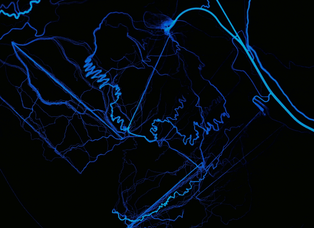
A comparison of the rendering before (above) and after (below) adding artificial noise to eliminate artifacts from devices that correct GPS data in accordance with the coordinates of the nearest road.
Many devices (primarily the iPhone) sometimes “fix” the GPS signal in residential areas, linking it to the known geometry of the road network, and not to the actual coordinates. This leads to an unsightly artifact when on some streets the width of the heat path is only one pixel. Now we are fixing this by adding a random bias (from a normal distribution two meters wide) over all points of each activity. This noise level is sufficient to suppress the artifact without noticeable blurring of other data.
We also rule out any “virtual” activities such as Zwift bike races because they include fake GPS data.
After filtering, the latitude / longitude coordinates of all points are transmitted to the Web Mercator Tile at zoom level 16. This level is a mosaic of the world of 2 16 × 2 16 tiles, each 256 × 256 pixels in size.
An old heatmap rasterized each GPS point exactly one pixel. This approach was often a hindrance because activities are recorded at a maximum speed of one data point per second. Because of this, visible artifacts often occur in areas of low activity: the write speed is such that spaces between pixels appear. In addition, deviations appear in areas where the movement of athletes slows down (compare the ascent to the hill and the descent). As an additional, more detailed zoom level appeared on the new heatmap (maximum spatial resolution increased from 4 to 2 meters), the problem became even more noticeable. Instead of the old algorithm, the new map displays each activity as an ideal pixel route that combines continuous GPS points.
To achieve this in parallel computing, you need to handle the case when the neighboring route points belong to different tiles. Each such pair of points is re-processed to include intermediate points along the route line at the border of each tile that it crosses. After such processing, all line segments begin and end on the same tile or have zero length and can be skipped. Thus, we can present our data as direct products (Tile, Array [TilePixel]) , where Array [TilePixel] is a continuous series of coordinates that describes the route of each activity inside the tile. The data set is then grouped by tiles, so that all the data needed to draw each tile is mapped to one machine.
Each consecutive pair of pixels in the tile is then rasterized as a line segment using the Bresenham algorithm . This step of drawing a line should be extremely fast, because it runs trillions of times. The tile itself at this stage is simply an Array [Double] array (256 * 256) , which represents the total number of segments including each pixel.
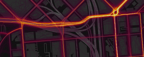
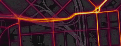
A comparison of the rendering shows the benefits of rasterizing paths over points and adding extra data. Location: Bachelor Volcano, Oregon .
At the largest zoom, we fill over 60 million tiles. This is a problem because directly storing each tile in the form of double arrays will require a minimum of 60 million × 256 × 256 × 8 bytes = ~ 30 terabytes of memory. Although this amount of memory can be allocated in a temporary cluster, this will be an unnecessary waste of resources, taking into account the fact that tiles usually allow strong compression, because most of the pixel values are zero. For performance reasons, we decided that a sparse array would not be an effective solution. In Spark, you can greatly reduce the maximum amount of memory needed if you organize parallelism at this stage, which is many times more than the number of active tasks in the cluster. Tiles from the completed task are immediately converted, compressed and written to disk,
Normalization is a function that compares the initial heat value for each pixel after rasterization from an unlimited area [0, Inf) with a limited area [0, 1] of the color map. The choice of a normalization method greatly affects how the heatmap looks. This function should be monotonous so that larger values correspond to stronger “heat”, but there are many ways to approach this problem. If you apply a single globalization function to the entire map, then the color for the maximum heat level will be displayed only in the most popular areas of Strava.
The method of smooth normalization (slick normalization) provides for the calculation of CDF (distribution function) for the initial values. Thus, the normalized value of this pixel will be the percentage of pixels with lower heat. This method provides maximum contrast, guaranteeing the same number of pixels of each color. In photo processing, this technique is called histogram alignment . We use it with minor modifications to avoid quantization artifacts in low-visited areas.
Calculation of CDF for the initial values of heat in only one tile in practice will not give a very good result, because a map with a size of at least 5 × 5 tiles (each of 256 × 256 pixels) is usually displayed on the screen. Therefore, we calculate the total CDF for the tile using its heat values and the values of neighboring areas within a radius of five tiles. This ensures that the normalization function can only be scaled larger than the size of the normal screen for viewing.
In real computing, for performance's sake, an approximate CDF is used: for this, the input data is simply sorted, from where a certain number of samples are taken. We found that it is better to calculate the offset CDF by taking more samples closer to the end of the array. This is because in most cases, interesting data on heat is contained only in a small part of the pixels.

Comparison of normalization methods (left: old, right: new) at 33% zoom to better see the effect. The new method guarantees the visibility on one image of any range of source heat data. In addition, bilinear interpolation of the normalization function between tiles prevents any visible artifacts at the borders of the tiles. Location: San Francisco Bay Area .
The advantage of this approach is that on the heatmap there is a perfectly uniform distribution of colors. In a sense, this leads to the fact that the heat map transmits maximum information about the relative values of heat. We also subjectively believe that it looks really beautiful.
The disadvantage of this approach is that the heat map now does not correspond to absolute quantitative values. The same color corresponds to the same heat level only at the local level. Therefore, for government agencies, departments of planning, security and transport, we offer a more complex product Strava Metro with an accurate quantitative version of the heat map.
So far, we have used the normalization function for each tile, which is a CDF of pixels within several neighboring tiles. However, the CDF is still abruptly changing at the borders of tiles so that it looks like an ugly artifact, especially in areas with a large gradient of absolute heat.
To solve this problem, we applied bilinear interpolation. The actual value of each pixel is derived from the sum of the bilinear coefficients of the four nearest neighboring tiles: max (0, (1-x) (1-y)) , where x, y are the distances from the center of the tile. Such interpolation requires more computational resources, because for each pixel you need to evaluate four CDFs instead of one.
So far, we have only talked about heat generation at one zoom level. When moving to other levels, the initial data simply adds up - four tiles merge into one with a resolution of a quarter of the original. Then, the normalization process is restarted. This continues until the last zoom level is reached (one tile for the whole world).
It is very exciting to watch as the new stages of the Spark process capture less and less data exponentially, so computing requires exponentially less and less time. Having spent about an hour calculating the first zoom level, the process effectively finished, calculating the last few levels in less than a second.
Zooming from a single tile in London (UK) to the whole world
As a result, the normalized heat data for each pixel takes up one byte, because we display the value on the color map, and the heat value is included in an array of 256 colors. This data is stored in S3, with the grouping of neighboring tiles into one file to reduce the total number of files on the hosting. At the time of the request, the server takes and caches the corresponding meta file from S3, then on the fly it generates PNG based on the source data and the requested color map. Then our CDN (Cloudfront) caches all tile images.
Various frontend updates have also been made. Now we have switched to Mapbox GL . Thanks to this, smooth zoom has become possible, as well as controlling bizarre turns and inclinations. We hope you enjoy exploring this updated heatmap .
Our global heatmap is the largest and most detailed, and it is the world's finest dataset of its kind. This is a direct visualization of the activities of the global Strava athletes network. To give an idea of the scale, the new heatmap includes:
- 1 billion activities
- 3 trillion points of longitude / latitude
- 13 trillion pixels after rasterization
- 10 terabytes of raw data
- Total route distance: 27 billion kilometers
- Recording total activity time: 200 thousand years
- 5% of terrestrial land is covered with tiles
The heat map of Moscow shows the pan / tilt function in Mapbox GL
In addition to simply increasing the amount of data, we completely rewrote the heat map code. This has significantly improved the quality of rendering. In the highlighted areas, the resolution is doubled. Activity data is rasterized by route, not point by point. The normalization technique has also been improved, which gives more detailed and beautiful visualizations.
Heatmaps are already available at Strava Labs and Strava Route Builder . The rest of the article is devoted to a more technical description of this update.
Background
The heatmap update was hindered by two technical problems:
- The previous version of the heatmap was written in low-level C and was designed to work on only one machine. Given this limitation, updating heatmaps would take months.
- Accessing stream data requires one S3 request per activity, so reading input for a billion activities would cost thousands of dollars and be difficult to manage.
The heatmap generation code was completely rewritten using Apache Spark and Scala. The new code uses a new infrastructure with mass access to the stream of activity and supports the parallelization on each stage from start to finish. After these changes, we completely solved all the problems of scaling. A complete global heatmap is built on several hundred machines in just a few hours, with a total cost of computing operations of only a few hundred dollars. In the future, the changes made will allow updating the heatmap on a regular basis.
Other parts of this article detail how each stage of the Spark heatmap task works, and describes specific rendering improvements.
Input and Filtering
Input streams with initial activity data are received from the Spark / S3 / Parquet data warehouse. This data includes each of the 3 trillion GPS points ever uploaded to Strava. Several algorithms clean and filter this data.
The platform has numerous restrictions for protecting privacy , which must be observed:
- Private activities are immediately excluded from processing
- Activity areas are trimmed according to user-defined privacy zones
- Athletes who have disabled the Metro / heatmap function in the privacy settings are completely excluded from processing
Additional filters eliminate erroneous data. Activities with run speeds higher than reasonable are excluded from the heat layer of runners because they were most likely mistakenly labeled as “run”. There are the same top maximum speed limits for cyclists to separate them from cars and planes.
Data on immovable objects has an undesirable side effect - they show the addresses where people live or work. The new algorithm identifies athlete stopping points much better. If the value of the time-averaged flow rate of activity becomes too small at any moment, then the corresponding points of this activity are filtered out until the activity exceeds a certain radius from the initial stopping point.
A comparison of the rendering before (above) and after (below) adding artificial noise to eliminate artifacts from devices that correct GPS data in accordance with the coordinates of the nearest road.
Many devices (primarily the iPhone) sometimes “fix” the GPS signal in residential areas, linking it to the known geometry of the road network, and not to the actual coordinates. This leads to an unsightly artifact when on some streets the width of the heat path is only one pixel. Now we are fixing this by adding a random bias (from a normal distribution two meters wide) over all points of each activity. This noise level is sufficient to suppress the artifact without noticeable blurring of other data.
We also rule out any “virtual” activities such as Zwift bike races because they include fake GPS data.
Thermal rasterization
After filtering, the latitude / longitude coordinates of all points are transmitted to the Web Mercator Tile at zoom level 16. This level is a mosaic of the world of 2 16 × 2 16 tiles, each 256 × 256 pixels in size.
An old heatmap rasterized each GPS point exactly one pixel. This approach was often a hindrance because activities are recorded at a maximum speed of one data point per second. Because of this, visible artifacts often occur in areas of low activity: the write speed is such that spaces between pixels appear. In addition, deviations appear in areas where the movement of athletes slows down (compare the ascent to the hill and the descent). As an additional, more detailed zoom level appeared on the new heatmap (maximum spatial resolution increased from 4 to 2 meters), the problem became even more noticeable. Instead of the old algorithm, the new map displays each activity as an ideal pixel route that combines continuous GPS points.
To achieve this in parallel computing, you need to handle the case when the neighboring route points belong to different tiles. Each such pair of points is re-processed to include intermediate points along the route line at the border of each tile that it crosses. After such processing, all line segments begin and end on the same tile or have zero length and can be skipped. Thus, we can present our data as direct products (Tile, Array [TilePixel]) , where Array [TilePixel] is a continuous series of coordinates that describes the route of each activity inside the tile. The data set is then grouped by tiles, so that all the data needed to draw each tile is mapped to one machine.
Each consecutive pair of pixels in the tile is then rasterized as a line segment using the Bresenham algorithm . This step of drawing a line should be extremely fast, because it runs trillions of times. The tile itself at this stage is simply an Array [Double] array (256 * 256) , which represents the total number of segments including each pixel.
A comparison of the rendering shows the benefits of rasterizing paths over points and adding extra data. Location: Bachelor Volcano, Oregon .
At the largest zoom, we fill over 60 million tiles. This is a problem because directly storing each tile in the form of double arrays will require a minimum of 60 million × 256 × 256 × 8 bytes = ~ 30 terabytes of memory. Although this amount of memory can be allocated in a temporary cluster, this will be an unnecessary waste of resources, taking into account the fact that tiles usually allow strong compression, because most of the pixel values are zero. For performance reasons, we decided that a sparse array would not be an effective solution. In Spark, you can greatly reduce the maximum amount of memory needed if you organize parallelism at this stage, which is many times more than the number of active tasks in the cluster. Tiles from the completed task are immediately converted, compressed and written to disk,
Thermal normalization
Normalization is a function that compares the initial heat value for each pixel after rasterization from an unlimited area [0, Inf) with a limited area [0, 1] of the color map. The choice of a normalization method greatly affects how the heatmap looks. This function should be monotonous so that larger values correspond to stronger “heat”, but there are many ways to approach this problem. If you apply a single globalization function to the entire map, then the color for the maximum heat level will be displayed only in the most popular areas of Strava.
The method of smooth normalization (slick normalization) provides for the calculation of CDF (distribution function) for the initial values. Thus, the normalized value of this pixel will be the percentage of pixels with lower heat. This method provides maximum contrast, guaranteeing the same number of pixels of each color. In photo processing, this technique is called histogram alignment . We use it with minor modifications to avoid quantization artifacts in low-visited areas.
Calculation of CDF for the initial values of heat in only one tile in practice will not give a very good result, because a map with a size of at least 5 × 5 tiles (each of 256 × 256 pixels) is usually displayed on the screen. Therefore, we calculate the total CDF for the tile using its heat values and the values of neighboring areas within a radius of five tiles. This ensures that the normalization function can only be scaled larger than the size of the normal screen for viewing.
In real computing, for performance's sake, an approximate CDF is used: for this, the input data is simply sorted, from where a certain number of samples are taken. We found that it is better to calculate the offset CDF by taking more samples closer to the end of the array. This is because in most cases, interesting data on heat is contained only in a small part of the pixels.
Comparison of normalization methods (left: old, right: new) at 33% zoom to better see the effect. The new method guarantees the visibility on one image of any range of source heat data. In addition, bilinear interpolation of the normalization function between tiles prevents any visible artifacts at the borders of the tiles. Location: San Francisco Bay Area .
The advantage of this approach is that on the heatmap there is a perfectly uniform distribution of colors. In a sense, this leads to the fact that the heat map transmits maximum information about the relative values of heat. We also subjectively believe that it looks really beautiful.
The disadvantage of this approach is that the heat map now does not correspond to absolute quantitative values. The same color corresponds to the same heat level only at the local level. Therefore, for government agencies, departments of planning, security and transport, we offer a more complex product Strava Metro with an accurate quantitative version of the heat map.
Interpolation of normalization functions across tile boundaries
So far, we have used the normalization function for each tile, which is a CDF of pixels within several neighboring tiles. However, the CDF is still abruptly changing at the borders of tiles so that it looks like an ugly artifact, especially in areas with a large gradient of absolute heat.
To solve this problem, we applied bilinear interpolation. The actual value of each pixel is derived from the sum of the bilinear coefficients of the four nearest neighboring tiles: max (0, (1-x) (1-y)) , where x, y are the distances from the center of the tile. Such interpolation requires more computational resources, because for each pixel you need to evaluate four CDFs instead of one.
Zoom Level Recursion
So far, we have only talked about heat generation at one zoom level. When moving to other levels, the initial data simply adds up - four tiles merge into one with a resolution of a quarter of the original. Then, the normalization process is restarted. This continues until the last zoom level is reached (one tile for the whole world).
It is very exciting to watch as the new stages of the Spark process capture less and less data exponentially, so computing requires exponentially less and less time. Having spent about an hour calculating the first zoom level, the process effectively finished, calculating the last few levels in less than a second.
Zooming from a single tile in London (UK) to the whole world
Issue
As a result, the normalized heat data for each pixel takes up one byte, because we display the value on the color map, and the heat value is included in an array of 256 colors. This data is stored in S3, with the grouping of neighboring tiles into one file to reduce the total number of files on the hosting. At the time of the request, the server takes and caches the corresponding meta file from S3, then on the fly it generates PNG based on the source data and the requested color map. Then our CDN (Cloudfront) caches all tile images.
Various frontend updates have also been made. Now we have switched to Mapbox GL . Thanks to this, smooth zoom has become possible, as well as controlling bizarre turns and inclinations. We hope you enjoy exploring this updated heatmap .