Chronology of the CO level in the US atmosphere (solving the Kaggle problem using Python + Feature Engineering)
- Tutorial
I want to share my experience in solving machine learning and data analysis tasks from Kaggle. This article is positioned as a guide for novice users on the example of a not entirely simple task.
Data Sample The data
sample contains about 8.5 million rows and 29 columns. Here are some of the options:

Task
Import libraries
Next, you need to check the source data for gaps. We will
deduce as a percentage the ratio of the number of gaps in each of the parameters. Based on the results below, the presence of gaps in the parameters ['aqi', 'local_site_name', 'cbsa_name'] is visible.
From the description of the attached data set, I concluded that these parameters can be neglected. Therefore, it is necessary to “delete” these parameters from the data set.
Detecting Dependencies on the Source Dataset
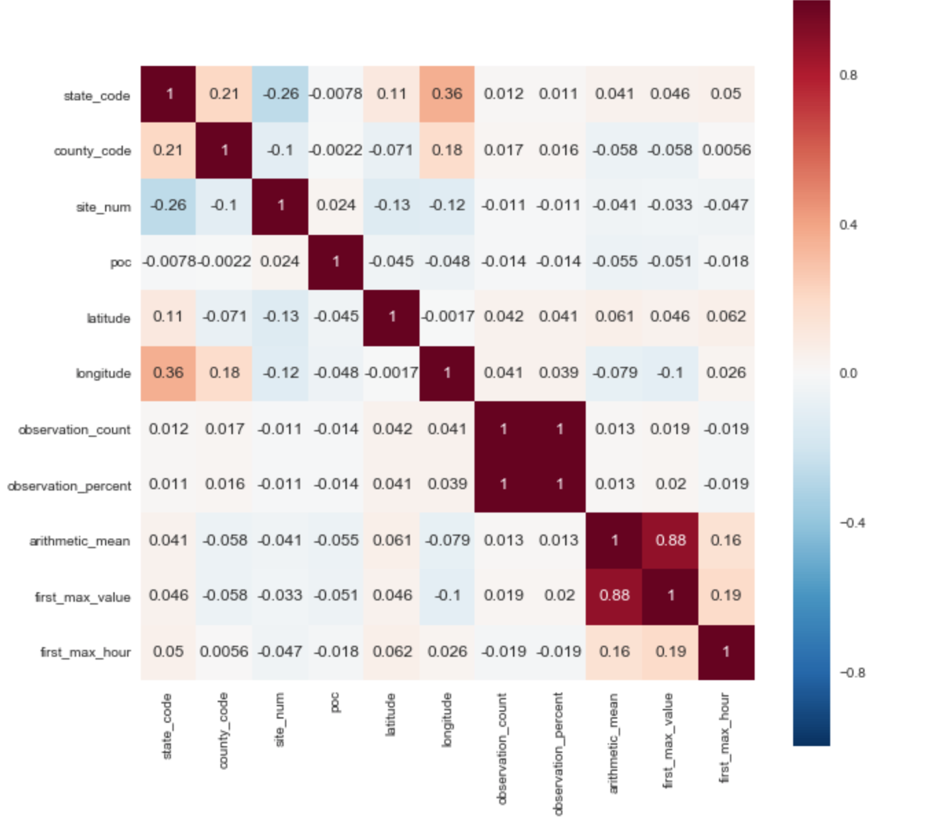
I selected the ['arithmetic_mean'] parameter as the target variable. Based on the correlation matrix, one can immediately reveal 2 positive correlations with the target parameter: ['arithmetic_mean'] and ['first_max_hour'], ['first_max_hour'].
From the description of the data set, it follows that “first_max_value” is the highest rate for the day, and “first_max_hour” is the hour when the highest rate was recorded.
Conversion of initial parameters:
For the algorithm to work correctly, it is necessary to convert a categorical sign into a numerical one. Several parameters are immediately evident in the data presented above:
“pollutant_standard”, “event_type”, “address”.
Feature Engineering
In the data set we have the date and time. To identify new dependencies and
increase the accuracy of prediction, it is necessary to introduce the seasonal parameter of the seasons.
We also denote each year in the chronological chain as a separate parameter.
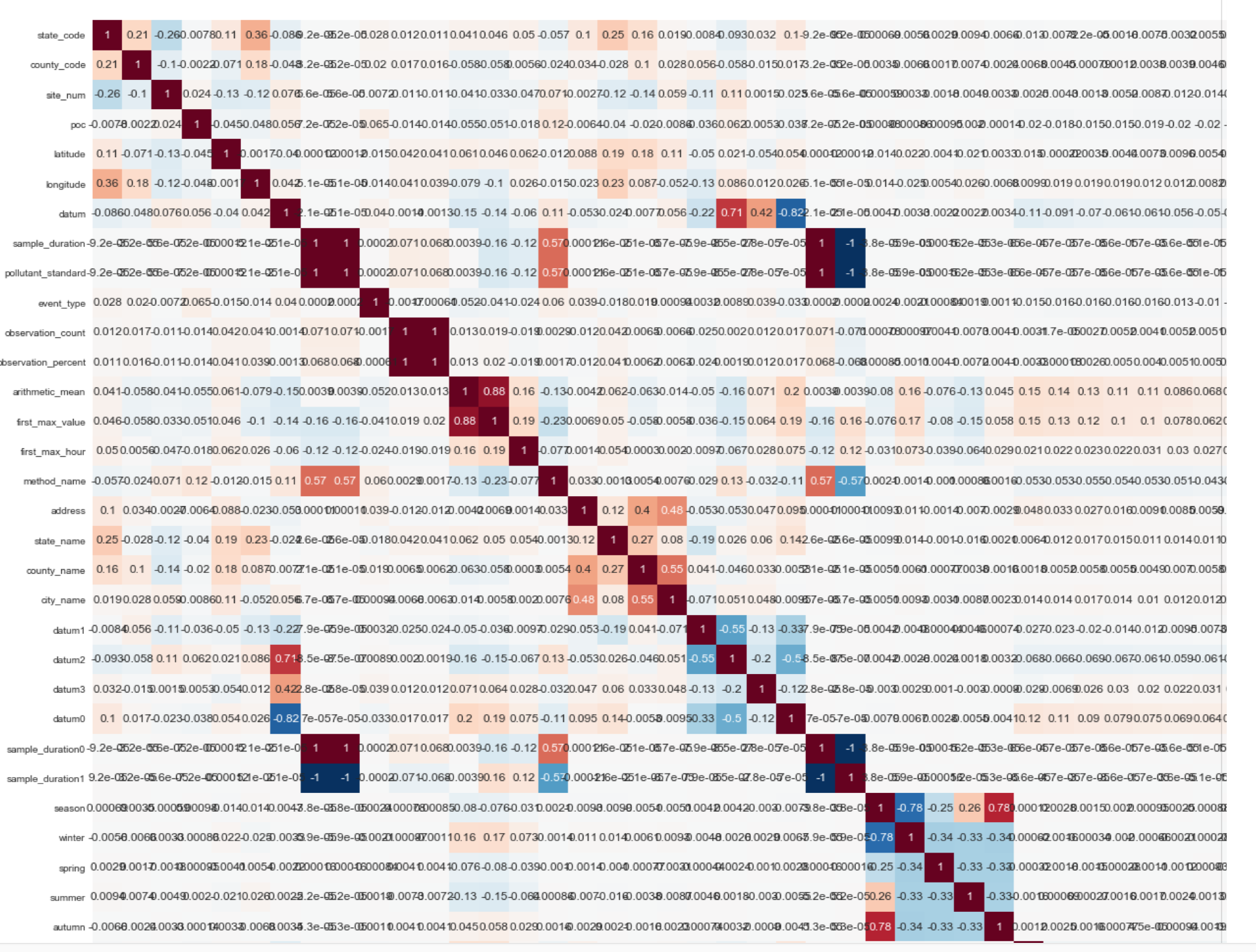
After the transformations, the dimension of the data set was significantly increased, as the number of parameters increased from 22 to 114.
Below is a fragment (1/4 of the correlation matrix of the final data set):
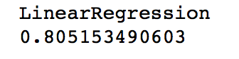
Prediction model:
As a tool for constructing the prediction hypothesis, I chose linear regression. The accuracy of the prediction on the original data set ranged from 17% to 22%. The accuracy of the prediction after introducing new variables and transforming the data set was:
Data visualization:
Map of the United States with the display of points where measurements were made:

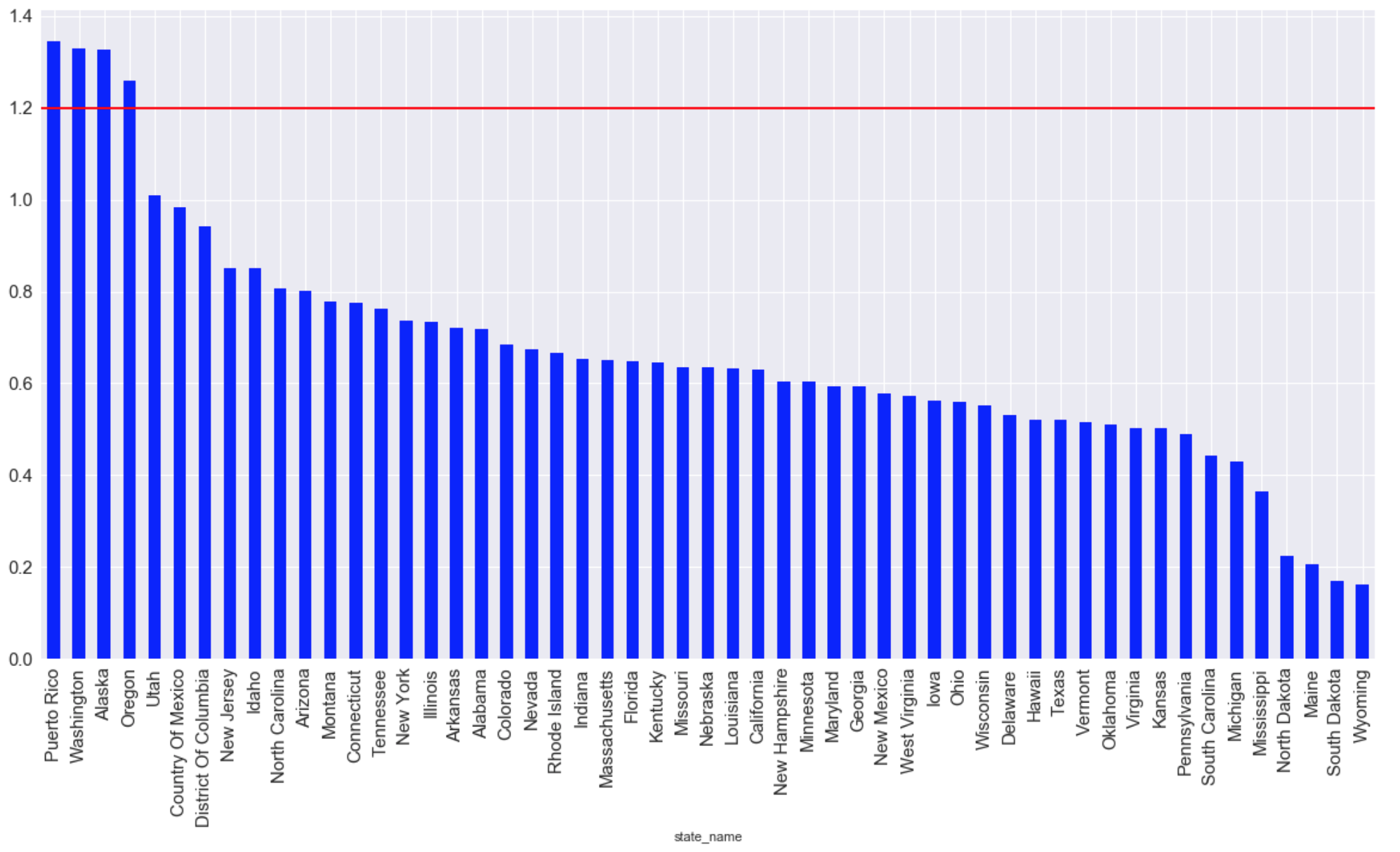
The states with the highest average CO emissions of all time (the red line indicates the maximum allowable living level):
Timeline of emission level development:

Data Sample The data
sample contains about 8.5 million rows and 29 columns. Here are some of the options:
- Latitude
- Longitude
- Sampling Method-method_name
- Date and time of sampling-date_local
Task
- Find the parameters that affect the level of CO in the atmosphere.
- Creating a hypothesis that predicts CO levels in the atmosphere.
- Create a few simple visualizations.
Import libraries
import pandas as pd
import matplotlib.pyplot as plt
from sklearn import preprocessing
from mpl_toolkits.basemap import Basemap
import matplotlib.pyplot as plt
import seaborn as sns
import numpy as np
from sklearn import preprocessing
import warnings
warnings.filterwarnings('ignore')
import random as rn
from sklearn.cross_validation import train_test_split
from sklearn.naive_bayes import GaussianNB
from sklearn.ensemble import RandomForestRegressor
from sklearn.neighbors import KNeighborsClassifier
from sklearn.linear_model import LogisticRegression
from sklearn import svm
Next, you need to check the source data for gaps. We will
deduce as a percentage the ratio of the number of gaps in each of the parameters. Based on the results below, the presence of gaps in the parameters ['aqi', 'local_site_name', 'cbsa_name'] is visible.
(data.isnull().sum()/len(data)*100).sort_values(ascending=False)method_code 50.011581
aqi 49.988419
local_site_name 27.232437
cbsa_name 2.442745
date_of_last_change 0.000000
date_local 0.000000
county_code 0.000000
site_num 0.000000
parameter_code 0.000000
poc 0.000000
latitude 0.000000
longitude 0.000000
...
From the description of the attached data set, I concluded that these parameters can be neglected. Therefore, it is necessary to “delete” these parameters from the data set.
def del_data_func(data,columns):
    for column_name in columns: del data[column_name]
del_list = data[['method_code','aqi','local_site_name','cbsa_name','parameter_code',
                 'units_of_measure','parameter_name']]
del_data_func (data, del_list)
Detecting Dependencies on the Source Dataset
I selected the ['arithmetic_mean'] parameter as the target variable. Based on the correlation matrix, one can immediately reveal 2 positive correlations with the target parameter: ['arithmetic_mean'] and ['first_max_hour'], ['first_max_hour'].
From the description of the data set, it follows that “first_max_value” is the highest rate for the day, and “first_max_hour” is the hour when the highest rate was recorded.
Conversion of initial parameters:
For the algorithm to work correctly, it is necessary to convert a categorical sign into a numerical one. Several parameters are immediately evident in the data presented above:
“pollutant_standard”, “event_type”, “address”.
data['county_name'] = data['county_name'].factorize()[0]
data['pollutant_standard'] = data['pollutant_standard'].factorize()[0]
data['event_type'] = data['event_type'].factorize()[0]
data['method_name'] = data['method_name'].factorize()[0]
data['address'] = data['address'].factorize()[0]
data['state_name'] = data['state_name'].factorize()[0]
data['county_name'] = data['county_name'].factorize()[0]
data['city_name'] = data['city_name'].factorize()[0]
Feature Engineering
In the data set we have the date and time. To identify new dependencies and
increase the accuracy of prediction, it is necessary to introduce the seasonal parameter of the seasons.
data['season'] = data['date_local'].apply(lambda x: 'winter' if (x[5:7] =='01' or x[5:7] =='02' or x[5:7] =='12') else x)
data['season'] = data['season'].apply(lambda x: 'autumn' if (x[5:7] =='09' or x[5:7] =='10' or x[5:7] =='11') else x)
data['season'] = data['season'].apply(lambda x: 'summer' if (x[5:7] =='06' or x[5:7] =='07' or x[5:7] =='08') else x)
data['season'] = data['season'].apply(lambda x: 'spring' if (x[5:7] =='03' or x[5:7] =='04' or x[5:7] =='05') else x)
data['season'].replace("winter",1,inplace= True)
data['season'].replace("spring",2,inplace = True)
data['season'].replace("summer",3,inplace=True)
data['season'].replace("autumn",4,inplace=True)
data["winter"] = data["season"].apply(lambda x: 1 if x==1 else 0)
data["spring"] = data["season"].apply(lambda x: 1 if x==2 else 0)
data["summer"] = data["season"].apply(lambda x: 1 if x==3 else 0)
data["autumn"] = data["season"].apply(lambda x: 1 if x==4 else 0)
We also denote each year in the chronological chain as a separate parameter.
data['date_local'] = data['date_local'].map(lambda x: str(x)[:4])
data["1990"] = data["date_local"].apply(lambda x: 1 if x=="1990" else 0)
data["1991"] = data["date_local"].apply(lambda x: 1 if x=="1991" else 0)
data["1992"] = data["date_local"].apply(lambda x: 1 if x=="1992" else 0)
data["1993"] = data["date_local"].apply(lambda x: 1 if x=="1993" else 0)
data["1994"] = data["date_local"].apply(lambda x: 1 if x=="1994" else 0)
data["1995"] = data["date_local"].apply(lambda x: 1 if x=="1995" else 0)
data["1996"] = data["date_local"].apply(lambda x: 1 if x=="1996" else 0)
data["1997"] = data["date_local"].apply(lambda x: 1 if x=="1997" else 0)
data["1998"] = data["date_local"].apply(lambda x: 1 if x=="1998" else 0)
data["1999"] = data["date_local"].apply(lambda x: 1 if x=="1999" else 0)
data["2000"] = data["date_local"].apply(lambda x: 1 if x=="2000" else 0)
data["2001"] = data["date_local"].apply(lambda x: 1 if x=="2001" else 0)
data["2002"] = data["date_local"].apply(lambda x: 1 if x=="2002" else 0)
data["2003"] = data["date_local"].apply(lambda x: 1 if x=="2003" else 0)
data["2004"] = data["date_local"].apply(lambda x: 1 if x=="2004" else 0)
data["2005"] = data["date_local"].apply(lambda x: 1 if x=="2005" else 0)
data["2006"] = data["date_local"].apply(lambda x: 1 if x=="2006" else 0)
data["2007"] = data["date_local"].apply(lambda x: 1 if x=="2007" else 0)
data["2008"] = data["date_local"].apply(lambda x: 1 if x=="2008" else 0)
data["2009"] = data["date_local"].apply(lambda x: 1 if x=="2009" else 0)
data["2010"] = data["date_local"].apply(lambda x: 1 if x=="2010" else 0)
data["2011"] = data["date_local"].apply(lambda x: 1 if x=="2011" else 0)
data["2012"] = data["date_local"].apply(lambda x: 1 if x=="2012" else 0)
data["2013"] = data["date_local"].apply(lambda x: 1 if x=="2013" else 0)
data["2014"] = data["date_local"].apply(lambda x: 1 if x=="2014" else 0)
data["2015"] = data["date_local"].apply(lambda x: 1 if x=="2015" else 0)
data["2016"] = data["date_local"].apply(lambda x: 1 if x=="2016" else 0)
data["2017"] = data["date_local"].apply(lambda x: 1 if x=="2017" else 0)
After the transformations, the dimension of the data set was significantly increased, as the number of parameters increased from 22 to 114.
Below is a fragment (1/4 of the correlation matrix of the final data set):
Prediction model:
As a tool for constructing the prediction hypothesis, I chose linear regression. The accuracy of the prediction on the original data set ranged from 17% to 22%. The accuracy of the prediction after introducing new variables and transforming the data set was:
Data visualization:
Map of the United States with the display of points where measurements were made:
m = Basemap(llcrnrlon=-119,llcrnrlat=22,urcrnrlon=-64,urcrnrlat=49,
        projection='lcc',lat_1=33,lat_2=45,lon_0=-95)
longitudes = data["longitude"].tolist()
latitudes = data["latitude"].tolist()
x,y = m(longitudes,latitudes)
fig = plt.figure(figsize=(12,10))
plt.title("Polution areas")
m.plot(x, y, "o", markersize = 3, color = 'red')
m.drawcoastlines()
m.fillcontinents(color='white',lake_color='aqua')
m.drawmapboundary()
m.drawstates()
m.drawcountries()
plt.show()
The states with the highest average CO emissions of all time (the red line indicates the maximum allowable living level):
graph = plt.figure(figsize=(20, 10))
graph = data.groupby(['state_name'])['arithmetic_mean'].mean()
graph = graph.sort_values(ascending=False)
graph.plot (kind="bar",color='blue', fontsize = 15)
plt.grid(b=True, which='both', color='white',linestyle='-')
plt.axhline(y=1.2, xmin=2, xmax=0, linewidth=2, color = 'red', label = 'cc')
plt.show ();
Timeline of emission level development: