New image search interface: 36.5% more efficient

Search Mail.Ru launched a new image search interface. Now it is available at the short address: http://images.mail.ru . The change was triggered by the results of our research, aimed at identifying the preferences and goals of users when searching for images.
We found out a lot of useful things - for example, we realized that most often pictures are searched to ...
- See the place where you are going to go soon
- Find sample photos, learn to take pictures
- Choose cards as a gift
- Decide what purchases to make - from a T-shirt to a car
- Create presentations, articles, wall newspapers
- Just cheer yourself up
We found that while searching for a suitable image, the user goes through three stages:
Let's see what you have here ...
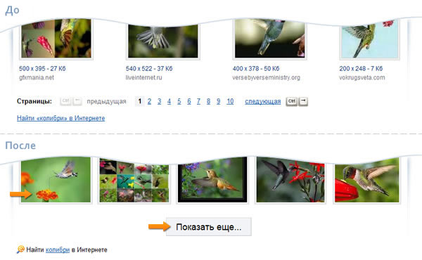
First, the user evaluates whether the search results meet his expectations. Therefore, as a rule, it is not limited to one page of results, but proceeds to the next.As it turned out, according to the results of the analysis, users spend a lot of time on page-by-page navigation, because they have to aim at small numbers. To speed up the page navigation (and, consequently, the search itself), we replaced the page-by-page transition with a large button “Show more ...”, when clicked on which more than 20 additional images. Note that the previous images do not disappear - you can quickly return to them by scrolling to the top.

Why didn’t we do “endless scroll?” We realized that in this case, people quickly scroll down, often not noticing the necessary results and increasing (and by no means reducing) the search time.
Faster, Higher ... Larger!
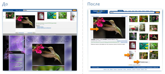
Secondly, if the picture seemed suitable, the user wants it to be larger. Therefore, we made it so that the size of the large picture automatically "adapts" to the size of the browser window.
Make yourself secure ...
Thirdly, among other things, the Search found that users often need to look at other image options, while leaving the selected image “in sight”.We did not leave this need unnoticed - now you can quickly continue the search by scrolling the mouse wheel, and the selected image will be located to the left of the search results. Of course, if necessary, you can quickly return to the list of pictures by simply clicking on the link “Hide picture”.
Are growing
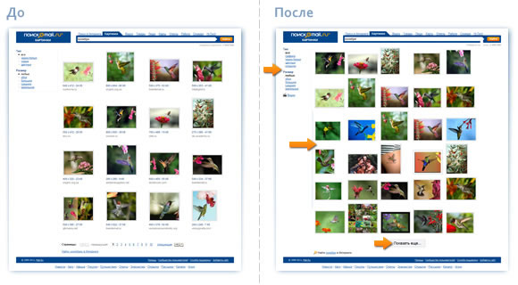
Fourth, now we have 80% more images on one web page - see for yourself: The
new interface is implemented using Ajax technology - this allows navigation without page reloading - faster and more economical. Only those images that are currently visible on the screen are downloaded - this saves traffic and minimizes the time it takes the browser to display a new portion of the images. It turns out a simple formula that is understandable to each user: less traffic -> less time to download -> less money.
In addition, we tried to compensate for the traditional disadvantages of Ajax. For example, you can use the usual browser buttons “Back” and “Forward” and save in your favorite bookmark the image you like.
Plus 36.5% - to everyone!
In order to test the new interface in action, Poisk Mail.Ru conducted a comparative test: before and after interface changes. During the study, users performed typical tasks, and we measured the time spent on their implementation. It turned out that using the new image search interface, users complete their tasks 36.5% faster.You can find out more about the results and testing methodology in our community .
Regards,
Search Team Mail.Ru
