ggplot2: how to easily combine multiple charts in one, part 2
- Transfer
- Tutorial
This article will show you step-by-step how to combine several ggplot graphs in one or more illustrations using the helper functions available in the R ggpubr , cowplot, and gridExtra packages . We also describe how to export the resulting graphs to a file.
We use the nested functions
For example, the code below does the following:
The following combination of features [package of cowplot ] can be used to locate graphics in certain areas of a predetermined size:
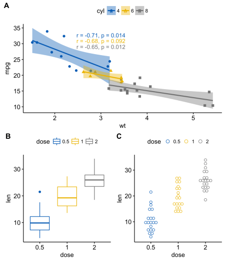
Note that by default, the coordinates change from 0 to 1, and the point (0, 0) is in the lower left corner of the canvas (see illustration below).
It can work with label vectors with associated coordinates.
For example, this way you can combine several graphs of different sizes with a specific location:

The function
For example, the code below does the following:
In the function,
In the code below
You can also add annotation to the output of the function
In order to easily add annotations to the outputs of functions
In the code above we used
The grid package allows you to specify a complex mutual arrangement of graphs using the function
The steps can be described as follows:

To define a common legend for several ordered charts, you can use the function
In the next part:
Reorder rows or columns
Using the ggpubr package
We use the nested functions
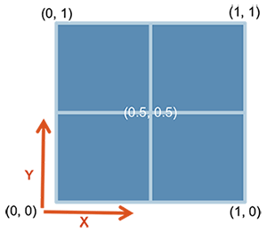
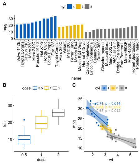
ggarrange()to change the location of the graphs in rows or columns. For example, the code below does the following:
- the scatter chart (sp) will be in the first row and occupy two columns
- scatter chart (bxp) and scatter chart (dp) will occupy the second row and two different columns
ggarrange(sp,  # Первая строка с диаграммой разброса
          ggarrange(bxp, dp, ncol = 2, labels = c("B", "C")), # Вторая строка с диаграммой рассеивания и точечной диаграммой
          nrow = 2,
          labels = "A"   # Метки диаграммы разброса
          )
Using the cowplot package
The following combination of features [package of cowplot ] can be used to locate graphics in certain areas of a predetermined size:
ggdraw() + draw_plot() + draw_plot_label().ggdraw (). Initialize an empty canvas:
ggdraw()Note that by default, the coordinates change from 0 to 1, and the point (0, 0) is in the lower left corner of the canvas (see illustration below).
draw_plot (). It has a graph somewhere on the canvas:
draw_plot(plot, x = 0, y = 0, width = 1, height = 1)plot: schedule for placement (ggplot2 or gtable)x, y: x / y coordinates of the lower left corner of the graphwidth, height: width and height of the graph
draw_plot_label (). Adds a label in the upper right corner of the graph.
It can work with label vectors with associated coordinates.
draw_plot_label(label, x = 0, y = 1, size = 16, ...)label: tag vectorx, y: vector with x / y coordinates of each label, respectivelysize: tag font size
For example, this way you can combine several graphs of different sizes with a specific location:
library("cowplot")
ggdraw() +
  draw_plot(bxp, x = 0, y = .5, width = .5, height = .5) +
  draw_plot(dp, x = .5, y = .5, width = .5, height = .5) +
  draw_plot(bp, x = 0, y = 0, width = 1, height = 0.5) +
  draw_plot_label(label = c("A", "B", "C"), size = 15,
                  x = c(0, 0.5, 0), y = c(1, 1, 0.5))
Using the gridExtra package
The function
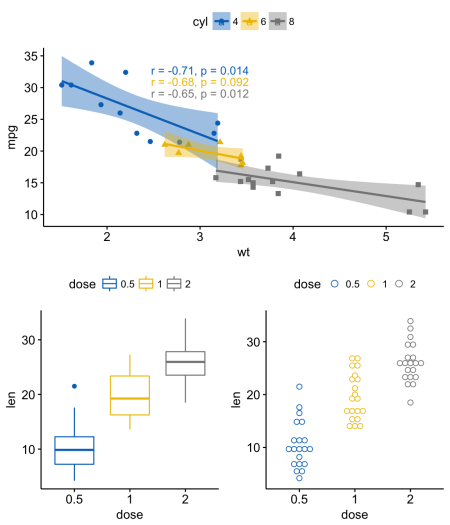
arrangeGrop()[in gridExtra ] helps to change the arrangement of graphs in rows or columns. For example, the code below does the following:
- the scatter chart (sp) will be in the first row and occupy two columns
- scatter chart (bxp) and scatter chart (dp) will occupy the second row and two different columns
library("gridExtra")
grid.arrange(sp,                            # Первая строка с одним графиком на две колонки
             arrangeGrob(bxp, dp, ncol = 2),# Вторая строка с двумя графиками в двух колонках
             nrow = 2)                      # Количество строк
In the function,
grid.arrange()you can also use the argument layout_matrixto create a complex mutual arrangement of graphs. In the code below
layout_matrix- 2x2 matrix (2 rows and 2 columns). The first row is all units, where the first graph occupies two columns; the second line contains graphs 2 and 3, each of which occupies its own column.grid.arrange(bp, # столбчатая диаграмма на две колонки
bxp, sp, # диаграммы рассеивания и разброса
ncol = 2, nrow = 2,
layout_matrix = rbind(c(1,1), c(2,3)))You can also add annotation to the output of the function
grid.arrange()using the helper function draw_plot_label()[in cowplot ]. In order to easily add annotations to the outputs of functions
grid.arrange()or arrangeGrob()(type gtable), you first need to convert them to type ggplot using the function as_ggplot()[in ggpubr ]. You can then apply the function to them draw_plot_label()[in cowplot ].library("gridExtra")
library("cowplot")
# Упорядочиваем графики с arrangeGrob
# возвращает тип gtable (gt)
gt <- arrangeGrob(bp, # столбчатая диаграмма на две колонки
bxp, sp, # диаграммы рассеивания и разброса
ncol = 2, nrow = 2,
layout_matrix = rbind(c(1,1), c(2,3)))
# Добавляем метки к упорядоченным графикам
p <- as_ggplot(gt) + # преобразуем в ggplot
draw_plot_label(label = c("A", "B", "C"), size = 15,
x = c(0, 0, 0.5), y = c(1, 0.5, 0.5)) # Добавляем метки
pIn the code above we used
arrangeGrob()instead grid.arrange(). The main difference between these two functions is that it grid.arrange()automatically displays ordered graphs. Since we wanted to add annotation to the graphs before drawing them, it is preferable to use the function in this case arrangeGrob().Using the grid package
The grid package allows you to specify a complex mutual arrangement of graphs using the function
grid.layout(). It also provides an auxiliary function viewport()for specifying a region, or scope. The function print()is used to place charts in a given region. The steps can be described as follows:
- Create graphs: p1, p2, p3, ....
- Go to a new page using the function
grid.newpage() - Create 2X2 layout - number of columns = 2; number of rows = 2
- Set scope: rectangular area on the graphics device
- Print graph in scope
library(grid)
# Перейти на новую страницу
grid.newpage()
# Создать расположение: nrow = 3, ncol = 2
pushViewport(viewport(layout = grid.layout(nrow = 3, ncol = 2)))
# Вспомогательная функция для задания области в расположении
define_region <- function(row, col){
  viewport(layout.pos.row = row, layout.pos.col = col)
}
# Упорядочить графики
print(sp, vp = define_region(row = 1, col = 1:2))   # Расположить в двух колонках
print(bxp, vp = define_region(row = 2, col = 1))
print(dp, vp = define_region(row = 2, col = 2))
print(bp + rremove("x.text"), vp = define_region(row = 3, col = 1:2))
Using a common legend for combined ggplot graphics
To define a common legend for several ordered charts, you can use the function
ggarrange()[in ggpubr ] with the following arguments:common.legend = TRUE: make a common legendlegend: set the position of the legend. The allowed value is one of c (“top”, “bottom”, “left”, “right”)
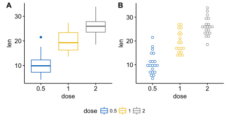
ggarrange(bxp, dp, labels = c("A", "B"),
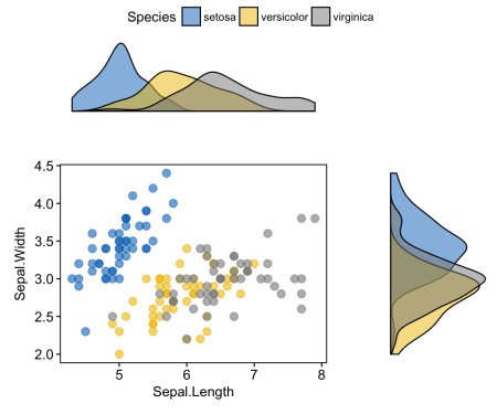
common.legend = TRUE, legend = "bottom")Scatter plot with unconditional distribution density plots
# Диаграмма разброса, цвет по группе ("Species")
sp <- ggscatter(iris, x = "Sepal.Length", y = "Sepal.Width",
                color = "Species", palette = "jco",
                size = 3, alpha = 0.6)+
  border()
# График плотности безусловного распределения по x (панель сверху) и по y (панель справа)
xplot <- ggdensity(iris, "Sepal.Length", fill = "Species",
                   palette = "jco")
yplot <- ggdensity(iris, "Sepal.Width", fill = "Species",
                   palette = "jco")+
  rotate()
# Почистить графики
yplot <- yplot + clean_theme()
xplot <- xplot + clean_theme()
# Упорядочить графики
ggarrange(xplot, NULL, sp, yplot,
          ncol = 2, nrow = 2,  align = "hv",
          widths = c(2, 1), heights = c(1, 2),
          common.legend = TRUE)
In the next part:
- mix table, text and ggplot2-graphics
- add a graphic element to ggplot (table, scatter chart, background image)
- place graphics on multiple pages
- nested relative position
- chart export