9 principles of beauty, simplicity and care in the UX

In March, JotForm told in a blog how they tried to “reinvent” forms for a year and make them really user-friendly. Here are the nine principles of beauty, simplicity and convenience in the UX that they formed during this time.
Principles of beauty
1. Beauty - the second UX
We love it when beautiful. And we also think that beautiful design is better than ugly, regardless of whether it is true or not.
The design should work first of all, should be comfortable and thoughtful. But its appeal is not the last thing.

With beautiful design it is more pleasant to use the site. It also enhances the sense of user-friendliness of the interface, even if there are any problems in design.
Part of the role of design is to arouse feelings of affection, loyalty and patience. And these are crucial moments in long-term use and product success. With the help of logic and beauty you can achieve a lot.
2. The effect of progress
Almost every coffee shop has a loyalty card that resembles gaming achievements and reflects progress:
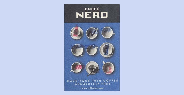
Every time you take another coffee, you approach the filling of the card. And although you may not realize this, the very existence of the card increases the likelihood that you will take the coffee again the next time.
The effect of visible progress makes people think that they will have to make less effort to achieve their goal. The closer they feel to this goal, the greater the likelihood that they will be persistent.

JotForm progress indicator motivates users
Make progress visible. So it will be easier for users to understand how quickly they go to the goal and whether it is worth changing something.
Principles of simplicity
3. Occam's razor
If there are several answers or solutions, the easiest option will be correct.
In design, this idea helps to make the choice in favor of "less but better." Do not complicate the functionality or information. An idea overloaded with product is harder to create, use and manage.
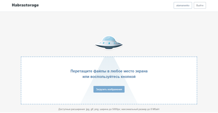
On the main “Habrastoreydzh” only one button
4. Hick's Law
If restaurants offered 500 items on the menu, few customers would have made the choice. And when all options are reduced to several of the best (as usual, restaurants do), to concentrate and make the choice will be easier .
The greater the number of available options, the more time and effort we spend on making a decision. So that the user can focus on a specific task, it is worth helping him to get rid of unnecessary choices.
We remove the secondary pages, unnecessary links and overloading the interface details.

One question on the page layout JotForm Cards reduces the semantic load
5. Fragmentation
A long sequence of identical elements is more difficult to remember than a short variety of elements. Therefore, it is often easier for people to memorize phone numbers in pieces, rather than one large pile of numbers.
Fragmentation is a memorization mechanism. If you divide the information into small pieces, it is easier and faster perceived and remembered.
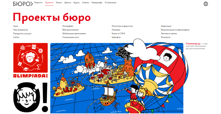
The Bureau is an excellent example of the fragmentation of the entire layout with a design approach.
6. The trade-off between flexibility and usability
People think of usage scenarios when creating a product (well, I hope;). And the more scenarios it turns out to cover, the more flexible the functionality becomes.
If the flexibility of the system increases, its complexity increases. And because of this, ease of use and efficiency, respectively, are reduced.
Recall the famous Swiss knives. Now there are already a couple dozen different tools and if you are at the top of the Himalayas, it will obviously come in handy. But if you need to cut a tag from a sweater, do you use an army knife or regular scissors?
Do not sacrifice simplicity for unnecessary functions.
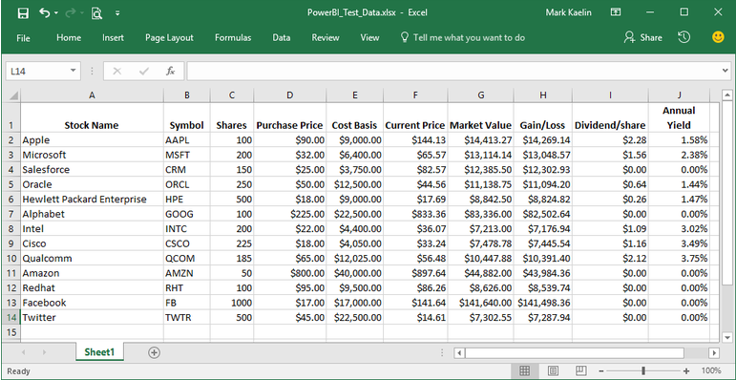
Many Excel users are not even aware of the existence of most of its functions.
Principles of care
7. The right to make a mistake
All people are wrong, and it is very important that there is always an opportunity to correct these errors.
How should the system behave when the user is about to press a key, and this will lead to unintended (and probably negative) consequences? Allowing these consequences is definitely not worth it.
You can ask the user in advance, or, even better, give the opportunity to take a step back.

Convenient error handling and autocomplete in JotForm Cards
Arrange information in such a way as to minimize possible errors. For example, you can make the most frequently used items the most accessible in terms of size or location.
8. Fitts Act
Before clicking a person takes aim at objects on a two-dimensional screen. Here, the Fitts law will sound something like this: the farther the object, the longer the aiming time; the larger the object, the shorter the aiming time.
Pay attention to the size of the elements pressed areas and their location. Clearly and in detail about the law of Fitts wrote Ilya Birman.
The iPhone keyboard dynamically adjusts the size of the buttons on the keyboard so that it is easier to write an existing word than to make a typo - watch the video {mp4, 0.9MB} .
9. Visibility
The shape of the objects makes us understand how they can be used. A container with a spout invites us to pour liquid, and a long strap attached to a bag, as if hinting to carry it over the shoulder. This visibility is a term that Don Norman popularized in “Design of Customary Things”.
The object is visual if it is not necessary to study it in detail in order to understand what to do with it.
Tips on how to use this or that thing should be clear and correct. If the door needs to be pushed, the designer must provide it with clues that indicate which side it should be. It does not destroy aesthetics. Attach a vertical plate from the side to be pushed. Or make the supports visible. The vertical plate and visible supports are natural clues that are naturally perceived and that no one thinks about.
That's what Norman writes about how natural design tips improve visibility.
The design should be visual. The simpler and clearer the product, the greater will be the efficiency of its use. The user will be able to act faster and make fewer mistakes.
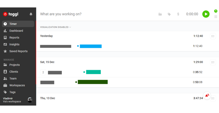
In order to change the time format in Toggle, you need to guess that the menu is hidden behind my little photo at the bottom left. This is not clear