Food Design Digest June 2017
For seven years now I have been publishing regular reviews of recent articles on the topic of interfaces, new tools and collections of patterns, interesting cases and historical stories. From the tapes of several hundred thematic subscriptions, approximately 5% of the publications worth publishing are selected, which are interesting to share. Previous materials: April 2010-May 2017 .

All Thumbs, Why Reach Navigation Should Replace the Navbar in iOS Design
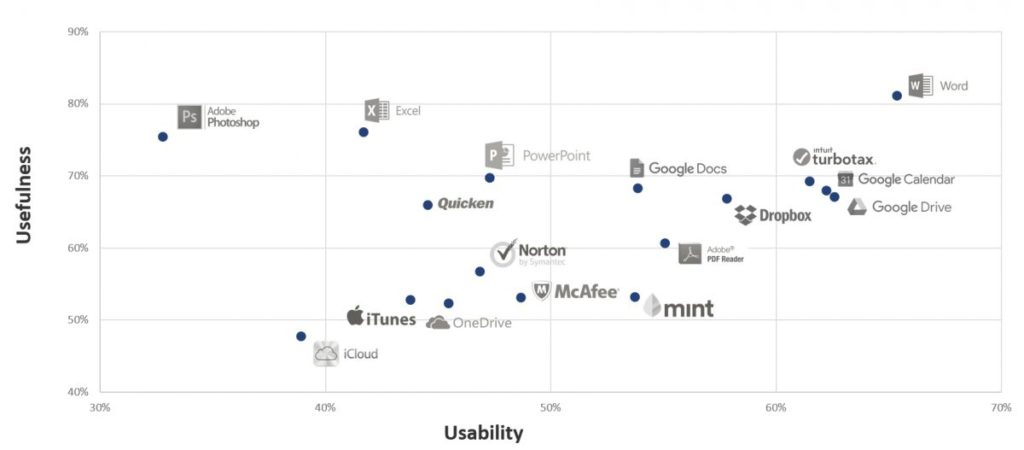
Brad Ellis parses ways to abandon the top navigation bar on mobile - it’s not easy to work with modern phone sizes. Dashboards - Making Charts and Graphs Easier to Understand An excellent overview of the complexity of the perception of how to present information on dashboards from Page Laubheimer of the Nielsen / Norman Group. Best Practices For Hero Images Nikolay Babich gives tips on using large images in the header of the site. Baymard Institute Research

Wizards - Definition and Design Recommendations
Raluca Bidiu of the Nielsen / Norman Group describes best practices for using turn-based helpers.
Usability rating of iOS-applications of banks, 2017
USABILITYLAB rating of mobile applications of Russian banks for iOS by USABILITYLAB. Five leaders: Tinkoff Bank, VTB 24 Bank, Sberbank, Alfa Bank, Promsvyazbank.
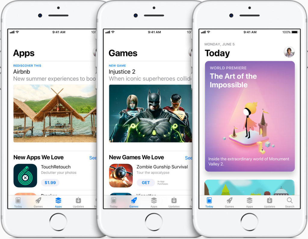
iOS 11 iOS 11 was
announced. At the WWDC presentation itself, there were few details about updating the mobile OS, but in the beta version it is clear that the styling of the Apple Music application becomes the basis of the platform’s visual language:
It's great that after the faceless iOS 7, which copied the problems of Windows Phone and its thousands of identical applications, the platform has a bright face.
The iPad continues to try to evolve towards replacing the computer (drag & drop between two open applications nearby, the taskbar a la doc on MacOS, the file system, advanced work with the pen ( more ), although a constant drop in sales in recent years suggests that it is developing not quite there. The only thing that shows glimpses of a brighter future is the emergence of an almost full-fledged analogue of Affinity Photo .
Of other interesting points: the standard camera learned to read QR codes (which should make them more popular), the development of machine learning capabilities I, the belated appearance of the possibilities of working with augmented reality , the “do not disturb” mode while driving , the infinitely ugly panel of quick settings . Materials for designers:
Apple watch
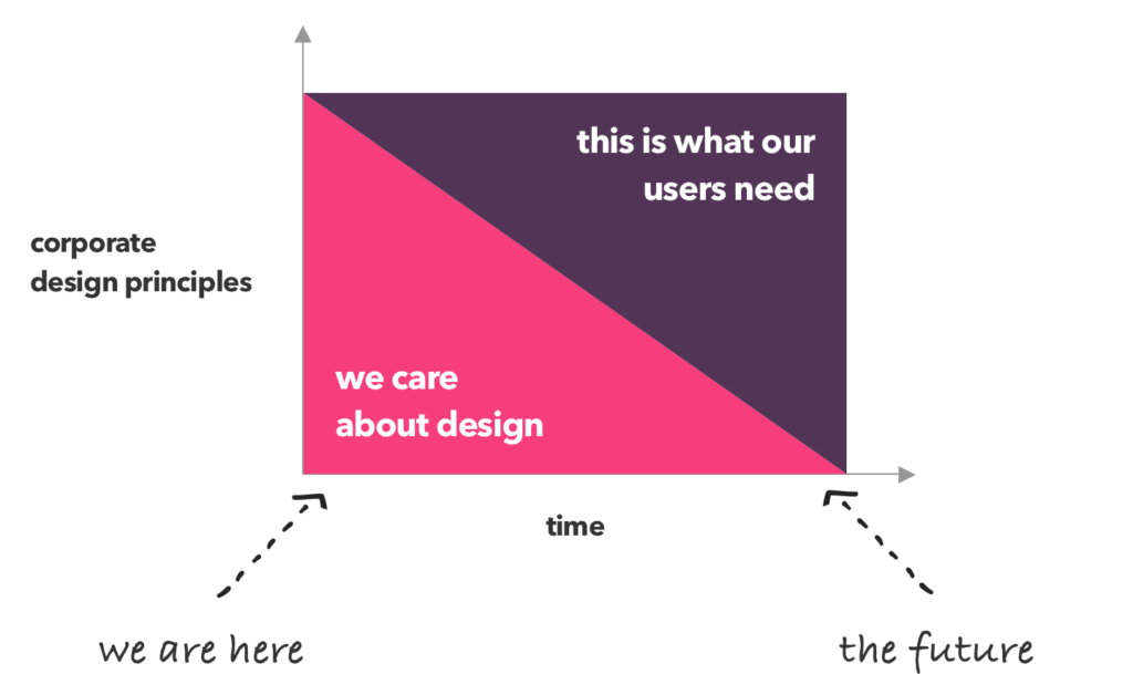
In the future, design principles won't be about design
Gorgeous analysis of the design principles of large companies by Jerome de Lafargue. He highlighted the most popular ones (they are the same for many organizations) and noted that good principles should not be just an abstract manifest of the values of the design team, but should give clear values related to the values of business and users. Continuing the topic:
Microsoft Mixed Reality Design Guidelines
Microsoft has published design guidelines for the design of mixed reality interfaces. Announcement .
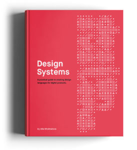
Alla Kholmatova - Design Systems
In September, Smashing Magazine released Alla Kholmatova's book Design Systems. You can pre-order it and read the first half now, plus chapter 2 is available for free . Other design systems news:
Building great user experiences on Slack Slack
guidelines for designing applications and bots for the messenger.
Cognitive bias cheat sheet The
coolest cognitive bias classification model from Buster Benson. He arranged them into 4 categories - too much information, not enough sense, you need to quickly make a decision, selective memory. Translation . Increase funnel conversion with Psych Darius Contractor from Dropbox proposed an unusual approach for assessing the cognitive load of an interface - it evaluates all interface elements using the conditional unit “psych”. If the number is greater than zero, the interface is good. This is somewhat similar to the “3 cans” model from Google. Translation . Who plays mobile games?

The Google Play team and SKIM Analytics conducted a study of the behavior of people playing on mobile. They identified 5 segments depending on their involvement and sociality.
Jobs To Be Done Approach
An excellent consolidated memo on the methodology for determining the needs of Jobs to Be Done users by Anna Buldakova.
Blind Spot - Illuminating the Hidden Value of Business
Last year, Rosenfeld Media released Steve Diller, Nathan Shedroff, and Sean Sauber's Blind Spot: Illuminating the Hidden Value of Business . UXmatters publishes an excerpt from it dedicated to the modern product design process.
UX Writing - How to do it like Google with this powerful checklist
Synopsis of Google I / O 2017 conference sessions on writing front-end texts. In the second half, a good approach to the formation of the tonality of the brand.
Provoking Difficult Design Conversations
Dan Brown shares his experience in solving complex design situations when it is difficult to interpret customer edits unambiguously. He proposes an approach in which part of the changes is made in order to begin a more substantive conversation.
Using UX design to reduce the risk of innovation failure An
entertaining “triple diamond” model from Nomensa - they added another step in the beginning, responsible for finding value for users and businesses.
Design principle: Organizing information
Anton Nikolov lists five approaches to organizing information: by location, alphabet, time, categories and hierarchy. Translation .
Sound Kit for Prototypes A
library of interface sounds from the Facebook design team. The license allows you to use them only in prototypes. Tips for working with sound in the interface from Will Littlejohn . Adobe xd
InVision Craft
Sketch 45
Improved work with plugins (auto-update does not require third-party utilities) and a lot of interface tuning ( translation ). Plugins and useful articles:

Framer
Gravit
How to Turn UX Research Into Results
Cindy McCracken memo for user researchers on how to properly communicate results to the product team and participate in a design process that makes corrections based on the findings. Continuing the topic:
Lab Testing Beyond Usability - Challenges and Recommendations for Assessing User Experiences
Much has been said that laboratory usability testing has its limitations and is not suitable for all situations, but analysis of specific problems is less common. Carine Lallemand and Vincent Koenig conducted a series of tests and described in detail the specific problems in interpreting user behavior.
7 Questions About User-Research Panels
Caroline Jarrett and Naintara Land describe the pros, cons, and pitfalls of creating your own respondent panel. A good reminder for those who are ready.
Why the SUPR-Q is better than the SUS for websites
Jeff Sauro believes that the SUPR-Q combined metric is better for evaluating sites than SUS - it is simpler, gives a final assessment of the necessary factors, and the results can be compared with similar products.
Master React - Unleash Your Design Superpower
An online React course for designers. A day without Javascript, Sonnie Sledge checked what happens with well-known sites when JavaScript is turned off - many are becoming difficult to use. Handling Long and Unexpected Content in CSS Ahman Shaheed shows how to handle edge situations in interface elements when real content breaks their structure. New scripts

Web Typography
Flexbox and CSS Grid
UX & NPS Benchmarks for Consumer Software (2017)
Jeff Sauro has published NPS research results for 17 popular professional programs and web services. The study says that SUS is responsible for about a third of the ratings of product-recommending users.
Humanizing the Enterprise
Pabini Gabriel-Petit writes on how to increase product team engagement through a social needs matrix. The concept is based on the book by Paul Herr “Primal Management”.
Crafting an Effective Working Group
Jessica Harllee talks about the format of situational working groups to solve complex design tasks at Etsy. We use a similar approach and it has proved to be great. More about the structure of design teams:

Wake
Kit Oliynyk - The Colors of Design Cultures
Speech by Cyril Oleinikaz Capital One at SXSW about their approach to identifying the strengths and weaknesses of a designer.
The Potential of Agile
Scott Sehlhorst did an excellent analysis of the agile work goals and the product benefits of this. How exactly does it help to check grocery insights.
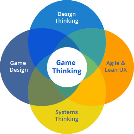
Game Thinking
The Game Thinking methodology involves the use of gaming experience to create more familiar digital products. Overview of the methodology by Amy Jo Kim . Sprint Design
Designing Facebook Spaces
Christophe Tauziet talks in detail about working on Facebook Spaces, an attempt to create a social network in virtual reality. The last part is especially interesting, where experiments with different interface approaches are shown. Transforming Data to Insights Anwesha Samanta of Salesforce talks about how they designed an analytic service and made it easier for users to search for insights among raw data. Redesigning a Remote A simple and cute case study on a mobile application from Eli Rousso. Unsolicited Redesigns

Web Design Museum
A collection of old sites from 1996 to 2005. 800 examples have been accumulated. Across the Computer Divide, The Nerds Face the Dummies A 1993 New York article that raises concerns about computer use talks about the usability and initiatives of Microsoft and other companies.

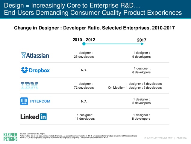
KBCP Internet Trends 2017 Report by Mary Meeker
Annual forecast of Internet development trends by Mary Meeker from KPCB ( selected ). Slide No. 188 is dedicated to increasing the number of designers in large companies - a good indicator of the maturity of the industry.
The State Of Advanced Website Builders
Drew Thomas reflects on whether site designers will replace design studios. He looks at their strengths and weaknesses and offers new formats of work for agencies that will remain necessary.
How Logos Became the Most Important Quarter-Inch in Business
Fortune has an interesting look at branding history - they write about how a digital product and interface have become decisive for it over time. What On Earth Is A Brutalist Website? 5 Things Today's Designers Can Learn From Brutalism

Andrew Wilshere analyzes sites in the spirit of brutalism regarding the principles inherent in such an architecture. This concept is simply mixed with a deliberately crude or grunge design, although the original idea of brutalism was in the simplicity and maximum openness of the structure. Algorithm designs seven million different jars of Nutella The Italian division of Ogilvy & Mather made algorithmic packaging for Nutella. They generated 7 million label patterns; the print run scattered in a month.

Other materials on algorithmic design:
Design in the Era of the Algorithm
Development of a Josh Clark article on the ethics of modern products that rely on algorithms and machine learning.
Designing experiences for Virtual Reality - Lessons from the physical world
Principles of designing virtual reality interfaces by Yisela Alvarez Trentini.
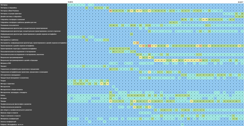
As I read all issues of the food digest,
Cyril Ulitin made the coolest analysis of the food design digest for 7 years - the main topics, keywords, mentioned people and companies, etc. Along with the name (initially everything was called “Overview of fresh materials on interface design”, later moved to the broader “Product Design Digest”), the categories changed (became more extensive), the degree of filtration (fewer publications on very basic topics), the approach to preparation (collaboration with vc.ru motivated to regularity, and she motivated to simplify the preparation), a newsletter was added. The site UX Buzzwords have an interactive version. I always wanted to analyze the archive of releases, but I did not have enough time and skills. Last week, the number of subscribers hit 15,000
- A new bar for domestic design groups on Facebook (excluding job search).
A Turn of Phrase - The Politics of UX Language
Carol J. Smith writes about how a UX specialist can speak a language that the client understands. She does not consider it shameful not to be afraid of what someone calls usability testing a “focus group” - it is often better to start work, and only then explain the difference.
Reddit users have suggested the most ridiculous options for the sound control interface
Flash mob on Reddit, in which the community has offered the most flawed approaches to the volume control interface.
Book Review: Practical UX Design
Review of Scott Faranello's book Practical UX Design , published last year by Packt Publishing.
No No No
Julie Zhuo teaches designers to say no at the right time and in the right way.
20 TED Lectures for Designers
The Tilda blog has put together solid TED speeches related to design.

Google Design
Updated Google Design site.
UXSTRAT 2017
In 2017, two parts of the UXSTRAT 2017 conference will be held: June 15-16 in Amsterdam and September 18-20 in Boulder, USA . It is dedicated to design strategies and gathers a powerful line-up of thematic speakers. Presentations from the European part of the conference . The most interesting presentations:
Enterprise UX 2017
The Enterprise UX 2017 conference was held June 7-9 in San Francisco, USA. Natalie Hanson made a gorgeous detailed summary of performances:
LX Conference 2017
The LX Conference 2017 was held April 24-25 in San Francisco, USA. It is dedicated to design management and UX-strategy ( video presentations ). Reviews:
Subscribe to our newsletter ! A letter arrives once a month.
Patterns and best practices
All Thumbs, Why Reach Navigation Should Replace the Navbar in iOS Design
Brad Ellis parses ways to abandon the top navigation bar on mobile - it’s not easy to work with modern phone sizes. Dashboards - Making Charts and Graphs Easier to Understand An excellent overview of the complexity of the perception of how to present information on dashboards from Page Laubheimer of the Nielsen / Norman Group. Best Practices For Hero Images Nikolay Babich gives tips on using large images in the header of the site. Baymard Institute Research
- An excerpt from the latest Baymard Institute report describing the importance of indicating shipping costs and possible ways to do this .
Wizards - Definition and Design Recommendations
Raluca Bidiu of the Nielsen / Norman Group describes best practices for using turn-based helpers.
Usability rating of iOS-applications of banks, 2017
USABILITYLAB rating of mobile applications of Russian banks for iOS by USABILITYLAB. Five leaders: Tinkoff Bank, VTB 24 Bank, Sberbank, Alfa Bank, Promsvyazbank.
Design systems and guidelines
iOS 11 iOS 11 was
announced. At the WWDC presentation itself, there were few details about updating the mobile OS, but in the beta version it is clear that the styling of the Apple Music application becomes the basis of the platform’s visual language:
- Large screen headers and generally avoiding thin fonts.
- Filled icons instead of outline ones: finally, it will be possible to unify Android and iOS applications. They became flooded and circles around the numbers when dialing a number (and also rounded in the calculator).
- Orchestrating animation in the spirit of Material Design: for example, a large heading turns into a back button when you go deeper into the navigation, and switching to application information in the store is very similar to what Google does.
- Juicy images are used more and more often: the updated AppStore is now similar in layout to Google Play (although the application screen is terribly overloaded).
- All pop-up layers are built on the principle of notifications and menus: for example, writing letters in a standard mail client.
- Full-fledged work with screenshots, including their editing - the lives of those who work on products will greatly simplify.
It's great that after the faceless iOS 7, which copied the problems of Windows Phone and its thousands of identical applications, the platform has a bright face.
The iPad continues to try to evolve towards replacing the computer (drag & drop between two open applications nearby, the taskbar a la doc on MacOS, the file system, advanced work with the pen ( more ), although a constant drop in sales in recent years suggests that it is developing not quite there. The only thing that shows glimpses of a brighter future is the emergence of an almost full-fledged analogue of Affinity Photo .
Of other interesting points: the standard camera learned to read QR codes (which should make them more popular), the development of machine learning capabilities I, the belated appearance of the possibilities of working with augmented reality , the “do not disturb” mode while driving , the infinitely ugly panel of quick settings . Materials for designers:
- Updated guideline home page .
- Templates for Sketch, Figma and Adobe XD from Great Simple Studio .
- The official iOS templates for Adobe XD .
Apple watch
- WatchOS 4 came out . From relatively explicit interface changes - the list of running and recent applications has turned into a vertical tape.
In the future, design principles won't be about design
Gorgeous analysis of the design principles of large companies by Jerome de Lafargue. He highlighted the most popular ones (they are the same for many organizations) and noted that good principles should not be just an abstract manifest of the values of the design team, but should give clear values related to the values of business and users. Continuing the topic:
- Buzzfeed Design Principles . Caitlin Osbahr tells how they were created .
Microsoft Mixed Reality Design Guidelines
Microsoft has published design guidelines for the design of mixed reality interfaces. Announcement .
Alla Kholmatova - Design Systems
In September, Smashing Magazine released Alla Kholmatova's book Design Systems. You can pre-order it and read the first half now, plus chapter 2 is available for free . Other design systems news:
- Cathy Lo talks about creating a visual language for Facebook business services .
- Nathan Curtis shows how you can apply the OKR methodology for planning work on a design system and gives several conditional examples. True, the annual plan contradicts the original idea of dynamism, which involves planning for the quarter.
- Max Stoiber describes the creation of a single environment for a component design system based on React, which integrates web, mobile applications and templates into Sketch.
- Great interview with Dan Mall about design systems . A lot of sensible thoughts about the real work on them and the pitfalls of implementation.
- Audrey Hacq offers an interesting metaphor for modular design systems - it compares them with music , where you can build chords and melodies from basic notes that also differ in rhythm and mood.
Building great user experiences on Slack Slack
guidelines for designing applications and bots for the messenger.
User understanding
Cognitive bias cheat sheet The
coolest cognitive bias classification model from Buster Benson. He arranged them into 4 categories - too much information, not enough sense, you need to quickly make a decision, selective memory. Translation . Increase funnel conversion with Psych Darius Contractor from Dropbox proposed an unusual approach for assessing the cognitive load of an interface - it evaluates all interface elements using the conditional unit “psych”. If the number is greater than zero, the interface is good. This is somewhat similar to the “3 cans” model from Google. Translation . Who plays mobile games?
The Google Play team and SKIM Analytics conducted a study of the behavior of people playing on mobile. They identified 5 segments depending on their involvement and sociality.
Jobs To Be Done Approach
An excellent consolidated memo on the methodology for determining the needs of Jobs to Be Done users by Anna Buldakova.
Information architecture, conceptual design, content strategy
Blind Spot - Illuminating the Hidden Value of Business
Last year, Rosenfeld Media released Steve Diller, Nathan Shedroff, and Sean Sauber's Blind Spot: Illuminating the Hidden Value of Business . UXmatters publishes an excerpt from it dedicated to the modern product design process.
UX Writing - How to do it like Google with this powerful checklist
Synopsis of Google I / O 2017 conference sessions on writing front-end texts. In the second half, a good approach to the formation of the tonality of the brand.
Provoking Difficult Design Conversations
Dan Brown shares his experience in solving complex design situations when it is difficult to interpret customer edits unambiguously. He proposes an approach in which part of the changes is made in order to begin a more substantive conversation.
Using UX design to reduce the risk of innovation failure An
entertaining “triple diamond” model from Nomensa - they added another step in the beginning, responsible for finding value for users and businesses.
Design principle: Organizing information
Anton Nikolov lists five approaches to organizing information: by location, alphabet, time, categories and hierarchy. Translation .
Design and design of interface screens
Sound Kit for Prototypes A
library of interface sounds from the Facebook design team. The license allows you to use them only in prototypes. Tips for working with sound in the interface from Will Littlejohn . Adobe xd
- In the June beta , characters finally appeared , including redefining the state of a specific copy. Improved work with layers and gradients.
InVision Craft
- Craft partnered with Getty Images and launched a free photo bank inside the plugin .
- Seriously updated Craft Library .
Sketch 45
Improved work with plugins (auto-update does not require third-party utilities) and a lot of interface tuning ( translation ). Plugins and useful articles:
- Symbol Spacer plugin that allows you to maintain standard indentation between elements using Auto Layout. How does it work ?
- The plugin allows you to synchronize layouts with a presentation on Google Slides .
- Chromatic plugin for creating harmonious gradients.
- UXperiment plugin for creating interactive prototypes and conducting experiments based on them.
- The Looper 2.0 plugin allows you to generate something like fractals from simple forms.
- Emin Inanc Unlu clearly illustrated how built-in adaptability works in Sketch 44 .
Framer
- Interview with the team of creators of Framer about their new generation tool .
- Ready-made patterns of typical interactions that allow you to quickly start working on a prototype.
- Video course .
Gravit
- Released version 3.1 .
User research and testing, analytics
How to Turn UX Research Into Results
Cindy McCracken memo for user researchers on how to properly communicate results to the product team and participate in a design process that makes corrections based on the findings. Continuing the topic:
- Michael Morgan’s sensible advice on packaging custom research results so that they impact the product and product team.
Lab Testing Beyond Usability - Challenges and Recommendations for Assessing User Experiences
Much has been said that laboratory usability testing has its limitations and is not suitable for all situations, but analysis of specific problems is less common. Carine Lallemand and Vincent Koenig conducted a series of tests and described in detail the specific problems in interpreting user behavior.
7 Questions About User-Research Panels
Caroline Jarrett and Naintara Land describe the pros, cons, and pitfalls of creating your own respondent panel. A good reminder for those who are ready.
Why the SUPR-Q is better than the SUS for websites
Jeff Sauro believes that the SUPR-Q combined metric is better for evaluating sites than SUS - it is simpler, gives a final assessment of the necessary factors, and the results can be compared with similar products.
Visual programming and design in the browser
Master React - Unleash Your Design Superpower
An online React course for designers. A day without Javascript, Sonnie Sledge checked what happens with well-known sites when JavaScript is turned off - many are becoming difficult to use. Handling Long and Unexpected Content in CSS Ahman Shaheed shows how to handle edge situations in interface elements when real content breaks their structure. New scripts
Web Typography
- Conrad Irvin shows how to use ligatures and other typographic techniques with standard CSS .
- Google’s Spectral parametric font , which is used in their office suite.
Flexbox and CSS Grid
- Morten Rand-Hendriksen step-by-step instructions on creating an adaptive grid using CSS Grid , which can be used on a real project.
- Benjamin De Cock talks about how he builds trendy Stripe promotion sites using CSS .
Metrics and ROI
UX & NPS Benchmarks for Consumer Software (2017)
Jeff Sauro has published NPS research results for 17 popular professional programs and web services. The study says that SUS is responsible for about a third of the ratings of product-recommending users.
UX Strategy and Management
Humanizing the Enterprise
Pabini Gabriel-Petit writes on how to increase product team engagement through a social needs matrix. The concept is based on the book by Paul Herr “Primal Management”.
Crafting an Effective Working Group
Jessica Harllee talks about the format of situational working groups to solve complex design tasks at Etsy. We use a similar approach and it has proved to be great. More about the structure of design teams:
- Andrew Coyle talks about how the structure of the design team at Flexport has changed .
- Tom Waterton talks about the working atmosphere and internal culture of IBM design teams .
- Cap Watkins talks about the third version of the design role description in Buzzfeed . Description of the roles .
- Alecsandru Grigoriu talks about how his team uses the weekly meetings of designers to good use . In general, a fairly typical approach, but an interesting template for capturing the results of the meeting.
Wake
- The service has launched a free tariff for small teams .
Kit Oliynyk - The Colors of Design Cultures
Speech by Cyril Oleinikaz Capital One at SXSW about their approach to identifying the strengths and weaknesses of a designer.
Product Management and Analytics
The Potential of Agile
Scott Sehlhorst did an excellent analysis of the agile work goals and the product benefits of this. How exactly does it help to check grocery insights.
Methodologies, Procedures, Standards
Game Thinking
The Game Thinking methodology involves the use of gaming experience to create more familiar digital products. Overview of the methodology by Amy Jo Kim . Sprint Design
- A selection of design sprint case studies curated by the Google Ventures team.
Cases
Designing Facebook Spaces
Christophe Tauziet talks in detail about working on Facebook Spaces, an attempt to create a social network in virtual reality. The last part is especially interesting, where experiments with different interface approaches are shown. Transforming Data to Insights Anwesha Samanta of Salesforce talks about how they designed an analytic service and made it easier for users to search for insights among raw data. Redesigning a Remote A simple and cute case study on a mobile application from Eli Rousso. Unsolicited Redesigns
- An unsolicited redesign of Nenad Milosevic's professional Ableton Live music creation tool .
History
Web Design Museum
A collection of old sites from 1996 to 2005. 800 examples have been accumulated. Across the Computer Divide, The Nerds Face the Dummies A 1993 New York article that raises concerns about computer use talks about the usability and initiatives of Microsoft and other companies.
Trends
KBCP Internet Trends 2017 Report by Mary Meeker
Annual forecast of Internet development trends by Mary Meeker from KPCB ( selected ). Slide No. 188 is dedicated to increasing the number of designers in large companies - a good indicator of the maturity of the industry.

The State Of Advanced Website Builders
Drew Thomas reflects on whether site designers will replace design studios. He looks at their strengths and weaknesses and offers new formats of work for agencies that will remain necessary.
How Logos Became the Most Important Quarter-Inch in Business
Fortune has an interesting look at branding history - they write about how a digital product and interface have become decisive for it over time. What On Earth Is A Brutalist Website? 5 Things Today's Designers Can Learn From Brutalism
Andrew Wilshere analyzes sites in the spirit of brutalism regarding the principles inherent in such an architecture. This concept is simply mixed with a deliberately crude or grunge design, although the original idea of brutalism was in the simplicity and maximum openness of the structure. Algorithm designs seven million different jars of Nutella The Italian division of Ogilvy & Mather made algorithmic packaging for Nutella. They generated 7 million label patterns; the print run scattered in a month.
Other materials on algorithmic design:
- Researchers from the University of Berkeley launched "Prism the other way around" - it turns the work of famous artists into photography.
- Экспериментальный проект pix2code, который может сверстать сайт по статической картинке. Качество кода вряд ли подойдёт для реального использования, но направление интересное.
- Экспериментальный проект генеративного супрематизма.
- Интереснейший экспериментальный инструмент от университета Стэнфорда и Adobe, который значительно упрощает работу кино-монтажёра. Он сам предлагает готовый кусок фильма на основе отснятых сцен.
- Экспериментальный инструмент uKit AI от создателей uCoz движется в сторону The Grid и Wix ADI.
- В продолжение экспериментального проекта Quick Draw в Гугле научились рисовать человекоподобные скетчи иконок.
- The Sketchplore experimental tool helps you work with your layout composition.
Design in the Era of the Algorithm
Development of a Josh Clark article on the ethics of modern products that rely on algorithms and machine learning.
Designing experiences for Virtual Reality - Lessons from the physical world
Principles of designing virtual reality interfaces by Yisela Alvarez Trentini.
For general and professional development
As I read all issues of the food digest,
Cyril Ulitin made the coolest analysis of the food design digest for 7 years - the main topics, keywords, mentioned people and companies, etc. Along with the name (initially everything was called “Overview of fresh materials on interface design”, later moved to the broader “Product Design Digest”), the categories changed (became more extensive), the degree of filtration (fewer publications on very basic topics), the approach to preparation (collaboration with vc.ru motivated to regularity, and she motivated to simplify the preparation), a newsletter was added. The site UX Buzzwords have an interactive version. I always wanted to analyze the archive of releases, but I did not have enough time and skills. Last week, the number of subscribers hit 15,000
- A new bar for domestic design groups on Facebook (excluding job search).
A Turn of Phrase - The Politics of UX Language
Carol J. Smith writes about how a UX specialist can speak a language that the client understands. She does not consider it shameful not to be afraid of what someone calls usability testing a “focus group” - it is often better to start work, and only then explain the difference.
Reddit users have suggested the most ridiculous options for the sound control interface
Flash mob on Reddit, in which the community has offered the most flawed approaches to the volume control interface.
Book Review: Practical UX Design
Review of Scott Faranello's book Practical UX Design , published last year by Packt Publishing.
No No No
Julie Zhuo teaches designers to say no at the right time and in the right way.
20 TED Lectures for Designers
The Tilda blog has put together solid TED speeches related to design.
People and companies in the industry
Google Design
Updated Google Design site.
Conference proceedings
UXSTRAT 2017
In 2017, two parts of the UXSTRAT 2017 conference will be held: June 15-16 in Amsterdam and September 18-20 in Boulder, USA . It is dedicated to design strategies and gathers a powerful line-up of thematic speakers. Presentations from the European part of the conference . The most interesting presentations:
- Презентация Andrea Picchi из Sony Mobile, одна из лучших на европейской части. Очень толковый и практически полезный фреймворк UX-стратегии, который позволяет сопоставить конкретные изменения в продуктах и организации с выхлопом, который они дадут. Я веду свою серию по UX-стратегии к чем-то похожей модели.
- Презентация David Ruiz о запуске Orange Bank. Шикарнейший детальный кейс с описанием ключевых этапов по хронологии проекта и привязкой к общей UX-стратегии. Одна из лучших презентаций, которую я когда-либо видел.
- Barbara Koop из Funda рассказывала о модели метрик, которая используется в компании.
- У Dr. Friederike Schultz из McKinsey была в целом проходная презентация от консультантов про связку бренд- и UX-стратегии. Но на слайде № 65 бесценный подход с матрицей сопоставления принципов бренда и интерфейсных решений — наконец-то есть простой и понятный инструмент.
- Презентация Martin Kulessa из BMW о запуске каршерингового сервиса NOW и UX-стратегии, которой придерживались при работе над продуктом. Получилась достаточно годная модель зрелости.
- Nico Weckerle из Deutsche Telekom рассказал о UX-стратегии при работе над унификацией экосистемы умного дома. Хороший процесс с запуском пилота, простая и чёткая стратегия.
Enterprise UX 2017
The Enterprise UX 2017 conference was held June 7-9 in San Francisco, USA. Natalie Hanson made a gorgeous detailed summary of performances:
- Presentation of Elizabeth Churchill from Google “ Exploring Cadence: You, Your Team, and Your Enterprise ” - how the company combines formats and practices of working on design at different levels.
- Presentations by Tricia Wang (Constellate Data), Robert Reimann (PatientsLikeMe) and Craig Villamor (AppDynamics) on design scaling .
- Presentations by Gretchen Anderson (Pacific Gas & Electric), Peter Merholz (Snagajob) and Kim Lenox (LinkedIn) on the design team structure .
- Panel discussion with stories of how insight and its presentation helped “sell” the idea .
- Presentations by Mark Interrante (HPE), Ross Smith (Microsoft) and Ariel Kennan (New York City Administration) on how cross-functional collaboration was built .
- Presentations by Kaaren Hanson (ex-Intuit), Bob Schwartz (GE) and Sam Yen (SAP) on how their companies have changed in relation to design .
- Citrix's Creating a Legacy: The Ultimate Experience presentation by Mark Templeton on how the company introduced mature design practices.
- Additional conference materials .
LX Conference 2017
The LX Conference 2017 was held April 24-25 in San Francisco, USA. It is dedicated to design management and UX-strategy ( video presentations ). Reviews:
- Capital One's Rahshia Sawyer gave a quick overview of the speeches with links to the video .
- The Polaris knowledge base from the WeWork team - it collects insights from user research in atomic form. These are fake, but the structure is real. Tomer Sharon presentation and video on how and why it was created.
Subscribe to our newsletter ! A letter arrives once a month.