Predicting the time to solve a ticket using machine learning
Making a ticket in the project management system and tracking tasks, each of us is happy to see the approximate timing of the decision on his request.
When receiving a stream of incoming tickets, a person / team needs to line them up in priority and time order that the solution of each call will take.
All this allows you to more efficiently plan your time for both parties.
Under the cut, I will talk about how I conducted the analysis and trained ML models that predict the time of the decision of the tickets issued to our team.
I myself work for the SRE position in a team called LAB. We are flooded with requests from both developers and QA regarding deploying new test environments, updating them to the latest release versions, solving various problems that arise and much more. These tasks are quite heterogeneous and, which is logical, take a different amount of time to perform. There is our team for several years and during this time a good database of references has accumulated. I decided to analyze this base and, on its basis, using machine learning, to make a model that will be engaged in predicting the likely closing time (ticket).
In our work, we use JIRA, however, the model I present in this article has no reference to a specific product - the necessary information does not make problems to get from any base.
So let's move from words to deeds.
Preliminary data analysis
We load all necessary and we will display versions of the used packages.
import warnings
warnings.simplefilter('ignore')
%matplotlib inline
import matplotlib.pyplot as plt
import pandas as pd
import numpy as np
import datetime
from nltk.corpus import stopwords
from sklearn.model_selection import train_test_split
from sklearn.metrics import mean_absolute_error, mean_squared_error
from sklearn.neighbors import KNeighborsRegressor
from sklearn.linear_model import LinearRegression
from datetime import time, date
for package in [pd, np, matplotlib, sklearn, nltk]:
    print(package.__name__, 'version:', package.__version__)
pandas version: 0.23.4
numpy version: 1.15.0
matplotlib version: 2.2.2
sklearn version: 0.19.2
nltk version: 3.3Load the data from the csv file. It contains information about tickets closed for the last 1.5 years. Before writing the data to the file, they were a bit pre-processed. For example, commas and periods were removed from text fields with descriptions. However, this is only a preliminary processing and in the future the text will be further cleared.
Let's see what is in our data set. A total of 10,783 tickets were included.
| Created | Date and time of the ticket creation |
| Resolved | Date and time of closing the ticket |
| Resolution_time | The number of minutes elapsed between the creation and closing of the ticket. It is considered the calendar time, because the company has offices in different countries, working in different time zones and there is no fixed time for the entire department. |
| Engineer_N | «Закодированные» имена инженеров (дабы ненароком не выдать какую-либо личную или конфиденциальную информацию в дальнейшем в статье будет еще не мало «закодированных» данных, которые по сути просто переименованы). В этих полях содержится количество тикетов в режиме «in progress» на момент поступления каждого из тикетов в представленном дата сете. На этих полях я остановлюсь отдельно ближе к концу статьи, т.к. они заслуживают дополнительного внимания. |
| Assignee | Сотрудник, который занимался решением задачи. |
| Issue_type | Тип тикета. |
| Environment | Название тестового рабочего окружения, касательно которого сделан тикет (может значиться как конкретное окружение так и локация в целом, например, датацентр). |
| Priority | Приоритет тикета. |
| Worktype | Вид работы, который ожидается по данному тикету (добавление или удаление серверов, обновление окружения, работа с мониторингом и т.д.) |
| Description | Описание |
| Summary | Заголовок тикета. |
| Watchers | Количество человек, которые «наблюдают» за тикетом, т.е. им приходят уведомления на почту по каждой из активностей в тикете. |
| Votes | Количество человек, «проголосовавших» за тикет, тем самым показав его важность и свою заинтересованность в нем. |
| Reporter | Человек, оформивший тикет. |
| Engineer_N_vacation | Находился ли инженер в отпуске на момент оформления тикета. |
df.info()<class 'pandas.core.frame.DataFrame'>
Index: 10783 entries, ENV-36273 to ENV-49164
Data columns (total 37 columns):
Created 10783 non-null object
Resolved 10783 non-null object
Resolution_time 10783 non-null int64
engineer_1 10783 non-null int64
engineer_2 10783 non-null int64
engineer_3 10783 non-null int64
engineer_4 10783 non-null int64
engineer_5 10783 non-null int64
engineer_6 10783 non-null int64
engineer_7 10783 non-null int64
engineer_8 10783 non-null int64
engineer_9 10783 non-null int64
engineer_10 10783 non-null int64
engineer_11 10783 non-null int64
engineer_12 10783 non-null int64
Assignee 10783 non-null object
Issue_type 10783 non-null object
Environment 10771 non-null object
Priority 10783 non-null object
Worktype 7273 non-null object
Description 10263 non-null object
Summary 10783 non-null object
Watchers 10783 non-null int64
Votes 10783 non-null int64
Reporter 10783 non-null object
engineer_1_vacation 10783 non-null int64
engineer_2_vacation 10783 non-null int64
engineer_3_vacation 10783 non-null int64
engineer_4_vacation 10783 non-null int64
engineer_5_vacation 10783 non-null int64
engineer_6_vacation 10783 non-null int64
engineer_7_vacation 10783 non-null int64
engineer_8_vacation 10783 non-null int64
engineer_9_vacation 10783 non-null int64
engineer_10_vacation 10783 non-null int64
engineer_11_vacation 10783 non-null int64
engineer_12_vacation 10783 non-null int64
dtypes: float64(12), int64(15), object(10)
memory usage: 3.1+ MBIn total, we have 10 "object" fields (i.e. containing a text value) and 27 numeric fields.
First of all, we will immediately look for emissions in our data. As you can see, there are tickets that have a solution time of millions of minutes. This is clearly not relevant information, such data will only interfere with the construction of the model. They got here, because the collection of data from JIRA was done by querying the Resolved field, not Created. Accordingly, those tickets that have been closed in the last 1.5 years have come here, but they could have been opened much earlier. It is time to get rid of them. Discard tickets that were created earlier on June 1, 2017. We will have 9493 tickets left.
As for the reasons, I think in each project it is easy to find such requests that have been hanging out for quite a long time due to various circumstances and are more often closed not by solving the problem itself, but after "the expiration of the statute of limitations."
df[['Created', 'Resolved', 'Resolution_time']].sort_values('Resolution_time', ascending=False).head()
df = df[df['Created'] >= '2017-06-01 00:00:00']
print(df.shape)
(9493, 33)So let's start looking at what's interesting we can find in our data. To begin with, we will derive the simplest - the most popular environments among our tickets, the most active "reporters" and the like.
df.describe(include=['object'])
df['Environment'].value_counts().head(10)Environment_104 442
ALL 368
Location02 367
Environment_99 342
Location03 342
Environment_31 322
Environment_14 254
Environment_1 232
Environment_87 227
Location01 202
Name: Environment, dtype: int64df['Reporter'].value_counts().head()Reporter_16 388
Reporter_97 199
Reporter_04 147
Reporter_110 145
Reporter_133 138
Name: Reporter, dtype: int64df['Worktype'].value_counts()Support 2482
Infrastructure 1655
Update environment 1138
Monitoring 388
QA 300
Numbers 110
Create environment 95
Tools 62
Delete environment 24
Name: Worktype, dtype: int64df['Priority'].value_counts().plot(kind='bar', figsize=(12,7), rot=0, fontsize=14, title='Распределение тикетов по приоритету');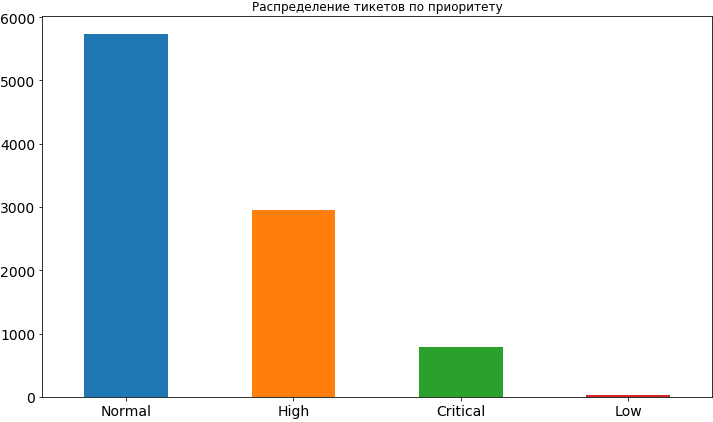
Well, something we have already learned. Most often, the priority for tickets is normal, about 2 times less high and even less often critical. Low priority is very rare, apparently people are afraid to exhibit it, believing that in this case it will hang in the queue for a rather long time and the time it will take may be delayed. Later, when we build the model and analyze its results, we will see that such concerns may be not unreasonable, because low priority really affects the timeline for completing the task and, of course, not in the direction of acceleration.
From the columns in the most popular environments and the most active reporters, we see Reporter_16 with a large margin, and in environments in the first place Environment_104. Even if you have not yet guessed, I will reveal a small secret - this reporter from the team working on this environment.
Let's look at what the environment most often come critical tickets.
df[df['Priority'] == 'Critical']['Environment'].value_counts().index[0]'Environment_91'And now we will display information on how many tickets with other priorities fall from this very “critical” environment.
df[df['Environment'] == df[df['Priority'] == 'Critical']['Environment'].value_counts().index[0]]['Priority'].value_counts()High 62
Critical 57
Normal 46
Name: Priority, dtype: int64Let's look at the runtime of the ticket in the context of priorities. For example, it is amusing to note that the average execution time of a low priority ticket is more than 70 thousand minutes (almost 1.5 months). It is also easy to trace the dependence of the execution time of a ticket on its priority.
df.groupby(['Priority'])['Resolution_time'].describe()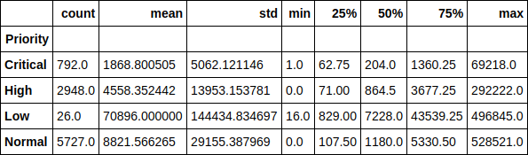
Or here is the median value as a graph. As you can see, the picture has not changed much, therefore, emissions do not really affect the distribution.
df.groupby(['Priority'])['Resolution_time'].median().sort_values().plot(kind='bar', figsize=(12,7), rot=0, fontsize=14);
Now let's take a look at the average time for solving a ticket for each of the engineers, depending on how many tickets in the job the engineer had at that time. In fact, these charts, to my surprise, do not show any single picture. For some, the runtime increases as the current tickets increase in work, and for some this dependence is reversed. For some, the dependence is not traced at all.
However, looking ahead again, I will say that the presence of this feature in dataset increased the accuracy of the model by more than 2 times and the impact on the execution time is definitely there. We just do not see it. And the model sees.
engineers = [i.replace('_vacation', '') for i in df.columns if'vacation'in i]
cols = 2
rows = int(len(engineers) / cols)
fig, axes = plt.subplots(nrows=rows, ncols=cols, figsize=(16,24))
for i in range(rows):
    for j in range(cols):
        df.groupby(engineers[i * cols + j])['Resolution_time'].mean().plot(kind='bar', rot=0, ax=axes[i, j]).set_xlabel('Engineer_' + str(i * cols + j + 1))
del cols, rows, fig, axes
Let's make a small matrix of pairwise interaction of the following signs: the time of decision of the ticket, the number of votes and the number of observers. Bonus diagonally we have the distribution of each feature.
From the interesting - one can see the dependence of the decrease in the time of decision of the ticket on the growing number of observers. It is also clear that people use voices not very actively.
pd.scatter_matrix(df[['Resolution_time', 'Watchers', 'Votes']], figsize=(15, 15), diagonal='hist');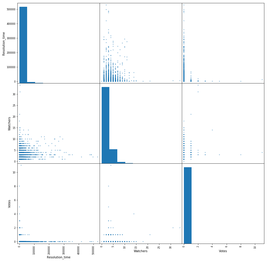
So, we conducted a small preliminary analysis of the data, saw the existing dependencies between the target attribute, which is the time to solve the ticket, and such signs as the number of votes per ticket, the number of “observers” behind it and its priority. Moving on.
Build a model. We build signs
It is time to move on to the construction of the model itself. But first we need to bring our signs in a clear form for the model. Those. decompose categorical features into sparse vectors and get rid of excess. For example, fields with the time of creation and closing of a ticket will not be needed in the model, as well as the field Assignee, since we will eventually use this model to predict the runtime of a ticket that has not been assigned to anyone ("zasasaynen").
The target feature, as I just mentioned, is the time to solve the problem for us, so we take it as a separate vector and also remove it from the general data set. In addition, some of our fields turned out to be empty due to the fact that reporters do not always fill out the description field when making a ticket. In this case, pandas puts their values in NaN, we just replace them with an empty string.
y = df['Resolution_time']
df.drop(['Created', 'Resolved', 'Resolution_time', 'Assignee'], axis=1, inplace=True)
df['Description'].fillna('', inplace=True)
df['Summary'].fillna('', inplace=True)
We decompose categorical features into sparse vectors ( One-hot encoding ). Until we touch the fields with the description and table of contents of the ticket. We will use them a little differently. Some reporter names contain [X]. So JIRA marks inactive employees who no longer work for the company. I decided to leave them among the signs, although it is possible to clear the data from them, because in the future, using the model, we will not meet the tickets from these employees.
defcreate_df(dic, feature_list):
    out = pd.DataFrame(dic)
    out = pd.concat([out, pd.get_dummies(out[feature_list])], axis = 1)
    out.drop(feature_list, axis = 1, inplace = True)
    return out
X = create_df(df, df.columns[df.dtypes == 'object'].drop(['Description', 'Summary']))
X.columns = X.columns.str.replace(' \[X\]', '')
And now we will deal with the description field in the ticket. We will work with him in one of the easiest ways - collect all the words used in our tickets, count the most popular among them, discard the "extra" words - those that obviously cannot affect the result, like, for example, "please" (please - all communication in JIRA is strictly in English), which is the most popular. Yes, these are our polite people.
Also remove the " stop words ", according to the nltk library, and more thoroughly clear the text of unnecessary characters. Let me remind you that this is the easiest thing to do with the text. We do not " stemming " words; you can also count the most popular N-grams of words, but we will limit ourselves to just that.
all_words = np.concatenate(df['Description'].apply(lambda s: s.split()).values)
stop_words = stopwords.words('english')
stop_words.extend(['please', 'hi', '-', '0', '1', '2', '3', '4', '5', '6', '7', '8', '9', '(', ')', '=', '{', '}'])
stop_words.extend(['h3', '+', '-', '@', '!', '#', '$', '%', '^', '&', '*', '(for', 'output)'])
stop_symbols = ['=>', '|', '[', ']', '#', '*', '\\', '/', '->', '>', '<', '&']
words_series = pd.Series(list(all_words))
del all_words
words_series = words_series[~words_series.isin(stop_words)]
for symbol in stop_symbols:
    words_series = words_series[~words_series.str.contains(symbol, regex=False, na=False)]
After all this, our output is a pandas.Series object, containing all the words used. Let's look at the most popular ones and take the first 50 of the list to use as signs. For each of the tickets, we will look at whether this word is used in the description, and if so, put 1 in the corresponding column, otherwise 0.
usefull_words = list(words_series.value_counts().head(50).index)
print(usefull_words[0:10])
['error', 'account', 'info', 'call', '{code}', 'behavior', 'array', 'update', 'env', 'actual']Now in our common data set we will create separate columns for the words we have chosen. You can get rid of the description field itself.
for word in usefull_words:
    X['Description_' + word] = X['Description'].str.contains(word).astype('int64')
X.drop('Description', axis=1, inplace=True)
Do the same for the ticket header field.
all_words = np.concatenate(df['Summary'].apply(lambda s: s.split()).values)
words_series = pd.Series(list(all_words))
del all_words
words_series = words_series[~words_series.isin(stop_words)]
for symbol in stop_symbols:
    words_series = words_series[~words_series.str.contains(symbol, regex=False, na=False)]
usefull_words = list(words_series.value_counts().head(50).index)
for word in usefull_words:
    X['Summary_' + word] = X['Summary'].str.contains(word).astype('int64')
X.drop('Summary', axis=1, inplace=True)
Let's see what we ended up with in the feature matrix X and the response vector y.
print(X.shape, y.shape)((9493, 1114), (9493,))Now we divide this data into a training (training) sample and a test sample as a percentage of 75/25. Total we have 7119 examples on which we will train, and 2374 on which we will estimate our models. And the dimension of our matrix of attributes increased to 1114 due to the unfolding of categorical signs.
X_train, X_holdout, y_train, y_holdout = train_test_split(X, y, test_size=0.25, random_state=17)
print(X_train.shape, X_holdout.shape)
((7119, 1114), (2374, 1114))We train the model.
Linear regression
Let's start with the easiest and (expectedly) least accurate model - linear regression. We will evaluate both the accuracy of the training data and the delayed sampling - data that the model did not see.
In the case of linear regression, the model more or less acceptably shows itself on the training data, but the accuracy on the delayed sample is monstrously low. Even worse than predicting a normal average for all tickets.
Here you need to make a small pause and tell how the model assesses quality using its score method.
Evaluation is made by the coefficient of determination :
R 2 = 1 - Σ m i = 1 ( y i -y ) 2∑ m i = 1 ( y i - ¯ y ) 2
Where Y - the result predicted by the model and - average over the entire sample.
We will not dwell too much on the coefficient now. We only note that it does not fully reflect the accuracy of the model that interests us. Therefore, at the same time we will use the Mean Absolute Error (MAE) to estimate and rely on it.
lr = LinearRegression()
lr.fit(X_train, y_train)
print('R^2 train:', lr.score(X_train, y_train))
print('R^2 test:', lr.score(X_holdout, y_holdout))
print('MAE train', mean_absolute_error(lr.predict(X_train), y_train))
print('MAE test', mean_absolute_error(lr.predict(X_holdout), y_holdout))
R^2 train: 0.3884389470220214
R^2 test: -6.652435243123196e+17
MAE train: 8503.67256637168
MAE test: 1710257520060.8154Gradient boosting
So where do without it, without gradient boosting? Let's try to train the model and see what we can do. We will use the well-known XGBoost for this. Let's start with the standard settings of the hyperparameters.
import xgboost
xgb = xgboost.XGBRegressor()
xgb.fit(X_train, y_train)
print('R^2 train:', xgb.score(X_train, y_train))
print('R^2 test:', xgb.score(X_holdout, y_holdout))
print('MAE train', mean_absolute_error(xgb.predict(X_train), y_train))
print('MAE test', mean_absolute_error(xgb.predict(X_holdout), y_holdout))
R^2 train: 0.5138516547636054
R^2 test: 0.12965507684512545
MAE train: 7108.165167471887
MAE test: 8343.433260957032The result of the box is no longer bad. Let us try to model a model by selecting hyper parameters: n_estimators, learning_rate and max_depth. As a result, we will dwell on the values of 150, 0.1 and 3, respectively, as showing the best result on the test sample in the absence of overtraining of the model on the training data.
*Вместо R^2 Score на картинке должна быть MAE.
xgb_model_abs_testing = list()
xgb_model_abs_training = list()
rng = np.arange(1,151)
for i in rng:
    xgb = xgboost.XGBRegressor(n_estimators=i)
    xgb.fit(X_train, y_train)
    xgb.score(X_holdout, y_holdout)
    xgb_model_abs_testing.append(mean_absolute_error(xgb.predict(X_holdout), y_holdout))
    xgb_model_abs_training.append(mean_absolute_error(xgb.predict(X_train), y_train))
plt.figure(figsize=(14, 8))
plt.plot(rng, xgb_model_abs_testing, label='MAE test');
plt.plot(rng, xgb_model_abs_training, label='MAE train');
plt.xlabel('Number of estimators')
plt.ylabel('$R^2 Score$')
plt.legend(loc='best')
plt.show();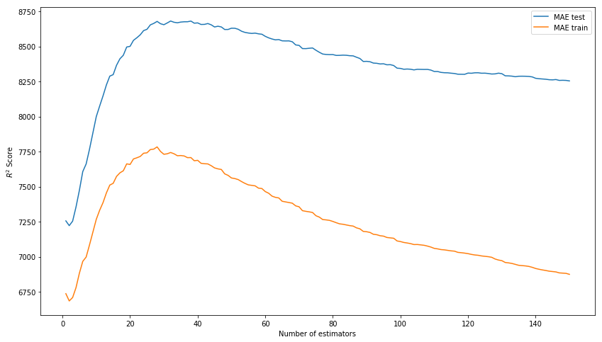
xgb_model_abs_testing = list()
xgb_model_abs_training = list()
rng = np.arange(0.05, 0.65, 0.05)
for i in rng:
    xgb = xgboost.XGBRegressor(n_estimators=150, random_state=17, learning_rate=i)
    xgb.fit(X_train, y_train)
    xgb.score(X_holdout, y_holdout)
    xgb_model_abs_testing.append(mean_absolute_error(xgb.predict(X_holdout), y_holdout))
    xgb_model_abs_training.append(mean_absolute_error(xgb.predict(X_train), y_train))
plt.figure(figsize=(14, 8))
plt.plot(rng, xgb_model_abs_testing, label='MAE test');
plt.plot(rng, xgb_model_abs_training, label='MAE train');
plt.xlabel('Learning rate')
plt.ylabel('MAE')
plt.legend(loc='best')
plt.show();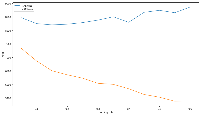
xgb_model_abs_testing = list()
xgb_model_abs_training = list()
rng = np.arange(1, 11)
for i in rng:
    xgb = xgboost.XGBRegressor(n_estimators=150, random_state=17, learning_rate=0.1, max_depth=i)
    xgb.fit(X_train, y_train)
    xgb.score(X_holdout, y_holdout)
    xgb_model_abs_testing.append(mean_absolute_error(xgb.predict(X_holdout), y_holdout))
    xgb_model_abs_training.append(mean_absolute_error(xgb.predict(X_train), y_train))
plt.figure(figsize=(14, 8))
plt.plot(rng, xgb_model_abs_testing, label='MAE test');
plt.plot(rng, xgb_model_abs_training, label='MAE train');
plt.xlabel('Maximum depth')
plt.ylabel('MAE')
plt.legend(loc='best')
plt.show();
Now we will train the model with selected hyper parameters.
xgb = xgboost.XGBRegressor(n_estimators=150, random_state=17, learning_rate=0.1, max_depth=3)
xgb.fit(X_train, y_train)
print('R^2 train:', xgb.score(X_train, y_train))
print('R^2 test:', xgb.score(X_holdout, y_holdout))
print('MAE train', mean_absolute_error(xgb.predict(X_train), y_train))
print('MAE test', mean_absolute_error(xgb.predict(X_holdout), y_holdout))
R^2 train: 0.6745967150462303
R^2 test: 0.15415143189670344
MAE train: 6328.384400466232
MAE test: 8217.07897417256The final result with the selected parameters and the visualization of feature importance - the importance of signs in the opinion of the model. In the first place is the number of observers for the ticket, and then 4 engineers go at once. Accordingly, the time of the decision of the ticket can be quite affected by the employment of an engineer. And it is quite logical that the free time of some of them is more important. If only because the team has both senior engineers and the middle (we have no juniors in the team). By the way, again in secret, the engineer in the first place (orange bar) is truly one of the most experienced among the whole team. Moreover, all 4 of these engineers have a senior prefix in their position. It turns out that the model is once again confirmed.
features_df = pd.DataFrame(data=xgb.feature_importances_.reshape(1, -1), columns=X.columns).sort_values(axis=1, by=[0], ascending=False)
features_df.loc[0][0:10].plot(kind='bar', figsize=(16, 8), rot=75, fontsize=14);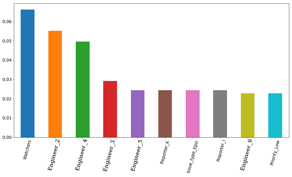
Neural network
But we will not dwell on one gradient boosting, and we will try to train a neural network, or more precisely, a Multilayer perceptron (Multilayer perceptron), a fully connected neural network of direct propagation. This time we will not start with the standard settings of the hyperparameters, since in the sklearn library, which we will use, the default is only one hidden layer with 100 neurons and when training, the model gives a warning of non-match in standard 200 iterations. We use 3 hidden layers with 300, 200 and 100 neurons, respectively.
As a result, we see that the model is not weakly overtraining on the training set, which, however, does not prevent it from showing a decent result on the test set. This result is quite a bit inferior to the result of gradient boosting.
from sklearn.neural_network import MLPRegressor
nn = MLPRegressor(random_state=17, hidden_layer_sizes=(300, 200 ,100), alpha=0.03,
                      learning_rate='adaptive', learning_rate_init=0.0005, max_iter=200, momentum=0.9,
                      nesterovs_momentum=True)
nn.fit(X_train, y_train)
print('R^2 train:', nn.score(X_train, y_train))
print('R^2 test:', nn.score(X_holdout, y_holdout))
print('MAE train', mean_absolute_error(nn.predict(X_train), y_train))
print('MAE test', mean_absolute_error(nn.predict(X_holdout), y_holdout))
R^2 train: 0.9771443840549647
R^2 test: -0.15166596239118246
MAE train: 1627.3212161350423
MAE test: 8816.204561947616Let's see what we can achieve by trying to find the best architecture of our network. To begin with, we will train several models with one hidden layer and one with two, just to make sure once again that models with one layer do not have time to converge in 200 iterations and, as can be seen from the graph, they can converge for a very, very long time. Adding another layer already helps a lot.
plt.figure(figsize=(14, 8))
for i in [(500,), (750,), (1000,), (500,500)]:
    nn = MLPRegressor(random_state=17, hidden_layer_sizes=i, alpha=0.03,
                      learning_rate='adaptive', learning_rate_init=0.0005, max_iter=200, momentum=0.9,
                      nesterovs_momentum=True)
    nn.fit(X_train, y_train)
    plt.plot(nn.loss_curve_, label=str(i));
plt.xlabel('Iterations')
plt.ylabel('MSE')
plt.legend(loc='best')
plt.show()
And now let's practice more models with completely different architecture. From 3 hidden layers to 10 and see which one shows itself better.
plt.figure(figsize=(14, 8))
for i in [(500,300,100), (80, 60, 60, 60, 40, 40, 40, 40, 20, 10), (80, 60, 60, 40, 40, 40, 20, 10),
          (150, 100, 80, 60, 40, 40, 20, 10), (200, 100, 100, 100, 80, 80, 80, 40, 20), (80, 40, 20, 20, 10, 5),
          (300, 250, 200, 100, 80, 80, 80, 40, 20)]:
    nn = MLPRegressor(random_state=17, hidden_layer_sizes=i, alpha=0.03,
                      learning_rate='adaptive', learning_rate_init=0.001, max_iter=200, momentum=0.9,
                      nesterovs_momentum=True)
    nn.fit(X_train, y_train)
    plt.plot(nn.loss_curve_, label=str(i));
plt.xlabel('Iterations')
plt.ylabel('MSE')
plt.legend(loc='best')
plt.show()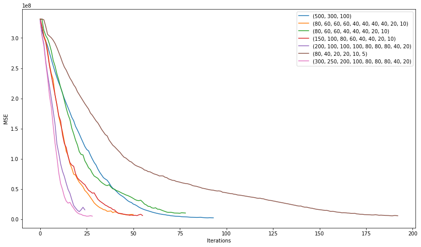
The model with architecture (200, 100, 100, 100, 80, 80, 80, 40, 20), which showed the following average error, won in this “competition”:
2506 on the training sample
7351 on the test sample
The result turned out to be better than the gradient boosting, although it suggests the idea of retraining the model. Let's try to slightly increase the regularization and learning rate and look at the result.
nn = MLPRegressor(random_state=17, hidden_layer_sizes=(200, 100, 100, 100, 80, 80, 80, 40, 20), alpha=0.1,
                      learning_rate='adaptive', learning_rate_init=0.007, max_iter=200, momentum=0.9,
                      nesterovs_momentum=True)
nn.fit(X_train, y_train)
print('R^2 train:', nn.score(X_train, y_train))
print('R^2 test:', nn.score(X_holdout, y_holdout))
print('MAE train', mean_absolute_error(nn.predict(X_train), y_train))
print('MAE test', mean_absolute_error(nn.predict(X_holdout), y_holdout))
R^2 train: 0.836204705204337
R^2 test: 0.15858607391959356
MAE train: 4075.8553476632796
MAE test: 7530.502826043687Well, it got better. The average error on the training sample increased, but the error on the test sample remained almost unchanged. This suggests that such a model is better generalized to data that it did not see.
Now we will try to deduce the importance of the signs. We do this as follows: take the absolute weight for each of the signs for each of the neurons in the first of the hidden layers (this is the one in which there are 200 neurons). And we calculate which of the signs have the greatest weight in the "opinion" of the largest number of neurons. For example, 30 neurons from 200 consider that the sign of the issue type: Epic most affects the runtime of a ticket. And here we do not see exactly which way, because we take the absolute value of the weight, but if you think about it, this type of ticket is used quite rarely and mostly works on it take a long time, so it is not difficult to assume that this feature affects the decision time in the direction of its increase. But on the 4th and 5th places the priority of the ticket is located. And if low priority also affects the increase in time, then critical reduces it. We traced this dependence on our own at the very beginning, and now the model has also revealed it.
However, it is worth making a small remark here - since in our model there are as many as 9 hidden layers, then determining the importance of signs by the weights of only the first one is not entirely correct. It is nice to see from this picture that the model at least behaves adequately with respect to the importance of the signs, but the deeper the data goes into the network, the more difficult it will be to present them in a form that is understandable to humans.
pd.Series([X_train.columns[abs(nn.coefs_[0][:,i]).argmax()] for i in range(nn.hidden_layer_sizes[0])]).value_counts().head(5).sort_values().plot(kind='barh', title='Feature importance', fontsize=14, figsize=(14,8));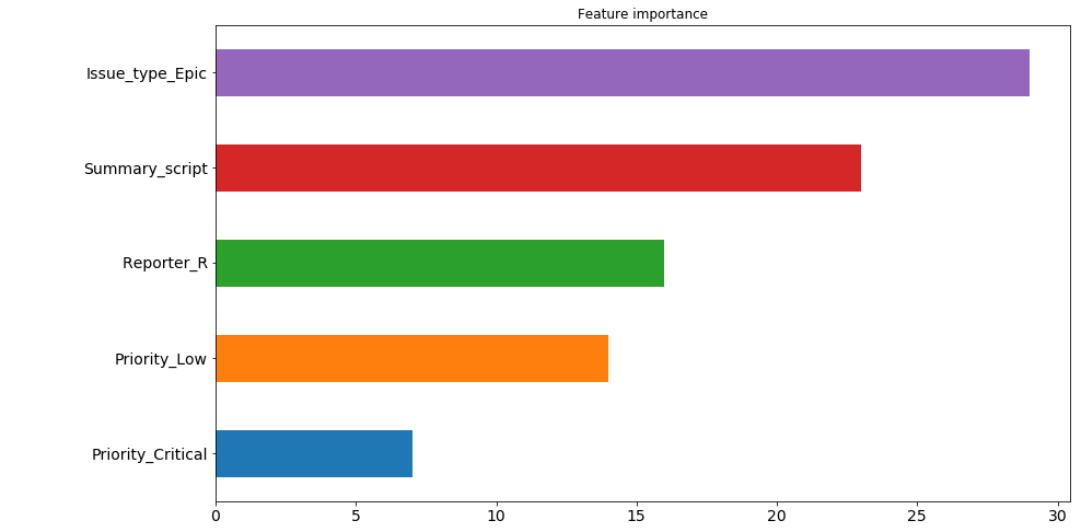
Model Ensemble
And in this part we will make an ensemble of two models by averaging their predictions. What for? It seems that here the error of one model is 7530 and the other is 8217. After all, averaging should be (7530 + 8217) / 2 = 7873, which is worse than a neural network error, right? No not like this. We do not average error, but model predictions. And the error from this took, and decreased to 7526.
In general, the ensemble of models is quite a powerful thing, people win competitions on kaggle. But the presented method of averaging is perhaps the simplest of them.
nn_predict = nn.predict(X_holdout)
xgb_predict = xgb.predict(X_holdout)
print('NN MSE:', mean_squared_error(nn_predict, y_holdout))
print('XGB MSE:', mean_squared_error(xgb_predict, y_holdout))
print('Ensemble:', mean_squared_error((nn_predict + xgb_predict) / 2, y_holdout))
print('NN MAE:', mean_absolute_error(nn_predict, y_holdout))
print('XGB MSE:', mean_absolute_error(xgb_predict, y_holdout))
print('Ensemble:', mean_absolute_error((nn_predict + xgb_predict) / 2, y_holdout))
NN MSE: 628107316.262393
XGB MSE: 631417733.4224195
Ensemble: 593516226.8298339
NN MAE: 7530.502826043687
XGB MSE: 8217.07897417256
Ensemble: 7526.763569558157Results analysis
Total what we have at the moment? Our model is mistaken for about 7,500 minutes on average. Those. for 5 days It looks like a not very accurate prediction for the runtime of the ticket. But get upset and panic early. Let's see where exactly the model is wrong most and how much.
The list with the maximum model errors (in minutes):
((nn_predict + xgb_predict) / 2 - y_holdout).apply(np.abs).sort_values(ascending=False).head(10).values[469132.30504392, 454064.03521379, 252946.87342439, 251786.22682697, 224012.59016987, 15671.21520735, 13201.12440327, 203548.46460229, 172427.32150665, 171088.75543224]The numbers are impressive. Let's see what these tickets are.
df.loc[((nn_predict + xgb_predict) / 2 - y_holdout).apply(np.abs).sort_values(ascending=False).head(10).index][['Issue_type', 'Priority', 'Worktype', 'Summary', 'Watchers']]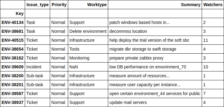
I will not go into too much detail on each of the tickets, but in general it is clear that these are some global projects for which even a person cannot predict the exact dates of completion. Let me just say that as many as 4 tickets here are associated with moving equipment from one location to another.
And now let's take a look where our model shows the most accurate results.
print(((nn_predict + xgb_predict) / 2 - y_holdout).apply(np.abs).sort_values().head(10).values)
df.loc[((nn_predict + xgb_predict) / 2 - y_holdout).apply(np.abs).sort_values().head(10).index][['Issue_type', 'Priority', 'Worktype', 'Summary', 'Watchers']]
[ 1.24606014, 2.6723969, 4.51969139, 10.04159236, 11.14335444, 14.4951508, 16.51012874, 17.78445744, 21.56106258, 24.78219295]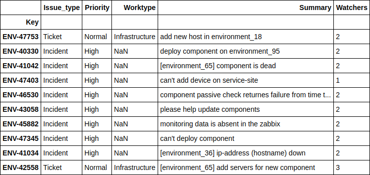
It can be seen that the model predicts best of all when people ask to deploy some additional server on their environment, or when some minor errors occur on existing environments and services. And, as a rule, it is most important for a reporter to have an approximate time to solve just such problems, with which the model copes well.
How Field Engineer Increased Accuracy
Remember, I promised several times to tell about the 'Engineer' fields, which contain the number of open tickets in use, on each of the engineers at the time of receipt of a new ticket? Keep the promise.
The fact is that before adding these data, the accuracy of the model was about 2 times worse than the current one. Of course, I tried various optimizations of hyperparameters, tried to make a more cunning ensemble of models, but all this increased the accuracy very slightly. As a result, after a little reflection, and taking advantage of the fact that I know the whole “kitchen” of our department’s work from the inside, it was concluded that not only (and not so much) priority, type of ticket and any other fields of it are important, affecting the time of its decision how busy engineers are. Agree, if all the staff of the department are overwhelmed with work and are sitting "in the soap", then no prioritization and changing the description of the problem will help speed up the process of solving it.
The idea seemed sensible to me, and I decided to collect the necessary information. Thinking on my own and after consulting with my colleagues, I didn’t find anything else except how to cycle through all the collected tickets and run an internal cycle for each of the 12 engineers for each of them, making the following query (this is the JQL language used in JIRA):
assignee was engineer_N during (ticket_creation_date) and status was "In Progress"The result was 10783 * 12 = 129396 queries that took ... a week. Yes, it took exactly one calendar week to get such historical data for each of the tickets for each of the engineers. about 5 seconds per request.
Now imagine how pleased I was when these new findings added to the model improved its accuracy immediately by 2 times. It would be unpleasant to spend a week collecting data and end up with nothing.
Results and future plans
The model with acceptable accuracy predicts the time to solve the most common problems and this is a good help. Now it is used in our team for the internal SLO to which we are oriented, building our turn of tickets.
In addition, there is an idea to use the same set of data to predict the engineer who will deal with the new incoming task (people in the team specialize in different things: someone is more involved in telephony, someone sets up monitoring, and someone works with databases) and to search for similar tickets already resolved earlier, which will help reduce time for debugging problems using existing experience.