Made a redesign - lost a billion
- Transfer
We explore the epic failures of the redesign and we shake on us.  The product manager enters the design department and orders a website redesign. “Our site looks so old! All our competitors have brighter sites. Let's redesign it. Buttons with multi-colored shadows are the future! ”
Designer:“ Ok, let's start with usability testing ”.
PM: “You have 3 weeks and I want all the colors to be replaced with hot pink, bright blue or orange.”
Here is how you kill your conversion rate . Although the above scenario may be a wild exaggeration, seeing the number of companies radically reworking their brand every year, it turns out that this is not the case. Just look at Facebook, which looks like new almost every time I open it. On Facebook there is a whole group consisting of3 thousand participants who track any detail that the company has changed .
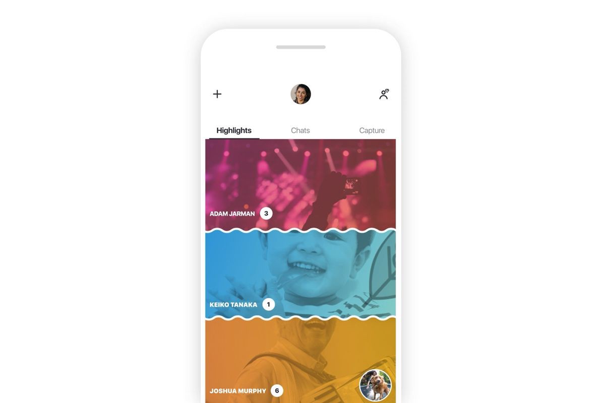
Skype Redesign 2018
Any product that users encounter must inevitably remain relevant and fresh in a constantly changing market. Redesign is vital for websites, applications or any product that interacts with any kind of users or interested parties. If done right with the data management process and well-defined key performance indicators for the design , the product developed can increase conversions, get more sales, and make your users happy.
But more often than not, a redesign seems rather undesirable, with falling conversions, angry users and negative reviews about the application. Whether small players like Snapchat or as big as Microsoft withWindows 8 and Skype - it seems no one is immune from the failure of the redesign.
A redesign, whether visual or functional, is a change in how the user remembers your product. People don't like change. When you change the way a user accesses the settings page of your application, you ask them to break the habit. Users who previously could go to the settings page in your application, without thinking about it, are now trying to find it. This leads to micro-aggression. Your job as a designer is to minimize these microagressions and motivate them to create new habits.

Let's analyze how Snapchat reworked one of its main user functions — viewing stories from friends.
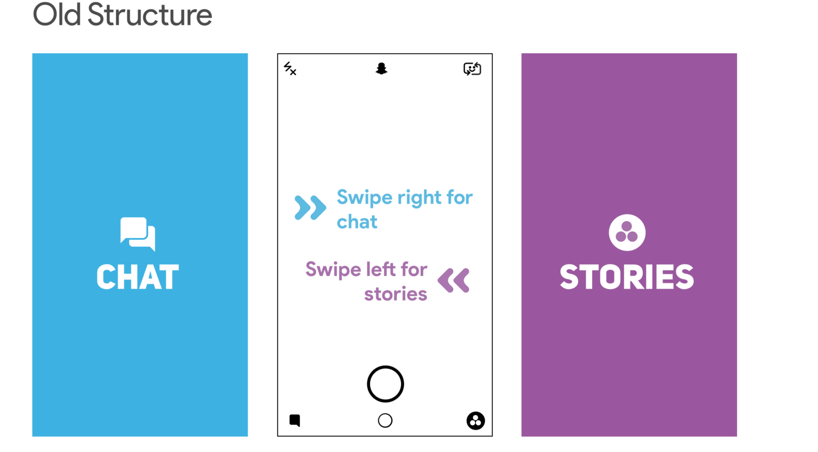
In the old version of Snapchat, the following navigation structure was set up: swipe left to view stories, and swipe right to chat with friends. To view your friends' stories, scroll left and then tap your friend's story.
Promoted stories of celebrities and media were part of this page. They appeared next to the stories of your friends.
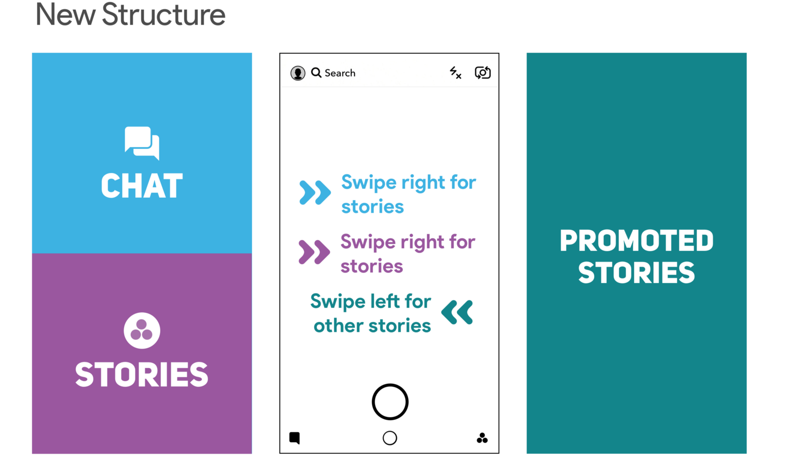
With the redesign, friends' stories have been moved to the left and merged with chat. Promoted stories got their page. This redesign meant that Snapchat has moved away from its previous separation between chat and stories. The focus was on the separation between friends and content publishers. Snapchat can promote paid content by grouping everything related to friends in one place.
The main area that you need to click to view the story has also been reduced in the redesign process. Previously, users had a rectangular area that they could click to view their friend’s story. After redesign, it was reduced to a much smaller circle, which was pushed all the way to the left towards the screen.
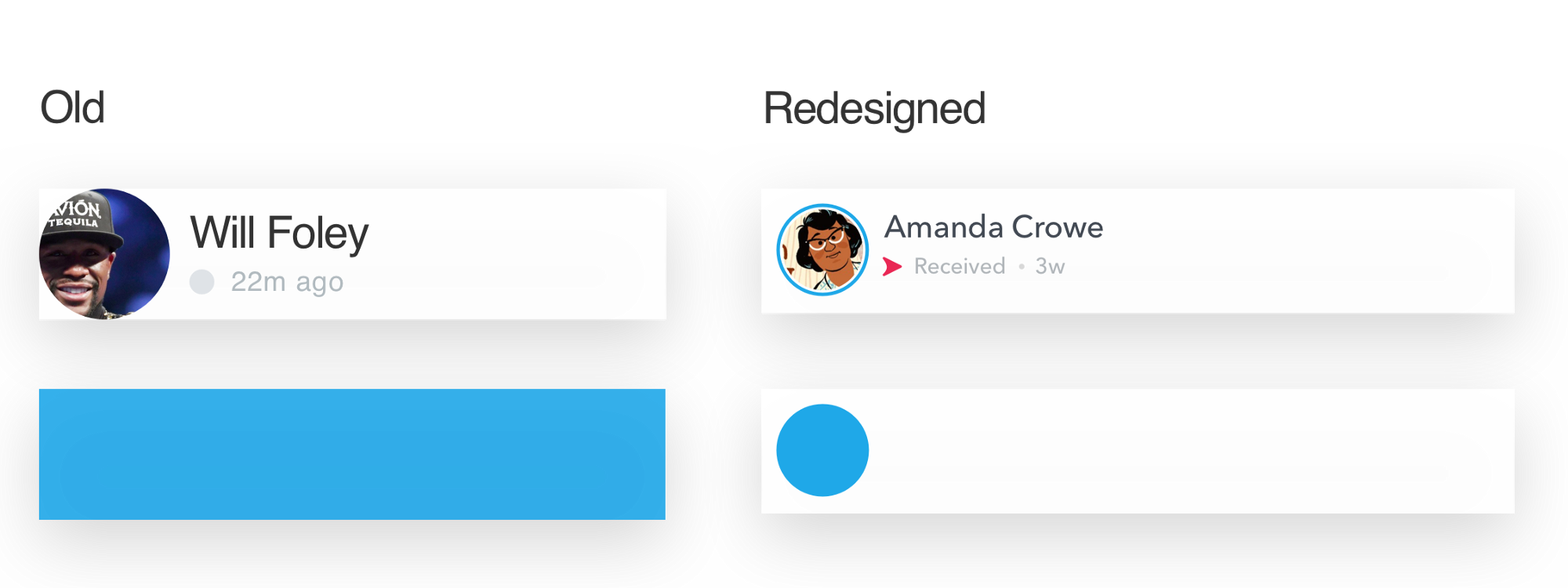
At least two practical rules have been changed: the navigation structure and the area that you need to click to view the history. Needless to say, users did not really like these changes. During the week, the average Snapchat rating dropped from 3.1 to 2.4.
I did a smart analysis of user reviews using Appbot . We can clearly see a surge of negative feedback after the redesign has been presented to users.


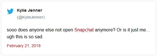
This tweet was worth a Snapchat billion a billion
Snapchat redesign was a disaster. Daily attendance decreased by 2% to 188 million from 193 million . Ad impressions and revenue fell by 36%. Many content publishers changed the platform and began calling Instagram their new home.
Six months after the introduction of the redesign, Snapchat made changes and announced the reshuffle. Friends stories moved to the right along with publishers stories. Quote:
Now let's see how Microsoft redesigned their Start menu in Windows 8. Let's try opening the control panel in Windows 7 and 8.
To open the control panel in Windows 7, you need to click on the Start button to display a list of all applications. And then you click on the control panel.
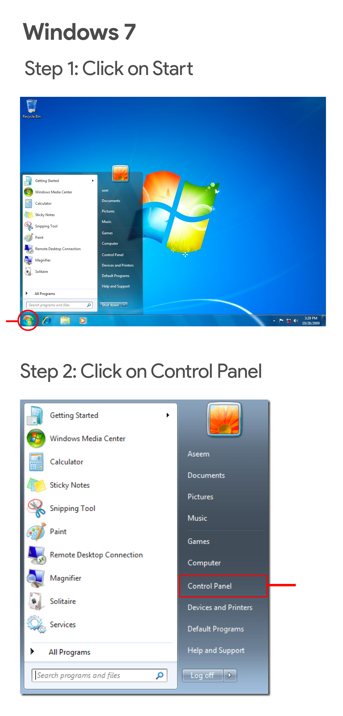
In Windows 8, you already start with the Start menu. Good start, right? Wrong. In the listed applications there is no control panel. Also there is no possibility to list all the programs.
To get to the panel, you need to open the Charms menu. The menu can be opened by hovering the mouse over the right upper or lower part of the screen. Once you have managed to open the Charms menu, you click on “Settings” and then on the control panel.
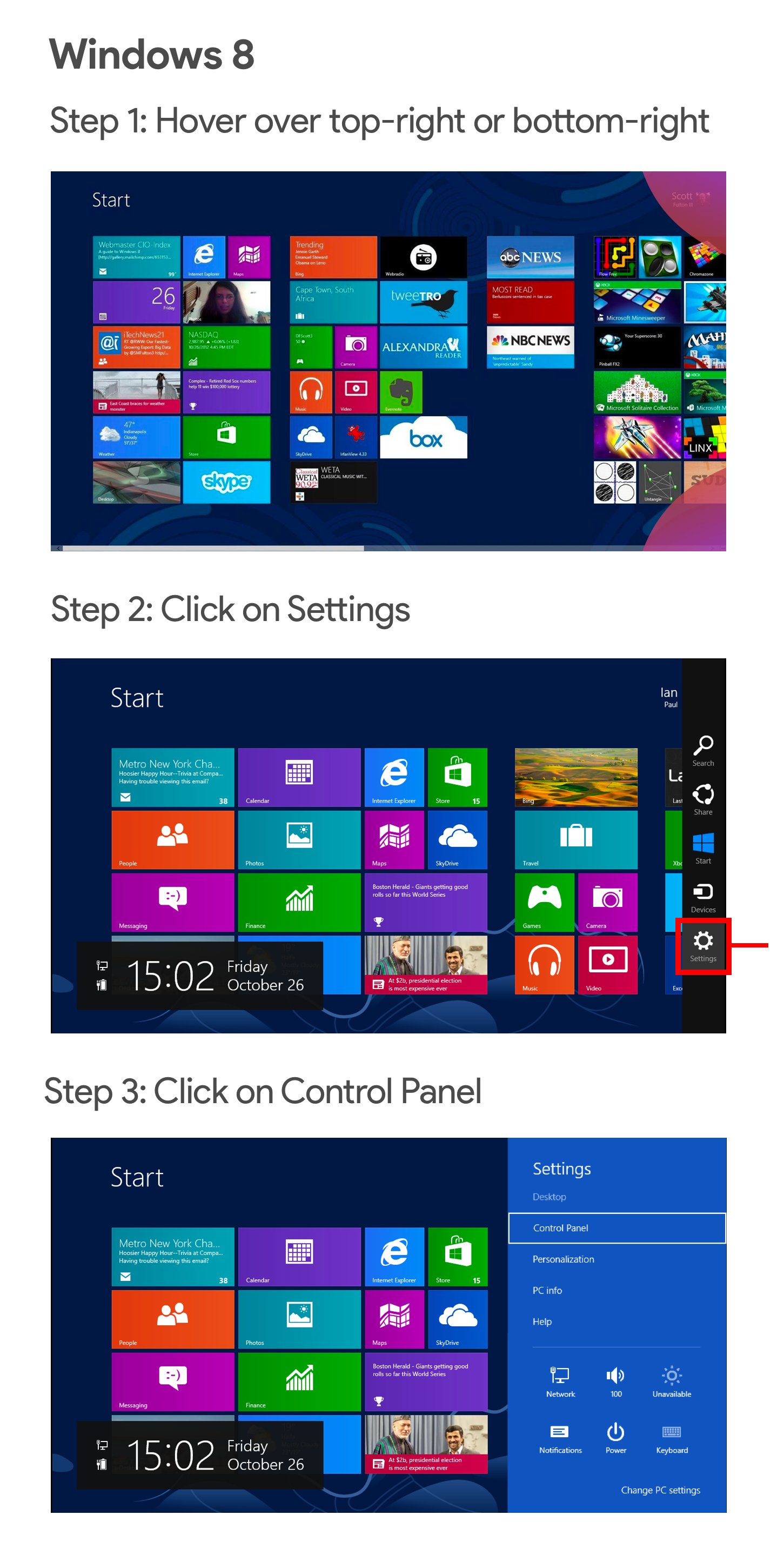
This gestural-based access to the panels was completely alien to users when running Windows 8. Windows did not provide any additional information to help users open the charm buttons menu. Even after users discovered the Charms menu, resorting to the help of Google or their friends, they still were uncomfortable with it. Gestures and hangs were new concepts for the OS.
Redesign is change, and people don't like change. From the examples above, it is easy to guess that spending time on redesign to change the product’s performance may not be a good investment for your product. But products that do not develop and retain the same design for a “safe game” will inevitably disappear due to its fast-moving competitors.
Easy and progressive changes that users can easily accept make the design a bearable. Sometimes this can lead to the omission of bright animations, gestures or navigation structures to the use of simpler alternatives with which the user is already familiar.
In 2012, Facebook was preparing to redesign its navigation through its applications. Up until now, the path to the friends pages, messages and notifications has been through the blue action bar at the top of the screen. This action bar was designed to simulate how users navigated the site.

Both Android and iOS implemented the same navigation with the same action panels.

But the base of mobile users was catching up, and users starting from mobile gradually shaded users using the desktop version. Mobile social networks such as Instagram, Snapchat and Vine (rip) were gaining popularity. It was clear that in the future people would spend more time on their phones than on computers.
Therefore, when Facebook decided to simplify its navigation structure for mobile devices, they decided to abandon consistency and view Android and iOS as two different products. Facebook introduced two different navigation structures for the respective applications. The Android app got a sliding tab bar that stuck to the top of the screen, and iOS got a static tab bar that stuck to the bottom.
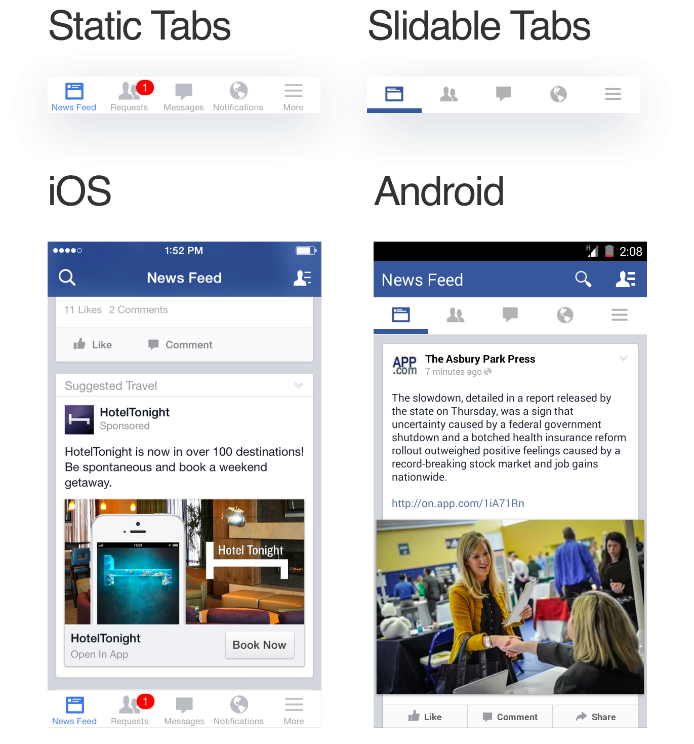
These changes were new to the application, but not to users. While the redesign really required users to break the habit of navigating to the blue navigation bar, users were already familiar with their tab bar for a particular platform. Slidebacks have been in the Android ecosystem for several years. It didn't take long for users to go from the action bar to the tab bar. Similarly, the tab bar iOS was present since the inception of the platform and did not feel alien to its users.
Splitting Facebook tabs on Android and iOS played a very good po for them. Soon they became the industry standard. Most applications implement similar navigation.
The most effective redesign, as a rule, is not the most beautiful.
Redesign is not the process of decorating things. The visual aspect is part of the redesign, but it is not a redesign. If you are upgrading your product just for the sake of more attractive visual elements, take inspiration from Dribble’s ready-made layouts and incorporate design trends without any research to support it, your redesign is doomed to failure.
Sometimes the problem may be that your outdated design language reduces the value of your brand. Your customers are moving to a competitor with a more attractive design system. And this is a perfectly normal desire to change the design of your system to look better. But blindly following trends, designing without any strategy or research confirming this need will lead to unfavorable results.
The redesign is designed to solve problems with specific business constraints and requirements.
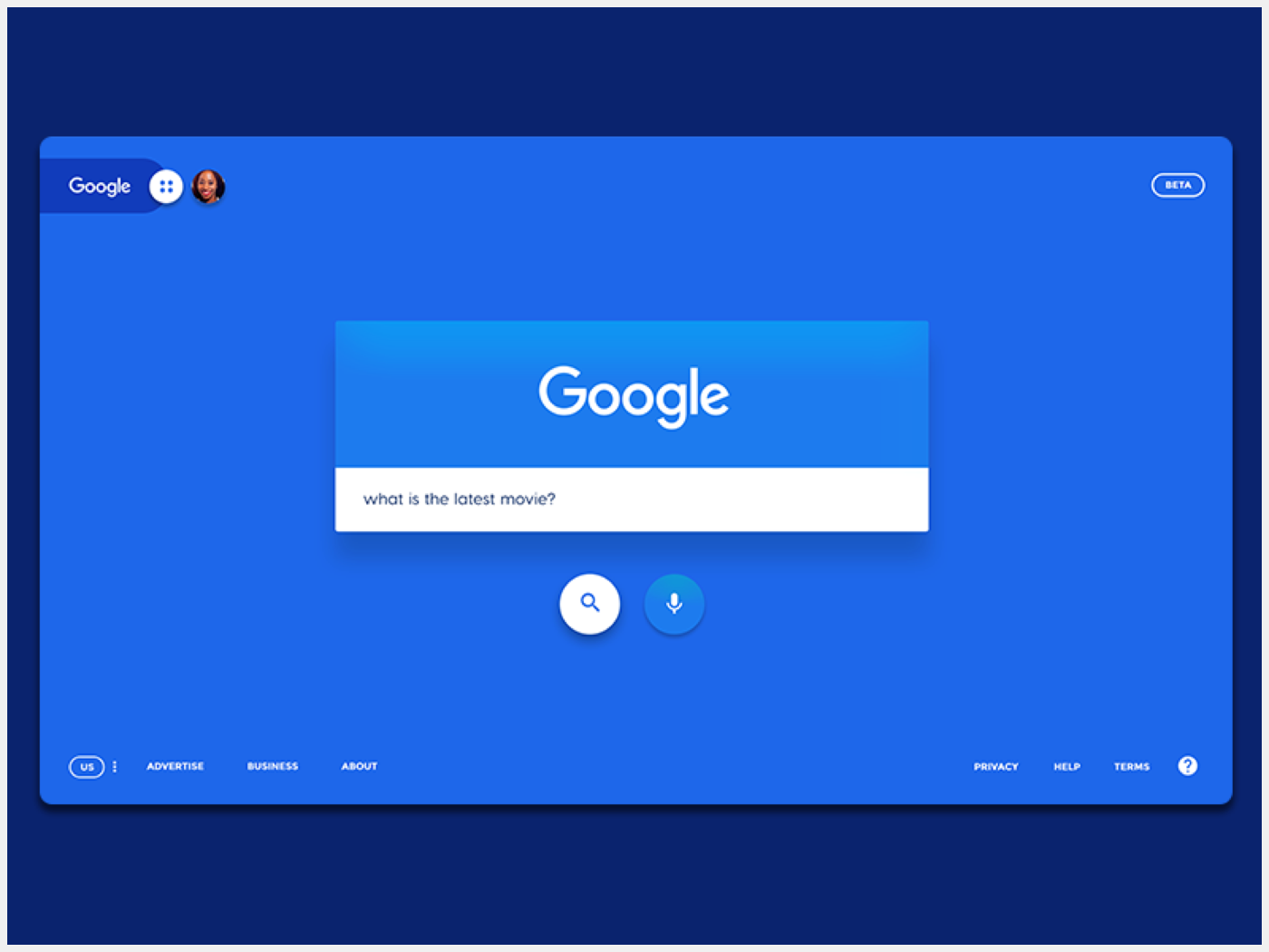
This Dribble Google design concept uses bright colors and heavy shadows to get your attention. Despite the fact that this design looks volatile, it has some serious flaws and will never see the light in Google. Firstly, there is no iconic branding from Google, which the brand has adhered to over the past 20 years. Second, all Google sites have a profile avatar on the right, and here, on the left. I could continue, but I hope you understand the essence of what I am trying to convey.
Redesign is a process, not a destination.
Product design is a cyclical process of prototyping, testing, analyzing, and improving a product or process. Redesign does not mean the product is complete. It simply means that it is “sufficiently fulfilled” to satisfy any current requirements. No product or user interface is ever “ready.”
Focus on microconversion
It is important to read between the lines to help you better draw a picture of your users and their activities. As a rule, when we talk about conversions in the technology vertical, we concentrate on the number of application installations, registered users, or generated sales.
Microconversions are often forgotten, and sometimes not tracked. Microconversions are low-hanging fruits, namely actions that lead users to the final goal, that is, macroconversion. Examples of micro-conversions include the number of users using the search function, the number of users updating their profile images, or the number of users confirming their phone number. Microconversion acts as a process step in a conversion funnel and affects the final step or macro conversion.
How do these microconversions work? Do you see a drop in a specific microconversion metric? Are users not able to add their friends because the new search bar is hard to find? Your call to sign up for a free trial was buried behind the new layout, and users can no longer find it? Determining the exact microconversion goals and tracking them helps you assess the points of contact along the user's path in your modified platform.
The translation was made with the support of the company EDISON Software , which is constantly improving its design , as well as engaged in investing in products and providing services for outsourced development .

Designer:“ Ok, let's start with usability testing ”.
PM: “You have 3 weeks and I want all the colors to be replaced with hot pink, bright blue or orange.”
Here is how you kill your conversion rate . Although the above scenario may be a wild exaggeration, seeing the number of companies radically reworking their brand every year, it turns out that this is not the case. Just look at Facebook, which looks like new almost every time I open it. On Facebook there is a whole group consisting of3 thousand participants who track any detail that the company has changed .

Skype Redesign 2018
Any product that users encounter must inevitably remain relevant and fresh in a constantly changing market. Redesign is vital for websites, applications or any product that interacts with any kind of users or interested parties. If done right with the data management process and well-defined key performance indicators for the design , the product developed can increase conversions, get more sales, and make your users happy.
But more often than not, a redesign seems rather undesirable, with falling conversions, angry users and negative reviews about the application. Whether small players like Snapchat or as big as Microsoft withWindows 8 and Skype - it seems no one is immune from the failure of the redesign.
Why redesign fails
A redesign, whether visual or functional, is a change in how the user remembers your product. People don't like change. When you change the way a user accesses the settings page of your application, you ask them to break the habit. Users who previously could go to the settings page in your application, without thinking about it, are now trying to find it. This leads to micro-aggression. Your job as a designer is to minimize these microagressions and motivate them to create new habits.
Snapchat Navigation Redesign

Let's analyze how Snapchat reworked one of its main user functions — viewing stories from friends.
In the old version of Snapchat, the following navigation structure was set up: swipe left to view stories, and swipe right to chat with friends. To view your friends' stories, scroll left and then tap your friend's story.
Promoted stories of celebrities and media were part of this page. They appeared next to the stories of your friends.

With the redesign, friends' stories have been moved to the left and merged with chat. Promoted stories got their page. This redesign meant that Snapchat has moved away from its previous separation between chat and stories. The focus was on the separation between friends and content publishers. Snapchat can promote paid content by grouping everything related to friends in one place.

The main area that you need to click to view the story has also been reduced in the redesign process. Previously, users had a rectangular area that they could click to view their friend’s story. After redesign, it was reduced to a much smaller circle, which was pushed all the way to the left towards the screen.

At least two practical rules have been changed: the navigation structure and the area that you need to click to view the history. Needless to say, users did not really like these changes. During the week, the average Snapchat rating dropped from 3.1 to 2.4.
I did a smart analysis of user reviews using Appbot . We can clearly see a surge of negative feedback after the redesign has been presented to users.


This tweet was worth a Snapchat billion a billion
Snapchat redesign was a disaster. Daily attendance decreased by 2% to 188 million from 193 million . Ad impressions and revenue fell by 36%. Many content publishers changed the platform and began calling Instagram their new home.
Six months after the introduction of the redesign, Snapchat made changes and announced the reshuffle. Friends stories moved to the right along with publishers stories. Quote:
We learned that combining viewing stories and chatting with friends in one place makes it difficult to optimize for both competing types of behavior. We are currently releasing an update to solve this problem, moving the stories of friends to the right side of the application. - Evan Spiegel, CEO of Snapchat
Revision of the Start menu in Windows 8
Now let's see how Microsoft redesigned their Start menu in Windows 8. Let's try opening the control panel in Windows 7 and 8.
To open the control panel in Windows 7, you need to click on the Start button to display a list of all applications. And then you click on the control panel.

In Windows 8, you already start with the Start menu. Good start, right? Wrong. In the listed applications there is no control panel. Also there is no possibility to list all the programs.
To get to the panel, you need to open the Charms menu. The menu can be opened by hovering the mouse over the right upper or lower part of the screen. Once you have managed to open the Charms menu, you click on “Settings” and then on the control panel.

This gestural-based access to the panels was completely alien to users when running Windows 8. Windows did not provide any additional information to help users open the charm buttons menu. Even after users discovered the Charms menu, resorting to the help of Google or their friends, they still were uncomfortable with it. Gestures and hangs were new concepts for the OS.
Are all redesigns bad?
Redesign is change, and people don't like change. From the examples above, it is easy to guess that spending time on redesign to change the product’s performance may not be a good investment for your product. But products that do not develop and retain the same design for a “safe game” will inevitably disappear due to its fast-moving competitors.
Easy and progressive changes that users can easily accept make the design a bearable. Sometimes this can lead to the omission of bright animations, gestures or navigation structures to the use of simpler alternatives with which the user is already familiar.
Facebook Navigation Redesign
In 2012, Facebook was preparing to redesign its navigation through its applications. Up until now, the path to the friends pages, messages and notifications has been through the blue action bar at the top of the screen. This action bar was designed to simulate how users navigated the site.

Both Android and iOS implemented the same navigation with the same action panels.

But the base of mobile users was catching up, and users starting from mobile gradually shaded users using the desktop version. Mobile social networks such as Instagram, Snapchat and Vine (rip) were gaining popularity. It was clear that in the future people would spend more time on their phones than on computers.
Therefore, when Facebook decided to simplify its navigation structure for mobile devices, they decided to abandon consistency and view Android and iOS as two different products. Facebook introduced two different navigation structures for the respective applications. The Android app got a sliding tab bar that stuck to the top of the screen, and iOS got a static tab bar that stuck to the bottom.

These changes were new to the application, but not to users. While the redesign really required users to break the habit of navigating to the blue navigation bar, users were already familiar with their tab bar for a particular platform. Slidebacks have been in the Android ecosystem for several years. It didn't take long for users to go from the action bar to the tab bar. Similarly, the tab bar iOS was present since the inception of the platform and did not feel alien to its users.
Splitting Facebook tabs on Android and iOS played a very good po for them. Soon they became the industry standard. Most applications implement similar navigation.
Lessons
The most effective redesign, as a rule, is not the most beautiful.
Redesign is not the process of decorating things. The visual aspect is part of the redesign, but it is not a redesign. If you are upgrading your product just for the sake of more attractive visual elements, take inspiration from Dribble’s ready-made layouts and incorporate design trends without any research to support it, your redesign is doomed to failure.
Sometimes the problem may be that your outdated design language reduces the value of your brand. Your customers are moving to a competitor with a more attractive design system. And this is a perfectly normal desire to change the design of your system to look better. But blindly following trends, designing without any strategy or research confirming this need will lead to unfavorable results.
The redesign is designed to solve problems with specific business constraints and requirements.

This Dribble Google design concept uses bright colors and heavy shadows to get your attention. Despite the fact that this design looks volatile, it has some serious flaws and will never see the light in Google. Firstly, there is no iconic branding from Google, which the brand has adhered to over the past 20 years. Second, all Google sites have a profile avatar on the right, and here, on the left. I could continue, but I hope you understand the essence of what I am trying to convey.
Redesign is a process, not a destination.
Product design is a cyclical process of prototyping, testing, analyzing, and improving a product or process. Redesign does not mean the product is complete. It simply means that it is “sufficiently fulfilled” to satisfy any current requirements. No product or user interface is ever “ready.”
Focus on microconversion
It is important to read between the lines to help you better draw a picture of your users and their activities. As a rule, when we talk about conversions in the technology vertical, we concentrate on the number of application installations, registered users, or generated sales.
Microconversions are often forgotten, and sometimes not tracked. Microconversions are low-hanging fruits, namely actions that lead users to the final goal, that is, macroconversion. Examples of micro-conversions include the number of users using the search function, the number of users updating their profile images, or the number of users confirming their phone number. Microconversion acts as a process step in a conversion funnel and affects the final step or macro conversion.
How do these microconversions work? Do you see a drop in a specific microconversion metric? Are users not able to add their friends because the new search bar is hard to find? Your call to sign up for a free trial was buried behind the new layout, and users can no longer find it? Determining the exact microconversion goals and tracking them helps you assess the points of contact along the user's path in your modified platform.
The translation was made with the support of the company EDISON Software , which is constantly improving its design , as well as engaged in investing in products and providing services for outsourced development .
Only registered users can participate in the survey. Sign in , please.
