 April 17, 2017 at 19:46
How we did the brand new KOMPAS-3D: History in seven chapters → part 1
Hello, Habr! We are ASCON , a developer of engineering software. You may have heard about our products KOMPAS-3D , Vertical , Pilot: PLM , Pilot-ICE , Renga and the geometric core C3D .
They help industrial enterprises to create models of products of any complexity and then produce them in production, and construction companies and design organizations to implement architectural ideas and manage the information model of buildings and structures.
In our blog, we will talk about the most diverse aspects of product development: the development of functionality, testing, api, design, usability, working with the geometric core (and we have our own!), The team and other important, curious and sometimes insider details!
Today is an important day for us. Not only because we published our first material
on Habré. On April 17, we released a new, one might even say revolutionary, version
of the 3D modeling system KOMPAS-3D v17. And the main character of this revolution is the interface. A post is devoted to him (in several chapters!) By Sergey Shvetsov, designer and designer of
user interfaces at ASCON. Caution traffic .
To find out why KOMPAS-3D v17 turned out the way it turned out, you need to know the customer's input requirements for modern CAD systems and the wishes of users. Like any mature product, KOMPAS-3D approached the line of life, when users want it, developers can’t and can’t stand it anymore! Against the backdrop of these events, it was decided to modernize. What for?
1. Overcome moral and technological obsolescence. The architecture of the new interface (including the interaction interface, and not just the pictures) should allow solving problems arising in the future without a serious alteration of the concept. For example, the trend towards an increase in the diagonals and resolutions of the monitor screens leads to the fact that the interface needs to adapt to these growing resolutions. And most importantly - it should be convenient for the user. Those. the user should be able to adjust the size of the interface elements and text. The beginning of this work has been laid. The new KOMPAS-3D v17 interface, with the exception of images in the on-line help, is completely “vector”. This allows you to scale the interface elements and texts regardless of the resolution of the monitor. And the user with a standard resolution monitor,
2. Create a reserve for the future, so that the new KOMPAS-3D can solve problems and fulfill the wishes of users in the next few years. Those. the new interface must be flexible enough to meet the requirements of users and at the same time be fast in production. Also important is the ability to construct potentially any interface with minimal development overhead. For these purposes, we conducted a total unification and standardization of all interface elements, dialogs, panels.
3. To maintain the continuity of the old and new interfaces. This was perhaps the most difficult stage of all, but systematization and unification did the trick. It was possible to transfer the functionality of previous versions with virtually no loss, without losing the existing work methods.
4. To unify KOMPAS-3D with popular foreign CAD systems for the conditionally “seamless” transition of users to KOMPAS-3D without losing their own “face” acquired in previous versions.
5. Increase usability.
6. Seamlessly integrate libraries and applications into the interface, which KOMPAS has a lot of.
How we solved these problems, you will learn in the following chapters. But before we begin, we purchased:
A special Occam Tools tools gift set.
The set includes:
1. Occam's razor - 1 pc.
2. Occam's rake - 1 pc.
3. Occam's enema (in a special gift box from Hank & Co.) - 1 pc.
4. Occam's pin (in special gift packaging from the company "Kant and Co") - 1 pc.
And so we stocked up with the necessary tools, patience and common sense and did it:
No, wait, it's too early. Let us first recall the Sufi parable of Jallaladin Rumi about the elephant.
We “clean” the interface from visual garbage (extra lines, gradients, colors). We make “all” buttons available, remove unnecessary ones. At the moment, only what is needed is present. Group the teams. Quick panel. Panel of trees.
Visual trash surrounds us everywhere, and the nature of man is such that we adapt and after some time we cease to notice it. But like any system, a person spends resources on maintaining recognition and ignoring this garbage, but already in the background. In order to increase the productivity of our users, we carefully removed the rulers in three rows, gradients, dashes and sticks - everything that turned the toolbars into a mixture of ash and peas.
Leaving only the necessary elements, we made the interface more clean and expressive. Each element is now responsible for its own behavior, and everywhere this behavior is the same.
The next task was to reduce the "amount" of an unnecessary interface without losing convenience, given the fact that modern screens are becoming more and more wide. To do this, we combined the main menu and the practically unused window title. Removed the Message Line. Its functionality was distributed between the Options panel (displaying contextual prompts in commands) and the Notification Center (displaying progress indicators). The Parameters panel left only one position - vertical.
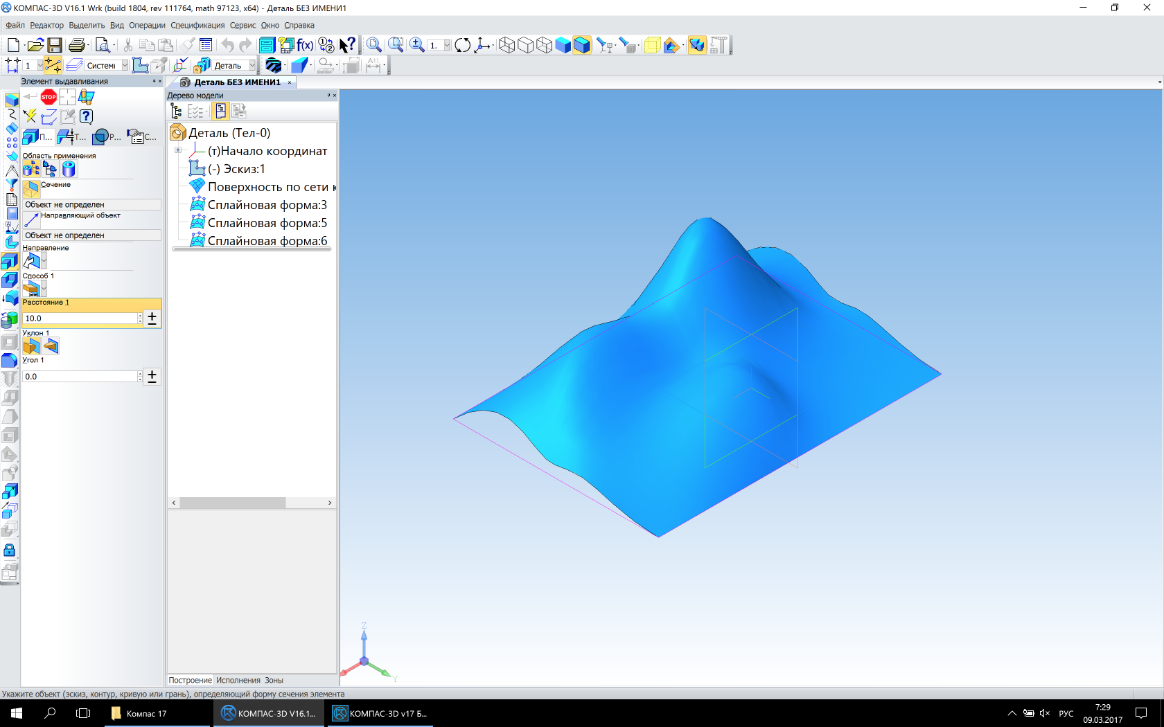
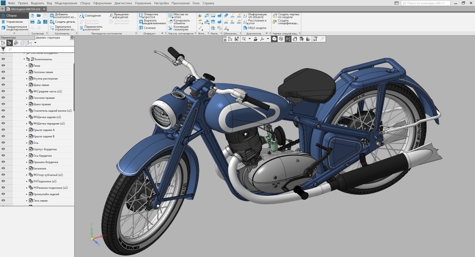
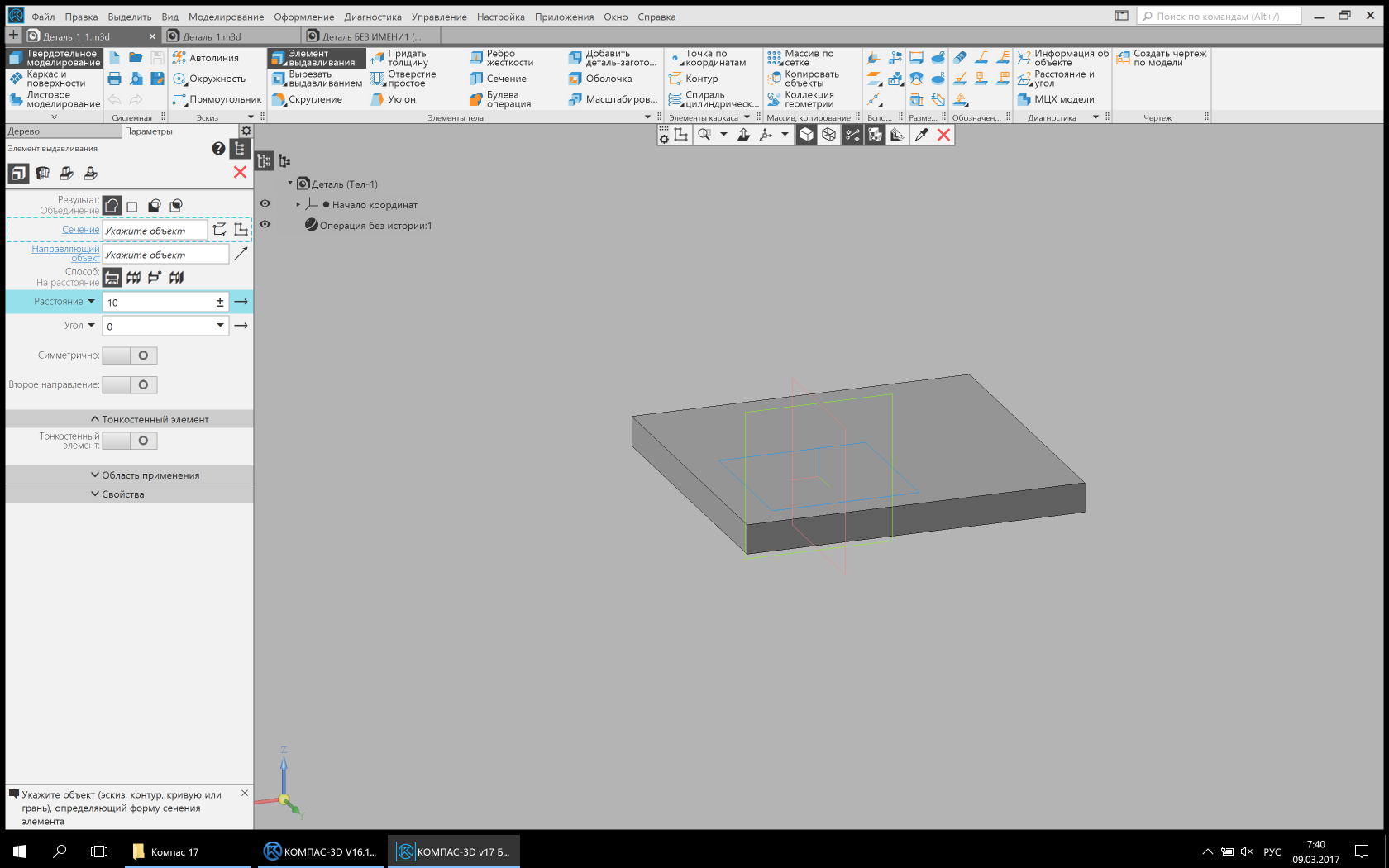
Classic interface (Image is clickable) Updated interface (Image is clickable) In previous versions of KOMPAS-3D there were a very large number of inactive elements on the screen that cluttered the interface and made it difficult to find the desired command or option. On the one hand, the interface told the user that the command cannot be used; on the other hand, it caused a bunch of questions. Why is the command inactive? What do I need to do to activate it? To remove the command deactivation, it was necessary to significantly revise the internal activation / deactivation mechanisms. The new interface deactivates a small number of elements with a clear history of deactivation. For example, the Undo / Redo buttons (action), as the context of their activation / deactivation is clear.

Classic view (Clickable image) Updated view (Clickable image) The so-called Compact panel has undergone significant alterations

. Her "spirit" was preserved, but everything began to work differently. Its successor, the List of sets, is now located in the upper left corner and has much fewer (in the default configuration) elements than the previous panel. This is due to the fact that the set now refers to the necessary set of user tools to perform a certain group of tasks. For example, in 3D modeling, this is solid state, sheet or surface modeling. Moreover, there are “virtual” sets that are included depending on the context of use. For example, the Sketch Tools set is only available in Sketch mode. Also, some libraries can create their own sets. Another set can contain any command available in v17, including a library, and in v17.1 users can create such sets themselves,
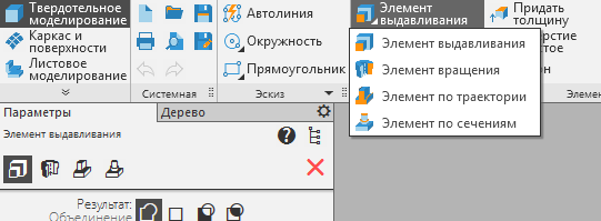
In the 17th version, all buttons, indicators, lists, and other elements that were responsible for displaying the state of the model or drawing are collected on a special Quick panel. This is done to make the interface more compact, and similar tools were concentrated in one place. Also, the mode and state buttons (sweep, explode, sketch) moved to this panel. Classic panels (the picture is clickable) Quick panel In 3D, all the trees are now assembled into a single panel. Those. The concept of a document manager is gradually disappearing. The following panels are now concentrated on a single panel: Construction Tree - historical and structural, Execution Tree and Zones. The very representation of trees is substantially revised and unified.


A new column has appeared in the trees, which allows you to quickly turn on / off the frequency functionality. For example, for a 3D document, these are Visibility, Editing ability, Inclusion in calculation and Projection.
In the Drawing, the drawing tree is also substantially revised. The Document Manager has been abolished. All information about the document is now available in one place, and a search with filtering will allow you to quickly find the desired object in the drawing. Also, lists have been moved to the tree to select the current view and layer. If you click on the color / number indicator in the list of a view or layer, you can quickly switch to the current view or layer in the tree.
Layout. Save space. Accessibility (contrast, choice of backlight colors, scalability of the interface). Search by teams. Why not a “tape”? Search in the trees.
The main center of the layout of the interface is the upper left corner. The whole layout scheme is built around it. Toolbar, Options panel, List of sets, document tab bar.
This is done in order to quickly access frequently used tools.
The new toolbar combines the strengths of the classic Toolbar and Quick Toolbar: quick access, compactness, extensibility, quick switching between toolboxes.
Many people ask, why not use a time-tested solution from Microsoft - tape? Like, all the leading CAD systems use it. After deep analysis, we found several reasons that led us to develop our own toolbar.
1. The complexity of designing under the tape. The concept of the tape involves the allocation of "frequency" commands that look like big buttons. This is a bit of common sense for small applications with one user role, for which the tape was developed (text editor, small graphic editor). But for applications such as KOMPAS-3D, where there are several hundred teams and several user roles, such a solution seems controversial. For example, take the Extrude command block.
In some roles, this is one of the main commands, in some not, some users use the Extrude Element command more often, others use the Section Element command, and someone does not use this block of commands at all. Suppose, by default, analysts decided to make the Extrusion block a large button and put the Extrusion Element command in first place. For users who do not use this command or extrusion in general, this solution will be unsatisfactory, because their frequency / importance of the commands is completely different. “But the user himself can adjust such an interface for himself!” - an inquisitive researcher will object. For example, it will make the button size for itself, change the order and so on. Yes, of course it can. But the development of such a constructor that allows users to customize the tape interface for themselves will take a lot of time, but this is not the main thing. In the general case, the user should not configure the interface, he should do his work, because for this he uses our application, and not to spend hours setting it up.
2. Compactness, or rather lack of compactness in the tape. One large button takes the place of three buttons with signatures or six without signatures.
3. Tabs. There are two problems. The first is that KOMPAS-3D uses tabs to display open documents, users really like it.
The location of the ribbon tabs and open document tabs in one place would greatly complicate the interface and complicate the lives of users. Since we wanted to maintain the continuity between the previous and new versions of KOMPAS-3D, during the analysis we found a second problem - uncontrolled “creep” of tabs. What are you talking about? The current list of sets is the successor to the Compact Panel of previous versions of KOMPAS-3D. A compact panel, in turn, can contain a number of buttons that switch panels. Moreover, this number is not limited by anything, since almost any third-party application can be integrated into the Compact Panel. If we used a ribbon, then even with a standard set of applications, the user could get a ribbon tab bar that does not fit on the screen,
4. Inability to place all the abundance of team settings on the tape. The concept of the tape from Microsoft involves placing additional controls on the tape itself. Those. not only buttons can be located there, but also other interface elements. The location of only the buttons violates the elaboration of the concept and reduces its advantages to zero.
To make it easier for KOMPAS-3D users to search for commands in the new, revised main menu, we added a command search, which is located on the same line as the main menu. Now the search searches and runs only the commands in the main menu. In the future, we plan to significantly expand the search functionality and make it global.

New version. Team Search
One of the innovations of the 17th version is the appearance of search fields in almost all long lists and trees. The 3D construction tree and the Drawing tree additionally have filters for faster and more accurate search for

New versions. From left to right. Search in the build tree, in variables and in libraries
 Sergey Shvetsov, ASCON user interface designer and designer
Link to the second part.
They help industrial enterprises to create models of products of any complexity and then produce them in production, and construction companies and design organizations to implement architectural ideas and manage the information model of buildings and structures.
In our blog, we will talk about the most diverse aspects of product development: the development of functionality, testing, api, design, usability, working with the geometric core (and we have our own!), The team and other important, curious and sometimes insider details!
Today is an important day for us. Not only because we published our first material
on Habré. On April 17, we released a new, one might even say revolutionary, version
of the 3D modeling system KOMPAS-3D v17. And the main character of this revolution is the interface. A post is devoted to him (in several chapters!) By Sergey Shvetsov, designer and designer of
user interfaces at ASCON. Caution traffic .
Epigraph
“Writing a book is like washing an elephant: it's hard to decide where to start, and it's hard to understand where the elephant is already washed and where not yet.” I don’t know to whom this aphorism belongs, but I experienced it in my own skin. This is true for books and also true for interface design. It's simple: the elephant is big, but any project is also big. It has a lot of work in general and even many different types of work. You need to know what to do, when to do, when to stop doing it.
Vlad V. Golovach
"User Interface Design 2. The Art of Washing an Elephant"
No chapter, from which one can nevertheless learn something
To find out why KOMPAS-3D v17 turned out the way it turned out, you need to know the customer's input requirements for modern CAD systems and the wishes of users. Like any mature product, KOMPAS-3D approached the line of life, when users want it, developers can’t and can’t stand it anymore! Against the backdrop of these events, it was decided to modernize. What for?
1. Overcome moral and technological obsolescence. The architecture of the new interface (including the interaction interface, and not just the pictures) should allow solving problems arising in the future without a serious alteration of the concept. For example, the trend towards an increase in the diagonals and resolutions of the monitor screens leads to the fact that the interface needs to adapt to these growing resolutions. And most importantly - it should be convenient for the user. Those. the user should be able to adjust the size of the interface elements and text. The beginning of this work has been laid. The new KOMPAS-3D v17 interface, with the exception of images in the on-line help, is completely “vector”. This allows you to scale the interface elements and texts regardless of the resolution of the monitor. And the user with a standard resolution monitor,
2. Create a reserve for the future, so that the new KOMPAS-3D can solve problems and fulfill the wishes of users in the next few years. Those. the new interface must be flexible enough to meet the requirements of users and at the same time be fast in production. Also important is the ability to construct potentially any interface with minimal development overhead. For these purposes, we conducted a total unification and standardization of all interface elements, dialogs, panels.
3. To maintain the continuity of the old and new interfaces. This was perhaps the most difficult stage of all, but systematization and unification did the trick. It was possible to transfer the functionality of previous versions with virtually no loss, without losing the existing work methods.
4. To unify KOMPAS-3D with popular foreign CAD systems for the conditionally “seamless” transition of users to KOMPAS-3D without losing their own “face” acquired in previous versions.
5. Increase usability.
6. Seamlessly integrate libraries and applications into the interface, which KOMPAS has a lot of.
How we solved these problems, you will learn in the following chapters. But before we begin, we purchased:
A special Occam Tools tools gift set.
For those who do not know about Okkama razor
Occam’s razor (sometimes Occam’s blade) is a methodological principle named after the English monk Franciscan, nominal philosopher William Ockham (Eng. Ockham, Occam; Latin Gulielmus Occamus; c. 1285–1349). In a concise form, it reads: “One should not multiply things without necessity” (or “One should not attract new entities without an emergency”). Ockham himself wrote: “What can be done on the basis of fewer [assumptions] should not be done on the basis of more” and “Diversity should not be assumed without necessity.” This principle forms the basis of methodological reductionism, also called the principle of frugality, or the law of economy (lat. Lex parsimoniae).
What is today called the “Occam's razor” was not created by Occam, given the basic content of this principle. What the Occam formulated under the Proto-Renaissance has been known, at least since the time of Aristotle.
(Link to the full Wikipedia article)
What is today called the “Occam's razor” was not created by Occam, given the basic content of this principle. What the Occam formulated under the Proto-Renaissance has been known, at least since the time of Aristotle.
(Link to the full Wikipedia article)
The set includes:
1. Occam's razor - 1 pc.
2. Occam's rake - 1 pc.
3. Occam's enema (in a special gift box from Hank & Co.) - 1 pc.
4. Occam's pin (in special gift packaging from the company "Kant and Co") - 1 pc.
And so we stocked up with the necessary tools, patience and common sense and did it:
Original. Caution, the link is music!
No, wait, it's too early. Let us first recall the Sufi parable of Jallaladin Rumi about the elephant.
What kind of elephant?
A DISPUTE ABOUT AN ELEPHANT
Recently brought from India,
An elephant was put in a close barn,
But the one who paid the watchman money,
He went into the corral to the elephant in the darkness.
And in the dark, not seeing anything,
With his hands people rummaged him.
Elephants have not been here until now.
And then he went in the midst of interesting arguments.
One, touching the trunk with his hand:
“The elephant is similar to a drainpipe!” The
other, feeling the ear, said: “You are lying,
it looks like a fan!” He
touched the third leg of the elephant,
Said: “It’s like a thick log.”
Fourth, stroking his back: "The argument is empty. A
log, a pipe ... it’s just like an ottoman."
Everyone represented this creature.
In different ways, not having seen him.
Their opinions are absurd, false -
Ignorance was born.
And there would be candles with them, by candlelight
And there would be no disagreement in speeches.
- The elephant is similar to a drainpipe!
Chapter 1. The interface is evil
We “clean” the interface from visual garbage (extra lines, gradients, colors). We make “all” buttons available, remove unnecessary ones. At the moment, only what is needed is present. Group the teams. Quick panel. Panel of trees.
Visual trash surrounds us everywhere, and the nature of man is such that we adapt and after some time we cease to notice it. But like any system, a person spends resources on maintaining recognition and ignoring this garbage, but already in the background. In order to increase the productivity of our users, we carefully removed the rulers in three rows, gradients, dashes and sticks - everything that turned the toolbars into a mixture of ash and peas.
Leaving only the necessary elements, we made the interface more clean and expressive. Each element is now responsible for its own behavior, and everywhere this behavior is the same.
The next task was to reduce the "amount" of an unnecessary interface without losing convenience, given the fact that modern screens are becoming more and more wide. To do this, we combined the main menu and the practically unused window title. Removed the Message Line. Its functionality was distributed between the Options panel (displaying contextual prompts in commands) and the Notification Center (displaying progress indicators). The Parameters panel left only one position - vertical.
By the way, by default, the classic KOMPAS interface assumed a horizontal Settings panel.
The classic interface. Options panel below. (Image is clickable)
The classic interface. Options panel below. (Image is clickable)
Classic interface (Image is clickable) Updated interface (Image is clickable) In previous versions of KOMPAS-3D there were a very large number of inactive elements on the screen that cluttered the interface and made it difficult to find the desired command or option. On the one hand, the interface told the user that the command cannot be used; on the other hand, it caused a bunch of questions. Why is the command inactive? What do I need to do to activate it? To remove the command deactivation, it was necessary to significantly revise the internal activation / deactivation mechanisms. The new interface deactivates a small number of elements with a clear history of deactivation. For example, the Undo / Redo buttons (action), as the context of their activation / deactivation is clear.
Classic view (Clickable image) Updated view (Clickable image) The so-called Compact panel has undergone significant alterations
. Her "spirit" was preserved, but everything began to work differently. Its successor, the List of sets, is now located in the upper left corner and has much fewer (in the default configuration) elements than the previous panel. This is due to the fact that the set now refers to the necessary set of user tools to perform a certain group of tasks. For example, in 3D modeling, this is solid state, sheet or surface modeling. Moreover, there are “virtual” sets that are included depending on the context of use. For example, the Sketch Tools set is only available in Sketch mode. Also, some libraries can create their own sets. Another set can contain any command available in v17, including a library, and in v17.1 users can create such sets themselves,
In the 17th version, all buttons, indicators, lists, and other elements that were responsible for displaying the state of the model or drawing are collected on a special Quick panel. This is done to make the interface more compact, and similar tools were concentrated in one place. Also, the mode and state buttons (sweep, explode, sketch) moved to this panel. Classic panels (the picture is clickable) Quick panel In 3D, all the trees are now assembled into a single panel. Those. The concept of a document manager is gradually disappearing. The following panels are now concentrated on a single panel: Construction Tree - historical and structural, Execution Tree and Zones. The very representation of trees is substantially revised and unified.
More about trees
The construction tree is a graphical sequence of objects that make up the model. From left to right: Classic tree, Updated tree, previously non-existent transparent tree in the model window (the picture is clickable).

A new column has appeared in the trees, which allows you to quickly turn on / off the frequency functionality. For example, for a 3D document, these are Visibility, Editing ability, Inclusion in calculation and Projection.
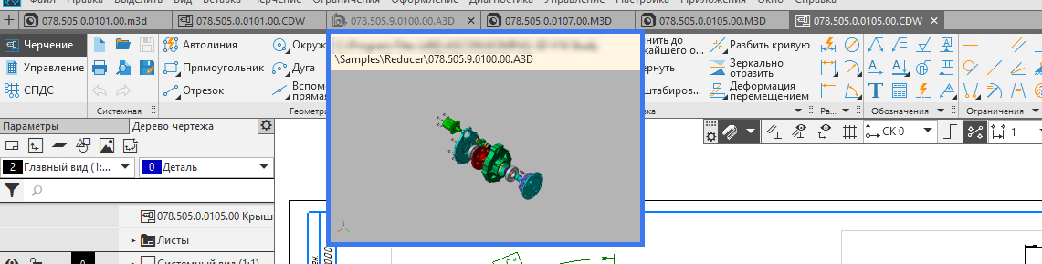
In the Drawing, the drawing tree is also substantially revised. The Document Manager has been abolished. All information about the document is now available in one place, and a search with filtering will allow you to quickly find the desired object in the drawing. Also, lists have been moved to the tree to select the current view and layer. If you click on the color / number indicator in the list of a view or layer, you can quickly switch to the current view or layer in the tree.
- Do not distinguish the elephant from the fan!
Chapter 2. The main window and the new toolbar
Layout. Save space. Accessibility (contrast, choice of backlight colors, scalability of the interface). Search by teams. Why not a “tape”? Search in the trees.
The main center of the layout of the interface is the upper left corner. The whole layout scheme is built around it. Toolbar, Options panel, List of sets, document tab bar.
This is done in order to quickly access frequently used tools.
The new toolbar combines the strengths of the classic Toolbar and Quick Toolbar: quick access, compactness, extensibility, quick switching between toolboxes.
Many people ask, why not use a time-tested solution from Microsoft - tape? Like, all the leading CAD systems use it. After deep analysis, we found several reasons that led us to develop our own toolbar.
1. The complexity of designing under the tape. The concept of the tape involves the allocation of "frequency" commands that look like big buttons. This is a bit of common sense for small applications with one user role, for which the tape was developed (text editor, small graphic editor). But for applications such as KOMPAS-3D, where there are several hundred teams and several user roles, such a solution seems controversial. For example, take the Extrude command block.
More about extrusion
This is a group of teams that are assembled under the squeeze command.
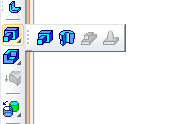
Classic look. The group was displayed by the clicked LMB on the icon.
Updated view. Added option to display the group at the top of the options panel.
Classic look. The group was displayed by the clicked LMB on the icon.
Updated view. Added option to display the group at the top of the options panel.
In some roles, this is one of the main commands, in some not, some users use the Extrude Element command more often, others use the Section Element command, and someone does not use this block of commands at all. Suppose, by default, analysts decided to make the Extrusion block a large button and put the Extrusion Element command in first place. For users who do not use this command or extrusion in general, this solution will be unsatisfactory, because their frequency / importance of the commands is completely different. “But the user himself can adjust such an interface for himself!” - an inquisitive researcher will object. For example, it will make the button size for itself, change the order and so on. Yes, of course it can. But the development of such a constructor that allows users to customize the tape interface for themselves will take a lot of time, but this is not the main thing. In the general case, the user should not configure the interface, he should do his work, because for this he uses our application, and not to spend hours setting it up.
2. Compactness, or rather lack of compactness in the tape. One large button takes the place of three buttons with signatures or six without signatures.
3. Tabs. There are two problems. The first is that KOMPAS-3D uses tabs to display open documents, users really like it.
In KOMPAS terminology, document tabs are called bookmarks.
Bookmarks Classic Bookmark view
. Updated view (a thumbnail appears when you hover over a bookmark)
Bookmarks Classic Bookmark view
. Updated view (a thumbnail appears when you hover over a bookmark)
The location of the ribbon tabs and open document tabs in one place would greatly complicate the interface and complicate the lives of users. Since we wanted to maintain the continuity between the previous and new versions of KOMPAS-3D, during the analysis we found a second problem - uncontrolled “creep” of tabs. What are you talking about? The current list of sets is the successor to the Compact Panel of previous versions of KOMPAS-3D. A compact panel, in turn, can contain a number of buttons that switch panels. Moreover, this number is not limited by anything, since almost any third-party application can be integrated into the Compact Panel. If we used a ribbon, then even with a standard set of applications, the user could get a ribbon tab bar that does not fit on the screen,
4. Inability to place all the abundance of team settings on the tape. The concept of the tape from Microsoft involves placing additional controls on the tape itself. Those. not only buttons can be located there, but also other interface elements. The location of only the buttons violates the elaboration of the concept and reduces its advantages to zero.
To make it easier for KOMPAS-3D users to search for commands in the new, revised main menu, we added a command search, which is located on the same line as the main menu. Now the search searches and runs only the commands in the main menu. In the future, we plan to significantly expand the search functionality and make it global.
New version. Team Search
One of the innovations of the 17th version is the appearance of search fields in almost all long lists and trees. The 3D construction tree and the Drawing tree additionally have filters for faster and more accurate search for
New versions. From left to right. Search in the build tree, in variables and in libraries
 Sergey Shvetsov, ASCON user interface designer and designer
 Link to the second part.