How Ivan stand conversion investigated
After Ivan became acquainted with the cohort analysis , he hated any kinds of sugary metrics.
But the irony was that the leadership did not know anything else, and categorically did not want to know. I had to step over myself and stupidly go to a meeting with the "requests" of the chief in order not to earn the reputation of a bad person who disobeys the instructions of the wise men.
Sometimes even very interesting results were obtained from this. About one such case now and will be discussed.
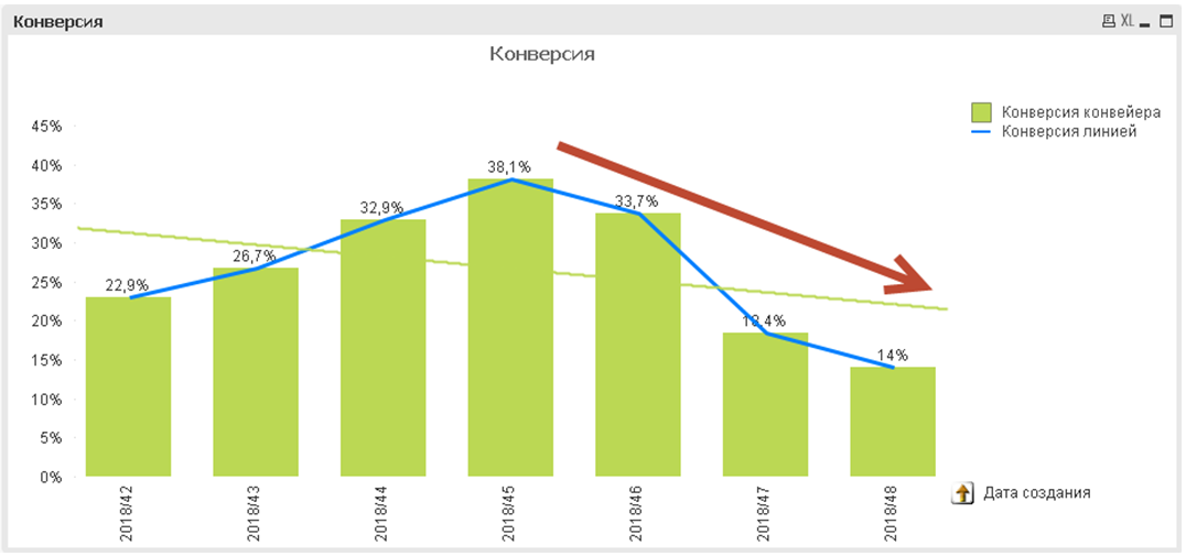
Once the manager asked Ivan to figure out why, within 3 weeks, the conversion of stand passing by the teams continuously decreases:
I must say that there were a lot of teams in the department of Ivan, several dozens, they did hundreds of builds of their distributions daily and checked them on the stands.
Conversion counted the ratio of the number of assemblies created by teams per week to the number of assemblies that passed the target stand.
One of the main disadvantages of sugary metrics is that it is impossible to determine anything by them. The conversion used by Ivan’s manager turned out to be a typical sugary metric. Conversion fell, but it was completely incomprehensible why.
Naturally, all the teams were put on their ears with an order to by all means improve the stand passing indicators. For this, one more sugary metric was compiled with the list of bad guys:
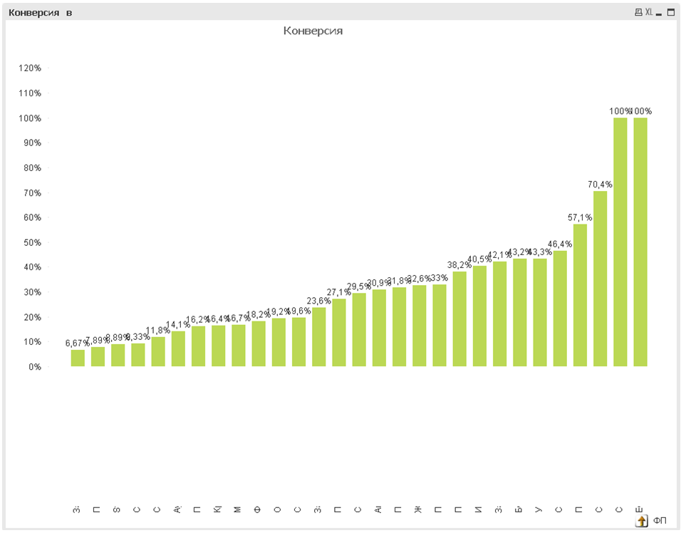
Under each of the columns in the picture in reality written the names of the teams.
The teams howled and began with all their might otbranhivatsya from the new misfortune fell on them.
Charter to drive the team leader called Ivan to understand the reasons for the fall of the conversion.
And that's what came out of it ...
Metrics must be understood. At least understand how they are considered. Then you can dig deeper and figure it out. So Ivan did:
Conversion = Created assemblies / Often passed the stand
Understanding the formula, Ivan first displayed two components of the conversion on the chart: It
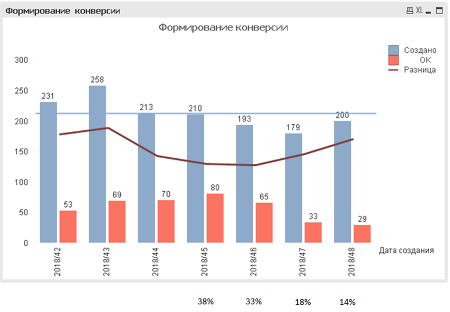
immediately became obvious that the number of created assemblies practically did not change, but the number of assemblies that went through the stand decreased, and the beginning it decreases at the exact moment when the conversion began to decrease.
Conversion has changed due to the fact that the difference between the number of assemblies being created and the number of those who passed the stand increased, but because conversion is the result of dividing one into another, then with the increase in the difference the conversion value synchronously changed (decreased).
The difference between the values on the graph is the dark line.
Those. the increase in the difference between the red and blue columns in the graph indicated an automatic decrease in conversion.
Ivan understood that the findings were still not enough to determine the cause.
Previous experience on metrics gave him one important thought: you need to dig to the root, to the true root cause of any problem.
The reason for any change in the DevOps conversion is actually ... people. Developers and teams of teams. It was to them that Ivan finally wanted to get there.
Looking at the growth of the difference between the assemblies created and going through the stand, he asked himself: why is this happening and who is the “generator” of assemblies that have not reached the stand?
The read book "Tao Toyota" gave a hint: you need to look at the "stock balance" or "work in progress".
Because The assemblies went through several booths and could have stayed there. Ivan decided to count not only the assemblies of one booth, but to see the true “real balance”, i.e. calculate how many assemblies were not used at all by any stand and were left to lie dead: the
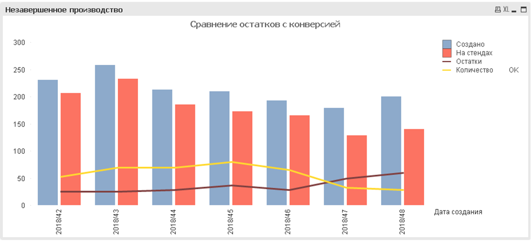
dark line shows the amount of residues, the yellow line shows the number of assemblies that have passed the target stand, which is taken into account in the original conversion chart.
There was no need to guess. The apparent synchronous movement of the two lines was confirmed by calculating the correlation:

It turned out that the more residuals of the assemblies remained, the smaller the desired conversion.
Determining who creates the remains was not difficult with the help of a simple table:

In the left column - the name of the team. Selected column - the number of residues created by this team per week.
Top 2 leaders got out immediately and Ivan instantly ran to them to understand.
The reason, of course, turned out to be trivial: the teams simply began a new development cycle and, creating functionality, began building assemblies to verify its correctness.
In fact, the change in conversion turned out to be closely tied to the cyclical nature of the development process and was not fatal and bad.

Three waves (cycles) of development are viewed on the conversion graph.
This is a natural process that should go.
And the teams that cursed the manager were absolutely right: with the current development process used in the company, an increase in conversion would not only be an “incomprehensible” action, but could completely disrupt the process and lead to significant delays in software delivery.
This is the main drawback of the sugary metrics - they turn the positive sides into negative ones, and instead of clarifying the situation, they only confuse and worsen it.
In general, the experience for Ivan was interesting, so he even with some pleasure prepared a presentation for the management, in which he explained that the metric used was not suitable for managing the department, was misleading, and could cause great problems.
That's all.
If Ivan's experience seemed interesting to you, he will be very grateful for your feedback.
By the way, Ivan now wants to enclose himself and his knowledge in an inspiring and incendiary project, therefore he accepts interesting proposals in a personal.
But the irony was that the leadership did not know anything else, and categorically did not want to know. I had to step over myself and stupidly go to a meeting with the "requests" of the chief in order not to earn the reputation of a bad person who disobeys the instructions of the wise men.
Sometimes even very interesting results were obtained from this. About one such case now and will be discussed.
Once the manager asked Ivan to figure out why, within 3 weeks, the conversion of stand passing by the teams continuously decreases:
I must say that there were a lot of teams in the department of Ivan, several dozens, they did hundreds of builds of their distributions daily and checked them on the stands.
Conversion counted the ratio of the number of assemblies created by teams per week to the number of assemblies that passed the target stand.
One of the main disadvantages of sugary metrics is that it is impossible to determine anything by them. The conversion used by Ivan’s manager turned out to be a typical sugary metric. Conversion fell, but it was completely incomprehensible why.
Naturally, all the teams were put on their ears with an order to by all means improve the stand passing indicators. For this, one more sugary metric was compiled with the list of bad guys:
Under each of the columns in the picture in reality written the names of the teams.
The teams howled and began with all their might otbranhivatsya from the new misfortune fell on them.
Charter to drive the team leader called Ivan to understand the reasons for the fall of the conversion.
And that's what came out of it ...
Understand the essence of metrics
Metrics must be understood. At least understand how they are considered. Then you can dig deeper and figure it out. So Ivan did:
Conversion = Created assemblies / Often passed the stand
Understanding the formula, Ivan first displayed two components of the conversion on the chart: It
immediately became obvious that the number of created assemblies practically did not change, but the number of assemblies that went through the stand decreased, and the beginning it decreases at the exact moment when the conversion began to decrease.
Conversion has changed due to the fact that the difference between the number of assemblies being created and the number of those who passed the stand increased, but because conversion is the result of dividing one into another, then with the increase in the difference the conversion value synchronously changed (decreased).
The difference between the values on the graph is the dark line.
Those. the increase in the difference between the red and blue columns in the graph indicated an automatic decrease in conversion.
Ponder the results
Ivan understood that the findings were still not enough to determine the cause.
Previous experience on metrics gave him one important thought: you need to dig to the root, to the true root cause of any problem.
The reason for any change in the DevOps conversion is actually ... people. Developers and teams of teams. It was to them that Ivan finally wanted to get there.
Looking at the growth of the difference between the assemblies created and going through the stand, he asked himself: why is this happening and who is the “generator” of assemblies that have not reached the stand?
The read book "Tao Toyota" gave a hint: you need to look at the "stock balance" or "work in progress".
Because The assemblies went through several booths and could have stayed there. Ivan decided to count not only the assemblies of one booth, but to see the true “real balance”, i.e. calculate how many assemblies were not used at all by any stand and were left to lie dead: the
dark line shows the amount of residues, the yellow line shows the number of assemblies that have passed the target stand, which is taken into account in the original conversion chart.
There was no need to guess. The apparent synchronous movement of the two lines was confirmed by calculating the correlation:
It turned out that the more residuals of the assemblies remained, the smaller the desired conversion.
Find the root cause
Determining who creates the remains was not difficult with the help of a simple table:
In the left column - the name of the team. Selected column - the number of residues created by this team per week.
Top 2 leaders got out immediately and Ivan instantly ran to them to understand.
The reason, of course, turned out to be trivial: the teams simply began a new development cycle and, creating functionality, began building assemblies to verify its correctness.
The main disadvantage of sugary metrics
In fact, the change in conversion turned out to be closely tied to the cyclical nature of the development process and was not fatal and bad.
Three waves (cycles) of development are viewed on the conversion graph.
This is a natural process that should go.
And the teams that cursed the manager were absolutely right: with the current development process used in the company, an increase in conversion would not only be an “incomprehensible” action, but could completely disrupt the process and lead to significant delays in software delivery.
This is the main drawback of the sugary metrics - they turn the positive sides into negative ones, and instead of clarifying the situation, they only confuse and worsen it.
findings
In general, the experience for Ivan was interesting, so he even with some pleasure prepared a presentation for the management, in which he explained that the metric used was not suitable for managing the department, was misleading, and could cause great problems.
That's all.
If Ivan's experience seemed interesting to you, he will be very grateful for your feedback.
By the way, Ivan now wants to enclose himself and his knowledge in an inspiring and incendiary project, therefore he accepts interesting proposals in a personal.