How we improved the conversion of the payment form
Online payments have become something as familiar as wi-fi at home and high-speed mobile Internet. And they continue to evolve, more and more services can be paid in a couple of clicks or from mobile applications, and then there are also auto payments, reminders, cost control and much more.
In pursuit of functionality, we should not forget about the user, because our main task is to make it convenient for him to make any payment for any scenario. This means that the payment form should be as clear as possible, as well as offer the user solutions to problems if they suddenly arise.
My name is Georgi Konnov, I am the director of product development for e-commerce at QIWI, and today I will tell you how we developed a payment form that any store can quickly connect to receive payments.
Under the cut - about conversion, user motivation, our protocol, charity and open source.
One of the main indicators of the success of the payment form is, of course, conversion. Well, seriously, if you made an awesome beautiful mold on the latest technologies and guidelines of the best companies, but it stupidly does not make money because of low conversion - it means that you did garbage, and not a payment form.
Almost everyone now says that the conversion rate for payment forms is about 99 percent, or even higher. This is not true.
If you honestly measure and evaluate the very motivation of people to make payments, you will notice that it very much depends on the category of payment (if measured from the opening of the payment form until the moment of making the payment itself). Maximum motivation to complete the payment process where the user has already undergone a number of complex procedures - identification and so on, various b2b payments, and the same extension of domains, for example. Then the person opened the form with a clear desire to extend the domain (otherwise it will fall off) or make an important payment - and he will do it.
But if this is a regular purchase, then you can easily lose a quarter of customers in the process of payment. Here, the conversion is already in the region of 75-85 percent.
There are many reasons. If it was some kind of spontaneous purchase (“It’s enough, I’ll buy gold in a quick way and I’ll bend over”), then the client may not have enough money. Or on the final window, he will see again the amount that is already ready to be debited from his account, and decides that this is not bad without gold. And close the form without completing the payment.
Yes, and with a real product it seems - there may be distracted by additional fields, a person wants to buy a vacuum cleaner at last, and the form asks him for a phone number, mail and a cat's name (we are here about payment form requests, and not a personal account which data series is required for shipping and order tracking). Or, everything is fine with the form, but, looking at the price, the person decides to check the prices at a more favorable price on the same Market, and leaves the form.
A bit surprising, though, was to see such behavior when paying for educational services. It would seem that here purposefulness is clearly higher than the desire to buy something for yourself by going to the store's website from a letter with the subject “Only today there is an 80% discount on everything *!”.
* almost everything
** for those two irons and the restored SE
That is, the person chose the right course for the required specialty, opened the payment form - and still the same conversion numbers are small as in charity.
Most measurements measure something like this.
There is such an entity as a transaction. It can be either successful or unsuccessful. If suddenly there is no money in the client’s account, an error is displayed on which the form cannot affect. Well, no money and no, do not give them the same. Or a technical error has occurred. As a result, it turns out that of the total number of payments with this approach, 98–99 are considered successful.
But if you measure from the moment you open a payment form to a successful payment, the numbers will be different.
We tied the whole story into accounts. There is an invoice, at the time of opening the form, he is billed and lives 45 days. That is, a person can return to the same form of payment during these 45 days and complete it, if for some reason he changed his mind earlier. This allows us to see the full conversion, even if the person returned a few days later - there is only one invoice, and the amount is total. Well, as practice shows, people can thus quite often return to the payment process.
Reminders are a different story altogether. We tried different mechanics here. Expected shitty thing went with the web-push. For example, there was a person at the store site, dialed a basket, received an invoice in the payment form, which he did not pay, and closed the window - and then he would get the “Pay the bill” web push. Such a thing annoying. Moreover, web pushes without an adequate context are perceived as spam already.
Well, 10 percent of users will sign up for such pushes. Then 10 percent of them will go. In general: for an average site, taking into account attendance, such figures make web push not the most useful channel of reminders. And if you also take into account that the base itself of such pushing within a month of interest is 15% rotten ...
But what works with a bang is if a person at the time of payment shows his previous forgotten payment, then this is already perceived as a useful reminder.
For example. You went to buy a new toy in the incentive. I chose, started to place an order, I realized that there was not enough money now, or just decided to postpone it for later. After a week I went to buy some little thing on Ali, you made the payment, and then the mold then you - “Pst, you wanted to buy a toy a week ago, look”. And such users usually go and complete the previous payment.
According to the figures - the web push brings 3 rubles to the specific mailing list.
A similar reminder - 60 rubles.
Such a mechanic works for providers connected to the Wallet. And it turns out such a win-win situation where each connected provider can increase the conversion of the other.
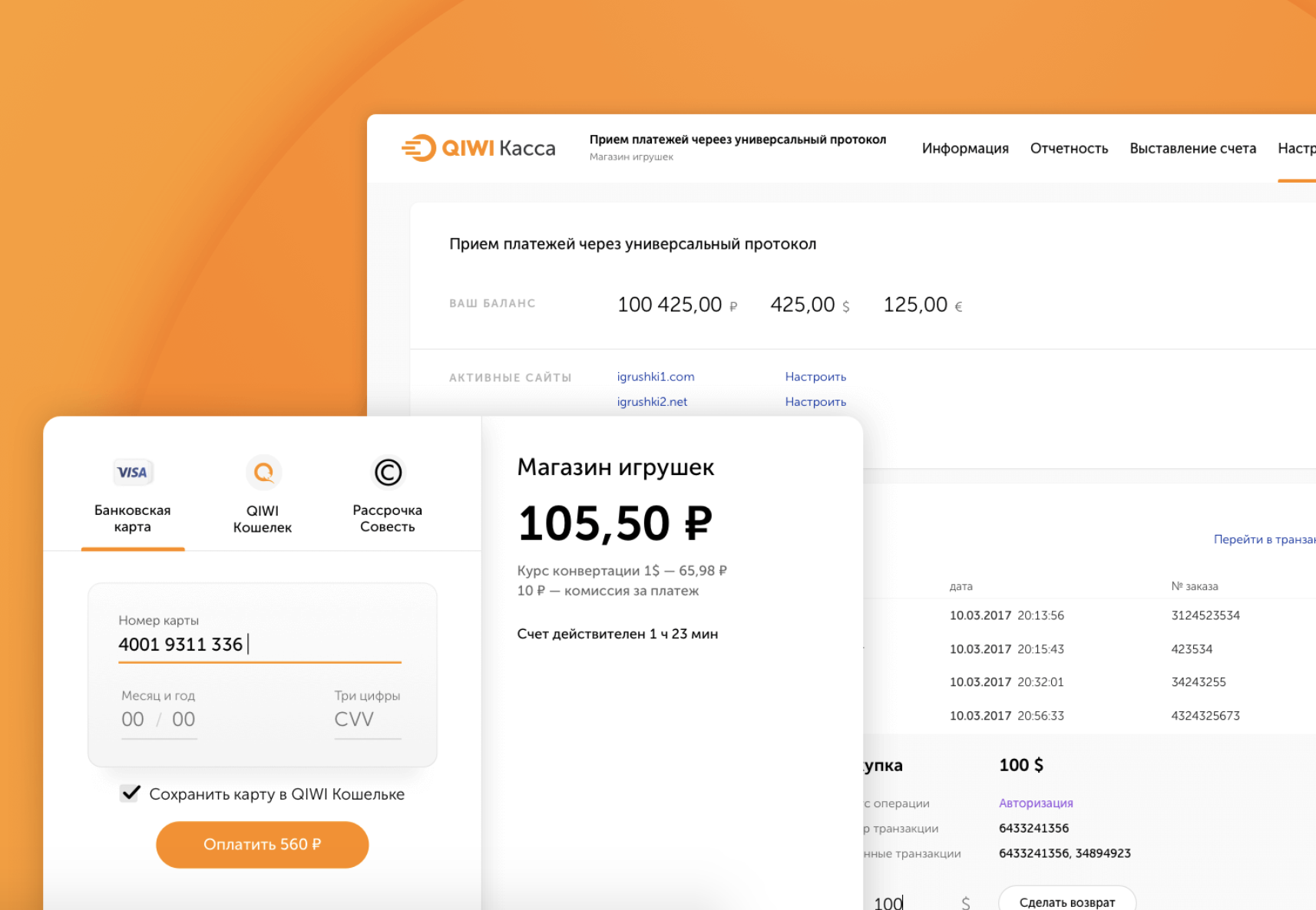
Previously, we had just a purse protocol, I already wrote about it here .
It was only Wallet . And this year we announced a new protocol, in which now Wallet, and acquiring, and mobile commerce, and installments according to our Conscience, and there will be a lot of other payment methods. All this in one solution, in a single protocol.
Our goal was to make transparent statistics for everyone. Therefore, they left accounts that allow us to follow the real conversion of the store, and not the technical one, as transparently as possible. And we added all the mechanics that help to increase the turnover. All turnkey.
From the side it may seem quite simple to do all this - put a payment form on it, and only manage to count the money. In fact, it turns out that the buyer may not have the funds on the card. Well, it happens.
And here we immediately offer an alternative in such cases. Not enough to pay? Look, we can quickly pay for it via mobile phone via SMS. Or even on the conscience here. Or something else.
It is important here that the client sees in this case not only the problem, but also the options for its solution. That is, in the absence of money, there is no “Lack of funds” as an error that only leads to closing the window or trying to enter another card, but immediately propose other payment methods without expanding the user.
This approach increases the total conversion to successful payments. Because to increase conversion, you can not focus on the rate of acquiring. In general, any attempts to focus on the rate are attempts to compete with a large green bank, which has the lowest cost of acquiring, since it can afford it.
But you can compete on conversion in payment. It is much easier to raise it by 2–3–5 percent than to try to lower the acquiring rate (which is already in area 2).
Therefore, we decided to simplify the IT part as much as possible and add all available mechanics to the checkout. To just take and quickly connected - and you all worked at all.
In my opinion, only lazy people didn’t talk about the role of mobile phones in online shopping. So I will repeat the famous thesis and add a few of our numbers.
In 2015, we had about 10 percent of mobile phone calls. And there were cool mobile apps in the top 3 in the markets. There was a choice - either to cut a separate web application for mobile, or to make a simple adaptive checkout. We decided not to bother much then, and as an experiment we made a simple adaptation for mobile. And in six months, this figure has increased from 10% to 30%.
A year ago - about 40 percent.
Now - 51-52.
In general, shopping with mobile phones is in fact dofiga. Therefore, we made a very good mobile layout. We saw an increase in payments, we decided to conduct a couple more studies and talked with partners in the market. It turned out that those who adapted to the mobile had sales growth. Those who scored on the mobile had about the same 10%.
By the way, here’s a chart showing the distribution of sales depending on whether the store is adapted or not. There are 14 large online stores, which we will not name, but just know - large ones.

Who has a mobile application - he already has 1.5 times more purchases. Who has the adaptation or application - there are also improvements in sales, as well as the very easy adaptive.
Violet on the scheme - guys without adaptive. But even they are not as sad as blue - these people have nothing at all from a mobile phone.
I wanted to say this. It’s not so necessary to make a top mobile app in pursuit of traffic. Even the application does not cancel the fact that you need to make an adaptation. Even the simplest adaptation of the pages will show you good results.
We took the first step in 2015, as I wrote above. And now we have a new version that fits nicely over the on-screen keyboard, works great with the Google API and with iOS in terms of auto-complete maps. And all this turnkey, so that it is fast and convenient. And now we have mobile phone conversion almost on par with the desktop. In this case, the adaptive itself determines how it should appear on which screen now.
The purse is not positioned as the only means of payment. You don’t have to pay anything with it - you can simply attach cards to it or agree to a simplified payment, in this case, the Wallet will work as an accelerator of already familiar payments. If we see that the user is familiar to us (for a number of signs) - we can give the opportunity to disable 3DS, for example. Of course, this is only an option, and if you don’t want to disable the additional check, you don’t need to.
We remember the authorization for half a year, both with a password and via SMS. Sessions are divided into half-crooks, that is, half of the token we have, and half on the user's device. If that - in 1 click you can reset the session.
Pass-through payment works everywhere - for example, even in the Aliexpress application for mobile phones, our form opens in which everything is already filled in if the buyer used it before.
We also decided to support backward compatibility, and the new pumped protocol also works for those partners who implemented the protocol in 2010, and for those who delivered it only yesterday. We have almost all active ecommers in our database. And we dragged this whole base to new tools.
The old version was sharpened under the terminals. The person entered his phone number, was billed, and this bill appeared everywhere - on the site, in terminals, in the mobile phone. Different providers then who in what much figy different input masks, which only complicated the integration.
In the new version of the account we saved. The invoice is issued without any signs. The provider gave the phone number - OK, did not; we work without it. Mobile commerce allows you to bill and pay for it immediately, combining two actions in one request. Partners do not have to complicate their lives. If somewhere it is possible to reduce the number of requests, then we are moving away from the canonical rest, which simplifies the life of the developers during the integration.
Integration, by the way, is also maximally simplified. The protocol was designed not only by technicians, but also under the watchful eye of business. And not in the plan to follow and customize, but in the plan to take into account at the start all the business difficulties and simplify all future integrations. There were 5 parameters in the old protocol - provider ID, secret password, authorization ID, currency, password for notifications.
In the new - 2 parameters. The public key for web forms, which can shine out, and the secret key, which is used in the server API with full access rights, the ability to cancel transactions, make returns and so on.
Plus we made it possible to transfer any additional data. Previously, you had to know the account ID and phone number. And now there are custom fields - the provider wants to get an internal buyer’s ID, please. It is necessary to throw the phone number, the address for delivery - this is it. In general, in order not to write your logic for all of this, you can simply transfer to us. And in all alerts after successful payment will return such data.
The protocol is modular, you can substitute any widgets and preorders, we actively tested them for charity.
Previously, everything was in the monolith. In which there was processing. Then he began to overgrow the sides with additional useful gizmos. Now it turns out that processing is actually responsible for conducting transactions. By the way, for the maps we wrote a new one - accelerated so as not to drag the legacy of the times.
A couple of years ago, we sat and thought how to combine payment and support of charitable funds in a normal and complete way. The very first thought - just throw a little (of course, if desired, the user and the corresponding checkbox) right in the check. Well, that is, you buy a teapot for 5,000 rubles, put a tick "I want to help" - and now you have a check for 5050, for example, you pay it. Total one transaction, in which part of the money goes to the store, and part - to the fund.
Gizmo unscalable from the word in general. The accounting department of the company to which we make the transfer sags - here in such cases you need to make a complex triple contract (we, the company, the fund).
And with the return difficult. Changed your mind about the kettle, returned it. And the amount for the kettle and the fee is gone in one transaction.
So we decided to do it like this.
After successful payment, the user is asked to make a small donation in 1 click. This scheme works, about 3-5 percent are ready to go for it. Here the main amount. If it does not greatly exceed 50 rubles, then it is OK and simple. If more - there is already a need for a context, where the money will go, and what for the fund, and what they do and so on.
Young people in this regard are simpler - they see that there is brand A, which they believe (store), they see brand B, and everything is fine, they are translating. And older people need a detailed context to make sure the reality of the fund, and that these 50 rubles are not for a new BMW employee of the store.
We tried to count the donation amounts in different ways. For example, a person bought something, and after buying from him, there would be 123 rubles left in his account. In such cases, we suggested rounding out and transferring 3 rubles or 23 rubles to the fund. Well, what for you this iron trifle in an electronic wallet, well, really.
It turned out that we were too much involved here, and this approach did not work much. It is much smaller fixed amounts that work better. Usually about 5 percent of the balance.
Earlier, directly conscious charitable payments on the site to the Khabensky Fund were 20 pieces per month. It became about 30 000 - 35 000 per month. They started it and thought that it would be good to show this not only from the payment from the Wallet, but also from any other - with the card and so on.
We found out in the end that people do not need such payment in 1 click, if they want to make a payment from the card, they will choose the method themselves. We added a hypothesis, by the way, just a week before the May ones.
By the way, you can try our payment form, and at the same time do a good deed by supporting one of the funds:
And site owners can help any fund by placing a widget or link in: widget.qiwi.com/vera , my.qiwi.com/bfkh , my.qiwi.com/vsem or many others. Write if you wish.
Now in the direction of open-source, we moved quite actively. We published the documentation, examples, SDK and integrations at https://github.com/QIWI-API/ . While reading the documentation , you can click on the “edit on GitHub” button and make a request for correction.
In general, we are trying to drag everything that is not processing into the open source. Both GitHub QIWI and GitHub QIWI APIs have been revived . We want the projects and components to lie separately, and the documentation, various SDKs and libraries on top of the QIWI API - separately. Much actively we carry in GitHub.
We open the Wallet API so that all the features available within the company are open to external developers. In principle, QIWI is now turning towards BaaS, Bank as a Service. And our task here is for all apishki to be simple, with common practices. Therefore, we are moving into the open source.
We want to take all the excellent and working to pay with QIWI Wallet and use it to complete the work with the cards - all these reminders, forgotten payments and more. Add billing methods to the bank. Needless to say - Apple Pay and Google Pay. They were shifted in priorities quite strongly, since they did not affect turnover in general and were such imaginative pieces, because in our case it was already from the level of marketing, rather than meaningful profit for customers.
Soon we will finish the official plug-ins for CMS-ok, so that the owners of small shops can connect QIWI Cashier and accept payment. For Wordpress done, and for others - in the next queue.
We are also working to simplify integration with fiscal data operators to comply with 54 FZs and an interesting solution for p2p transfers and self-employed.
Kassa.qiwi.com - here we have collected all our services for small and large businesses. We try to do so that the business could just come and quickly connect a bunch of ready-made solutions.
And in order to understand how the API works, we made a demo zone where you can touch the whole thing.
In general, there are plenty of plans, and the general message is to make integration even easier and more accessible.
PS By the way, here is the page about our team: kassa.qiwi.com/team
We will always be happy to React JS developers and Java programmers. For those who want to, in JS Fullstack, we have a test of 15 minutes, so that we can touch the data, libraries and approaches that we work with inside. The schoolchildren coped with it, but the six-Hols also hung. :)
In pursuit of functionality, we should not forget about the user, because our main task is to make it convenient for him to make any payment for any scenario. This means that the payment form should be as clear as possible, as well as offer the user solutions to problems if they suddenly arise.
My name is Georgi Konnov, I am the director of product development for e-commerce at QIWI, and today I will tell you how we developed a payment form that any store can quickly connect to receive payments.
Under the cut - about conversion, user motivation, our protocol, charity and open source.
One of the main indicators of the success of the payment form is, of course, conversion. Well, seriously, if you made an awesome beautiful mold on the latest technologies and guidelines of the best companies, but it stupidly does not make money because of low conversion - it means that you did garbage, and not a payment form.
Almost everyone now says that the conversion rate for payment forms is about 99 percent, or even higher. This is not true.
If you honestly measure and evaluate the very motivation of people to make payments, you will notice that it very much depends on the category of payment (if measured from the opening of the payment form until the moment of making the payment itself). Maximum motivation to complete the payment process where the user has already undergone a number of complex procedures - identification and so on, various b2b payments, and the same extension of domains, for example. Then the person opened the form with a clear desire to extend the domain (otherwise it will fall off) or make an important payment - and he will do it.
But if this is a regular purchase, then you can easily lose a quarter of customers in the process of payment. Here, the conversion is already in the region of 75-85 percent.
There are many reasons. If it was some kind of spontaneous purchase (“It’s enough, I’ll buy gold in a quick way and I’ll bend over”), then the client may not have enough money. Or on the final window, he will see again the amount that is already ready to be debited from his account, and decides that this is not bad without gold. And close the form without completing the payment.
Yes, and with a real product it seems - there may be distracted by additional fields, a person wants to buy a vacuum cleaner at last, and the form asks him for a phone number, mail and a cat's name (we are here about payment form requests, and not a personal account which data series is required for shipping and order tracking). Or, everything is fine with the form, but, looking at the price, the person decides to check the prices at a more favorable price on the same Market, and leaves the form.
A bit surprising, though, was to see such behavior when paying for educational services. It would seem that here purposefulness is clearly higher than the desire to buy something for yourself by going to the store's website from a letter with the subject “Only today there is an 80% discount on everything *!”.
* almost everything
** for those two irons and the restored SE
That is, the person chose the right course for the required specialty, opened the payment form - and still the same conversion numbers are small as in charity.
How to measure
Most measurements measure something like this.
There is such an entity as a transaction. It can be either successful or unsuccessful. If suddenly there is no money in the client’s account, an error is displayed on which the form cannot affect. Well, no money and no, do not give them the same. Or a technical error has occurred. As a result, it turns out that of the total number of payments with this approach, 98–99 are considered successful.
But if you measure from the moment you open a payment form to a successful payment, the numbers will be different.
We tied the whole story into accounts. There is an invoice, at the time of opening the form, he is billed and lives 45 days. That is, a person can return to the same form of payment during these 45 days and complete it, if for some reason he changed his mind earlier. This allows us to see the full conversion, even if the person returned a few days later - there is only one invoice, and the amount is total. Well, as practice shows, people can thus quite often return to the payment process.
Reminders
Reminders are a different story altogether. We tried different mechanics here. Expected shitty thing went with the web-push. For example, there was a person at the store site, dialed a basket, received an invoice in the payment form, which he did not pay, and closed the window - and then he would get the “Pay the bill” web push. Such a thing annoying. Moreover, web pushes without an adequate context are perceived as spam already.
Well, 10 percent of users will sign up for such pushes. Then 10 percent of them will go. In general: for an average site, taking into account attendance, such figures make web push not the most useful channel of reminders. And if you also take into account that the base itself of such pushing within a month of interest is 15% rotten ...
But what works with a bang is if a person at the time of payment shows his previous forgotten payment, then this is already perceived as a useful reminder.
For example. You went to buy a new toy in the incentive. I chose, started to place an order, I realized that there was not enough money now, or just decided to postpone it for later. After a week I went to buy some little thing on Ali, you made the payment, and then the mold then you - “Pst, you wanted to buy a toy a week ago, look”. And such users usually go and complete the previous payment.
According to the figures - the web push brings 3 rubles to the specific mailing list.
A similar reminder - 60 rubles.
Such a mechanic works for providers connected to the Wallet. And it turns out such a win-win situation where each connected provider can increase the conversion of the other.
Protocol work
Previously, we had just a purse protocol, I already wrote about it here .
It was only Wallet . And this year we announced a new protocol, in which now Wallet, and acquiring, and mobile commerce, and installments according to our Conscience, and there will be a lot of other payment methods. All this in one solution, in a single protocol.
Our goal was to make transparent statistics for everyone. Therefore, they left accounts that allow us to follow the real conversion of the store, and not the technical one, as transparently as possible. And we added all the mechanics that help to increase the turnover. All turnkey.
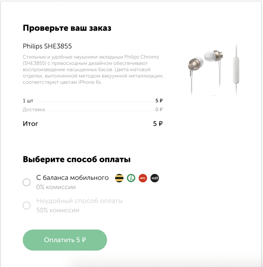
From the side it may seem quite simple to do all this - put a payment form on it, and only manage to count the money. In fact, it turns out that the buyer may not have the funds on the card. Well, it happens.
And here we immediately offer an alternative in such cases. Not enough to pay? Look, we can quickly pay for it via mobile phone via SMS. Or even on the conscience here. Or something else.
It is important here that the client sees in this case not only the problem, but also the options for its solution. That is, in the absence of money, there is no “Lack of funds” as an error that only leads to closing the window or trying to enter another card, but immediately propose other payment methods without expanding the user.
This approach increases the total conversion to successful payments. Because to increase conversion, you can not focus on the rate of acquiring. In general, any attempts to focus on the rate are attempts to compete with a large green bank, which has the lowest cost of acquiring, since it can afford it.
But you can compete on conversion in payment. It is much easier to raise it by 2–3–5 percent than to try to lower the acquiring rate (which is already in area 2).
Therefore, we decided to simplify the IT part as much as possible and add all available mechanics to the checkout. To just take and quickly connected - and you all worked at all.
Not web single
In my opinion, only lazy people didn’t talk about the role of mobile phones in online shopping. So I will repeat the famous thesis and add a few of our numbers.
In 2015, we had about 10 percent of mobile phone calls. And there were cool mobile apps in the top 3 in the markets. There was a choice - either to cut a separate web application for mobile, or to make a simple adaptive checkout. We decided not to bother much then, and as an experiment we made a simple adaptation for mobile. And in six months, this figure has increased from 10% to 30%.
A year ago - about 40 percent.
Now - 51-52.
In general, shopping with mobile phones is in fact dofiga. Therefore, we made a very good mobile layout. We saw an increase in payments, we decided to conduct a couple more studies and talked with partners in the market. It turned out that those who adapted to the mobile had sales growth. Those who scored on the mobile had about the same 10%.
By the way, here’s a chart showing the distribution of sales depending on whether the store is adapted or not. There are 14 large online stores, which we will not name, but just know - large ones.
Who has a mobile application - he already has 1.5 times more purchases. Who has the adaptation or application - there are also improvements in sales, as well as the very easy adaptive.
Violet on the scheme - guys without adaptive. But even they are not as sad as blue - these people have nothing at all from a mobile phone.
I wanted to say this. It’s not so necessary to make a top mobile app in pursuit of traffic. Even the application does not cancel the fact that you need to make an adaptation. Even the simplest adaptation of the pages will show you good results.
We took the first step in 2015, as I wrote above. And now we have a new version that fits nicely over the on-screen keyboard, works great with the Google API and with iOS in terms of auto-complete maps. And all this turnkey, so that it is fast and convenient. And now we have mobile phone conversion almost on par with the desktop. In this case, the adaptive itself determines how it should appear on which screen now.
Wallet and Integration
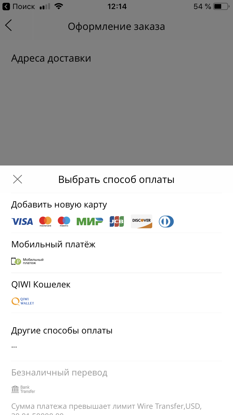
The purse is not positioned as the only means of payment. You don’t have to pay anything with it - you can simply attach cards to it or agree to a simplified payment, in this case, the Wallet will work as an accelerator of already familiar payments. If we see that the user is familiar to us (for a number of signs) - we can give the opportunity to disable 3DS, for example. Of course, this is only an option, and if you don’t want to disable the additional check, you don’t need to.
We remember the authorization for half a year, both with a password and via SMS. Sessions are divided into half-crooks, that is, half of the token we have, and half on the user's device. If that - in 1 click you can reset the session.
Pass-through payment works everywhere - for example, even in the Aliexpress application for mobile phones, our form opens in which everything is already filled in if the buyer used it before.
We also decided to support backward compatibility, and the new pumped protocol also works for those partners who implemented the protocol in 2010, and for those who delivered it only yesterday. We have almost all active ecommers in our database. And we dragged this whole base to new tools.
The old version was sharpened under the terminals. The person entered his phone number, was billed, and this bill appeared everywhere - on the site, in terminals, in the mobile phone. Different providers then who in what much figy different input masks, which only complicated the integration.
In the new version of the account we saved. The invoice is issued without any signs. The provider gave the phone number - OK, did not; we work without it. Mobile commerce allows you to bill and pay for it immediately, combining two actions in one request. Partners do not have to complicate their lives. If somewhere it is possible to reduce the number of requests, then we are moving away from the canonical rest, which simplifies the life of the developers during the integration.
Integration, by the way, is also maximally simplified. The protocol was designed not only by technicians, but also under the watchful eye of business. And not in the plan to follow and customize, but in the plan to take into account at the start all the business difficulties and simplify all future integrations. There were 5 parameters in the old protocol - provider ID, secret password, authorization ID, currency, password for notifications.
In the new - 2 parameters. The public key for web forms, which can shine out, and the secret key, which is used in the server API with full access rights, the ability to cancel transactions, make returns and so on.
Plus we made it possible to transfer any additional data. Previously, you had to know the account ID and phone number. And now there are custom fields - the provider wants to get an internal buyer’s ID, please. It is necessary to throw the phone number, the address for delivery - this is it. In general, in order not to write your logic for all of this, you can simply transfer to us. And in all alerts after successful payment will return such data.
The protocol is modular, you can substitute any widgets and preorders, we actively tested them for charity.
Previously, everything was in the monolith. In which there was processing. Then he began to overgrow the sides with additional useful gizmos. Now it turns out that processing is actually responsible for conducting transactions. By the way, for the maps we wrote a new one - accelerated so as not to drag the legacy of the times.
Charitable contributions
A couple of years ago, we sat and thought how to combine payment and support of charitable funds in a normal and complete way. The very first thought - just throw a little (of course, if desired, the user and the corresponding checkbox) right in the check. Well, that is, you buy a teapot for 5,000 rubles, put a tick "I want to help" - and now you have a check for 5050, for example, you pay it. Total one transaction, in which part of the money goes to the store, and part - to the fund.
Gizmo unscalable from the word in general. The accounting department of the company to which we make the transfer sags - here in such cases you need to make a complex triple contract (we, the company, the fund).
And with the return difficult. Changed your mind about the kettle, returned it. And the amount for the kettle and the fee is gone in one transaction.
So we decided to do it like this.
After successful payment, the user is asked to make a small donation in 1 click. This scheme works, about 3-5 percent are ready to go for it. Here the main amount. If it does not greatly exceed 50 rubles, then it is OK and simple. If more - there is already a need for a context, where the money will go, and what for the fund, and what they do and so on.
Young people in this regard are simpler - they see that there is brand A, which they believe (store), they see brand B, and everything is fine, they are translating. And older people need a detailed context to make sure the reality of the fund, and that these 50 rubles are not for a new BMW employee of the store.
We tried to count the donation amounts in different ways. For example, a person bought something, and after buying from him, there would be 123 rubles left in his account. In such cases, we suggested rounding out and transferring 3 rubles or 23 rubles to the fund. Well, what for you this iron trifle in an electronic wallet, well, really.
It turned out that we were too much involved here, and this approach did not work much. It is much smaller fixed amounts that work better. Usually about 5 percent of the balance.
Earlier, directly conscious charitable payments on the site to the Khabensky Fund were 20 pieces per month. It became about 30 000 - 35 000 per month. They started it and thought that it would be good to show this not only from the payment from the Wallet, but also from any other - with the card and so on.
We found out in the end that people do not need such payment in 1 click, if they want to make a payment from the card, they will choose the method themselves. We added a hypothesis, by the way, just a week before the May ones.
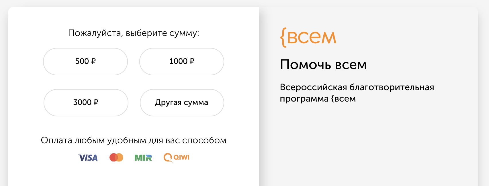
By the way, you can try our payment form, and at the same time do a good deed by supporting one of the funds:
- Vera - system help to hospices and their patients
- Khabensky Foundation - help for children with severe brain diseases
- {all - at once to several charitable funds in equal shares
And site owners can help any fund by placing a widget or link in: widget.qiwi.com/vera , my.qiwi.com/bfkh , my.qiwi.com/vsem or many others. Write if you wish.
Open source
Now in the direction of open-source, we moved quite actively. We published the documentation, examples, SDK and integrations at https://github.com/QIWI-API/ . While reading the documentation , you can click on the “edit on GitHub” button and make a request for correction.
In general, we are trying to drag everything that is not processing into the open source. Both GitHub QIWI and GitHub QIWI APIs have been revived . We want the projects and components to lie separately, and the documentation, various SDKs and libraries on top of the QIWI API - separately. Much actively we carry in GitHub.
We open the Wallet API so that all the features available within the company are open to external developers. In principle, QIWI is now turning towards BaaS, Bank as a Service. And our task here is for all apishki to be simple, with common practices. Therefore, we are moving into the open source.
For the future
We want to take all the excellent and working to pay with QIWI Wallet and use it to complete the work with the cards - all these reminders, forgotten payments and more. Add billing methods to the bank. Needless to say - Apple Pay and Google Pay. They were shifted in priorities quite strongly, since they did not affect turnover in general and were such imaginative pieces, because in our case it was already from the level of marketing, rather than meaningful profit for customers.
Soon we will finish the official plug-ins for CMS-ok, so that the owners of small shops can connect QIWI Cashier and accept payment. For Wordpress done, and for others - in the next queue.
We are also working to simplify integration with fiscal data operators to comply with 54 FZs and an interesting solution for p2p transfers and self-employed.
Kassa.qiwi.com - here we have collected all our services for small and large businesses. We try to do so that the business could just come and quickly connect a bunch of ready-made solutions.
And in order to understand how the API works, we made a demo zone where you can touch the whole thing.
In general, there are plenty of plans, and the general message is to make integration even easier and more accessible.
PS By the way, here is the page about our team: kassa.qiwi.com/team
We will always be happy to React JS developers and Java programmers. For those who want to, in JS Fullstack, we have a test of 15 minutes, so that we can touch the data, libraries and approaches that we work with inside. The schoolchildren coped with it, but the six-Hols also hung. :)