History of the RGB color model
- Transfer
I am going to take an excursion into the history of the science of human perception, which has led to the creation of modern video standards. I will also try to explain commonly used terminology. In addition, I will briefly explain why the typical process of creating a game over time will more and more resemble the process used in the film industry.
Today we know that the retina of the human eye contains three different types of photoreceptor cells called cones. Each of the three types of cones contains a protein from the family of opsin proteins, which absorbs light in various parts of the spectrum:
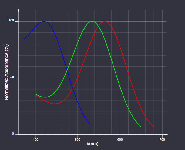
Absorption of Light by Opsins
Cones correspond to the red, green, and blue parts of the spectrum and are often called long (L), medium (M), and short (S) according to the wavelengths to which they are most sensitive.
One of the first scientific papers on the interaction of light and the retina was Isaac Newton's treatise Hypothesis Concerning Light and Colors, written between 1670-1675. Newton had a theory that light with different wavelengths led to a resonance of the retina with the same frequencies; these vibrations were then transmitted through the optic nerve to the sensorium.
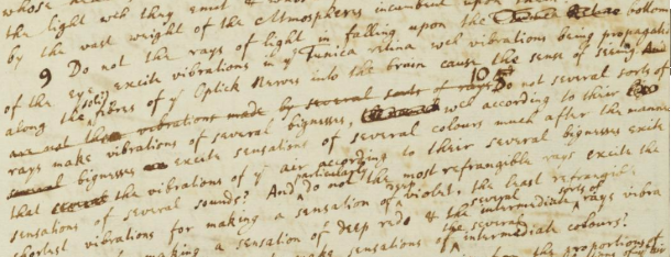
“The rays of light, falling to the bottom of the eye, excite vibrations in the retina, which propagate through the fibers of the optical nerves to the brain, creating a sense of vision. Different types of rays create vibrations of different strengths, which, according to their strength, excite sensations of different colors ... "
(I recommend that you read the scanned drafts of Newton on the Cambridge University website . I, of course, state the obvious, but what a genius he was!)
More than a hundred years later, Thomas Jung came to the conclusion that since the resonance frequency is a system-dependent property, in order to absorb light of all frequencies, there must be an infinite number of different resonant systems in the retina. Jung considered this unlikely, and reasoned that the quantity is limited to one system for red, yellow, and blue. These colors have traditionally been used in subtractive color mixing. In his own words :
In 1850, German Helmholtz was the first to receive an experimental proof of Jung's theory. Helmholtz asked the subject to compare the colors of different samples of light sources, adjusting the brightness of several monochrome light sources. He came to the conclusion that for comparing all the samples, three light sources are necessary and sufficient: in the red, green and blue parts of the spectrum.
Fast forward to the early 1930s. By that time, the scientific community had a fairly good idea of the inner workings of the eye. (Although it took another 20 years for George Wold to experimentally confirm the presence and function of rhodopsins in the retinal cones. This discovery led him to the Nobel Prize in medicine in 1967.) Commission Internationale de L'Eclairage (International Commission on Lighting), CIE, set the task of creating an exhaustive quantitative assessment of human color perception. The quantification was based on experimental data collected by William David Wright and John Guild with parameters similar to those first selected by Hermann Helmholtz. The basic settings were 435.8 nm for blue, 546.1 nm for green and 700 nm for red.
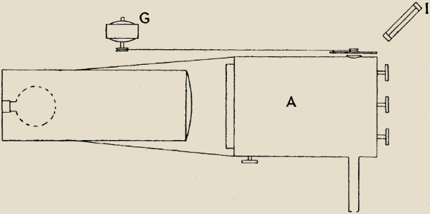
John Guild's experimental setup, three knobs adjust the primary colors.
Due to the significant overlap in the sensitivity of the M and L cones, it was impossible to compare some wavelengths with the blue-green part of the spectrum. To “compare” these colors, we needed to add a little basic red color as a reference point:

If we imagine for a moment that all the primary colors make a negative contribution, then the equation can be rewritten as follows:

The experiment resulted in an RGB triad table for each wavelength, what was displayed on the chart as follows:
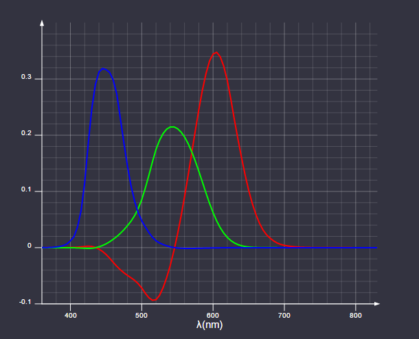
CIE 1931 RGB color matching functions
Of course, colors with a negative red component cannot be displayed using CIE primary colors.
Now we can find the trichromic coefficients for the light of the spectral intensity distribution S as the following internal product:

It may seem obvious that sensitivity to different wavelengths can be integrated in this way, but in fact it depends on the physical sensitivity of the eye, linear with respect to sensitivity to lengths waves. This was empirically confirmed in 1853 by Herman Grassmann, and the integrals presented above in the modern formulation are known to us as Grassmann's law.
The term “color space” arose because the primary colors (red, green and blue) can be considered the basis of the vector space. In this space, the various colors perceived by man are represented by rays emanating from the source. The modern definition of vector space was introduced in 1888 by Giuseppe Peano, but more than 30 years before that, James Clerk Maxwell had only used the nascent theories of what later became linear algebra to formally describe the trichromatic color system.
CIE decided that to simplify the calculations, it would be more convenient to work with a color space in which the coefficients of the primary colors are always positive. Three new primary colors were expressed in the coordinates of the RGB color space as follows:

This new set of primary colors cannot be realized in the physical world. This is just a math tool to simplify working with color space. In addition, so that the coefficients of the primary colors are always positive, the new space is arranged in such a way that the color coefficient Y corresponds to the perceived brightness. This component is known as CIE brightness (read more about it in the wonderful Color FAQ article by Charles Poynton).
To simplify the visualization of the resulting color space, we will perform the last conversion. Dividing each component by the sum of the components, we get a dimensionless amount of color that does not depend on its brightness:

The x and y coordinates are known as chromaticity coordinates, and together with the Y CIE luminance, they make up the xyY CIE color space. If we plot the chromaticity coordinates of all colors with a given brightness on the graph, we get the following diagram, which you probably know:
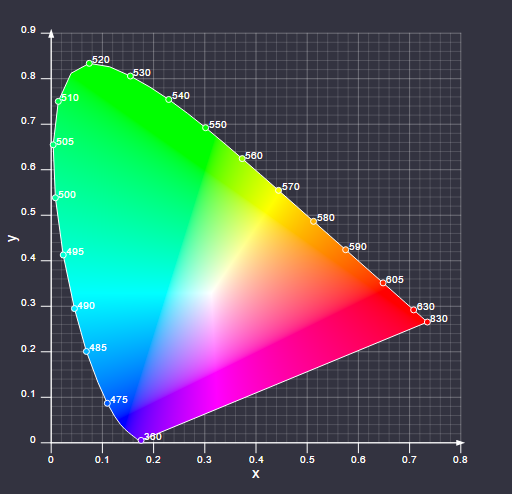
XyY CIE 1931 diagram
And the last thing to know is what is considered the white color of the color space. In such a display system, white is the x and y coordinates of the color, which are obtained when all the coefficients of the primary RGB colors are equal.
Over time, several new color spaces have appeared, which in various aspects have improved the 1931 CIE spaces. Despite this, the xyY CIE system remains the most popular color space describing the properties of display devices.
Before considering video standards, two more concepts must be introduced and explained.
The optical-electronic transfer function (OETF) determines how the linear light detected by the device (camera) should be encoded in the signal, i.e. this is a function of the form:

V used to be an analog signal, but now, of course, it is digitally encoded. Typically, game developers rarely encounter OETF. One example in which the function will be important: the need to combine video recordings with computer graphics in the game. In this case, you need to know with which OETF the video was recorded in order to restore linear light and mix it correctly with the computer image.
The electronic-optical transfer function (EOTF) performs the opposite OETF task, i.e. it determines how the signal will be converted into linear light:

This function is more important for game developers, because it determines how the content they create will be displayed on TVs and user monitors.
Although the concepts of EOTF and OETF are interconnected, they serve different purposes. OETF is needed to represent the captured scene, from which we can then reconstruct the original linear lighting (this representation is conceptually a frame buffer of the HDR ( High Dynamic Range ) frame of a regular game). What happens at the production stages of a regular film:
A detailed discussion of this process will not be included in our article, but I recommend that you study the detailed formalized description of the ACES (Academy Color Encoding System) workflow .
Until now, the standard technical process of the game was as follows:
Most game engines use the color correction method, popularized by Naty Hoffman's presentation “Color Enhancement for Videogames” from Siggraph 2010. This method was practical when only the target SDR ( Standard Dynamic Range ) was used, and it allowed using color correction software, already installed on the computers of most artists, such as Adobe Photoshop.
SDR standard color grading workflow (image courtesy of Jonathan Blow)
After the introduction of HDR, most games began to move toward a process similar to that used in movie production. Even in the absence of HDR, a similar process to the cinematic process allowed us to optimize the work. Performing color grading in HDR means that you have a whole dynamic range of the scene. In addition, some effects that were previously unavailable become possible.
Now we are ready to consider the various standards currently used to describe TV formats.
Most of the standards related to video broadcasting have been issued by the International Telecommunication Union (ITU), a UN body mainly dealing with information technology.
Recommendation ITU-R BT.709 , which is more commonly referred to as Rec. 709 is a standard that describes the properties of HDTV. The first version of the standard was released in 1990, the latest in June 2015. The standard describes parameters such as aspect ratio, resolution, frame rate. Most people are familiar with these characteristics, so I will not consider them and will focus on sections of the standard related to color reproduction and brightness.
The standard describes in detail the color limited by the xyY CIE color space. The red, green, and blue light sources of the display conforming to the standard should be selected so that their individual color coordinates are as follows:

Their relative intensity should be adjusted so that the white dot has color

(This white dot is also known as CIE Standard Illuminant D65 and similar to capturing the chromaticity coordinates of the spectral intensity distribution of ordinary daylight.)
The chromaticity properties can be visually represented as follows:
Reach Rec. 709
The area of the color scheme, bounded by a triangle created by the primary colors of a given display system, is called coverage.
Now we move on to the part of the standard devoted to brightness, and here everything becomes a little more complicated. The standard states that “General optical-electronic transfer characteristic in the source” is equal to:

There are two problems here:
This happened historically, because it was believed that the display device, i.e. Consumer TV is EOTF. In practice, this was done by adjusting the captured brightness range in the above OETF so that the image looks good on the reference monitor with the following EOTF:

where L = 1 corresponds to a brightness of about 100 cd / m² (the unit cd / m² in this industry is called “nit”). This is confirmed by ITU in recent versions of the standard with the following comment:

CRTElephant Cemetery
Non-linearity of brightness as a function of the applied voltage led to how the CRT monitors are physically arranged. By pure chance, this non-linearity is (very) approximately the inverted non-linearity of the perception of brightness by a person. When we switched to the digital representation of signals, this led to the successful effect of a uniform distribution of the sampling error over the entire brightness range.
Rec. 709 is designed to use 8-bit or 10-bit encoding. Most content uses 8-bit encoding. For him, the standard states that the distribution of the signal brightness range should be distributed in codes 16-235.
As for HDR video, there are two main rivals in it: Dolby Vision and HDR10. In this article, I will focus on HDR10 because it is an open standard that has quickly become popular. This standard is selected for the Xbox One S and PS4.
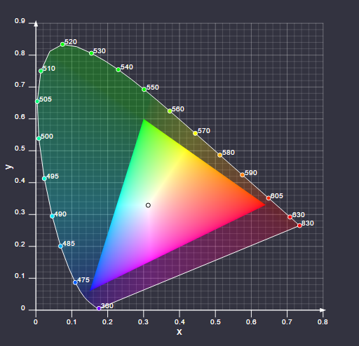
We will start again by looking at the portion of the color space color used in HDR10 as defined in Recommendation ITU-R BT.2020 (UHDTV). It indicates the following chromaticity coordinates of the primary colors:

Again, D65 is used as the white point. When visualized in an xy Rec. 2020 is as follows:

Reach Rec. 2020
It is obvious that the coverage of this color space is much larger than that of Rec. 709.
Now we turn to the section of the standard on brightness, and here again everything becomes more interesting. In his 1999 Ph.D. dissertation, “Contrast sensitivity of the human eye and its effect on image quality”, Peter Barten presented a slightly frightening equation:

(Many of the variables of this equation are themselves complex equations, for example, the brightness is hidden inside the equations that calculate E and M).
The equation determines how sensitive the eye is to changes in contrast at different brightnesses, and various parameters determine the viewing conditions and some properties of the observer. “ Just Noticeable Difference (JND) is the opposite of Barten’s equation, so the following should be true to discretize the EOTF to get rid of the viewing conditions:

Society of Motion Picture and Television Engineers (SMPTE) decided that the Barten equation would be a good basis for the new EOTF. The result is what we now call the SMPTE ST 2084 or Perceptual Quantizer (PQ).
PQ was created by choosing conservative values for the parameters of the Barten equation, i.e. expected typical viewing conditions by the consumer. Later PQ was defined as discretization, which for a given range of brightness and number of samples most closely matches the Barten equation with the selected parameters.
The discretized EOTF values can be found using the following recurrence formula for finding k <1 . The final sampling value will be the required maximum brightness:

For a maximum brightness of 10,000 nits using 12-bit sampling (which is used in Dolby Vision), the result is as follows:
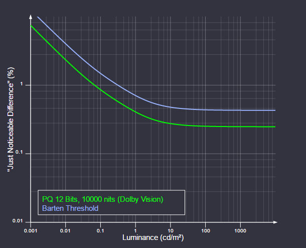
EOTF PQ
As you can see, sampling does not occupy the entire brightness range.
The HDR10 standard also uses EOTF PQ, but with 10-bit sampling. This is not enough to stay below the Barten threshold in a brightness range of 10,000 nits, but the standard allows metadata to be embedded in the signal to dynamically control peak brightness. Here's how 10-bit PQ sampling looks for different brightness ranges:
Different EOTF HDR10
But even so, the brightness is slightly higher than Barten's threshold. However, the situation is not as bad as it might seem from the graph, because:
At the time of writing, HDR10 televisions on the market typically have a peak brightness of 1000-1500 nits, and 10 bits is enough for them. It is also worth noting that TV manufacturers can decide for themselves what to do with brightnesses above the range that they can display. Some take a hard cut approach, others a softer one.
Here is an example of what Rec. 8-bit sampling looks like. 709 with a peak brightness of 100 nits:
EOTF Rec. 709 (16-235)
As you can see, we are much higher than Barten's threshold, and, importantly, even the most illegible buyers will tune their TVs to significantly larger 100 nits peak brightness (usually 250-400 nits), which will raise the Rec curve. 709 is even higher.
One of the biggest differences between Rec. 709 and HDR in that the brightness of the latter is indicated in absolute values. Theoretically, this means that content intended for HDR will look the same on all compatible TVs. At least until their peak brightness.
There is a popular misconception that HDR content in general will be brighter, but in the general case this is not so. HDR films will most often be produced in such a way that the average level of image brightness is the same as for Rec. 709, but so that the brightest parts of the image are brighter and more detailed, which means that the midtones and shadows will be darker. In combination with the absolute brightness values of HDR, this means that for optimal viewing of HDR, good conditions are needed: in bright lighting, the pupil narrows, which means that it will be more difficult to see details in dark areas of the image.
Pioneers of color research
Today we know that the retina of the human eye contains three different types of photoreceptor cells called cones. Each of the three types of cones contains a protein from the family of opsin proteins, which absorbs light in various parts of the spectrum:
Absorption of Light by Opsins
Cones correspond to the red, green, and blue parts of the spectrum and are often called long (L), medium (M), and short (S) according to the wavelengths to which they are most sensitive.
One of the first scientific papers on the interaction of light and the retina was Isaac Newton's treatise Hypothesis Concerning Light and Colors, written between 1670-1675. Newton had a theory that light with different wavelengths led to a resonance of the retina with the same frequencies; these vibrations were then transmitted through the optic nerve to the sensorium.
“The rays of light, falling to the bottom of the eye, excite vibrations in the retina, which propagate through the fibers of the optical nerves to the brain, creating a sense of vision. Different types of rays create vibrations of different strengths, which, according to their strength, excite sensations of different colors ... "
(I recommend that you read the scanned drafts of Newton on the Cambridge University website . I, of course, state the obvious, but what a genius he was!)
More than a hundred years later, Thomas Jung came to the conclusion that since the resonance frequency is a system-dependent property, in order to absorb light of all frequencies, there must be an infinite number of different resonant systems in the retina. Jung considered this unlikely, and reasoned that the quantity is limited to one system for red, yellow, and blue. These colors have traditionally been used in subtractive color mixing. In his own words :
Since, for the reasons indicated by Newton, it is possible that the retinal motion is more vibrational than wave nature, the frequency of vibrations should depend on the structure of its substance. Since it is almost impossible to believe that each sensitive point of the retina contains an infinite number of particles, each of which is able to oscillate in perfect harmony with any possible wave, it becomes necessary to assume that the quantity is limited, for example, by three primary colors: red, yellow and blue ...Jung’s assumption regarding the retina was incorrect, but he made the right conclusion: there are a finite number of cell types in the eye.
In 1850, German Helmholtz was the first to receive an experimental proof of Jung's theory. Helmholtz asked the subject to compare the colors of different samples of light sources, adjusting the brightness of several monochrome light sources. He came to the conclusion that for comparing all the samples, three light sources are necessary and sufficient: in the red, green and blue parts of the spectrum.
The birth of modern colorimetry
Fast forward to the early 1930s. By that time, the scientific community had a fairly good idea of the inner workings of the eye. (Although it took another 20 years for George Wold to experimentally confirm the presence and function of rhodopsins in the retinal cones. This discovery led him to the Nobel Prize in medicine in 1967.) Commission Internationale de L'Eclairage (International Commission on Lighting), CIE, set the task of creating an exhaustive quantitative assessment of human color perception. The quantification was based on experimental data collected by William David Wright and John Guild with parameters similar to those first selected by Hermann Helmholtz. The basic settings were 435.8 nm for blue, 546.1 nm for green and 700 nm for red.
John Guild's experimental setup, three knobs adjust the primary colors.
Due to the significant overlap in the sensitivity of the M and L cones, it was impossible to compare some wavelengths with the blue-green part of the spectrum. To “compare” these colors, we needed to add a little basic red color as a reference point:
If we imagine for a moment that all the primary colors make a negative contribution, then the equation can be rewritten as follows:
The experiment resulted in an RGB triad table for each wavelength, what was displayed on the chart as follows:
CIE 1931 RGB color matching functions
Of course, colors with a negative red component cannot be displayed using CIE primary colors.
Now we can find the trichromic coefficients for the light of the spectral intensity distribution S as the following internal product:
It may seem obvious that sensitivity to different wavelengths can be integrated in this way, but in fact it depends on the physical sensitivity of the eye, linear with respect to sensitivity to lengths waves. This was empirically confirmed in 1853 by Herman Grassmann, and the integrals presented above in the modern formulation are known to us as Grassmann's law.
The term “color space” arose because the primary colors (red, green and blue) can be considered the basis of the vector space. In this space, the various colors perceived by man are represented by rays emanating from the source. The modern definition of vector space was introduced in 1888 by Giuseppe Peano, but more than 30 years before that, James Clerk Maxwell had only used the nascent theories of what later became linear algebra to formally describe the trichromatic color system.
CIE decided that to simplify the calculations, it would be more convenient to work with a color space in which the coefficients of the primary colors are always positive. Three new primary colors were expressed in the coordinates of the RGB color space as follows:
This new set of primary colors cannot be realized in the physical world. This is just a math tool to simplify working with color space. In addition, so that the coefficients of the primary colors are always positive, the new space is arranged in such a way that the color coefficient Y corresponds to the perceived brightness. This component is known as CIE brightness (read more about it in the wonderful Color FAQ article by Charles Poynton).
To simplify the visualization of the resulting color space, we will perform the last conversion. Dividing each component by the sum of the components, we get a dimensionless amount of color that does not depend on its brightness:
The x and y coordinates are known as chromaticity coordinates, and together with the Y CIE luminance, they make up the xyY CIE color space. If we plot the chromaticity coordinates of all colors with a given brightness on the graph, we get the following diagram, which you probably know:
XyY CIE 1931 diagram
And the last thing to know is what is considered the white color of the color space. In such a display system, white is the x and y coordinates of the color, which are obtained when all the coefficients of the primary RGB colors are equal.
Over time, several new color spaces have appeared, which in various aspects have improved the 1931 CIE spaces. Despite this, the xyY CIE system remains the most popular color space describing the properties of display devices.
Transfer functions
Before considering video standards, two more concepts must be introduced and explained.
Optoelectronic Transfer Function
The optical-electronic transfer function (OETF) determines how the linear light detected by the device (camera) should be encoded in the signal, i.e. this is a function of the form:
V used to be an analog signal, but now, of course, it is digitally encoded. Typically, game developers rarely encounter OETF. One example in which the function will be important: the need to combine video recordings with computer graphics in the game. In this case, you need to know with which OETF the video was recorded in order to restore linear light and mix it correctly with the computer image.
Electron-optical transfer function
The electronic-optical transfer function (EOTF) performs the opposite OETF task, i.e. it determines how the signal will be converted into linear light:
This function is more important for game developers, because it determines how the content they create will be displayed on TVs and user monitors.
The relationship between EOTF and OETF
Although the concepts of EOTF and OETF are interconnected, they serve different purposes. OETF is needed to represent the captured scene, from which we can then reconstruct the original linear lighting (this representation is conceptually a frame buffer of the HDR ( High Dynamic Range ) frame of a regular game). What happens at the production stages of a regular film:
- Scene data capture
- OETF inversion to restore linear lighting values
- Color correction
- Mastering for various target formats (DCI-P3, Rec. 709, HDR10, Dolby Vision, etc.):
- Reducing the dynamic range of the material to match the dynamic range of the target format (tone compression)
- Convert to target color space
- Invert EOTF for the material (when using EOTF in the display device, the image is restored as needed).
A detailed discussion of this process will not be included in our article, but I recommend that you study the detailed formalized description of the ACES (Academy Color Encoding System) workflow .
Until now, the standard technical process of the game was as follows:
- Rendering
- HDR frame buffer
- Tone correction
- EOTF inversion for the intended display device (usually sRGB)
- Color correction
Most game engines use the color correction method, popularized by Naty Hoffman's presentation “Color Enhancement for Videogames” from Siggraph 2010. This method was practical when only the target SDR ( Standard Dynamic Range ) was used, and it allowed using color correction software, already installed on the computers of most artists, such as Adobe Photoshop.
SDR standard color grading workflow (image courtesy of Jonathan Blow)
After the introduction of HDR, most games began to move toward a process similar to that used in movie production. Even in the absence of HDR, a similar process to the cinematic process allowed us to optimize the work. Performing color grading in HDR means that you have a whole dynamic range of the scene. In addition, some effects that were previously unavailable become possible.
Now we are ready to consider the various standards currently used to describe TV formats.
Video Standards
Rec. 709
Most of the standards related to video broadcasting have been issued by the International Telecommunication Union (ITU), a UN body mainly dealing with information technology.
Recommendation ITU-R BT.709 , which is more commonly referred to as Rec. 709 is a standard that describes the properties of HDTV. The first version of the standard was released in 1990, the latest in June 2015. The standard describes parameters such as aspect ratio, resolution, frame rate. Most people are familiar with these characteristics, so I will not consider them and will focus on sections of the standard related to color reproduction and brightness.
The standard describes in detail the color limited by the xyY CIE color space. The red, green, and blue light sources of the display conforming to the standard should be selected so that their individual color coordinates are as follows:
Their relative intensity should be adjusted so that the white dot has color
(This white dot is also known as CIE Standard Illuminant D65 and similar to capturing the chromaticity coordinates of the spectral intensity distribution of ordinary daylight.)
The chromaticity properties can be visually represented as follows:
Reach Rec. 709
The area of the color scheme, bounded by a triangle created by the primary colors of a given display system, is called coverage.
Now we move on to the part of the standard devoted to brightness, and here everything becomes a little more complicated. The standard states that “General optical-electronic transfer characteristic in the source” is equal to:
There are two problems here:
- There is no specification of what physical brightness L = 1
- Although this is a video broadcast standard, it does not specify EOTF
This happened historically, because it was believed that the display device, i.e. Consumer TV is EOTF. In practice, this was done by adjusting the captured brightness range in the above OETF so that the image looks good on the reference monitor with the following EOTF:
where L = 1 corresponds to a brightness of about 100 cd / m² (the unit cd / m² in this industry is called “nit”). This is confirmed by ITU in recent versions of the standard with the following comment:
In standard manufacturing practice, the encoding function of the image sources is adjusted so that the final image has the desired appearance, corresponding to that seen on the reference monitor. The decoding function from Recommendation ITU-R BT.1886 is taken as a reference. The reference viewing environment is specified in Recommendation ITU-R BT.2035.Rec. 1886 is the result of documentation of the characteristics of CRT monitors (the standard was published in 2011), i.e. is a formalization of existing practice.
CRT
Non-linearity of brightness as a function of the applied voltage led to how the CRT monitors are physically arranged. By pure chance, this non-linearity is (very) approximately the inverted non-linearity of the perception of brightness by a person. When we switched to the digital representation of signals, this led to the successful effect of a uniform distribution of the sampling error over the entire brightness range.
Rec. 709 is designed to use 8-bit or 10-bit encoding. Most content uses 8-bit encoding. For him, the standard states that the distribution of the signal brightness range should be distributed in codes 16-235.
HDR10
As for HDR video, there are two main rivals in it: Dolby Vision and HDR10. In this article, I will focus on HDR10 because it is an open standard that has quickly become popular. This standard is selected for the Xbox One S and PS4.
We will start again by looking at the portion of the color space color used in HDR10 as defined in Recommendation ITU-R BT.2020 (UHDTV). It indicates the following chromaticity coordinates of the primary colors:
Again, D65 is used as the white point. When visualized in an xy Rec. 2020 is as follows:
Reach Rec. 2020
It is obvious that the coverage of this color space is much larger than that of Rec. 709.
Now we turn to the section of the standard on brightness, and here again everything becomes more interesting. In his 1999 Ph.D. dissertation, “Contrast sensitivity of the human eye and its effect on image quality”, Peter Barten presented a slightly frightening equation:
(Many of the variables of this equation are themselves complex equations, for example, the brightness is hidden inside the equations that calculate E and M).
The equation determines how sensitive the eye is to changes in contrast at different brightnesses, and various parameters determine the viewing conditions and some properties of the observer. “ Just Noticeable Difference (JND) is the opposite of Barten’s equation, so the following should be true to discretize the EOTF to get rid of the viewing conditions:
Society of Motion Picture and Television Engineers (SMPTE) decided that the Barten equation would be a good basis for the new EOTF. The result is what we now call the SMPTE ST 2084 or Perceptual Quantizer (PQ).
PQ was created by choosing conservative values for the parameters of the Barten equation, i.e. expected typical viewing conditions by the consumer. Later PQ was defined as discretization, which for a given range of brightness and number of samples most closely matches the Barten equation with the selected parameters.
The discretized EOTF values can be found using the following recurrence formula for finding k <1 . The final sampling value will be the required maximum brightness:
For a maximum brightness of 10,000 nits using 12-bit sampling (which is used in Dolby Vision), the result is as follows:
EOTF PQ
As you can see, sampling does not occupy the entire brightness range.
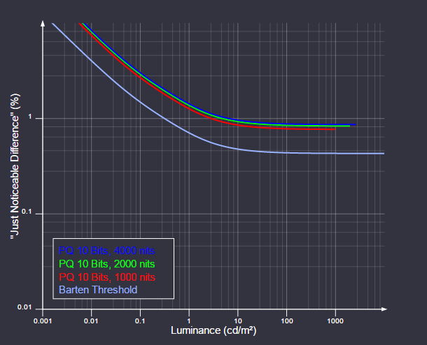
The HDR10 standard also uses EOTF PQ, but with 10-bit sampling. This is not enough to stay below the Barten threshold in a brightness range of 10,000 nits, but the standard allows metadata to be embedded in the signal to dynamically control peak brightness. Here's how 10-bit PQ sampling looks for different brightness ranges:
Different EOTF HDR10
But even so, the brightness is slightly higher than Barten's threshold. However, the situation is not as bad as it might seem from the graph, because:
- The curve is logarithmic, so the relative error is actually not so large
- Do not forget that the parameters taken to create the Barten threshold are chosen conservatively.
At the time of writing, HDR10 televisions on the market typically have a peak brightness of 1000-1500 nits, and 10 bits is enough for them. It is also worth noting that TV manufacturers can decide for themselves what to do with brightnesses above the range that they can display. Some take a hard cut approach, others a softer one.
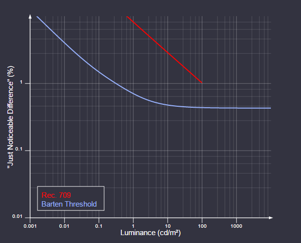
Here is an example of what Rec. 8-bit sampling looks like. 709 with a peak brightness of 100 nits:
EOTF Rec. 709 (16-235)
As you can see, we are much higher than Barten's threshold, and, importantly, even the most illegible buyers will tune their TVs to significantly larger 100 nits peak brightness (usually 250-400 nits), which will raise the Rec curve. 709 is even higher.
Finally
One of the biggest differences between Rec. 709 and HDR in that the brightness of the latter is indicated in absolute values. Theoretically, this means that content intended for HDR will look the same on all compatible TVs. At least until their peak brightness.
There is a popular misconception that HDR content in general will be brighter, but in the general case this is not so. HDR films will most often be produced in such a way that the average level of image brightness is the same as for Rec. 709, but so that the brightest parts of the image are brighter and more detailed, which means that the midtones and shadows will be darker. In combination with the absolute brightness values of HDR, this means that for optimal viewing of HDR, good conditions are needed: in bright lighting, the pupil narrows, which means that it will be more difficult to see details in dark areas of the image.