 January 17, 2017 at 13:29
Introducing 8pt Grids
- Transfer
Any designer, no matter what he worked on - websites, magazines or mobile applications - probably had to hear the term "grid". There are grids for all kinds of content layout options. We use column grids to line up content horizontally, baseline grids to vertically align text blocks, soft and hard grids - depending on how strictly we are going to stick to them. I became interested in the 8pt grid system when I heard how passion Brin Jackson was talking about it and decided to see what advantages it could give to my designs (and whether at all).
What's the problem? Somehow I managed so far without an 8pt grid system
I used to raise projects using design systems like Bootstrap and Foundation, and even myself created several similar ones. Only recently I came to the conclusion that individual components - for example, buttons - can be well implemented on their own, but spoil the design as a whole when you embed them in a salad of other elements and content. The reason is that creating a visually pleasing page composition in a single style is quite difficult. I can move elements back and forth in accordance with my design vision, but you can’t expect that the whole team of designers and developers will share it. When there is no system for calculating dimensions and distances, it is difficult to achieve constancy.
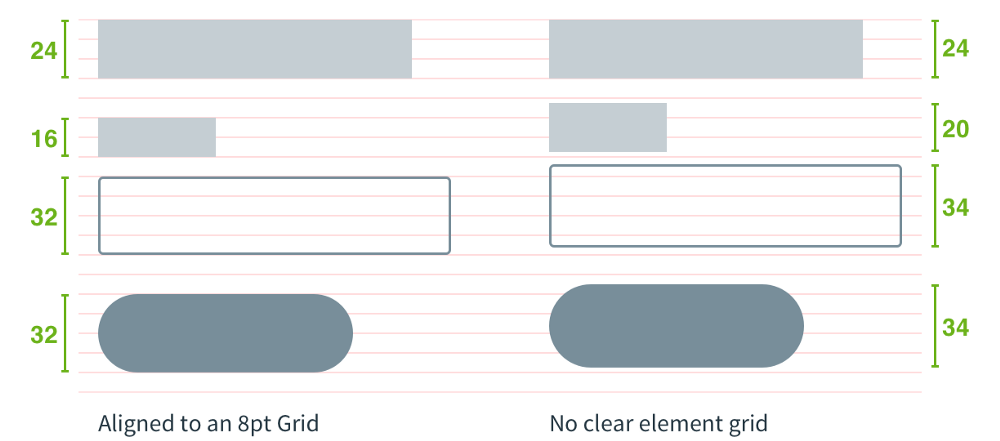
The comparison is presented below: in the picture on the left, the components of the form are constructed according to a system of 8pt grids, on the right, according to another system in which you can set arbitrary numerical values for sizes and distances.
But why should consistency be maintained in my interface?
Should not. However, if you want it to leave a feeling of reliability and professionalism, this will not hurt. If you have ever made purchases on the Web, you probably know how skeptic you feel when you click on the Buy button and the form for entering credit card information does not look like the rest of the site’s pages. A little constancy can give good results.
Why are systems like Bootstrap bad?
Bootstrap is a component library that allows designers to focus on content and user experience. With its help, the quality of many sites has been improved. But the lack of a single unit of measurement can lead to a discrepancy between the structures of different pages, especially if several designers are involved in the project.
In the process of developing a corporate identity for Pivotal, we often had to create unique elements and layouts. Recently, working on the unification of the UI system, we found that the logo in the upper corner is different from product to product. These products were handled by different teams scattered around the world - as a result, the general concept is maintained everywhere, but the performance is slightly different. Which logo is wrong?

Honestly, no. They all have different heights and different indents, but we don’t have a system that would clearly explain on what basis this or that standard is introduced, so why adhere to standards?
So what do you suggest then, wise guy?
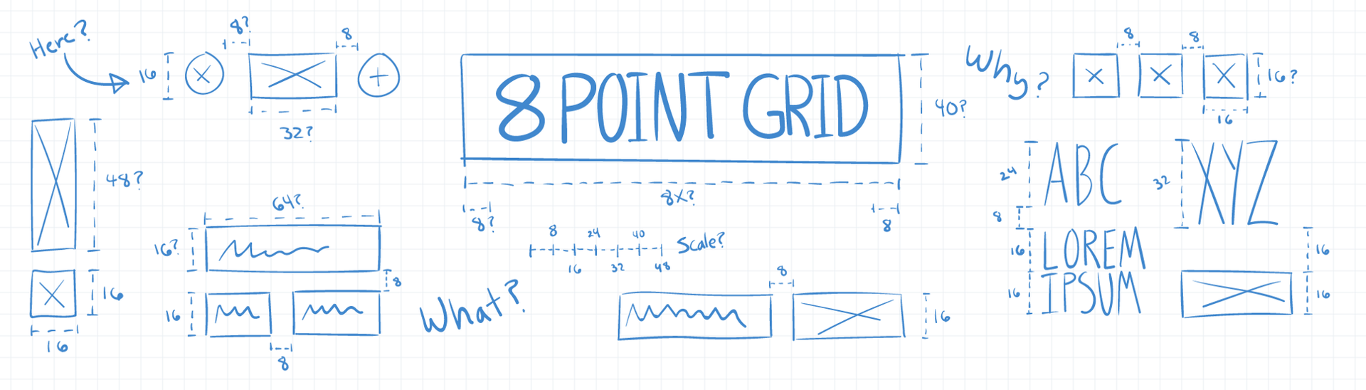
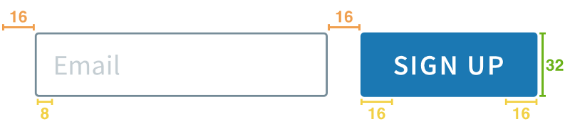
A system of 8pt grids. Calculate the sizes of all elements and the distances between them in increments of 8. I understand this: any given height, width, margin or indent will be a multiple of eight.
Why exactly 8?
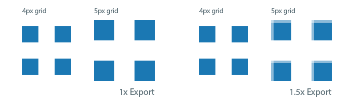
The variety in screen sizes and resolutions only increases with time, thereby complicating the task for designers when creating objects. If all the numerical values are even, it’s easier to scale the sizes and distances for a wide range of devices, keeping the design in its original form.
For example, devices with a resolution of one and a half times the original will have problems with rendering odd values. Increasing an element of five pixels in size by one and a half times will result in a half pixel offset.
Okay, with even numbers everything is clear, but the truth is, why is 8, not 6 or 10?
For most common devices, the screen size in pixels is a multiple of eight, which means it will be easier to customize the interface with this system. A step of eight pixels gives a sufficient number of different options, without overloading you with variables, unlike the 6pt system, and without limiting it like 10pt. Ultimately, you need to choose a size that is convenient for your audience. Only the “system” that is easy to follow and easy to reproduce is good.
What is the value of the 8pt system?
For designers: Increases efficiency, requires fewer solutions to maintain a high-quality uniform rhythm between elements.
For the team: A convenient system for interaction between designers and developers (less fuss due to pixels). It’s easier for the developer to figure out a 8-pixel line in the eye than take measurements every time.
For the user: Consistency in the design of the brand they trust. No blur due to a half-pixel offset on any device that they prefer.
Where to begin?
Here are some articles about implementing the 8pt grid method for designers and developers.
Brin Jackson's post on the 8pt grid system is the most comprehensive guide that has everything from definitions of terms to implementation instructions.
A post by Anthony Kolurafichi about his experience with using 8pt grids when working with Sketch will be useful for getting to know the system.
An article by Google entitled Material Design - Metrics & keylines is another good resource with examples and explanations.
Intuit's Harmony design system offers responsive baseline grids and a clear explanation of why each pixel matters.
Questions
We, a team of designers and developers from Pivotal, have not yet fully explored all the features of the system. In future posts, I will share new discoveries along the way. Do you use something like that? If not, why? If so, what has this experience taught you?
What's the problem? Somehow I managed so far without an 8pt grid system
I used to raise projects using design systems like Bootstrap and Foundation, and even myself created several similar ones. Only recently I came to the conclusion that individual components - for example, buttons - can be well implemented on their own, but spoil the design as a whole when you embed them in a salad of other elements and content. The reason is that creating a visually pleasing page composition in a single style is quite difficult. I can move elements back and forth in accordance with my design vision, but you can’t expect that the whole team of designers and developers will share it. When there is no system for calculating dimensions and distances, it is difficult to achieve constancy.
The comparison is presented below: in the picture on the left, the components of the form are constructed according to a system of 8pt grids, on the right, according to another system in which you can set arbitrary numerical values for sizes and distances.
But why should consistency be maintained in my interface?
Should not. However, if you want it to leave a feeling of reliability and professionalism, this will not hurt. If you have ever made purchases on the Web, you probably know how skeptic you feel when you click on the Buy button and the form for entering credit card information does not look like the rest of the site’s pages. A little constancy can give good results.
Why are systems like Bootstrap bad?
Bootstrap is a component library that allows designers to focus on content and user experience. With its help, the quality of many sites has been improved. But the lack of a single unit of measurement can lead to a discrepancy between the structures of different pages, especially if several designers are involved in the project.
In the process of developing a corporate identity for Pivotal, we often had to create unique elements and layouts. Recently, working on the unification of the UI system, we found that the logo in the upper corner is different from product to product. These products were handled by different teams scattered around the world - as a result, the general concept is maintained everywhere, but the performance is slightly different. Which logo is wrong?
Honestly, no. They all have different heights and different indents, but we don’t have a system that would clearly explain on what basis this or that standard is introduced, so why adhere to standards?
So what do you suggest then, wise guy?
A system of 8pt grids. Calculate the sizes of all elements and the distances between them in increments of 8. I understand this: any given height, width, margin or indent will be a multiple of eight.
Why exactly 8?
The variety in screen sizes and resolutions only increases with time, thereby complicating the task for designers when creating objects. If all the numerical values are even, it’s easier to scale the sizes and distances for a wide range of devices, keeping the design in its original form.
For example, devices with a resolution of one and a half times the original will have problems with rendering odd values. Increasing an element of five pixels in size by one and a half times will result in a half pixel offset.
Okay, with even numbers everything is clear, but the truth is, why is 8, not 6 or 10?
For most common devices, the screen size in pixels is a multiple of eight, which means it will be easier to customize the interface with this system. A step of eight pixels gives a sufficient number of different options, without overloading you with variables, unlike the 6pt system, and without limiting it like 10pt. Ultimately, you need to choose a size that is convenient for your audience. Only the “system” that is easy to follow and easy to reproduce is good.
What is the value of the 8pt system?
For designers: Increases efficiency, requires fewer solutions to maintain a high-quality uniform rhythm between elements.
For the team: A convenient system for interaction between designers and developers (less fuss due to pixels). It’s easier for the developer to figure out a 8-pixel line in the eye than take measurements every time.
For the user: Consistency in the design of the brand they trust. No blur due to a half-pixel offset on any device that they prefer.
Where to begin?
Here are some articles about implementing the 8pt grid method for designers and developers.
Brin Jackson's post on the 8pt grid system is the most comprehensive guide that has everything from definitions of terms to implementation instructions.
A post by Anthony Kolurafichi about his experience with using 8pt grids when working with Sketch will be useful for getting to know the system.
An article by Google entitled Material Design - Metrics & keylines is another good resource with examples and explanations.
Intuit's Harmony design system offers responsive baseline grids and a clear explanation of why each pixel matters.
Questions
We, a team of designers and developers from Pivotal, have not yet fully explored all the features of the system. In future posts, I will share new discoveries along the way. Do you use something like that? If not, why? If so, what has this experience taught you?