 December 27, 2016 at 16:18
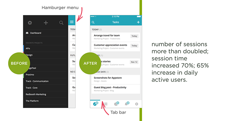
Basic models of mobile navigation
- Transfer
Navigation in the application should be intuitive and predictable. Understanding how to navigate it should be easy both for those who have already used the application, and for those who open it for the first time. But on mobile devices, making navigation accessible and easy to detect is not easy due to the restrictions imposed by the small screen size and the need to give priority to content over UI elements. Different navigation models try to solve this problem in different ways, but each of them suffers from a number of usability problems.
In his article, Nick Babich, a specialist in the development of mobile applications and UX design, examines three basic navigation models - the hamburger menu, Tab bar and gesture control - and describes their strengths and weaknesses.
The space on the screen of a mobile device is worth its weight in gold, and the hamburger menu is one of the most popular navigation models that help you save it. A pull-out panel allows you to hide the navigation behind the left border of the screen and show it only when the user performs a certain action. This solution is especially useful if you want the user to focus on the content of the main screen.
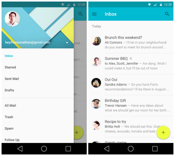
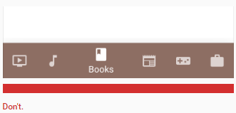
Example
As you can see, the menu itself is hidden behind the icon.
Pros
A large number of navigation options. The main advantage of the navigation menu is that with its help you can fit a large number of options in a small area.
Neat design. Free up space on the screen by transferring all options from it to the side menu.
Minuses
Hidden navigation is harder to find. Out of sight, out of mind. If the navigation is hidden, users are less likely to use it. Despite the fact that this scheme is becoming standard and many owners of mobile phones are familiar with it, a large number of people simply do not think of opening the menu.
Contradiction to platform navigation rules. For Android, the hamburger menu has become almost the standard, but on iOS devices it is simply impossible to implement it without affecting the basic navigation elements. As a result, the panel may be overloaded.

With the hamburger menu, the context is hidden. The hamburger menu does not display the current position of the user; this information is more difficult to extract, since it becomes visible only when you click on the menu icon.
In order to get to the desired page, an additional action is required. To go to a particular page, you need at least two clicks (one to the menu icon, the second to the page of interest to the user).
Tips
Options should be a priority. If you have complicated navigation, you will not make life easier for the user by hiding it. There are many life examples that show: when the options from the menu are presented in a more visually accessible way, engagement grows and the user experience improves. Ask yourself: “What elements are so important to make them visible on a mobile device?”. To answer this question, you first need to figure out what matters to your users.
If you have a small number of high priority menu items, consider moving them to tabs or to the Tab bar.
See how your information is structured. Good applications have a very narrow focus. If the structure is complex, it may make sense to separate functions between two or more applications more simply. Facebook released its Messenger precisely in order to solve the problem of excessive complexity. If you cut the functionality, the number of options in the menu will also be reduced, which means that there will be no need to implement a hamburger menu.
The model using the tab bar is a legacy of the design of desktop applications. Typically, a panel presents a relatively small number of options of equal importance, which should be available for direct transition from any screen in the application.
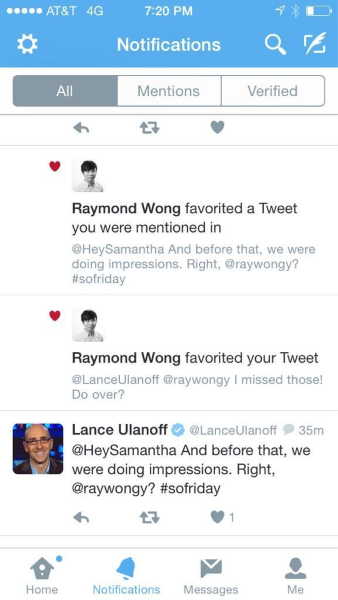
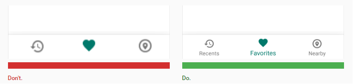
Example on
Twitter Tab bar allows the user to go directly to the screen associated with the selected object.
Pros
Tab bar easily transfers information about the user's location. With the correct use of visual cues (icons, captions, colors), it becomes self-evident and does not require additional explanation.

Tab bar provides consistency. The navigation options are always presented on the screen, so that users see what the main windows are in the application, and can click on any of them.
Cons
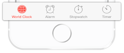
The number of navigation options is limited. If there are more than five of them in your application, it will be difficult to fit everything on the Tab bar, while maintaining the optimal size for the touchscreen icons.
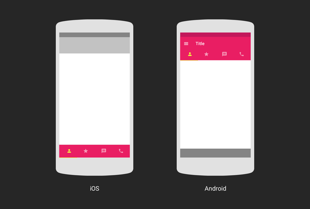
The logic and layout of the tab bar on iOS and Android are different. Each of these platforms has its own rules and recommendations regarding UI and usability; they should be taken into account when creating a Tab bar for a device. The panel can be located at the top (mainly on Android) or the bottom (mainly on iOS) of the page. In addition, on iOS, the bottom panel is often used to switch between application screens. On Android, on the contrary, it is customary to display tabs for visual control from above. In addition, actions are sometimes displayed on the bottom panel.
Advice
Do not make the icons too small. They should be large enough to be easily clicked on. To calculate the size of each action icon in the bottom panel, divide the screen width by the number of actions. Or adjust the size of all the icons to the largest of them.
Icons should be tested for usability. Apply the five-second rule: if it took you more than five seconds to come up with an icon for anything, most likely it will not be able to effectively convey the desired value.
Always add captions to the icons. Due to the fact that most of the icons lack a standard of application, an explanatory text is necessary to convey the necessary information and reduce the degree of uncertainty. Users should understand what exactly happens if they click on an item.
On June 29, 2007, a turning point came. As soon as Apple launched the first smartphone with a full touch screen, interaction with the touchscreen became the dominant type of control for mobile devices.
Gestures quickly gained popularity among designers; There are many applications that have experimented with gesture control.
Today, the success of a mobile application can largely depend on how thoughtfully gestures are built into the user experience.
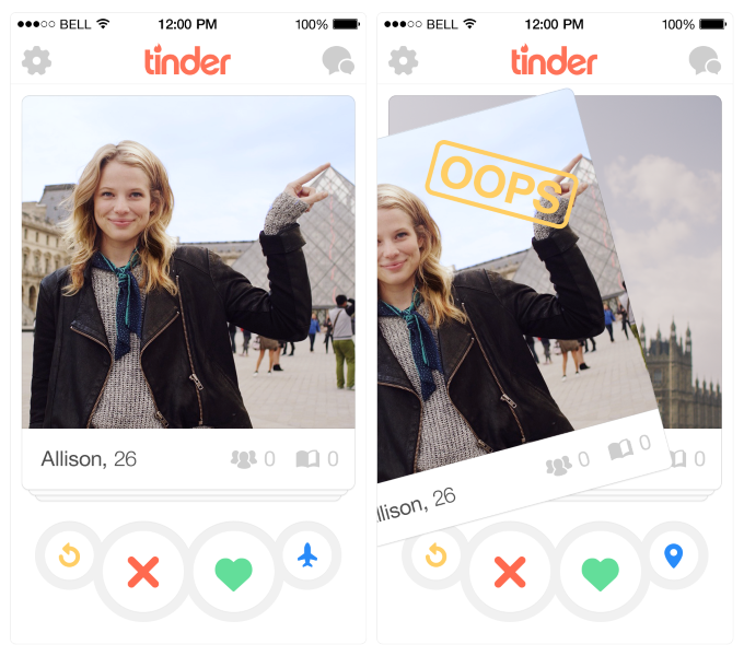
Example
Tinder revolutionized its industry with the swipe gesture, which has become almost the hallmark of the product. In humans, this app is associated with "swipe right" and "swipe left."
pros
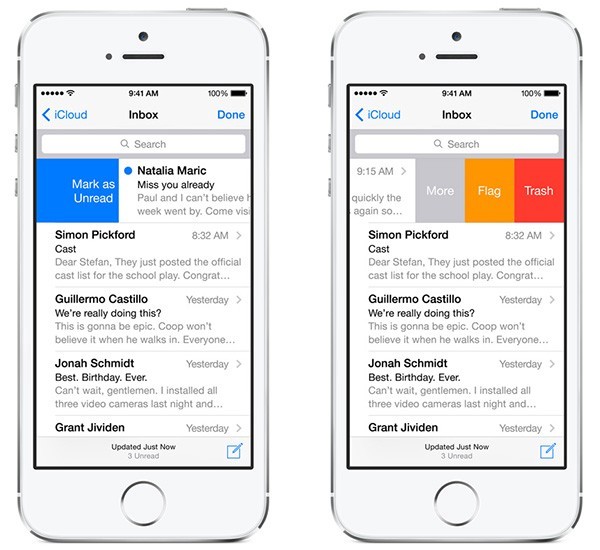
Removes unnecessary elements from the interface. Building a design based on gesture control, you get the opportunity to make the interface more concise, thereby saving space for valuable content.
"Natural interface." Luke Wroblewski in his article cites data from a study in which forty people from nine different countries were asked to come up with gestures for various actions (deleting, scrolling, zooming in, etc.). It is important to note the following trend: the selected gestures were similar, despite differences in cultures and experience of the participants in the experiment. For example, when they were offered to “delete”, most people, regardless of their nationality, tried to drag an object onto the screen.
Minuses
Invisible navigation. Visibility is an important principle of UI design. Through the menu, you can make sure that all possible actions are visible and, as a result, that they can be easily found. An invisible interface may look attractively beautiful, but its invisibility itself causes a lot of usability problems. Gesture management by its nature exists in a hidden form, the user must first detect it. The same pattern works here as in the case of the hamburger menu: if the opportunity is hidden, fewer people will use it.
More effort on the part of the user. Most of the gestures are neither natural nor easy to learn and remember. When designing gesture-based navigation, keep in mind that as you remove objects from the interface, it becomes more difficult for the user to learn how to work with your application. Without visual cues, he can get confused, not knowing how to interact with the interface.
Advice
Make sure that you are not trying to teach people a radically new pattern of interaction with the application. Recreate an experience they are already familiar with. To create good gesture-based navigation, first you need to look at how things are going with them in the world of mobile applications in general. For example, if you are developing a mail application, you can use swipe to scroll through letters - this gesture will be familiar to many users.
Provide information as needed and use visual instructions to teach people how to use your application. Remember: you need to show only the data necessary for the user for the action that he is currently performing - almost like in games where the mechanics are revealed as they progress.
Helping the audience navigate should be a priority in every application. Always strive to understand who your user is, for what purposes he uses the application, and use navigation in such a way as to facilitate his achievement of these goals. The easier it is for people to use your product, the more likely they are to use it.
In his article, Nick Babich, a specialist in the development of mobile applications and UX design, examines three basic navigation models - the hamburger menu, Tab bar and gesture control - and describes their strengths and weaknesses.
Hamburger menu
The space on the screen of a mobile device is worth its weight in gold, and the hamburger menu is one of the most popular navigation models that help you save it. A pull-out panel allows you to hide the navigation behind the left border of the screen and show it only when the user performs a certain action. This solution is especially useful if you want the user to focus on the content of the main screen.
Example
As you can see, the menu itself is hidden behind the icon.
Pros
A large number of navigation options. The main advantage of the navigation menu is that with its help you can fit a large number of options in a small area.
Neat design. Free up space on the screen by transferring all options from it to the side menu.
Minuses
Hidden navigation is harder to find. Out of sight, out of mind. If the navigation is hidden, users are less likely to use it. Despite the fact that this scheme is becoming standard and many owners of mobile phones are familiar with it, a large number of people simply do not think of opening the menu.
Contradiction to platform navigation rules. For Android, the hamburger menu has become almost the standard, but on iOS devices it is simply impossible to implement it without affecting the basic navigation elements. As a result, the panel may be overloaded.
With the hamburger menu, the context is hidden. The hamburger menu does not display the current position of the user; this information is more difficult to extract, since it becomes visible only when you click on the menu icon.
In order to get to the desired page, an additional action is required. To go to a particular page, you need at least two clicks (one to the menu icon, the second to the page of interest to the user).
Tips
Options should be a priority. If you have complicated navigation, you will not make life easier for the user by hiding it. There are many life examples that show: when the options from the menu are presented in a more visually accessible way, engagement grows and the user experience improves. Ask yourself: “What elements are so important to make them visible on a mobile device?”. To answer this question, you first need to figure out what matters to your users.
If you have a small number of high priority menu items, consider moving them to tabs or to the Tab bar.
See how your information is structured. Good applications have a very narrow focus. If the structure is complex, it may make sense to separate functions between two or more applications more simply. Facebook released its Messenger precisely in order to solve the problem of excessive complexity. If you cut the functionality, the number of options in the menu will also be reduced, which means that there will be no need to implement a hamburger menu.
Tab bar
The model using the tab bar is a legacy of the design of desktop applications. Typically, a panel presents a relatively small number of options of equal importance, which should be available for direct transition from any screen in the application.
Example on
Twitter Tab bar allows the user to go directly to the screen associated with the selected object.
Pros
Tab bar easily transfers information about the user's location. With the correct use of visual cues (icons, captions, colors), it becomes self-evident and does not require additional explanation.
Tab bar provides consistency. The navigation options are always presented on the screen, so that users see what the main windows are in the application, and can click on any of them.
Cons
The number of navigation options is limited. If there are more than five of them in your application, it will be difficult to fit everything on the Tab bar, while maintaining the optimal size for the touchscreen icons.
The logic and layout of the tab bar on iOS and Android are different. Each of these platforms has its own rules and recommendations regarding UI and usability; they should be taken into account when creating a Tab bar for a device. The panel can be located at the top (mainly on Android) or the bottom (mainly on iOS) of the page. In addition, on iOS, the bottom panel is often used to switch between application screens. On Android, on the contrary, it is customary to display tabs for visual control from above. In addition, actions are sometimes displayed on the bottom panel.
Advice
Do not make the icons too small. They should be large enough to be easily clicked on. To calculate the size of each action icon in the bottom panel, divide the screen width by the number of actions. Or adjust the size of all the icons to the largest of them.
Icons should be tested for usability. Apply the five-second rule: if it took you more than five seconds to come up with an icon for anything, most likely it will not be able to effectively convey the desired value.
Always add captions to the icons. Due to the fact that most of the icons lack a standard of application, an explanatory text is necessary to convey the necessary information and reduce the degree of uncertainty. Users should understand what exactly happens if they click on an item.
Gesture management
On June 29, 2007, a turning point came. As soon as Apple launched the first smartphone with a full touch screen, interaction with the touchscreen became the dominant type of control for mobile devices.
Gestures quickly gained popularity among designers; There are many applications that have experimented with gesture control.
Today, the success of a mobile application can largely depend on how thoughtfully gestures are built into the user experience.
Example
Tinder revolutionized its industry with the swipe gesture, which has become almost the hallmark of the product. In humans, this app is associated with "swipe right" and "swipe left."
pros
Removes unnecessary elements from the interface. Building a design based on gesture control, you get the opportunity to make the interface more concise, thereby saving space for valuable content.
"Natural interface." Luke Wroblewski in his article cites data from a study in which forty people from nine different countries were asked to come up with gestures for various actions (deleting, scrolling, zooming in, etc.). It is important to note the following trend: the selected gestures were similar, despite differences in cultures and experience of the participants in the experiment. For example, when they were offered to “delete”, most people, regardless of their nationality, tried to drag an object onto the screen.
Minuses
Invisible navigation. Visibility is an important principle of UI design. Through the menu, you can make sure that all possible actions are visible and, as a result, that they can be easily found. An invisible interface may look attractively beautiful, but its invisibility itself causes a lot of usability problems. Gesture management by its nature exists in a hidden form, the user must first detect it. The same pattern works here as in the case of the hamburger menu: if the opportunity is hidden, fewer people will use it.
More effort on the part of the user. Most of the gestures are neither natural nor easy to learn and remember. When designing gesture-based navigation, keep in mind that as you remove objects from the interface, it becomes more difficult for the user to learn how to work with your application. Without visual cues, he can get confused, not knowing how to interact with the interface.
Advice
Make sure that you are not trying to teach people a radically new pattern of interaction with the application. Recreate an experience they are already familiar with. To create good gesture-based navigation, first you need to look at how things are going with them in the world of mobile applications in general. For example, if you are developing a mail application, you can use swipe to scroll through letters - this gesture will be familiar to many users.
Provide information as needed and use visual instructions to teach people how to use your application. Remember: you need to show only the data necessary for the user for the action that he is currently performing - almost like in games where the mechanics are revealed as they progress.
Conclusion
Helping the audience navigate should be a priority in every application. Always strive to understand who your user is, for what purposes he uses the application, and use navigation in such a way as to facilitate his achievement of these goals. The easier it is for people to use your product, the more likely they are to use it.