 November 29, 2016 at 14:30
As I recalled school geometry course
How often did you have to solve a differential equation or find the integral after graduation? I think infrequently, unless, of course, you are not a scientist. But there are disciplines, the theoretical knowledge of which may suddenly come in handy in our work, even if this work is not directly related to science. One of these disciplines is geometry.
In this article I want to talk about a problem that geometric formulas helped me solve. And since I am developing interfaces, we will talk about the layout of such a pop-up message.
At first glance, nothing complicated. Quickly outline the main styles, add roundings and shadow, and make a pointer in the shape of a triangle using a pseudo-element and well-known technique . Check the result:
→ http://codepen.io/belyan/pen/vymwXe
Everything is fine, only the triangle should also be with a shadow. But if we add a shadow to our pseudo-element, then nothing will work out: the shadow will be square.

It turns out that this method is only suitable for creating simple triangles, without shadow and stroke.
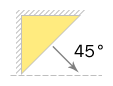
Let's try a different, slightly less well-known technique for creating triangles in CSS. We’ll use the border again, just make a triangle in the upper left corner, add a shadow to the element and move it to the same corner using negative values. Now turn the element 45 degrees clockwise - and get a triangle with a shadow.
→ http://codepen.io/belyan/pen/ObmYQa
The result already looks better, but not perfect. If you look closely, you can see that the triangle on the layout is slightly lower than ours. And we cannot fix it, because our triangle will always remain rectangular . We can add a fillet to it, and even emulate the stroke using the inner shadow, but we cannot change the value of the top corner.
To create a non- rectangular triangle, we will use a more complex way. Its essence is that we create a square, rotate it by 45 degrees and tilt it to the desired angle to get a rhombus, and then hide its lower part. As a result, we get an isosceles triangle of any size, to which we can add a shadow, border and rounding.

The difficulty lies in the fact that you have to manually select the size of the square and the angle of inclination, until you get the desired view. Therefore, many do not use this method. So let's write a mixin that will do all the calculations for us!
Writing a mixin
Next, I will use the LESS preprocessor, but this mixin can easily be rewritten to SCSS.
Let us take such a triangle as an illustration and set its dimensions — base band height — as initial parameters h.
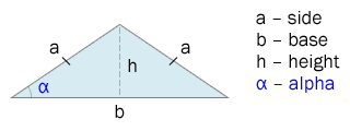
We start the calculation by finding the side a. Since the height of an isosceles triangle divides its base in half, the side acan be found by the Pythagorean theorem :
@base: 100px;
@height: 100px;
@side: sqrt(@base * @base / 4 + @height * @height); // про штаны, надеюсь, все помнят ;)
Knowing the values of all sides, we can find the lateral angle alpha. We recall that the sine of the angle is the ratio of the opposite side to the hypotenuse. The opposite leg is with us h, and the hypotenuse is a. Thus:
@alpha: asin(@height / @side); // результат будет в радианах!Now you need to calculate the angle of inclination to transform our square after turning 45 degrees. To do this, draw a rectangular triangle, the base of which coincides with ours.
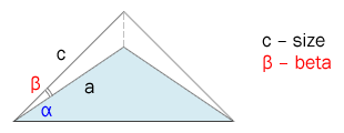
Now you can clearly see that the angle of inclination betawill be equal to the difference between the lateral angle alphaand the angle of rotation.
@beta: convert(@alpha, deg) - 45deg; // не забываем перевести радианы обратно в градусыThe last value that we need to calculate is the lateral side of the square before its transformation. To do this, use the cosine of the angle . We know the angle of inclination, and the side will be the adjacent leg a. Thus, the side can be calculated by the formula:
@size: @side * cos(@beta);Now we know the initial dimensions of the square, as well as the angles of rotation and tilt, to transform it into a rhombus. Add the necessary styles and hide the lower half of the rhombus with overflow: hidden, as a result we get an isosceles triangle of the given sizes. Mixin is ready.
→ http://codepen.io/belyan/pen/wozWXE
We apply it to our pop-up message and finally get the desired result. :)
→ http://codepen.io/belyan/pen/LbyKEd
I want to add that with the help of the same mixin we can create equilateral triangles, since they are a special case of isosceles. In this case, we only base will be sufficient to set a triangle, and its height can be easily calculated using the formula: @height: @base * sin(60deg);.
You can also add in hagfish opportunity to set the direction of the triangle: top, left, right, bottom. I did not do this in the article, since the amount of code would increase significantly. For those who are interested in this topic, I suggest taking a look at the extended version of this mixin. There you will also find mixins for other geometric shapes, such as a circle, oval, cross, star, etc.
→ http://codepen.io/belyan/pen/Lpqdmx
I hope you were interested. Thanks for attention!