5 Tips for Improving Game Animations
- Transfer
Hi, my name is Dave Bleja, I work at Volnaiskra Studio. Over the past 3 years, I have created Spryke , a fun and elaborate platformer about deep sea cyber fish exploring the wonders of land.
As the only regular member of the Spryke team, I was responsible for many parts of the creative and technical process. Some tasks are tedious, but most are fun. My favorite aspect was animation, and I want to share with you the five animation tips that I have developed over the years.
First tip: sometimes “quantity” means “quality”
The phrase “Less is more” has become such a cliched cliche that my proposal may seem outrageous. Well hold on. Sometimes less is ... less!
There is no substitute for quality, and as artists, we should always strive for it. Knowledge of the anatomy, physics and lighting of the real world will help you improve game graphics; lack of knowledge will hurt her. But it turns out that one of the most important quality building blocks is a simple quantity. And this is especially true of animation.
At a fundamental level, animation is quantity. The animator creates hundreds of still images so connected to each other that the brain can no longer process them separately. So the magic of movement is created. The same principle is often applied to the creation of high-quality animations.
For example, take these bubbles. They look good, right? (Of course it is, because they are taken from our awesome Spryke game!)
Animation

So what am I talking about? Oh yes, the bubbles. They look good, but the basic graphics of the bubbles themselves are incredibly simple - basically, it's just circles. They look beautiful because of the quantity. But not only due to the number of bubbles, but also a large number of processes occurring with these bubbles at the same time. Let's look at them in detail:
Animation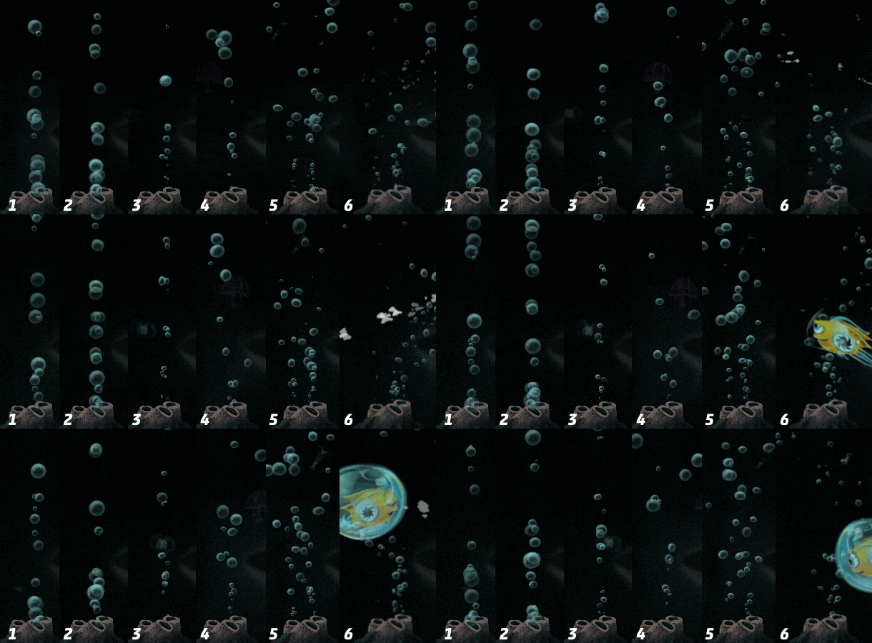

(1) Bubbles with different transparency and size;
(2) + slightly different shapes;
(3) + randomized vibrations and smaller size at the very beginning;
(4) + randomized trigonometric movement (i.e., along a curve);
(5) + several sources;
(6) + the refraction of light in water, the bubbles move and separate into smaller ones when they collide with a player.
Each stage of this process is simple (oscillations and deviations require a little knowledge of geometry, but nothing particularly complicated). None of these steps individually is anything impressive or believable. But combining them all together, we create a complex and convincing whole. When we got to step 6, so many things are happening around that the consciousness cannot track all this separately, and the individual components of the animation merge into one beautiful and dynamic whole.
I want to emphasize that this principle applies not only to multiple objects, such as bubbles. The same approach of “quantity creates quality” applies to animation of anything. Most objects of nature move in various, often barely noticeable ways. Carefully looking closely at a person standing motionless, you will see a dozen small movements, from blinking and swallowing to movement of the hips. Observe a walking person - almost every part of his body and face moves in a special way, and not just his arms and legs.
In the general case, the more that happens during the animation, the less mechanical it looks, and the more organic and interesting. This approach can even be applied to mechanical objects such as this door:
Animation

About a dozen processes take place in this animation of the door, and most of them are very simple: the parts move up and down, the lights flicker, the screens light up and change colors, plus the basic effects of smoke particles. But due to the fact that these simple movements contrast with each other (some elements move up or down, others to the sides; some flicker, others burn) and due to the slightly different time of their action, together they create a complex whole.
The extent to which complexity can be added to animations depends in part on the animation method used. In this regard, animation in the engine is more limited (although it has other advantages, such as randomization and dynamic response, see the bubble example).
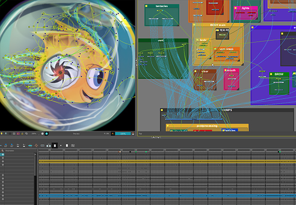
Spryke itself uses pre-rendered animation, which allows me to increase the complexity compared to what is practically possible in the engine. To create a good, pre-rendered animation, I highly recommend you programs like Toon Boom Harmony Premium, which allow you to rig characters using nodes.

Fish Spike, although the game does not exceed 70x70 pixels in size, is composed of more than 30 moving parts, controlled and connected using about 250 separate nodes. This allows you to create a very flexible and detailed movement in various poses.
Second tip: ugly frames can make animation better
As we know, most of the magic of animation takes place at the border of the conscious and the unconscious. This is a vague area in which the animation "dissolves" in the subconscious and becomes larger than the sum of its parts. But in some cases, animation elements for efficiency should not be tracked by consciousness at all.
A good technique for creating more charm and appeal of animation is perfectly mastered by Warner Bros animators: creating a single frame with huge exaggeration. The trick here is to choose the moment of a collision or fast movement and insert one (and only one) frame showing a pose in an exaggeratedly caricature state. With conscious observation, this frame will look excessive and inaccurate. But when you “feel” it in the animation, it takes the rest of the animation to a higher level.
Animation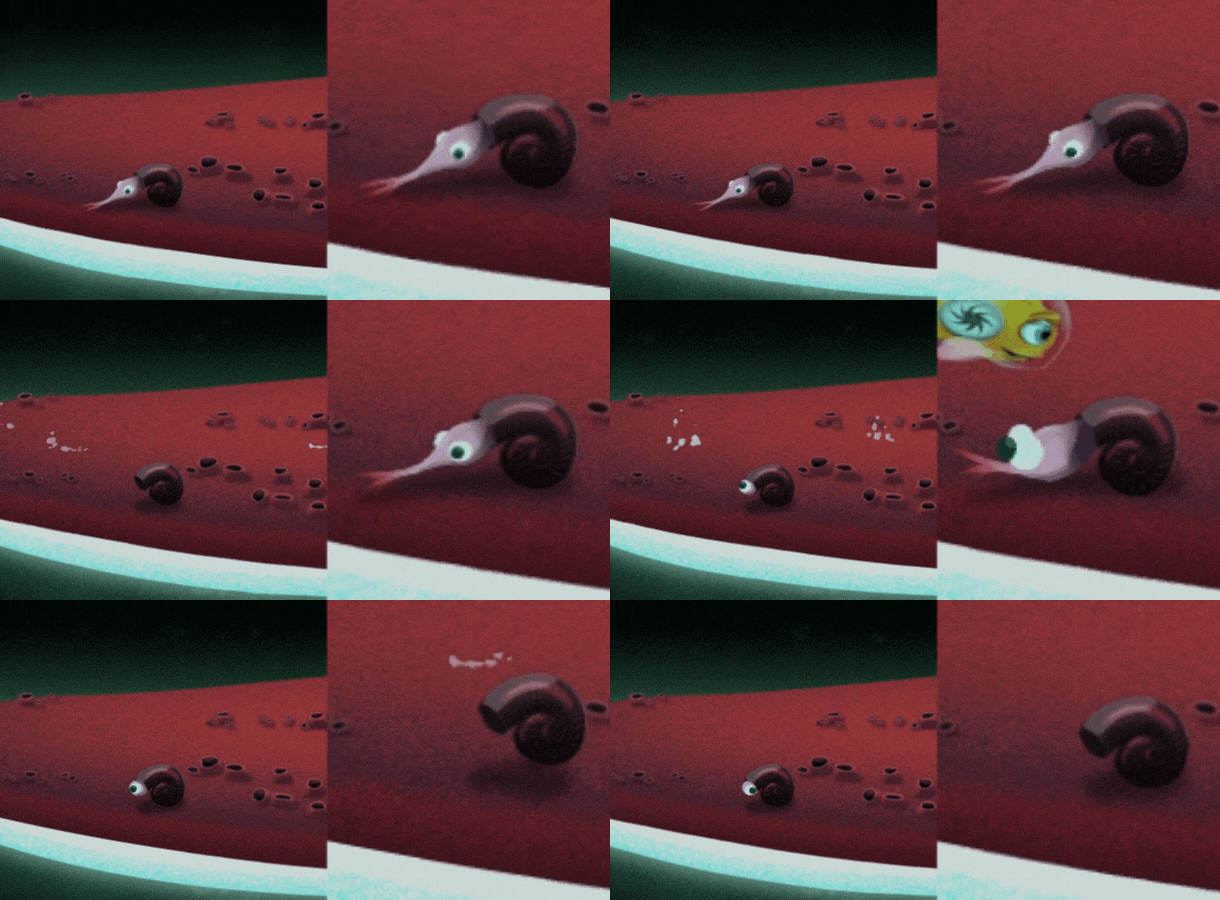

One distorted frame of a frightened snail does not look very plausible in a stationary state (i.e., with a conscious viewing). But if you close the slow-motion version with your hand and look only at the left side, you will not understand how “wrong” it looks. Instead, it adds animations a little more pleasantness.
Animation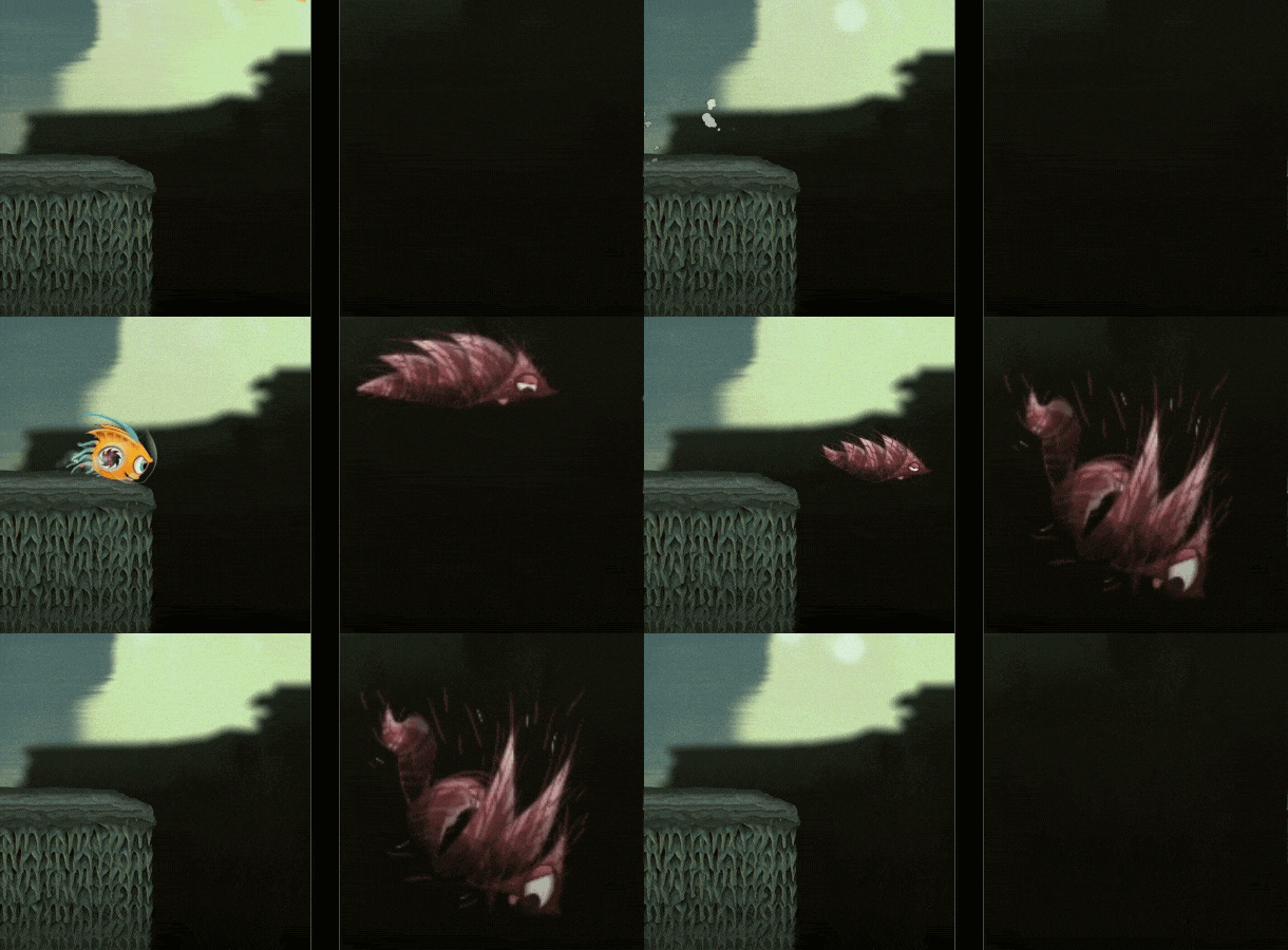

In this exaggerated shot of the coyotechuk (which I named after the Cunning Coyote !), I distorted different parts of the body so that the illustration actually “bursts”. But such a discontinuity is not really recognized in the animation, so this frame simply enhances the drama of the moment.
Third tip: fuzzy, blurry frames can save precious milliseconds
Also, as you can add additional charm to the animation using a trick with a cartoon frame, you can add even more dynamics using a fuzzy, “blurry” frame. This technique allows you to create very fast movement in a small number of frames, which fits perfectly into many game scenarios in which responsiveness is paramount.
The trick is to take two external motion frames, and combine them into a blurry third frame, which is inserted in the middle.
Here you need to remember a couple of principles. Firstly, a fuzzy frame should look like a mixture, and not the average between the start and end frames. In other words, the area that it overlaps should approximately correspond to the area that is covered by both the start and end frames (this will make the object in the blurry frame larger than usual, but this is normal).
Secondly, special attention should be paid to the small key components of the character, such as the eye. If the position of the eye in the initial and final frames is very different, then placing it in the middle in the middle frame, we get a twitching animation that has lost smoothness. Therefore, in this middle frame, you need to “smear” the eye from the initial to the final position, as in the example below:
Animation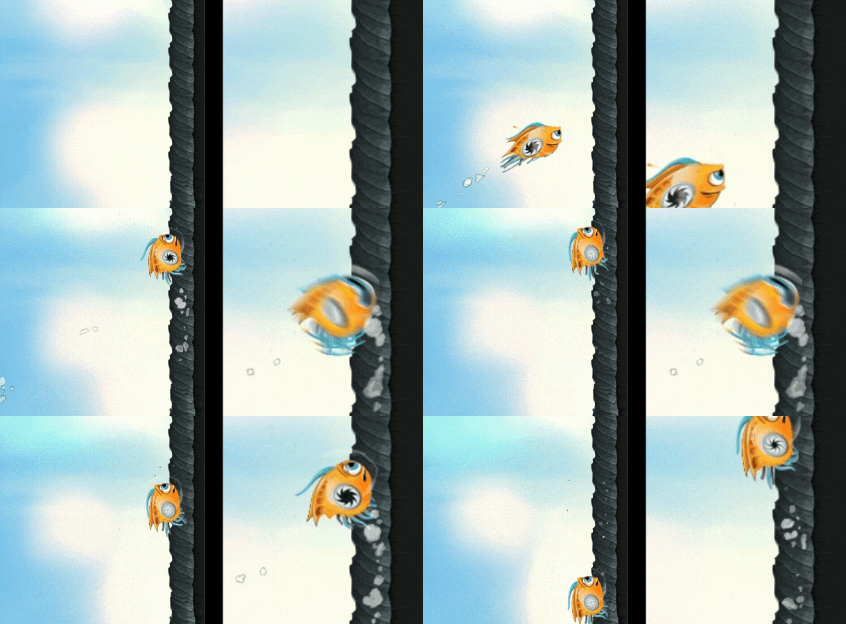

This frame of intermediate movement during conscious viewing looks ominous, but provides a very quick and dynamic transition during animation (close the right side of the image to see this!). This creates the feeling that Spike very quickly touches the wall. A greased eye helps the eye smoothly transition from the initial to the final position.
Fourth tip: remember that nine old men did not play video games
If you have not heard about 12 principles of animation , you must familiarize yourself with them. These are logical principles developed by the masters of Disney animation, the so-called "Nine Disney Old Men." But in the context of certain video games, following some of these principles can be problematic.
Take the highly effective anticipation principle. This principle assumes that most movements should be preceded by movement in the opposite direction: a baseball pitcher throwing the ball forward first takes his hand back; a screaming person first takes a breath and squeezes the muscles of the face. The inclusion of such lead movements in the animation makes them more believable and enjoyable.
Unfortunately, this principle sometimes contradicts the needs of game design. When a player presses the jump key, he expects the character to jump immediately. If you precede the jump with several frames of lead, then it may look better, it feels worse (less responsive). The same applies to the principle of softening the beginning and end of the movement: the animation of the jump with significant softening will be beautiful, but unresponsive.
Therefore, in many games, these principles are ignored in some animations. Even in beautifully animated games like Rayman Legends. Notice: Rayman has lead on hitting the ground, and NPC has lead on hitting, but when he comes to Rayman’s jump animation, he suddenly loses his visual “rubberiness” and instantly comes off the ground as if he were raised from a chessboard. This leads to less quality animation, but also to greater responsiveness, and therefore, to a better feeling from the game.
Animation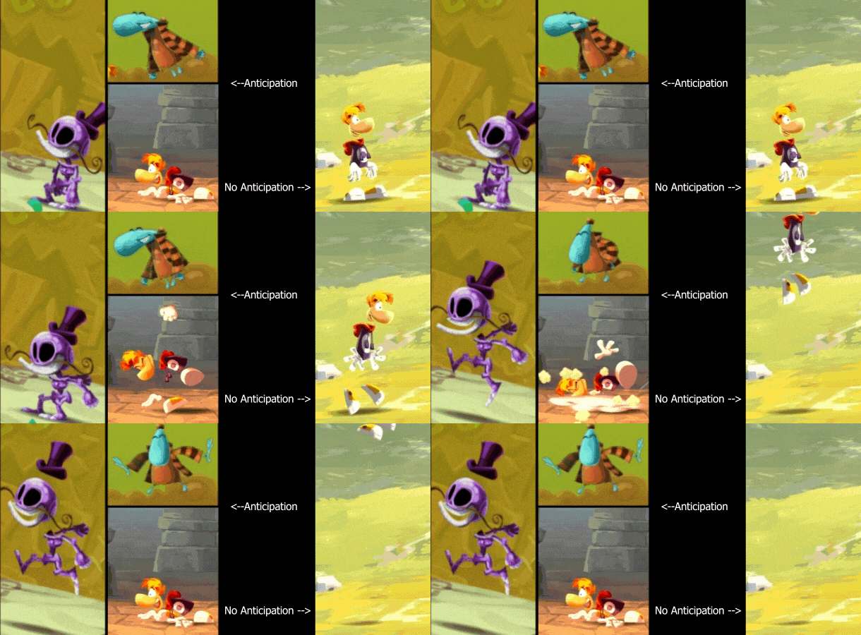

In Rayman's jump, responsiveness was placed above animation, and in the original Prince of Persia, the opposite was true. Notice how there is almost a full second of lead when jumping off a cliff. This looks good, believable in terms of physics and anatomy, but it creates a delay that the player must take into account with each jump.
I believe that this was the right decision for the game Prince of Persia, which hit us with an unprecedented level of realistic animation. But today, many players will not accept this.
Prince of Persia

When animating the Jump jump, I made a compromise and tried to include a little lead in it that did not interfere with the gameplay. As a result, I made Spike jump instantly, but put some lead in the animation. Therefore, there is a lead in the Spike movement, despite the fact that it jumps immediately after pressing the jump key. This is not as effective as a few frames of pure lead, but it seems to me that this is a worthy replacement.
The time and movement of these two sequences are the same. In the animated version, you can see how the whole mass of Spike jumps up instantly, just like in the version without animation. But inside her animation there is a bit of lead: she pushes off a bit, moving the weight from her center back. This, in turn, causes its antenna and scallops to move forward for several frames until they are thrown back.
Note, however, that when most of her body is repelled with a little lead, the opposite happens to her eyes: they instantly move forward and move in the desired direction. It turned out that this helps to emphasize its instantaneous upward movement, even when the rest of the body shows weak signs of lead and delay.
Animation

In addition to anticipation, the principle of softening the beginning and end of movement ( slow in and slow out , aka easing ) can influence the sensations from the game . Take a look at these two animations from The Witcher 3:
Witcher 3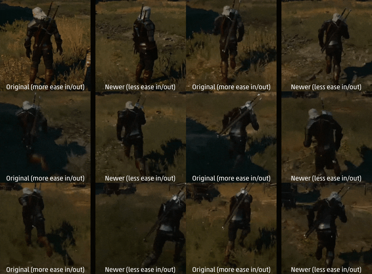

It is hard to deny that the animation on the left looks better: the movement is more convincing, it has more weight and masculinity. The movement on the right is more energetic, but it looks very unrealistic and stupid. Geralt looks light, like a feather, and in the world it seems that there is no part of physics. Many different processes take place here, but the main one is a less pronounced softening of the beginning and end, which leads to the movement of Geralt in a zigzag with almost no inertia.
On the left is the version with which The Witcher 3 started. But due to customer requirements, CD Projekt Red changed the patch to an alternative motion (on the right). When I first tried the alternative movement in the game, I was shocked - it harmed realism and immersion in the game so much. Suddenly, the game, full of severe power, became like an arcade Darksiders.
Although it broke my heart a bit, I left this animation for the rest of the game: the new animation felt better. Both as a player and as a game developer, I am all for immersing myself in the game, but the needs of responsiveness to control and gaming sensations are so important that even I did not want to interfere with them.
Fifth tip: create mechanics, then animation, and mechanics again
Animation is not just superimposed on top of mechanics - it fundamentally changes mechanics.
Important knowledge about game design: even such old games as the first Mario were first created without graphics, from just blocks. As soon as it becomes interesting to play with these ugly blocks, you need to start thinking about improving them. Otherwise, you can confuse beautiful graphics with interesting gameplay and as a result create a game that looks much better than it is played.
Spryke spent 3-4 months in block form. I knew that I wanted to create a platformer with especially frisky and attractive movements, so I endlessly experimented with inertia, acceleration, jumping curves, the mechanics of hitting the ceilings and soaring in the air, until the movement of this square block in level became excitingly interesting.
At this stage, I did not even imagine what the character of Spike would be, and her appearance gradually grew out of the requirements of the abstract mechanics of this block. It became clear that for fast and fast movement, the best shape would be a square of 50x50 pixels. Therefore, when I started to design the spray, we knew that it would be small and similar in shape to a ball in order to move briskly in any direction.
Then we performed many iterations of her design, until the character and his character began to take shape, after which I animated her various movements.
An interesting thing happened at this stage: play testers began to notice how much better the mechanics became. They said that management has become much more responsive. However, in reality, the mechanics have not changed - we have not changed anything except animations. I realized that my sense of mechanics was complemented by thinking out the animation that was in my head, and the play testers were deprived of this opportunity.
The difference can be seen in the comparison below. Without animation, Spike looks and feels like a bowling ball. She sticks to the ceiling, as magnetized, falls heavily to the ground when jumping. Her jump itself looks like some kind of artificial parabola. When animating the exact same movement, Spike becomes soft and playful. Her jump looks more natural (maybe even a little longer), and with a step she seems to be repelled from the ground by a spring.
Animation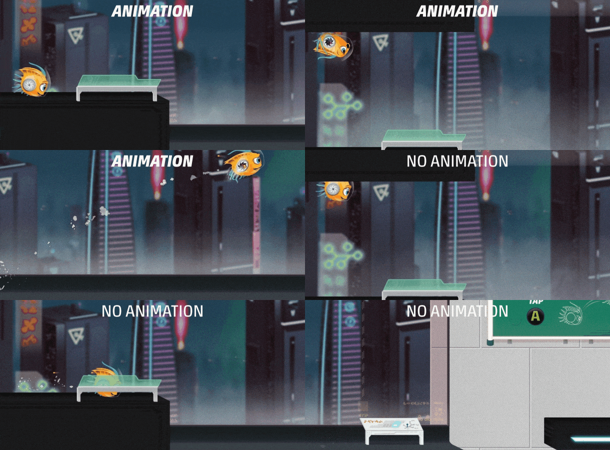

Technically, nothing has changed in mechanics, although it could. The animation changed the feel of the game, and Spryke seemed to be a completely different game.
Since animations so powerfully change the feel of the game, there is no point in stopping the design process after they are completed. Instead, it’s worth doing a revision of mechanics, looking at it from above: has the initial vision of mechanics been preserved? Do I need to change several variables? Did the animation reveal anything interesting that can be further emphasized by revising the mechanics?
In our case, most of the Spike movements felt great - the process was more like improving the mechanics of the first stage than re-inventing it. The main exception was soaring mechanics. Spryke has always had soaring mechanics to slow down in order to avoid danger or reach the platform. But after I animated this mechanics in a bubble, she healed her own life. The hover looked so different that it seemed wrong. In the existing mechanics, it was just a decrease in speed that could be turned on in the air, but this new bubble animation required something lighter and more springy.
As a result, I redid the mechanics of hovering in the air from scratch. I created a new physical component that allowed me to glide as if on an air cushion using my own impulse, pushing the character. The new “instant” bubble (instabubble) gave a very pleasant sensation, which I can only describe with the word “jerk”.
Instabubble is now one of the most unique elements of Spryke, and the most pleasant basic game mechanics. And she was born from animation! Or, to be more precise, it was born out of a process that allows a function to determine its shape, and then improve the function of the resulting form. First mechanics. Then animation. And again the mechanics.
Animation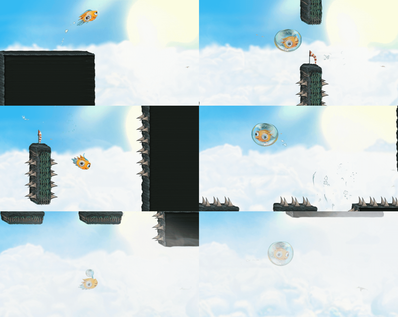

That's it. I hope you enjoyed my tips, let them be useful to you!
