Pixel Launcher vs Other Launchers
The first Pixel assemblies appeared on the network , and I want to raise the topic, is it better? - After all, the changes are not so big ?! To do this, compare it with other interesting launchers ( Google Start , Yandex Launcher , Nova , Go ). I will not compare from the point of view of speed, the possibility of customization, the number of themes and wallpapers, but from the point of view of the main function of the launcher - search for applications and their launch .

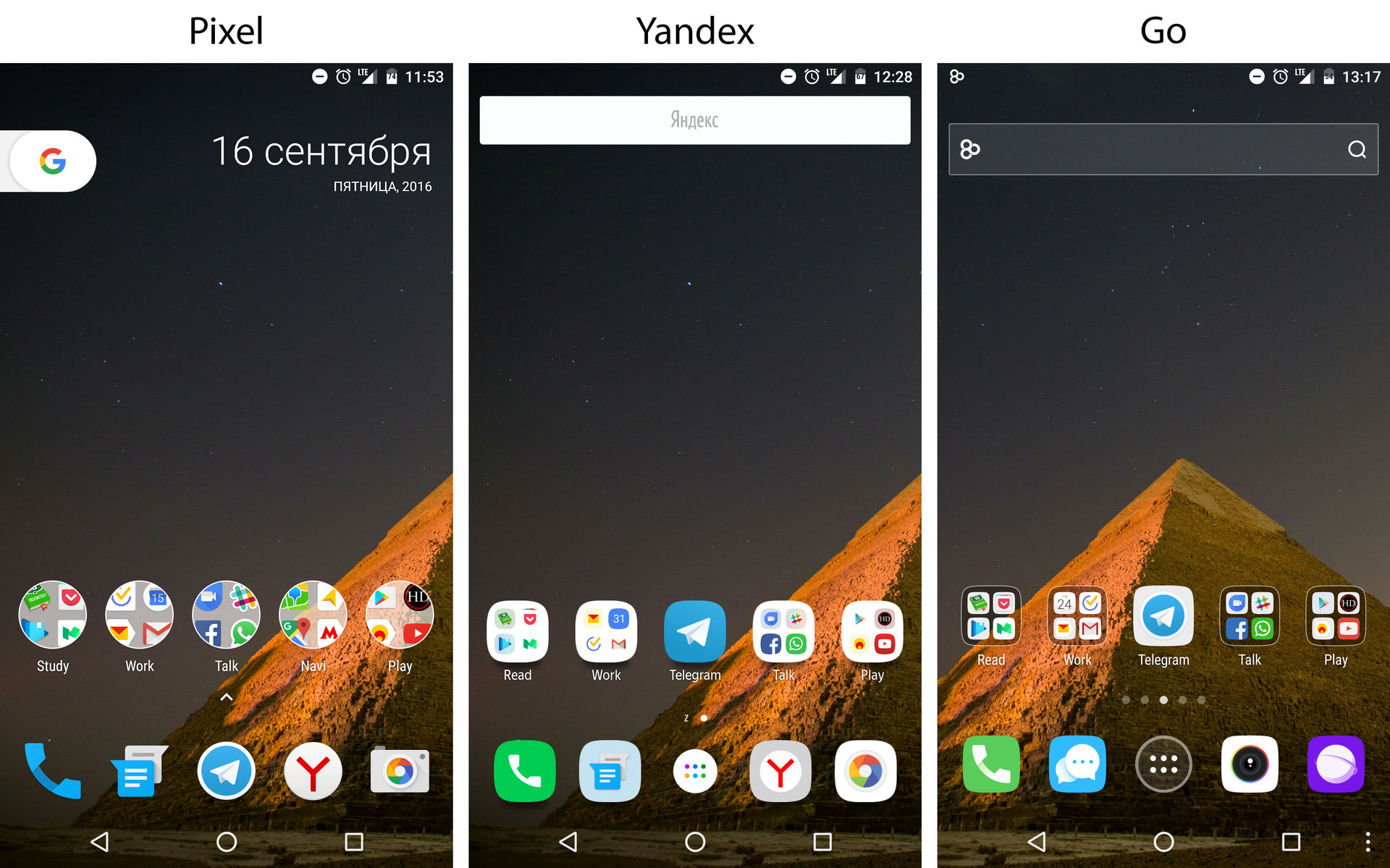
The main innovation that catches your eye is the new folder design. Before installing Pixel, my main launcher was Google Start, and I didn't like the new folders. In Start, I liked the fact that stylistically they were not much different from applications, they looked like a single solution. In Pixel, folders and applications are very different from each other. But why are they made that way?
The first four applications are immediately visible in contrast to the Start and Nova solutions, and the first we usually put the most important and often used ones. The folder itself needs to be opened less often to see which applications it contains - this speeds up the search for the desired application!
Showing four applications in folders in this way is not a new solution. But look how they managed to improve it! They increased the size of application icons by 2 times, without increasing the size of the folders themselves. We managed to do this by hiding a small part of the icon outside the folder. As a result of such an implementation, the feeling is created that we, as if peeping, see the contents of the folder in advance. There is even more transparent background - this makes folders more light and organically integrates into the general desktop background. A very powerful solution that definitely increases the speed of visual identification and speeds up the search for applications.
They removed the familiar search widget, freed up a place where it would most likely also be possible to put other widgets or customize the current one. I think this was done because Google is moving away from the usual association that Google is just a search. They shift the focus to the Now Personal Assistant.
The most noticeable change is the lack of an AllApps button and the ability to open with a swipe. Remarkably, a place is freed up where you can put another frequently launched application into the “dock”. On the other hand, it may be difficult for initial users to understand what needs to be done at the initial stage. Swipe works on the entire dock area, which speeds up the opening of AllApps, without having to “center” on the button. In addition, the click also did not go anywhere, you can click in the free area of the dock (they expanded it) and AllApps will open. Longtab also works in this area! Improved and maintained the old functionality, well done.
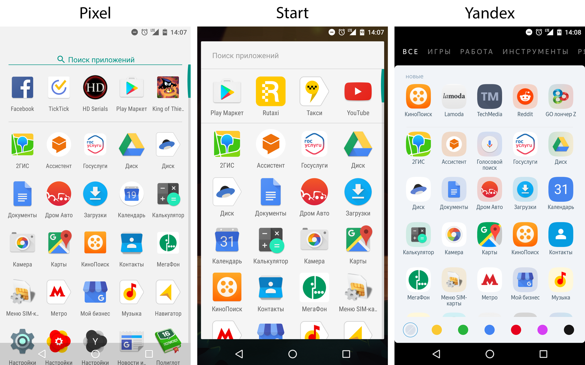

The AllApps page has also changed and gotten better:
Another imperceptible change, but no less important - when installing new applications, they fall into the "Recommended Applications" section (section under the search). This change solves two problems: the first - allows you to quickly find the newly installed application, and the second - to remind the user that he recently installed it. In this case, the second scenario is no less important, because there is a real problem: the user does not start it after installing the application.
Speaking of search speed, Yandex has the ability to search for applications by color, and I really liked this functionality. I remember the colors of the application icons that I often use, and you really find them through this tool instantly.
I really liked the release. It may seem that the changes are insignificant, but in fact quite specific tasks were set, and they were solved very well.
PS Dear Android users, can you write 1-2 killer features of your launcher in the comments? What do you like the most?
New folder design
»Pixel vs Start vs Nova
The main innovation that catches your eye is the new folder design. Before installing Pixel, my main launcher was Google Start, and I didn't like the new folders. In Start, I liked the fact that stylistically they were not much different from applications, they looked like a single solution. In Pixel, folders and applications are very different from each other. But why are they made that way?
The first four applications are immediately visible in contrast to the Start and Nova solutions, and the first we usually put the most important and often used ones. The folder itself needs to be opened less often to see which applications it contains - this speeds up the search for the desired application!
»Pixel vs Yandex vs Go
Showing four applications in folders in this way is not a new solution. But look how they managed to improve it! They increased the size of application icons by 2 times, without increasing the size of the folders themselves. We managed to do this by hiding a small part of the icon outside the folder. As a result of such an implementation, the feeling is created that we, as if peeping, see the contents of the folder in advance. There is even more transparent background - this makes folders more light and organically integrates into the general desktop background. A very powerful solution that definitely increases the speed of visual identification and speeds up the search for applications.
Button instead of search
They removed the familiar search widget, freed up a place where it would most likely also be possible to put other widgets or customize the current one. I think this was done because Google is moving away from the usual association that Google is just a search. They shift the focus to the Now Personal Assistant.
Allapps
»Opening with a swipe
The most noticeable change is the lack of an AllApps button and the ability to open with a swipe. Remarkably, a place is freed up where you can put another frequently launched application into the “dock”. On the other hand, it may be difficult for initial users to understand what needs to be done at the initial stage. Swipe works on the entire dock area, which speeds up the opening of AllApps, without having to “center” on the button. In addition, the click also did not go anywhere, you can click in the free area of the dock (they expanded it) and AllApps will open. Longtab also works in this area! Improved and maintained the old functionality, well done.
" New design
The AllApps page has also changed and gotten better:
- The page is now full screen, no indentation or any other noise. Maximum attention to content.
- The hardware buttons are transparent and we see even more content.
- Icons are adjusted to a single size, less visual noise, it is easier to search for an application. Differences in size are clearly visible when comparing Pixel and Start.
Another imperceptible change, but no less important - when installing new applications, they fall into the "Recommended Applications" section (section under the search). This change solves two problems: the first - allows you to quickly find the newly installed application, and the second - to remind the user that he recently installed it. In this case, the second scenario is no less important, because there is a real problem: the user does not start it after installing the application.
Speaking of search speed, Yandex has the ability to search for applications by color, and I really liked this functionality. I remember the colors of the application icons that I often use, and you really find them through this tool instantly.
Conclusion
I really liked the release. It may seem that the changes are insignificant, but in fact quite specific tasks were set, and they were solved very well.
PS Dear Android users, can you write 1-2 killer features of your launcher in the comments? What do you like the most?