 August 31, 2016 at 14:27
The main developer of the site Kremlin.ru Artyom Geller about creating a service and working with the presidential administration
The general director of lab.AG studio Artyom Geller, who worked on the new version of the presidential site Kremlin.ru, gave an interview to Smashing Magazine , where he talked about developing the resource, technical aspects of working with the presidential administration, creating an adaptive interface for the site, and also revealed some details project.
A state customer is the same as a commercial one, sometimes even better. The presidential administration trusted us as designers and designers, its representatives wanted to make the Kremlin website better. Perhaps, to work with them was the same as with the best of commercial customers.
But the story began a long time ago. Around 2008, the press service of the presidential administration sent out proposals to companies involved in information design on the web, an offer to make the site of the president. I had a lot of time at that moment, and I made my own version - thoughtful and voluminous.
From time to time they called me and informed me that we were in the top twenty, then in the top ten. But at some point they called me and said: "Come to the Kremlin." There, of the three best companies, they chose mine.
I was responsible for the event and reference part of the portal Kremlin.ru, which was launched in 2009. This was the first “cool” state website to receive good reviews from the professional community, including visitors to Habrahabr. Then they called me to make the government website (government.ru), and it was the second landmark for the Russian e-gov.
When I made the first site in 2009, 80 percent of subsequent gossytes were tailored to his style. I saw the same thing after the creation of government.ru, and even then I began to lay down the possibility of standardization. When developing one, you think about all the resources that will copy this to themselves.
Creating a new site, we kept in mind the entire Russian e-government. I do not like the term "government sites." We wanted to create a benchmark.
We were constantly in direct contact with the presidential press service. And the president himself took part in creating the site at key stages of development.
I always liked competent people who can make decisions. It was with such a team on the customer side that we had to work. Rare customer. We saw officials who sat on Friday after ten in the evening discussing with us “how to make our site better,” although they had already let go of their subordinates. They worked with us from the very beginning until the last day before launch. They trusted our opinion. We tried and rechecked every solution.
The previous version of the site has gloriously served 6-7 years. During this time, we structured and solved more and more new tasks based on user requests and the needs of the press service. We had enough time to understand the priorities of a changing audience. Gradually, a lot of ideas arose that could radically improve UX for all user groups, tasks appeared that required updating our CMS, the platform changed - the hardware component of the resource.
Technology, audience preferences are changing quite quickly. So it’s quite natural that the president’s website should meet all the needs of the time. All this influenced the creation of a completely new resource, and I would not call it a redesign.
Now work on the site continues.
We collected all possible statistics on users and groups using popular tools. In addition, we have accumulated statistics collected from the results of testing our architectural and interface ideas. They experimented on a “living” resource, making certain conclusions.
Interviews and analysis of target audiences were conducted. In our case, these are primarily (40%) journalists - due to informational rather than service specifics. It is this resource that is often cited as the primary source of important information related to the activities of the president.
We have done a lot for them. As one of hundreds of small examples - a link to material without styles, from where it is easy to copy text.
This is very convenient, since with the standard Ctrl (Cmd) + A, Ctrl (Cmd) + C, Ctrl (Cmd) + V we allow you to paste material from the buffer without any styles. To do this, we placed it in the text area. This allows you to not change the formatting in your editor after insertion.
The second segment is Russian citizens and a foreign audience (50%). The biggest and most important part that we have endlessly thought of from the start of creating the concept to the smallest detail. Let me tell you a secret, inside our team there is an unspoken slogan that we borrowed from the guys creating gov.uk: “User needs, not government needs”.
The state is aware of the problems that it itself generates; a turning point has passed, now it’s easier - a request has been formed for a product that is high-quality by all criteria. Yes, it’s difficult with us. Yes, there are problems of bureaucracy and understanding of processes.
In the end, what is now was created precisely by designers and developers who could not, did not want to, did not prove the correctness of the decisions and did not direct the client towards human orientation.
Officials (increasingly young today) formulate tasks in a completely different way: taking care of the interests of the audience, they replace taste-giving with functionalism. Previously, the designer spoke about this, now customers themselves put the emphasis on this.
The president introduced the most complicated KPI - satisfaction of users of Internet services with services by 90% by December 2015, and by December 2020 - by 95%. It is difficult to understand how to achieve such results, but something else is important: there are KPIs, the wording exists, they will work on implementation.
The third group of professional audience - officials with their tasks and specifics, 10%. In most cases, here we solve the issues of accessibility to the operatively updated base of regulatory documents, instructions, key tasks that the president and his administration pose.

We did not set ourselves the task of understanding the information structure of a past resource (we already created it and simply supported it), but wanted to rethink our approaches to presenting different types of data, taking into account the potential context.
We tried to combine several major presidential resources in one as simple as possible. For example, before there was a separate website called “The State”, on which materials were stored on the institution of the presidency and information on the activities of state structures, advisory and advisory bodies under the president. Now all these materials can be found on Kremlin.ru in the "Structure" section. Yes, and we got rid of the archives. Now all materials, starting in January 2000, are available on the current resource.

It was important for us to separate information about events (news and other content) from “static” information - for example, navigation elements. At the same time, it was necessary to minimize the amount of information noise. One of the main ideas is the linearity of content, information is displayed in a single column everywhere. As a result, we have a clear, not overloaded structure. We suggest the availability of official background information only in the necessary context.
Kremlin.ru is not a media in its traditional or modern sense, there is a significant specificity - in particular, you do not need to unscrew advertising. The same with the indicators “viewing depth” or “time spent on the resource”: for us, the positiveness of these indicators is often a negative factor indicating that a person could not get as quickly as possible the information that he was looking for.
We had a file with a structure that corresponded until the project started. In particular, we needed to select the most accurate, concise formulations. We cannot afford the dual interpretation of texts on a state resource of such great informational and political significance.
The site is filled with things in the spirit of “Little big details”. I think you will be interested to study them. All of them carry a specific task. We can explain the need to use every block, connection, text, pixel and microanimation on the site — there is nothing superfluous on Kremlin.ru. Logic is behind everything, because "God is in the details."
If we made this project “average”, it would be a real failure. If we did this project “badly” - it would be a disaster. If the project is done "very well", then the only question that the professional community and the media could potentially raise is "how much money has been spent on it?" We are not afraid of such questions, because we can tell you what each ruble took.
The cost of the updated site of the president amounted to 20 million rubles (about $ 330 thousand). The price includes both the development of a new version of the site, and support for the old. In the case of the presidential site, it is also security. In addition, part of this money was spent on creating an English version of the site and a version for children.
A significant and most important proportion of users of our resource are employees of news agencies, various Russian and international media. According to reviews, they love our resource for the fact that we never forgot and always tried to create useful and convenient solutions for a professional audience.
We finalized the concept of “Work with Text” introduced six years ago, which serves as a convenient tool for navigating long transcripts. Semi-automatically mark up videos, topics, faces presented in the material, at times speeding up the search for information. We make a large array of text understandable and interactive .
The other day on the site will be able to watch video with subtitles. Thanks to this, the content will be available not only to English-speaking users, but also to people with disabilities.
On the technical side, we did not reinvent the wheel; we chose only one format for video - MP4, and one format for audio - MP3. We needed to make our site work efficiently on the maximum number of browsers and devices. We immediately decided that we would work with HTML5 video / audio, since most modern browsers support the formats we have chosen, and for the old Internet browsers we left a Flash player.
To write your player meant to run into the same rake as most, so we stopped at the MediaElement.js library. At the same time, they added support for some plugins that can be installed on the user, such as QuickTime, Windows Media Player, VLC. We took into account several issues of displaying media without using JavaScript and experimented with styling the built-in Google Chrome player.
We display an image for video if the browser does not support HTML video, and also do not display our large Play button if JS is disabled or does not work, as it blocks the interaction with the video element.
For Chrome, we got a good result of applying styles to the Shadow DOM, similar to the JS player:

We try to follow the innovations for browser players and accordingly change our implementation.
To navigate when displaying material with video, we wrote a layout editor for text and automated the player to navigate through marked areas.
The state resource should be accessible to citizens as much as possible. This is one of the basic ultimatum principles. On a large resource, it makes no sense to chase trends, since we are designing the future, an actual resource for 5-6 years in advance. During this time, the industry will manage to filter out all the husk, leaving only the significant.
We did not proceed from mobile-first ideology. We had enough time to separately approach all types of versions of the project display, we allocated enough resources and time for each one to make Kremlin.ru convenient on all types of devices with different ways of interaction. On all device formats, we tried to leave the native solutions as much as possible. All the content and functionality of the "large desktop" version are available on the "mobile", "tablet", "laptop".
Of course, we got rid of some interface solutions on the mobile version that are simply impossible to use from the phone (working with the transcript), but if we are dealing with a large format - like a tablet - then this specific, professional tool is already available. All content is clearly available on all devices. Functionality is more difficult to control, but we conceptually tried to always support all versions.
I can tell you in more detail about the principles of Kremlin.ru adaptability, as this is a separate and interesting question.
BEM ("block, element, modifier", the methodology for creating web applications - approx. Ed.) Is the right way to develop web development, not without reason projects such as ReactJS and WebComponents are gaining momentum.
In the process of development, we have formed our own “version” of BEM, a certain variation of the concept. We separated the JS and CSS code of the components into separate files. When designing HTML templates, we proceeded from the convenience of reuse without being tied to specific functional elements.
Especially for our needs, we wrote a query processor and display manager, as well as an anchor system for smoother animation.
All these tools serve a responsible grid with two independent columns and a dedicated multi-level menu in the header, footer and side menu. There are a lot of corner cases for each size, and they have to be programmed individually (processing and animating transitions between pages, resizing windows, showing and hiding a mobile menu, and so on).
There were specific problems for the current time. For example, abandonment of Flash - we try as much as possible to support HTML5 video, but we retain support for displaying video via Flash and Silverlight for older browsers.
We also used modern methods of CSS and JavaScript pre- and post-processing, and this helped us a lot:
There is one important rule. Invite good engineers and give them time - it’s actually not difficult.
Features of working with navigation and animations
Site navigation is faster due to the fact that JavaScript and CSS are loaded once, in addition, we use the History API. Before starting, we identified the slowest places in both client and server code, optimized them, turned on caching wherever possible.
The smoothness of the animation is achieved mainly through the use of CSS, but not only. We performed optimization at the level of rendering contexts. We tested the response time in the animation, it is very important for smooth display of interface elements, there were a lot of problems with support for outdated, but still used browsers.
We recommend that other projects pay attention to such details, it is these little things that make the site really convenient and enjoyable to use.
At this stage of the evolution of design and development, a basic understanding of adaptability has formed to a large extent. We have not yet waited for AiUi - software-generated interfaces, as a result of processing automatically collected data. Where initially the interface does not exist and there is only information at the input, with the help of which objects, entities, accents, sizes, colors and so on are built. We have to put up with reality and do this work ourselves, not personally, but for groups.
To understand the result, it is necessary to understand several important introductory: proportions vary. The old 4: 3 has long been supplanted by the desire for 16: 9, understanding this prevailing reality, we have the opportunity to think in this direction. There are much more devices. “Mobile” and “desktop” are feed formats that most developers of adaptive resources emit. In our case, we have identified not two, but four basic types of display:
It is these four formats with their popular browser window sizes that formed the basis of the adaptive resource.
According to our statistics, 22% of users access the resource from mobile devices and see a site adapted for them, 54% have low resolution - they see the site in the middle or with a small indent on the right. Another 24% have large horizontal resolutions.
Browsers:
Geography of the Russian version of the resource:
Geography of the English version of the resource:
We thought of all user groups with multiple devices. They created their own, correct, separate experience for everyone. As a result, in order to perfectly display the site on all types of devices with intermediate values, we needed 9 breakpoints. All versions were developed in parallel.
It makes sense to tell what idea we put into the most interesting way of navigation and display, which starts from 1580 px.
For most modern resources, the vast majority of users come to specific material from external links. In our case, they immediately see two independent columns. The left column is no longer exclusively content, but turns into the main navigation element. The right column remains exclusively content without unnecessary navigation tools and unnecessary interface bindings.
According to our calculations, the navigation speed in this mode increased by 1.5 times, which was very liked by the editors and our regular users. Also, a unique opportunity appeared to draw additional information on the left side of the site without closing the material. We managed to surprise the presidential administration with the dynamics and convenience of the decision. A few weeks later, all questions in this part disappeared from them.
Usually standard tree solutions are used. I will give one example out of hundreds. A person reads a news story, and a face is mentioned in it. He clicks on it, in the column on the left, without closing the material, information about his current position, biography and some other important data appears. It is with this functionality that we accelerate navigation and do not break the reading rhythm. In the same way, without being distracted from an event or document, you can open another section, read additional information, write a letter, find out the contacts of the press service and so on.
According to our statistics, the percentage of users with a browser resolution of 1580px + of the total number of audience floats within 24% of the total number of users. Based on the grid, we still have the opportunity to reduce the value in pixels for a two-column display, but based on statistics, we will not be able to get a large percentage increase in the audience. At the moment, in this struggle of compromise, we settled on the number 1580.
Two independent columns give rise to many new ways of interacting. Have you been waiting for tabs in Finder? Do you remember Norton Commander? Are you used to your email apps and news aggregators? We will reveal all these interface features on the new Kremlin.ru. As an example: in one of the next releases, we will launch material stacks when read and additional materials are collected in the right column, to which you can return or find out something important. There are a lot of such ideas and it is important to feel a balance, understanding the tasks.
I already said at the beginning that the site is simply teeming with the small pleasures of the designer, designer and web developer. I’ll try to list a small part of the goodies:
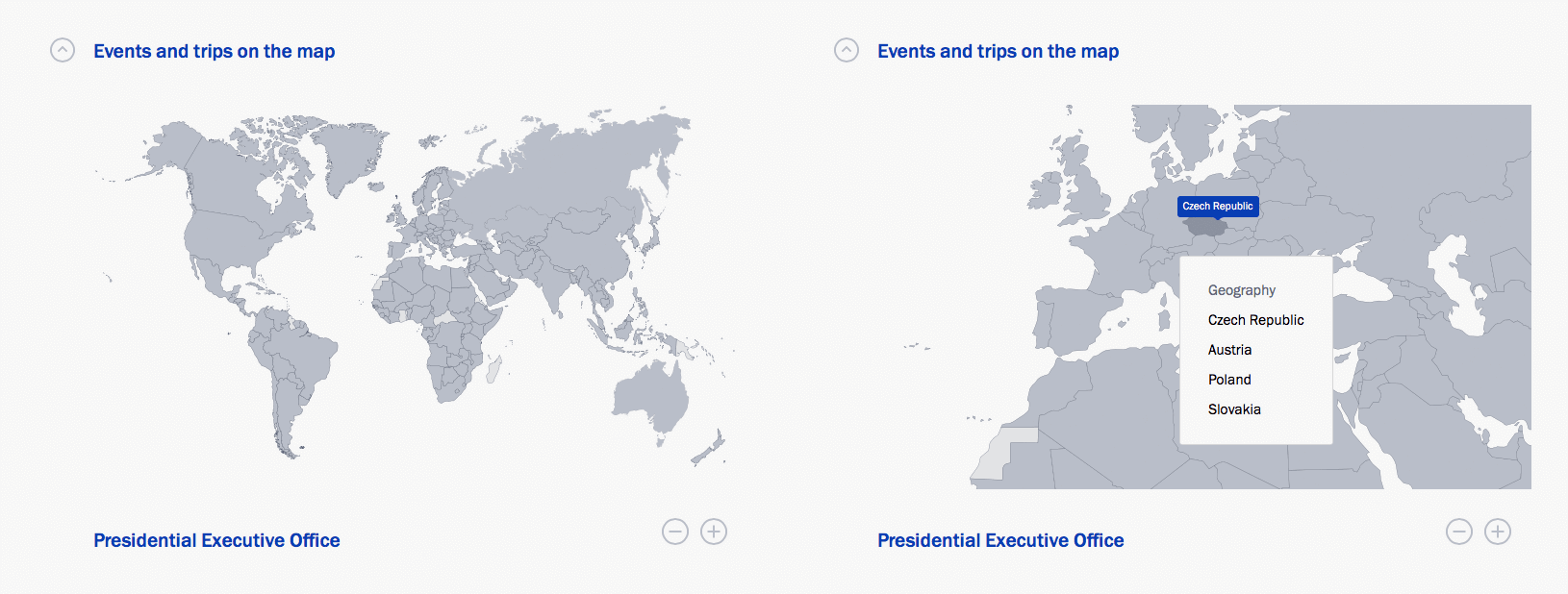
SVG-map of Russia and the world. When you click on a specific site, surrounded by a large number of borders, you can select all the nearest countries or regions from the list. The map automatically approaches this area.
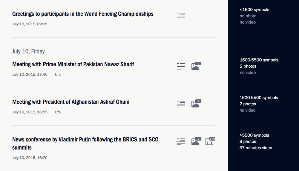
Data icons. In tapes and materials, we not only show the length of the video, audio and number of photos, but also the size of the material - pre-calculating the number of characters. This solves two professional tasks: the user does not need to go into the material if he sees that work is underway on him and the full text appears later. Also, the user can decide in advance whether he is ready to read a large text or not.
Notifications. If you don’t close the tab with the site, the news is updated in the feeds and the number of unread is marked. For the efficiency of the editorial work immediately after the event, a short text appears on the site, then - a transcript and photographs, at the end the video is posted. We see all these updates, returning to the tab with the New Kremlin.

Work close icon in the material. When we scroll down, we hide the icon, but when we scroll up, it appears again. We also begin to show it when hovering in a large area on the top right, as we understand that a person potentially wants to close the material. You can also close the material by simply clicking in the free area on the right.
Click interaction animation or tap. On touch devices, the animation tells the user whether the interaction has passed. This is important due to our specifics of dynamically loaded content.
Download fonts. It is important to enable a user with a low connection speed to immediately start reading headings and text of materials, without waiting for the annoying loading of custom fonts. The solution to this problem helped us save the user from painful expectations, but we got small “leaps” that we will try to compensate for by selecting system font settings.
Loading tapes.To display the lists, the incremental loading mechanism is used when scrolling the page. At the same time, it was necessary for us to give the opportunity to view and use the footer. We used the so-called loading and display zones, upon entering which one of the actions occurs: either displaying the next page or preloading the page. Navigation buttons to the next or previous page of the list also appear.
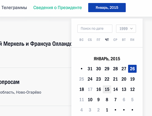
Calendar that adjusts to the context. Try to open the calendar in the event stream and, without closing it, continue scrolling the news.
Clever zoom. Give it a try! In the mobile version, with double tap on the text in the material, we increase the font size while maintaining the position.
Responsive Headers. The font size changes depending on the size of the title to stay in our grid.
Image upload. One of our tasks was to fully support various devices with different pixel densities (Retina, Ultra HD). We use a fairly recent technique using the srcset attribute, which is supported by many modern browsers, and for the old ones, we took a JavaScript implementation. At the same time, they wrote a similar thing for the video poster. For slow connections, we used a background gradient as a preloader, which is calculated based on the prevailing shades of the image.
Responsive icons. Sometimes we open the material “on top” of the site, and sometimes on the right. For each of these situations, we carry out calculations and show an icon corresponding to the situation. Try changing your browser window at high resolution.
Font rendering. A lot of effort was spent on high-quality rendering of fonts in all possible operating systems and browsers. In different situations, we used different solutions, and sometimes even changed the color of the text for a particular browser. For Franklin Gothic, we tried to use several different rendering options, but later focused on: text-rendering: optimizeLegibility; -webkit-font-smoothing: subpixel-antialiased, which worked best in the maximum number of browsers and OS.
As an example, in Chrome, the text color in the footer looked gray and in Safari blue. We chose a slightly different shade that met our goals and looked the same everywhere.
We also went through several iterations of changing color solutions in order to achieve the optimal result on most devices, including devices using Retina.
Transcripts, video markup. To mark up the text, we wrote our own module. You can set the theme, person for any paragraph. We show the list of markers on the page with the transcript, where, when clicked, you can go to the marked words. Each paragraph is also marked with a temporary marker. And when playing a video, the material automatically rolls to a position in the video.
Moreover, transcript navigation and video navigation can work simultaneously. In this part, one of the main challenges was the creation of a convenient interface for editors. We wrote an extension for the admin panel. An interface that allows the editor to match each paragraph with a person, topic, time span. The result is classes and data- * attributes (see, for example, the source view-source: http: //kremlin.ru/events/president/transcripts/pre ... - Ctrl + F data-time-start), which are picked up and used in js.
Aesthetics in detail. We show our backgrounds in case the user continues to scroll, resting on the end or the beginning of the site.
Separate version of the coat of arms. They made a separate version of the coat of arms, which complies with the law and looks just fine. This was necessary because until this moment there was no special version designed for the screen. It was important to enter the emblem in the correct simple form, which was not done earlier, and later to add recognizability to add details close to the usual visualization. We initially decided that we would give the emblem to everyone who would create the websites, we posted the source files and illustrations under a free Creative Commons license.

Mark and Share. This library allows users to highlight fragments of content on the site and share unique links to marked elements with other network users.
It seems to me that this list can be endless.
All design took place with testing English formulations of the basic elements. There are many points that distinguish these versions, in particular on the main page of the English version we show a world map, not a map of Russia, or display the international format +7 ... instead of the Russian 8 (495) ... We check for back-end. If the language is Russian, then print 8, if English, then +7.
We also use gettext with automatic assembly of PO files (file in the format “source phrase - translation”) from the source code: serverside, templates, JavaScript. When building a project, finished translations are packaged back into JavaScript, templates and code substitute translations when generating the page. Pretty typical solution.
We all work in one spacious room in which everyone respects the opinion of the other. We are professional enough to listen, hear and make decisions without slipping into the bureaucracy of bloated teams.
From our side, two UX-designers worked on the project - five front-end engineers and a significant number of people engaged in back-end in a different sense.
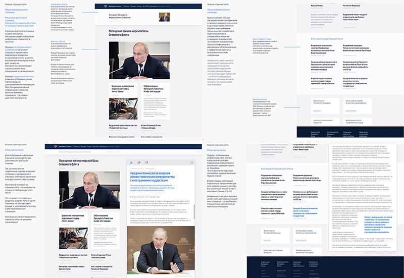
We started the development with simple prototypes, reflecting the basic principles that we were going to follow at the start. A little later, they grew into detailed prototypes with testing of stylistic elements: colors, fonts, interface solutions. A system of used colors and fonts was built, which partially changed in the process. Also at this stage, we made a prototype of our solutions in the browser to understand what pitfalls of different scales can expect us.
As an example: it was in the prototype for the browser that the client really understood how convenient our idea with a two-column independent structure was.
Engineering, design and development are parallel processes that started almost simultaneously and continued until the launch of the new Kremlin.ru. We are now continuing to work on improving the project in different directions.
We started designing on paper and in familiar Photoshop, but almost immediately redrawn everything in Sketch. We were tormented during the formation of the product from its instability and the mysterious specifics of exporting to SVG, but as Sketch develops, there is no great desire to return to Adobe Photoshop.
If we take all the stages, including primary theoretical, the development lasted more than a year.
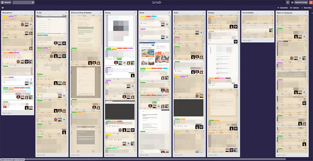
We decided to transfer a significant part of the frontend tasks to Trello, where more than 2500 cards with tasks and task lists were closed during the year. About the development of government services and libraries used Not considering those that were archived or deleted. We are constantly updating the list based on our ideas and reasonable user reviews. Currently, there are 72 cards that are yet to be closed.
During the project, 40-80 versions of almost every layout with iterations of varying degrees of complexity were created.

In a magical world, 15 smart people gather and immediately decide what the site should be. But in real life you won’t take everything into account at once. Thumbnails of the site during this time have not changed. But we went through its structure two thousand times, collected all the rakes in order to get the necessary solutions as a result.
Based on the results, we made a brief presentation of the principles on which the new site should be built. On sheets of A3 format - all the main pages of the future site, descriptions of "how, what and why." So that a person "from the outside" for our region in five minutes can understand the essence - what is offered and why. We described the principles, prepared the pictures, made the drills with the explanations "this principle works like this in this place."
It is very important that communication with the client is efficient and that there are decision-makers on both sides. The presidential administration saw everything - from the first sketches of a pen on paper with an explanation of fundamental ideas to constant access to several servers with different versions.
We learn a lot from our customers.
In the near future, the quality of the state itself will be perceived, including through design. Loyalty to government organizations will be built on the same principle: it’s convenient and quick to work with the site’s service — a good department, an incomprehensible and ugly site — a “bad” department. And this fact will be the most important criterion for the development of state Internet projects.
Already today, Russian officials formulate the tasks in a completely different way, taking care of the interests of the audience, and replacing the taste with functionalism. Previously, the designer spoke about this, now customers themselves put the emphasis on this.
We have our own set of libraries, which we either already actively share or share after we put it in order.
We have already laid out our backend framework - iktomi, - a set of tools for the frontend, the most popular of which are SVG cards and mashaJS (Mark and Share). We strive to highlight the best practices and give them to the community, this also helps us to simplify their use.
It happens that some developers do not even use version control tools. We understand that many regional sites try to be like federal state sites. Often this entails an inept transfer of design elements or site structures.
We have a desire to help create good and convenient resources.
As an example, we pay special attention to code acceptance and automation of error search, the use of integration and unit testing. Not all contractors follow this and not all customers set such requirements. Acceptance recommendations would help customers get better sites.
For example: we saw a government project in which failure protection was built by duplicating content on five servers, in case of an error in one of the servers, the request was forwarded to the second server, and so on. This reduced the likelihood that the user will see an error, but at the same time, this number of servers is redundant and not rational.
We undertake the task of publishing recommendations, sets of examples and principles that will help make government sites more accessible and useful. Now we are creating a collection of components and recommendations in order to share it with the community.
This will be a site on which we will collect recipes for development and management, components and libraries that can be reused, recommendations and principles for designing website designs for various purposes. Subsequently, it will become a place where standards are born, patterns are developed with perfectionism, where the best people in the design industry work together to create pictographs, fonts and so on, where problems are voiced and solved, and ready-made solutions are copied for free to any resources, in particular, state ones .
We hope that this site will unite all available practices and information, form the style and the necessary level of quality for other state Internet resources.
We will be glad to receive updates and wishes from other teams and their projects.
Perhaps it was necessary to start from this. Many thanks to all the guys who took part in the creation of Kremlin.ru. I will try to list those I can: Sergey Shapiro, Katrin Shapiro (coat of arms), Arthur Chafonov, Olga Romanova, Eugene and guys from the backend.
Features of working with government agencies
A state customer is the same as a commercial one, sometimes even better. The presidential administration trusted us as designers and designers, its representatives wanted to make the Kremlin website better. Perhaps, to work with them was the same as with the best of commercial customers.
But the story began a long time ago. Around 2008, the press service of the presidential administration sent out proposals to companies involved in information design on the web, an offer to make the site of the president. I had a lot of time at that moment, and I made my own version - thoughtful and voluminous.
From time to time they called me and informed me that we were in the top twenty, then in the top ten. But at some point they called me and said: "Come to the Kremlin." There, of the three best companies, they chose mine.
I was responsible for the event and reference part of the portal Kremlin.ru, which was launched in 2009. This was the first “cool” state website to receive good reviews from the professional community, including visitors to Habrahabr. Then they called me to make the government website (government.ru), and it was the second landmark for the Russian e-gov.
When I made the first site in 2009, 80 percent of subsequent gossytes were tailored to his style. I saw the same thing after the creation of government.ru, and even then I began to lay down the possibility of standardization. When developing one, you think about all the resources that will copy this to themselves.
Creating a new site, we kept in mind the entire Russian e-government. I do not like the term "government sites." We wanted to create a benchmark.
We were constantly in direct contact with the presidential press service. And the president himself took part in creating the site at key stages of development.
I always liked competent people who can make decisions. It was with such a team on the customer side that we had to work. Rare customer. We saw officials who sat on Friday after ten in the evening discussing with us “how to make our site better,” although they had already let go of their subordinates. They worked with us from the very beginning until the last day before launch. They trusted our opinion. We tried and rechecked every solution.
The previous version of the site has gloriously served 6-7 years. During this time, we structured and solved more and more new tasks based on user requests and the needs of the press service. We had enough time to understand the priorities of a changing audience. Gradually, a lot of ideas arose that could radically improve UX for all user groups, tasks appeared that required updating our CMS, the platform changed - the hardware component of the resource.
Technology, audience preferences are changing quite quickly. So it’s quite natural that the president’s website should meet all the needs of the time. All this influenced the creation of a completely new resource, and I would not call it a redesign.
Now work on the site continues.
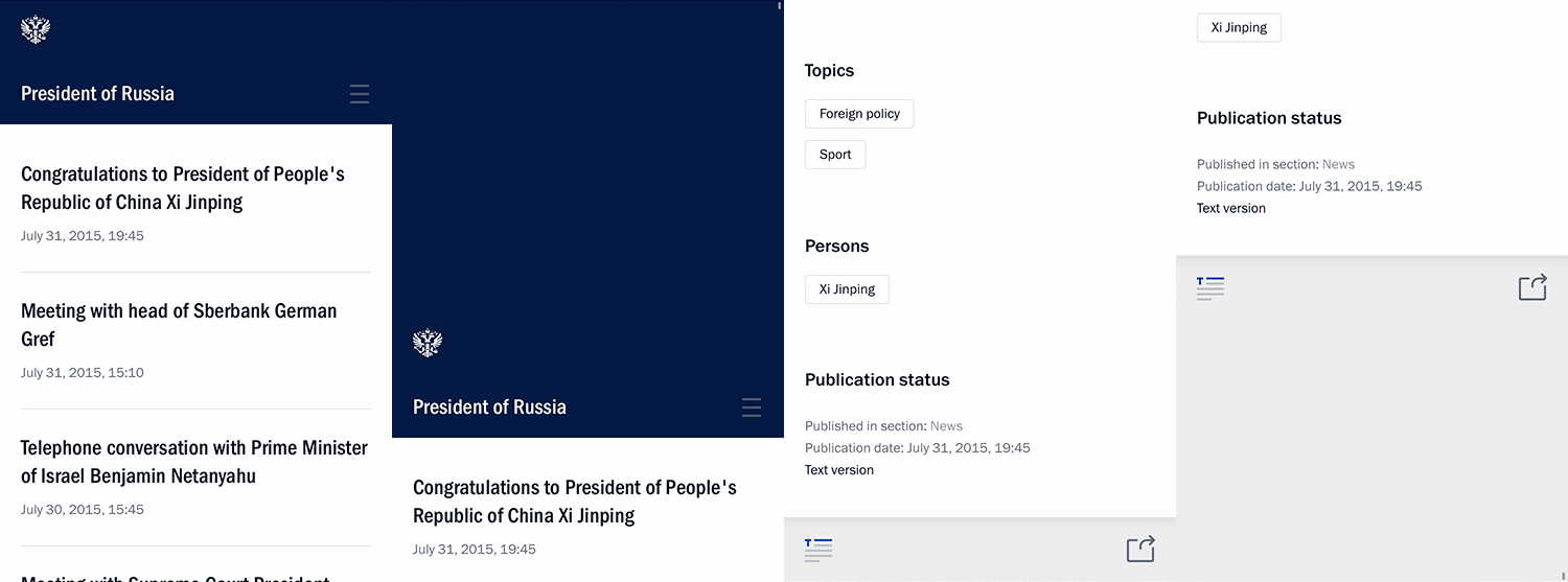
Site Information Structure
We collected all possible statistics on users and groups using popular tools. In addition, we have accumulated statistics collected from the results of testing our architectural and interface ideas. They experimented on a “living” resource, making certain conclusions.
Interviews and analysis of target audiences were conducted. In our case, these are primarily (40%) journalists - due to informational rather than service specifics. It is this resource that is often cited as the primary source of important information related to the activities of the president.
We have done a lot for them. As one of hundreds of small examples - a link to material without styles, from where it is easy to copy text.
This is very convenient, since with the standard Ctrl (Cmd) + A, Ctrl (Cmd) + C, Ctrl (Cmd) + V we allow you to paste material from the buffer without any styles. To do this, we placed it in the text area. This allows you to not change the formatting in your editor after insertion.
The second segment is Russian citizens and a foreign audience (50%). The biggest and most important part that we have endlessly thought of from the start of creating the concept to the smallest detail. Let me tell you a secret, inside our team there is an unspoken slogan that we borrowed from the guys creating gov.uk: “User needs, not government needs”.
The state is aware of the problems that it itself generates; a turning point has passed, now it’s easier - a request has been formed for a product that is high-quality by all criteria. Yes, it’s difficult with us. Yes, there are problems of bureaucracy and understanding of processes.
In the end, what is now was created precisely by designers and developers who could not, did not want to, did not prove the correctness of the decisions and did not direct the client towards human orientation.
Officials (increasingly young today) formulate tasks in a completely different way: taking care of the interests of the audience, they replace taste-giving with functionalism. Previously, the designer spoke about this, now customers themselves put the emphasis on this.
The president introduced the most complicated KPI - satisfaction of users of Internet services with services by 90% by December 2015, and by December 2020 - by 95%. It is difficult to understand how to achieve such results, but something else is important: there are KPIs, the wording exists, they will work on implementation.
The third group of professional audience - officials with their tasks and specifics, 10%. In most cases, here we solve the issues of accessibility to the operatively updated base of regulatory documents, instructions, key tasks that the president and his administration pose.
We did not set ourselves the task of understanding the information structure of a past resource (we already created it and simply supported it), but wanted to rethink our approaches to presenting different types of data, taking into account the potential context.
We tried to combine several major presidential resources in one as simple as possible. For example, before there was a separate website called “The State”, on which materials were stored on the institution of the presidency and information on the activities of state structures, advisory and advisory bodies under the president. Now all these materials can be found on Kremlin.ru in the "Structure" section. Yes, and we got rid of the archives. Now all materials, starting in January 2000, are available on the current resource.
It was important for us to separate information about events (news and other content) from “static” information - for example, navigation elements. At the same time, it was necessary to minimize the amount of information noise. One of the main ideas is the linearity of content, information is displayed in a single column everywhere. As a result, we have a clear, not overloaded structure. We suggest the availability of official background information only in the necessary context.
Kremlin.ru is not a media in its traditional or modern sense, there is a significant specificity - in particular, you do not need to unscrew advertising. The same with the indicators “viewing depth” or “time spent on the resource”: for us, the positiveness of these indicators is often a negative factor indicating that a person could not get as quickly as possible the information that he was looking for.
We had a file with a structure that corresponded until the project started. In particular, we needed to select the most accurate, concise formulations. We cannot afford the dual interpretation of texts on a state resource of such great informational and political significance.
The site is filled with things in the spirit of “Little big details”. I think you will be interested to study them. All of them carry a specific task. We can explain the need to use every block, connection, text, pixel and microanimation on the site — there is nothing superfluous on Kremlin.ru. Logic is behind everything, because "God is in the details."
If we made this project “average”, it would be a real failure. If we did this project “badly” - it would be a disaster. If the project is done "very well", then the only question that the professional community and the media could potentially raise is "how much money has been spent on it?" We are not afraid of such questions, because we can tell you what each ruble took.
Project budget
The cost of the updated site of the president amounted to 20 million rubles (about $ 330 thousand). The price includes both the development of a new version of the site, and support for the old. In the case of the presidential site, it is also security. In addition, part of this money was spent on creating an English version of the site and a version for children.
Features related to working on media files
A significant and most important proportion of users of our resource are employees of news agencies, various Russian and international media. According to reviews, they love our resource for the fact that we never forgot and always tried to create useful and convenient solutions for a professional audience.
We finalized the concept of “Work with Text” introduced six years ago, which serves as a convenient tool for navigating long transcripts. Semi-automatically mark up videos, topics, faces presented in the material, at times speeding up the search for information. We make a large array of text understandable and interactive .
The other day on the site will be able to watch video with subtitles. Thanks to this, the content will be available not only to English-speaking users, but also to people with disabilities.
On the technical side, we did not reinvent the wheel; we chose only one format for video - MP4, and one format for audio - MP3. We needed to make our site work efficiently on the maximum number of browsers and devices. We immediately decided that we would work with HTML5 video / audio, since most modern browsers support the formats we have chosen, and for the old Internet browsers we left a Flash player.
To write your player meant to run into the same rake as most, so we stopped at the MediaElement.js library. At the same time, they added support for some plugins that can be installed on the user, such as QuickTime, Windows Media Player, VLC. We took into account several issues of displaying media without using JavaScript and experimented with styling the built-in Google Chrome player.
We display an image for video if the browser does not support HTML video, and also do not display our large Play button if JS is disabled or does not work, as it blocks the interaction with the video element.
For Chrome, we got a good result of applying styles to the Shadow DOM, similar to the JS player:
We try to follow the innovations for browser players and accordingly change our implementation.
To navigate when displaying material with video, we wrote a layout editor for text and automated the player to navigate through marked areas.
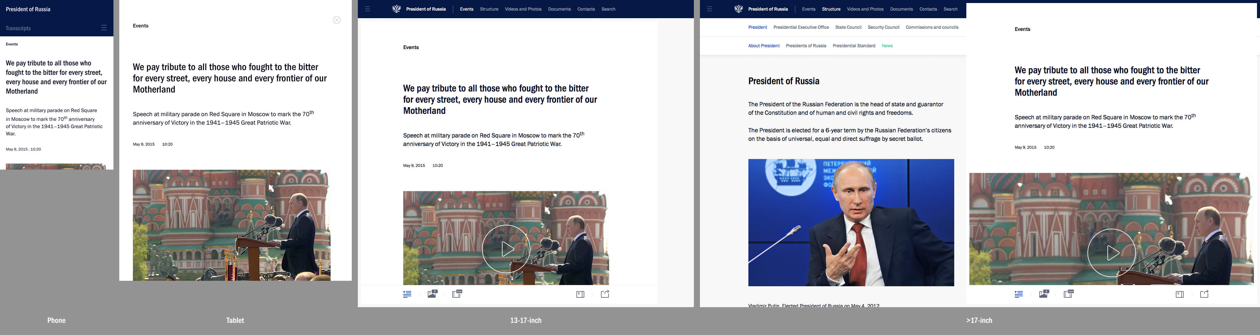
Desktop or mobile
The state resource should be accessible to citizens as much as possible. This is one of the basic ultimatum principles. On a large resource, it makes no sense to chase trends, since we are designing the future, an actual resource for 5-6 years in advance. During this time, the industry will manage to filter out all the husk, leaving only the significant.
We did not proceed from mobile-first ideology. We had enough time to separately approach all types of versions of the project display, we allocated enough resources and time for each one to make Kremlin.ru convenient on all types of devices with different ways of interaction. On all device formats, we tried to leave the native solutions as much as possible. All the content and functionality of the "large desktop" version are available on the "mobile", "tablet", "laptop".
Of course, we got rid of some interface solutions on the mobile version that are simply impossible to use from the phone (working with the transcript), but if we are dealing with a large format - like a tablet - then this specific, professional tool is already available. All content is clearly available on all devices. Functionality is more difficult to control, but we conceptually tried to always support all versions.
I can tell you in more detail about the principles of Kremlin.ru adaptability, as this is a separate and interesting question.
Frontend and backend
BEM ("block, element, modifier", the methodology for creating web applications - approx. Ed.) Is the right way to develop web development, not without reason projects such as ReactJS and WebComponents are gaining momentum.
In the process of development, we have formed our own “version” of BEM, a certain variation of the concept. We separated the JS and CSS code of the components into separate files. When designing HTML templates, we proceeded from the convenience of reuse without being tied to specific functional elements.
Especially for our needs, we wrote a query processor and display manager, as well as an anchor system for smoother animation.
All these tools serve a responsible grid with two independent columns and a dedicated multi-level menu in the header, footer and side menu. There are a lot of corner cases for each size, and they have to be programmed individually (processing and animating transitions between pages, resizing windows, showing and hiding a mobile menu, and so on).
There were specific problems for the current time. For example, abandonment of Flash - we try as much as possible to support HTML5 video, but we retain support for displaying video via Flash and Silverlight for older browsers.
We also used modern methods of CSS and JavaScript pre- and post-processing, and this helped us a lot:
- CSS: SASS + Compass, with automatic generation of PNG. It greatly simplifies working with media queries and CSS animations and increases reusability of code compared to regular CSS.
- JS: we did not use preprocessors like CoffieScript or TypeScript. We only automated the collection of scripts, compression and packaging into a single file.
- Build automation through Grunt tasks.
- The assembly is hung on the repository hooks, and at the time of the deployment, the repository always contains the current version of all generated files. There is no human factor in this process.
There is one important rule. Invite good engineers and give them time - it’s actually not difficult.
Features of working with navigation and animations
Site navigation is faster due to the fact that JavaScript and CSS are loaded once, in addition, we use the History API. Before starting, we identified the slowest places in both client and server code, optimized them, turned on caching wherever possible.
The smoothness of the animation is achieved mainly through the use of CSS, but not only. We performed optimization at the level of rendering contexts. We tested the response time in the animation, it is very important for smooth display of interface elements, there were a lot of problems with support for outdated, but still used browsers.
We recommend that other projects pay attention to such details, it is these little things that make the site really convenient and enjoyable to use.
Adaptive Interface Design Features
At this stage of the evolution of design and development, a basic understanding of adaptability has formed to a large extent. We have not yet waited for AiUi - software-generated interfaces, as a result of processing automatically collected data. Where initially the interface does not exist and there is only information at the input, with the help of which objects, entities, accents, sizes, colors and so on are built. We have to put up with reality and do this work ourselves, not personally, but for groups.
To understand the result, it is necessary to understand several important introductory: proportions vary. The old 4: 3 has long been supplanted by the desire for 16: 9, understanding this prevailing reality, we have the opportunity to think in this direction. There are much more devices. “Mobile” and “desktop” are feed formats that most developers of adaptive resources emit. In our case, we have identified not two, but four basic types of display:
- mobile phone;
- tablet (vertical and horizontal);
- medium-sized laptop or screen - 15-17 inches;
- large desktop - 17–27 inches.
It is these four formats with their popular browser window sizes that formed the basis of the adaptive resource.
According to our statistics, 22% of users access the resource from mobile devices and see a site adapted for them, 54% have low resolution - they see the site in the middle or with a small indent on the right. Another 24% have large horizontal resolutions.
User statistics
Browsers:
Google Chrome - 30.4%
Firefox - 15.9%;
Internet Explorer - 12.5%;
- MSIE 11 - 5.74%;
- MSIE 8 - 2.83%;
- MSIE 9 - 2.18%;
- MSIE 10 - 1.41%;
- MSIE 7 - 0.21%;
- MSIE 6 - 0.033%;
Opera - 11.2%;
Mobile Safari - 8.34%;
Yandex.Browser - 7.59%;
ChromeMobile - 5.06%;
Android Browser - 2.95%;
Safari - 1.67%;
Opera Mini - 1%.
Geography of the Russian version of the resource:
Russia - 77.9%;
Ukraine - 7.12%;
Germany - 1.29%;
USA - 1.29%;
Belarus - 1.12%;
Kazakhstan - 1.04%;
China - 0.58%;
Great Britain - 0.57%;
Moldova - 0.42%;
Uzbekistan - 0.39%.
Geography of the English version of the resource:
USA - 20.1%;
Russia - 8.22%;
Germany - 7.72%;
Great Britain - 6.13%;
Canada - 4.18%;
France - 3.88%;
Netherlands - 3.09%;
Australia - 2.59%;
Austria - 2.4%;
Norway - 2.21%.
We thought of all user groups with multiple devices. They created their own, correct, separate experience for everyone. As a result, in order to perfectly display the site on all types of devices with intermediate values, we needed 9 breakpoints. All versions were developed in parallel.
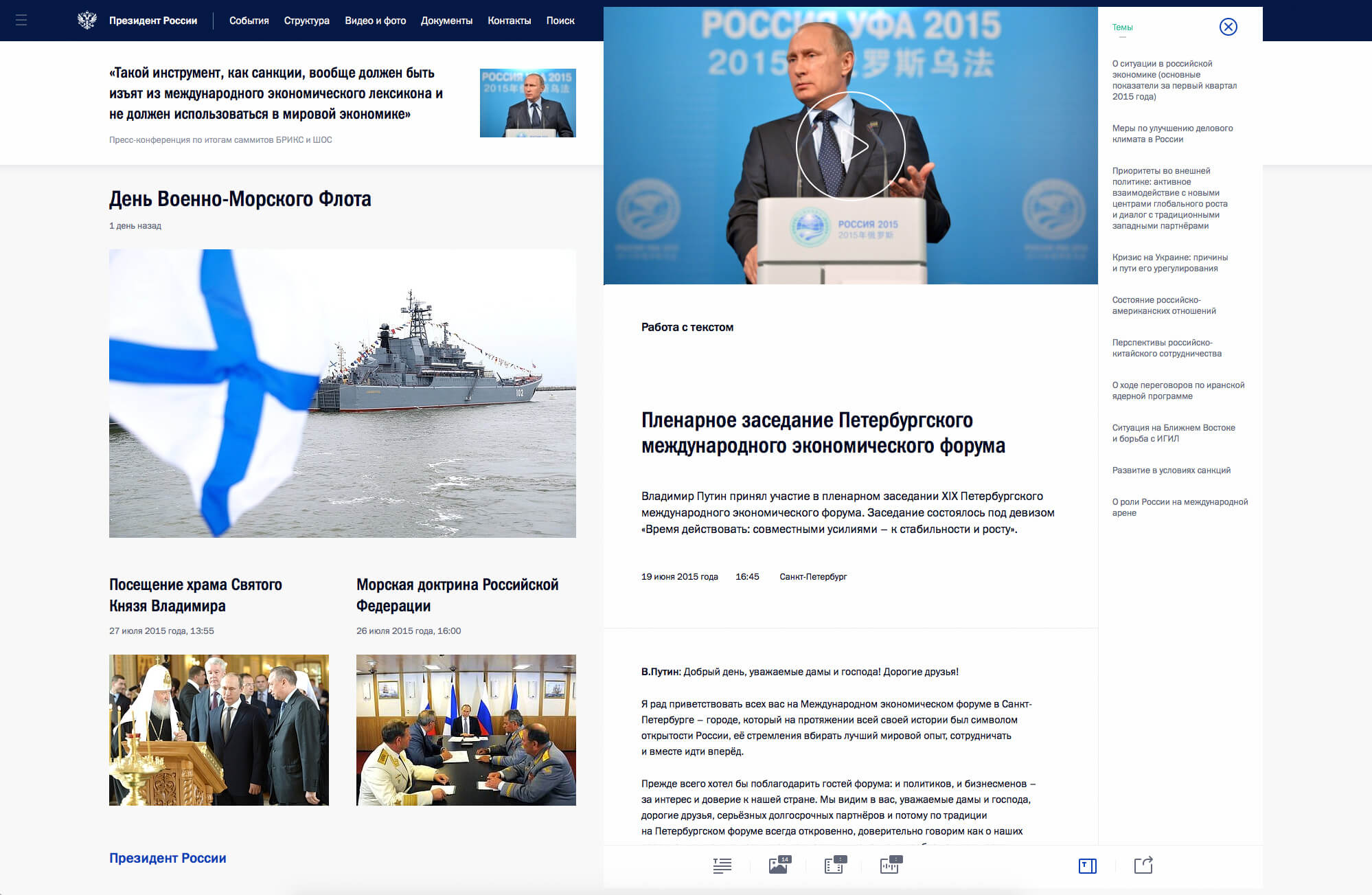
It makes sense to tell what idea we put into the most interesting way of navigation and display, which starts from 1580 px.
For most modern resources, the vast majority of users come to specific material from external links. In our case, they immediately see two independent columns. The left column is no longer exclusively content, but turns into the main navigation element. The right column remains exclusively content without unnecessary navigation tools and unnecessary interface bindings.
According to our calculations, the navigation speed in this mode increased by 1.5 times, which was very liked by the editors and our regular users. Also, a unique opportunity appeared to draw additional information on the left side of the site without closing the material. We managed to surprise the presidential administration with the dynamics and convenience of the decision. A few weeks later, all questions in this part disappeared from them.
Usually standard tree solutions are used. I will give one example out of hundreds. A person reads a news story, and a face is mentioned in it. He clicks on it, in the column on the left, without closing the material, information about his current position, biography and some other important data appears. It is with this functionality that we accelerate navigation and do not break the reading rhythm. In the same way, without being distracted from an event or document, you can open another section, read additional information, write a letter, find out the contacts of the press service and so on.
According to our statistics, the percentage of users with a browser resolution of 1580px + of the total number of audience floats within 24% of the total number of users. Based on the grid, we still have the opportunity to reduce the value in pixels for a two-column display, but based on statistics, we will not be able to get a large percentage increase in the audience. At the moment, in this struggle of compromise, we settled on the number 1580.
Two independent columns give rise to many new ways of interacting. Have you been waiting for tabs in Finder? Do you remember Norton Commander? Are you used to your email apps and news aggregators? We will reveal all these interface features on the new Kremlin.ru. As an example: in one of the next releases, we will launch material stacks when read and additional materials are collected in the right column, to which you can return or find out something important. There are a lot of such ideas and it is important to feel a balance, understanding the tasks.
Other interesting features
I already said at the beginning that the site is simply teeming with the small pleasures of the designer, designer and web developer. I’ll try to list a small part of the goodies:
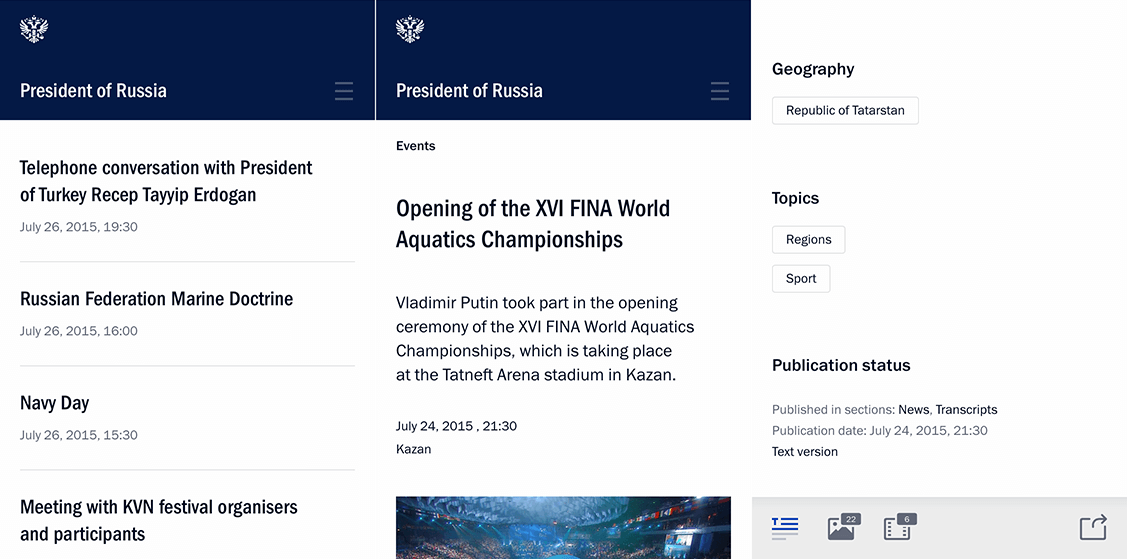
SVG-map of Russia and the world. When you click on a specific site, surrounded by a large number of borders, you can select all the nearest countries or regions from the list. The map automatically approaches this area.
Data icons. In tapes and materials, we not only show the length of the video, audio and number of photos, but also the size of the material - pre-calculating the number of characters. This solves two professional tasks: the user does not need to go into the material if he sees that work is underway on him and the full text appears later. Also, the user can decide in advance whether he is ready to read a large text or not.
Notifications. If you don’t close the tab with the site, the news is updated in the feeds and the number of unread is marked. For the efficiency of the editorial work immediately after the event, a short text appears on the site, then - a transcript and photographs, at the end the video is posted. We see all these updates, returning to the tab with the New Kremlin.
Work close icon in the material. When we scroll down, we hide the icon, but when we scroll up, it appears again. We also begin to show it when hovering in a large area on the top right, as we understand that a person potentially wants to close the material. You can also close the material by simply clicking in the free area on the right.
Click interaction animation or tap. On touch devices, the animation tells the user whether the interaction has passed. This is important due to our specifics of dynamically loaded content.
Download fonts. It is important to enable a user with a low connection speed to immediately start reading headings and text of materials, without waiting for the annoying loading of custom fonts. The solution to this problem helped us save the user from painful expectations, but we got small “leaps” that we will try to compensate for by selecting system font settings.
Loading tapes.To display the lists, the incremental loading mechanism is used when scrolling the page. At the same time, it was necessary for us to give the opportunity to view and use the footer. We used the so-called loading and display zones, upon entering which one of the actions occurs: either displaying the next page or preloading the page. Navigation buttons to the next or previous page of the list also appear.
Calendar that adjusts to the context. Try to open the calendar in the event stream and, without closing it, continue scrolling the news.
Clever zoom. Give it a try! In the mobile version, with double tap on the text in the material, we increase the font size while maintaining the position.
Responsive Headers. The font size changes depending on the size of the title to stay in our grid.
Image upload. One of our tasks was to fully support various devices with different pixel densities (Retina, Ultra HD). We use a fairly recent technique using the srcset attribute, which is supported by many modern browsers, and for the old ones, we took a JavaScript implementation. At the same time, they wrote a similar thing for the video poster. For slow connections, we used a background gradient as a preloader, which is calculated based on the prevailing shades of the image.
Responsive icons. Sometimes we open the material “on top” of the site, and sometimes on the right. For each of these situations, we carry out calculations and show an icon corresponding to the situation. Try changing your browser window at high resolution.
Font rendering. A lot of effort was spent on high-quality rendering of fonts in all possible operating systems and browsers. In different situations, we used different solutions, and sometimes even changed the color of the text for a particular browser. For Franklin Gothic, we tried to use several different rendering options, but later focused on: text-rendering: optimizeLegibility; -webkit-font-smoothing: subpixel-antialiased, which worked best in the maximum number of browsers and OS.
As an example, in Chrome, the text color in the footer looked gray and in Safari blue. We chose a slightly different shade that met our goals and looked the same everywhere.
We also went through several iterations of changing color solutions in order to achieve the optimal result on most devices, including devices using Retina.
Transcripts, video markup. To mark up the text, we wrote our own module. You can set the theme, person for any paragraph. We show the list of markers on the page with the transcript, where, when clicked, you can go to the marked words. Each paragraph is also marked with a temporary marker. And when playing a video, the material automatically rolls to a position in the video.
Moreover, transcript navigation and video navigation can work simultaneously. In this part, one of the main challenges was the creation of a convenient interface for editors. We wrote an extension for the admin panel. An interface that allows the editor to match each paragraph with a person, topic, time span. The result is classes and data- * attributes (see, for example, the source view-source: http: //kremlin.ru/events/president/transcripts/pre ... - Ctrl + F data-time-start), which are picked up and used in js.
Aesthetics in detail. We show our backgrounds in case the user continues to scroll, resting on the end or the beginning of the site.
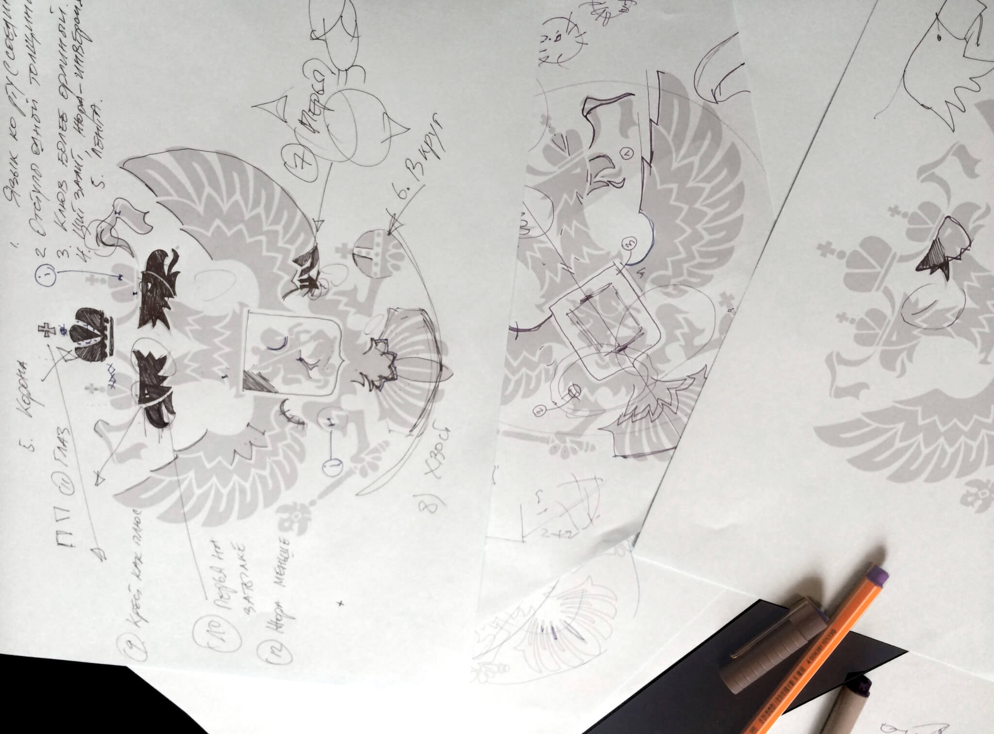
Separate version of the coat of arms. They made a separate version of the coat of arms, which complies with the law and looks just fine. This was necessary because until this moment there was no special version designed for the screen. It was important to enter the emblem in the correct simple form, which was not done earlier, and later to add recognizability to add details close to the usual visualization. We initially decided that we would give the emblem to everyone who would create the websites, we posted the source files and illustrations under a free Creative Commons license.
Mark and Share. This library allows users to highlight fragments of content on the site and share unique links to marked elements with other network users.
It seems to me that this list can be endless.
Features of localization into two languages (Russian and English)
All design took place with testing English formulations of the basic elements. There are many points that distinguish these versions, in particular on the main page of the English version we show a world map, not a map of Russia, or display the international format +7 ... instead of the Russian 8 (495) ... We check for back-end. If the language is Russian, then print 8, if English, then +7.
We also use gettext with automatic assembly of PO files (file in the format “source phrase - translation”) from the source code: serverside, templates, JavaScript. When building a project, finished translations are packaged back into JavaScript, templates and code substitute translations when generating the page. Pretty typical solution.
How the team worked
We all work in one spacious room in which everyone respects the opinion of the other. We are professional enough to listen, hear and make decisions without slipping into the bureaucracy of bloated teams.
From our side, two UX-designers worked on the project - five front-end engineers and a significant number of people engaged in back-end in a different sense.
We started the development with simple prototypes, reflecting the basic principles that we were going to follow at the start. A little later, they grew into detailed prototypes with testing of stylistic elements: colors, fonts, interface solutions. A system of used colors and fonts was built, which partially changed in the process. Also at this stage, we made a prototype of our solutions in the browser to understand what pitfalls of different scales can expect us.
As an example: it was in the prototype for the browser that the client really understood how convenient our idea with a two-column independent structure was.
Engineering, design and development are parallel processes that started almost simultaneously and continued until the launch of the new Kremlin.ru. We are now continuing to work on improving the project in different directions.
Tools used in team work
We started designing on paper and in familiar Photoshop, but almost immediately redrawn everything in Sketch. We were tormented during the formation of the product from its instability and the mysterious specifics of exporting to SVG, but as Sketch develops, there is no great desire to return to Adobe Photoshop.
If we take all the stages, including primary theoretical, the development lasted more than a year.
We decided to transfer a significant part of the frontend tasks to Trello, where more than 2500 cards with tasks and task lists were closed during the year. About the development of government services and libraries used Not considering those that were archived or deleted. We are constantly updating the list based on our ideas and reasonable user reviews. Currently, there are 72 cards that are yet to be closed.
During the project, 40-80 versions of almost every layout with iterations of varying degrees of complexity were created.
In a magical world, 15 smart people gather and immediately decide what the site should be. But in real life you won’t take everything into account at once. Thumbnails of the site during this time have not changed. But we went through its structure two thousand times, collected all the rakes in order to get the necessary solutions as a result.
Based on the results, we made a brief presentation of the principles on which the new site should be built. On sheets of A3 format - all the main pages of the future site, descriptions of "how, what and why." So that a person "from the outside" for our region in five minutes can understand the essence - what is offered and why. We described the principles, prepared the pictures, made the drills with the explanations "this principle works like this in this place."
It is very important that communication with the client is efficient and that there are decision-makers on both sides. The presidential administration saw everything - from the first sketches of a pen on paper with an explanation of fundamental ideas to constant access to several servers with different versions.
We learn a lot from our customers.
On the development of public services and libraries used
In the near future, the quality of the state itself will be perceived, including through design. Loyalty to government organizations will be built on the same principle: it’s convenient and quick to work with the site’s service — a good department, an incomprehensible and ugly site — a “bad” department. And this fact will be the most important criterion for the development of state Internet projects.
Already today, Russian officials formulate the tasks in a completely different way, taking care of the interests of the audience, and replacing the taste with functionalism. Previously, the designer spoke about this, now customers themselves put the emphasis on this.
We have our own set of libraries, which we either already actively share or share after we put it in order.
We have already laid out our backend framework - iktomi, - a set of tools for the frontend, the most popular of which are SVG cards and mashaJS (Mark and Share). We strive to highlight the best practices and give them to the community, this also helps us to simplify their use.
It happens that some developers do not even use version control tools. We understand that many regional sites try to be like federal state sites. Often this entails an inept transfer of design elements or site structures.
We have a desire to help create good and convenient resources.
As an example, we pay special attention to code acceptance and automation of error search, the use of integration and unit testing. Not all contractors follow this and not all customers set such requirements. Acceptance recommendations would help customers get better sites.
For example: we saw a government project in which failure protection was built by duplicating content on five servers, in case of an error in one of the servers, the request was forwarded to the second server, and so on. This reduced the likelihood that the user will see an error, but at the same time, this number of servers is redundant and not rational.
We undertake the task of publishing recommendations, sets of examples and principles that will help make government sites more accessible and useful. Now we are creating a collection of components and recommendations in order to share it with the community.
This will be a site on which we will collect recipes for development and management, components and libraries that can be reused, recommendations and principles for designing website designs for various purposes. Subsequently, it will become a place where standards are born, patterns are developed with perfectionism, where the best people in the design industry work together to create pictographs, fonts and so on, where problems are voiced and solved, and ready-made solutions are copied for free to any resources, in particular, state ones .
We hope that this site will unite all available practices and information, form the style and the necessary level of quality for other state Internet resources.
We will be glad to receive updates and wishes from other teams and their projects.
Perhaps it was necessary to start from this. Many thanks to all the guys who took part in the creation of Kremlin.ru. I will try to list those I can: Sergey Shapiro, Katrin Shapiro (coat of arms), Arthur Chafonov, Olga Romanova, Eugene and guys from the backend.