Visualization of attacks, anomalies and information security breaches using OpenGraphiti
Those who visit our headquarters in San Jose are always struck by the large video wall displaying a real-time attack picture with the ability to drill down after touching certain areas of the screen.
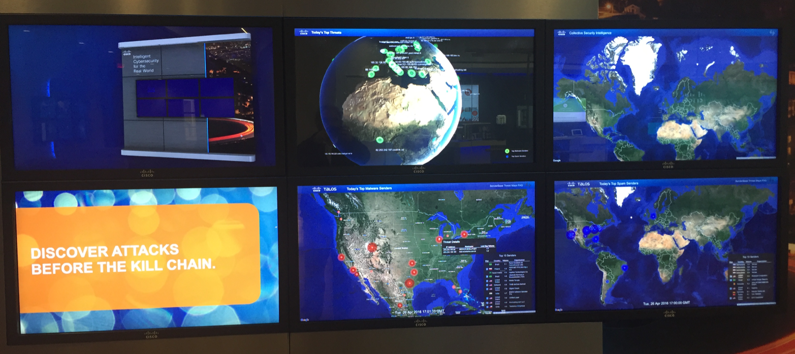
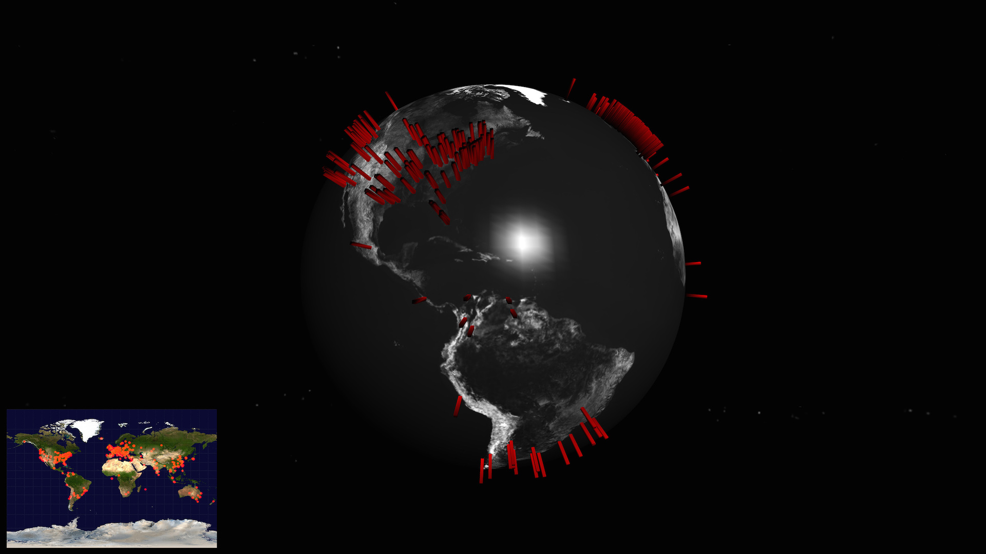
However, like any attack map, and I have 34 in my collection , any such visualization is ineffective in real life. Show the bosses, show reporters, include in any video ... This is all useful, but in practice there is little applicable. Usually you have your own data sets generated by your security features. And you are interested in what is happening in your network or directed to your network, but certainly not beautiful cards with “ballistic missile strikes” that are drawn by the vast majority of companies providing attack visualization services.

One of the solutions to this problem is the open source toolkit OpenGraphiti , developed by OpenDNS , which is now part of Cisco . OpenGraphiti is a free 3D data visualization engine that analysts can use to display and analyze semantic networks. The presence of its own API allows you to effectively use OpenGraphiti for your own purposes, which, in the case of information security, include:
Here's how, for example, a part of the Dark Hotel spy campaign semantic network built using OpenGraphiti looks like:

Some clarification is needed on the color legend of this semantic network. The red domains are the domains to which the initial request was sent, and the blue is the final point to which the request was ultimately redirected through the intermediate nodes marked in white. It is worth paying attention to these differences, as they once again demonstrate that banal black lists in proxies, Internet access control systems or even in the ITU are focused on the fight against “red” nodes, completely ignoring the complex chain of interaction in malicious infrastructure.
And here is what the ZeuS semantic infrastructure network looks like:

Finally, this is how Shellshock’s vulnerability spread looks like:
Of course, the essence of the semantic network is displayed not by a static picture, but by a dynamically changing map, which can change its scale and detail depending on the tasks facing analysts. For example, this is how the WikiLeaks website sees and interacts with it:
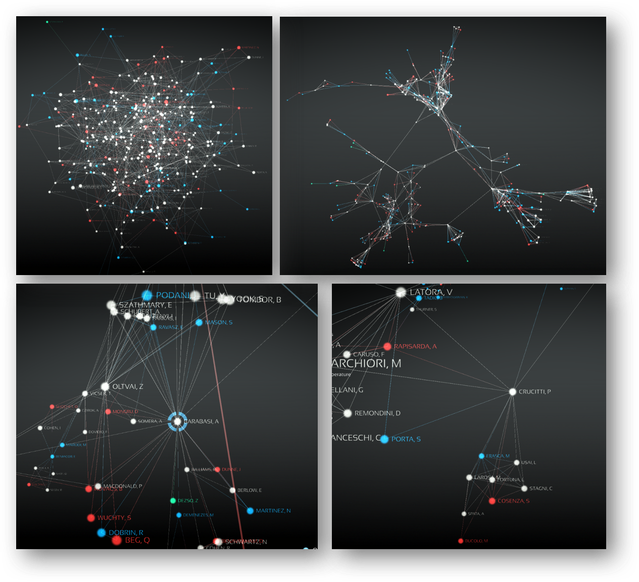
The semantic network is, as Wikipedia says , an information model of a subject domain, having the form of a directed graph. This graph consists of vertices (nodes), which are the studied entities. Here, for example, is the semantic map of the concepts of domestic GOST R ISO / IEC 15408, also known as the “General criteria”.

To be more practical and apply the semantic network to the visualization of attacks and other anomalies, then as the entities or vertices of the graph can be considered various characteristics of servers and nodes in the network - Web, mail, NTP, SSH, etc. Another example is social media accounts or email accounts. The edges or arcs of such a graph (connections between nodes) describe the relationship between entities. Examples of such edges include bandwidth, time, number of connections / messages, etc.
In the process of creating our own semantic network, we need to compose our own set of entities of interest to us, depending on the goals of the analysis. For example, when analyzing social networks, both people and companies that interest us can be used as entities (vertices of the graph). Moreover, as edges of the graph can be considered:
Using a semantic network, it is very easy to analyze internal and external communications. E-mail addresses can be taken as entities, and many different attributes can be taken as relations between entities:
If we want to analyze network interaction, then as the studied entities we can take IP addresses, servers, hosts, ITUs, routers, proxies, autonomous systems, etc. And as relations (edges of the graph), we can analyze the ports used in the network interaction, host name (hostname), country (geo-referencing), autonomous system (AS), domain. Please note that the autonomous system is mentioned twice - both as an entity and as a relation. Why is that? It all depends on what we want to analyze. If we are interested in how traffic circulates between different autonomous systems, then they will interest us precisely as entities, that is, nodes of the semantic network. And if we are interested in where we are most often attacked from, the autonomous system turns for us into an attitude, that is, edges of the graph.
The advantages that OpenGraphiti has are:
If we pay a little more attention to the first advantage, then with the help of visualization we can identify the use of DGA (Domain Generation Algorithms), which are used not only for marketing purposes, but also by malicious programs. One-day sites whose domains are created automatically and in large quantities in order to bypass the blacklist mechanism.

Once again, OpenGraphiti is a free open source tool, the requirements for which are quite simple:
Instructions for installing and configuring OpenGraphiti are available at www.opengraphiti.com . The design itself is customizable and can be integrated into its monitoring centers (SOC), linking it with its data. So, for example, OpenGraphiti runs on the OpenDNS website (requires Chrome):

Obviously, as the volume of data increases, so does the complexity of the map. It can be controlled using entity grouping or selection. For example, I can visualize not the entire network with millions of IP addresses (as in the Cisco network), but sets of nodes grouped by one or another criterion — geographic location, department affiliation, node importance, etc. This allows you to not immediately plunge into details, but to capture the picture from a bird's eye view, followed by immersion in the area we need at a given time.
Here's how, for example, the Zbot botnet map looks like:

Using the zoom function for various parameters, we can change the level of detail of the same map:

Why do we need visualization and why cannot we do without plain text or a tabular representation of the data that the available means of protection generate for us? There is a good analogy. If you imagine that the human eye can transmit visual data to the brain at an Ethernet speed, then reading text allows you to interact with the brain at dial-up speeds. Obviously, working with textual information, namely, it is mainly operated by the majority of protection tools, today has a number of disadvantages, among which the main one is the speed of perception and the detection of implicit interdependencies. This is especially important when we are dealing with monitoring large volumes of frequently changing data. To achieve the desired effect with text data is also difficult to visualize, which in no way cancels the existing types of analysis,
In conclusion, I would like to note that today, in a situation where IS analysts are overloaded, it becomes very important to choose the right tools for visualizing large amounts of data, allowing you to see the protected system, which allows us to ask the right questions and get the right answers, which is the key building the right information security strategy in the enterprise. And OpenGraphiti helps in solving this problem.
However, like any attack map, and I have 34 in my collection , any such visualization is ineffective in real life. Show the bosses, show reporters, include in any video ... This is all useful, but in practice there is little applicable. Usually you have your own data sets generated by your security features. And you are interested in what is happening in your network or directed to your network, but certainly not beautiful cards with “ballistic missile strikes” that are drawn by the vast majority of companies providing attack visualization services.
One of the solutions to this problem is the open source toolkit OpenGraphiti , developed by OpenDNS , which is now part of Cisco . OpenGraphiti is a free 3D data visualization engine that analysts can use to display and analyze semantic networks. The presence of its own API allows you to effectively use OpenGraphiti for your own purposes, which, in the case of information security, include:
- botnet visualization
- visualization of DDoS attacks
- visualization of spam mailings
- visualization of hacker campaigns
- visualization of malware / hacker movement over the network
- vulnerability visualization
- visualization of wireless devices, including and unauthorized
- visualization of IoT devices
- visualization of information flows within a corporate or departmental network, including regarding email analysis
- visualization of connections in social networks
- etc.
Here's how, for example, a part of the Dark Hotel spy campaign semantic network built using OpenGraphiti looks like:
Some clarification is needed on the color legend of this semantic network. The red domains are the domains to which the initial request was sent, and the blue is the final point to which the request was ultimately redirected through the intermediate nodes marked in white. It is worth paying attention to these differences, as they once again demonstrate that banal black lists in proxies, Internet access control systems or even in the ITU are focused on the fight against “red” nodes, completely ignoring the complex chain of interaction in malicious infrastructure.
And here is what the ZeuS semantic infrastructure network looks like:
Finally, this is how Shellshock’s vulnerability spread looks like:
Of course, the essence of the semantic network is displayed not by a static picture, but by a dynamically changing map, which can change its scale and detail depending on the tasks facing analysts. For example, this is how the WikiLeaks website sees and interacts with it:
What is a semantic network?
The semantic network is, as Wikipedia says , an information model of a subject domain, having the form of a directed graph. This graph consists of vertices (nodes), which are the studied entities. Here, for example, is the semantic map of the concepts of domestic GOST R ISO / IEC 15408, also known as the “General criteria”.
To be more practical and apply the semantic network to the visualization of attacks and other anomalies, then as the entities or vertices of the graph can be considered various characteristics of servers and nodes in the network - Web, mail, NTP, SSH, etc. Another example is social media accounts or email accounts. The edges or arcs of such a graph (connections between nodes) describe the relationship between entities. Examples of such edges include bandwidth, time, number of connections / messages, etc.
In the process of creating our own semantic network, we need to compose our own set of entities of interest to us, depending on the goals of the analysis. For example, when analyzing social networks, both people and companies that interest us can be used as entities (vertices of the graph). Moreover, as edges of the graph can be considered:
- Place of work
- Account Creation Date (allows you to calculate bots)
- Account activity
- Religion
- Groups in which subjects of interest participate
- Etc.
Using a semantic network, it is very easy to analyze internal and external communications. E-mail addresses can be taken as entities, and many different attributes can be taken as relations between entities:
- time of writing letters (or sending messages using instant messengers)
- communication method (e-mail, skype, Jabber, etc.)
- device (personal or business)
- etc.
If we want to analyze network interaction, then as the studied entities we can take IP addresses, servers, hosts, ITUs, routers, proxies, autonomous systems, etc. And as relations (edges of the graph), we can analyze the ports used in the network interaction, host name (hostname), country (geo-referencing), autonomous system (AS), domain. Please note that the autonomous system is mentioned twice - both as an entity and as a relation. Why is that? It all depends on what we want to analyze. If we are interested in how traffic circulates between different autonomous systems, then they will interest us precisely as entities, that is, nodes of the semantic network. And if we are interested in where we are most often attacked from, the autonomous system turns for us into an attitude, that is, edges of the graph.
The advantages that OpenGraphiti has are:
- providing a context for searching for various relationships between entities of interest to us, including various anomalies
- “Telling” the story of your Big Data security
- ability to compare different attacks and campaigns
- help in attributing cybercriminals and finding out entry points for various IS breaches
- showing the “show” in real time, which allows you to correlate an attack or other violation with various news from the security world (publishing information about vulnerabilities, new attacks, etc.).
If we pay a little more attention to the first advantage, then with the help of visualization we can identify the use of DGA (Domain Generation Algorithms), which are used not only for marketing purposes, but also by malicious programs. One-day sites whose domains are created automatically and in large quantities in order to bypass the blacklist mechanism.
Once again, OpenGraphiti is a free open source tool, the requirements for which are quite simple:
- MacOS or Linux
- Clang ++ or g ++
- Python 2.7.x
Instructions for installing and configuring OpenGraphiti are available at www.opengraphiti.com . The design itself is customizable and can be integrated into its monitoring centers (SOC), linking it with its data. So, for example, OpenGraphiti runs on the OpenDNS website (requires Chrome):
Obviously, as the volume of data increases, so does the complexity of the map. It can be controlled using entity grouping or selection. For example, I can visualize not the entire network with millions of IP addresses (as in the Cisco network), but sets of nodes grouped by one or another criterion — geographic location, department affiliation, node importance, etc. This allows you to not immediately plunge into details, but to capture the picture from a bird's eye view, followed by immersion in the area we need at a given time.
Here's how, for example, the Zbot botnet map looks like:
Using the zoom function for various parameters, we can change the level of detail of the same map:
Why do we need visualization and why cannot we do without plain text or a tabular representation of the data that the available means of protection generate for us? There is a good analogy. If you imagine that the human eye can transmit visual data to the brain at an Ethernet speed, then reading text allows you to interact with the brain at dial-up speeds. Obviously, working with textual information, namely, it is mainly operated by the majority of protection tools, today has a number of disadvantages, among which the main one is the speed of perception and the detection of implicit interdependencies. This is especially important when we are dealing with monitoring large volumes of frequently changing data. To achieve the desired effect with text data is also difficult to visualize, which in no way cancels the existing types of analysis,
In conclusion, I would like to note that today, in a situation where IS analysts are overloaded, it becomes very important to choose the right tools for visualizing large amounts of data, allowing you to see the protected system, which allows us to ask the right questions and get the right answers, which is the key building the right information security strategy in the enterprise. And OpenGraphiti helps in solving this problem.