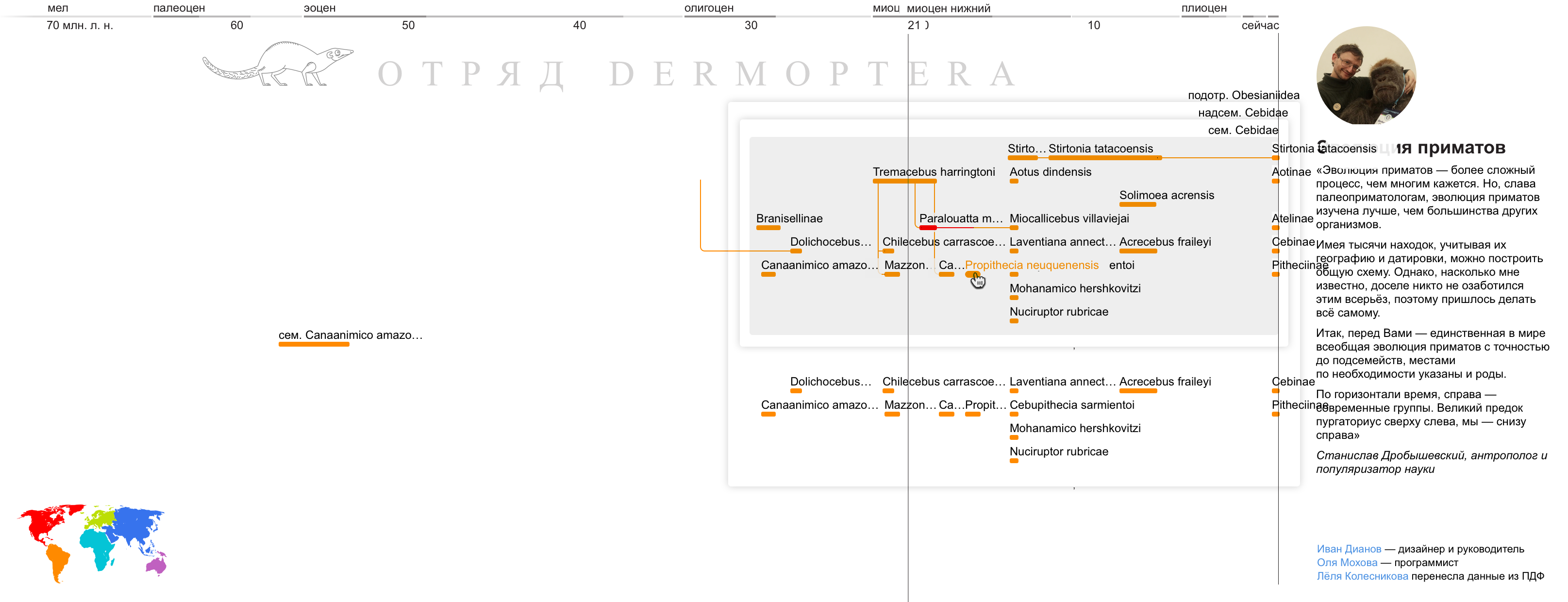
Primate tree visualization
Stanislav Drobyshevsky published a detailed tree of primate origin at the beginning of the year . Version in PDF
Commentators in Vkontakte asked for an interactive version ( 1, 2, 3, 4 ), because it is more convenient to study and easier to update when new data is available.
Olya Mokhovoy and I decided to help paleoprimatology and made a prototype on d3js.
On the left - the original diagram, on the right - our version: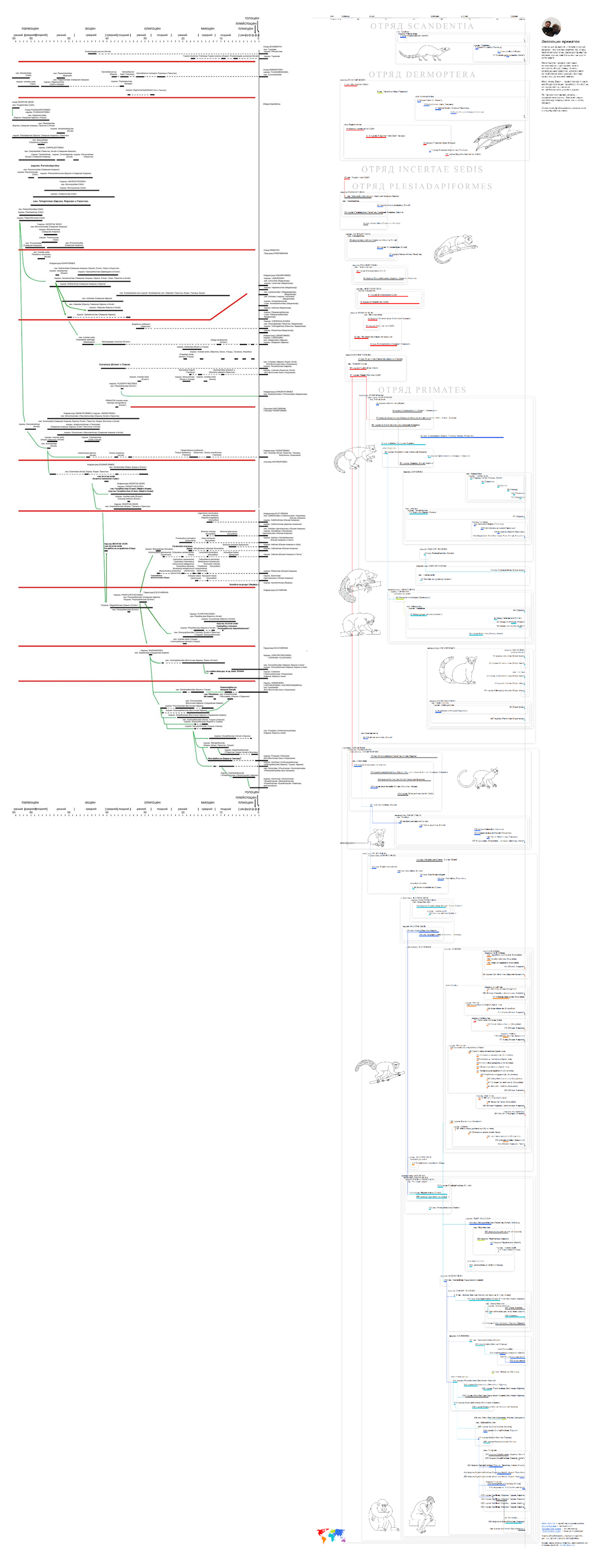
I'll tell you how the work went, and what techniques helped us.
purpose
First, we want to make a popular science scheme, a more advanced version of the famous image: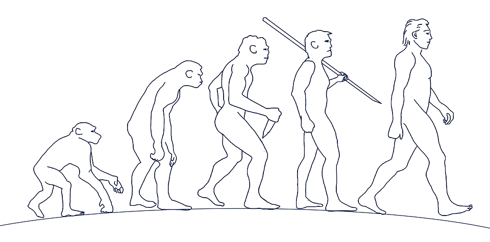
But about this already there is an excellent project of Gleb Krauklish .
We decide to go the other way: to make a prototype system for the aggregation of archaeological data. Of course, I want to make a megaproject with the movement of tectonic plates, photographs of finds, detailed information on each taxon, links to Wikipedia, a schedule of average annual temperature. But we decide to start making an interactive version of the existing scheme.
Design
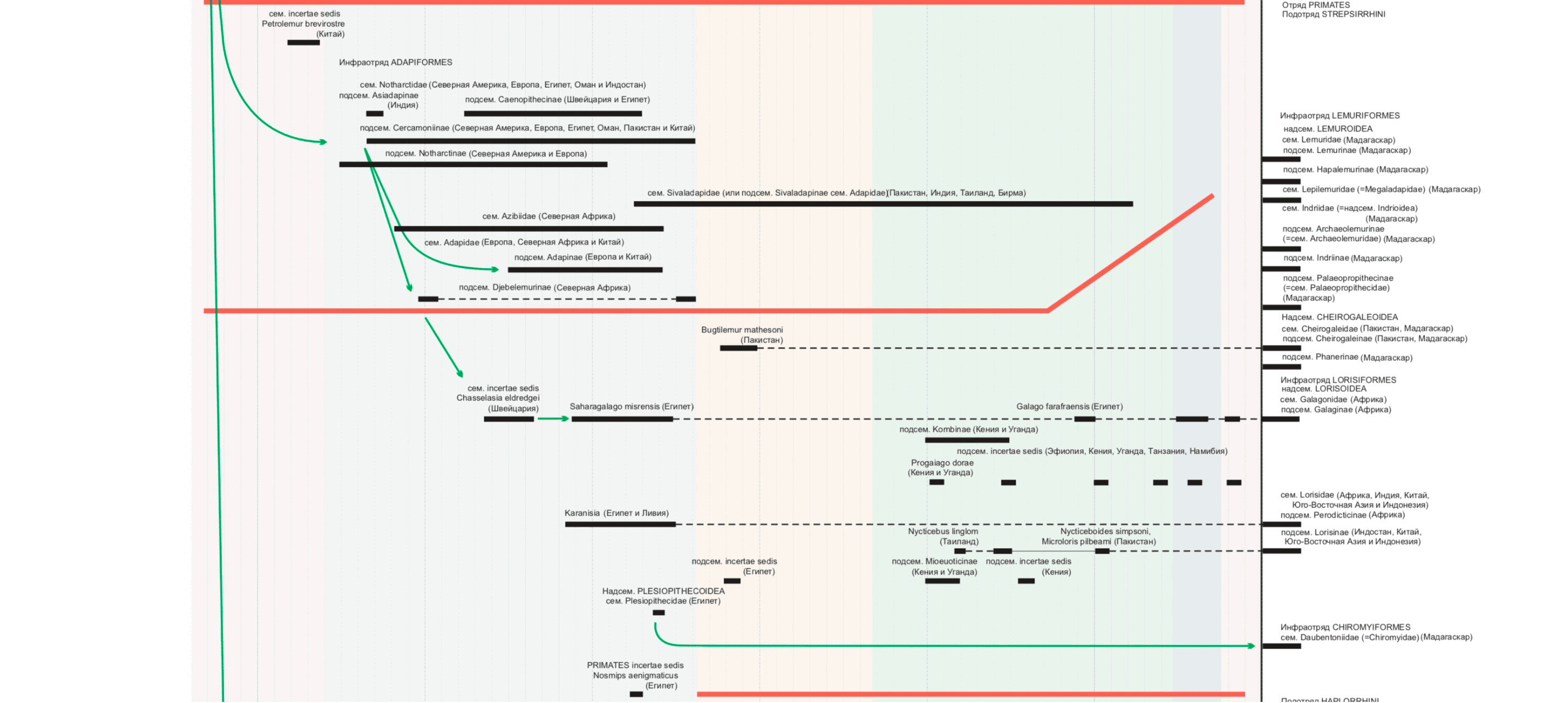
In the original scheme, the color is almost never used. You can color show, for example, on which continent the beast was found.
I also want to more clearly show the hierarchy of taxa (groups of organisms).
I make the first sketch:
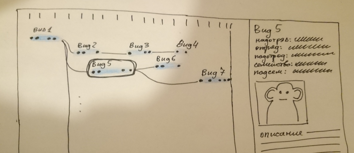
Immediately there are questions. For example: “Shouldn't kinship somehow depend on taxon nesting?” I have to dig in Wikipedia, learn about cladistics and monophilia . I learn from Stanislav that there is no cladistics on the diagram, which means that the tree of kinship does not have to coincide with the nesting of taxa.
I draw a piece of the scheme with data similar to the real ones. I try to use the most inconvenient data in order to collect as many cones as possible at the layout stage. I take names that do not fit, showing how the value of the slider overlaps with other text.
Database
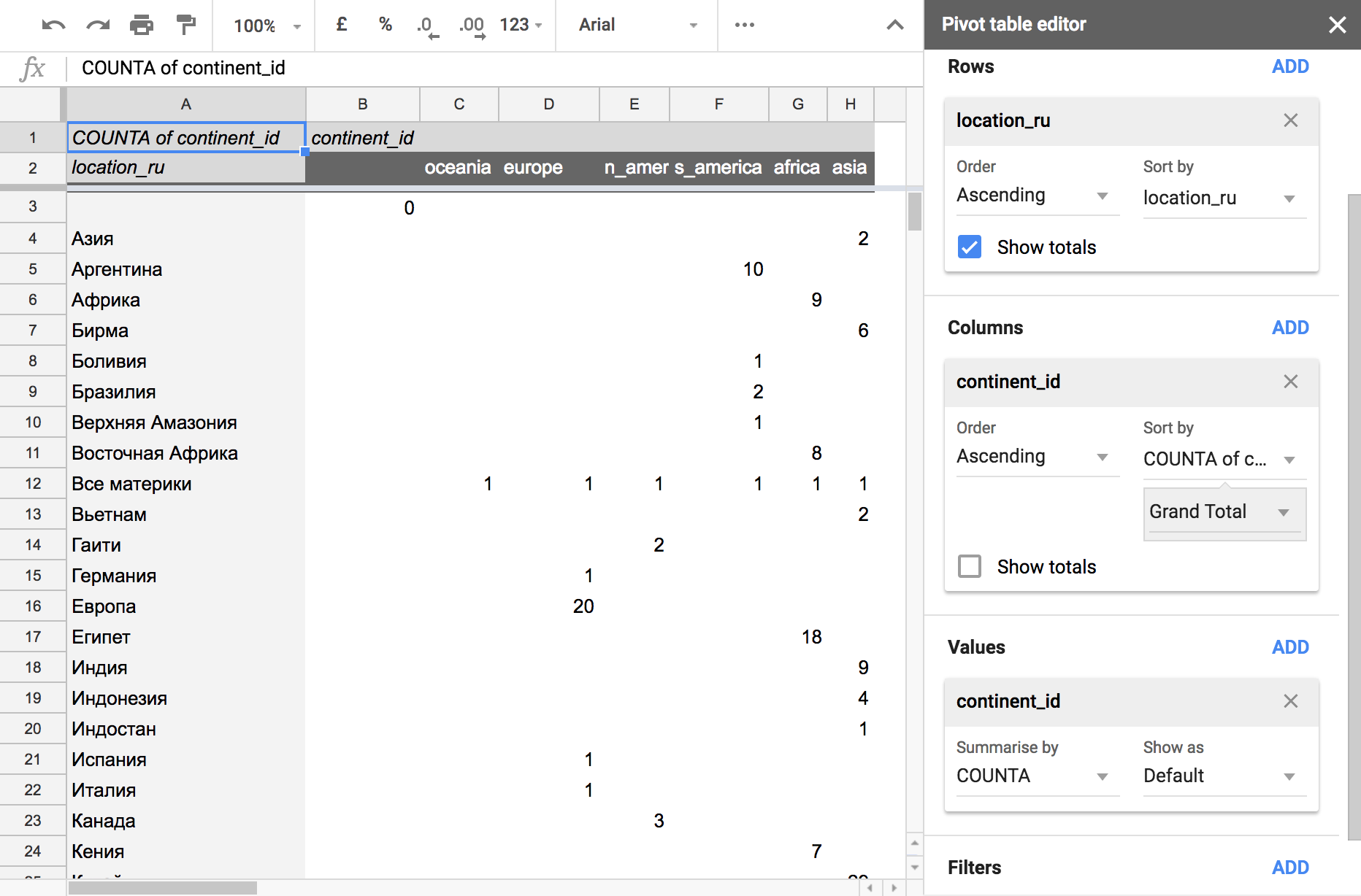
The project is hosted on Github pages . Initially, we wanted to prepare the data in the google table, then convert them to csv and commit it to the githab. As a result, we decided to load the data directly from the google table.
Advantages of such a decision:
- Stanislav Drobyshevsky will be able to change the data without our help.
- During the development process, it was necessary to frequently correct errors, try a different order of data. Googlotable saved us a lot of time.
Minuses:
- Loaded a little longer, but not critical.
- If you spoil the data in the table, the site also immediately breaks. However, the google table keeps a history of changes, in case of a problem, you can roll back to the old version. You can also duplicate your worksheet before making changes and use a duplicate as backup.
Copying data
The main difficulty is the deep nesting of taxa. Here is a list of all ranks:
- Peace squad
- Squad
- Suborder
- Infrastructure
- Parvotryad
- Superfamily
- Family
- Subfamily
- Rod
To simplify the copying of data and their verification, I drew colored dies over the diagram. Color means the rank of the taxon, the names are signed above.
Lola Kolesnikova came to the rescue . It copies data from PDF to a table with 300 rows. Of course, I want to automate the process, but this is difficult: some nuances are not obvious even with manual transfer.
Illustrations
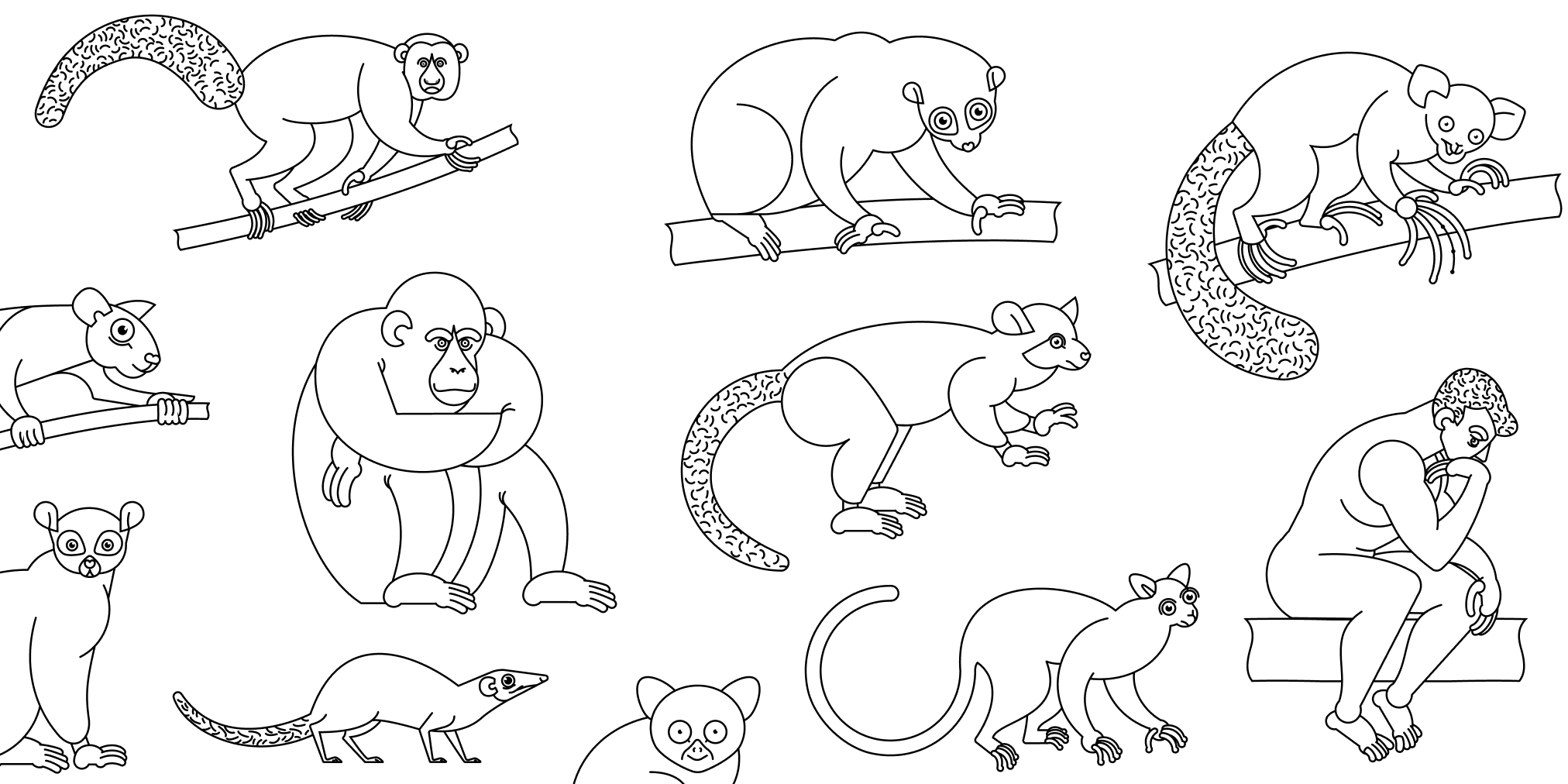
The pictures help to diversify the monotonous canvas and help to roughly imagine what the representatives of taxa look like. We call in the project of the illustrator. Tatyana Sergeevna gets down to business.
Discuss references: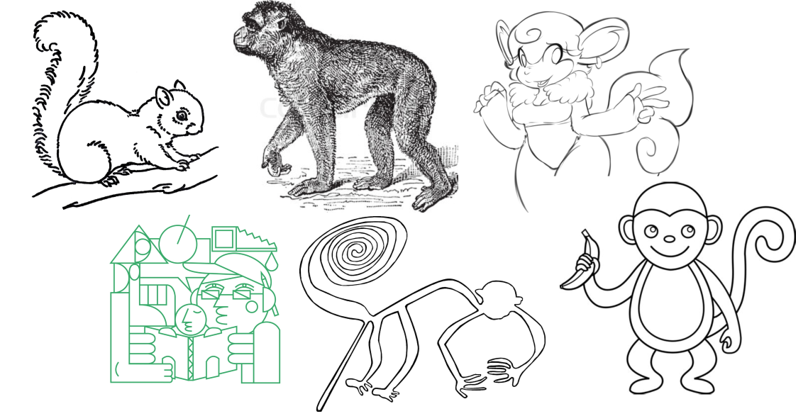
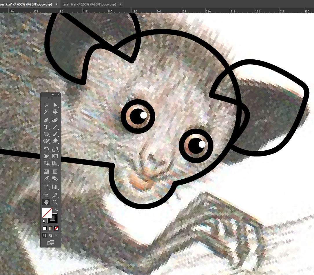
Selecting photos and reconstruction of typical representatives, Tanya draws. Some geometrical illustrations help to distract from details that vary greatly from species to species.
Data checking
When transferring from PDF to data, errors crept in. Therefore, before showing the scheme to Stanislav, we check it ourselves.
- Each country should relate to only one of the continents. I check this correspondence with the summary table:
 .
.
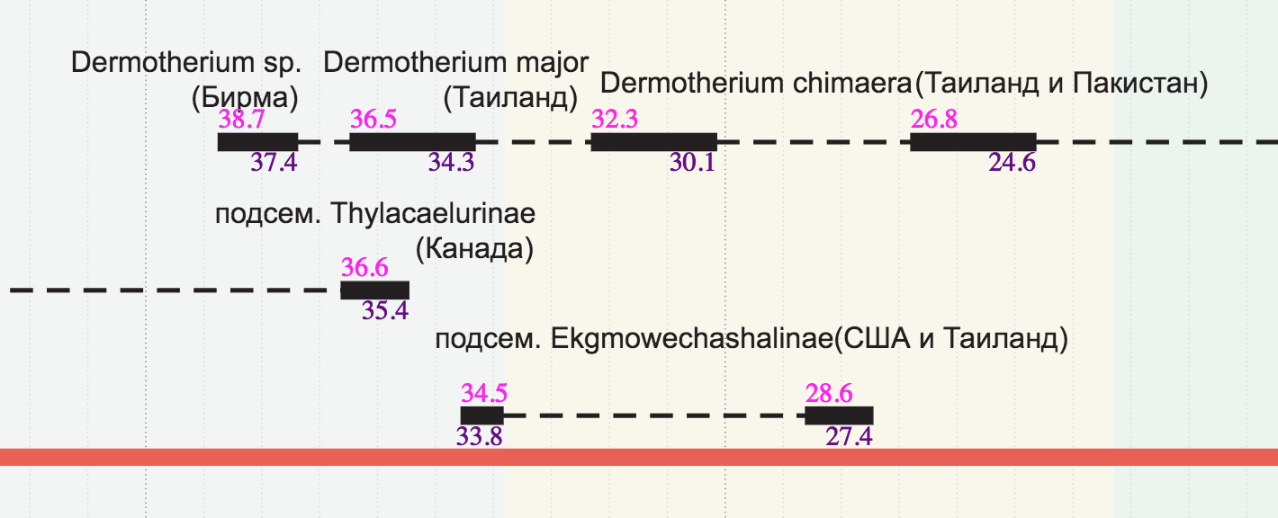
- To make it easier to check the periods, I write a mini-script on d3, which signs the beginning and end of the periods directly on the chart. It was necessary from the very beginning to do so.
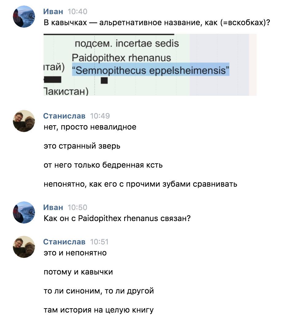
- Sometimes the names of taxa are similar to each other, but in fact they are different. To protect myself from such errors, I insert hash pictures next to columns of taxa. If two words differ by at least one letter, the pictures will most likely be different and the error will be revealed:
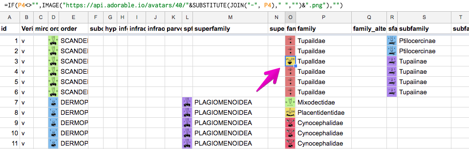
Pictures are loaded from http://avatars.adorable.io/
Difficulties
In the course of the work interesting problems emerge, discuss them with Stanislav.
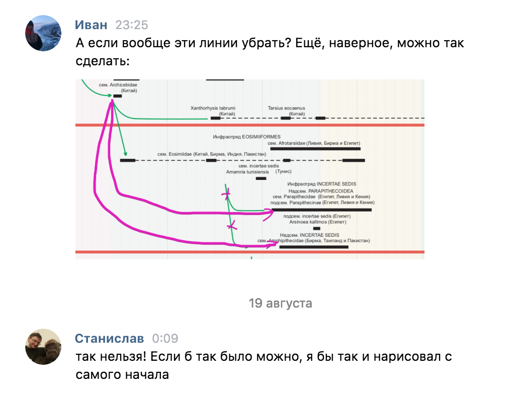
For example, some taxa are descended from later ones. For example, Amphipithecidae → Oligopithecinae → Perupithecus ucayaliensis. Of course, this is impossible, just the earlier representatives of Amphipithecidae and Oligopithecinae have not yet been found. We decide to artificially increase the parental taxon in the past:
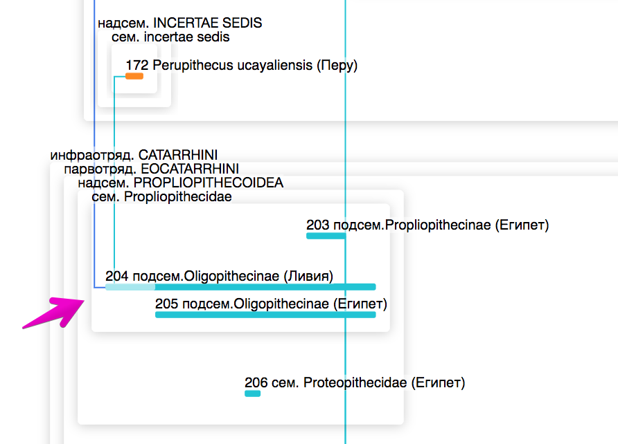
At first, we thought that communication was possible only between “bricks”, but then it turned out that we needed the ability to connect any taxa: both “bricks” and “frames”. So far, we have to remove the problematic connections (from the EOSIMIIFORMES infra-unit)
Sometimes interesting things come up:
For the future
- The maximum task is to make a base of archaeological finds and show them on this diagram. Now it is not clear where all these stripes came from, what archaeological finds are behind them.
- Add the possibility of communication between taxa of any rank. Now only bricks can be connected to each other. Therefore, we can not show a connection with the source scheme EOSIMIIFORMES → Amphipithecidae
- Show places of archaeological finds directly on the map.
- Earth for 65 million years has changed greatly. It would be great if you move the cursor along the timeline to change the shape of the color map below.
- You can carefully collect the names of taxa on the left side, as on the table in Taft .
- When clicking on a taxon to show detailed information about it.
- Anthropologists do not have a single view on evolution. I would like to visualize this uncertainty in the future and see what everyone agrees with, and what opinions differ.
What do you think is good and what is bad? How would you improve the project?
If you have interesting data that needs to be processed, visualized and shown to people - write, we will be glad to cooperate: ivan@dianov.org, telegrams: @ivan_dianov