How the redesign helped increase conversion by 104%
- Transfer

“Our customers were happy, the product is great, and we had a terrible conversion in registration. That's what we did with it. ”
So begins the story of Groove service founder Alex Turnbull.
Groove is a customer support work management service (support management via chat, online polls, trigger mailing, integration with social networks; call analytics and other chips).
On the product side, everything is cool: the service quickly gained several thousand users, many of whom did not want to hear about other options. Groove ideally fell into the needs of the target audience - small companies that do not need “cool” functionality.
Easier to work, more personalized settings, 4.5 times cheaper than top competitors (Zendesk). Plus a great blog with a lot of insights, and its own support became the benchmark for SaaS: project founder Alex Turnbull spent 500 (!) Hours talking with clients on Skype to find out their needs, motives and expectations.
It would seem, what else to worry about, here it is - market fit - the “assembly point" of the product and the market. However ...
One of the colleagues said: "I am surprised that you generally receive any applications from the landing page." Let's see what is terrible there.

Title: "Customer Support for SaaS and e-Commerce."
User review: “Groove makes it very easy to manage client requests. It’s more convenient than Gmail or “sophisticated” analogues. ”
Social proof: “97% of users recommend Groove.”
CTA - Learn More button.
Alex Turnbull notes: “In fact, we are not the best solution for most readers of the blog and those who came from different publics about startups. Creating valuable content does not mean selling. With a conversion of 2.3%, we would not have long stretched. "
5 things they did before the redesign
Blind restructuring can kill the good that is and destroy the project. Groove already had the sad experience of redesigning at an early stage, in which they “swelled” $ 50,000 without much benefit. This time they came to the matter more thoughtfully.
1) Learned best practices
Alex and colleagues read all that is possible about the design and optimization of landing pages. “Try to understand what and why it works for others. Foreign cases will not work for you 1 to 1, but this knowledge will definitely come in handy. ”
2) Consulted with experts.
To better understand the reasons for the low conversion, Groove asked feedback from 12 well-known experts - what they think about the site based on their experience. Current indicators were not reported. The responses are a cross between "a little awful" and "incredibly awful."
Here are the main points.
Old heading (“Customer Support for SaaS and e-Commerce”):
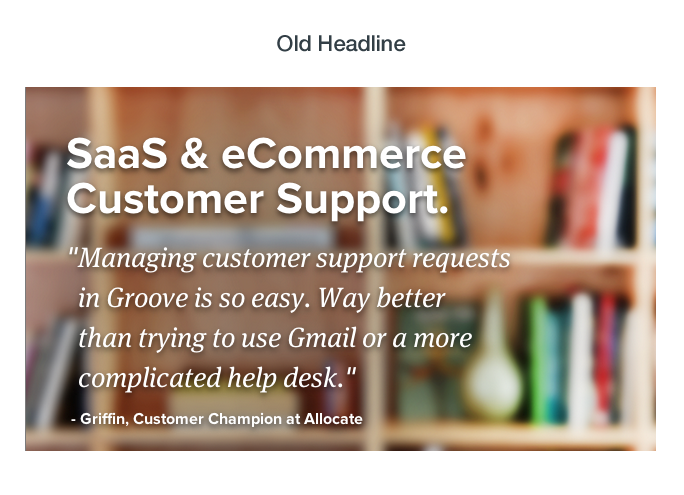
Expert Review: “Customer support is a product, not a problem. What problems do you solve? ”
Subheading (“You'll set it all up in less than 1 minute”):
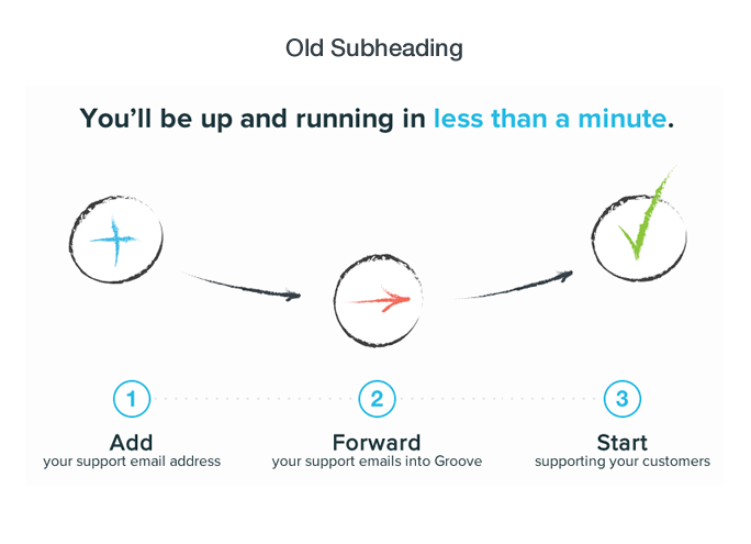
Expert opinion: “You are selling me how easy it is to set everything up despite not selling the solution itself.”
According to Alex, the critical mistake is talking to customers in the language of marketers. They hate it. The right approach is to use the exact expressions of the clients themselves.
3) Interviewed current users.
With the help of KISSmetrics analytics, they “pulled out” the list of users who completed the most operations and ... no, did not do polls with “yes or no” answers, send mailings and other commonplace things.
Groove needed not analytics, but a lively response. Therefore, we recorded the opinions of advanced users by phone and skype. Exactly - what you like and what you don't like about the service + how they describe it.
Four security questions:
- What problems did you want to solve when you registered with Groove?
- What can you compare your user experience with?
“What was the start of the job like?”
- What was the “aha moment” for you when you “fell in love” with Groove?
Part of the answers, specific quotes were included in the content of the new site. Alex Turnbull advises: “Your customers can teach you the right marketing. And if they repeat the same things in reviews, it’s probably worth focusing on them. ”
4) We talked with new subscribers
This is necessary in order to more accurately determine user triggers - why people decide to work with you. Feedback from new users allows you to simulate a value proposition. You do not invent from your head, but firsthand hear what the audience needs, what is expected of you and what problems they hope to solve.
In addition, the company has a welcome mailing list. A new user receives an email asking, “Why did you sign up for Groove?”:
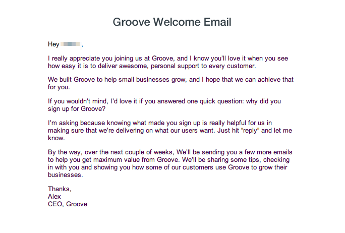
Alex Turnbull asks to write an answer to him personally, because this will help to improve the functionality and customer service. In conclusion - "In the coming weeks we will send several letters with cases that will help you" squeeze "the maximum benefit out of Groove."
41% of subscribers replied to welcome email. According to the developers, this move had the strongest impact on the company's marketing. Interestingly, a week after registration, the responses of new users evade features of functionality.
Therefore, the immediate reaction “Subscription - Welcome email” is extremely important until the feedback is “contaminated” by practical experience. The task is to identify attraction triggers. Retention at the work stage is a separate story.
5) Defined “Who we are and who we want to be”
These are questions to ourselves, to which all Groove participants answered. Here they are:
- Why does our business exist?
- What do we mean in the lives of our customers?
“What do we believe in?”
“What do we NOT believe in?”
- Who are our ideal customers?
- How do we want the client to perceive us?
“Who are we not suitable for?”
- How are we different?
Great approach - helps to clearly understand the values of the team and the direction of movement. In short, the mission of the project.
Copy-First design development
In previous cases, Groove followed a standard pattern: first aesthetics, then copywriting. That is, at first they made a beautiful picture, and customized the content for it. According to Alex, it was crazy.
This time, they acted differently: first, we analyzed user feedback and tried to write the “history” of the product, sketching the structure in Balsamiq:

The task is to bring the page visitor to the Groove user experience as much as possible, make him “walk in our shoes” and feel all the benefits of the product.
Alex Turnbull says: “We wanted to make a site similar to a friendly conversation with a visitor. To do this, they wrote two separate stories related to the problems of our audience. As part of each, dozens of copywriting and value proposition options were created in the title, of which 5 were selected for testing.
The messages focused not on the product, but on the real problems of the audience. They tied the benefits of Groove as a solution. We edited and rewrote almost everything until we were convinced that we have something worthy of embodiment. And only after that they began to design the design, eventually building a layout for copywriting. ”
Working page prototype:
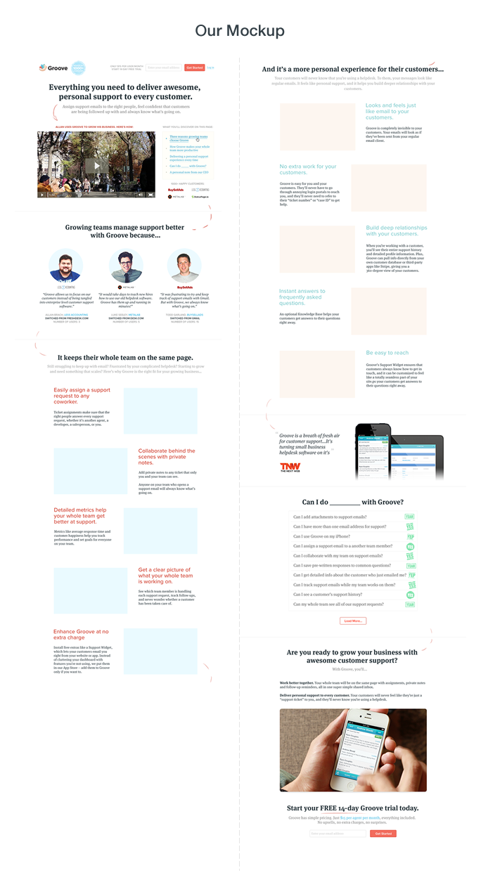
As you can see, a huge "footcloth" has turned out, especially in comparison with the source. On the first screen there is a heading / subheading with a value proposition, a customer’s video review + a list of features that await the visitor.
Next, a few text reviews with the announcement “We make customer support management better thanks to Groove, because ...” And each of the review authors explains that he is most attracted to working with Groove. Benefits of the product in the words of customers.
The third and fourth screens occupy the functional features and advantages of the service. Fifth - again a quote from the review (“Groove - like a breath of fresh air for support work”) + answers to frequently asked questions “What can I do in the program?”
And on the last screen - the sum of user benefits with a call to subscribe to the 14-day trial.
What is the result?
After 10 days, the first statistically significant results stunned the developers: the conversion in registration increased from 2.3 to 4.3%. At 87%, almost twice (!)
Once again, for comparison, the original and the new version (first screen):
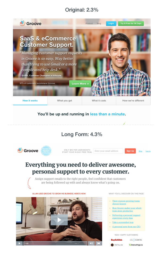
Message of the new version: "All you need to create great personalized support for each client."
Over the next two weeks, the conversion tightened to 4.7%. Thus, the total increase after the redesign is 104%.
Groove does not stop there. They continue to collect feedback from visitors to the landing page to find out the reason for the rejection of registration; test headlines, subheadings, images, and calls to action, and also launch a short landing page.
Alex Turnbull notes: “Product design and development are processes, not events. They continue as long as the business lives. There is always something to check and “tighten”.
“I challenge you, no matter what your current situation. Try asking yourself the same questions. Answers can completely change your business. ”
Share your experiences in the comments and what you think about all this.