How to work with Lebedev Studio: the experience of Tutu.ru
My name is Nikita Ivanov, I am design director Tutu.ru. Our business has been operating since 2003, and last time we rethought its identity almost 12 years ago - at the end of 2006.
Now Tutu.ru is growing from a set of popular services into a single product for travel. Design is one of the tools that helps us in this.
In this article, I will tell you how we were looking for a new identity and choosing a partner, why we chose Artemy Lebedev Studio, and how the work with their team was arranged, and how we are now changing the design of services with a 15-year history.

Tutu.ru in 2006 is a train schedule, an online train ticket and flight schedule, 20,000 website visitors per day and a team of seven people. Tutu.ru in 2018 is the Russian tourist service number 1 (GfK data for Q1 2018), about a million visitors a day, five mobile apps for iOS and Android and a team of more than 350 people.
For several years, our focus was customer convenience and new useful features; we paid less attention to how our products communicate with people or how we talk about changes. We reasoned like this: “Is it worth spending the team’s resources for decorative changes, and not for new cool features? What benefits will it bring to customers? And how do we measure it? ”And it’s really difficult to measure. But working on a brand is important. There are no services without a brand. If you do not engage in a brand, then in the minds of your audience its image will take shape by itself, only, alas, without your participation.
Designers in Tutu.ru have been heated for updating the identity for a long time, but we ourselves understood that “making a redesign” is an incorrect formulation of the problem. To get a cool design, you need to understand what we want to be and why. In a big complex business, this is not easy. Last year, a working group gathered in Tutu.ru, which found answers to these questions, and this was already enough to correctly set the task of a new identity.
We were looking for a more lively, friendly and emotional style that will reflect the new character of Tutu.ru. It was time for us to leave the sign with intersecting roads, which many people associate only with trains and electric trains. The new logo should be about traveling of any kind and at the same time be the logo of the technology company, and not the kind of lamp emblem of the travelers club. Plus, we wanted to maintain continuity with the old style of the company: millions of customers know us like that, and this is valuable.
We decided to do a new identity with our partners, and in order to correctly set the task for them, we wrote a brief. In the brief, we collected a description of the brand, its platform (positioning, style, mission, vision and values), our understanding of the task, expectations from the workflow and even showed with examples what scale of change we are ready for and what seems to us too small or on the contrary, radical.
The description of the task turned out to be long (on 10 sheets), but it helped synchronize the expectations inside Tutu.ru and ask ourselves the right questions. It seems to us it turned out to be even more useful than the partners.

To find a team with which we will succeed, we met with several strong studios and agencies. What did we pay attention to?
On the cool work for complex digital products in the portfolio. From the inside of the Internet, it sometimes seems that everyone already “can be in digital”. But there are a lot of great teams that do a better job with packaging design, media or advertising. The main point of contact of people with Tutu.ru is our interfaces and letters, it is much more important for us to “reflash” the identity in them, rather than to get instead excellent advertising layouts for magazine turns or merch.
On the opportunity to work with the creative team directly.In some studios it is not customary for designers to communicate with customers themselves. There are managers who pass on questions and answers, go to meetings. We counted on a deeper dive.
On the number of designers. By and large, no matter how many people work on the project, the result is important. But it happens that designers burn out before they give out the best idea, so it is not bad when there is an opportunity to “change hands” without changing the partner.
On the cost of work. In Tutu.ru carefully consider the costs. Obviously, the work of a good team cannot be cheap, but even here we were left with quite thrifty guys and were not ready to overpay.
On personal contact. We could have abandoned a strong team if we had not managed to find a common language.
After a dozen negotiations with different teams, we chose Lebedev Studio. First, they proved to their portfolio that they could cope with such a project. Secondly, from the first minutes of their acquaintance, they were quick and open in communication, asking the most accurate questions. And let it sound a little pompous, but they had "the right fire in their eyes." We felt that the project is in safe hands.
Another sensitive issue for us is the project budget. Before we began the search for the best team, we almost excluded the Studio from the list of potential partners: we all remember that there is “Long, dear ...”.
But I thought: “You don’t take money for acquaintance!” - breathed deeply, exhaled and wrote to the studio mail. The quick answer - talking on the phone - meeting in a studio office inside a giant printing complex on ul. 1905 ... it would be strange to stop interesting communication, and later it turned out that the cost of the Studio’s work was on par with the proposals of other strong teams that we were considering. I will not say the amount, but the myth has collapsed.
Colleagues questioned us about our business and goals, told about themselves, showed projects of similar size in their portfolio, conducted around the office (now I know how I want to see Tutu.ru’s future office!). I will not describe the commercial offer of the Studio, or as we designed all the papers, I’ll proceed to work on the design.
The first layouts that Studio showed us were seven search sketches. What it is? - Outline future identity without much detail. What are they needed for? - To quickly understand which images are closer to us, and which way you shouldn’t even think.
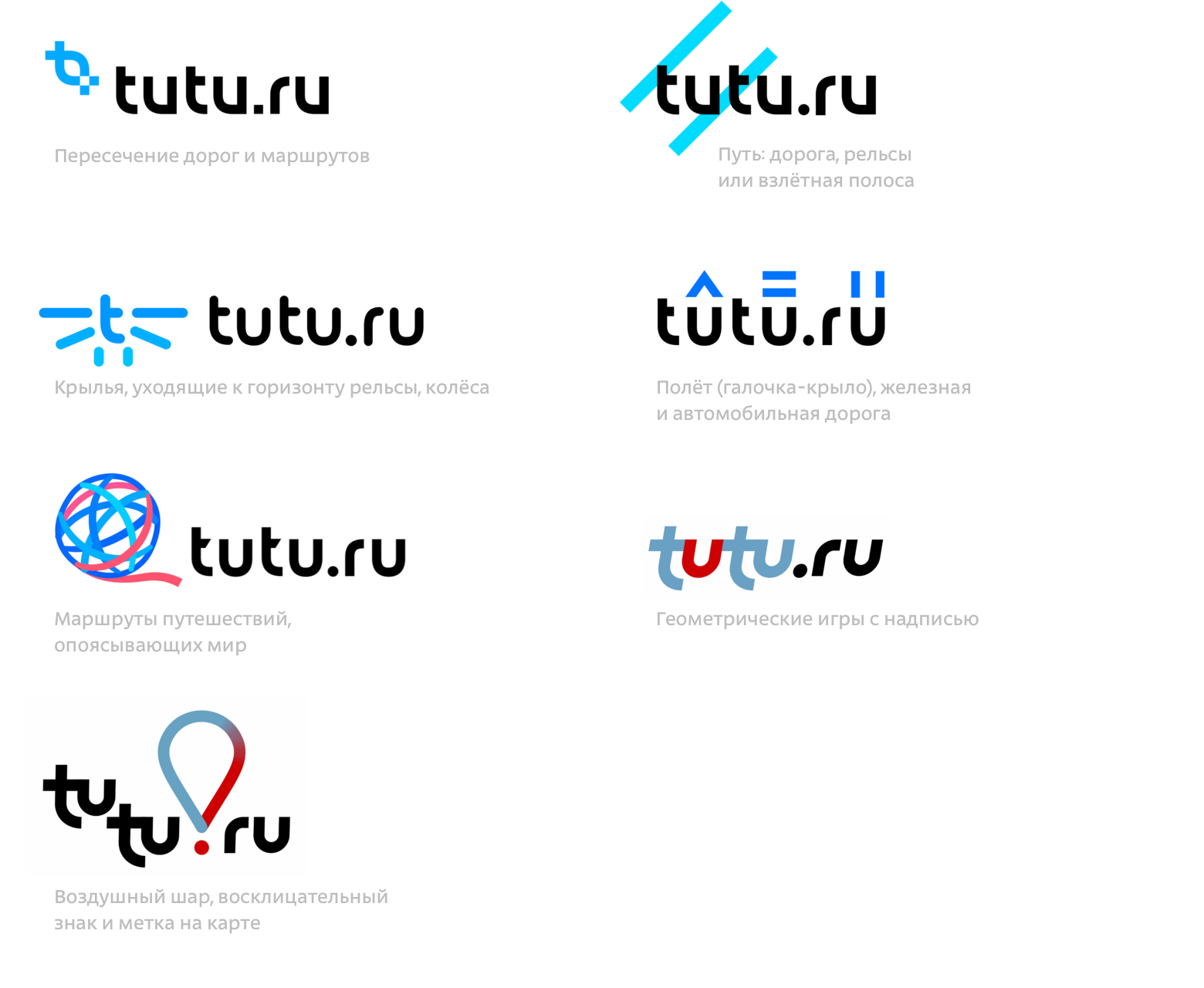
Of the proposed options, we immediately eliminated four. We liked the other three:
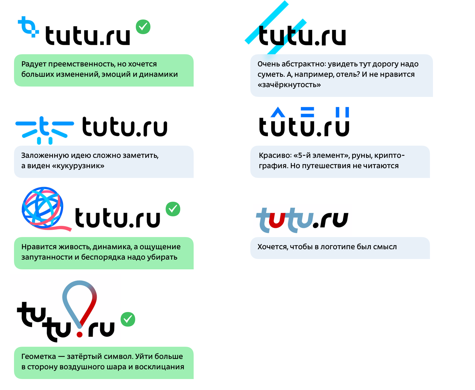
This may seem counterintuitive and frivolous - cool guys come and show seven hastily drawn pictures. Waiting is clearly not this. But even without knowing the studio kitchen and laughing at the funny associations (“This is Twitter, which founded the airline?”), You understand that this start of work saves the carriage of time. With the pictures on the hands easier and faster to understand each other.
It's time to talk about how the interaction with the studio team of our project was arranged.
From the Studio side, Nastya Sharkova, art director, Yegor Zhgun, art director, and Ivan Vaschenko, designer, participated most actively in the work. I once heard that Tyom approves sketches before the presentation to clients, but I cannot confirm or deny this: his participation in our project remained behind the scenes of the Studio.
The project was conducted in the internal system of project management - they marked the dates of future meetings, fixed comments and agreements after discussions. New layouts were shown to us at personal meetings, they were held in the office of Tutu.ru, usually every one or two weeks, on Thursday or Friday. Between meetings, correspondence or short phoning for further details.
So, we liked three ideas. The first version played up the metaphor of paths and intersections. In addition, it is most similar to our old logo, and we did not want to lose continuity. However, we wanted more noticeable changes, we lacked emotions and dynamics. Colleagues developed the idea as follows:

The second concept, which we chose at the first meeting, with a geotag, a balloon and an exclamation point. It's all about travel: an exclamation mark about brightness and emotions, a ball about romance, geotagging is understandable and true. We asked colleagues to reduce the association with geotagging: the symbol is too erased. Here's what happened:

The third concept is still the most vibrant and vibrant. Preserving this liveliness, character, dynamics and wealth on metaphors, we asked the designers to remove the "intricacies":

Now it was necessary either to choose the winning idea, or to go to another iteration of the improvements. We did something average - we dropped one of the ideas, and the other two asked to develop one more:
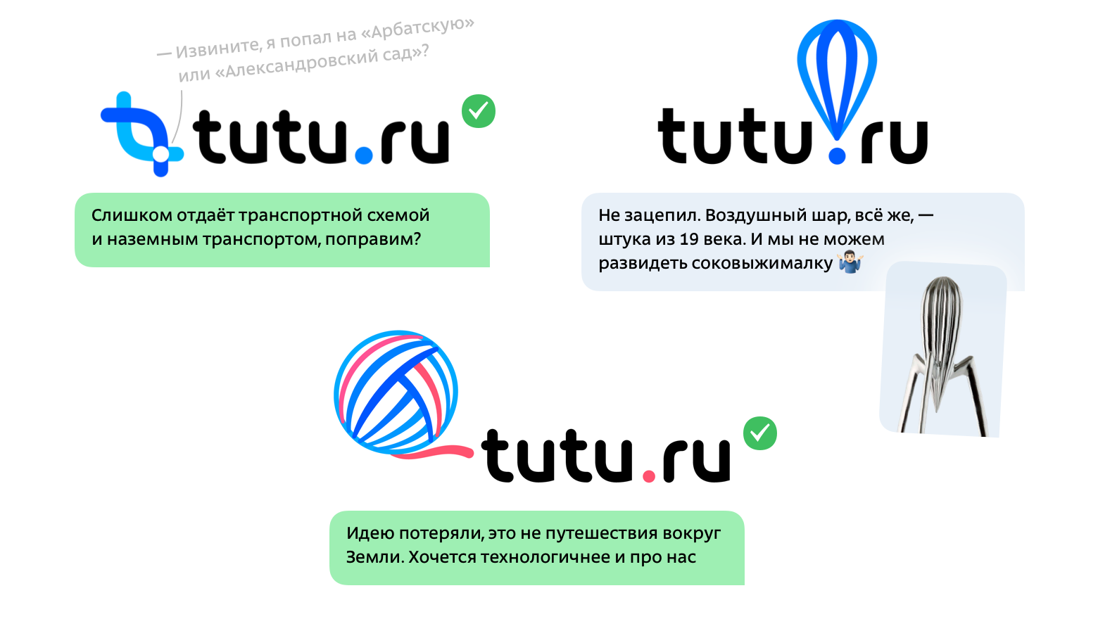
Another approach, and we were convinced that the idea with the globe and the “route” of the traveler was the strongest. We decided to develop it.
The first thing I wanted to get rid of the similarity with a ball of thread. Ariadne's clue, which helps to solve a difficult task, is, of course, a beautiful image, but we were looking for another one. Need more tech sign. Another attempt: The
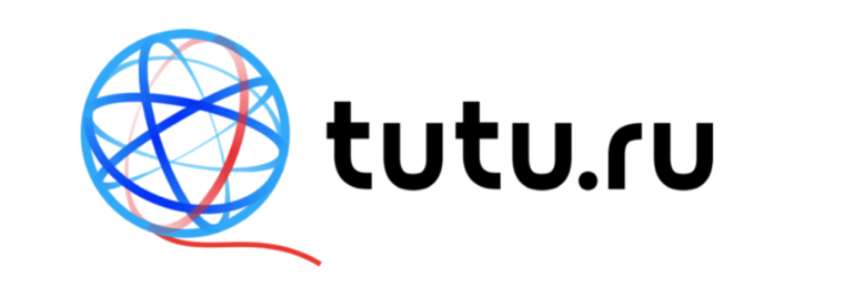
movement in the right direction, however, now resembles a planetary model of the atom and something telekomovskoe. We tried to make a more lively and “warm” sign, but technologically advanced:
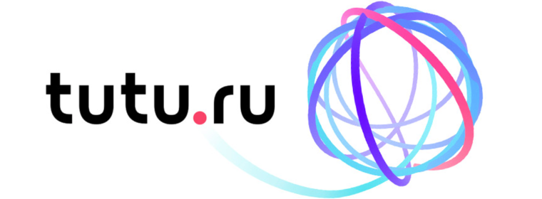
It is no longer an atom, but it looks complicated and confusing. It's cool that the graphic and font parts of the logo make friends with each other, and the starting point of any journey is now on Tutu.ru - literally. Development of the idea:
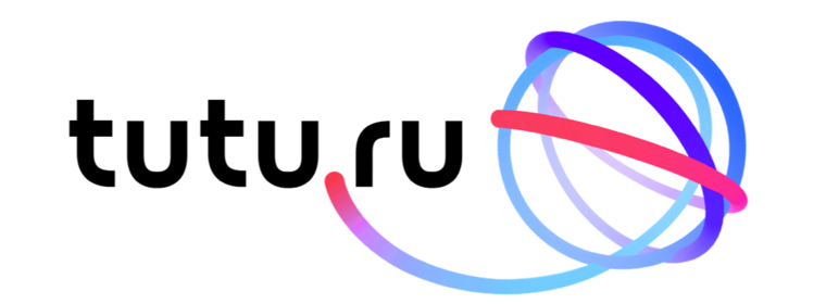
Here is the plastic we were looking for! We asked our colleagues to modify the color scheme, because this sign turned out to be rather purple, and we are blue-red:
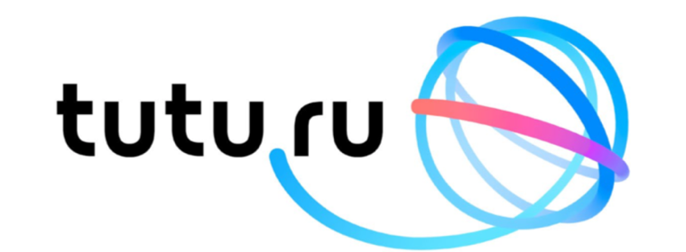
We work on the details. The inscription has become denser and stronger, the blue-red train optimistically soars upward, rather than aiming at our domain:

Final Fyntuning - the density of lines, the details in lettering, the colors, the angle of take-off of the plume change. It was what you need! The final version:
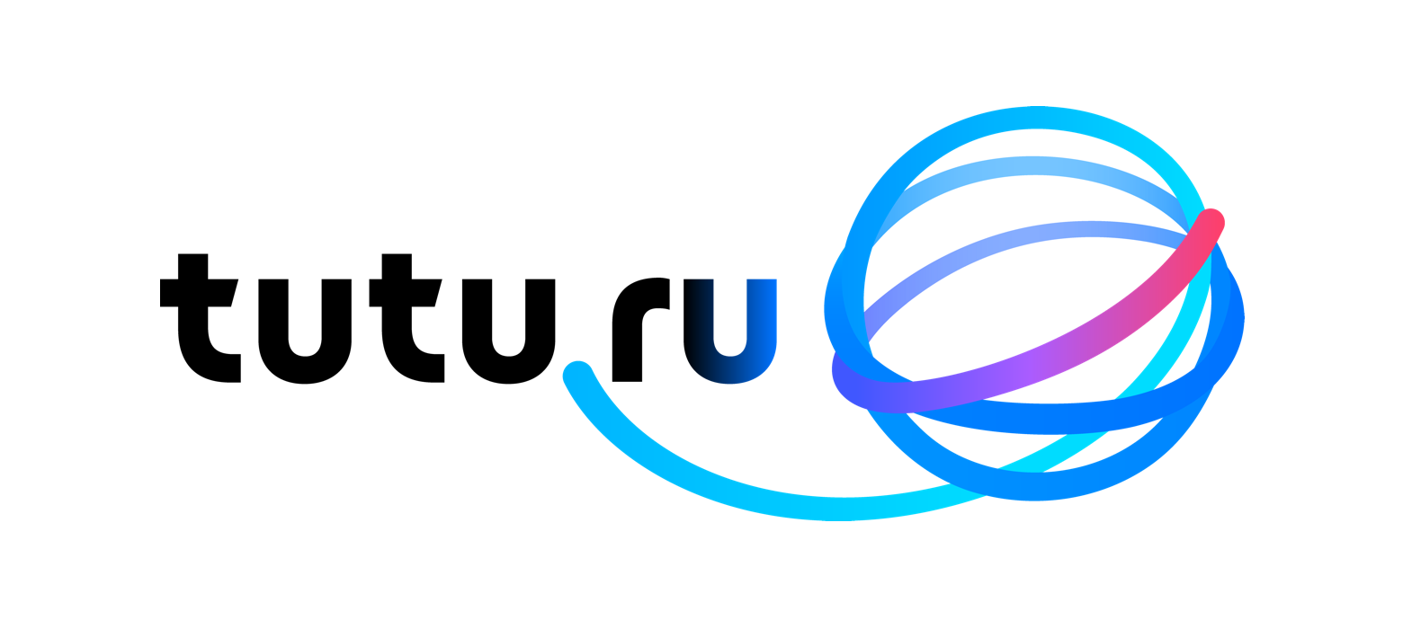
So we found our new, lively and friendly style, and Studio managed to lay in it the image of the journey, the starting point of which is Tutu.ru.
Having just decided on the appearance of the logo and the main style-forming moves, we in Tutu.ru tried on the new identity for the interfaces of the site and mobile applications, for mailing lists, advertising graphics and even for our own office. This helped to ensure that the solutions proposed by Studio will behave well in our tasks.
In addition to the basic version of the logo, they made several special ones: for large and small size, for elongated and more “square” formats, for a dark background, icons, monochrome drawing (faxes, fortunately, became extinct, but there is, for example, engraving or stamping).
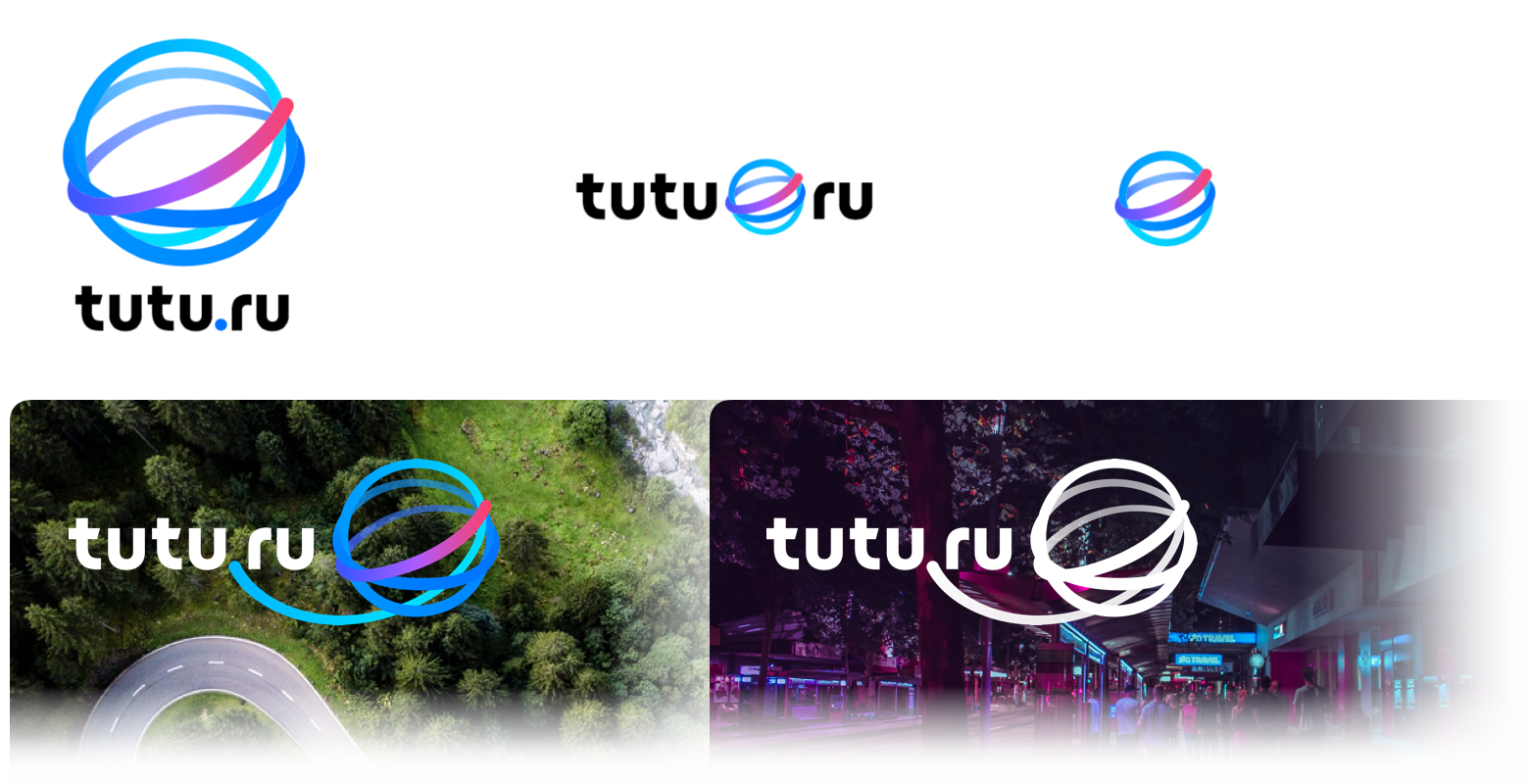
The result of the work was a guide on the use of the new identity and a link to the archive in the cloud with all the necessary sources. In this article, I showed the evolution of the logo. In fact, of course, this is only part of the project: in parallel, we worked with the color gamut, proprietary graphic moves, product icons and typography. But we left the work on product interfaces behind us, this is one of our core competencies.
A visual identity is not just a logo, a palette or fonts, or even rules for using them. Identity is a part of the language in which Tutu.ru communicates with customers and partners. What we will be for people depends on how much benefit we can bring. Therefore, we will support the fashionable logo with deeds and further improvement of our products.
Now we have shown the first part of the changes.
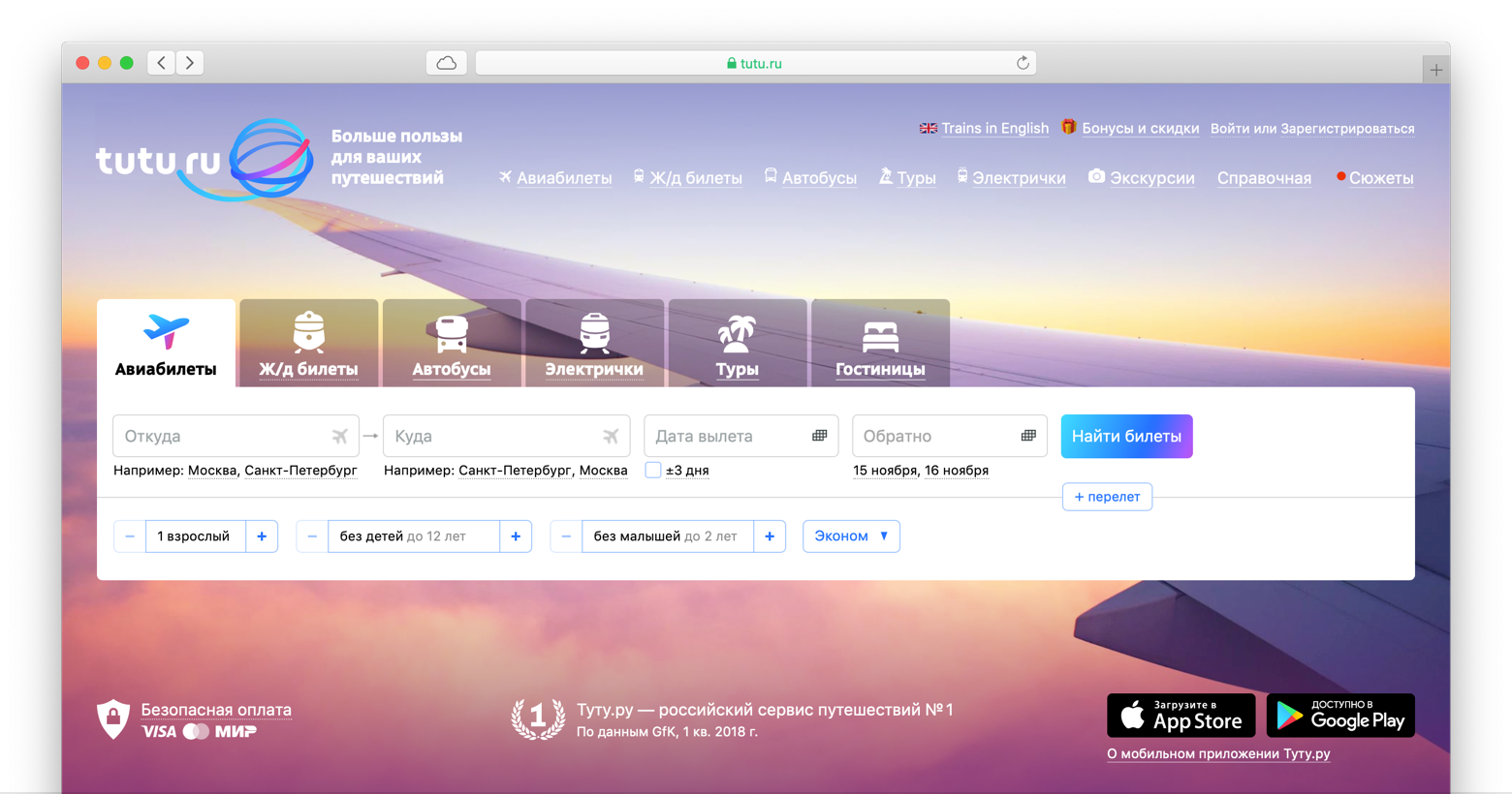
At this stage, we changed only the design of the key screens, and now we are engaged in the redesign of our interfaces to make a single and friendly product. A new identity is a good reason to think about the experience of using our products and make a qualitative leap.
This is a big task: to make radical changes to the service, which is used by tens of millions of people a month and who does not cease to expand - we will release new versions of products twice a week.
To make fewer mistakes, we test big ideas by making functional prototypes. We discuss them with colleagues from non-grocery teams, and if it seems that the hypothesis is working, conduct in-depth interviews with customers. It is more difficult and longer than just drawing a layout, but the results of a good qualitative research help not to spend a lot of money on developing unnecessary features. Our solutions are tested last in A / B testing at production.
In the coming year, Tutu.ru products will change in appearance more than in the previous five years ( we are pleased with cool designerscome to get acquainted!). Now the introduction of new products is in full swing: we are collecting bumps, dodging the rake, watching important metrics. In a few months we will exhale, and I will tell you about what it has taught us and how our experience can be useful to others.
If you see that something in our products does not work or does not look very good, please write - we will fix it as soon as possible. And if you find a bug, for a story about which you need a few screenshots and a lot of text, send it to me by email, ivanov@tutu.ru . Well, you can already look at Tutu.ru on the new identity .

Now Tutu.ru is growing from a set of popular services into a single product for travel. Design is one of the tools that helps us in this.
In this article, I will tell you how we were looking for a new identity and choosing a partner, why we chose Artemy Lebedev Studio, and how the work with their team was arranged, and how we are now changing the design of services with a 15-year history.

How did we come up with the idea of redesign
Tutu.ru in 2006 is a train schedule, an online train ticket and flight schedule, 20,000 website visitors per day and a team of seven people. Tutu.ru in 2018 is the Russian tourist service number 1 (GfK data for Q1 2018), about a million visitors a day, five mobile apps for iOS and Android and a team of more than 350 people.
For several years, our focus was customer convenience and new useful features; we paid less attention to how our products communicate with people or how we talk about changes. We reasoned like this: “Is it worth spending the team’s resources for decorative changes, and not for new cool features? What benefits will it bring to customers? And how do we measure it? ”And it’s really difficult to measure. But working on a brand is important. There are no services without a brand. If you do not engage in a brand, then in the minds of your audience its image will take shape by itself, only, alas, without your participation.
Designers in Tutu.ru have been heated for updating the identity for a long time, but we ourselves understood that “making a redesign” is an incorrect formulation of the problem. To get a cool design, you need to understand what we want to be and why. In a big complex business, this is not easy. Last year, a working group gathered in Tutu.ru, which found answers to these questions, and this was already enough to correctly set the task of a new identity.
What was in the brief?
We were looking for a more lively, friendly and emotional style that will reflect the new character of Tutu.ru. It was time for us to leave the sign with intersecting roads, which many people associate only with trains and electric trains. The new logo should be about traveling of any kind and at the same time be the logo of the technology company, and not the kind of lamp emblem of the travelers club. Plus, we wanted to maintain continuity with the old style of the company: millions of customers know us like that, and this is valuable.
We decided to do a new identity with our partners, and in order to correctly set the task for them, we wrote a brief. In the brief, we collected a description of the brand, its platform (positioning, style, mission, vision and values), our understanding of the task, expectations from the workflow and even showed with examples what scale of change we are ready for and what seems to us too small or on the contrary, radical.
The description of the task turned out to be long (on 10 sheets), but it helped synchronize the expectations inside Tutu.ru and ask ourselves the right questions. It seems to us it turned out to be even more useful than the partners.

The choice of partners
To find a team with which we will succeed, we met with several strong studios and agencies. What did we pay attention to?
On the cool work for complex digital products in the portfolio. From the inside of the Internet, it sometimes seems that everyone already “can be in digital”. But there are a lot of great teams that do a better job with packaging design, media or advertising. The main point of contact of people with Tutu.ru is our interfaces and letters, it is much more important for us to “reflash” the identity in them, rather than to get instead excellent advertising layouts for magazine turns or merch.
On the opportunity to work with the creative team directly.In some studios it is not customary for designers to communicate with customers themselves. There are managers who pass on questions and answers, go to meetings. We counted on a deeper dive.
On the number of designers. By and large, no matter how many people work on the project, the result is important. But it happens that designers burn out before they give out the best idea, so it is not bad when there is an opportunity to “change hands” without changing the partner.
On the cost of work. In Tutu.ru carefully consider the costs. Obviously, the work of a good team cannot be cheap, but even here we were left with quite thrifty guys and were not ready to overpay.
On personal contact. We could have abandoned a strong team if we had not managed to find a common language.
Why we chose Lebedev Studio
After a dozen negotiations with different teams, we chose Lebedev Studio. First, they proved to their portfolio that they could cope with such a project. Secondly, from the first minutes of their acquaintance, they were quick and open in communication, asking the most accurate questions. And let it sound a little pompous, but they had "the right fire in their eyes." We felt that the project is in safe hands.
Another sensitive issue for us is the project budget. Before we began the search for the best team, we almost excluded the Studio from the list of potential partners: we all remember that there is “Long, dear ...”.
But I thought: “You don’t take money for acquaintance!” - breathed deeply, exhaled and wrote to the studio mail. The quick answer - talking on the phone - meeting in a studio office inside a giant printing complex on ul. 1905 ... it would be strange to stop interesting communication, and later it turned out that the cost of the Studio’s work was on par with the proposals of other strong teams that we were considering. I will not say the amount, but the myth has collapsed.
Getting Started with Studio
Colleagues questioned us about our business and goals, told about themselves, showed projects of similar size in their portfolio, conducted around the office (now I know how I want to see Tutu.ru’s future office!). I will not describe the commercial offer of the Studio, or as we designed all the papers, I’ll proceed to work on the design.
The first layouts that Studio showed us were seven search sketches. What it is? - Outline future identity without much detail. What are they needed for? - To quickly understand which images are closer to us, and which way you shouldn’t even think.

Of the proposed options, we immediately eliminated four. We liked the other three:

This may seem counterintuitive and frivolous - cool guys come and show seven hastily drawn pictures. Waiting is clearly not this. But even without knowing the studio kitchen and laughing at the funny associations (“This is Twitter, which founded the airline?”), You understand that this start of work saves the carriage of time. With the pictures on the hands easier and faster to understand each other.
How is the workflow
It's time to talk about how the interaction with the studio team of our project was arranged.
From the Studio side, Nastya Sharkova, art director, Yegor Zhgun, art director, and Ivan Vaschenko, designer, participated most actively in the work. I once heard that Tyom approves sketches before the presentation to clients, but I cannot confirm or deny this: his participation in our project remained behind the scenes of the Studio.
The project was conducted in the internal system of project management - they marked the dates of future meetings, fixed comments and agreements after discussions. New layouts were shown to us at personal meetings, they were held in the office of Tutu.ru, usually every one or two weeks, on Thursday or Friday. Between meetings, correspondence or short phoning for further details.
Evolution of concepts
So, we liked three ideas. The first version played up the metaphor of paths and intersections. In addition, it is most similar to our old logo, and we did not want to lose continuity. However, we wanted more noticeable changes, we lacked emotions and dynamics. Colleagues developed the idea as follows:

The second concept, which we chose at the first meeting, with a geotag, a balloon and an exclamation point. It's all about travel: an exclamation mark about brightness and emotions, a ball about romance, geotagging is understandable and true. We asked colleagues to reduce the association with geotagging: the symbol is too erased. Here's what happened:

The third concept is still the most vibrant and vibrant. Preserving this liveliness, character, dynamics and wealth on metaphors, we asked the designers to remove the "intricacies":

Now it was necessary either to choose the winning idea, or to go to another iteration of the improvements. We did something average - we dropped one of the ideas, and the other two asked to develop one more:

Another approach, and we were convinced that the idea with the globe and the “route” of the traveler was the strongest. We decided to develop it.
The development of the concept of the globe
The first thing I wanted to get rid of the similarity with a ball of thread. Ariadne's clue, which helps to solve a difficult task, is, of course, a beautiful image, but we were looking for another one. Need more tech sign. Another attempt: The

movement in the right direction, however, now resembles a planetary model of the atom and something telekomovskoe. We tried to make a more lively and “warm” sign, but technologically advanced:

It is no longer an atom, but it looks complicated and confusing. It's cool that the graphic and font parts of the logo make friends with each other, and the starting point of any journey is now on Tutu.ru - literally. Development of the idea:

Here is the plastic we were looking for! We asked our colleagues to modify the color scheme, because this sign turned out to be rather purple, and we are blue-red:

We work on the details. The inscription has become denser and stronger, the blue-red train optimistically soars upward, rather than aiming at our domain:

Final Fyntuning - the density of lines, the details in lettering, the colors, the angle of take-off of the plume change. It was what you need! The final version:

So we found our new, lively and friendly style, and Studio managed to lay in it the image of the journey, the starting point of which is Tutu.ru.
Having just decided on the appearance of the logo and the main style-forming moves, we in Tutu.ru tried on the new identity for the interfaces of the site and mobile applications, for mailing lists, advertising graphics and even for our own office. This helped to ensure that the solutions proposed by Studio will behave well in our tasks.
In addition to the basic version of the logo, they made several special ones: for large and small size, for elongated and more “square” formats, for a dark background, icons, monochrome drawing (faxes, fortunately, became extinct, but there is, for example, engraving or stamping).

The result of the work was a guide on the use of the new identity and a link to the archive in the cloud with all the necessary sources. In this article, I showed the evolution of the logo. In fact, of course, this is only part of the project: in parallel, we worked with the color gamut, proprietary graphic moves, product icons and typography. But we left the work on product interfaces behind us, this is one of our core competencies.
What's next
A visual identity is not just a logo, a palette or fonts, or even rules for using them. Identity is a part of the language in which Tutu.ru communicates with customers and partners. What we will be for people depends on how much benefit we can bring. Therefore, we will support the fashionable logo with deeds and further improvement of our products.
Now we have shown the first part of the changes.

At this stage, we changed only the design of the key screens, and now we are engaged in the redesign of our interfaces to make a single and friendly product. A new identity is a good reason to think about the experience of using our products and make a qualitative leap.
This is a big task: to make radical changes to the service, which is used by tens of millions of people a month and who does not cease to expand - we will release new versions of products twice a week.
To make fewer mistakes, we test big ideas by making functional prototypes. We discuss them with colleagues from non-grocery teams, and if it seems that the hypothesis is working, conduct in-depth interviews with customers. It is more difficult and longer than just drawing a layout, but the results of a good qualitative research help not to spend a lot of money on developing unnecessary features. Our solutions are tested last in A / B testing at production.
In the coming year, Tutu.ru products will change in appearance more than in the previous five years ( we are pleased with cool designerscome to get acquainted!). Now the introduction of new products is in full swing: we are collecting bumps, dodging the rake, watching important metrics. In a few months we will exhale, and I will tell you about what it has taught us and how our experience can be useful to others.
If you see that something in our products does not work or does not look very good, please write - we will fix it as soon as possible. And if you find a bug, for a story about which you need a few screenshots and a lot of text, send it to me by email, ivanov@tutu.ru . Well, you can already look at Tutu.ru on the new identity .

