Material Design: Shape - tips for improving the GUI application of Android (and not only) by changing the shape of elements
- Transfer
From the translator
Hello. I’m doing this translation because I recently started to work with Shape in Android myself, decided to fumble around material.io , and found this collection of usage tips there. It seemed to me interesting, useful, and informative, so I decided to share it with the Russian segment of mobile application developers.
It seems to me that this topic is quite important, because the use of different forms for interface elements makes the application more interesting, and maybe even more serious.
When the user sees some non-standard implementation (within reason of course) of ordinary interface elements, it catches the eye. In addition, subconsciously, the user of such an application will understand that the developer did not just throw up the components in the editor, but came up with the creativity, came up with something of his own.
I hope that you will be able to benefit from reading, and it is possible to improve the quality of your applications.
Table of contents
Introduction
Hierarchy of Forms
Form as a means of expression
Forms in motion
Introduction
GUI elements in the Material Design style can have different shapes. Custom forms of elements attract the attention of users, make your product more expressive, and improve the impression of use.
Forms of elements
By default, in Material Design all elements are rectangular with rounded corners (4dp). Their shape can be changed by adjusting the following parameters:
- Corner roundness
- Degree of sharpness of the corners
Thus, you can either slightly change the shape of the element, or make it completely different.
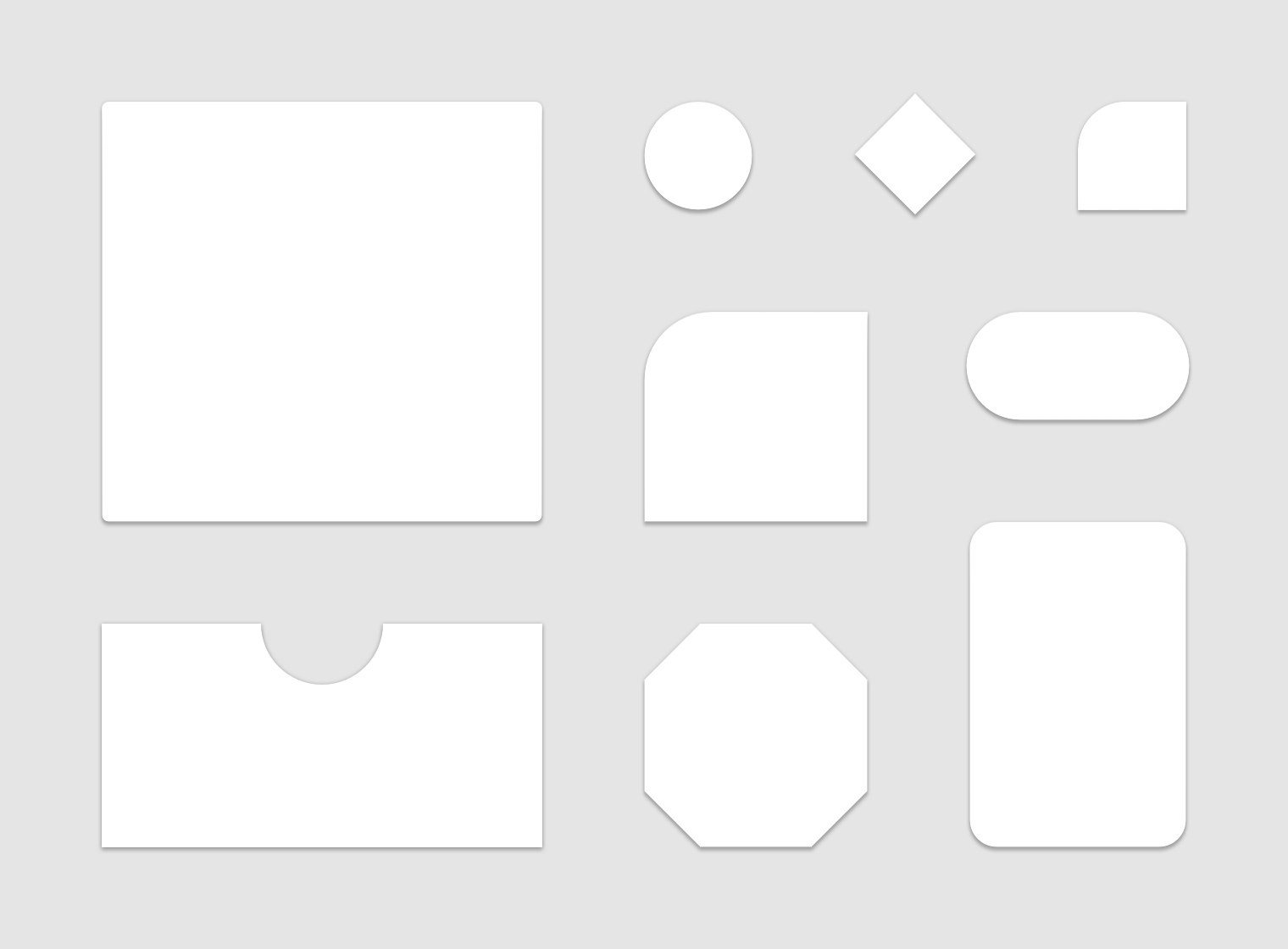
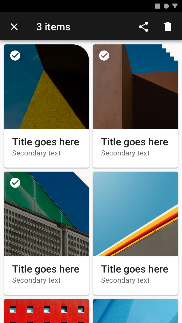
Customization of the standard form of the Material Design elements.
Application
Focusing attention
Since the uniqueness of forms highlights them on the screen, they can focus the user's attention on its different parts.
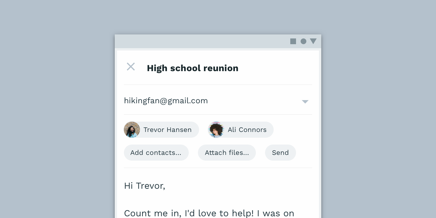
This combination of a round button and a rounded bottom panel stands out against the background of ordinary rectangular elements located anywhere on the screen.
Identification of elements
Forms give users the ability to identify interface elements by meaning, to guess their purpose.
Guess about the purpose of these inserts can be in their form.
Status display
You can display a change in the state of elements using forms. When using a form to display a state change, use the same form every time you want to display a state change.
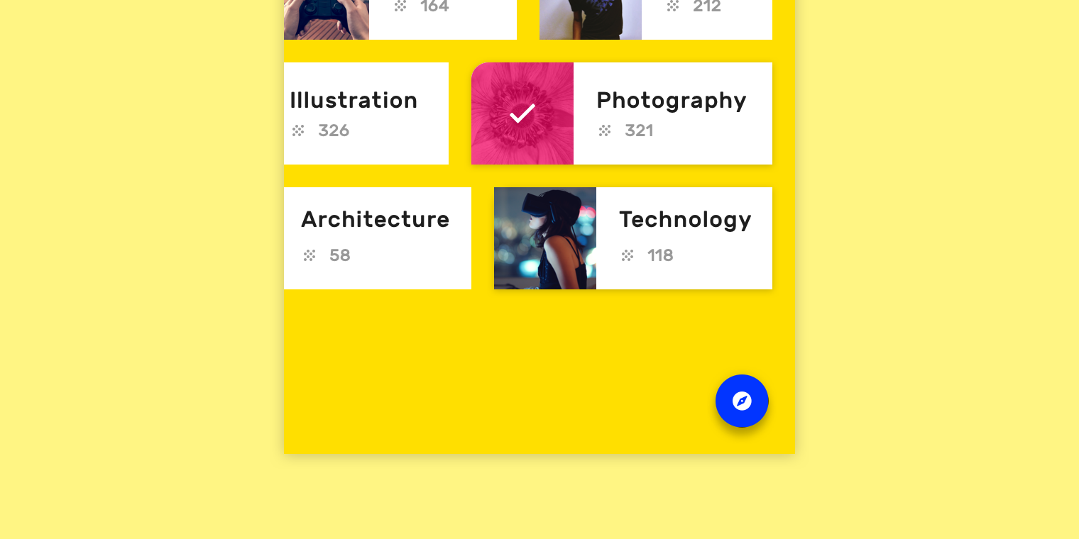
The element partially changes its shape to display the selection.
Branding
To give your brand a recognizable visual style, use forms in combination with other customization methods (for example, color). Small context changes of forms throughout the application will improve the impression of use.

Proper use of form elements in the application helps to improve the impression of its use.
Form Display
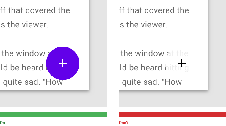
Modified shapes are especially visible when their contour contrasts with the background. By default, Material Design uses shadow highlighting to emphasize the shape outline. Other ways to highlight shapes (such as color or transparency) can be used in combination with a shadow.
 |  |
| How to do it The color of the button fill contrasts with the background, making the button shape noticeable. | How to do it is not necessary The translucent background of the button and its color worsens the visibility of its shape. |
Relationship between elements
Forms can be used to reflect dependencies between interface components. Text or icons can help strengthen the meaning, but only if the form of the element clearly indicates which way to think.
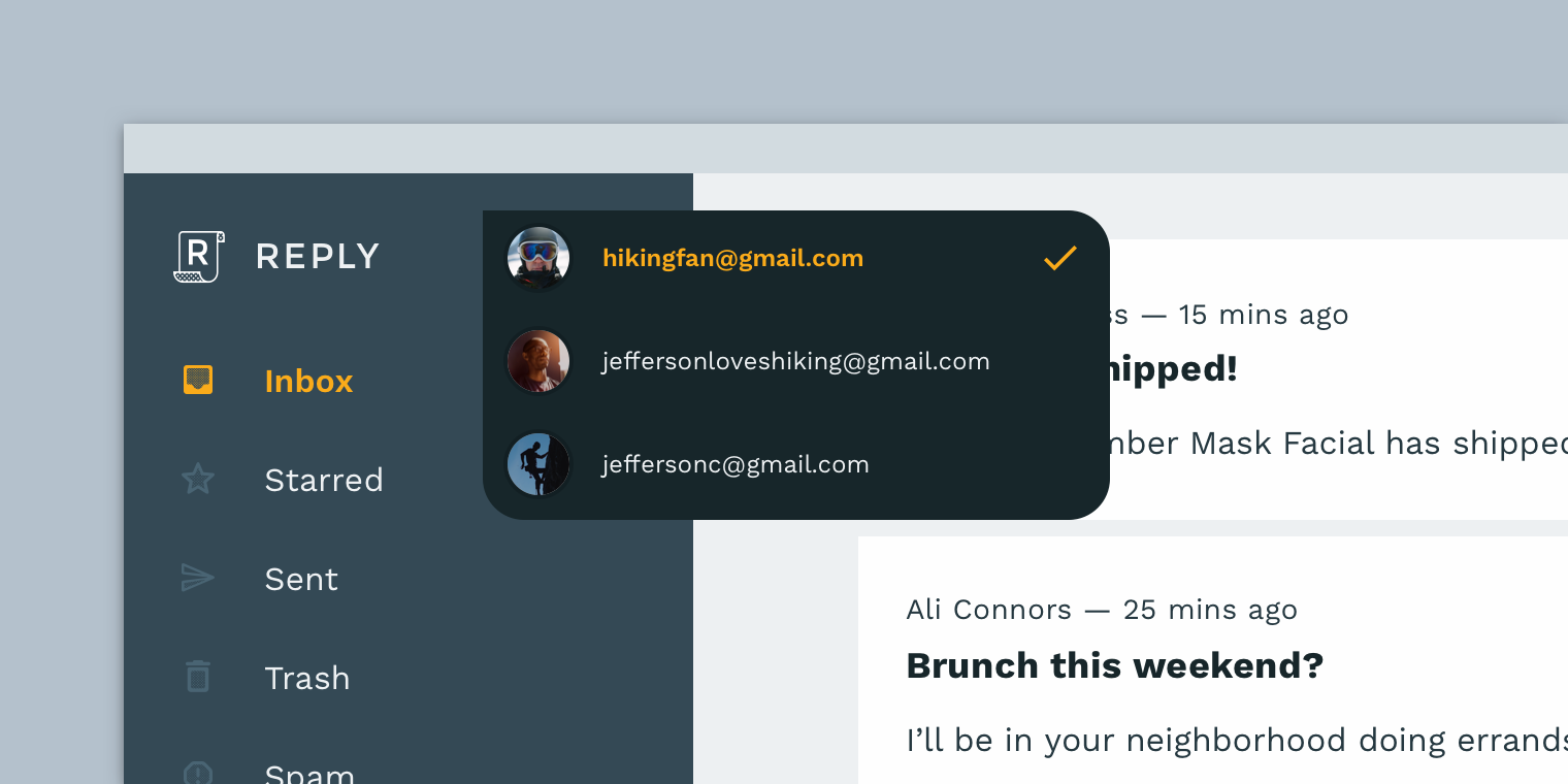
How to do The
drop-down menu has a pointed angle, similar to an arrow pointing to a navigation
bar, showing the connection between these two components.

How to do it is not necessary
Give up using the form if you feel that it creates an ambiguous idea. The cancel button implies a return to the previous stage, while its shape, similar to the “Forward” arrow, creates the false impression that the button takes the user to the next stage.
The need to change the form
The shapes of the components influence their perception by the user. The degree of need to change the shape depends on the following factors:
- How much a component depends on another component
- Is the component limited to ergonomic requirements?
How to do it is not necessary.
Do not use forms that make components completely unrecognizable.
How to do it is not necessary
Do not use forms which complicate interaction with the user. This button is too small area of depression.
How to do it is not necessary.
Do not use forms that make components completely unrecognizable. These buttons have the same shape with the inserts above. Because of this, it becomes difficult to distinguish one component from another.
Hierarchy of Forms
Forms can draw attention to important interface elements and display the relationships between components.
Hierarchy design
Unique shapes
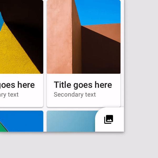
Components with unique forms stand out from the rest of the elements, content around, and in the interface as a whole. The form emphasizes their importance and attracts the user's attention.
How to do it
Make the shapes of the components contrast with the environment. The round shape of this button makes it stand out against the background of rectangular elements, and the black color contrasts with the white background.
How to do it is not necessary
The element is more difficult to distinguish from others, if it has the same shape. This button is difficult to notice due to the fact that it is among the elements with the same shape.
Relationship of elements
Joining elements with forms
Forms of elements can help the user to understand how they are interconnected.
Identical elements
The identical form of the elements indicates their interconnectedness and general meaning.
Related Items
If one of the elements complements the other, but is not an exact copy of it, this relationship can be expressed in form. For example, the acute angle of a shape may symbolize an arrow pointing to a related element.
Unrelated items
With the help of the figures, it is also possible to emphasize that the elements are not connected with each other, and work separately.
 |  |
| How to do The rounded corners of the white element emphasize that it is not associated with purple. | How to do Here the shape of the button in the lower right corner indicates that it is not associated with the element behind. |
How to do it.
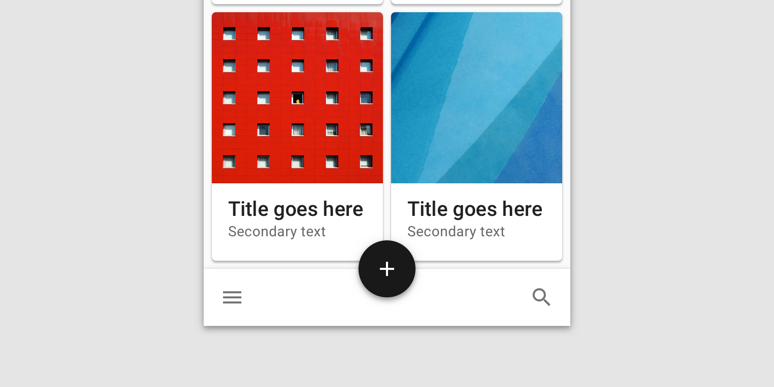
The form and size of the cards signal that these elements belong to the same group.
How to do it is not necessary
Do not use the pointing form if the element is not associated with other elements. Here the dialog box has a form pointing to the card behind, giving the impression that they are connected.
Form as a means of expression
Forms can display the status of an item, and make your brand recognizable.
Status display
Forms can display different states of elements, such as selection, the result of data processing, and much more.
Elements Interactivity
To use the forms to display the interactivity of elements, use a change of form at the moment of user interaction with the element. For example, change the shape of an element to display its selection after the user touches it, or mark the selection element with an icon.
Lack of interactivity
If the element is not interactive, you should choose a form for it so that the user does not think that you can interact with this element.

How to do
Changing the form should be clearly related to the specific actions of the user, or other obvious reason. Here the shape of the element changes after the swipe to the right, and the element has a corresponding indicator in the corner.
 |  |
| How to do it is not worth it. If you want to display the state of an element, do not do it with too small forms of indicators. | How to do it is not necessary But you should not overdo it with the size. It uses too large form indicator. |

Accurately
In some cases, the form of an element can create ambiguity - is this form a state display, or is it just a developer trick? Here, the bent corners of the cards just create such ambiguity. It may not be clear to the user whether the folded corner is an indication that the card is highlighted, or added to favorites. You can resolve this ambiguity in one of the following ways:
- Assign a change in the angle of the card to a specific user action, selection or addition to favorites
- remove the imitation of the bending in general, but leave the corner rounding if you want to use it as a chip
 |  |
| How to do it Use one form to display one state. Rounded corners here represent the selection of cards. | Gently Here, different forms are used to display one state, which makes it difficult for the user to perceive. |
Brand recognition
Formation of brand style using forms
Use forms in combination with other customization options (color and font, for example) to create a visual style for your brand. Repetitive forms will help make your brand unique and recognizable. Your application can also use a set of forms with similar forms for different components. The style of the forms in the set should match the style of your brand.
Style creation
When you create your form style, avoid:
- Nemekov on interactivity
- ambiguous forms
- difficulty using
Mixing different styles makes it difficult to associate any form with your product or brand.
Abuse using
Too frequent use of the form, which was conceived as a feature of the brand, can reduce the degree of its perception as such.
How to do it
Reasonable use of forms contributes to the formation of the visual style of your product. This application uses a form based on its logo.

How to do
This application uses forms similar to the shape of the logo.
 |  |
| Accurate Too frequent use of one form negatively affects its perception. | How to do it is not necessary Do not use forms that are not included in the set of forms of your application. |
Forms in motion
Forms may change as a result of changing content or user actions.
Application
Forms change is an event that occurs in response to a change in content within a form, a state change, or a user action. For example, when you translate a device in a horizontal position, the interface elements may change their size, which will lead to a change in shape.
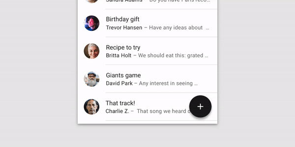
The form can also be changed to preserve the visual style of the application, or to display the addition of new objects to a set ( for example, a translator: for example, adding cards to a sheet ).
The main reasons for the dynamic change of form:
- Item does not fit on screen
- Disturbed ergonomics
- Change the meaning of an element
- Mismatch app style
- Binding / relationship to another element
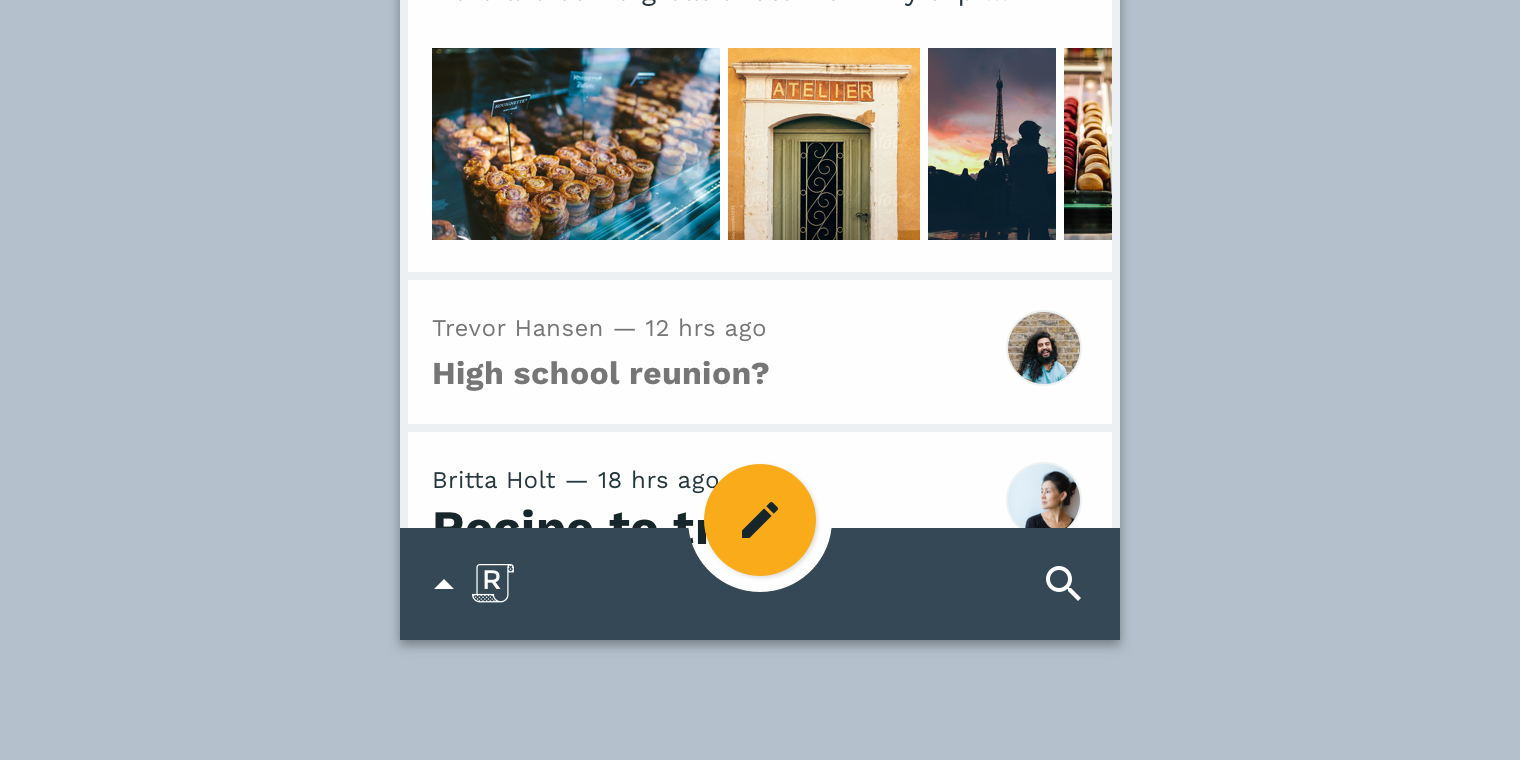
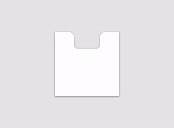
 |  |
| How to do it The form can change in response to other changes in the interface. On the bottom panel, a button cutout appears dynamically. | How to do The item may reflect state changes. In this application, the form dynamically expands as the selection of cards, while maintaining the rounding of the corner. |
Dynamic shape change
Change forms
As the size of the element changes, its shape also changes. It can keep the current position on the screen, but at the same time stretch or shrink.
Dimensions

How to do it.
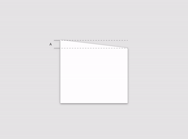
The form can keep the original dimensions and position when changing. Part “B” retains its original dimensions and position in relation to part “A”, while part “C” is stretched.
How to do it
The element can change its original dimensions to save the form. The height of part “A” changes in proportion to the width of the element in order to maintain the angle of inclination.
Stretching and cutting
Forms can stretch and shrink in response to component size changes. The transformation must maintain the proportions of the original shapes.

How to do this
As you stretch this element, its shape remains recognizable because its distinctive rounded corners retain their original dimensions.
How to do it is not necessary
Avoid deforming elements during the contraction or stretching. The corners of this figure do not retain their original dimensions, but stretch in proportion to the base.
Resizing
Keep the aspect ratio of the shape when resized to avoid distortion.
How to do
The corner radius changes its size in accordance with its initial ratio to the size of the form.
Transformation to another form
The form may change to a completely different.

Gently
Changing the shape to exactly the same, but with different parameters, looks smooth during the conversion process. Changing the form to something other than the original may look strange or ridiculous in the process of transformation.
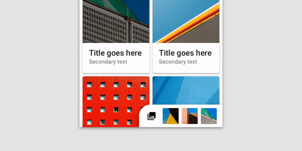
Content Display
Content Visibility
All content contained in the element must be visible to the user, without clipping, even when changing the form.
 |  |
| How to make the form elements must be resized in accordance with the content changes, but keeping the original recognition. | How to do it is not necessary Avoid separating the form from the content. The form of the panel of this application creates a false perception of the buttons separately from the panel itself. |
Default form
By default, components in the Material Design style are rectangular. They can transform into something else, and vice versa. For example, a round button can turn into a rectangular menu, and in the opposite direction.
Rectangular shapes provide maximum space for scrolling content and blend with the rest of the shapes on the screen. As a result, the element pays attention to its contents.
Using the standard form, you can add a hint (for example, an expand and collapse icon) to show how to change it.

How to do The
round button is transformed into a rectangular menu to give the content a maximum of space.
How not to do
Choose such forms of unfolding elements that are suitable for the content that they display. This round menu prevents content from being perceived because it retains the shape of the button.

How to do
Maximum space to display the list is achieved by transforming the rounded corner into a standard right angle.
Concentration of attention
Rectangular shapes merge with other rectangular shapes, allowing you to focus attention.

How to do
When the drop-down list is active, the shape of the upper layer removes the rounded corners, reducing the selection among other shapes, focusing the user's attention on the filter settings.
Translator's conclusion
Well, that's all. You probably noticed that some moments were repeated several times, and this is true. This I have removed some very obvious repetitions that are in the original, but I tried to follow the source text as much as possible.
Do you have any thoughts on how you can improve the experience of using the application? I would be glad to read what you think about it in the comments!
Only registered users can participate in the survey. Sign in , please.