What happened to google maps?
- Transfer
If you often use Google Maps, you probably noticed the changes that occurred after the redesign about three years ago. The most noticeable thing is that there are much less tags, the cards seem to be empty.
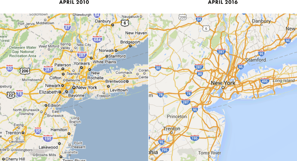
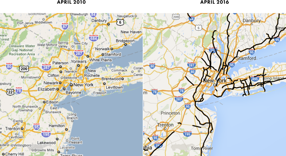
Here's what New York neighborhood looks like compared to the 2010 map.
How many cities disappeared from the map? Let's count.
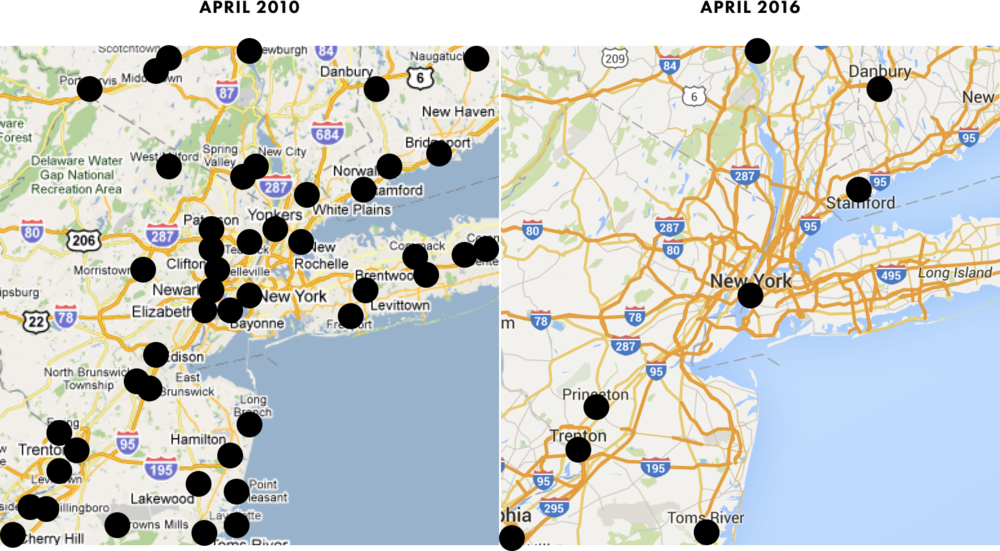
2010 - 46 cities
2016 - 8 cities, that is, a reduction of 83%
It is interesting to see which cities have disappeared from the map. For example, the second largest city in this area, Newark, has disappeared. Anyway, if you take the five largest cities (except New York), then on modern maps there is not one of them left , although in 2010 everyone was present: Newark, Yonkers, Paterson and Bridgeport.

The map is so deserted that the nearest city from New York is at a distance of as much as 60 kilometers!

Strange, isn't it?
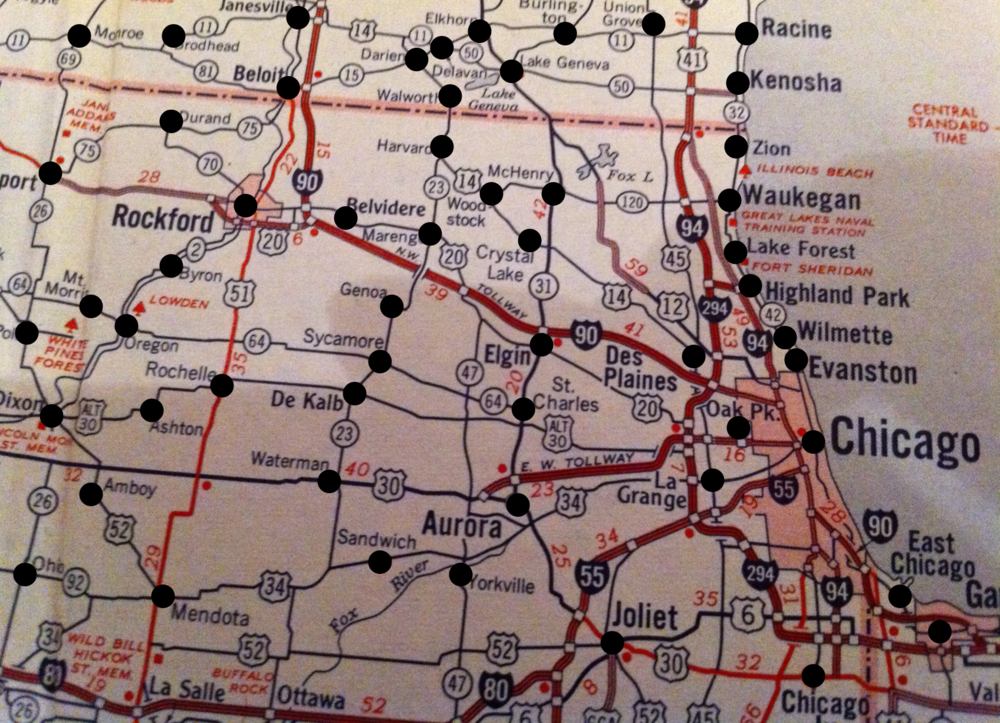
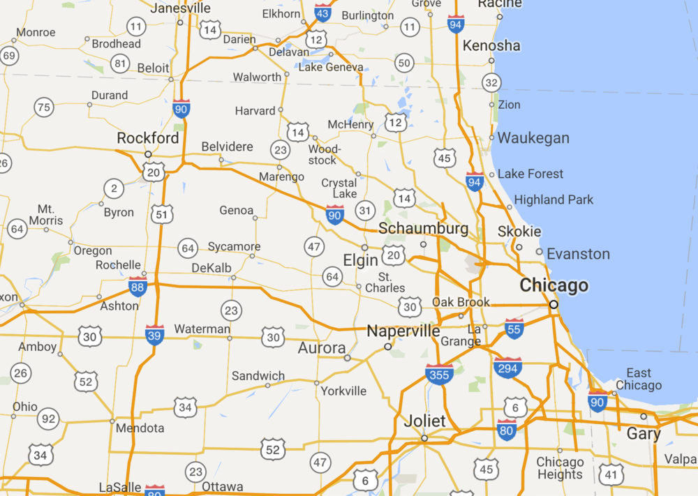
Let's see a couple of other areas, did the same thing happen there? Let's start with Chicago.

The same as in New York, the map of 2016 also has fewer tags.
How much less?
Let's calculate the difference between them.
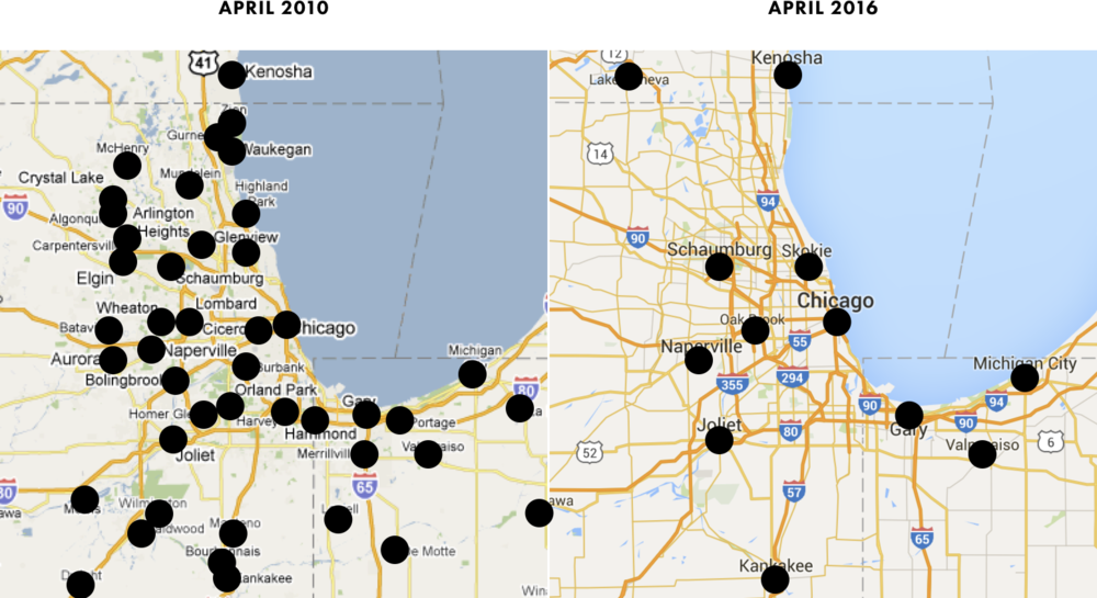
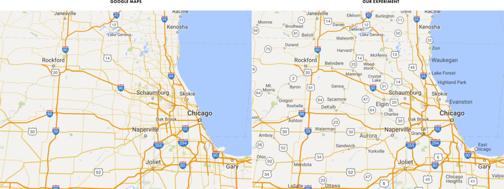
2010 - 44 cities
2016 - 12 cities, that is, a reduction of 73%
As in the previous case, the second largest city in the region (Aurora) disappeared from the map of 2016.
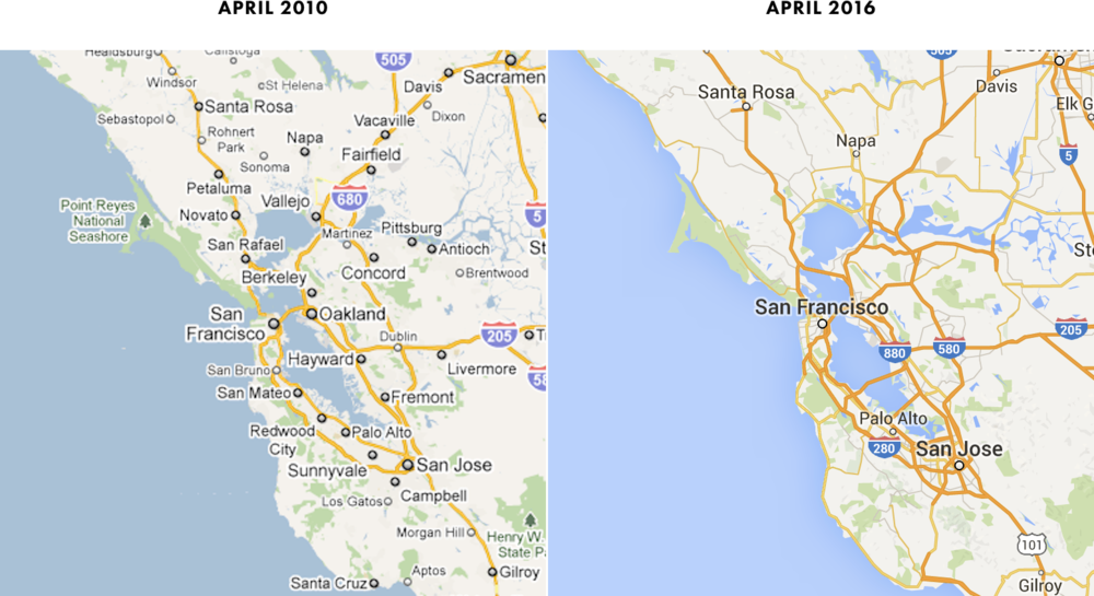
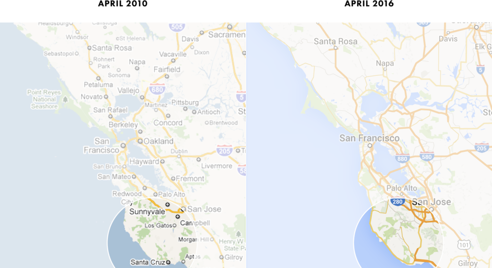
We’ll check one more region to see the trend. This time, the San Francisco Bay Area.

The same as in New York and Chicago.
Particularly surprising is the disappearance of Auckland and Berkeley. There is quite a lot of space on the map for them, if you place the name San Francisco to the left of the label, as on the maps of 2010. By the way, here we can make sure that on maps of 2016 the text is always positioned strictly above the center of the label. Compare with the maps of 2010, where the positioning of the text varied.
The last time we count the number of tags on each map.

2010 - 44 cities
2016 - 10 cities, that is, a reduction of 77%
It is clear that the number of cities on the maps has significantly decreased from 2010 to 2016.
But when reviewing the cards, did we notice anything else strange?
If you compare the cards, then another change is noteworthy. While the number of cities has decreased significantly, the number of roads has increased markedly .
Let's take a look at the maps of New York and the surrounding area.

This is the first pair of cards we have reviewed. It seems as if in 2016 there were more roads than in 2010? Indeed, it is.
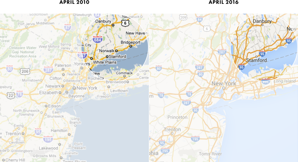
If you look at Connecticut, you can see much more roads.
While many new roads appeared, some old roads became higher in status. For example, on Long Island.

Across the map, approximately 40 roads have improved their status on new maps, compared to 2010. Below they are highlighted in black.
Interestingly, many of the "elevated" roads are actually short segments, they are usually not as important as the main highways highlighted on old 2010 maps, like I-95 or I-80.
So many roads have been added and so many have become fatter that the 2016 map sometimes seems more cluttered compared to the 2010 map.
For example, here is the area north of New York, near Yonkers.

In 2010, there were also many roads, but at least they could be distinguished and tracked separately. In 2016, there is a mess. The roads are so close that they merge with each other, it is difficult to track a specific path.
Let's take a look at Long Island again.

The Long Island main highway, I-495, stands out clearly on the 2010 map. But on the map of 2016, this is not so much obvious: there are so many roads that have elevated status, and I-495 among them. Even worse, it’s even hard to say which road the “I-495” mark corresponds to.
As Edward Tufte said, “ clutter is not an attribute of information, clutter is a design error ... fix the design, not clear all the details from the map .”
On Google Maps, it’s as if Tufty’s advice were applied vice versa between 2010 and 2016. All roads that turned bold orange on the maps of 2016 were present there in 2010, but their appearance changed, which made the maps more complicated. The coherence and clarity that were in 2010 is gone now.
And one moment. None of the “elevated in status” roads are marked.

If they are so important, why didn’t they get their badges indicating the number? After all, an unmarked road is half as useful.
So, on the maps there are fewer cities and more roads.
I wonder what caused these changes?
One thing is clear: today's cards look unbalanced. Too many roads, too few cities.
How to fix it?
Digging deeper ...
At the zoom level that we are analyzing, the entire map is mainly cities and roads. If you remove them, almost nothing remains.

On the contrary, look at the map, where there are only cities and roads.
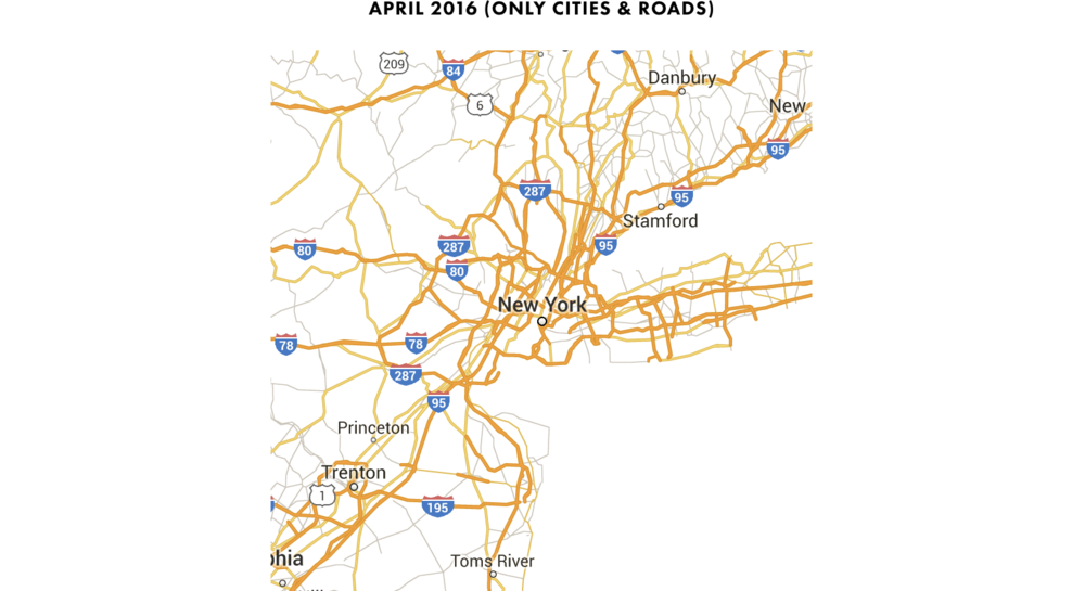
Amazing Although everything was deleted, except for cities and roads, but the map still looks like a map.
In many ways, the map at the top is a graph in which cities are the vertices or nodes of the graph, and roads are the connections between the vertices, arcs, or edges of the graph.
If you live in a city, you often come across similar graphs.

Or here is the more famous one.
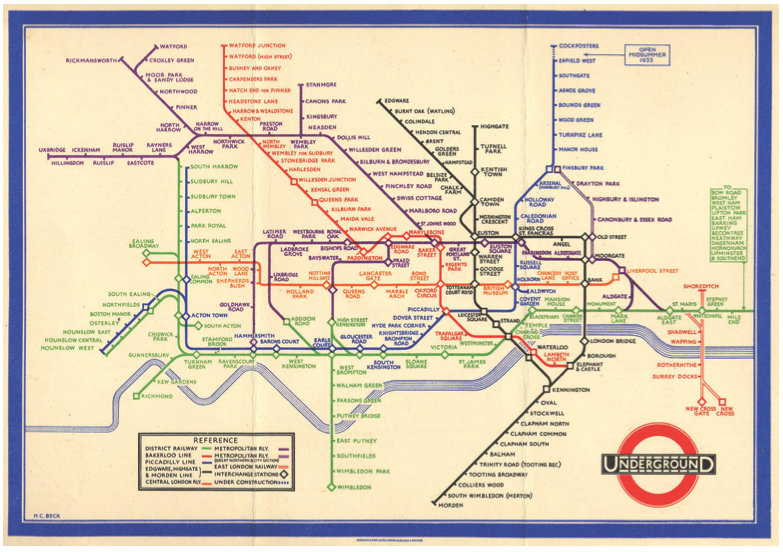
Counts have a feature. There are no vertices on them that are not connected with other vertices. And the graph has no edges without vertices.
This is exactly what happened with Google Maps between 2010 and 2016.
Take another look at the San Francisco Bay Area.
Have you noticed?
2010 - many cities and few roads, so many cities are not connected by roads.
2016 is a lot of roads, but few cities, so some roads don't connect anything.
As a public transport scheme, this is not a very useful map.
Will it be useful as a roadmap?
Let's take a closer look at some areas within this area. First, the Pittsburgh and Antiok area.
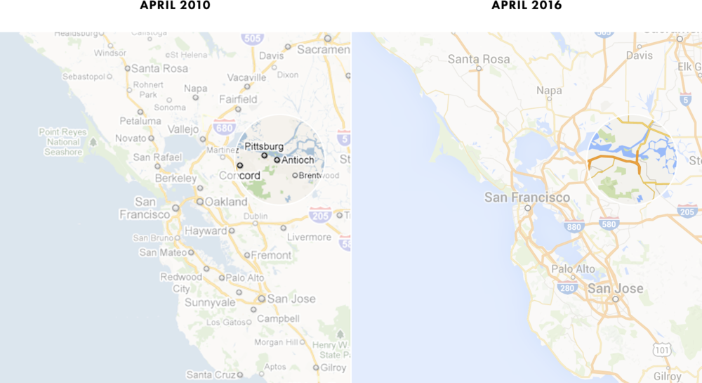
2010 - Pittsburgh and Antioch are on the map, but how do I get there? No roads lead to Pittsburgh and Antioch.
2016 - Roads are shown, but the cities themselves are not on the map. Why go on these roads? Where are they going?
On the maps of 2010, Pittsburgh and Antiochus are what cartographers call "hanging cities." They are not connected by roads with the entire road network.
The same is in the vicinity of Santa Cruz.
From both maps, it’s not clear how to get from San Francisco (or any other city) to Santa Cruz.
See the problem? Both cards, 2010 and 2016, suffer from a similar flaw: lack of balance.
There are many cities on the maps of 2010, but not expensive enough.

On the maps of 2016 there are many roads, but not enough cities.

Ideally, there should be a balance.

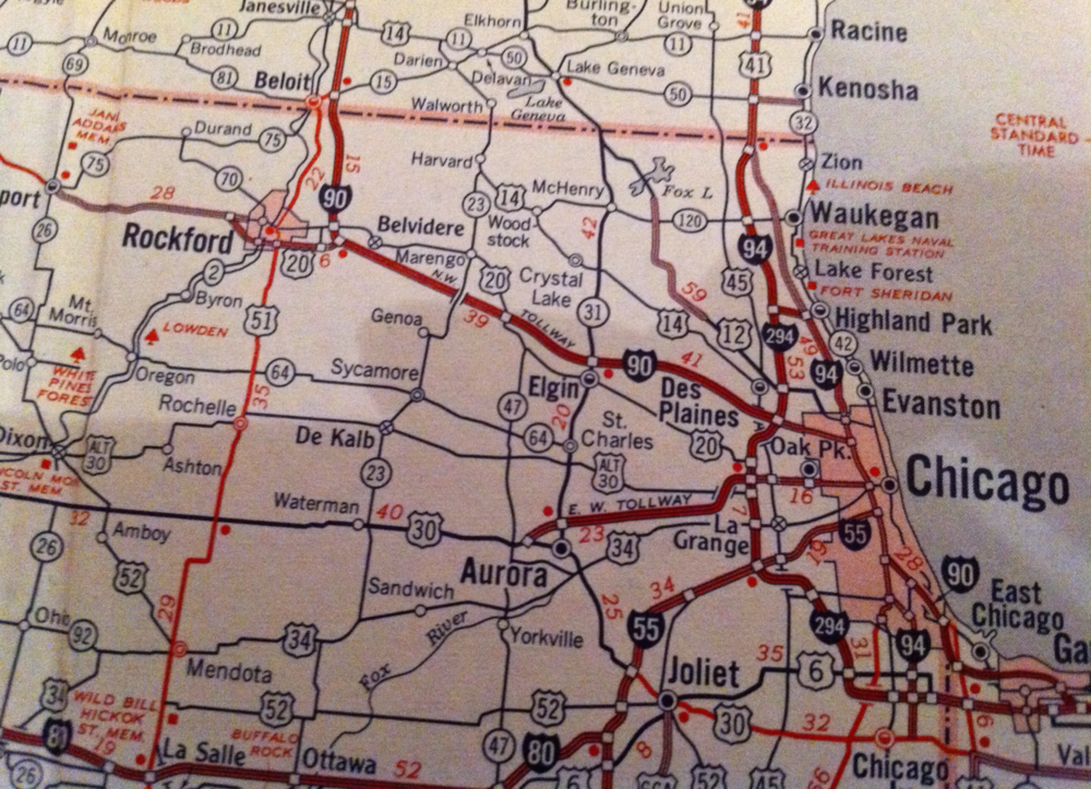
A few years ago I lived in Chicago and once found a great map in a gas station store. Someone made a cover for a photo album from this card.
I took some photos, because here is the best example of this concept among all that I saw (photos were taken on the iPhone 4 in the dark, so I apologize for the quality).
Now compare this map with Google Maps on about the same scale.
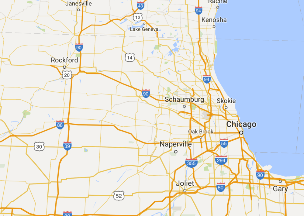
Although the map was created in the early 60s, it is much more balanced than the Google map.
Notice that there are no hanging cities on the old map . Each city is connected to the road network.
And not only are there no hanging cities, there are also no unnecessary roads.Almost every road is marked, and almost every road has a city . There is no mishmash of unmarked roads, as on Google Maps. Instead, each road has its own purpose.
Balance is present.
And such a card is incredibly effective.
I took a picture more than five years ago, but I always wondered what the modern version of the old map would look like. Will it be better than Google Maps today?
Let's try a little experiment.
To get started, take today's Google Maps.

Now add the cities from the old road map of the 60s.

After adding cities, the balance has clearly improved.
Now delete all the roads that are not on the map of the 60s. We will leave free freeways (freeways) because many of them have not yet been built - but we will get rid of everything else.

After the removal of these roads, it does not seem at all that we have lost something important. And on individual roads it is now much easier to follow the path through the eyes, especially north of Chicago.
True, there was one problem: but the remaining roads lack marks.
Take them from the map of the 60s and see what happens.
Now almost every road has a mark, and the map has become more useful.
Finally, compare the result of our upgrade with the current Google Maps.
If I got lost in this area, I know which card I would choose.
Based on the foregoing, I suspect that the reduction in the number of cities on Google Maps is due to the optimization of maps for mobile devices, and new roads have been added so that the maps do not look so deserted. In the end, if there are fewer marks on the map, then it’s faster to evaluate with a cursory glance.
It is enough to see how the number of sold mobile devices and personal computers has changed between April 2010 and April 2016, when these screenshots were taken.
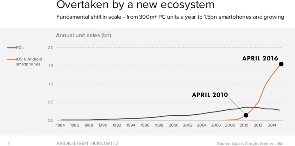
During this period, the number of Google Maps users from mobile devices exceeded the number of Google Maps users from personal computers.
So it looks like Google Maps has been optimized for mobile access, which explains some of the changes made.
Unfortunately, such "optimizations" only exacerbated a long-standing problem with card imbalances.
Google should return some cities to the map, then the maps will become better and more balanced.
Hope they do it.
Here's what New York neighborhood looks like compared to the 2010 map.
How many cities disappeared from the map? Let's count.
2010 - 46 cities
2016 - 8 cities, that is, a reduction of 83%
It is interesting to see which cities have disappeared from the map. For example, the second largest city in this area, Newark, has disappeared. Anyway, if you take the five largest cities (except New York), then on modern maps there is not one of them left , although in 2010 everyone was present: Newark, Yonkers, Paterson and Bridgeport.
The map is so deserted that the nearest city from New York is at a distance of as much as 60 kilometers!
Strange, isn't it?
Let's see a couple of other areas, did the same thing happen there? Let's start with Chicago.
The same as in New York, the map of 2016 also has fewer tags.
How much less?
Let's calculate the difference between them.
2010 - 44 cities
2016 - 12 cities, that is, a reduction of 73%
As in the previous case, the second largest city in the region (Aurora) disappeared from the map of 2016.
We’ll check one more region to see the trend. This time, the San Francisco Bay Area.
The same as in New York and Chicago.
Particularly surprising is the disappearance of Auckland and Berkeley. There is quite a lot of space on the map for them, if you place the name San Francisco to the left of the label, as on the maps of 2010. By the way, here we can make sure that on maps of 2016 the text is always positioned strictly above the center of the label. Compare with the maps of 2010, where the positioning of the text varied.
The last time we count the number of tags on each map.
2010 - 44 cities
2016 - 10 cities, that is, a reduction of 77%
It is clear that the number of cities on the maps has significantly decreased from 2010 to 2016.
But when reviewing the cards, did we notice anything else strange?
Fewer cities ... but more roads?
If you compare the cards, then another change is noteworthy. While the number of cities has decreased significantly, the number of roads has increased markedly .
Let's take a look at the maps of New York and the surrounding area.
This is the first pair of cards we have reviewed. It seems as if in 2016 there were more roads than in 2010? Indeed, it is.
If you look at Connecticut, you can see much more roads.
While many new roads appeared, some old roads became higher in status. For example, on Long Island.
Across the map, approximately 40 roads have improved their status on new maps, compared to 2010. Below they are highlighted in black.
Interestingly, many of the "elevated" roads are actually short segments, they are usually not as important as the main highways highlighted on old 2010 maps, like I-95 or I-80.
So many roads have been added and so many have become fatter that the 2016 map sometimes seems more cluttered compared to the 2010 map.
For example, here is the area north of New York, near Yonkers.
In 2010, there were also many roads, but at least they could be distinguished and tracked separately. In 2016, there is a mess. The roads are so close that they merge with each other, it is difficult to track a specific path.
Let's take a look at Long Island again.
The Long Island main highway, I-495, stands out clearly on the 2010 map. But on the map of 2016, this is not so much obvious: there are so many roads that have elevated status, and I-495 among them. Even worse, it’s even hard to say which road the “I-495” mark corresponds to.
As Edward Tufte said, “ clutter is not an attribute of information, clutter is a design error ... fix the design, not clear all the details from the map .”
On Google Maps, it’s as if Tufty’s advice were applied vice versa between 2010 and 2016. All roads that turned bold orange on the maps of 2016 were present there in 2010, but their appearance changed, which made the maps more complicated. The coherence and clarity that were in 2010 is gone now.
And one moment. None of the “elevated in status” roads are marked.
If they are so important, why didn’t they get their badges indicating the number? After all, an unmarked road is half as useful.
So, on the maps there are fewer cities and more roads.
I wonder what caused these changes?
One thing is clear: today's cards look unbalanced. Too many roads, too few cities.
How to fix it?
Digging deeper ...
Hanging cities and roads to nowhere
At the zoom level that we are analyzing, the entire map is mainly cities and roads. If you remove them, almost nothing remains.
On the contrary, look at the map, where there are only cities and roads.
Amazing Although everything was deleted, except for cities and roads, but the map still looks like a map.
In many ways, the map at the top is a graph in which cities are the vertices or nodes of the graph, and roads are the connections between the vertices, arcs, or edges of the graph.
If you live in a city, you often come across similar graphs.
Or here is the more famous one.
Counts have a feature. There are no vertices on them that are not connected with other vertices. And the graph has no edges without vertices.
This is exactly what happened with Google Maps between 2010 and 2016.
Take another look at the San Francisco Bay Area.
Have you noticed?
2010 - many cities and few roads, so many cities are not connected by roads.
2016 is a lot of roads, but few cities, so some roads don't connect anything.
As a public transport scheme, this is not a very useful map.
Will it be useful as a roadmap?
Let's take a closer look at some areas within this area. First, the Pittsburgh and Antiok area.
2010 - Pittsburgh and Antioch are on the map, but how do I get there? No roads lead to Pittsburgh and Antioch.
2016 - Roads are shown, but the cities themselves are not on the map. Why go on these roads? Where are they going?
On the maps of 2010, Pittsburgh and Antiochus are what cartographers call "hanging cities." They are not connected by roads with the entire road network.
The same is in the vicinity of Santa Cruz.
From both maps, it’s not clear how to get from San Francisco (or any other city) to Santa Cruz.
See the problem? Both cards, 2010 and 2016, suffer from a similar flaw: lack of balance.
There are many cities on the maps of 2010, but not expensive enough.
On the maps of 2016 there are many roads, but not enough cities.
Ideally, there should be a balance.
A few years ago I lived in Chicago and once found a great map in a gas station store. Someone made a cover for a photo album from this card.
I took some photos, because here is the best example of this concept among all that I saw (photos were taken on the iPhone 4 in the dark, so I apologize for the quality).
Now compare this map with Google Maps on about the same scale.
Although the map was created in the early 60s, it is much more balanced than the Google map.
Notice that there are no hanging cities on the old map . Each city is connected to the road network.
And not only are there no hanging cities, there are also no unnecessary roads.Almost every road is marked, and almost every road has a city . There is no mishmash of unmarked roads, as on Google Maps. Instead, each road has its own purpose.
Balance is present.
And such a card is incredibly effective.
I took a picture more than five years ago, but I always wondered what the modern version of the old map would look like. Will it be better than Google Maps today?
Let's try a little experiment.
To get started, take today's Google Maps.
Now add the cities from the old road map of the 60s.
After adding cities, the balance has clearly improved.
Now delete all the roads that are not on the map of the 60s. We will leave free freeways (freeways) because many of them have not yet been built - but we will get rid of everything else.
After the removal of these roads, it does not seem at all that we have lost something important. And on individual roads it is now much easier to follow the path through the eyes, especially north of Chicago.
True, there was one problem: but the remaining roads lack marks.
Take them from the map of the 60s and see what happens.
Now almost every road has a mark, and the map has become more useful.
Finally, compare the result of our upgrade with the current Google Maps.
If I got lost in this area, I know which card I would choose.
Based on the foregoing, I suspect that the reduction in the number of cities on Google Maps is due to the optimization of maps for mobile devices, and new roads have been added so that the maps do not look so deserted. In the end, if there are fewer marks on the map, then it’s faster to evaluate with a cursory glance.
It is enough to see how the number of sold mobile devices and personal computers has changed between April 2010 and April 2016, when these screenshots were taken.
During this period, the number of Google Maps users from mobile devices exceeded the number of Google Maps users from personal computers.
So it looks like Google Maps has been optimized for mobile access, which explains some of the changes made.
Unfortunately, such "optimizations" only exacerbated a long-standing problem with card imbalances.
Google should return some cities to the map, then the maps will become better and more balanced.
Hope they do it.