Websites continue to use “dark patterns”: interfaces designed to deceive
 For more than five years, Harry Brignull, an independent user interface designer from London, has been collecting a unique collection of DarkPatterns.org - the so-called dark patterns - real examples of how professionals use specific web design techniques to deceive and encourage Internet users to the "necessary" actions. For example, coercion to buy an unwanted product or click on an advertising link.
 The Dark Patterns collection is not at all a design error, quite the opposite. This is the result of the work of competent specialists who consciously apply their skills for unscrupulous purposes. They may call it an “effective design” or a “selling site”, but the essence is precisely in the manipulations with the aim of gaining profit.
Unfortunately, recently some sites have returned to these dirty tricks again. This can be seen in the example of the online newspaper Boston Globe , which, due to the crisis in the media market, resorted to fraudulent methods to increase the number of paid subscribers.
Suppose you open the article " An Open Letter to Bernie Sanders ."
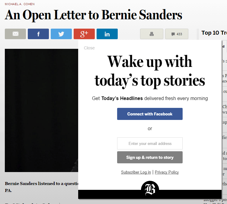
A pop-up window appears asking you to subscribe. A small trick is used here: the Close button is drawn with a very weak contrasting background, so it’s hard to notice. In addition, she moved to a non-standard upper left corner. Developers expect that some users will not notice the button and subscribe.
If you still clicked "Close", the manipulation continues.


A clearly visible fixed banner pops up at the bottom of the page, again with a proposal to issue a paid subscription. Again, this banner itself is annoying, but quite acceptable. However, the text says that the subscription costs “only 99 cents per week”, but this is not true, as we will see below.
Follow the link Subscribe Now .


Here it becomes clear that 99 cents a week is not a real price. Commercial companies often provide a discount when connecting a service or at the beginning of a subscription, this is normal. The problem is that the Boston Globe does not indicate the real price at all, which it will begin to take in four weeks. This is misleading to the user.
If you click Sign Up , we will see even more dark patterns.
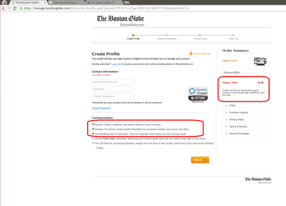

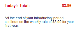
The page shows the amount that will be removed for the first month ($ 3.96). The actual price is indicated below in small print. It is selected in such a way ($ 3.99 per week) so that it does not differ much from the declared red price, so it will not immediately occur to the user that the price is increasing significantly: then the calculation is carried out not by months, but by weeks. In addition, by default, the user on the left is subscribed to three marketing newsletters.
At the next stages of subscription, the real value is no longer shown even once. To find out, you need to go to the FAQ section using the small link on the right side of the page.
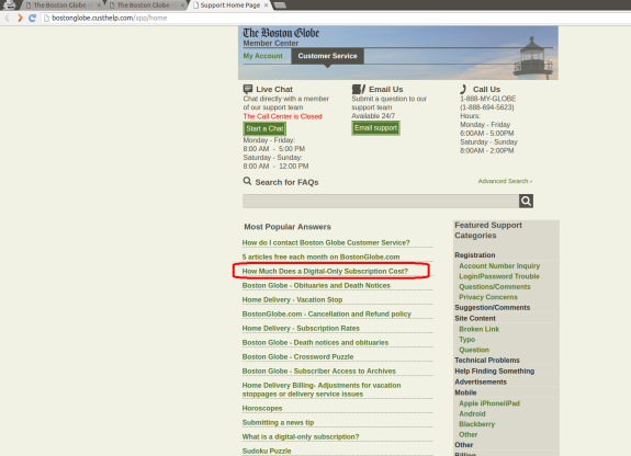
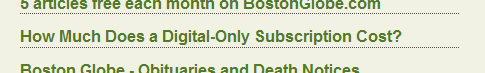
Among the questions about crosswords, obituaries and horoscopes, the question “How much does a digital subscription cost” is hidden.
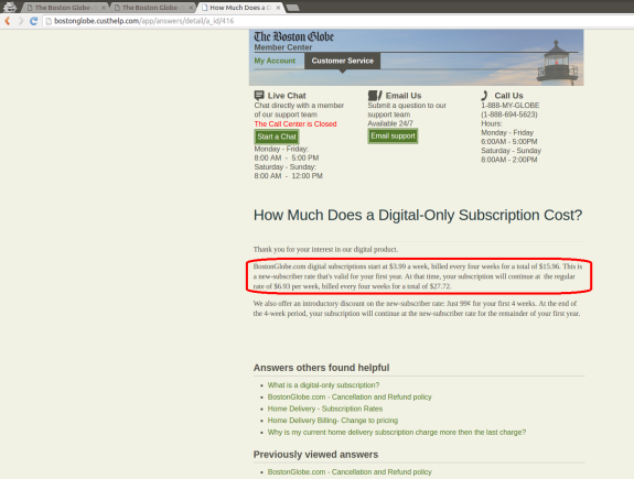
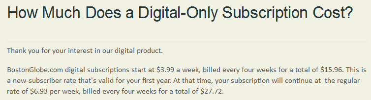
It states that the real price is not at all $ 0.99 per week, as it was in the advertisement, and not even $ 3.99 per week, as reported on the subscription page, but ... $ 6.93 per week! Almost two times more expensive or seven times more than on an advertising banner. This price takes effect only after a year, so it will be difficult for an ordinary subscriber to notice that more money has been debited from the account, unless he studies bank statements in detail. Very competent reception!
And finally, the last move. If the user nevertheless noticed something was amiss and would try to unsubscribe, then a small surprise awaits him.

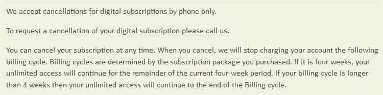
For any questions, you can contact the editorial office by e-mail or online chat, but you can unsubscribe only by phone (probably after a long wait on a toll line), while money will continue to be debited from the account until the end of the current “four-week period”.
Unfortunately, these and other dark patterns are often found on quite respectable and decent sites, including Russian ones. So you can increase sales in the short term, but in the long run, they damage the brand’s reputation.
On the Dark Patterns website, all types of manipulative techniques of web design are divided into categories.
Dark pattern library
- Bait and switch . The user performs one action, but something else happens instead.
- Disguised advertising . Banners disguise themselves as content or navigation to encourage users to click on ads.
- Hidden detail . Instead of delivering detailed details every month to the user's mailbox, service companies try to get the user to check it himself. It is understood that he will forget to do this.
- Forced renewal . The user subscribes to a free trial service, but the paid subscription is forcibly renewed.
- Forced disclosure . To provide the user with a free or cheap service, they are forced to disclose certain personal information, which is actually not necessary for the transaction.
- Friend spam . The application asks for authorization, and then publishes messages on the social network on behalf of the user, sending spam to his friends.
- Hidden cost . At the last stage of payment for the goods, the user is suddenly offered to pay another small amount (commission, insurance, tax, etc.).
- Change of focus . The user's attention is specially attracted to an external object in order to divert attention from the main thing.
- Prevent price comparisons . The practice of obfuscating price information in different ways: changing the number of goods in a package, changing the size of a package, etc.
- "Privacy Zucking . " The practice of using web design techniques and phraseological units to persuade users to make the right choice. The term “zuckering” suggested using the Electronic Frontier Foundation for such actions.
- Traps suggest the creation of a situation where it will be most difficult for the user to abandon the choice made, cancel his action (for example, cancel a paid subscription to the magazine).
- Blocking . The interface makes it difficult for the user to take the desired action by placing a foreign object in front of him on the screen. For example, the appearance of an advertisement on the pause button in a video player.
- Surprise in the basket . Adding excess goods to the shopping cart.
- Questions with a trick . An appeal to the user to make a choice when a cursory reading of the text creates one impression, and when carefully reading it, it’s completely different. This trick is based on the fact that users tend to inattentively read texts on the Internet (“scan” them diagonally).