Subtleties and thick icons. Sketch pro, rendering features and game with thick lines
In this article we will analyze the nuances of exporting vector icons from graphic packages. Despite the fact that vector icons have been successfully exploited for more than one year, there are still annoying situations in which the display of icons will be incorrect: the thickness of the lines will dance, blur will appear, fillets disappear, or vice versa - fillets appear where sharp corners are expected.
There are three main reasons: features (or even bugs) of exporting and optimizing icons from graphic packages, features and rendering errors (we will focus on rendering by Chrome browser or Electron shell ), designers' mistakes on inexperience. Although everything looked good in the graphics package itself (in this case we are considering Sketch, but there are similar problems everywhere).
As a rule, the distortions on the icons appear in the following cases (and their combinations):
For sites, small kosyachki on the icons are not particularly critical. Everyone is accustomed to this, and rarely anyone is willing to spend a lot of resources on solving minor perfectionist problems. In applications, especially those that are used a lot and often - perhaps this will be treated more closely. Especially if you ran into a perfectionist (see the material “ Working with objections when demonstrating a design ”).
If, when unloading, the icons lose some of the lines, are twisted, decomposed into components - it makes sense to look inside the SVG-file. This is not a problem for programmers: the format itself is an XML file with a fairly clear structure and a set of commands for drawing content. Often, for simple cases, this code can be used to understand what exactly “graphic” faked ”the graphic package while saving. For example, to see fractional values, where obviously they should not be. Or extra paths (path). Or some other rubbish. Edit the SVG file with your hands - an occupation for an amateur, and he has no prospects. But it is often possible to understand what went wrong in the source file.
When working with the classic Sketch + Zeplin combination, the problem of “garbage” in the SVG files does not just go away, but it can get worse. The point is how Zeplin runs the svg-file code through the built-in optimizer. Judging by the code that it generates, SVGO is probably used .
By the way, the same library can very often be the cause of broken icons at later stages, for example when building projects via a webpack (specifically, image-webpack-loader , which is already using SVGO at the lower level). Garbage can remain, but significant elements can be ditched. If you suddenly encounter a problem with broken icons - for starters, you can try to remove the optimizer, and see if the issue is resolved.
Moreover, the online version of Zeplin and its desktop application give different results when uploading. When optimizing, depending on the source code of the icon, significant pieces of the icon may be lost. And in different versions in different ways. It infuriates.
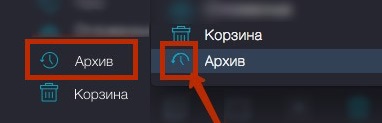
Compare the code - below the icon, unloaded from Sketch, even lower - from the online version of Zeplin. It can be seen that in the second case pieces of code disappeared:

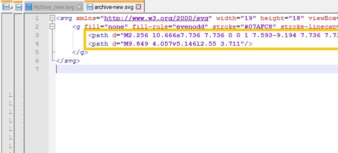
And this is how it looks:

The first icon is unloaded directly from Sketch, the second is from the online version of Zeplin, the third is what it should be
Unfortunately, it’s not just the designer, the graphics package or the optimizer that can be to blame for the crooked icons. Depending on which software is responsible for rendering, the result can be very different. There are also annoying errors, for example, in Chrome browser rendering, anti-aliasing of single-pixel lines - the problem has been known for at least 2016, but there is still no solution (October 2018). Very sorry!
Then we collected a number of tips, restrictions and life hacks, which help either to completely solve the problems with rendering, or at least to achieve a decent result.
The more transformations with an icon (scaling, rotation along the axis or reflection horizontally / vertically), the more path attributes (and simply a sequence of points) in its code will appear. More paths are more likely that after optimizations when rendering by the browser, icons will look crooked.

Instead of the “Groups” icon - something like a fifth point.
2. Convert elements and text from a vector to contours (Convert to Outlines)
If you leave the text as text, and the layers separately, the main sequence of points (path) will probably be divided into several, which, when exported, will be on their own mind.
The obvious rule for programmers. Unfortunately, it can be broken by inexperienced orsloppy too creative designers. If the name of one icon matches another one, Sketch can combine them into one object. For convenience, consider in advance a reasonable system of names. For example, the name may have the format popup-icon-close, where the popup is the block, where the icon will be used, icon is the icon itself, and close is what this icon means. Also at the end of the file name you can add its size - for example, 16x16.
When there are many icons and they repeat on several layouts, it is convenient to turn each into a symbol (Create a Symbol). If you change the size or color inside the symbol, these parameters will change for all such icons on all layouts. Export settings for such icons are better to set inside the symbol too. Professionally use symbols not only for icons, but also for all typical controls: buttons, text fields, and checkboxes, etc.
This is a plugin that allows you to download optimized icons directly from Sketch. This helps to control the optimization process (and not let it go to the optimizer from the webpack). If optimization jambs are immediately visible, you can check the source code of the icon immediately after unloading, especially if it is complex and consists of several parts. But in most cases, when exporting with this plugin, everything runs smoothly.
Otherwise, a piece of the icon may again be lost during export.

Otherwise, the icon is exported along with the white background around.
This is wild game. Vector icons just came up with in order to use one for different sizes. Unfortunately, there are situations when, after scaling, you get a vigorous result. As a rule - soap edges where you need clear lines. This is mainly due to the fact that when scaling some lines fall on fractional pixel values. For example, if the base icon was 16 × 16 and the derivative was 24 × 24 (with powers of two, almost always everything is fine, but there are also exceptions with central vertical lines). In such situations, you can either put up with it, or, unfortunately, you have to adjust the icons with your hands for each of the sizes used.
If you make an icon by these 7 rules, then even through the Zeplin plugin, the export will go well. But even if you received a beautiful svg-source of the icon, and the icon does not fall apart into pieces and is not deformed when displayed in the browser - this does not guarantee that everything will be fine with it on screens with different densities.
Suppose you all checked under the Retina-display on your MacBook. Try connecting a more or less average external monitor. Most likely, lines of 1 pixel will be blurred. Simple math: if you draw a line with a thickness of 1 pixel in the middle of a square measuring 4 × 4 pixels, when displayed, the line will fall between pixels and blur. If the line thickness is not a whole number, the same.
More about these problems is here.. As a solution to the problem - the icon templates for applications from Bjango : their beauty is that they immediately take into account the specifications for Android, iOS, macOS, tvOS, watchOS, Windows, Windows Phone, etc. You can use them at least as a reference. Learn more about the list of specifications for different devices in Google Device Metrics - you can find out the screen size, pixel density, and even the approximate distance at which the screen is located from the user's eyes. And one more thing that will help to overcome the problem - the designer’s guide on DPI and PPI . It will help to learn even more subtleties and practical techniques for designers on Android and iOS.
How to:

How not to:
By the way, we checked single-pixel icons on many sites and in applications on an average display quality - and we saw mostly “soap”. That is, the “Humble” solution is quite popular, as solving this problem and adjusting the icons is the way of the stubborn (very time consuming). The second most popular solution is to use a line thickness of at least 2 pixels (as in many places Google does). However, for hard-pressed perfectionists with a large budget of time on projects, a solution with a fit for each size will give the most accurate results.

Separately, we note that it is worth checking not only the render contours, but also the fill areas. Especially if the icons are used in a pair of “filled icon + contour” (for example, on hover).
Since the ban on the transformation of objects in Sketch takes a lot of time on the dreary drawing of all the elements, some designers find it more convenient to draw icons, such as Affinity, and then unload them into Sketch.
It's pretty simple:
In most cases, small distortions on the icons, caused either by a feature of their drawing by the designer, or by uploading or optimizing, or rendering nuances, do not cause any complaints. In the end, most of the icons are taken from icon packs and used "as is". But there are situations when fine tuning and fitting are justified. For example, if you are building an application on an Electron platform, and you want to achieve maximum clarity on all platforms. In any case, it makes sense for designers to come to a single style of work on icons (for example, you can use our simple checklist as a basis ).
Successes!
There are three main reasons: features (or even bugs) of exporting and optimizing icons from graphic packages, features and rendering errors (we will focus on rendering by Chrome browser or Electron shell ), designers' mistakes on inexperience. Although everything looked good in the graphics package itself (in this case we are considering Sketch, but there are similar problems everywhere).
As a rule, the distortions on the icons appear in the following cases (and their combinations):
- Thin (single-pixel) elements (either become blurred, or the lines are interrupted, or the one-pixel line becomes too oily).
- Area fills fill in those areas that were supposed to be empty on the design.
- The icon looks good on the Retina-display, but extremely bad - when an external monitor is connected. It is clear that the decline in quality on non-Retina-displays is inevitable, but in some cases the “pixeliness” clearly goes beyond the boundaries of good and evil.
For sites, small kosyachki on the icons are not particularly critical. Everyone is accustomed to this, and rarely anyone is willing to spend a lot of resources on solving minor perfectionist problems. In applications, especially those that are used a lot and often - perhaps this will be treated more closely. Especially if you ran into a perfectionist (see the material “ Working with objections when demonstrating a design ”).
Garbage in the SVG file and optimizers
If, when unloading, the icons lose some of the lines, are twisted, decomposed into components - it makes sense to look inside the SVG-file. This is not a problem for programmers: the format itself is an XML file with a fairly clear structure and a set of commands for drawing content. Often, for simple cases, this code can be used to understand what exactly “graphic” faked ”the graphic package while saving. For example, to see fractional values, where obviously they should not be. Or extra paths (path). Or some other rubbish. Edit the SVG file with your hands - an occupation for an amateur, and he has no prospects. But it is often possible to understand what went wrong in the source file.
When working with the classic Sketch + Zeplin combination, the problem of “garbage” in the SVG files does not just go away, but it can get worse. The point is how Zeplin runs the svg-file code through the built-in optimizer. Judging by the code that it generates, SVGO is probably used .
By the way, the same library can very often be the cause of broken icons at later stages, for example when building projects via a webpack (specifically, image-webpack-loader , which is already using SVGO at the lower level). Garbage can remain, but significant elements can be ditched. If you suddenly encounter a problem with broken icons - for starters, you can try to remove the optimizer, and see if the issue is resolved.
Moreover, the online version of Zeplin and its desktop application give different results when uploading. When optimizing, depending on the source code of the icon, significant pieces of the icon may be lost. And in different versions in different ways. It infuriates.
Compare the code - below the icon, unloaded from Sketch, even lower - from the online version of Zeplin. It can be seen that in the second case pieces of code disappeared:
And this is how it looks:
The first icon is unloaded directly from Sketch, the second is from the online version of Zeplin, the third is what it should be
Rendering errors
Unfortunately, it’s not just the designer, the graphics package or the optimizer that can be to blame for the crooked icons. Depending on which software is responsible for rendering, the result can be very different. There are also annoying errors, for example, in Chrome browser rendering, anti-aliasing of single-pixel lines - the problem has been known for at least 2016, but there is still no solution (October 2018). Very sorry!
Restrictions and lifehacks in the fight for the purity of icons
Then we collected a number of tips, restrictions and life hacks, which help either to completely solve the problems with rendering, or at least to achieve a decent result.
1. Do not transform the elements of the icon
The more transformations with an icon (scaling, rotation along the axis or reflection horizontally / vertically), the more path attributes (and simply a sequence of points) in its code will appear. More paths are more likely that after optimizations when rendering by the browser, icons will look crooked.
Instead of the “Groups” icon - something like a fifth point.
2. Convert elements and text from a vector to contours (Convert to Outlines)
and merge all layers with elements into one (Combine Shapes)
If you leave the text as text, and the layers separately, the main sequence of points (path) will probably be divided into several, which, when exported, will be on their own mind.
3. The rule of contraception: call each icon is unique
The obvious rule for programmers. Unfortunately, it can be broken by inexperienced or
When there are many icons and they repeat on several layouts, it is convenient to turn each into a symbol (Create a Symbol). If you change the size or color inside the symbol, these parameters will change for all such icons on all layouts. Export settings for such icons are better to set inside the symbol too. Professionally use symbols not only for icons, but also for all typical controls: buttons, text fields, and checkboxes, etc.
4. Install SVGO Compressor right into Sketch
This is a plugin that allows you to download optimized icons directly from Sketch. This helps to control the optimization process (and not let it go to the optimizer from the webpack). If optimization jambs are immediately visible, you can check the source code of the icon immediately after unloading, especially if it is complex and consists of several parts. But in most cases, when exporting with this plugin, everything runs smoothly.
5. Select icons when exporting manually and set the Make exportable property to them.
Otherwise, a piece of the icon may again be lost during export.
6. Uncheck the “Include in Export” parameter on the background
Otherwise, the icon is exported along with the white background around.
7. If nothing helps: for each size - its own icon
This is wild game. Vector icons just came up with in order to use one for different sizes. Unfortunately, there are situations when, after scaling, you get a vigorous result. As a rule - soap edges where you need clear lines. This is mainly due to the fact that when scaling some lines fall on fractional pixel values. For example, if the base icon was 16 × 16 and the derivative was 24 × 24 (with powers of two, almost always everything is fine, but there are also exceptions with central vertical lines). In such situations, you can either put up with it, or, unfortunately, you have to adjust the icons with your hands for each of the sizes used.
If you make an icon by these 7 rules, then even through the Zeplin plugin, the export will go well. But even if you received a beautiful svg-source of the icon, and the icon does not fall apart into pieces and is not deformed when displayed in the browser - this does not guarantee that everything will be fine with it on screens with different densities.
Suppose you all checked under the Retina-display on your MacBook. Try connecting a more or less average external monitor. Most likely, lines of 1 pixel will be blurred. Simple math: if you draw a line with a thickness of 1 pixel in the middle of a square measuring 4 × 4 pixels, when displayed, the line will fall between pixels and blur. If the line thickness is not a whole number, the same.
More about these problems is here.. As a solution to the problem - the icon templates for applications from Bjango : their beauty is that they immediately take into account the specifications for Android, iOS, macOS, tvOS, watchOS, Windows, Windows Phone, etc. You can use them at least as a reference. Learn more about the list of specifications for different devices in Google Device Metrics - you can find out the screen size, pixel density, and even the approximate distance at which the screen is located from the user's eyes. And one more thing that will help to overcome the problem - the designer’s guide on DPI and PPI . It will help to learn even more subtleties and practical techniques for designers on Android and iOS.
How to:
How not to:
By the way, we checked single-pixel icons on many sites and in applications on an average display quality - and we saw mostly “soap”. That is, the “Humble” solution is quite popular, as solving this problem and adjusting the icons is the way of the stubborn (very time consuming). The second most popular solution is to use a line thickness of at least 2 pixels (as in many places Google does). However, for hard-pressed perfectionists with a large budget of time on projects, a solution with a fit for each size will give the most accurate results.
Separately, we note that it is worth checking not only the render contours, but also the fill areas. Especially if the icons are used in a pair of “filled icon + contour” (for example, on hover).
Export Icons (Affinity, Illustrator, etc.)
Since the ban on the transformation of objects in Sketch takes a lot of time on the dreary drawing of all the elements, some designers find it more convenient to draw icons, such as Affinity, and then unload them into Sketch.
It's pretty simple:
- Draw icons in Affinity on a pixel grid! All for the same: so that there is no blurring of boundaries due to misses in the grid.
- Select the icon in Affinity and copy to Sketch.
- There is a possibility that in Sketch the size will differ within a couple of pixels - then you should use the Scale tool for the desired size, checking that the size and thickness of the lines remain integer.
- Translate elements and fonts into contours. Check size and position again.
- Merge the layers.
- Set the property Make exportable and select the icon on the artboard.
- Export - voila, you have a perfect svg-file with a single path that behaves very predictably.
findings
In most cases, small distortions on the icons, caused either by a feature of their drawing by the designer, or by uploading or optimizing, or rendering nuances, do not cause any complaints. In the end, most of the icons are taken from icon packs and used "as is". But there are situations when fine tuning and fitting are justified. For example, if you are building an application on an Electron platform, and you want to achieve maximum clarity on all platforms. In any case, it makes sense for designers to come to a single style of work on icons (for example, you can use our simple checklist as a basis ).
Successes!