March 28, 2016 at 11:01
Visualize training data with DevExpress Dashboard

It is no secret that among IT people there are many who love physical activity. Perhaps this is due to the sedentary nature of the work and the desire to take care of your health. Or maybe it's just a fashion for bicycles, running and swimming. In any case, some of those who like physical activity go in for sports or exercise regularly.
Lyrical digression
If you did not engage in any cyclic sport in your childhood, then a hobby for sports can begin by buying a bicycle. A bicycle, of course, is chosen after studying a lot of reviews and recommendations and reading a cycling addiction, and it’s definitely not a “hassle bike” (see a joke recently flown over the Internet about how infuriating you can figure it out). Then it turns out that riding a steep mountain bike in the park and around the city is not very interesting, and you are looking for like-minded people, you start to regularly participate in the pokatushki of the local cycling club and maybe you get to your first amateur KK race in life. It suddenly turns out that your physical form allows you to take pride of place only somewhere at the end of the list. After that, if you don’t say “well, these, these races”, and you start to study the same velomania, but for training,
Another thing that IT people love is a variety of statistics and numbers. Conventional sports services do not allow you to somehow play with statistics, providing only standard types of reports, such as mileage or time counters for weeks and days of the week and types of activity. It just so happened that the author of these lines is both training and participating in the development of DevExpress Dashboard. And of course, I wanted to make a dashboard myself (and show everyone how easy it is) according to my training diary.
I keep a diary in the form of a Google doc table. Keeping a diary is simple: for each workout you need to record the type of activity, the resulting time, distance, average / maximum speed, heart rate data. Usually, I transfer data from the Strava or from movescount.com to my diary (since I record workouts using the suunto ambit 3 watch). The most difficult thing is to remember to measure your heart rate in the morning, which is an indicator of general fatigue and overtraining if it suddenly arises. The diary looks like this:

Our dashboards, starting with version 15.2, allow you to import data from Excel, so for using them it’s enough just to save it in a file in xls format.
Of course, to build a dashboard, the data had to be combed a little. I put down the correct formats (numerical or temporary) for the cells, deleted the incorrect values, and also added a column “Type of activity” so that it could be aggregated. It can take one of the following values - “Road bike”, “MTB”, “Exercise bike”, “Pool”, “Running” and “Gym”, which I put my hands for each workout.
What I would like to see on my dashboard:
- standard statistics on mileage by type of activity - general numbers of mileage, time and set of heights by type of activity, as well as their graphs by time,
- history of training by day of the week, approximately how it looks in the strain ,
- any data on the pulse, for example, the correlation between the average heart rate in training and average speed,
- and of course, the dashboard must be live, that is, not just a static picture. It should have a maximum of interactivity so that you can select a specific data slice and look at them “more closely”.
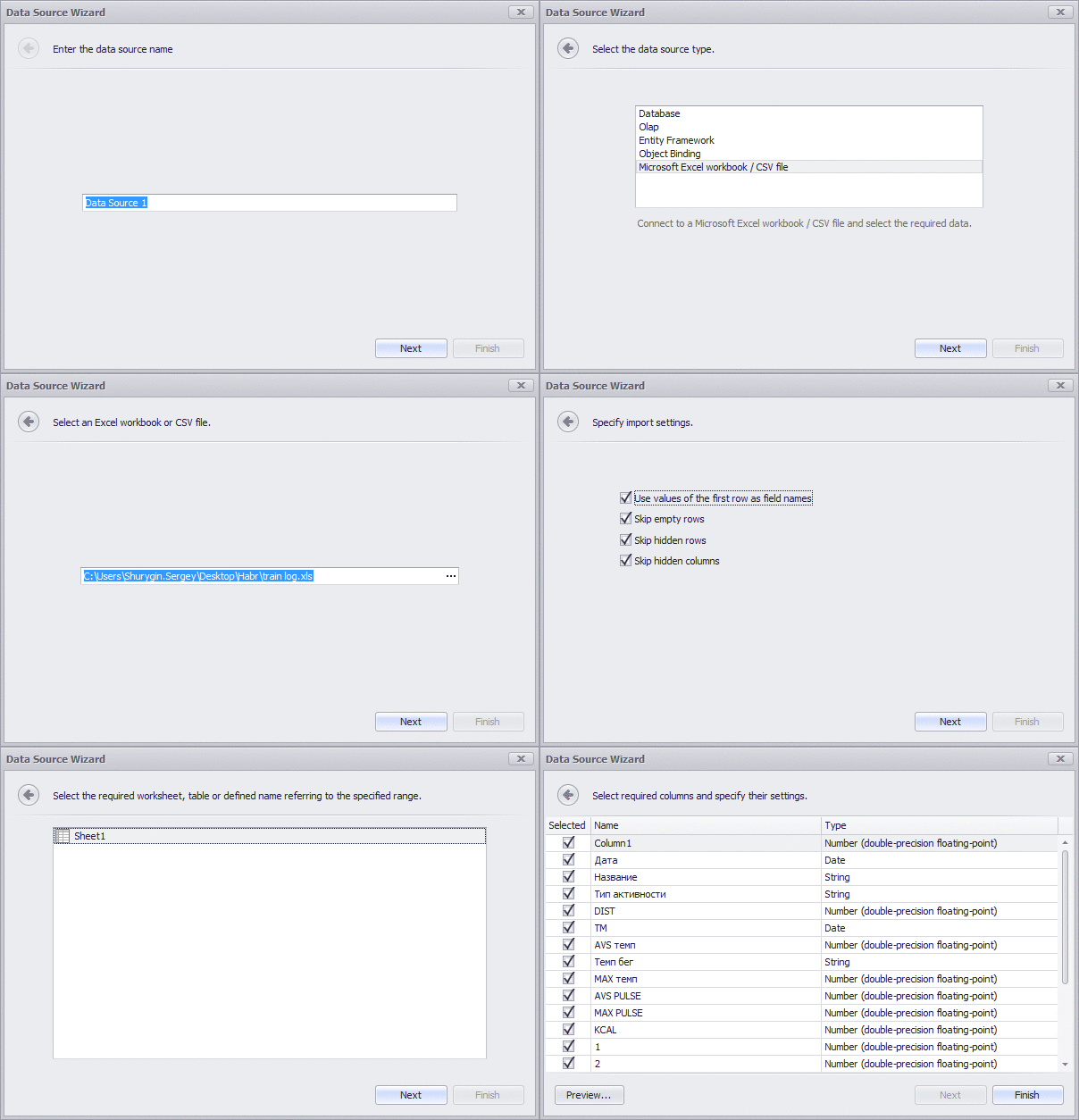
Now you can start the designer (and to make a designer, just create a new WinForms application, add a DashboardDesigner to the form and generate a ribbon for it), create a new dashboard (or dashboard, as it is written in Russian localization). Let's start by adding a data source from Excel to it:
Next, add cards to the dashboard, put the “activity type” field in the data series (Series), and make a few cards (in time and mileage). However, there are several problems:
First, the duration of the workout comes from the Excel in the form of a DateTime column, in which the date component is 01.01.0001. It is impossible to sum the dates, and therefore, the duration must be converted to a floating-point number, which can be done using the calculated field by specifying the expression GetHour ([TM]) + GetMinute ([TM]) / 60.0 . I don’t expect trainings longer than a day, so we will limit ourselves to hours and minutes.
Secondly, “bare” cards do not look very good, so it would be nice to add sparkline there. But, in order to make the chart look beautiful, you need to group the data by week. Unfortunately, we don’t have a built-in group interval for weeks and years, and grouping only by the week number of the year will be wrong, you will have to make another calculated field with the start date of the week so that it can be used as a value for grouping. The expression will look like AddDays ([Date], - GetDayOfWeek ([Date]) + 1) . Just a little more settings (format of numbers and names) and we get the following:

Yes, dashboards are not only numbers and functionality, but also a beautiful picture. When developing a specific dashboard, you have to take into account its visual component - everything should look good.
After the general figures, I would like to show more detailed information on the dashboard. We add the graphs of training volumes for mileage, time, climb, in the context of different types of activities and dates. To do this, create a new element in the dashboard - a chart (Chart). To get the grouping by week and year, first add the “Date” field with the grouping by year, and then again it with the grouping “Week number of the year”. Next, add a few panels (Pane) and add fields to them by training duration, time and climb. Next, add the type of training to the Series and turn on the coloring. Switch the types of charts on all panels in the "Stacked bar" (in Russian it sounds like a "histogram with accumulation") and get the following picture:

Now I want to check - does the dashboard show the correct data? And also satisfy curiosity and find out what is hiding under a specific column in the diagram. For example, to find out what training was in that week when the climb climbed over 3 thousand meters? To do this, give the dashboard its important ability - interactivity. First, add a table (Grid Dashboard Item) to the dashboard. I would like to see detailed training information there - that is, almost all fields from the source data. You will have to spend a little time adding them to the table and adjusting the options for displaying them. After that, we will enable the mode of the multiple master filter in the previously added chart and see what happened:

Thus, by clicking on the graph, you can filter the entries in the table below. And so that the filter does not affect the cards at the top - they need to set the ignore mode of the master filter. At the same time, you can make the filter work when you click on the card. Only now, so that it does not affect the graphics, they will also have to prohibit responding to the master filter.
So, now the dashboard allows you to select one or more specific types of activities and see a list of training on them in the table below. After that, you can select one or more dates on the activity graphs and filter the data in the table in even more detail:

Now we have statistics on the volume and dates of training, but in the source data there is also data on the pulse. In theory, the average heart rate should reflect the intensity of the workout and I would like to look at the correlation between the average heart rate and the average speed, which should approximately reflect the progress in training. Of course, the simple pulse / average speed relationship will not take into account the fact that running on a treadmill is easier than on rough terrain, and for a bicycle, speed also depends on the quality of the road, wind and other external factors. But still, it would be interesting to look at her.
To do this, use the scatter chart. We’ll put the average heart rate on the X axis, the average speed on the Y axis. We’ll put the date of the trip in the arguments so that the points do not merge into one, and the type of activity, to color different types with different colors (but the same one with which the chart elements are colored - thanks to the support for dashboards global palettes). In the “weight” field we will place the “climb” to distinguish trips on a flat terrain from trips with a large climb (but at the same time, we lose training on a bicycle station, because, unfortunately, there are no data on climb or they are shown on the diagram will not).
It will also be convenient to reduce to one scale the pace of running, which is set in minutes / km, and the speed when riding a bicycle, which is set in km / h. To do this, we will make another calculated field “Average speed / pace of running” with the following expression: Iif ([AVS pace] <1, [AVS pace] * 24, [AVS pace] )
Generally speaking, there is also swimming, where the pace is often recorded in min / 100m, but the exact data on the speed in the pool I have accumulated a little, and the climb in the pool does not make sense. Therefore, the speed in the pool, I did not take into account in this expression. In skiing, speed is also often recorded in the form of pace, as in running - but the author of these lines does not really like cross-country skiing.
Let’s turn on the filtering mode for the resulting diagram so that you can find out which workouts fell into it by a specific value. The resulting dashboard will look like this:

What is the result?
A dashboard can be used for detailed “digging” in data. For example, you can choose only running training for a specific week and see the speed / heart rate distribution for them. Or choose a week with the maximum amount of training and see what kind of training it was. In this case, the pulse diagram will show a correlation between the training intensity and average heart rate, as well as the values that "fall out" of the general trend. In this case, it will be easy to see why they turned out so. In my case, this is either a large set of heights, due to which, at the same average heart rate, the average speed is 15 km / h instead of the usual 22 km / h for such a heart rate, or a specific type of activity, such as for MTB, where the last cross Country Race last season. In which, despite the rather extreme pulse values for me,
The source code of the example, as well as the data and the xml file of the dashboard can be downloaded from GitHub . You can either try to change the dashboard, and substitute your data in an xls file (or add your data source).
I will be glad to answer all the questions, both on the training process and on dashboards.