Zabbix 3.0: Interface
We continue the series of mini-articles about innovations in Zabbix 3.0.
One of the most significant and expected changes in the new version was a redesigned interface. Our goal was to make the interface easier, to remove all the piling up elements, but at the same time not to scare away our users, who were accustomed to the old Zabbix appearance.
In general, there are two possible approaches to solving this issue: is it a radical redesign or a gradual improvement from release to release. And we thought that the best option is something in between, but with an understanding of what our users want and how they use Zabbix. We believe that this approach will allow us to significantly improve the quality of the visual part of our product.
And now this process has started, and today you can already see a much cleaner and more modern look, optimized for large screens.
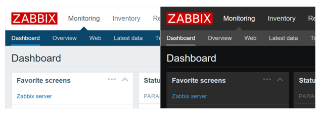
In addition, we made an effort to create several color schemes for design, each of which should look great in a certain environment. Surely many will like the dark theme, as it looks good and helps relieve tension from the eyes.
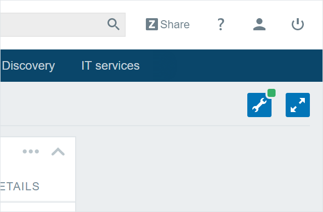
Following is the readability of the interface. In monitoring systems, it is very important to control a large amount of information, and for convenience we changed the fonts, increased the amount of free space on the page, removed some optional design elements that only distracted. All these little things together made the interface easier, and therefore more readable.
We will continue to work on key elements of the visual interface, our goal is to make it easy to use, beautiful and working with a large number of permissions.
We must not forget about the second aspect, such as the user experience in general. The evolution of the visual and technical component of the Zabbix frontend is our current project that has just begun.
For applications with a long history, redesigning an interface is always a serious challenge. Sometimes it takes extra effort to decide to change established patterns of action within the product. And we would like to constantly study how Zabbix is used in real installations, and do it better on the basis of this knowledge, thus achieving an increasingly intuitive, yet familiar user experience.
Zabbix definitely has something to strive for, but it’s important to understand that front-end changes must take into account the habits of our users so that we do not overwhelm them.
Read also about the new interface here.
Well, of course, read about other features of Zabbix 3.0, if you suddenly missed it, on Habré .
Translation of an article from our blog.
One of the most significant and expected changes in the new version was a redesigned interface. Our goal was to make the interface easier, to remove all the piling up elements, but at the same time not to scare away our users, who were accustomed to the old Zabbix appearance.
In general, there are two possible approaches to solving this issue: is it a radical redesign or a gradual improvement from release to release. And we thought that the best option is something in between, but with an understanding of what our users want and how they use Zabbix. We believe that this approach will allow us to significantly improve the quality of the visual part of our product.
And now this process has started, and today you can already see a much cleaner and more modern look, optimized for large screens.
In addition, we made an effort to create several color schemes for design, each of which should look great in a certain environment. Surely many will like the dark theme, as it looks good and helps relieve tension from the eyes.
Following is the readability of the interface. In monitoring systems, it is very important to control a large amount of information, and for convenience we changed the fonts, increased the amount of free space on the page, removed some optional design elements that only distracted. All these little things together made the interface easier, and therefore more readable.
We will continue to work on key elements of the visual interface, our goal is to make it easy to use, beautiful and working with a large number of permissions.
We must not forget about the second aspect, such as the user experience in general. The evolution of the visual and technical component of the Zabbix frontend is our current project that has just begun.
For applications with a long history, redesigning an interface is always a serious challenge. Sometimes it takes extra effort to decide to change established patterns of action within the product. And we would like to constantly study how Zabbix is used in real installations, and do it better on the basis of this knowledge, thus achieving an increasingly intuitive, yet familiar user experience.
Zabbix definitely has something to strive for, but it’s important to understand that front-end changes must take into account the habits of our users so that we do not overwhelm them.
Read also about the new interface here.
Well, of course, read about other features of Zabbix 3.0, if you suddenly missed it, on Habré .
Translation of an article from our blog.