Interfaces: How to create email subscription forms and alerts

In our blog we write a lot about the creation of mailing lists - their layout , design and interesting statistical facts . Today we bring to your attention an adapted translation of the material from AcquireConvert project founder Giles Thomas on the creation of truly high-quality forms for subscribing to email newsletters or notifications.
Forms
Contact forms are the basis for attracting potential customers, as well as the key to the growth of online sales. Forms affect revenue, business growth, and even its life.
Few people like to fill out forms, because it's boring. What to do with it, and how to maximize the conversion rate?
Today we will try to answer this question and consider the following topics:
- Various types of shapes that we can optimize;
- Creating forms to provide an effective user experience;
- Customer Development;
- Creation of effective inscriptions and texts;
- Conversion support;
- Other ways to create quality shapes.
In each chapter, we will consider specific examples based on data from our studies. I will try not to express my own opinion and will not offer universal solutions.
Throughout the tutorial, I will give tips on what to optimize and why. You can start testing current ideas right now, but, of course, with test cases.
What types to optimize? When it comes to conversion, we are interested in four main types of forms:
- Lead forms (contact and subscription forms);
- Online sales forms (order forms);
- User registration forms (registration forms);
- Operational forms (forms oriented towards the fulfillment of certain tasks).
The lead form gives the user the opportunity to contact company representatives or join the mailing list. Online sales forms are related to the purchase of products.
Using registration forms, users can join your project. Operational forms are necessary to perform any operations on the site or in the application; a good example is internet banking.
Regardless of the type of forms you use, you should analyze user flows and funnel data to increase your conversion rate.
Most likely, when you first imagine the appearance of your form, you don’t think about the words you write on it. But they are of great importance, for example, in the name for the data entry field.
User behavior (he will fill out a form or leave the site) depends on the simplicity and comprehensibility of the wording. 37Signals founder Jason Fried said: “ Most of the texts on the Internet suck because they are written by copywriters for copywriters, not for the reader. Write to the reader. That is all . ”
Proper copywriting is an important part of developing interfaces, where each word means as much as icons and small pixels.
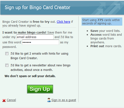
The name of the form should reflect its purpose.
First of all, the user reads the title, that is, the name of the form. Make sure that it clearly and concisely describes its purpose. Also use incentive words to encourage the user to take action.
Let him know what will happen if he fills out the form, motivate him to do it. For example:

Tip: Make sure the title of the form reflects its purpose. Use incentive words.
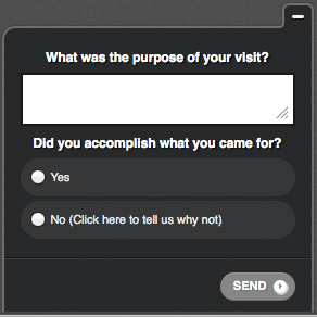
Do not use dialog boxes with Yes or No buttons.
As we know, users only glance at the page, and do not read everything, so the speed with which they perform the necessary task in the web application affects the effectiveness of its [application] use. It depends on whether a person becomes a client or leaves the project, which, in turn, affects the coefficient of outflow of users.
Therefore, you need to be careful about the details, adding information to the form of interaction with users. A common mistake in creating texts for forms oriented to a specific task is the abuse of yes / no dialogs.
Dialog boxes with yes / no or confirm / cancel buttons often do not reveal the context. A classic example is the file delete dialog in Windows 7.
Just by looking at the buttons, the user will not extract any useful information.

Suppose the user reads only the text on the buttons. In this case, the inscription on the button should be directly related to the question.

In this example, we linked the text on the “Save Worksheet” button to the title of the form, increasing its effectiveness. Now the user better understands what is required of him, and quickly makes a decision.
Tip: to achieve maximum conversion, make sure that the button labels answer the question asked in the form header
Placeholder harms usability
In some forms, the name is replaced with instructions or prompts in the input field, that is, placeholders. For example:

However, IT tracking studies show that empty fields are more likely to attract user attention. A person spends more time searching for non-empty fields and may simply not notice them, and this leads to a decrease in conversion.
Moreover, users have to remember the purpose of the form, because when you place the cursor in the selected field, the placeholder disappears. It turns out that in order to look at the text in the input field again, the client will have to delete what he has already written - this slows down the filling time, causes the user to feel irritated and reduces the conversion. It really becomes uncomfortable when filling out large and long forms.
If the user presses the Tab key to go to the next input field, then by the time he looks at the corresponding form element, the placeholder will already disappear.
Tip: do not use placeholders as names, just as a hint or example of input
Location of field name matters
Not only placeholders can slow form filling. The location of the name in relation to the input field in itself can be an obstacle.
During the study , the UXmatters online magazine found that placing a name on a form affects the speed at which it is completed.
The company conducted an IT tracking study of three options for the location of the field header:
- The name was left aligned and was on the same line with the input field;
- The name was right-aligned and was on the same line with the input field;
- The name was above the input field in its left part.

It turned out to be the most difficult to fill out the form in the first case, since due to the distance between the elements the user had to shift his eyes from one point to another.

The second variant of the mutual arrangement of the elements on the form showed itself better than the first.
However, the third option turned out to be the best option - with such a mutual arrangement of elements, it is easiest for the user to fix his gaze.
Tip: to speed up the reading process, put the name of the field above it and left-aligned.
Long forms with names above the input fields look large and bulky, therefore they can be averse to users. To visually reduce the shape, place the names of the input fields on the same line with them.
Display messages about the correctness of the data entered next to the form
When confirming the entered data, errors are often encountered. Sometimes error messages are grouped over a form.
With this approach, it is difficult for the user to find and correct incorrectly entered data. Each time after correcting one field, he has to scroll up to read the message and find the next error.
The figure above shows that the names of the fields with errors are highlighted in red, but it is better to display a message about incorrectly entered data next to the input field, in parallel indicating the cause of the error (see image below). Research

results Luke Wroblewski, they tell us that an even greater increase in conversion can be achieved if you verify the entered data in real time - that is, display a message as soon as the user has filled out the form.
This video shows how the user fills out a feedback form and in real time receives messages about the correctness or incorrectness of the entered data.
Compared to validation after form validation, real-time validation allowed:
- Increase the number of successful completion of forms by 22%;
- Reduce the number of errors during filling by 22%;
- Increase satisfaction rate by 31%;
- Reduce filling time by 42%;
- Reduce the number of gaze translations by 47%.
Tests have shown that checking for errors is best done after filling out each element of the form, that is, at the moment when the user goes to the next or previous field.
To top it all, the study found that users prefer that error messages and input correctness do not disappear over time.
Tip: make sure that error messages appear next to an incorrectly filled field. If possible, then check the completed fields in real time, adding informative messages that do not disappear over time.
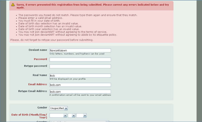
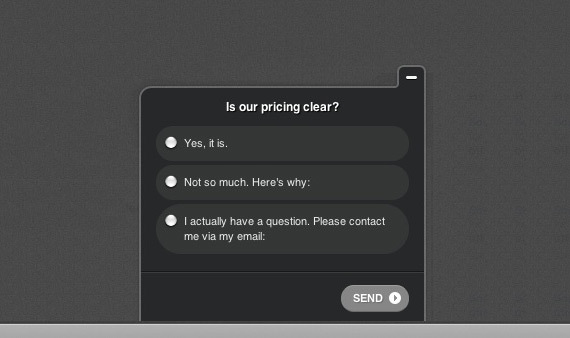
Radio button or drop-down list?
The user stops when filling out a form when faced with a selection problem. We want to fill out our forms was easy, therefore it is necessary to determine the appropriate tool for this. Which is better: radio buttons or drop-down list?
Internet lab Marketing Experiments tried to find out and conducted a one-factor A / B test.

Test using radio buttons
The option with a drop-down menu
The hypothesis says that a drop-down list, making the form visually shorter, can increase the conversion of the registration form. However, the radio buttons exceeded the drop-down list by 15%.
Tip: before comparing the effectiveness of the drop-down list and the radio buttons, make sure that the forms themselves are brought to mind.
Right and wrong ways to create narrative forms
Jeremy Keith , founder of the Huffduffer website, created a Mad Libs-style game. The idea of the concept is that you create a regular form with input fields, but the text on it is submitted in the form of a story.

The right way to use narrative forms
The Vast.com project conducted comparative A / B testing of traditional and narrative forms. The narrative form increased conversion by 25-40% (see two forms below).
Wrong way to use a narrative form
In this case, consider the results of a study conducted by the Kalzumeus website. There is a significant decrease in conversion after the introduction of the narrative form. Below are two design options.

Traditional form style
Narrative form
Conversion of the traditional form was 27.5%, while the conversion of the narrative form was only 21.73%.
Tip: sometimes it’s very difficult to create the right narrative form. Make sure that the text used for the story makes sense and does not mislead the reader, thereby reducing conversion (as in this example).
Asking for a password twice is inefficient
The request for re-entering the password is necessary so that the user does not make a typo when changing the password.
However, it’s more efficient to add a switch or “Show password” button. With this approach, there is no need to re-enter it.
In this study, we compared the effectiveness of two approaches: with password confirmation and using the "Show password" button.

Password confirmation form
Entering a password with the "Show password" button
Results:
- The number of visitors filling out the form after viewing the page increased by 14.3%;
- Conversion increased by 56.3%;
- The number of users who completely filled out the form increased by 35.5%;
- The number of corrections when filling out the form decreased by 23.9%.
Tip: try adding a switch or the "Show password" button - this can increase the conversion rate and overall performance of the form.
CAPTCHAs strain
Harry Brignull said: “Using captcha is a way to announce
all over the world that you have problems with spam, and you don’t know how to deal with them, because you put them on the shoulders of users. This is a pretty pathetic sight. ”
But we do not want to be miserable and, of course, do not want to reduce the conversion rate. Animoto, an excellent video-maker, has tested its sign-up form (image below).

The test was conducted until a 99% confidence level was reached. The conversion of the form with captcha was 48%, and without it - 64%. The conversion increase was 33%.
Tip: test your form with and without captcha.
Proper use of HTML
We are trying to gradually improve our site, right? Let's use HTML5 forms? Have you noticed that when you enter email on a website from your phone, the @ symbol appears on the main keyboard?
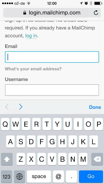
This is the account creation screen on the mobile version of the Mailchimp site. Everything is right here!
Because the developer prudently used the "email" form.
/>There are other ways to increase the efficiency of filling out special forms on the mobile.
When you enter the URL, a slash and a dot appear.
/>Type of input TEL displays the telephone keypad.
/>To enter digital data, a numeric keypad is displayed on the screen. In the attributes you can specify the maximum and minimum values and step sequences.
/>Tip: try testing HTML5 data entry forms to increase form efficiency and increase conversion on mobile devices.
A small number of fields can lead to the appearance of unqualified leads.
We already know that reducing the number of fields on a form leads to an increase in conversion, and there are many studies proving this .
However, you need to consider the quality of your leads. If you use short forms only to increase conversion rates, then you spend money on marketing, trying to attract the wrong people - on low-quality leads.
Kindercare added a “Questions and Comments” text box in its study .

Before

after
The conversion has not changed, and the quality of leads has increased.
Tip: When optimizing the types and amount of data collected, be sure to evaluate the quality of leads.
Multi-step or long forms
If you need to collect a large amount of information about the user, for example, during the checkout process, then it is worth comparing the effectiveness of long and multi-step forms. The type of form used can greatly affect the interrupt rate (the number of users who started filling out the form but not finished).
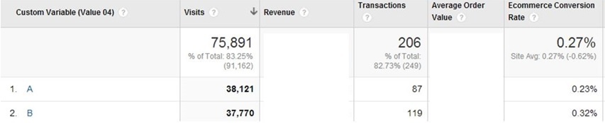
A study for Pass4Sure tested the cart page - how will combining it with the checkout and payment page affect conversion?
The store sells software for the IT industry. The test lasted 5 weeks, 3300 transactions were conducted.

Step-by-step form

Cart combined with the form of payment
The hypothesis says that if you delete the cart page, then users will immediately proceed to checkout and make a decision on the purchase of goods faster.
Conversion increased by 13.39% with a confidence level of 100%. Revenue per visitor increased from $ 44.87 to $ 51.52. The annual revenue growth of the company amounted to $ 744,000.
Tip: try changing the number of steps of multi-stage forms. Check out the conversion funnels in Google Analytics or use the Paditrack website to find out at what stage customers stop filling out step-by-step forms.
Vertical or horizontal arrangement of forms
We have already examined many factors and minor details that affect form elements and conversion rates. Next we will see how to place these elements. A similar study was conducted by Arenaturist.
Arenaturist.com is one of the best hotel booking sites in Croatia. The creators of the project changed the design of the page and tested how the location of the registration form affects its conversion.

Horizontal form

Vertical form
The A / B test used a tag with the canonical attribute so that Google would not index duplicate content and the company would not go down in search results.
Vertical conversion rates were 52% higher than horizontal conversion rates.
Tip: Test different layouts of the form, examine their effect on the conversion rate.
Customer development
Many companies optimizing their conversion rates omit the stage of Customer Development. However, in my experience, this is the most valuable and effective part of the work.
A customer survey is the best way to get to know your customer and understand the problems he is facing, as well as to find out what place your product occupies in the market.
First you need to find customers or potential users for the survey - it's not so simple. Alternatively, create a simple landing page using the Launchrock website and launch a Facebook ad.
Make contact with people who are “spinning” in your area, using social services. networks or contact them by mail. Try talking to reporters who write about your product. It's also worth paying attention to the Google / Buzzsumo alerts, which are easy to set up .
Another option is to offer your customers any bonuses. Send messages to your contact list and ask for a couple of minutes.
It is believed that people who were motivated by bonuses can discount the result of the study, but most often the number of quality reviews received is much higher than the number of reviews from selfish people.
You can also just google companies from your area in your area and call the numbers found, but do not abuse this way. It is better to ask for the recommendation of colleagues.
It is difficult to convince people to devote their time to you, so you need to use it to the maximum. Ask them about friends or contacts from whom you can also interview. You might even be able to find new customers.
Ask questions that will be helpful.
When formulating questions for the questionnaire, try to break them into two groups. The first is questions for conducting behavioral research - what are people doing now, do they have any problems, and how do they solve them? The second is questions for studying user experience with your product.
Begin your interview with questions that will help you understand a person’s mood, his problems, and his decisions. Then ask questions about your product experience. It is very important to draw a line here; if you have the opportunity, it is best to conduct these interviews at different times.
In this case, you will receive more information in a short period of time.
Try not to ask closed questions, for example:
Q: Would you recommend _______ to friends or relatives?
A: Yes / No
What do you learn from the answer yes or no? Nothing.
Do not ask to rate you on a scale of 1 to 10.
Q: How satisfied are you with our product / service (1-10)?
About: 6
What does the number 6 give you? Nothing.
Tip: try to understand your client, his problems and needs.
Customer Survey and Exit Intent Technology
A great way to interview site visitors is Qualaroo . Qualaroo allows you to display a survey or questionnaire on the website page. The information received gives you the opportunity to understand what problems users face.
You can specify where and under what circumstances these polls should appear. One of the use cases can be the processing of the Exit Intent event - when the movement of the mouse cursor indicates that the user is about to leave the site, a window appears with a question.
In fact, this gives you another attempt to convert the user, or at least find out the reasons why he decided to leave the site.
When interviewing customers, it is important to determine the focus group (at what stage of the purchase processare customers). This may be a visitor who came for the first or second time, or a regular customer.
We are trying to understand why they are buying? How? Why do they doubt it? That is, we study the course of their thoughts.
Segmenting your research and addressing various questions to different types of users will help you get deeper and more personalized information. Thus, it becomes possible to conduct more personalized marketing.
Conversion is easier to raise if you are well acquainted with your field of activity and the specifics of work.
Use Qualaroo to address the root causes of the decline in conversion. You can display questionnaires on each page of the site, but do not abuse it and display them several times in a short period of time.
It’s best to place the survey on a page with high traffic and a bounce rate - the page from which users leave the site. These pages are holes in the conversion funnel.

Placed? Now ask specific questions related to the main task that the user must complete on the page.
For example, if we are talking about a page representing a tennis racket in an online sports store, then you could ask a question about tennis or offer a better racket. The idea is to learn all about the buying process, that is, to understand the thoughts of the buyer when choosing a store, brand, model, etc.
Use your knowledge to write marketing texts
Find patterns in the comments of users - what they most often mention. It is important not only to hear these comments and work through them, but also to use the exact wording and expressions of your customers.
In their study, the company used Officedrop Kiss Insights on the page with the prices of its SaaS-services. Employees of the company knew that visitors spend a lot of time on it. It was also an exit page.
The visitors were asked the following question: “Do you understand how the price of our services is formed?”
After the question, there was a text box with ready-made answer options.
After studying the collected data, it became clear that users did not see the difference between the various products of the company and did not always understand why they cost so much.
After that, the page has been fixed. The results of A / B testing showed that the conversion increased by 15% compared with the page before editing; the number of customers who understood the pricing process increased by 10.5%.
Other popular testing options include end-to-end site views (testing in browsers and devices), usability assessment and heuristic analysis.
Tip: try to find new ideas for A / B testing to develop your product. Tests performed personally give the best result.
Copywriting Tips
Write inspirational headlines! 37Signals conducted a study and found that an incentive heading is more useful.
The original version read: "The best way to implement projects."
Changed title: "Manage your projects better with Basecamp."
The word “manage” is more specific and precise than the word “implement”, which can be interpreted in different ways.
The new slogan increased conversion rates by 14%. However, not only it can affect the conversion.
Tip: Test your headlines with better terms.
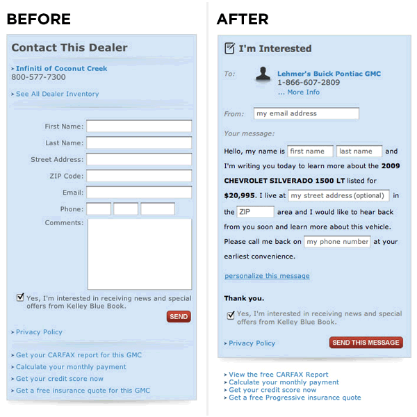
Write personalized texts for call to action buttons
The call to action button text is as important as the title text. A call to action is a crucial moment at which the user will either leave the site or become a regular user. A potential customer should understand what will happen when he finishes filling out the form and presses the confirmation button.
In this study , we compared the efficiency of the call-to-action button with a personalized and analyze the text.
The text of the second button to a greater extent reveals what the user will receive when he clicks on it. The phone number has also been deleted.

Before

After
A modified form with first-person text increased conversion by 24% with a confidence level of 98%.
Changing any text, try to make it concise, simple (without technical jargon) and friendly.
Here is an excellent resource on copywriting for the Android platform, however, the techniques described there can be applied on your site.
Tip: check the text on the buttons; make sure it is personalized.
Develop user doubts and concerns
Now try to dispel the fears and concerns of users that prevent them from becoming your customers. Many sites have a FAQ section - this is bad because the user is forced to leave the funnel to find answers to their questions, after which he may no longer return to the conversion point and leave the site.
Add encouraging text next to your form to help pull the user into the conversion funnel.
Conversion support
We often do not pay attention to minor conversion points, for example, checkboxes and style design.
Wilder Funnel, in its study, examined the effect of bold text and images next to checkboxes on increasing the number of selectable options.
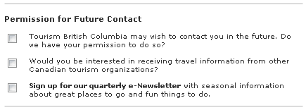
Before
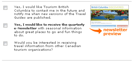
After
As you may have noticed, the second item with bold font and image immediately attracted attention. In this case, the number of users subscribing to the newsletter increased by 12%.
Tip: do not underestimate the importance of the small elements of your forms. Try adding images that fit the theme of the checkbox. Collect user behavior data using the Crazy Egg heatmap and scrolling cards - this allows you to see how customers interact with your forms.
Recommendations from other users increase confidence in your product.
It’s a good idea to secure a positive review on your page from a former client or user. Try placing it next to a form or call to action button.
Wikijob decided to check how adding a block with reviews to the landing page affects conversion.
Before

After
After adding a block of reviews (highlighted part of the page in the last image) sales increased by 34%. This tells us how much public acceptance can increase product confidence.
Tip: Use blocks with reviews and recommendations from other users - this can help increase conversion.
Do not use stop words next to call to action buttons
Information about the confidentiality of data on the subscription form allows you to establish a trusting relationship with the user and dispel his fears and doubts regarding private information.
This sounds reasonable, but any suggestions related to increased conversions are worth checking out. There are no unshakable rules!
In its study, Content Verve tested the effect of 100% privacy, no spam! On conversion. Conversion decreased by 18.70% with a confidence level of 96%.
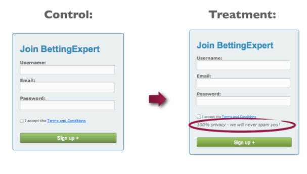
The word "spam" causes negative connotations in the minds of users, which leads to a decrease in conversion. Therefore, a second test was carried out - this time the inscription read: “We guarantee 100% confidentiality. Your information will not be shared with third parties. ” The control form did not contain any message.

According to the results of the second test, the number of registrations increased by 19.47%.
This tells us that the wording of a privacy statement can seriously affect your conversion.
Tip: Try not to use “stop words” and make a positive impression.
A couple more tips for creating high conversion forms
Let's look at a couple more studies before creating our own form.
It is necessary to correctly organize the visual hierarchy - the conversion rate depends on this. The visual hierarchy determines the order in which we see and perceive the elements of the interface.
I know what you’re thinking about: “You need to make a huge call to action button!”

But the size of the element does not necessarily make it a more visible part of the interface.
You can control the user's attention with the help of contrast, color, saturation, and even empty spaces (spaces).
In this study, we see how, using contrasting highlighting, the call to action button has become more visible on the page.

It does not matter what color the button is: green or red, it is important that it contrasts with the rest of the colors. By adding a contrasting color, we can visually highlight the button from the color context of the page.
Tip: Make sure that important page elements are visually highlighted.
Consider the features of the movement of the gaze of a person
Aitracking studies have shown that while viewing the contents of a web page, the user's gaze follows an F-shaped path . For example, like this:

Thus, you can direct the user to the call to action button in four stages. Here it is:

Before
After
The task was to force the user to read the text in the following sequence: heading - reviews - action (due to the F-shaped reading pattern). First, he sees the benefits that the service offers, and then goes to the call to action button. This approach increases the likelihood of conversion.
In this particular case, the conversion increased by 35.6%.
Tip: experiment with a different order of visual elements on the page.
Conclusion
Use this knowledge to test your own ideas and theories. There are no strict laws and unbreakable rules. Do not forget our recommendations on working with clients; use the Customer Development methodology. Use inspirational headlines, images, and customer feedback blocks.
We wish you high conversion rates in the new year!