Mastering the Data Science specialty at Coursera: personal experience (Part 1)
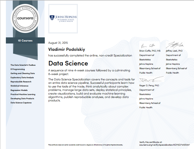
Recently, Vladimir Podolsky vpodolskiy , an analyst at the IBS Department of Education , graduated from Data Science with Coursera. This is a set of 9 coursework from Johns Hopkins University + thesis, the successful completion of which gives the right to a certificate. For our blog on Habré, he wrote a detailed post about his studies. For convenience, we broke it into 2 parts. We add that Vladimir also became the editor of the project to translate the Data Science specialization into Russian, which was launched by IBS and ABBYY LS in the spring .
Part 1.About the specialty Data Science in general terms. Courses: Data analysis tools (R programming); Preliminary data processing; Documenting data processing.
Hello, Habr!
Not so long ago, my 7-month marathon for mastering the specialization “Data Science” at Coursera ended. The organizational aspects of mastering the specialty are very accurately described here . In my post I will share my impressions of the content of the courses. I hope that after reading this note, everyone will be able to draw conclusions for themselves on whether it is worth spending time to gain knowledge on data analytics or not.
About the profession in general
The Course “Data Science” specialty is a set of 9 interconnected courses on various topics related to various aspects of data analysis: from data collection to the development of a full-fledged analytical product (online application). The cherry on the nine-layer pie is a graduation project in the specialty (the so-called Data Science Capstone), which makes it possible not only to practice all the acquired skills in a complex, but also to try to solve the real problem. The project is given as much as 2 months and it starts three times a year, while each of the 9 regular courses takes a month of study and starts every month.
Mastering the entire specialty “Data Science” with obtaining certificates for each of the 9 courses is not cheap. I was lucky with the payment of courses - IBS fully sponsored my training. The company was looking for volunteers to learn Data Science and offered to pay a certificate to every employee who successfully completed training at Coursera. Nevertheless, if you don’t bother and take three courses a month, your own funds will be enough - each course costs $ 49, except for the first one, which is cheaper than the rest (in rubles, as a rule, the price is also fixed, but changes periodically ) However, no one cancels the free option in case there is no need for certificates.
Frankly, the training was not easy - to watch lectures and to complete assignments was obtained either in the late evenings after work (hello, beloved Moscow Region!), Or on weekends. And it was not uncommon for situations typical of students from the category “to hand over at the last moment”. Additional problems were created by the limited time for passing tests and reporting materials - if you didn’t do it on time, blame yourself - the points for being late are removed. If classmates evaluate the task, the latecomer does not receive points at all. Nevertheless, this approach keeps in good shape.
And, finally, about what I got from the specialty "Data Science"
- systematized knowledge of data analytics. Even before mastering DSS, I had to form analytics of various levels of complexity, but my knowledge and skills were rather fragmented. Although Baumanka was given quality statistics and theory, but not a word was said about how to process the data (there was a course on databases, but it was about Oracle and sql queries);
- learned to work with the language R and RStudio. Very convenient tools, by the way. If you need to somehow change the processing process, it turned out to be much easier for me to make changes to the R code and restart it than to repeat the same sequence of actions with the mouse in Excel. However, this is a matter of taste. In any case, the commands and functions of R are very well suited for processing data of any kind: almost all the necessary functions can be found in freely distributed packages, and those not found can be independently added (if there are corresponding coding skills in C);
- Got an idea of how to maximize the performance of data research. As in any study, there is its own structure, its own rules, initial data and results. Everything, let’s say so, fell into place: we get the data, clear it and normalize it, conduct an exploratory analysis (write down its results along the way), conduct a full study, record the result and create, if necessary, an application for processing data using an invented method. This is if in rough terms - each process has its own subtleties and pitfalls. For example, I was particularly interested in preparing reports on the results of data analysis - lecturers presented a very good report structure from the point of view of understanding by an unprepared user;
- an additional bun was the presence in R of special packages for processing and visualizing graphs. The fact is that I am also loaded with a Ph.D. thesis, where the lion's share of the methods used is based on graph approaches. Perhaps, I have not seen anything easier and more visual than the implementation of R operations on graphs. There was no need to reinvent the wheel ...
About courses
According to my subjective feelings, all 9 courses of specialization can be grouped into five blocks. Each such block simultaneously covers a number of fundamental moments in data science. Grouping is given in the table.
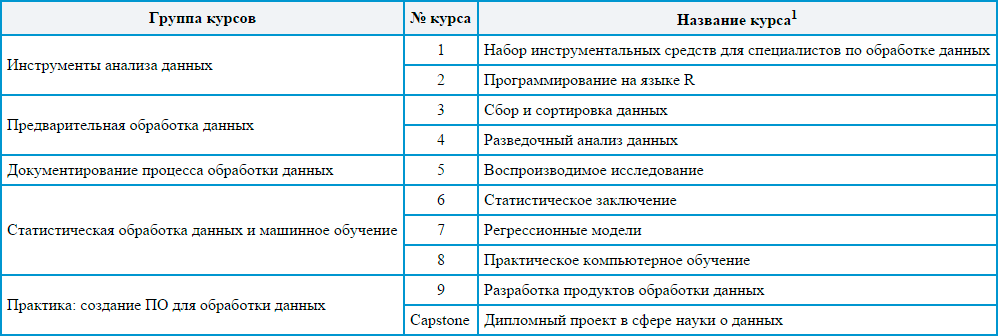
1 Names are given in accordance with the official translation of DSS into Russian on Coursera
Data Analysis Tools (Courses 1 and 2)
There is a common opinion that if in the first minute the students did not fall asleep on the tools (software, etc.), then the session can be considered successful. In this regard, the DSS toolkit courses were fully successful - it’s interesting to listen, and trying tools on the go is a hundred times more interesting than listening. The attention of both courses on data analysis tools is focused on the programming language R. In fact, students are smoothly introduced to the topic of data analysis and immediately given the opportunity to try out the tools in practice in order to get comfortable. The courses are largely unhurried, but cover all the essentials. A deeper knowledge of R is given during the remaining courses - as needed. Somewhere dplyr will be taught, and somewhere closer to ggplot will be introduced. This practice-oriented “explain as needed” approach, in my opinion, very effective - dry instructions for using tools quickly evaporate from the head. If you do not use the skill, then it dries out. L On the screen - typical RStudio.
But, as usual, not without a fly in the ointment ... Although the authors clearly did not intend to make an exhaustive review of all the R tools and to give the opportunity to properly test each tool, the above review still seemed to me insufficient. In particular, the topic of creating your own function packages for R turned out to be very poorly disclosed. Perhaps it would be worthwhile for it to create some advanced unit that would not be included in the test questions. From experience with R, I can say that writing modules is extremely important for those who seriously decide to do data analytics on R. I would love to delve into this topic (which, apparently, I will do, but on my own).
I would also like to have more detailed information in the video format on examples of using functions from different auxiliary packages, but it’s rather nitpicking - for the most part, working with functions from different packages is quite transparent when reading the appropriate manuals.
Data Processing (Courses 3 and 4)
In this group, I threw courses on data collection, their preliminary processing and exploratory analysis. In general, these are indeed all phases that precede the process of deep data analysis. These courses seemed to me very interesting, if not exciting. And why? As part of these courses, they show and tell us: a) how to collect data from a variety of sources (including social networks and web pages) and b) how to build simple graphs that explain what the data collected can tell us. In general, this turns out to be such a scanty, but more or less complete approach to data analysis.
Of the pre-processing, it is perhaps worth highlighting extremely useful information on how best to bring the data to normal form. A normal form means a form of data organization in which each column of the data table corresponds to only one variable, and each row corresponds to only one observation. It is such tables that are most easily processed and analyzed in the future. However, as a rule, data comes to us in a poorly organized form or even in an unstructured form (for example, messages on social networks are arrays of characters, text). For further processing, such data arrays must be brought back to normal form, which can be done using various commands of the dplyr package. Moreover, it is important to understand that for each new data source, its own sequence of transitions must be determined for the implementation of the final normalization. Without manual coding, here, as usual, nowhere ...
Using two tables as an example, I tried to show what kind of beast this is - “normalization”. The data for the tables was invented on the basis of a project for work ...
If the original table with the data looks something like this:
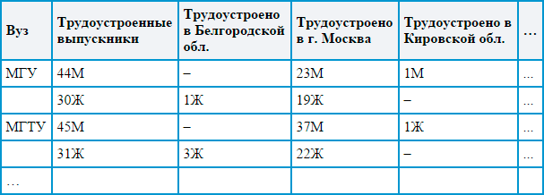
Then during normalization we should get something like this:
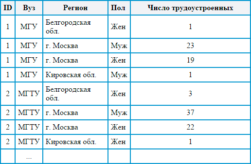
Agree, the second option is easier to process automatically using formulas and functions, and it looks much more presentable. Here, each observation has a unique identifier, and the value of each variable can be selected separately, and in general, the structure turns out to be more logical and simple for perception. Processing tables in a normalized form is easy and fast using automation tools (as a rule, this form is not always convenient for people). Based on such data, R makes it easy to build a variety of descriptive diagrams, such as the one below. The data for the diagrams is taken from the official website of the Ministry of Education and Science of the Russian Federation .
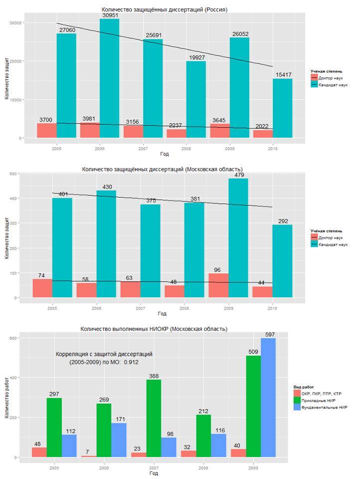
I like the style of R diagrams - they combine simplicity with the rigor of a scientific style and visibility. The functionality allows you to colorize the diagrams, but you should not get too carried away with this - it will be difficult for users to navigate in the diagram that is full of rainbow colors. In addition, diagrams can be saved in separate files and later used as illustrations in scientific articles, presentations or other works. By the way, to build one diagram it’s enough to write only a simple line of code (although sometimes you have to tinker with the preliminary processing of the data to build the diagram).
Summing up this part of my opus, I note the extraordinary importance of the steps described in this section for conducting high-level analysis. In data analytics, as well as in work with anti-aircraft installations, if the sight goes down at least half a degree, the projectile will not hit the target. To ensure high accuracy of the “sight”, it is necessary to prepare the data for analysis already in the first stages, as well as find out what questions and how they will help to answer. The very reconnaissance data analysis helps a lot for the second goal - the simplest graphs built already at the initial stage are able to demonstrate basic patterns and even in general terms answer the question of whether further analysis is needed and whether it can be carried out on the available data or not.
Documenting data processing (course 5)
Documenting anything always seemed to me an incredibly boring act. When everything is done and works fine, it would seem, why document the actions taken? Why generate new and new documents? Why all this waste paper?
But in analytics, the data of one conducted study and the obtained results are not enough - to convince the other representatives of the cohort of analysts, it is necessary to tell how and what data was processed. So, if your research cannot be repeated, then such research is worthless. Therefore, one of the DSS courses teaches how to best document the data processing performed. In fact, they teach the rules of good manners in science: done - tell everyone how you did it.
The documentation for the course is quite extensive. For this process, the built-in RStudio toolkit is used. A document describing your research of data will be created on the basis of an Rmd file, in which you will just describe how and what you worked on. Examples of documents can be found here .
In general, as part of the course, it was recommended to adhere to approximately the following structure for presenting information:
- a summary of the work performed (including the goal);
- description of the data set (interpretation of variables, description of the order of receipt, links to data sets);
- description of the data preprocessing procedure (data cleaning, normalization);
- a description of the data processing conditions (for example, the initiation of a random number counter value);
- results of exploratory data analysis;
- in-depth analysis results;
- conclusions;
- applications: tables, graphs, etc.
Of course, this is not a panacea - you should step back from the given structure if you need to describe something additionally or to describe something is impractical. Nevertheless, it is this structure that allows the reader to quickly understand the essence of your research and, if necessary, repeat it.
What I like about R in terms of documentation is the fact that in a Rmd file you can provide a text description with inserts of data processing code, which when compiling an Rmd file into PDF is converted to processing results: calculation results, beautiful graphs, and so on. In fact, this is very convenient - you do not need to think about where and how to add another illustration.
A very accurate PDF or HTML document (including a presentation, but this is a slightly different story) can be formed from an Rmd file. Such a dock is not a shame to show to colleagues in the data analysis workshop. And it will be useful for yourself: believe me, when you want to return to your research a year later, you most likely will not remember where the data came from, how it was processed, and why the research was done at all.
End of the first part
Read in the second part : Stat courses. data processing and machine learning; Practice: creating software for data processing (graduation project); other useful courses on the cursor.