Confused about developing letters
Attention picture belongs to studio4
Hi. For a long time, a lot of interesting things have accumulated on the topic of developing letters, but I cannot imagine systematizing this into a full-fledged story. Instead, I just talk about it as indicated in the title of the topic.
Haters of letters believe that I am evil. This is not true. I make sure that all the guano that you don’t like in your inbox, at least look human. In addition to marketing mailings, there are trigger, system, and transactional ones. And even the simplest letters need layout. In the end, limiting the width of the letter and working a little on typography will never be superfluous. At the same time, preserving the adequacy of displaying letters on mobile phones.
Marketers believe that I overestimate the importance of typesetting letters. At the same time, I cannot read 50% of the letters I receive on my mobile. They look like stuffing. Another 25% of the remaining part is made up with bugs, or not adapted at all. Marketers tease on CTR, but the quality of the letter does not bother them. Why is the magazine typesetter pulled over a curved layout, and in letters you can mess up?
My framework collected 143 stars on a github. This is a good motivator in order to continue working on it. By the way, now it’s not just a letter template. We screwed up the gulp collector and inline styles. This feature has not yet been brought to mind, but will be soon. Thanks to csscoderRU for participating in the development of the framework.
“The bottom line is that this letter should not only be bulletproof, it must withstand a direct nuclear strike”
Artem Kiselev. TimePad
All airlines and ticketing sites have vomit mailings. However, OneTwoTrip makes a pleasant attempt to fix this point.
Example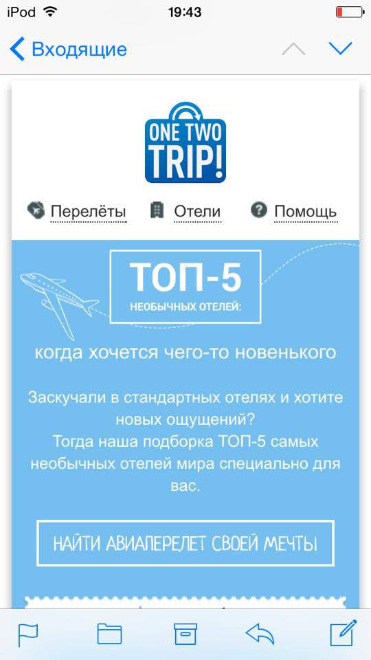

Among the classic fonts, there are no really really bold ones. But if you apply subpixel antialiasing to gelvetics, then it turns out
very cool.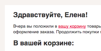
It is a pity that anti-aliasing will not work in all email clients. 
Delighted lets you implement
nice questionnaires in letters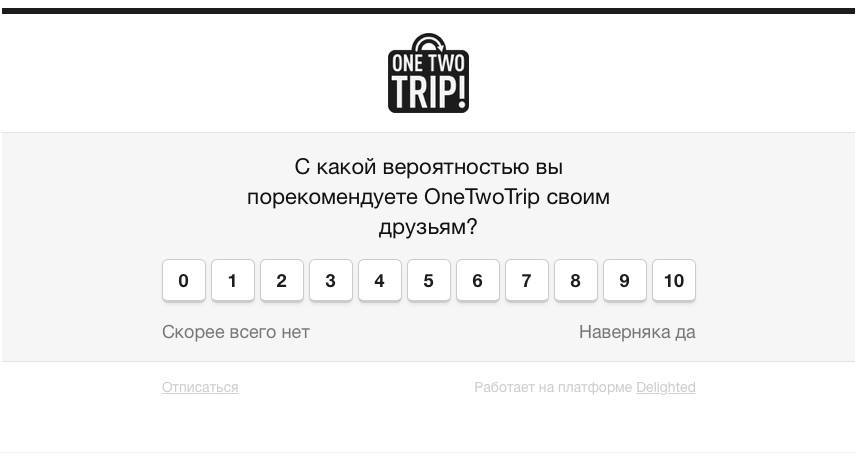
Here are just a mobile adaptation of these letters is lame. 
Be careful with template engines.
body {
background:url('{{PictureServer}}/image.jpg');
}At gog.com
mind-blowing

mailing lists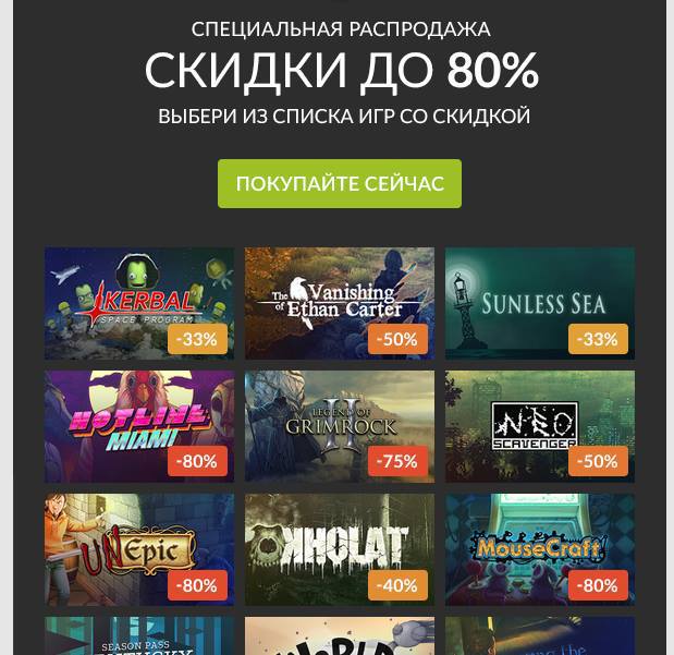
They adopted the excellent Steam selling practice. But as a killerfic, Gog specifically draws a cool cover for each game. Looking at them is a pleasure. 
File avatars for the addresses of your newsletters.
Instead of arguments

Emoji in the subject of letters is gaining popularity. While it was used by units, it was fun. It will soon be a disaster.
Test your letters on different platforms. For example, a letter from LiteRes on a winphone in general
not displayed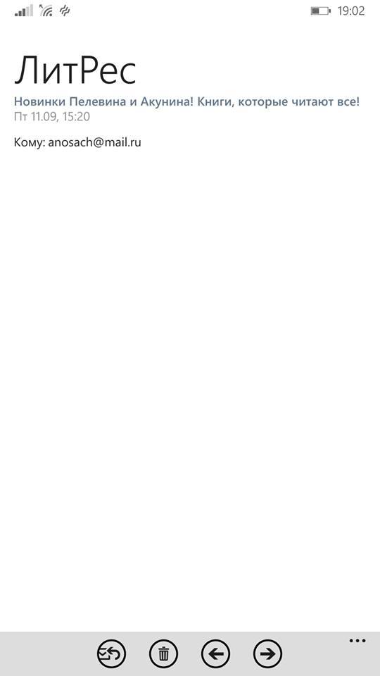

A vivid example of why you should not use justify
text formatting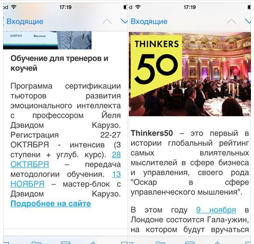

I do not like what happens in the examples of this topic .
Even letters from Litmus can get into spam.
Socicon is a great social icon generator.
Do not open rambler mail
on smartphone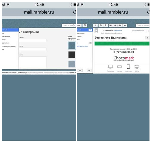

And by the way body {margin: 0; } only works for android mobile email clients. You should not use this property if your letters are left-aligned and executed on a white canvas without indentation. Simply put, minimalistic. Otherwise, the text will stick to the left edge of the smartphone screen.
What do you know about Twitter fakes? I only know that they are too lazy to start their own soaps. For the sake of the fan, I observe the following picture. My Yandex mailbox was hacked a couple of years ago, but the password was not changed. With enviable regularity, a lot of fakes are registered on my mailbox, for which I can even log in on Twitter. They there will spam something of their own and delete the acc. Then again they register a fake on my box. Fail is that they don’t turn off email notifications and I constantly get follow-up offers for some Diego Rodriguez.
Memo to the letter designer:
- Links to the typesetter’s ears, how cool you are and make changes to the layout every day (bad advice)
- Use a modular grid with a step of 10px for all layouts of letters
- Use the mail interface template to draw letters. I am * overwhelmed by censorship * how do I continue your background image when you cut it around the edges of the letter?
- Try to draw a letter layout so that it can be made up without using graphics. Crap, huh?
- Use only classic fonts: arial, helvetica, tahoma, verdana, times, courier. As a last resort roboto, calibri and myriad pro. Crap, huh?
- Never make letters wider than 600px. Just do as I ask.
- Do not draw the mobile version of the letter. I still don’t make it up the way you intended.
- Never do elements protruding from the main canvas if your life is dear to you.
- You love drawing promotional codes. Draw them so that they can be made up without using graphics.
- I understand that you thought of these fillets at the buttons as a design solution, but believe me, if a person uses BAT or Outluk, then he does not care about them, he is much more interested in child porn. Why am I doing this? We will impose on CSS, no pictures. Forget about gradients, too. But if you really want, then sometimes you can.
- Use smart objects in Photoshop. Better yet, cut all the pictures yourself and put them in a daddy next to the layout. Yes, so that with dual resolution. We support retina.
Memo to the typesetter of letters for exorcism with Outluk:
- Background images only work for Body
- Draw backgrounds for cells through VML akin to coprofilia. You can try, but people better not know about it
- Background-color for DIV does not work. Set it for a table cell
- Do not use conditional comments in styles. Only in the DOM structure. Why? Because Outlook 2007+ wants it that way. Or google a horse in a bathtub with cucumbers.
- Do not trust Litmus when testing 2003 Outlook.
- Do not set line-height in EMs or percent. Only pixels.
- Wish the designer a quick death
On the question of why letters are best done in a width of 600px;
It's just a magical and verified number for years.
See:
- The display area of letters on desktops and tablets is never less than 600px
- For example, in the apple mailbox, this area is clearly 620px; just to fit a 600px letter and leave space for the substrate
- The number 600 is ideally divided by 2/3/4/5/6 = 300/200/150/120/100, which allows us to perfectly arrange multi-column elements for layout
- The size of the visible area letters on mobile phones is often equal to 300px, which leads us to the simplest adaptation of layout by dividing by 2 in width. Collisions are corrected by media queries and max-width
No other number is ideally suited for the size of the letter.
Everything ingenious is simple.
You won’t believe it, but in terms of the quality of message rendering, Outlook on iOS is the coolest mobile email client along with Spark (which is no less surprising). There is NO ONE criticism to them. One gets the impression that they are made on one engine. To show the difference, I will go over the rest:
- Outlook (android) - incorrect calculation of percent for the width of multi-column elements. The error is about 0.2%. A trifle, but nasty.
- Yahoo! (iOS) - no CSS3 support (lack of border-radius)
- Google Inbox (iOS, android) - even more unpredictable behavior of the width property than in gmail. Otherwise, the rendering principle is similar. There is no support for media queries.
- Gmail (iOS, android) - the width property for block elements and pictures is basically not supported. In letters asymmetric in columns, mince begins. If you send a non-adaptive letter, then the client tries to adapt it according to its own algorithms. On Android, mince is also obtained. On iOS, you can view an unadapted original. There is no support for media queries.
- Mail.ru (android, iOS) - generally approx. Disgusting text wrapping implementation. When transforming a phone number into a link (and generally any transformation of text into a link), the link itself does not pick up the design color from css. There is no support for media queries.
- My.com mail - the engine is identical to the mail.ru application
- Yandex mail (web, android) - there is no support for media queries. Errors were observed on the android client when calculating the width of multi-column elements.
- Sparrow - was an ideal email client except that its interface has not changed since the 4th iPhone. Now drank from eppstor.
- Apple Mail (iOS) - body has a reinforced concrete margin: 15px; There is no way to defeat him.
- Mailbox (iOS, android) - overall great. But the basic body values are zero, like all apple mail clients except Outlook and Apple mail. Thus, it is still inferior to Outluk.
- Android Mail - There are no complaints, with the exception of rendering those images whose original size exceeds the size specified in the layout. A dozen phones on android passed through my hands and everywhere, in all email clients on android there are artifacts in such pictures.
That's all for now.
