How to create email subscription forms: Errors and Solutions

On the Pechkin blog, we pay great attention to the topic of layout of mailing lists and experiments in this area (for example, the mechanics of creating interactive letters - one , two , three ). Often readers of our posts on Habré perceive mailing lists exclusively in terms of unwanted spam, that is, messages that users receive without even subscribing to it.
In fact, real email is always created for subscribers., that is, people who have clearly demonstrated an interest in certain content. And today we’ll talk about how to create online forms with which people subscribe to the newsletter, fully aware of why they do it.
In preparing the article, Litmus and MailCharts materials were used .
How not to: errors when creating forms
First of all, we will analyze common mistakes that companies make when creating forms for subscribing to their mailing lists.
The user must understand what he has done.
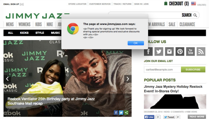
Companies do not always pay much attention to what happens immediately after a user has typed their mailing address in the corresponding field. Meanwhile, you need to make it clear to the person what he just did (signed up for the newsletter). The confirmation message should be clear and not contain layout errors, as in the example below:
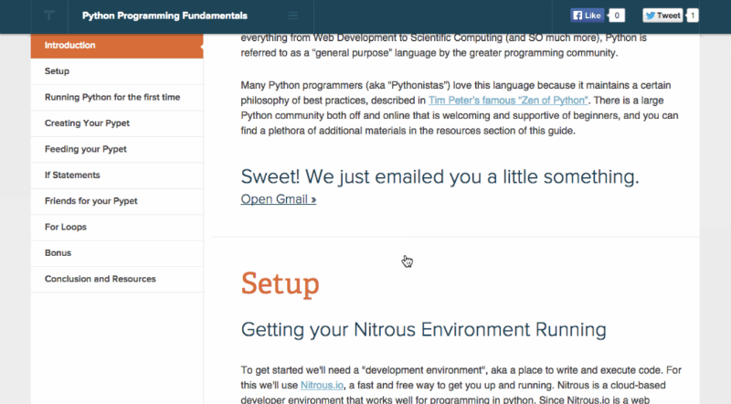
You can get out of the situation better - update the form itself and tell the user that he has signed up for the newsletter. Moreover, for his complete happiness, you can also determine what kind of mail service he uses (Gmail. Mail.ru, Yandex mail, etc.) and offer him to open this particular program. In the image below, the form suggested switching to Gmail:
Infinite scroll does not match footer shape
A common mistake of content projects with a large number of articles. If you place the form for subscribing to the newsletter in the footer of the page (this is often done), then it will be difficult for the user to catch up with it, even once having seen that, new articles will be constantly “sucked up” using an endless scroll, and the form will continue to go down. In this case, it is better to move it to the top of the page.
Duplication of confirmation or lack thereof
A point that is indirectly related to the forms themselves. Sometimes it happens that there are two forms on the page for subscribing to the newsletter - at the top and bottom. Errors periodically occur that result in the fact that each of these forms lives its own life - then if the user drives the address into them, then he can receive two letters at once with confirmation of the subscription, which can be regarded as spam.
Another point that does not directly relate to forms, but which cannot be ignored.
Unsubscribing should be easy
Each Internet user is faced with a situation in which unsubscribing from the mailing list is quite difficult. The reason is not always in the evil will of the company that created it, sometimes it is a question of simple disorder. A business can use different mail programs and email providers to organize, say, automatic newsletters about creating an account and a digest with blog publications.
It is necessary to check each time that the process of unsubscribing from each of the sent mailings is simple and intuitive. Otherwise, the user will have the full moral right to mark letters from which it is not clear how to unsubscribe, as spam.
What do we have to do
After analyzing the errors, it is logical to consider how to proceed when creating a form for subscribing to mailing lists.
Well need to be afraid of extra fields
On the web, it is customary to try by all means to reduce the number of fields in forms - no one likes to fill them out, and the presence of a large number of required fields annoys users. However, in the field of email, everything is slightly different from the standards accepted on the web.
The truth of life is that mailing list subscribers have certain expectations from the content they receive. And if these expectations are not met, then at least a quarter of all subscribers will unsubscribe from the newsletter.
Accordingly, in order to send people suitable content, in some cases it’s better to ask a couple of questions about their interests, even if this results in one or two additional fields in the form.
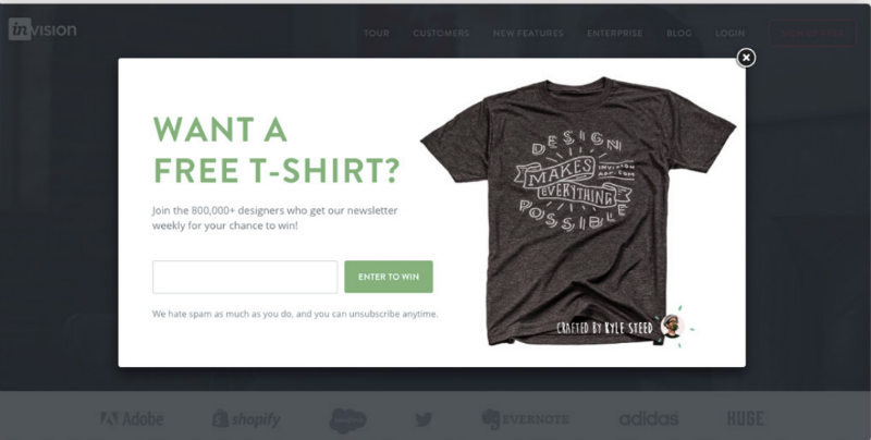
Sometimes people sign in pursuit of a "freebie"
There are situations when marketers attract subscribers using any discounts and offers. Many Internet users like to get something tangible. Therefore, if a company, for example, offers a future subscriber a T-shirt, such an offline and online connection usually works well.
Explanations and Social Evidence
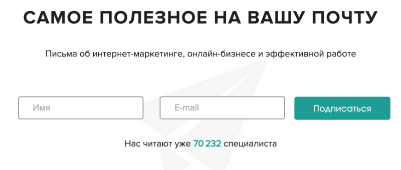
Again, the email newsletter is characterized by the fact that users subscribe to it voluntarily. So, they must understand what they will receive if they enter their mailing address in the form. Therefore, it is necessary in one sentence to describe the content that usually appears in letters, as well as information about the frequency of distribution. So, for example, the Buffer social network posting service team arrives - on their form for collecting email addresses it is indicated that subscribers receive “practical tips on working in social media” every day.

In addition, few people like to be a pioneer. People like to be in a good company, so if the form immediately displays information about the number of subscribers to the newsletter. This form of social proof works very well. It is used by both foreign companies and domestic projects. Below is a screenshot of the form from the Netologia website:
The form should not strain
Sometimes forms on sites naturally “chase” visitors - they move up and down the page when scrolling or suddenly pop up in the form of pop-ups. Despite the fact that such mechanics can increase the amount of collection of mailing addresses, the likelihood that users will drive a “left” address into them, if only to get rid of the form as soon as possible.
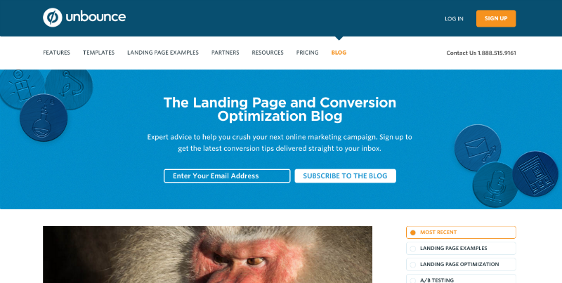
Therefore, it is worth making the form unobtrusive, but positioning it in the right place. An example is the form for collecting email addresses of the Unbounce project - it is located at the top of the company’s blog page and is rigidly fixed there, without moving when scrolling.
That's all for today, thanks for watching!
Other interesting materials on the Pechkina blog:
- How Easter eggs in email helped the company draw attention to their conference
- What 100 million letters are talking about: A complete guide to working with email newsletters
- 26 helpful email marketing tips from the most successful companies from around the world
- What 22 billion news letters can say about design for mobile platforms