How to create custom shapes with MaterialShapeDrawable
- Transfer
In Material Design 2.0, several new concepts have appeared. One of them is a special attention to the geometric forms of the interface elements. And there is a simple way to make beautiful custom shapes. It is called MaterialShapeDrawable. Let's see how useful and easy it is to use.
There are several ways to add graphics to the Android application screen. The simplest one is to import raster images in webp or png formats. Another option is to use VectorDrawable, which allows you to stretch the image to the size you need. Another way to add graphics to the screen is to use ShapeDrawable. The latter are the easiest way to add a simple background or even create an icon. Images created with ShapeDrawable do not depend on the density of pixels on the screen. They can be described in the xml file, be part of another graphic resource (for example, StateListDrawable) and are present in the Android SDK, starting with API v.1.
To change the appearance of the shape, we can change several ShapeDrawable properties: shape name, fill color (or gradient), shape border color. For rectangles, you can also set the radius of the corners. Using these properties, you can create graphics that will be used as separate images on the screen, separators, background buttons, or for any other purpose. If the application uses API v.21 + and ShapeDrawable as a background for elements with elevation, then the shadow under these elements will also be of the correct form:
ShapeDrawable is a handy tool that almost always solved its tasks well, but with the advent of Material Design 2.0, developers need something more flexible. The new design system encourages the use of different forms to emphasize their meaning, condition and individual style of the application. I wrote above that there are several ways to do what I want, but the simplest of them is no longer relevant. Does this mean that we need to start using vector graphics and thereby lose the possibility of “free” creating shadows for interface elements with elevation? Or is it worth generally to roll back to the use of bitmaps and create graphic resources for the six possible pixel densities on the screen? Fortunately, with the advent of Material Design 2.0, a completely new component library has appeared.
This library is designed to unify the appearance and behavior of the UI of Material Design components on all versions of Android and other platforms (there are versions of this library for iOS, the web and Flutter). In the component library, many features are implemented for the new Material Design. For example, it includes the BottomAppBar component with the expected behavior. Among other components and utilities there is a class MaterialShapeDrawable. In my opinion, this is a necessary tool for solving the problems that a new design system sets for developers.
Although MaterialShapeDrawable is still considered experimental in the release of the 1.0.0 library, it can be used to create cool effects in the application. In the MaterialShapeDrawable class, you can describe a shape by specifying the type of its sides and each of its angles. These specified properties can be controlled by the interpolator, which allows them to animate.
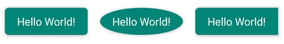
To create your own MaterialShapeDrawable, you can use a constructor that needs to pass an object of type ShapePathModel in the parameters. It stores information about each side and every corner of a figure in the EdgeTreatment and CornerTreatment classes, respectively (there are always exactly four sides and corners, but this does not prevent us from describing almost any shape with them). You can set descriptions individually for each side and angle, or you can set them once for the whole figure at once by calling one method.
The library already has several ready-to-use descriptions (treatment) of the sides and angles, which include most of the innovations regarding the shape of the components presented in Material Design 2.0. Already present: RoundedCornerTreatment - for rounded corners, CutCornerTreatment - for cut corners, TriangleEdgeTreatment - for cutting or adding a triangle to the side. To demonstrate their work there is a simple example:
val shapePathModel = ShapePathModel().apply {
    setAllCorners(CutCornerTreatment(dip(5).toFloat()))
    setAllEdges(TriangleEdgeTreatment(dip(5).toFloat(), true))
}
val backgroundDrawable = MaterialShapeDrawable(shapePathModel).apply {
    setTint(ContextCompat.getColor(this@MainActivity, R.color.colorPrimary))
    paintStyle = Paint.Style.FILL
}
textView.background = backgroundDrawable
It will look like this:
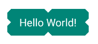
Of course, you can simply create your own descriptions of faces and angles. The form is always set for the upper left element, and Drawable will itself perform rotation / flip operations to get a complete shape. To demonstrate this, there is a small example:
classCutoutCornersTreatment(val size: Float) : CornerTreatment() {
    overridefungetCornerPath(angle: Float, interpolation: Float, shapePath: ShapePath) {
        shapePath.reset(0.0f, size * interpolation)
        shapePath.lineTo(size * interpolation, size * interpolation)
        shapePath.lineTo(size * interpolation, 0f)
    }
}
classCurvedEdgeTreatment(val size: Float) : EdgeTreatment() {
    overridefungetEdgePath(length: Float, interpolation: Float, shapePath: ShapePath) {
        shapePath.quadToPoint(length / 2f, size * interpolation, length, 0f)
    }
}
If this MaterialShapeDrawable is used as a background, the result will be as follows:

In the bottomappbar package of the new Material-components library there is a BottomAppBarTopEdgeTreatment. He describes the “cutout” in the BottomAppBar for the FloatingActionButton button. Its upper side can be animated depending on the position and size of the button. I advise you to read the code of these classes in order to see with your own eyes that MaterialShapeDrawable is very flexible in use, and they can do almost anything.
If we talk about the usual ShapeDrawable, there is another detail that is worth mentioning - the ability to cast a shadow of the shape corresponding to the contour. Since it is now possible to create outlines of very unusual shapes using MaterialShapeDrawable, it would be a disappointment not to bring the shape of the shadow into the shape of the image, especially when these shadows can be seen everywhere in Matarial Design 2.0. MaterialShapeDrawable also calculates the appearance of the shadow. Using the shadowEnabled property, you can turn on the shadow, which will exactly follow the outline of the shape itself, it is also possible to determine the radius, height (elevation) and color of the shadow. Sounds too good to be true? Unfortunately yes. If you use the MaterialShapeDrawable shadow, you get a normal shadow (drawn by the Paint class setShadowLayer () method, which is designed to draw text shadows),

It must be remembered that MaterialShapeDrawable is still considered experimental, as is its API, and may change in the future. It is also worth noting that the code of the new Material Components library is open, so the creation of tickets in the bug tracker or even pull-requests with the correction of known problems is very welcome. In fact, when you read these lines, the API is already slightly different in the master branch of the library (for example, ShapeAppearanceModel will be used instead of ShapePathModel), which indicates active work. One of the most promising features in the next release may be the ability to determine the default view of the sides / corners for the entire theme of the application. You can learn more about this from the official documentation or library sources.
From the translator: It’s
cool that there are tools that add new features to the usual ShapeDrawable and help to create some not so simple graphics. This allows the developer not to pull the designer on every detail, but to solve the problem himself, and it takes much less time. We are waiting for the next versions of Material Components to try out new ways to solve existing problems in practice.