Central Park NY: redesign of the official app
Where am I, where can I go, I think I'm lost ...
The day after arriving in New York, I agreed to meet with a friend in Central Park at the Conservatory Garden Center Fountain. A huge park with endless paths, lawns, bridges, ponds, one large ecosystem inside a metropolis of metal and glass. To get to the place faster, I was advised to install the app - the official app of Central Park .
Houston we have a problem
Of course, I found a friend, but I wanted to delete the application right away. At this moment, the idea was born to make your concept, explaining the logic and improvements. About what the app is bad in the current version and how to make it more convenient - under habrakat.

App Store screenshot
Discovery
Redesign is always used to solve a specific problem. An important stage - Discovery - it is necessary to identify the problem and ways to solve it, otherwise the work may turn into thoughtless redrawing of pictures with zero result in the end. It is logical to start troubleshooting with the App Store, where complaints from users and suggestions for improvement are poured.
App Store screenshot
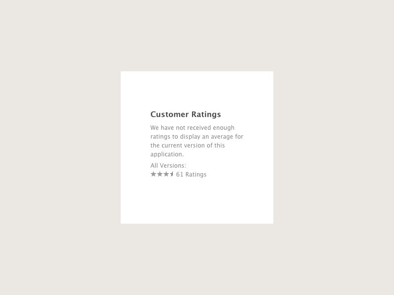
Oh my ...
The lack of rating and the minimum percentage of downloads indicates the unpopularity of the application.
Mind map
It is important to understand how to build navigation, with which we will first introduce the user, and what he needs to learn on his own.
Menu
Fierce debates regularly flare up in the design community about where and when to use the side menu. In mobile applications, the side menu often becomes the optimal solution. Tabbar is needed only in cases where there is a need to quickly navigate in a complex application, such are more common in the business segment. A good example of using the side menu is the Urban Walks application , a project by Anton Reponen.

Start
The application has a complete set of navigation elements for the guidebook, but it shuffles them rather strange. The same information is duplicated on the home screen and in the menu. It’s bad to clog the main screen with useless information: why, for example, is the weather here? For her there is a weather widget in the upper curtain, but not in the application. It’s good when the user begins to get acquainted with the park immediately, for example, through cards in the main section of the Explore application, where all locations are expressively and clearly reflected.

Screenshot and concept
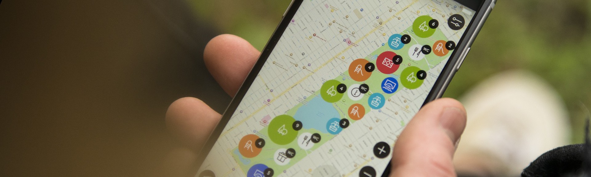
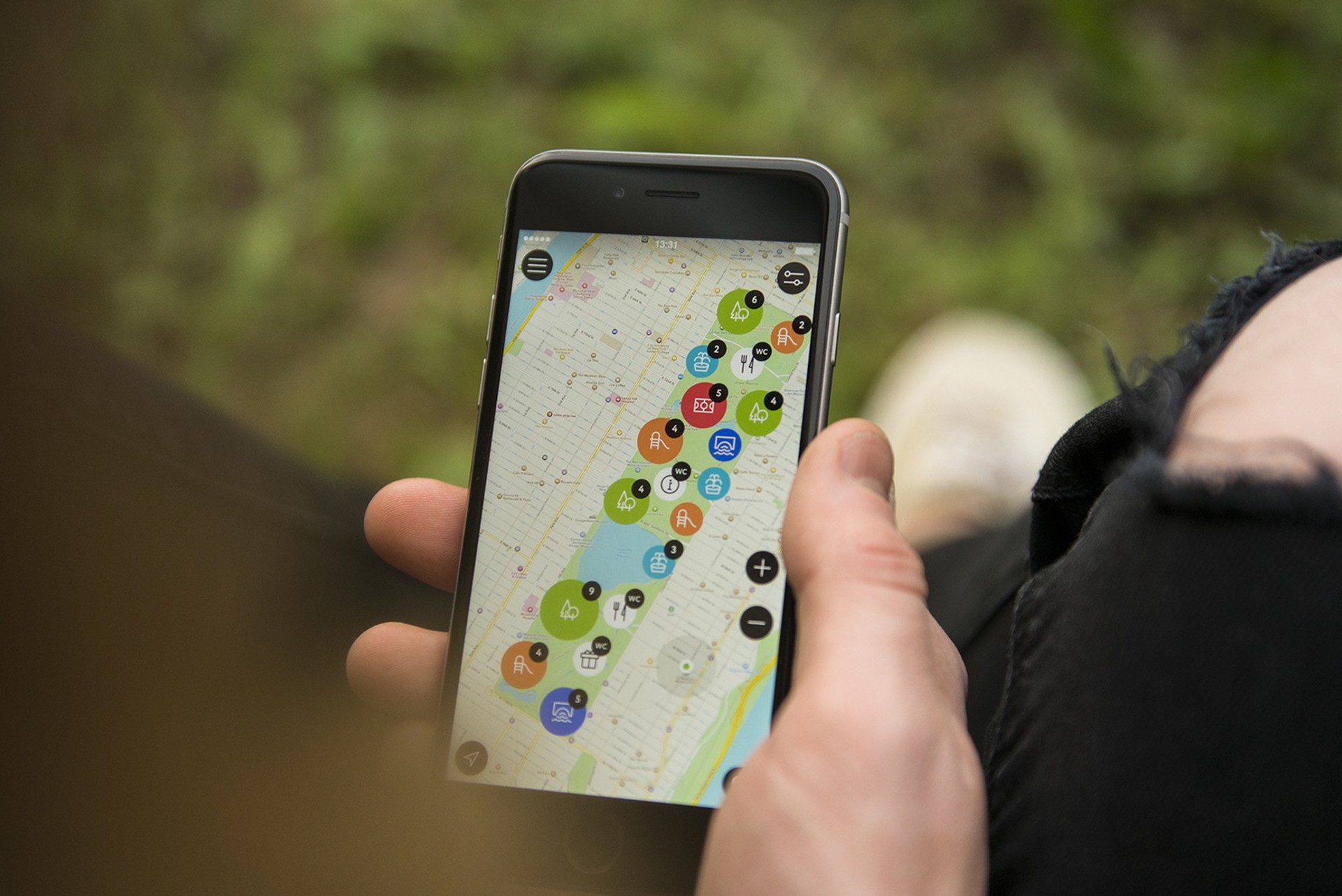
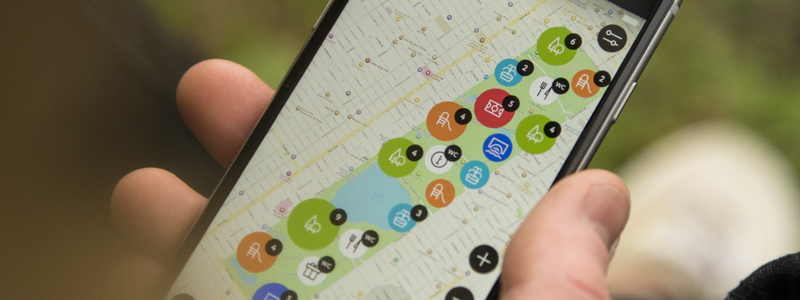
Map
Everything is not easy with the map: a huge number of locations and their display merge into an “information slam”, preventing the user from quickly understanding which of these locations he is in, not to mention finding specific places. Filtering is hidden behind an inexpressive icon, complicating the interaction between the user and the application.
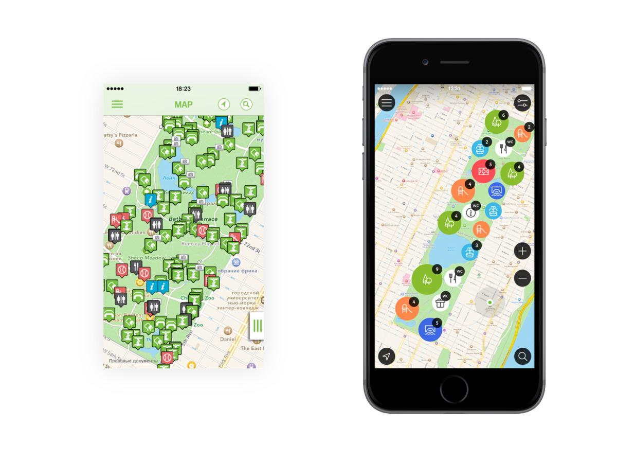
Screenshot and concept

Spot & details
Working with content is one of the most important tasks facing a designer. There are a large number of schools and typographical layout rules (this is, for example, said Thomas Byttebier designer in his blog). Neatly arranged text and visual blocks make up the overall style of the mobile application.
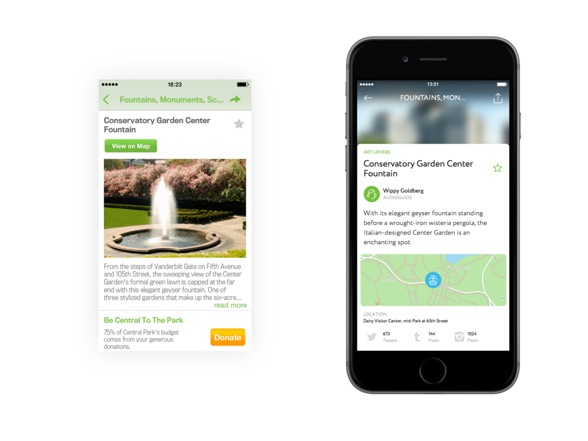
Screenshot and concept

Yes, Explore
Filtering looks boring and cloying. Dry text labels with icons work poorly - you should pay more attention to the elaboration of content and its expressiveness. A good solution is to use cards as containers for photos and captions. It will not be superfluous to unobtrusively remind the user about the selected places, they also have a separate card.

Screenshot and concept

Events
Exiting the application takes the user to the browser version of the site, to the events section is a rather strange choice. The desktop version of the section looks appropriate on the macbook screen, but the browser crutch on the smartphone is not able to correctly display information on events, especially at a resolution of 750 x 1334.

Screenshot and concept

Donate
It is very important to remind the user that charitable donations are 75% of the park’s budget. The donation card is shuffled on the Explore screen. Donations over five dollars require the user to switch to the browser version of the site - this is bad.

Screenshot and concept
Ok ...
In general, the application works correctly, but the process of interacting with it leaves much to be desired: skeormorphism on buttons and cross navigation are accompanied by errors. The creators of the application focused on the cleanliness of the code, but they were not seriously considering the interaction of the user with the application. While working on the redesign, I tried to pay attention to the nativeness of the internal elements and their layout, and of course, I thought that it would be convenient for the user to use the app. The prototype of the application can be found here .