July 9, 2015 at 01:32
Improving the form of payment through design and animation
 Many people think that designing a form of payment is not the most important thing. However, if you think about it, the form of payment of any selling site is one of the most important components of it, the very “point of no return”, after which the buyer will not turn back. Being on the form of payment, the client makes the final decision on the purchase of the selected product or on the cancellation of the order. In other words, the payment form is that thin line that separates you from the goal of any selling site - to sell the goods. And if you argue in this way, it becomes obvious that you can’t neglect the design of the form in any way.
 In the previous articleWe described how you can make an order payment form more attractive by visually improving the fields. This article will discuss how to increase the number of successful payments using correctly selected animations. The article will be useful to those who plan to add micro-animations to their interfaces, at least now we are implementing it in our electronic exchanger aggregator and many principles, as it turned out, are easy to transfer to most web services.
Animation on the form of payment should not be exclusively entertaining in nature, on the contrary, its main goal is to help the user understand what is required of him and push him to the most efficient use of your product. It is important not to overdo it. There is a simple but effective rule that helps to understand whether the animation you have chosen on the payment form is so necessary: turn it off and see what happens. If, after disabling animation effects, your form has significantly lost in information content and functionality, the interface has become less convenient and looks incomplete, then the animation is really useful and necessary, otherwise, if you turned off the animation, the perception of the form has not changed, most likely, it will be superfluous.
Let's move from theory to practice and consider a fewexamples of successful animations from the Stripe payment development team.
Animation adding context
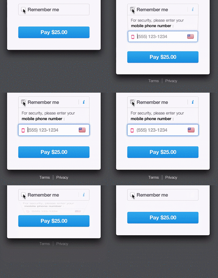
A click on the checkbox opens additional information with a field for entering a mobile phone number. This is an example of user-friendly animation. The form looks very light and does not take up useful space, and also does not load users who are not interested in the “Remember” function with unnecessary information, but only focuses on the payment button. For those who want to "remember", just activate the checkbox and enter the necessary data.
Swing animation
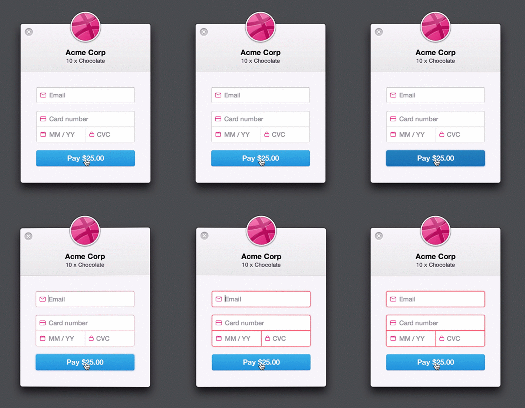
When filling out a payment form, many users may not immediately notice the mistakes made. Of course, they can be perceived in different ways. However, most users are annoyed when, after entering all the necessary data, a message pops up in front of them about incorrectly specified information (as a result, we get a high percentage of payments canceled).
The “swing” animation, on the one hand, softens the possible irritation of the client with its playfulness, and on the other hand, indicates errors made while filling in the fields, as if shaking his head and saying: “Something is wrong, check the entered data.”
Sleight of hand
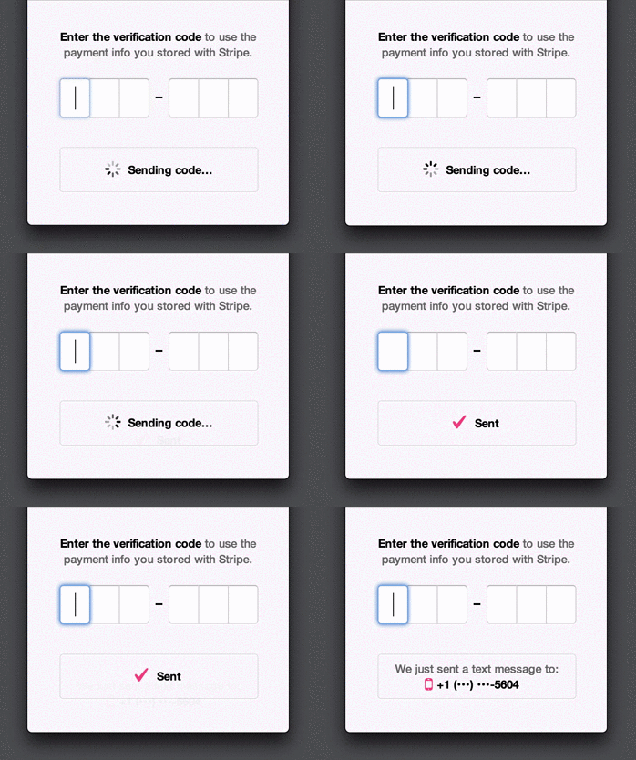
Animation can be a good tool for improving the speed of perception of important information. We all know that when a person waits for something, time slows down, and expectation often turns into eternity. The small animation presented above allows you to make the waiting process much more dynamic and interesting, despite the fact that the message delivery time remains the same. It is worth noting that this animation is just an illusion, because in fact we do not know exactly when the SMS message will come, however, it works.
Transformable Buttons
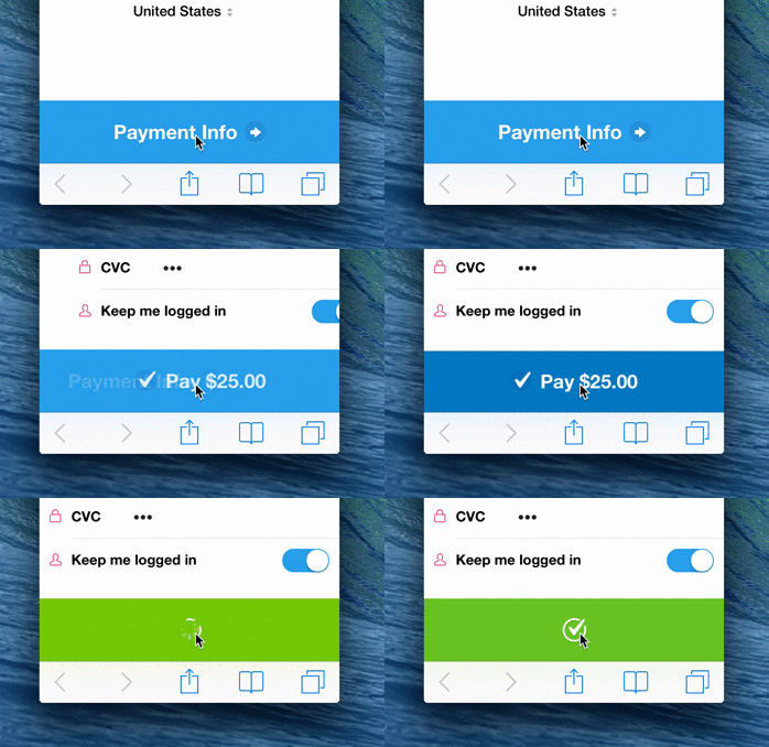
In this animation, the transition between the two states of the buttons ("Payment Information" and "Pay $ 25.00") also corresponds to a change in payment details (fields for entering payment details appear above the button). Thus, the button and the form are combined by one animation, and when moving to the next payment step, the user realizes that he is committing a new action.
When the user clicks “Pay”, the download indicator appears briefly (to give the whole process more dynamics), after which an icon is displayed on the form informing the user about the successful completion of the operation. An animated checkmark gives the feeling that you made a purchase easily and quickly.
Bonus

This animation may be among the "unnecessary", because when it is disabled, the form does not lose its functionality, and this, in turn, contradicts the general principle of animation of forms of payment. But do not rush to refuse it, because it can become very useful and significantly increase the number of sales.
Tools
Creating interface animations is a close-knit work of the designer-animator and developer. Having come up with an idea, the designer draws an animation storyboard and must explain to the developer how to implement it, it is possible in words, but in most cases this is not enough. For such cases, one of the existing tools for creating animation is used, here are some of them: After Effects , Facebook Origami , Pixate , Google Form , Framer , Flinto , Composite , Precursor .
The animations presented above are an important functional component of the interface; they significantly improve the user experience. In addition, such interactive elements increase the level of trust in the site, forming the impression that the selected resource is modern, high-quality, which means, in the opinion of most users, safe.
Personally, I think that the holy grail of any product manager is the state of his company’s website when the user is so impressed by the interactive and user-friendly design that the process of working with him until the payment is delayed is perceived as a game, it’s fun, and with each I want to move on to the next step, if only to see how the interface changes. Animation will help to achieve this state.
Of course, animation in the form of payment is not quite a common thing, but who said that this does not work? The examples presented in this article, as well as tips for visual improvement of the fields, will help you optimize the form of payment in the best way and significantly increase the number of successfully completed transactions.
No matter what type of application you create, the animation will make it more convenient for your user and more efficient for the entire project. With the help of correctly selected animation you can do a lot - change the perception of time, make important clarifications, attract users, but most importantly - please them not only in music, photos and other applications, but also when making purchases.
Subscribe to our blogon Habrahabr, as well as on the newsletter on our website , there are still many interesting posts about payment services, development, fintech startups, etc.