Design for color blind people (and with them)
- Transfer

Every time someone finds out that I'm color blind, I answer the same question: “What color is it?”. In 95% of cases, I will answer correctly, and so they ask me another question: “Wait, so you understand what it is [insert color name]? So what do you see? ” And here begins the process of explaining how color blindness works, and how it affects me.
As designers, we constantly care about intelligibility, the attractiveness of content, and how easy it is for the user to use the interface. But we often forget about every tenth user who is color blind. Many times I downloaded an application or game, just to experience great pain when using. I often cannot distinguish one object from another or see how this or that object is marked.
If 1 out of 10 users has difficulty using the application, or cannot use it at all, then the ratings will drop significantly. So how do we experience the application? How to fix problems? How can these problems be prevented?
Where do we find problems
If I'm color blind, this does not mean that I do not see the color at all. My life has enough colors; watching with my eyes is not the same as watching Hitchcock movies.
I do not miss the colors, I see them all. I just can’t name them or distinguish from each other. When the leaves change color in autumn, I do not always see red, orange and yellow shades. I see only orange, and sometimes I barely notice the difference. For me, the leaves immediately turn from green to brown. Taking this into account, when working on the application, you do not need to look at the colors separately and make sure that they are "visible". You need to look at combinations or groups of colors, whether they are distinguishable.
Successful applications
The developers of some applications did a great job for the benefit of those who are color blind. Trello , the organizer application, allows the user to enable the mode for color blind. This feature allows users like me to quickly distinguish labels.

Another application, Two Dots, is a game in which you need to connect dots of the same color. It also has the ability to enable the mode for color blind. In the beginning, I played this game very slowly, it took a very long time to complete levels. All because I could not distinguish the colors of the dots. After I discovered a mode for color blind, which uses symbols for dots of different colors, it became much easier to play.


Prevent errors
So, you have completed the design process, selected templates, icons, fonts, everything else. Now you need to make sure that the selected colors are suitable for color blind. But how to do this without asking a friend for color blind? There are a couple of ways. Firstly, the Sim Daltonism app allows users to look at the screen through the eyes of a color blind.
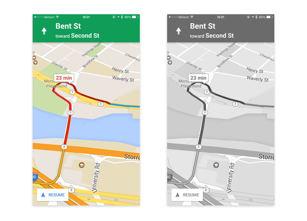
Another important test is to look at your design in black and white. This test allows you to see how similar the shades of colors are. If two colors of the same temperature (blue and violet, red and green, orange and red, etc.) have the same tone, it will be difficult to distinguish them. Google Maps, despite the use of red and green colors, use different tones, which allows me to easily distinguish them.
The easiest way to test the application in black and white is to go to Settings on the iPhone → Accessibility → enable Grayscale.
“But how did you become a designer if you can’t even see the colors?”
Good question, I don’t know. I just pretend to know what I'm doing and hope my boss doesn't notice it.
In fact, to some extent this simplifies my life. I spend less time in the initial stages of work, I don’t have to worry about “what shade of blue should I choose?” Or “will such an orange look?” On the contrary, I focus on the location of the elements and how they look in black and white. I do not need to look for another color blind to approve the choice of colors.
Even the choice of colors has become easier. Am I wasting time mixing colors to find the perfect blue? Not. Am I waiting for others to do this for me? Not. In fact, I take ready-made color schemes. This does not mean that I am copying hex codes exactly. I find compositions with a pleasant combination of colors. For example, the clip 'We Can't Stop' from Miley Cyrus, in my opinion, has excellent colors. I take them from there. Same thing with the Gorillaz 'Stylo' clip.

Shots from the 'We Can't Stop' clip by Miley Cyrus
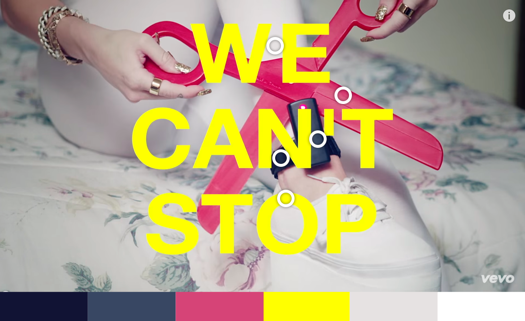
Selecting colors

Shots from the 'Stylo' clip by Gorillaz

Selecting colors
I find good photos with a nice combination of colors, for example, furniture, paintings and so on. The Sip app allows you to highlight color combinations from your screen. Main function Qolor lies in the ability to detect colors using the camera of your iPhone.
So why did I read all this?
Do you have anything else to do? Postponed your household chores? I do not know. But I hope that your applications satisfy the needs of all users. Despite the fact that a relatively low proportion of people suffer from color blindness, their features must be taken into account. Ultimately, the result will justify the effort.
From the translator. With all the wishes and comments regarding the translation, please contact me in PM. Thanks!
PS
For comparison with Google Maps, I’ll give an example of Yandex.Navigator
