The best usability solutions for online shopping: we make the customer happy
People tend to buy. Therefore, the interest of scientists and researchers in the issues of consumption in general and the purchase process in particular does not dry out. If earlier economists and sociologists studied these processes, now psychologists and neurophysiologists have joined the study of consumer behavior. In foreign medical and popular science publications, even such a term has appeared - retail therapy . The fact is that during the purchase, sensations similar to stress may appear, there may be a feeling of anxiety, or there may be a state of euphoria. And this applies to all types of purchases, including those made online. So it makes no difference whether you are selling in a real or virtual store - as a seller, it is important for you to do everything so that the buyer receives real pleasure from the purchase and returns again.

In the previous post, we examined the main mistakes made when developing the pages of buying online stores, now we will focus on the successful finds and best practices that the respondents noted - participants in the tests conducted by MasterCard and UsabilityLab.
Generally speaking, there are several key points that you should pay attention to in the process of prototyping and designing an online store. You can see general recommendations based on best practices on the infographic.
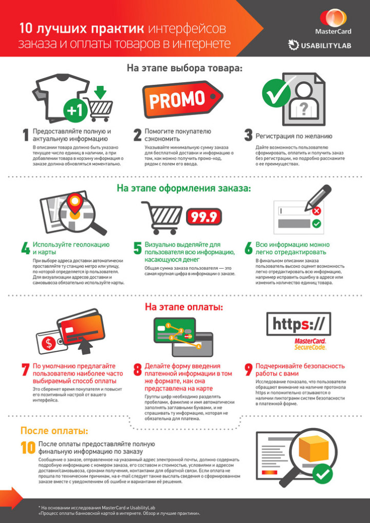
We divide the buying process according to the principle of three blocks: the stage of selecting goods, the stage of placing an order and the stage of payment. Consider the most successful solutions from the point of view of respondents.
At this stage, the buyer selects and puts aside / puts in the basket the product he likes. In this case, the decision to purchase, as a rule, is not made to the end, and it is important not to confuse the buyer with unobvious and unjustified actions. And here it is very important how to visualize the process of adding goods to the basket. There are several ways to do this:
In other words, when adding a product, there must be a feedback indicating that the product has been successfully added. The step of adding goods should contain the minimum number of necessary steps.
It is also necessary to minimize the likelihood of re-adding the product. For example, on the store’s website Enter, when you click on the “Add to Cart” button, the name of the button immediately changes, and the button becomes inactive after the first press. The likelihood of re-adding is minimized.
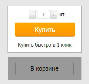
On the website of the Ozon store, when adding goods to the basket, the name of the button changes to “In the basket”, pressing the button again transfers the buyer to the basket.

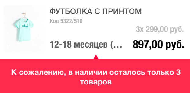
It is also good if the buyer in time finds out about the availability of goods. In the application of the Zara store information on the available quantity of goods is presented directly on the basket page.
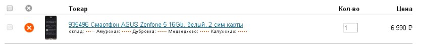
If the store has several points, it is worth indicating in which and how many specific goods are available. This solution is especially useful for urgent purchases - the buyer is sure that he will receive the goods at the selected point. An example of such a successful solution can be a basket on the Citylink store website: the stores that have the goods are listed on the basket page with the approximate amount of goods in each of them.
After the goods are selected, it is important to lead the user to the payment stage. At this step, the correct design of the continue purchase button plays an important role: it should be noticeable and understandable. On the sites of most of the tested stores, the button to continue ordering is visually highlighted and visible on the page. For example, on the store’s website Enter, the button to continue ordering has a visual priority.
At the stage of the basket, it is worth telling about all the options (and if available - and bonuses) of delivery that the online store offers. It is especially important to indicate this information on the page if free delivery is available starting from a certain order amount. For example, on the Sportmaster store’s website, the minimum order amount is reported so that the delivery is free, and next to the price is information that the delivery cost is not calculated in the order amount. Respondents said that they could start looking at the site for other necessary products in order to make delivery free. Accordingly, such a decision can increase the value of the average purchase receipt.
Another important detail when placing an order is the accounting of promotional codes and coupons that the user may have. We have already considered an example of negative situations that arise when the promotional code field is highlighted and attracts the attention of buyers who do not have a coupon. If the input field is hidden by default, users continue to purchase and do not attempt to find an opportunity to receive a discount code. For example, on the M.Video store website, the promotional code input field is hidden behind the link, the attention of users is not attracted once again.

And on the website of the Wikimart service, next to the activation code for the promotional code, a link to a page with information on how to get it is given. Users do not need to switch to third-party services to receive a discount.

At any time, the composition of the purchase may change, based on the needs and capabilities of the user. Accordingly, attention should be paid to the process of removing goods from the basket. For most users, the removal of goods from the basket is associated with a change in the quantity of goods in the order, so the function of deleting goods should be next to the counter of their quantity in the basket. Examples of successful solutions for the removal of goods are taken from the sites of Wikimart and Enter stores.

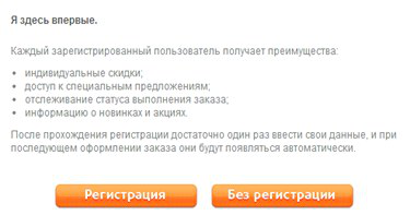
As a rule, immediately after selecting a product, a user authorizes on the site - an intermediate stage for moving to the payment process. Authorization should be concise, understandable and unobtrusive - the buyer should be asked for the minimum information necessary for the purchase, preferably without requiring confirmation of the information without good reason. In addition, the opportunity to complete the order without registration should be provided. For example, on the Kassir service website, confirmation of the phone number is not necessary for placing an order, as a result, respondents successfully completed the purchase.
In the future, you can offer the user automatic registration based on the contact details entered for placing an order. More often, background registration is used on sites selling electronic products. The study revealed that such registration was not noticeable to the respondent and did not cause a sense of waste of time.
You can also take advantage of background registration when selling physical goods. For example, on the website of the Sotmarket store, background registration is carried out at the first purchase - the user immediately goes to the checkout page, there is no authorization stage. After placing an order, a letter arrives in the mail containing registration information and a password. For subsequent purchases, it is enough to enter your e-mail address on the checkout page so that the “password” field for entering the site appears.
Despite the fact that during registration the same amount of data is requested as with a regular order, users do not want to register on sites, considering that it takes time. Background registration can provide users with access to the full functionality of the site, without causing a feeling of unnecessary actions.
To further encourage the user to register, it is worthwhile to clearly and clearly describe its advantages - a good example is the site of the Svyaznoy store:
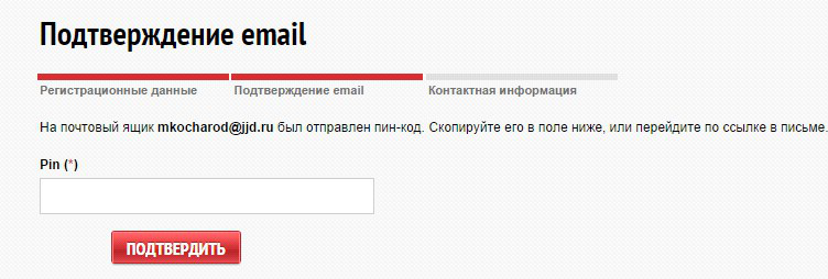
Unnecessary actions, such as confirming the phone and email after registration, distance the buyer from the purchase. Therefore, it is better to do all the necessary confirmations as part of the registration, as, for example, it is implemented on the Ticketland website, where the confirmation process is built into the registration and the user does not need to perform unnecessary actions.
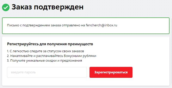
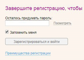
Voluntary registration after completing an order is the preferred registration option for the user. In this case, the buyer decides to register on the site on his own and can set his own password. This seems convenient for customers, since most of them on sites that visit as necessary to buy something, set one standard password. On the tested M.Video website, the registration opportunity after placing an order has been successfully implemented. On the order confirmation page, just enter the password and registration will be completed.
There is a similar implementation on the Wikimart website. Registration is carried out after placing the order is not highlighted in a separate stage.
In the vast majority of cases, when placing an order, the user leaves his personal contact information. Everyone knows that such data is a valuable base for marketing activities. This is also known to the buyer, who is most likely interested in receiving good news about discounts and promotions.
However, virtually none of the sites tested had instructions on how the user's contact information will be used, in particular, the email address. Such information is provided, for example, on the Wikimart service website.
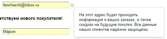
Warn users about their intentions to use the received contacts - and the interested customer will always leave their data to receive additional information from your store.
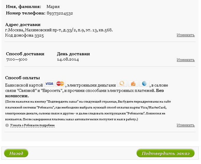
The next stage of the purchase is payment and everything connected with it. At this stage, it is important to ensure the correctness of data entry, and each interface element should be understandable. Many online stores managed to cope with this task - during the study, respondents noted convenient solutions.
When payment options are divided into groups, it’s easier to get an idea of the payment methods and make a choice. For example, on the Enter store’s website, the options are divided into groups “upon receipt of the order” and “right now”. This solution allows you to pay attention to exactly those methods that are necessary, and not to look at all the options in a long list.
Another good find is to sort the payment methods by popularity and offer at the top of the list of options the most popular options. For example, on the website of the Sotmarket store, payment options in the "prepayment" item are sorted by popularity, and the least-frequency methods are hidden under the link "Another 7 payment methods". The list is not overloaded with low-frequency options, and it is easier for users to find and select the desired option.
The most popular payment method among the audience of the site can be selected by default, this will allow most users not to take unnecessary actions to choose. So, on the IVI website, by default, payment by credit card is selected, the user does not need to additionally select the desired option.
It is worthwhile to provide the user with the ability to attach a bank card for added convenience when making further purchases. For example, on the site and in the Steam application, after the first payment, the user is invited to use the bank card details for further payments. In this case, you will not need to re-enter the card details.
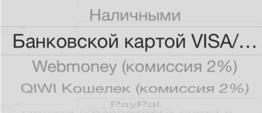
Be sure to specify the commission for the payment, it is also desirable to indicate its absence, so that the user knows the exact amount that will be debited from the card. Possible price changes must be reported next to the payment method. For example, on the mobile site of the Holodilnik store, a commission is marked next to the name of the payment method. In this case, users will not have questions when, when paying, they will encounter a higher order amount.
Drawings, especially familiar logos, are perceived by a person more simply than text. That is why payment methods should be supplemented with pictograms and logos of payment services, for example, as is done on the LiteRes website. The information presented in this way is easy to read, users can easily select the desired option.

In the case of pickup, it is convenient for the user that the goods are delivered to the point of delivery closest to it. Optimally, if the geographic coordinates of the user are determined automatically and they are offered the nearest delivery point. If this is not possible, then you need to strive for maximum automation: for example, substitute the parameters of the nearest point or metro station based on the entered address. On the Enter store website, the name of the metro station automatically appears after entering the address. At the same time, the field remains editable, and if the system has detected the station incorrectly, the user has the option to register it from the keyboard.

Modern Internet users are actively using virtual maps of the city: traffic services, navigators, searching for organizations ... Therefore, an even more convenient solution is to view the location of an offline store on a map. On the website of the Svyaznoy store, stores are presented both on the map and in the list. The form also has a search field, which can be useful if the store has a lot of pick-up points. Additionally, it is possible to sort the list of items by the parameter necessary for the user.
Items can be sorted alphabetically, by metro station name. With a large number of stores, you can use the color indication of the metro line to facilitate the search. For example, on the website of the Ulmart store, the list is sorted by the names of the metro stations, each line has a color indicator of the line on which the station is located.
The user may make a mistake when entering the address, and this should not cause a refusal to continue placing the order. To avoid possible errors, it is necessary to propose options from the list by the first letters you enter - this will help the user to select the desired address. On the store’s website Enter, you can either select an address from the drop-down list or enter it manually from the keyboard.

Often when choosing a store next to its name there is an indication of when exactly it is possible to pick up the goods. On the sites of Ulmart and Svyaznoy stores, next to the store name, the list contains information about the time when the order can be picked up.

In some cases, it is important to pick up the goods from the store immediately after ordering. For the convenience of the user, stores in which you can pick up the goods right now can be marked in the list.
In the process of order confirmation, the user for any reason may want to change the order parameters - so this functionality should be available directly from the confirmation form. For example, on the Buket store website, you can change all order parameters. The user does not need to go back to the previous steps for editing and thereby move away from the final action of payment for the goods.
The stage of entering card details, as a rule, requires increased attention. A small and familiar bank card contains a fairly large amount of information that needs to be transferred to the form of an online store. In this case, the user must be convinced of the correctness of data entry. The thoughtful design of the details input page can give him additional confidence.
Since users during or after data entry verify the correctness of the transmitted information, it is convenient to visually divide the input fields of the card number into blocks. During the study, respondents did not use their personal banking information, and the level of anxiety when filling in the details was lower than in real life. However, more than half of the participants checked the correctness of the data entered. In cases where the card number is presented in a continuous sequence of numbers, respondents had problems with verification.

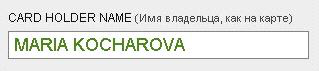
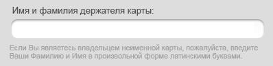
In general, in the process of designing the page for entering details from the card, many things that seem trifles are not such. For example, entering a first and last name, “like on a map”. Firstly, the field should be the same for the name and surname, and secondly, you should pay attention to the case of the entered letters, because the name and surname on the bank card are typed in capital letters and Latin letters, which causes questions for inexperienced users when filling out the field. Almost all respondents with little experience of paying online while filling out the “Name” field asked themselves whether to write the name in capital letters or lowercase, whether it is necessary to write the name in Latin letters. Dialing from mobile devices is complicated by the fact that the translation into spelling in capital letters is not obvious to most users,
A successful implementation example can be seen on the Aeroexpress website. When typing a name, the letters are displayed in capital letters. In the event that the user started typing in Cyrillic without accidentally switching the keyboard layout, the letters are automatically replaced with their corresponding Latin letters on the keyboard.
Using a recording format similar to that on the card reduces the cognitive load on the user and positively affects the experience with the service. Finding the information you need on the map becomes easier, and less questions arise when filling out the form fields.
To make the user enter the details of the card less difficult, it is best to implement the input form in the form of the bank card itself - then it will be absolutely obvious what data to enter. Successful payment form on the website of the LitRes store: the location of the input fields corresponds to the location of the information on the map. In this version, even inexperienced users can easily find the right information.

The sequence of entering the card details on the page should correspond to the trajectory of the user's gaze and is not interrupted by entering additional information. The Rambler.Kassa service has a successful solution for payment from mobile devices. All fields are located in the order in which the user sees them on the map.
In the process of entering details, it is not recommended to request data that can be determined automatically. The card type, bank name and bank technical support number can be determined automatically, but they are still often requested on payment pages as a security measure. An example of a good solution is the PayU system, in which the type of card is determined automatically as you type.
Additional form fields do not create a sense of security for the user, since few people associate more fields with more protection. In many cases, of the optional payment fields, only the card holder’s name field is used, but because of its frequency, the survey respondents considered it mandatory for payment and did not perceive it as unnecessary. For example, on the payment page in the Poster application only the fields necessary for making the payment are presented, users quickly and easily fill out the payment form.
Due to the large number of unnamed cards, additional tips are required on what to do in this case. For example, Russian Standard Bank provides for an unnamed card.
For users, the correct design of the pages of the online store is a synonym for the safety of purchase and payment. Therefore, it is worth paying special attention to the design of the payment system page, to which the buyer is redirected after placing the order.
The page of the payment system may be embedded in the website of the online store or external. In any case, it is necessary to maintain uniformity in design and brand the page so that the user is not confused by the transition to a new site. When the payment form is embedded on the store’s website page, it becomes possible to display the contents of the basket. How, for example, is done on the M.Video website. The user can check the contents of the basket and the amount of the order.
When paying for a subscription to the Vedomosti publication, a transition to the bank’s payment page occurs, however, the page’s design style is maintained on the page, there is a Vedomosti logo and an order description. In this case, the majority of respondents did not notice a change in the page address and are confident in the security of the payment.
The payment system logos or 3DSecure service icons (for example, MasterCard SecureCode) should be present on the page of the form of payment. It will not be superfluous to save the “lock” symbol in the URL address bar. Despite the fact that most users do not understand the technical meaning of the icons on the payment page, such icons are an additional factor that increases the subjective feeling of payment security.

During an electronic payment, there is a likelihood of technical problems, problems on the part of the user (for example, there is no money on the card) or any other situation leading to the cancellation of the payment. If the operation is canceled, a transition to the page with information about the declined payment should occur. If payment is unsuccessful, the Robokassa service page will go to the page with brief information about the error that has occurred. The user is asked to either return to payment or return to the store to adjust the order.

In the event that payment for the order has failed, the user must be immediately notified. On the Lamoda store website after an unsuccessful payment, a return to the store website occurs. The page provides information that the order is formed and information that the store manager will contact the buyer to clarify the order.

The acquiring bank page should also be user-friendly and intuitive. An important role is played by the layout of all the information and the evidence of the necessary actions. Information about the amount of debiting should be visible, the one-time password entry field is noticeable or the absence of the need to enter a password is directly indicated. So the user can easily check important information.
The payment confirmation button should be located to the right of the input field, since when placed under the input field, when paying from a smartphone, the keyboard often overlaps it. When it is located on the right, the payment process takes less time, there are no problems finding the button.
The buyer of the online store should always receive information about what is happening on the page, and what are its further actions. For example, on the page of one of the banks information is indicated that a message was sent to the phone and instructions for its use were given. The form uses frequency terms that are understandable to most users.
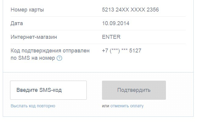
Often, a confirmation code comes at the end of the SMS message and you need to take extra actions in order to see it. This is especially inconvenient when entering a password from the same mobile device. This is well implemented in the SMS messages of two tested banks. The confirmation code is at the beginning of the message. The user does not need to spend time opening the message, reading it and finding the code.
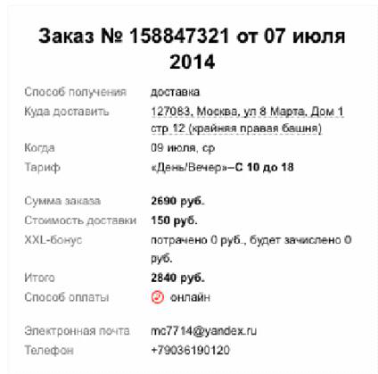
After making the payment, the final touch remains - to thank the user. However, in addition to gratitude, on the “Thank you for your purchase” page, you need to place information on the composition and amount of the order, the selected method and delivery time. For example, on the website of the Ulmart store, on the confirmation page of a placed order, all parameters important for verification are indicated.
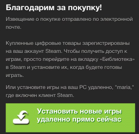
If you purchased electronic goods or electronic tickets, the page should contain instructions for obtaining a purchase or the ability to download the purchased goods from the link. For example, in the Steam application after making a purchase, it is proposed to remotely install the purchased games.
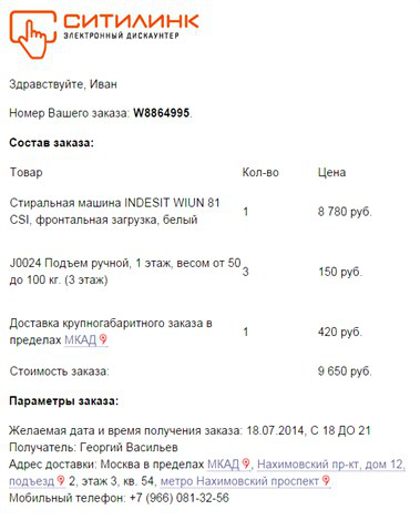
Also, all information must be duplicated by the buyer’s e-mail so that he can refer to the letter at any time. The Citilink store letter duplicated all the details about the delivery, payment and contact details of the recipient. The text of the letter also indicates the number and composition of the order, the total amount.
It will be useful to think over a form with order parameters for printing.
There are no minor details for the usability of the pages of the online store - all interface elements must work to help the user make purchases comfortably. In this case, it does not matter at all what scale is involved: a huge online store or purchase page on the manufacturer’s website. The best practices and typical mistakes will be most useful for those who are just going to sell online - after all, creating an initially convenient page is better than fixing it later, learning from your mistakes.
In the comments on the first post on the MasterCard blog, user selekowrote: “Mastercard, pay attention to the percentage of stores that generally allow you to pay for purchases online. I’m not sure that an extra click is so critical compared to the inability to pay online :) ”That's right, there are still a lot of stores that do not accept payments for online purchases, but only allow you to order the selected product. There are those who use the site only as a showcase, and the entire purchase process takes you either to outlets or to order by phone. However, the sphere of e-commerce is growing rapidly and there are new and new online stores and shopping pages on sites. And at the stage of creating each of them, it is important to pay special attention to the usability of all stages of the purchase. Remember the important rules when creating the prototype and design of the purchase pages on your site.

Based on high-quality expertise and best practices, it will be easier to create a selling online store, and, accordingly, to become closer to your audience. Which will certainly affect customer loyalty, and, ultimately, profit. Full study (PDF, 15MB, 203 pages) Thank you for your attention, to be continued


In the previous post, we examined the main mistakes made when developing the pages of buying online stores, now we will focus on the successful finds and best practices that the respondents noted - participants in the tests conducted by MasterCard and UsabilityLab.
Generally speaking, there are several key points that you should pay attention to in the process of prototyping and designing an online store. You can see general recommendations based on best practices on the infographic.
We divide the buying process according to the principle of three blocks: the stage of selecting goods, the stage of placing an order and the stage of payment. Consider the most successful solutions from the point of view of respondents.
Product selection
At this stage, the buyer selects and puts aside / puts in the basket the product he likes. In this case, the decision to purchase, as a rule, is not made to the end, and it is important not to confuse the buyer with unobvious and unjustified actions. And here it is very important how to visualize the process of adding goods to the basket. There are several ways to do this:
- pop-up window with information that the product is in the basket is for medium and small amount of goods to buy
- automatic transition to the cart page - also for a small number of items
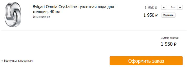
- by changing the add product button or counter in the product card - especially relevant for a large number of items (products, food to order).
In other words, when adding a product, there must be a feedback indicating that the product has been successfully added. The step of adding goods should contain the minimum number of necessary steps.
It is also necessary to minimize the likelihood of re-adding the product. For example, on the store’s website Enter, when you click on the “Add to Cart” button, the name of the button immediately changes, and the button becomes inactive after the first press. The likelihood of re-adding is minimized.
On the website of the Ozon store, when adding goods to the basket, the name of the button changes to “In the basket”, pressing the button again transfers the buyer to the basket.
It is also good if the buyer in time finds out about the availability of goods. In the application of the Zara store information on the available quantity of goods is presented directly on the basket page.
If the store has several points, it is worth indicating in which and how many specific goods are available. This solution is especially useful for urgent purchases - the buyer is sure that he will receive the goods at the selected point. An example of such a successful solution can be a basket on the Citylink store website: the stores that have the goods are listed on the basket page with the approximate amount of goods in each of them.
After the goods are selected, it is important to lead the user to the payment stage. At this step, the correct design of the continue purchase button plays an important role: it should be noticeable and understandable. On the sites of most of the tested stores, the button to continue ordering is visually highlighted and visible on the page. For example, on the store’s website Enter, the button to continue ordering has a visual priority.
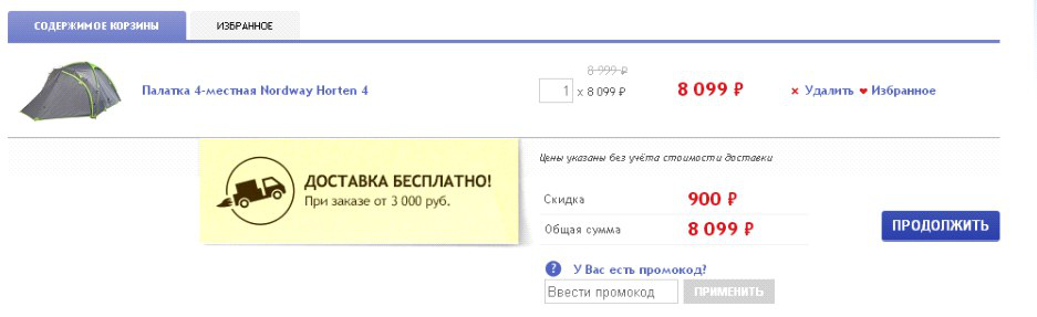
At the stage of the basket, it is worth telling about all the options (and if available - and bonuses) of delivery that the online store offers. It is especially important to indicate this information on the page if free delivery is available starting from a certain order amount. For example, on the Sportmaster store’s website, the minimum order amount is reported so that the delivery is free, and next to the price is information that the delivery cost is not calculated in the order amount. Respondents said that they could start looking at the site for other necessary products in order to make delivery free. Accordingly, such a decision can increase the value of the average purchase receipt.
Another important detail when placing an order is the accounting of promotional codes and coupons that the user may have. We have already considered an example of negative situations that arise when the promotional code field is highlighted and attracts the attention of buyers who do not have a coupon. If the input field is hidden by default, users continue to purchase and do not attempt to find an opportunity to receive a discount code. For example, on the M.Video store website, the promotional code input field is hidden behind the link, the attention of users is not attracted once again.
And on the website of the Wikimart service, next to the activation code for the promotional code, a link to a page with information on how to get it is given. Users do not need to switch to third-party services to receive a discount.
At any time, the composition of the purchase may change, based on the needs and capabilities of the user. Accordingly, attention should be paid to the process of removing goods from the basket. For most users, the removal of goods from the basket is associated with a change in the quantity of goods in the order, so the function of deleting goods should be next to the counter of their quantity in the basket. Examples of successful solutions for the removal of goods are taken from the sites of Wikimart and Enter stores.
Checkout
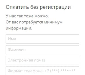
As a rule, immediately after selecting a product, a user authorizes on the site - an intermediate stage for moving to the payment process. Authorization should be concise, understandable and unobtrusive - the buyer should be asked for the minimum information necessary for the purchase, preferably without requiring confirmation of the information without good reason. In addition, the opportunity to complete the order without registration should be provided. For example, on the Kassir service website, confirmation of the phone number is not necessary for placing an order, as a result, respondents successfully completed the purchase.
In the future, you can offer the user automatic registration based on the contact details entered for placing an order. More often, background registration is used on sites selling electronic products. The study revealed that such registration was not noticeable to the respondent and did not cause a sense of waste of time.
You can also take advantage of background registration when selling physical goods. For example, on the website of the Sotmarket store, background registration is carried out at the first purchase - the user immediately goes to the checkout page, there is no authorization stage. After placing an order, a letter arrives in the mail containing registration information and a password. For subsequent purchases, it is enough to enter your e-mail address on the checkout page so that the “password” field for entering the site appears.
Despite the fact that during registration the same amount of data is requested as with a regular order, users do not want to register on sites, considering that it takes time. Background registration can provide users with access to the full functionality of the site, without causing a feeling of unnecessary actions.
To further encourage the user to register, it is worthwhile to clearly and clearly describe its advantages - a good example is the site of the Svyaznoy store:
Unnecessary actions, such as confirming the phone and email after registration, distance the buyer from the purchase. Therefore, it is better to do all the necessary confirmations as part of the registration, as, for example, it is implemented on the Ticketland website, where the confirmation process is built into the registration and the user does not need to perform unnecessary actions.
Voluntary registration after completing an order is the preferred registration option for the user. In this case, the buyer decides to register on the site on his own and can set his own password. This seems convenient for customers, since most of them on sites that visit as necessary to buy something, set one standard password. On the tested M.Video website, the registration opportunity after placing an order has been successfully implemented. On the order confirmation page, just enter the password and registration will be completed.
There is a similar implementation on the Wikimart website. Registration is carried out after placing the order is not highlighted in a separate stage.
In the vast majority of cases, when placing an order, the user leaves his personal contact information. Everyone knows that such data is a valuable base for marketing activities. This is also known to the buyer, who is most likely interested in receiving good news about discounts and promotions.
However, virtually none of the sites tested had instructions on how the user's contact information will be used, in particular, the email address. Such information is provided, for example, on the Wikimart service website.
Warn users about their intentions to use the received contacts - and the interested customer will always leave their data to receive additional information from your store.
Payment stage
The next stage of the purchase is payment and everything connected with it. At this stage, it is important to ensure the correctness of data entry, and each interface element should be understandable. Many online stores managed to cope with this task - during the study, respondents noted convenient solutions.
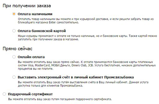
When payment options are divided into groups, it’s easier to get an idea of the payment methods and make a choice. For example, on the Enter store’s website, the options are divided into groups “upon receipt of the order” and “right now”. This solution allows you to pay attention to exactly those methods that are necessary, and not to look at all the options in a long list.
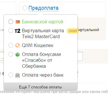
Another good find is to sort the payment methods by popularity and offer at the top of the list of options the most popular options. For example, on the website of the Sotmarket store, payment options in the "prepayment" item are sorted by popularity, and the least-frequency methods are hidden under the link "Another 7 payment methods". The list is not overloaded with low-frequency options, and it is easier for users to find and select the desired option.
The most popular payment method among the audience of the site can be selected by default, this will allow most users not to take unnecessary actions to choose. So, on the IVI website, by default, payment by credit card is selected, the user does not need to additionally select the desired option.
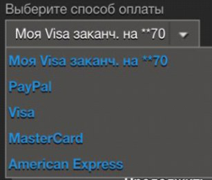
It is worthwhile to provide the user with the ability to attach a bank card for added convenience when making further purchases. For example, on the site and in the Steam application, after the first payment, the user is invited to use the bank card details for further payments. In this case, you will not need to re-enter the card details.
Be sure to specify the commission for the payment, it is also desirable to indicate its absence, so that the user knows the exact amount that will be debited from the card. Possible price changes must be reported next to the payment method. For example, on the mobile site of the Holodilnik store, a commission is marked next to the name of the payment method. In this case, users will not have questions when, when paying, they will encounter a higher order amount.
Drawings, especially familiar logos, are perceived by a person more simply than text. That is why payment methods should be supplemented with pictograms and logos of payment services, for example, as is done on the LiteRes website. The information presented in this way is easy to read, users can easily select the desired option.
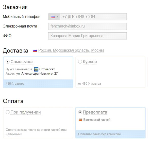
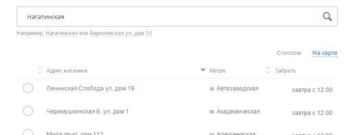
In the case of pickup, it is convenient for the user that the goods are delivered to the point of delivery closest to it. Optimally, if the geographic coordinates of the user are determined automatically and they are offered the nearest delivery point. If this is not possible, then you need to strive for maximum automation: for example, substitute the parameters of the nearest point or metro station based on the entered address. On the Enter store website, the name of the metro station automatically appears after entering the address. At the same time, the field remains editable, and if the system has detected the station incorrectly, the user has the option to register it from the keyboard.
Modern Internet users are actively using virtual maps of the city: traffic services, navigators, searching for organizations ... Therefore, an even more convenient solution is to view the location of an offline store on a map. On the website of the Svyaznoy store, stores are presented both on the map and in the list. The form also has a search field, which can be useful if the store has a lot of pick-up points. Additionally, it is possible to sort the list of items by the parameter necessary for the user.
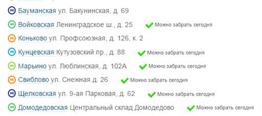
Items can be sorted alphabetically, by metro station name. With a large number of stores, you can use the color indication of the metro line to facilitate the search. For example, on the website of the Ulmart store, the list is sorted by the names of the metro stations, each line has a color indicator of the line on which the station is located.
The user may make a mistake when entering the address, and this should not cause a refusal to continue placing the order. To avoid possible errors, it is necessary to propose options from the list by the first letters you enter - this will help the user to select the desired address. On the store’s website Enter, you can either select an address from the drop-down list or enter it manually from the keyboard.
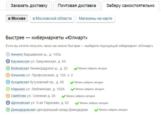
Often when choosing a store next to its name there is an indication of when exactly it is possible to pick up the goods. On the sites of Ulmart and Svyaznoy stores, next to the store name, the list contains information about the time when the order can be picked up.
In some cases, it is important to pick up the goods from the store immediately after ordering. For the convenience of the user, stores in which you can pick up the goods right now can be marked in the list.
In the process of order confirmation, the user for any reason may want to change the order parameters - so this functionality should be available directly from the confirmation form. For example, on the Buket store website, you can change all order parameters. The user does not need to go back to the previous steps for editing and thereby move away from the final action of payment for the goods.
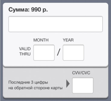
The stage of entering card details, as a rule, requires increased attention. A small and familiar bank card contains a fairly large amount of information that needs to be transferred to the form of an online store. In this case, the user must be convinced of the correctness of data entry. The thoughtful design of the details input page can give him additional confidence.
Since users during or after data entry verify the correctness of the transmitted information, it is convenient to visually divide the input fields of the card number into blocks. During the study, respondents did not use their personal banking information, and the level of anxiety when filling in the details was lower than in real life. However, more than half of the participants checked the correctness of the data entered. In cases where the card number is presented in a continuous sequence of numbers, respondents had problems with verification.
In general, in the process of designing the page for entering details from the card, many things that seem trifles are not such. For example, entering a first and last name, “like on a map”. Firstly, the field should be the same for the name and surname, and secondly, you should pay attention to the case of the entered letters, because the name and surname on the bank card are typed in capital letters and Latin letters, which causes questions for inexperienced users when filling out the field. Almost all respondents with little experience of paying online while filling out the “Name” field asked themselves whether to write the name in capital letters or lowercase, whether it is necessary to write the name in Latin letters. Dialing from mobile devices is complicated by the fact that the translation into spelling in capital letters is not obvious to most users,
A successful implementation example can be seen on the Aeroexpress website. When typing a name, the letters are displayed in capital letters. In the event that the user started typing in Cyrillic without accidentally switching the keyboard layout, the letters are automatically replaced with their corresponding Latin letters on the keyboard.
Using a recording format similar to that on the card reduces the cognitive load on the user and positively affects the experience with the service. Finding the information you need on the map becomes easier, and less questions arise when filling out the form fields.
To make the user enter the details of the card less difficult, it is best to implement the input form in the form of the bank card itself - then it will be absolutely obvious what data to enter. Successful payment form on the website of the LitRes store: the location of the input fields corresponds to the location of the information on the map. In this version, even inexperienced users can easily find the right information.
The sequence of entering the card details on the page should correspond to the trajectory of the user's gaze and is not interrupted by entering additional information. The Rambler.Kassa service has a successful solution for payment from mobile devices. All fields are located in the order in which the user sees them on the map.
In the process of entering details, it is not recommended to request data that can be determined automatically. The card type, bank name and bank technical support number can be determined automatically, but they are still often requested on payment pages as a security measure. An example of a good solution is the PayU system, in which the type of card is determined automatically as you type.
Additional form fields do not create a sense of security for the user, since few people associate more fields with more protection. In many cases, of the optional payment fields, only the card holder’s name field is used, but because of its frequency, the survey respondents considered it mandatory for payment and did not perceive it as unnecessary. For example, on the payment page in the Poster application only the fields necessary for making the payment are presented, users quickly and easily fill out the payment form.
Due to the large number of unnamed cards, additional tips are required on what to do in this case. For example, Russian Standard Bank provides for an unnamed card.
For users, the correct design of the pages of the online store is a synonym for the safety of purchase and payment. Therefore, it is worth paying special attention to the design of the payment system page, to which the buyer is redirected after placing the order.
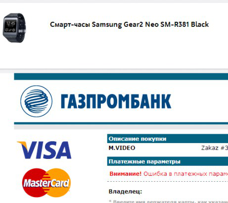
The page of the payment system may be embedded in the website of the online store or external. In any case, it is necessary to maintain uniformity in design and brand the page so that the user is not confused by the transition to a new site. When the payment form is embedded on the store’s website page, it becomes possible to display the contents of the basket. How, for example, is done on the M.Video website. The user can check the contents of the basket and the amount of the order.
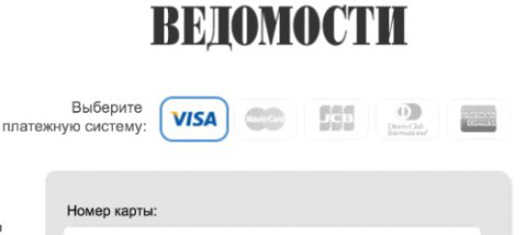
When paying for a subscription to the Vedomosti publication, a transition to the bank’s payment page occurs, however, the page’s design style is maintained on the page, there is a Vedomosti logo and an order description. In this case, the majority of respondents did not notice a change in the page address and are confident in the security of the payment.
The payment system logos or 3DSecure service icons (for example, MasterCard SecureCode) should be present on the page of the form of payment. It will not be superfluous to save the “lock” symbol in the URL address bar. Despite the fact that most users do not understand the technical meaning of the icons on the payment page, such icons are an additional factor that increases the subjective feeling of payment security.
During an electronic payment, there is a likelihood of technical problems, problems on the part of the user (for example, there is no money on the card) or any other situation leading to the cancellation of the payment. If the operation is canceled, a transition to the page with information about the declined payment should occur. If payment is unsuccessful, the Robokassa service page will go to the page with brief information about the error that has occurred. The user is asked to either return to payment or return to the store to adjust the order.
In the event that payment for the order has failed, the user must be immediately notified. On the Lamoda store website after an unsuccessful payment, a return to the store website occurs. The page provides information that the order is formed and information that the store manager will contact the buyer to clarify the order.
The acquiring bank page should also be user-friendly and intuitive. An important role is played by the layout of all the information and the evidence of the necessary actions. Information about the amount of debiting should be visible, the one-time password entry field is noticeable or the absence of the need to enter a password is directly indicated. So the user can easily check important information.
The payment confirmation button should be located to the right of the input field, since when placed under the input field, when paying from a smartphone, the keyboard often overlaps it. When it is located on the right, the payment process takes less time, there are no problems finding the button.
The buyer of the online store should always receive information about what is happening on the page, and what are its further actions. For example, on the page of one of the banks information is indicated that a message was sent to the phone and instructions for its use were given. The form uses frequency terms that are understandable to most users.
Often, a confirmation code comes at the end of the SMS message and you need to take extra actions in order to see it. This is especially inconvenient when entering a password from the same mobile device. This is well implemented in the SMS messages of two tested banks. The confirmation code is at the beginning of the message. The user does not need to spend time opening the message, reading it and finding the code.
After payment
After making the payment, the final touch remains - to thank the user. However, in addition to gratitude, on the “Thank you for your purchase” page, you need to place information on the composition and amount of the order, the selected method and delivery time. For example, on the website of the Ulmart store, on the confirmation page of a placed order, all parameters important for verification are indicated.
If you purchased electronic goods or electronic tickets, the page should contain instructions for obtaining a purchase or the ability to download the purchased goods from the link. For example, in the Steam application after making a purchase, it is proposed to remotely install the purchased games.
Also, all information must be duplicated by the buyer’s e-mail so that he can refer to the letter at any time. The Citilink store letter duplicated all the details about the delivery, payment and contact details of the recipient. The text of the letter also indicates the number and composition of the order, the total amount.
It will be useful to think over a form with order parameters for printing.
There are no minor details for the usability of the pages of the online store - all interface elements must work to help the user make purchases comfortably. In this case, it does not matter at all what scale is involved: a huge online store or purchase page on the manufacturer’s website. The best practices and typical mistakes will be most useful for those who are just going to sell online - after all, creating an initially convenient page is better than fixing it later, learning from your mistakes.
In the comments on the first post on the MasterCard blog, user selekowrote: “Mastercard, pay attention to the percentage of stores that generally allow you to pay for purchases online. I’m not sure that an extra click is so critical compared to the inability to pay online :) ”That's right, there are still a lot of stores that do not accept payments for online purchases, but only allow you to order the selected product. There are those who use the site only as a showcase, and the entire purchase process takes you either to outlets or to order by phone. However, the sphere of e-commerce is growing rapidly and there are new and new online stores and shopping pages on sites. And at the stage of creating each of them, it is important to pay special attention to the usability of all stages of the purchase. Remember the important rules when creating the prototype and design of the purchase pages on your site.
Based on high-quality expertise and best practices, it will be easier to create a selling online store, and, accordingly, to become closer to your audience. Which will certainly affect customer loyalty, and, ultimately, profit. Full study (PDF, 15MB, 203 pages) Thank you for your attention, to be continued